Ancillary Application Windows
Ancillary application windows are windows that are not really part of the application's functionality, but are provided as a matter of convention. These windows are either available only on request or are offered up by the program only once, such as the program's credit screen. Those that are offered unilaterally by the program are erected when the program is used for the very first time or each time the program is initiated. All these windows, however, form channels of communication that can both help the user and better communicate your brand.
About boxes
The About box is a single dialog box that — by convention — identifies the program to the user. The About box is also used as the program's credit screen, identifying the people who created it. Ironically, the About box rarely tells the user much about the program. On the Macintosh, the About box can be summoned from the top of the Apple pop-up menu. In Windows, it is almost always found at the bottom of the Help menu.
Microsoft has been consistent with About boxes in its programs, and it has taken a simple approach to its design, as you can see in Figure 35-1. Microsoft uses the About box almost exclusively as a place for identification, a sort of driver's license for software. This is unfortunate, as it is a good place to give the curious user an overview of the program in a way that doesn't intrude on those users who don't need it. It is often, but not always, a good thing to follow in Microsoft's design footsteps. This is one place where diverging from Microsoft can offer a big advantage.
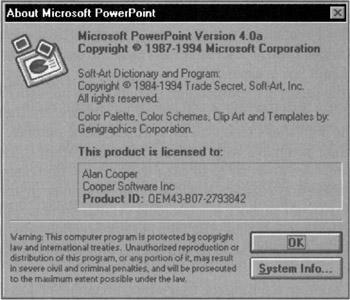
Figure 35-1: This About box from PowerPoint is a typical example of Microsoft's approach. It tells you the exact name and version of the program, states relevant copyrights, issues legal warnings (ugh!), and displays the user's name and company. The program's icon is traditionally shown in the upper-left corner. The problem is, if a friend asked you to tell her about PowerPoint, you probably wouldn't recite the relevant copyrights, but would instead describe to her what the program is about. What's wrong with this picture?
The main problem with Microsoft's approach is that the About box doesn't tell the user about the program. In reality, it is an identification box. It identifies the program by name and version number. It identifies various copyrights in the program. It identifies the user and the user's company. These are certainly useful functions, but are more useful for Microsoft customer support than for the user.
The desire to make About boxes more useful is clearly strong — otherwise, we wouldn't see memory usage and system-information buttons on them. This is admirable, but, by taking a more goal-directed approach, we can add information to the About box that really can help the user. The single most important thing that the About box can convey to the user is the scope of the program. It should tell, in the broadest terms, what the program can and can't do. It should also state succinctly what the program does. Most program authors forget that many users don't have any idea what the InfoMeister 3000 Version 4.0 program actually does. This is the place to gently clue them in.
The About box is also a great place to give the one lesson that might start a new user successfully. For example, if there is one new idiom — like a direct-manipulation method — that is critical to the user interaction, this is a good place to briefly tell him about it. Additionally, the About box can direct the new user to other sources of information that will help him get his bearings in the program.
Because the current design of this facility just presents the program's fine print instead of telling the user about the program, it should be called an Identity box instead of an About box, and that's how we'll refer to it from this point on. The Identity box identifies the program to the user, and the dialog in Figure 35-1 fulfills this definition admirably. It tells us all the stuff the lawyers require and the tech support people need to know. Clearly, Microsoft has made the decision that an Identity box is important, whereas a true About box is expendable.
As we've seen, the Identity box must offer the basics of identification, including the publisher's name, the program's icons, the program's version number, and the names of its authors. Another item that could profitably be placed here is the publisher's technical support telephone number.
Many software publishers don't identify their programs with sufficient discrimination to tie them to a specific software build. Some vendors even go so far as to issue the same version number to significantly different programs for marketing reasons. But the version number in the Identity — or About — box is mainly used by customer support. A misleading version number will cost the publisher a significant amount of phone-support time just figuring out precisely which version of the program the user has. It doesn't matter what scheme you use, as long as this number is very specific.
An important part of reporting the version number is telling the user which previous version it replaces. Knowing that this is version 3.2 isn't tremendously meaningful. Knowing that version 3.2 fixes bugs in version 3.1 and supersedes all versions 2.x, however, is useful. Vendors work hard to improve their software, and each version is usually intended to replace some previous version. Smaller, incremental revisions are released to fix bugs but may not entirely replace a predecessor. Similarly, a special version may be shipped that allows compatibility with certain new hardware or software. This should be stated, as well.
If you are going to display an informative version number, it wouldn't hurt to explain the details of the numbering scheme in this box. Most users will ignore it, but it will be appreciated by thousands of corporate IT managers.
Many programs are uniquely identified by their serial numbers. This, of course, is the place to display that number. The user may need to use that number in correspondence with the publisher, or for his own company records, so the program should let the user view it and select it for copying.
The About box (not the Identity box) is absolutely the right place to state the product team's names. The authors firmly believe that credit should be given where credit is due in the design, development, and testing of software. Programmers, designers, managers, and testers all deserve to see their names in lights. Documentation writers sometimes get to put their names in the manual, but the others only have the program itself. The About box is one of the few dialogs that has no functional overlap with the main program, so there is no reason why it can't be oversized. Take the space to mention everyone who contributed. Although some programmers are indifferent to seeing their names on the screen, many programmers are powerfully motivated by it and really appreciate managers who make it happen. What possible reason could there be for not naming the smart, hard-working people who built the program?
This last question is directed at Bill Gates (as it was in the first edition in 1995), who has a corporate-wide policy that individual programmers never get to put their names in the About boxes of programs. He feels that it would be difficult to know where to draw the line with individuals. But the credits for modern movies are indicative that the entertainment industry, for one, has no such worries. In fact, it is in game software that development credits are most often featured. Perhaps now that Microsoft is heavy into the game business things will change — but don't count on it.
Microsoft's policy is disturbing because its conventions are so widely copied. As a result, its no-programmer–names policy is also widely copied by companies who have no real reason for it other than blindly following Microsoft.
Splash screens
A splash screen is a dialog box displayed when a program first loads into memory. Sometimes it may just be the About box or Identity box, displayed automatically, but more often publishers create a separate splash screen that is more engaging and visually exciting.
The splash screen should be placed on the screen as soon as user launches the program, so that he can view it while the bulk of the program loads and prepares itself for running. After a few seconds have passed, it should disappear and the program should go about its business. If, during the splash screen's tenure, the user presses any key or clicks any mouse button, the splash screen should disappear immediately. The program must show the utmost respect for the user's time, even if it is measured in milliseconds.
The splash screen is an excellent opportunity to create a good impression. It can be used to reinforce the idea that your users made a good choice by purchasing your product. It also helps to establish a visual brand by displaying the company logo, the product logo, the product icon, and other appropriate visual symbols.
Splash screens are also excellent tools for directing first-time users to training resources that are not regularly used. If the program has built-in tutorials or configuration options, the splash screen can provide buttons that take the user directly to these facilities (in this case, the splash screen should remain open until manually dismissed).
Because splash screens are going to be seen by first-timers, if you have something to say to them, this is a good place to do it. On the other hand, the message you offer to those first-timers will be annoying to experienced users, so subsequent instances of the splash screen should be more generic. Whatever you say, be clear and terse, not long-winded or cute. An irritating message on the splash screen is like a pebble in your shoe, rapidly creating a sore spot if it isn't removed promptly.
Shareware splash screens
If your program is shareware, the splash screen can be your most important dialog (though not your users'). It is the mechanism whereby you inform users of the terms of use and the appropriate way to pay for your product. Some people refer to shareware splash screens as the guilt screen. Of course, this information should also be embedded in the program where the user can request it, but by presenting to users each time the program loads, you can reinforce the concept that the program should be paid for. On the other hand, there's a fine line you need to tread lest your sales pitch alienate users. The best approach is to create an excellent product, not to guilt-trip potential customers.
|
|
EAN: N/A
Pages: 263
- MPLS Overview
- Command Reference
- Implementing Layer 3 VPNs over L2TPv3 Tunnels
- Introduction to QoS-Classification and Marking
- Case Study 2: Implementing Multi-VRF CE, VRF Selection Using Source IP Address, VRF Selection Using Policy-Based Routing, NAT and HSRP Support in MPLS VPN, and Multicast VPN Support over Multi-VRF CE