Selection Controls
Because the imperative control is a verb, it needs a noun upon which to operate. Selection and entry controls are the two controls used to select nouns. A selection control allows the user to choose an operand from a group of valid choices.
No action is associated with selection controls. Selection controls can either present a single choice (to which the user can only say Yes or No), or it can present a group of choices (from which the user can select one or more choices, depending on how the control is configured). The list box and the check box are good examples of selection controls.
Check boxes
The check box was one of the earliest visual control idioms invented, and it is the favorite for presenting a single, binary choice. The check box has a strong visual affordance for clicking; it appears as a pliant area because of a mouseover highlight or a 3D "recessed" visual treatment. After the user clicks on it and sees the checkmark appear, he has learned all he needs to know to make it work at will: Click to check; click again to uncheck. The check box is simple, visual, and elegant.
The check box is, however, primarily a text-based control. The checkable box acts as a visually recognizable icon next to its discriminating text. This works in just the way that icons to the left of text items in a list box help the user visually discriminate their types. Like those list box entries, however, the graphic supports the text, rather than the other way around. The check box is a familiar, effective idiom; but it has the same strengths and weaknesses as menus. The exacting text makes check boxes unambiguous. The exacting text forces the user to slow down to read it, and takes a considerable amount of real estate.
Traditionally, check boxes are square. Users recognize visual objects by their shape, and the square check box is an important standard. There is nothing inherently good or bad about squareness; it just happens to have been the shape originally chosen and many users have already learned to recognize this shape. There is no good reason to deviate from this pattern. Don't make them diamond-shaped or round, regardless of what the marketing or graphic arts people say.
Perhaps we could do to the check box what the butcon did to the menu. Perhaps we could develop a check-box control that dispenses with text and uses an icon instead. Well, sort of, We won't get far trying to iconize the check box, but we can replace the check-box function with another evolving idiom: the butcon.
The push-button evolved into the butcon by replacing its text with an icon, then migrating onto the toolbar. Once there, the metamorphosis of the button continued by the simple expedient of allowing it to stay in the recessed — or pushed-in — state when clicked, then returning to the raised aspect when it is clicked again, a latching butcon (see Figure 26-1). The state of the latching butcon is no longer momentary, but rather locks in place until it is clicked again. The character of the control has changed sufficiently to move it into an entirely different category, from imperative to selection control!
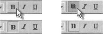
Figure 26-1: Butcons in their flat, mouseover (raised), and clicked states on Windows 2000 (left) and XP (right). The button affordance on the left is clearer. The controls pictured are also examples of latching butcons, invented by applying the simple expedient of not letting the button pop back out after it has been clicked. What is remarkable about this idiom is that it moves the butcon idiom from the imperative category — a verb — into the selection category — a noun. It has all the idiomatic and space-saving advantages of the butcon, except that it sets state rather than invoking an immediate command.
The default toolbar configuration on Microsoft's Office suite of programs seems tacitly to separate the momentary, imperative butcons from the latching, selection butcons. Generally Microsoft only put imperative butcons on the top bar and put mostly selection butcons on the others.
The latching butcon is widely superseding the check box as a single-selection idiom and is especially appropriate in modeless interactions that do not require interruption of a user's flow to make a decision. Latching butcons are more space-efficient than check boxes: They are smaller because they can rely on visual recognition instead of text labels to indicate their purpose. Of course, this means that they exhibit the same problem as imperative butcons: the inscrutability of the icon. We are saved once again by ToolTips. Those tiny, pop-up windows give us just enough text to disambiguate the butcon without permanently consuming too many pixels.
Flip-flop buttons: A selection idiom to avoid
Flip-flop buttons are an all-too-common control variant used to save interface real estate, but at the cost of considerable user confusion. The verb on the flip-flop button is always one of multiple states that the control can be in. For example, if a flip-flop button were designed to control print resolution, it might say Draft Output until you click it, and then it might say Quality Output.
The control affords that you can click it, so when it says Quality Output it intends to mean that by clicking it you will get into quality output mode. The button then changes to say, Draft Output to indicate that clicking it again will put the application in draft output mode. The problem with this technique is that the control could be interpreted to serve as an indicator of which state you are in. Unfortunately, because it shows Draft Output when you are in quality output mode and vice versa, it is, in fact, doing exactly the opposite of what might be expected. The control can either serve as a state indicator or as a state-switching imperative control, but not both (see Figure 26-2).
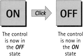
Figure 26-2: Flip-flop button controls are very efficient. They save space by controlling two mutually exclusive options with a single control. The problem with flip-flop controls is that they fail to fulfill the second duty of every control — to inform the user of their current state. If the button says ON when the state is off, it is unclear what the setting is. If it says OFF when the state is off, however, where is the ON button? Don't use them. Not on buttons and not on menus!
The solution to this one is to either spell it out on the button as a verb phrase — Switch to Quality Output — or to use some other technique entirely. Replacing it with two radio buttons is a popular choice. The downside is that this consumes more screen real estate.
Another approach is pictorial. Draw a picture of the page in portrait. When the user clicks on it, it rolls over onto its side to show that you are in landscape orientation. This is very memorable and engaging, but it is not necessarily very discoverable. That depends on how well the rest of your program has influenced the user to expect that a small picture is pliant and will have some effect. Cursor hinting will help. However, it's important not to put the image on top of a button. If you do, you will have just created a pictographic flip-flop butcon with the same conflicting messages as those with a text label.
Radio buttons
A variant of the check box is the radio button. The name says it all. When radios were first put in automobiles, we all discovered that manually tuning an analog radio with a rotating knob while driving was dangerous to your health. So automotive radios were offered with a newfangled panel consisting of a half-dozen chrome-plated push-buttons, each of which would twist the tuner to a preset station. Now you could tune to your favorite station, without taking your eyes off of the road, just by pushing a button. The idiom is a powerful one, and it still has many practical uses in interaction design.
The behavior of radio buttons is mutually exclusive, which means that when one option is selected, the previously selected option automatically deselects. Only one button can be selected at a time. (Techno-geeks frequently use the word mux as a convenient contraction of the phrase mutually exclusive, and we often use it in reference to these controls.)
In consequence of mutual exclusion, radio buttons always come in groups of two or more, and one radio button in each group is always selected. (Technically speaking, there is no enforcement of this mutual exclusion, nor is there enforcement of the always-one-selected rule. The individual developer is quite free to break the rules.) A single radio button is undefined — it must act like a check box instead. (You should use a check box or similar non-mux selection control in this instance.)
Radio buttons are even more wasteful of screen real estate than check boxes. They waste the same amount of space as check boxes, and for the same reasons, but radio buttons are only meaningful in groups, so their waste is always multiplied. In some cases, the waste is justified, particularly where it is important to show the user the full set of available choices at all times. This should sound vaguely pedagogic, and it is. Radio buttons are well suited to a teaching role, which means they can be justified in infrequently used dialog boxes, but they should not be visible on the surface of a sovereign application which must cater to daily users.
For the same reason that check boxes are traditionally square—that's how we've always done it—radio buttons are round. There are no reasons to change this shape other than aesthetic or marketing ones, and these reasons take back seat to the established tradition. (X Windows/Motif's radio buttons are diamonds, so you might consider sticking to those if you're designing for the Unix world.)
Radio buttons are one of the oldest GUI idioms, and consequently many designers see them as somehow better than other, newer idioms, but this isn't so. In some cases, radio buttons are being supplanted by more modern idioms.
As you might imagine, the butcon has also done to the radio button what it did to the check box: replaced it on the surface of an application. If two or more latching butcons are grouped together and mux-linked—so that only one of them at a time can be latched—they behave in exactly the same way as radio buttons. They form a radio butcon.
They work just like radio buttons: One is always selected—latched down—and whenever another one is pressed, the first one returns to its normal—raised—position. The alignment controls on Word's toolbar are an excellent example of a radio butcon, as shown in Figure 26-3.
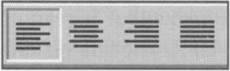
Figure 26-3: Word's alignment controls are a radio butcon group, acting like radio buttons. One is always selected, and when another is clicked, the first one returns to its normal, raised position. This variant is a very space-conservative idiom that is well suited for frequently used options.
Just as in all butcon idioms, these are very efficient consumers of space, letting experienced users rely on pattern recognition to identify them and letting infrequent users rely on ToolTips to remind users of their purpose. First-time users will either be clever enough to learn from the ToolTips or will learn more slowly, but just as reliably, from other, parallel, pedagogic command vectors.
Combutcons
A variant of the radio butcon is a drop-down version. Because of its similarity to the combobox control, we call this a combutcon. It is shown in Figure 26-4. Normally, it looks like a single, latched butcon with a small down-arrow to its right (in Windows), but if you click and hold the arrow, it drops down a menu of several (sometimes many, arranged in a 2D array) latching butcons. You slide the cursor much the same way you do on a pull-down menu to select one of the items in the combutcon's drop-down list/array. When you release the mouse button, the selection is made and the selected butcon now appears on the toolbar next to the arrow (clicking on the butcon itself toggles the butcon state). Like menus, the menu of butcons should also deploy if the user clicks once on the arrow and releases. A second click makes the selection.
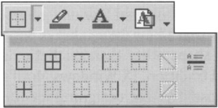
Figure 26-4: A combutcon is a group of latching butcons that behave like a combobox. Clicking the mouse button while over the combutcon's down-arrow drops down a menu of butcons. Slide the cursor down to the desired one and release. The newly selected butcon shows on the toolbar as the selected option. Think of this idiom as a way to cram many related latching butcons into the space of a single one. It creates more user excise than putting up separate butcons, but is useful when space is at a premium or when the functions are not used very frequently.
Variations on combutcons include drawing a small, downward- or right-pointing triangle in the lower-right corner of the combutcon icon in place of the separate down-arrow that is seen in Microsoft toolbars. Adobe products make use of this variant in their palette controls; this variant also requires a click and hold on the butcon itself to bring up the menu (which, in Adobe palette controls, unfolds to the right rather than down, as shown in Figure 26-5). You can vary this idiom quite a bit, and creative software designers are doing just that in the never-ending bid to cram more functions onto screens that are always too small.
Figure 26-5: These combutcons are taken from Adobe Photoshop (left) and Microsoft Word (right). In Photoshop, the combutcon opens to the right, and includes a text description of each butcon. In the Word combutcon, clicking the butcon causes a tear-off menu to appear, which can become a floating palette. Colors are selected from the swatches at the top or from the text item, which brings up a color selection dialog. This dense packing of information, both input and output, is indicative of the direction in which superior user interfaces have moved in the last 15 years.
You can see a Microsoft variant in Word, where the butcon for specifying the colors of highlights and text show combutcon menus that look more like little palettes than stacks of butcons. As you can see from Figure 26-5, these menus can pack a lot of power and information into a very compact control. This facility is definitely for frequent users, particularly mouse-heavy users, and not at all for first-timers. However, for the user who has at least a basic familiarity with the available tools, the idiom is instantly clear after it is discovered or demonstrated. This is an excellent control idiom for sovereign-posture programs with which users interact for long hours. It demands sufficient manual dexterity to work a menu with relatively small targets, but is much faster than going to the menu bar, pulling down a menu, selecting an item, waiting for the dialog box to deploy, selecting a color on the dialog box, and then clicking the OK button.
List controls
List controls allow users to select from a finite set of text strings, each representing a command, object, or attribute. These controls are sometimes called picklists because they offer lists of items from which the user can pick a selection; they are also known as list boxes or listviews, depending on which platform and which control variant you are talking about. The list control is a powerful tool for simplifying interaction because it eliminates the possibility of making an incorrect selection.
List controls are small text areas with a vertical scrollbar on the right-hand edge. The application displays objects as discrete lines of text in the box, and the scrollbar moves them up or down. The user can select a single line of text at a time by clicking on it. A list control variant allows multiple selection, where the user can select multiple items at one time, usually by pressing the Shift or Ctrl key while clicking with the mouse.
Early list controls handled text only, and that decision affects their behavior to this day. A list control filled with line after line of text unrelieved by visual symbols is a dry desert indeed. Some adventurous programmers have adapted older list controls for graphics, but most programmers probably aren't that masochistic.
However, Microsoft seems to have done a good job, as of Windows 95, with its listview control. Among other features, it allows each line of text to be preceded with an icon without need of custom coding. This is excellent news, because there are many instances in which users would benefit from items shown in lists with an identifying or information-providing visual icon next to important text entries. Figure 26-6 in the next section shows a modified listview control with icons.
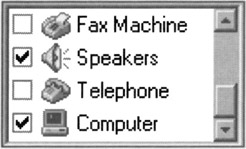
Figure 26-6: Selection is normally a mutually exclusive (mux) operation. When the need arises to discard mux in order to provide multiple selection, things can become confusing if some of the items can be scrolled out of sight. Earmarking is a solution to this. Put check boxes next to each text item and use them instead of selection to indicate the user's choices. Check boxes are a clearly non-mux idiom and a very familiar GUI idiom. Users grasp the workings of this idiom right away.
| DESIGN TIP | Distinguish important text items in lists with graphic icons. |
Listviews are, true to their name, good for displaying lists of items and allowing the user to select one or more of them. They are also good idioms for providing a source of draggable items. If the items are draggable within the listview itself, it makes a fine tool for enabling the user to put items in a specific order (see the "Ordering Lists" section later in this chapter).
Many lists displayed in desktop interfaces are not static and support modification by users who add, delete, and change the text of entries. To support this requires the ability to key, directly into the listview, a new text item or a modification to an existing one. Luckily, in addition to icons, listviews support drag-and-drop and edit-in-place capabilities.
The weight of history and habit still puts older list controls onto a lot of dialog boxes. Thankfully, most of those dialogs appear quickly, allow the user to select a single item, and then go away. To provide better interaction, programmers should use the newer listview control—or its equivalents on other platforms—exclusively.
EARMARKING
Generally speaking, users select items in a list control as input to some function, like selecting the name of a desired font from a list of several available fonts. Selection in a list control is conventional, with keyboard equivalents, focus rectangles, and selected items shown in highlight colors.
Occasionally, however, list controls are used to select multiple items, and this can introduce complications. The selection idiom in list controls is very well suited for single selection, but much weaker for multiple selection. In general, multiple selection of discrete objects works adequately if the entire playing field is visible at once, like the icons on a desktop. If two or more icons are selected at the same time, you can clearly see this because all the icons are visible.
But if the pool of available discrete items is too large to fit in a single view and some of it must be scrolled off screen, the selection idiom immediately becomes unwieldy. This is the normal state of affairs for list controls. Their standard mode of selection is mutual exclusion, so when you select one thing, the previous selected thing deselects. It is thus far too easy, in the case of multiple selection, for users to select an item, scroll it into invisibility, and then select a second item, forgetting that they have now deselected the first item because they can no longer see it.
The alternative is equally unpalatable: The list control is programmed to disable the mutual-exclusion behavior of a standard list control in its selection algorithm, allowing users to click on as many items as they like with them all remaining selected. Things now work absolutely perfectly (sort of): The user selects one item after another, and each one stays selected. The fly in the ointment is that there is no visual indication that selection is behaving differently from the norm. It is just as likely that a user will select an item, scroll it into invisibility, then spot a more desirable second item and select it expecting the first—unseen—item to automatically deselect by way of the mux standard. You get to choose between offending the first half of your users or the second half. Bad idea.
When objects can scroll off the screen, multiple selection requires a better, more distinct idiom. The correct action is to use a different idiom from simple selection, one that is visually distinct. But what is it?
It just so happens we already have another well-established idiom to indicate that something is selected—the check box. Check boxes communicate their purposes and their settings quite clearly and, like all good idioms, are extremely easy to learn. Check boxes are also very clearly disassociated from any hint of mutual exclusion. If we were to add a check box to every item in our problematic list control, the user would not only clearly see which items were selected and which were not, he would also clearly see that the items were not mux-linked, solving both of our problems in one stroke. This check box alternative to multiple selection is called earmarking, an example of which is shown in Figure 26-6.
Earmarking also solves another niggling problem with multiple selections. Multiple selection list controls, when they are created, have no selected items. However, in some variants, once the user selects an item, there is no way to return to a state where nothing is selected. In other words, there is no idiom for selecting nothing. If the list control is used in the sense of an operand selector for a function dialog box, the Cancel button provides the escape route if the user changes his mind. However, if the list control isn't on a dialog box, he may be stuck (ideally, clicking again on a selected item should unselect it even in this case). Earmarking doesn't operate under the same rules as selection, and each item in the list is independent. One click checks the box; a second click unchecks the box.
Sometimes, as in some drawing programs like Powerpoint, it makes sense to have a None or No Color item at the top of the list. In this particular case, None is truly a valid selection, because you can have an object with no outline or no fill color. Don't, however, use this idiom as a means for general purpose deselecting of items in a list, especially if an item needs to be selected for the user to proceed! Use earmarking instead.
DRAGGING-AND-DROPPING FROM LISTS
List controls can be treated as palettes of goodies to use in a direct-manipulation idiom. If the list was part of a report-writing program, for example, you could click on an entry and drag it to the surface of the report to add a column representing that field. It's not selection in the usual sense, because it is a completely captive operation. Without a doubt, many programs would benefit if they made use of list controls that supported dragging and dropping.
Such draggable items can help users gather items in a desired set. Two adjacent list controls, one showing available items and the other showing chosen items, is a common GUI idiom. One or sometimes a bidirectional pair of push-buttons placed between them allows items to be selected and transferred from one box to the other, as shown in Figure 26-7. It is so much more pleasant when the idiom is buttressed with the capability to just click and drag the desired item from one box to another without having to go through the intermediate steps of selection and function invocation.
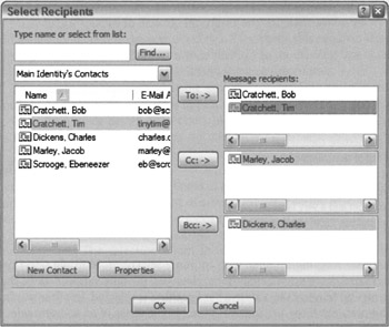
Figure 26-7: This dialog from Microsoft Outlook Express would benefit from the capability to drag a contact from the list at left into the To, Cc, and Bcc lists at right. Also notice the unfortunate use of horizontal scrollbars in all list fields. In the left-hand field, in particular, ToolTips could show the full row of information in the left-hand box.
ORDERING LISTS
Sometimes the need arises to drag an item from a list control to another position in the same list control. Actually, this need arises far more often than most interaction designers seem to think. Many programs offer automatic sort facilities for important lists. Windows Explorer, for example, allows sorting files by name, by type, by modification date, and by size. That's nice, but wouldn't be even better to be able to order them by importance to the user? Algorithmically, the program could order them by frequency of user access, but that won't always get the right results. Adding in a factor of how recently files were accessed, as well, would get closer, but still wouldn't be exactly what right. (Microsoft does this with its font picker in some applications, and it works pretty well for this purpose.) Why not let the user be able to move what's important to him to a region at the top, and sort those things separately (in alphabetical or whatever order), in addition to sorting the full directory below? For example, you might want to rearrange a list of the people in your department in descending order by how competent you think they are. There is no automatic function that will do this; you just have to drag them until it's right. Now, this is the kind of customizing that an experienced user wants to do after long hours of familiarization with an application. It takes a lot of effort to fine-tune a directory like this, and the program must remember the exact settings from session to session—otherwise, the capability to reorder things is worthless.
Being able to drag items from one place to another in a list control is powerful, but it demands that autoscrolling be implemented (see Chapter 23). If you pick up an item in the list but the place you need to drop it is currently scrolled out of view, you must be able to scroll the listview without putting down the dragged object.
HORIZONTAL SCROLLING
List controls normally have a vertical scrollbar for moving up and down through the list. List controls can also be made to scroll horizontally. This feature allows the programmer to put extra-long text into the list controls with a minimum of effort. However, it offers nothing to users but a major pain.
Scrolling text horizontally is a terrible thing, and it should never, ever be done. When a text list is scrolled horizontally, it hides from view one or more of the first letters of every single line of text showing. This makes none of the lines readable and the continuity of the text is utterly destroyed. To see this, take your bookmark and cover up just the first two characters of each line in this paragraph. See how hard it becomes to read? Yes, it is decipherable, but you have to strain at it. The purpose of computers is to eliminate strain from the lives of humans.
| AXIOM | Never scroll text horizontally. |
If you find a situation that seems to call for horizontal scrolling of text, search for alternative solutions. Begin by asking yourself why the text in your list is so long. Can you shorten the entries? Can you wrap the text to the next line to avoid that horizontal length? Can you allow the user to enter aliases for the longer entries? Can you use graphical entries instead? Can you use a smaller typeface? You should alternatively be asking yourself if there is some way to widen the control. Can you rearrange things on the window or dialog to expand horizontally?
The best answer will usually be to wrap the text onto the next line, indenting it so it is visually different from other entries. This means that you now have a list control with items of variable height, but this is still better than horizontal scrolling.
Remember, we're just talking about text. For graphics, there is nothing wrong with horizontal scrollbars or horizontally scrollable windows in general. But providing a text-based list with a required horizontal scrollbar is like providing a computer with a required pedal-powered electrical generator—bad news.
ENTERING DATA INTO A LIST
Little work has been done historically to enable users to make direct text entry into an item in a list control. Older list box controls punted on this, and it takes some pretty nifty coding to implement it yourself. Of course, the need to enter text where text is output is widespread, and much of the kludginess of dialog box design can be directly attributed to programmers trying to dodge the bullet of having to write edit-in-place code.
However, modern list and tree controls in Windows and other platforms offer an edit-in-place facility. Windows Explorer uses both of these controls, and you can see how they work by renaming a file or directory. To rename a file in the Mac OS or Windows 95, you click twice—but not too quickly (lest it be interpreted as a double-click and open the object in question)—on the desired name. You then enter whatever changes are desired. (This has changed a bit in Windows XP, so that in some views you need to select Rename from a right-click menu to get into Rename mode—is this progress?). Items that are editable in other circumstances should, when displayed in list controls, be editable there as well.
The edge case that makes edit-in-place a real problem is adding a new entry to the list. Most designers use other idioms to add list items: Click a button or select a menu item and a new, blank entry is added to the list and the user can then edit-in-place its name. It would be more sensible if you could, say, double-click in the space between existing entries to create a new, blank entry right there or at least have a perpetual open space at the beginning or end of the list with a Click to Add Entry label on it to make it discoverable. Ah, wishful thinking.... The real-world solution to this problem is the combobox, which we'll talk about next.
Comboboxes
Windows 3.0 introduced a new control called the combobox. It is—as its name suggests—a combination of a list box and an edit field. It provides an unambiguous method of data entry into a list control. The other attribute of the combobox that makes it a winner is its pop-up variant that is extremely conservative of screen real estate.
With the combobox control, there is a clear separation between the text-entry part and the list-selection part, minimizing user confusion. For single selection, the combobox is a superb control. The edit field can be used to enter new items, and it also shows the current selection in the list. When the current selection is showing in the edit field, the user can edit it there—sort of a poor man's edit-in-place.
Because the edit field of the combobox shows the current selection, the combobox is by nature a single-selection control. There is no such thing as a multiple-selection combobox. Single selection implies mutual exclusion, which is one of the reasons why the combobox is fast replacing groups of radio buttons for mux-linked options. (The Mac OS had pop-up menus before Windows had the combobox, and these served to replace large banks of radio buttons on that platform. The Mac versions didn't have the combobox's edit feature, however.) The other reasons include its space efficiency and its capability to add items dynamically, something that radio buttons cannot do.
When the drop-down variants of the combobox are used, the control shows the current selection without consuming space to show the list of choices. Essentially, it becomes a list-on-demand, much like a menu provides a list of immediate commands on demand. A combobox is a pop-up list control.
The screen efficiency of the combobox allows it to do something remarkable for a control of such complexity: It can reasonably reside permanently on a program's main screen. It can even fit comfortably on a toolbar. It is a very effective control for deployment on a sovereign-posture application. There are four comboboxes visible on the authors' word processors' toolbars, for example. This effectively crams a huge amount of information and usefulness into a very small space. Using comboboxes on the toolbar is more effective than putting the equivalent functions on menus, because the comboboxes display their current selection without requiring any action on the user's part, such as pulling down a menu to see the current status. Once again, the control that delivers the most information with the smallest permanent screen footprint wins the Darwinian battle for pixels.
If drag and drop is implemented in list controls, it should also be implemented in comboboxes. For example, being able to open a combobox, scroll to a choice, and then to be able to drag the choice onto a document under construction is a very powerful idiom. Because comboboxes fit so well on toolbars, the idiom has real appeal for adding direct manipulation to sovereign applications. Drag-and-drop functionality should be a standard part of comboboxes.
The utility of the combobox collapses if the situation calls for multiple selection; the idiom just can't handle it, and you must return to a plain list box. Regular list controls consume significant space on-screen, however—enough so that it shouldn't be considered practical for permanent deployment unless there is a truly great need. In general, list controls are best relegated to transient dialogs.
Tree controls
Mac OS 7 and Windows 95 both brought us general-purpose tree controls, which had already been in use in the Unix world for some time. Tree controls are listviews that can present hierarchical data. They display a sideways tree, with icons for each entry. The entries can be expanded or collapsed the way that many outline processors work. Programmers tend to like this presentation. It is often used as a file system navigator, and some find the format of the display to be effective—certainly more effective than scattering icons around in multiple windows on the desktop. Unfortunately, it is problematic for users because of the difficulty many nonprogrammer users have with understanding hierarchical data structures. In general, it makes sense to use a treeview, no matter how tempting it may be, only in the case where what is being represented is "naturally" thought of as a hierarchy (such as a family tree). Using a treeview to represent arbitrary objects organized in an arbitrary fashion at the whim of a programmer is asking for big trouble when it comes to usability.
|
|
 The Essentials of Interaction Design")
EAN: N/A
Pages: 263
- Challenging the Unpredictable: Changeable Order Management Systems
- Enterprise Application Integration: New Solutions for a Solved Problem or a Challenging Research Field?
- The Effects of an Enterprise Resource Planning System (ERP) Implementation on Job Characteristics – A Study using the Hackman and Oldham Job Characteristics Model
- Distributed Data Warehouse for Geo-spatial Services
- Data Mining for Business Process Reengineering