Entry Controls
Entry controls enable the user to enter new information into the program, rather than merely selecting information from an existing list.
The most basic entry control is a text edit field. Like selection controls, entry controls represent nouns to the program. Because a combobox contains an edit field, some combobox variants qualify as entry controls, too. Also, any control that lets the user enter a numeric value is an entry control. Controls such as spinners, gauges, sliders, and knobs fit in this category.
Bounded and unbounded entry controls
Any control that restricts the available set of values that the user can enter is a bounded entry control. A slider that moves from 1 to 100, for example, is bounded. Regardless of the user's actions, no number outside those specified by the program can be entered with a bounded control. It is thus impossible for users to enter an invalid value with bounded entry controls.
Conversely, a simple text field can accept any alphanumeric data the user keys into it. This open-ended entry idiom is an example of an unbounded entry control. With an unbounded entry control, it is easy for users to enter invalid values. The program may subsequently reject it, of course, but the user can still enter it.
Simply put, bounded controls should be used wherever bounded values are needed. If the program needs a number between 7 and 35, presenting the user with a control that will accept any numeric value from −1,000,000 to +1,000,000 is not doing the user any favors. She would much rather be presented with a control that embodies 7 as its bottom limit and 35 as its upper limit. Users are smart, and they will immediately comprehend and respect the limits of their sandbox.
It is important to understand that we mean a quality of the entry control and not of the data. To be a bounded control, it needs to clearly communicate, preferably visually, the acceptable data boundaries to the user. A text field that rejects the user's input after he has entered it is not a bounded control. It is simply a rude control.
Most quantitative values needed by software are bounded, yet many programs allow unbounded entry with numeric fields. When the user inadvertently enters a value that the program cannot accept, the program issues an error message box. This is cruelly teasing the user with possibilities that aren't. "What would you like for dessert? We've got everything," we say. "Ice cream," you respond. "Sorry, we don't have any," we say. "How about pie?" you innocently ask. "Nope," we say. "Cookies?" "Nope." "Candy?" "Nope." "Chocolate?" "Nope." "What, then?" you scream in anger and frustration. "Don't get mad," we say indignantly. "We have plenty of fruit compote." This is how the user feels when we put up a dialog box with an unbounded edit field when the valid values are bounded. She types 17, and we reward this innocent entry with an error message box that says "You can only enter values between 4 and 8." This is poor user-interface design; a much better scheme is to use a bounded control that automatically limits the input to 4, 5, 6, 7, or 8. If the bounded set of choices is composed of text rather than numbers, you can still use a slider of some type, or a combobox, or list box. Figure 26-8 shows a bounded slider used by Microsoft in the Windows Display Settings dialog. It works like a slider or scrollbar, but has four discrete positions that represent distinct resolution settings. Microsoft could easily have used a non-editable combobox in its place, too. In many cases, a slider is a nice choice because it telegraphs the range of valid entries. A combobox isn't much smaller but it keeps its cards hidden until clicked—a less friendly stance.
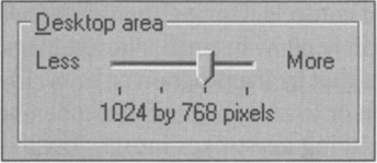
Figure 26-8: A bounded control lets you enter only valid values. It does not let you enter invalid values, only to reject them when you try to move on. This figure shows a bounded slider control from the Display Settings dialog in Windows 95. The little slider has four discrete positions. As you drag the slider from left to right, the legend underneath it changes from "640 by 480 pixels" to "800 by 600 pixels" to "1024 by 768 pixels" to "1280 by 1024 pixels." Why didn't they use a combobox? Which would you prefer?
If the program requires a numeric value that must remain within specific boundaries, give the user a control that intrinsically communicates those limits and prevents him from entering a value outside of the boundaries. The scrollbar control class does this. Although scrollbars have significant drawbacks, they are exemplary in one area: They allow the user to enter quantitative information by analogy. Scrollbars allow the user to specify numeric values in relative terms, rather than by directly keying in a number. That is, the user moves the sliding thumb to indicate, by its relative position, a proportional value for use inside the program. They are less useful for entering precise numbers, though many programs use them for that purpose. Controls like spinners are better for entering exact numbers.
Spinners
Spinner controls are a common form of numeric entry control that permit data entry using either the mouse or keyboard. Spinners contain a small edit field with two half-height buttons attached, as shown in Figure 26-9. Spinners blur the difference between bounded and unbounded controls.
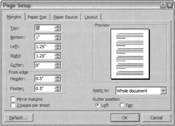
Figure 26-9: The Page Setup Dialog from MS Word makes heavy use of the spinner control. On the left side of the dialog, you see a stack of seven of these new controls, whose popularity is growing fast. By clicking on either of the small, arrowed buttons, the specific numeric value is made to increase or decrease in small, discrete steps. If the user wants to make a large change in one action or to enter a precise setting, he can use the edit field portion for direct text entry. The arrow button portion of the control embodies bounding, whereas the edit field portion does not. Does that make this a bounded control?
Spinners blur the difference between bounded and unbounded controls. Using either of the two small arrow buttons enables the user to change the value in the edit window in small, discrete steps. These steps are bounded—the value won't go above the upper limit set by the program or below the lower limit. If the user wants to make a large change in one action or to enter a specific number, he can do so by clicking in the edit window portion and directly entering keystrokes into it, just like entering text into any other edit field. Unfortunately, the edit window portion of this control is unbounded, leaving the user free to enter values that are out of bounds or even unintelligible garbage. In the page setup dialog box in the figure, if the user enters an invalid value, the program behaves like most other rude programs, issuing an error message box explaining the upper and lower boundaries (sometimes) and requiring the user to click the OK button to continue.
Overall, the spinner is an excellent idiom and can be used in place of plain edit fields for most bounded entry. In Part VII, we will discuss ways to improve control error handling.
Unbounded entry: Text edit controls
The primary unbounded entry control is the text edit control. This simple control allows the user to key in any alphanumeric text value. Edit fields are most often small areas where a word or two of data can be entered by the user, but they can also be fairly sophisticated text editors in their own right. The user can edit text within them using the standard tools of contiguous selection (as discussed in Chapter 22) with either the mouse or the keyboard.
Text edit controls are often used either as data entry fields in database applications (and now quite often on Web sites connected to databases), as option entry fields in dialog boxes, or as the entry field in a combobox. In all these roles, they are frequently called upon to do the work of a bounded entry control. However, if the desired values are finite, the text edit control should not be used. If the acceptable values are numeric, use a bounded numeric entry control, such as a slider or knob, instead. If the list of acceptable values is composed of text strings, a list control should be used so the user is not forced to type.
Sometimes the set of acceptable values is finite but too big to be practical for a list control. For example, a program may require a string of any 30 alphabetic characters excluding spaces, tabs, and punctuation marks. In this case, a text edit control is probably unavoidable even though its use is bounded. If these are the only restrictions, however, the text edit control can be designed to reject non-alphabetic characters and similarly disallow more than 30 characters to be entered into the field. This, however, brings up interaction issues surrounding validation.
VALIDATION
From an unbounded control's point-of-view, there is really no such thing as invalid data. Data can only be adjudged invalid in the context of the program. For example, 1995 is valid in a text entry control that gathers the year, but not in one that gathers the month. Physically, an unbounded entry control cannot recognize invalid data—only the program can make the actual determination of validity. From the program's point of view, a bounded entry control will only hand it valid input. Thus, by definition, an unbounded control can return invalid input to the program.
An unbounded control that is used to gather bounded data must serve two bosses: The control must blithely accept whatever data the user keys in, and then, if the program judges that input to be invalid, the control is forced to be the bearer of someone else's bad news. Putting unbounded controls in the role of accepting bounded input is one of the most significant contributors to user dissatisfaction with computers.
| AXIOM | Use bounded controls for bounded input. |
If the data is bounded—but not too heavily bounded—the program must let the user enter the data, only to reject it afterwards. Although there are some mitigating steps, there really is no good way to solve this problem. Unless. ...
There is one way to solve this problem: The program could just go ahead and accept whatever the user enters. In other words, eliminate the handling of semibounded data. Either coerce the correct data with a bounded control, or accept whatever the user gives the program in an unbounded control. Most programmers reject this solution. They do not feel that their programs can accept, for example, asdf;lkj as input to a social security number field. However, there are some cases where this may make sense. In Chapter 33, we discuss this idea in detail.
The way programmers have dealt with this dilemma is by creating a validation control, or an unbounded text entry control with built-in editing. Many data entry types are commonplace, including formats such as dates, phone numbers, zip codes, and social security numbers. Specialized text edit controls are commercially available; you can purchase variants of the text entry control that will only allow numbers or letters or phone numbers, or reject spaces and tabs, for example.
Although the validation control is a very widespread idiom, it is a poor one because users must rely on the greater application context to determine what valid values might be for a given control. Tactically, though, these controls are often necessary; so we'll ignore the bigger issues for now and look at practical ways to make them better. The key to successfully designing a validation control is to give the user generous feedback. An entry control that merely refuses to accept input is just plain rude and will guarantee an angry and resentful user.
A fundamental improvement, based on the axiom: Visually distinguish elements that behave differently (Chapter 19), is to make validation controls visually distinct from non-validated controls, whether it is the typeface used in the text edit field, a different border color, or even a different background color for the field itself.
However, the primary way to improve validation controls is to provide rich status feedback to the user. Unfortunately, the text edit control, as we know it today, provides virtually no built-in support for feedback of any kind. The designer must specify such feedback mechanisms in detail, and the programmer will likely need to implement them himself as a custom control.
ACTIVE AND PASSIVE VALIDATION
Some controls reject the user's keystrokes as he enters them. When a control actively rejects keystrokes during the entry process, this is an example of active validation. A text-only entry control, for example, may accept only alphabetic characters and refuse to allow numbers to be entered. Some controls reject any keystrokes other than the numeric digits 0 through 9. Other controls reject spaces, tabs, dashes, and other punctuation in real-time. Some variants can get pretty intelligent and reject some numbers based on live calculations, for example, unless they pass a checksum algorithm.
When an active validation control rejects a keystroke, it must make it clear to the user that it has done so. It should also alert the user as to why it made the rejection. If an explanation is proffered, the user will be less inclined to assume the rejection is arbitrary. He will also be in a better position to give the program what it wants.
The user is expecting to be able to enter keystrokes at will; this is the nature of the keyboard. If the control is going to reject some keystrokes based on their value, it must clearly communicate this to the user.
Sometimes the range of possible data is such that the program cannot validate it until the user has completed his entry, rather than at each individual keystroke. The editing step then takes place only when the control loses focus, that is, when the user is done with the field and moves on to the next one. The editing step must also take place if the user closes the dialog—or invokes another function if the control is not on a dialog box (for example, selects Submit on a Web page). If the control waits until the user finishes entering data before it edits the value, this is passive validation.
The control may wait until a name is fully entered, for instance, before it interrogates a database to see if it is an existing entry. Each character is valid by itself, yet the whole may not pass muster. The program could attempt to verify the name as each character is entered, but that would probably bring the network and server to their knees with the extra workload. Besides, although the program would know at any given instant whether the name was valid, the user could still move on while the name was in an invalid state.
A way to address this is by maintaining a countdown timer in parallel with the input and reset it on each keystroke. If the countdown timer ever hits zero, do your validation processing. The timer should be set to around 400 milliseconds, although you may wish to user test this for a more precise number. The effect of this is that as long as the user is entering a keystroke faster than once every 400 ms, the system is extremely responsive. If the user pauses for more than 400 ms, the program reasonably assumes that the user has paused to think (something that takes months in CPU terms) and goes ahead and performs its analysis of the input so far.
To provide rich visual feedback, the entry field could change colors to reflect its estimate of the validity of the entered data. The field could show in shades of pink until the program judged the data valid, when it would change to white or green.
CLUE BOXES
Another good solution to the validation control problem is the clue box. This little pop-up window looks and behaves just like a ToolTip (but could be made distinguishable from a ToolTip by background color). Its function is to explain the range of acceptable data for a validation control, either active or passive. Whereas a ToolTip appears when the cursor sits for a moment on a control, a clue box would appear as soon as the control detects an invalid character (it might also display unilaterally just like a ToolTip if the cursor sits unmoving on the field for a second or so). If the user enters, for example, a non-numeric character in a numeric-only field, the program would put up a clue box near the point of the offending entry, yet without obscuring it. It would say, for example, 0–9. Short, terse, but very effective. Yes, the user is rejected, but he is not also ignored. The clue box also works for passive validation, as shown in Figure 26-10.
Figure 26-10: The ToolTip idiom is so effective that it could easily be extended to other uses. Instead of yellow ToolTips offering flyover labels for butcons, we could have pink ones offering flyover hints for unbounded edit fields. These clue boxes could also help eliminate error message boxes. In this example, if the user enters a value lower than allowable, the program could replace the entered value with the lowest allowable and display the cluebox that modelessly explains the reason for the substitution. The user can enter a new value or accept the minimum without being stopped by an error dialog.
HANDLING OUT OF BOUNDS DATA
Typically, an edit field is used to enter a numeric value needed by the program, like the point size of a font. The user can enter anything he wants, from 5 to 500, and the field will accept it and return the value to the owning program. If the user enters garbage, the control must make some kind of decision. In Microsoft Word, for example, if you enter asdf as a font point size, the program issues an error message box informing you: This is not a valid number. It then reverts the size to its previous value. The error dialog is rather silly, but the summary rejection of my meaningless input is perfectly appropriate. But what if you had keyed in the value nine? The program rejects it with the same curt error message box. If instead the control were programmed to think of itself as a numeric entry control, it could perhaps behave better. It doesn't bother me if the program converts the nine into a 9, but it certainly is incorrect when it says that nine is not a valid number. Without a doubt, it is valid, and the program has put its foot in its mouth.
Barring other tools, a simple rejection of input data is better than a rejection coupled with an error message box. For example, if a passive validation control can only accept a number between 5 and 25, and the user enters 50 the control should change to 25 and proceed. If the user enters 2, the control should change it to 5 and proceed. If the user enters asdf, the control should revert to the previously valid value and proceed.
UNITS AND MEASUREMENTS
It's nice when a text edit control is smart enough to recognize appropriate units. For example, if a program is requesting a measurement, and the user enters 5i or 5in or 5 inches, the control should not only report the result as five, but it should report inches as well. If the user enters 5mm the control should report it as five millimeters. SketchUp, an elegant architectural sketching application on Windows and the Mac, supports this type of feedback.
Say that the field is requesting a column width. The user can enter either a number or a number and an indicator of the measurement system as described above. The user could also be allowed to enter the word default and the program would set the column width to the default value for the program. The user could alternately enter best fit and the program would measure all the entries in the column and choose the most appropriate width for the circumstances. There is a problem with this scenario, however, because the words default and best fit must be in the user's head rather than in the program somewhere. This is easy to solve, though. All we need to do is provide the same functionality through a combobox. The user can drop down the box and find a few standard widths and the words default and best fit. Microsoft uses this idea in Word, as shown in Figure 26-11.
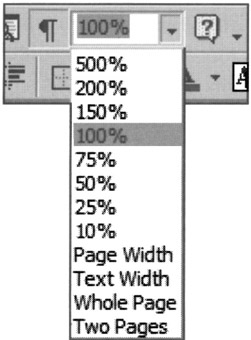
Figure 26-11: The drop-down combobox makes an excellent tool for bounded entry fields because it can accommodate entry values other than numbers. The user doesn't have to remember or type words like Page Width or Whole Page because they are there to be chosen from the drop-down list. The program interprets the words as the appropriate number, and everyone is satisfied.
The user can pull down the combobox, see items like Page Width or Whole Page and choose the appropriate one. With this idiom, the information has migrated from the user's head into the program where it is visible and choosable.
RICH TEXT CONTROLS
With the advent of rich text controls it is possible for simple text edit controls to take on the excise overhead of full-blown word processors. It is important for designers to be clear about the scope of options that should be exposed to the user when edit fields are implemented with rich text controls. Activating entire paragraph-formatting subsystems is not appropriate for simple entry fields that are expecting a single word or number as input.
The rich text control isn't very useful as a tool for entering structured data for fitting into rigidly structured databases. It is, however, handy for such tasks as composing e-mail messages or taking notes—in other words, unbounded text entry that will be used verbatim.
INSERT AND OVERTYPE ENTRY MODES
In most text editors there is a user-settable option toggling between insert mode, where text following the insertion point is preserved by sliding it out of the way as new text is added, and overtype mode, where text following the insertion point is lost as the user types over it. These two modes are omnipresent in the world of word processors and, like FORTRAN, never seem to die. Insert and overtype are modes that cause a significant change in the behavior of an interface, with no visible indication until after the user has interacted, and there is no clear way into or out of these modes (at least in Windows) except by means of a rather obscure keystroke.
Today, with modern GUI word processors, it's hard to imagine anyone using overtype mode, but undoubtedly such people are out there. But for edit fields of a single line, adding controls beyond simple insert-mode entry and editing is foolish—the potential for trouble is far greater than the advantages. Of course, if you are designing a word processor, the story is different.
USING TEXT EDIT CONTROLS FOR OUTPUT: A BAD IDEA
The text edit control, with its familiar system font and visually articulated white box, strongly affords data entry. Yet software developers frequently use the text edit control for read-only output fields. The edit control certainly works as an output field, but to use this control for output only is to bait-and-switch your user, and he will not be amused. If you have text data to output, use a text display control and not a text edit control. If you want to show the amount of free space on disk, for example, don't use a text edit field, because the user is likely to think that he can get more free space by entering a bigger number. At least, that is what the control is telling him with its equivalent of body language.
If you are going to output editable information, go ahead and output it in a fully editable text control and wire it up internally so that it works exactly as it will appear. If not, stick to display controls, described in the next section.
| DESIGN TIP | Use non-editable (display) controls for output-only text. |
|
|
 The Essentials of Interaction Design")
EAN: N/A
Pages: 263
- Chapter I e-Search: A Conceptual Framework of Online Consumer Behavior
- Chapter IV How Consumers Think About Interactive Aspects of Web Advertising
- Chapter VI Web Site Quality and Usability in E-Commerce
- Chapter VII Objective and Perceived Complexity and Their Impacts on Internet Communication
- Chapter XV Customer Trust in Online Commerce