Visual Design
| In About Face, I showed why it wasn't the graphical nature of the graphical user interface (GUI) that made it the dominant form of computer interaction. Rather, it was the tightly restricted interaction vocabulary of the new interfaces that made them so much better than their green-screen predecessors. Good visual design can be an important contributor to the quality of any interface, but many people in the industry still credit it with value that it simply doesn't have. I was a judge one year in a contest for the design and construction of in-house application software.[1] One of the top prize winners was a program that managed ticket sales at an annual aviation-enthusiast's convention in Wisconsin. The point-of-sale terminal the beating-heart of the system was decidedly nongraphic, showing only a simple textual display that was singularly stiff, rectilinear, and aesthetically primitive. Yet the program was a clear winner because the design paid close attention to the peculiar needs of the all-volunteer sales staff at the convention. These volunteers had a mission-critical but simple job to do, and they had to do it rapidly and with minimal training. GUIs are superb tools for showing managers the big picture of how their business is doing, but the users of this point-of-sale system had no such need because each successive customer who appeared at the head of the line was different and disassociated from every other customer in line. Seeing the big picture wasn't part of the requirement. A simple textual screen was entirely sufficient to make the product an award winner. This lesson is lost on many practitioners.
One of the characteristics of GUIs is their ability to display rich bitmapped graphics. It is feasible to have program interfaces that are as visually lush as the game Myst. Consequently, there are numerous visual designers and graphic artists out there who will gladly put attractive bitmapped graphics on the face of your program. But graphic artists rarely address the underlying interaction.
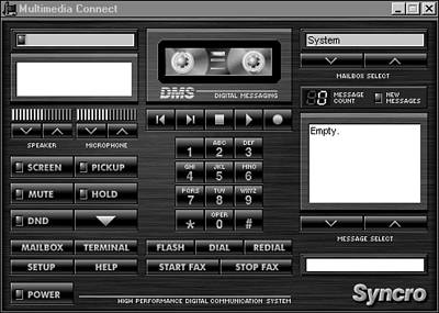
This interface is one of those useless eye-candy programs given away free with new computers and worth every penny you pay for it. Its purpose has something to do with running the phone or the CD-ROM, I'm not exactly sure which. The interface is undeniably beautiful, particularly if you are a gadget-loving technophile, but its use is inscrutable. It is an example of what we call "painting the corpse." The programmers took an interface that was unusable because of deep behavioral design flaws and put a sexy visual cover on it. Hardware vendors seem to be particularly enamored of this approach remember, this came free with my new computer. I suspect it is because the interface is so metaphorically faithful to a vision of cool hardware. We often see products that look really good whose aesthetics are superb but whose functionality or whose interactivity isn't adequate. That is not because the product wasn't designed, but because it was designed by an aesthetic, visual designer rather than by an interaction designer with the tools to master cognitive friction. |
EAN: N/A
Pages: 170