8.3 Front Panel
8.3.1 General Front Panel Standards
All we're going to say about fonts is to use a standard font. Hey, we're all grown-ups, use whatever you like, we don't care! For some reason Times New Roman invokes a negative response from customers; they don't like the flourishes or something like that. It's not a bad idea to standardize somewhat on labels, but don't lose too much sleep over this.
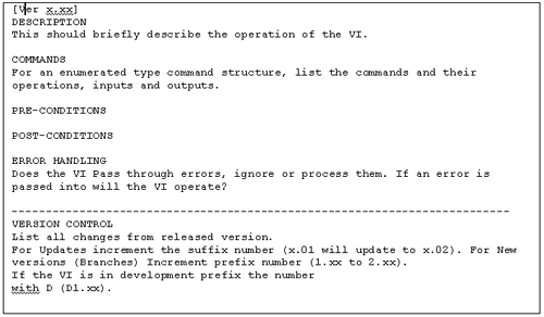
The context help in LabVIEW is an excellent place to put all information that is relevant to, and needs to be kept with, the VI. It's a good idea to have a template for the VI's description, keeping a common look and feel to the documentation. See the example in Figure 8.7.
Figure 8.7. VI description.
8.3.2 Public Front Panel Standards
-
Use Strict Type Definitions for Enumerated Commands and Attributes.
-
Fill in the Icon. It only takes a minute, and because LabVIEW is an iconic language it will greatly improve the readability of your program.
-
A user description for each control or indicator will aid in documentation of the application and will also make LabVIEW help facilities available to the user .
-
Keep a common look and feel, at least for the same customer. This will improve familiarity and reduce the learning curve when the customer is supplied with new software.
8.3.3 Private Front Panel Standards
This applies to all panels of subVIs that are not available or visible to the user.
-
Connector Controls on the left
-
Connector Indicators on the right
-
Local Indicators and Controls in the middle or on the bottom
-
Align and evenly space them
-
Have them in the same order as they are connected
-
Frame the relevant areas Input, Output, and Local where applicable
-
Use and label the recessed frame from the decorations menu
-
Use the brush with the foreground set to transparent to tidy up the label
8.3.4 Icon and Connector Standards
We've said it before but just to reinforce , if you can't afford the 60 seconds required to fill in the icon then your project is in real trouble!
-
Fill in your icons.
-
A readable and compact font is Arial Narrow at size 14. Just double-click on the letter "A" icon in the Icon Editor.
-
Small Fonts at size 11 work well as an alternative.
-
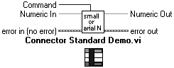
Place Inputs on the right, Outputs on the left, and commands up the middle.
-
If possible, for full-size icons, keep to 4 in and 4 out as a connector pattern. This helps to keep your wiring tidy.
-
Wire error clusters along the bottom input and output connector.
The standard connector pattern that we employ is shown in Figure 8.8. The component command can be wired top or bottom, the error cluster is at the bottom inputs and outputs.
Figure 8.8. Connector standard.
8.3.5 Organization of Files
It's reasonable to organize your files into a structure that emulates your software architecture. We also tend to declare public and private directories.
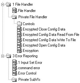
What do we mean by public and private? A public VI is a VI that hasn't got a specific owner, whereas a private VI has only one caller. This helps to encourage information hiding because the private subVIs are of no interest to any other developer and are clearly stated as such. Figures 8.9 and 8.10 demonstrate this relationship.
Figure 8.9. Hierarchy.
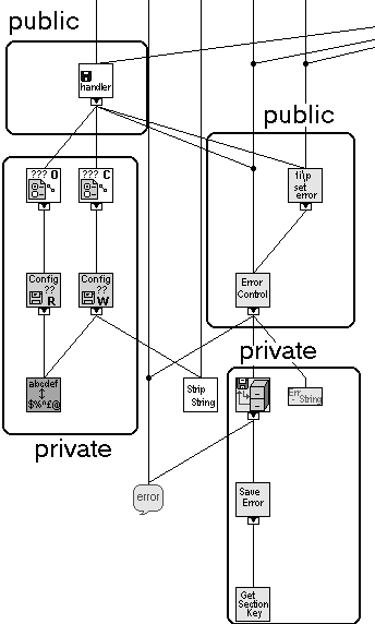
Figure 8.10. How it maps to directories.
For all the standards mentioned above, a reasonable way of enforcement is to provide a checklist. You could run through the checklist prior to releasing the component. Another excellent method of encouragement is the code review. Sitting down and having to justify your design and style decisions before your peers is one of the most powerful software quality methods available to you.
Remember though that standards should be agreed and changed by consensus. Life is too short to become a "Style Fascist."
| |
| Top |
EAN: 2147483647
Pages: 66