Form Field Validation
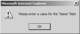
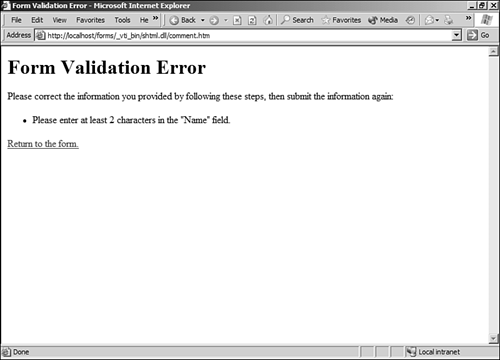
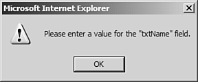
| Form field validation allows you to configure constraints on the data that is entered in to a form field. It can be as simple as requiring an entry with no other constraints on the data that is entered, or as complex as requiring data in a certain format. FrontPage can perform validation by running code on the user's Web browser or by running code on the Web server. There is a tremendous benefit to performing validation on the client. If a user enters information that does not conform to the constraints you have configured, she will be presented with a message box indicating that she needs to correct her entry (see Figure 18.15) prior to the page being posted to the Web server. If you do validation on the Web server, the user has to wait for the page to be transmitted, wait for the Web server to process the form, and then wait for the Web server to send back an error page, as shown in Figure 18.16. She then has to click a link to go back to the form and try again. Validation on the client is a much better user experience. Figure 18.15. Client-side validation makes it easy for your users to correct their data.
Figure 18.16. Server-side validation is not nearly as user-friendly. The user had to wait for this page.
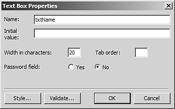
Configuring Form Field ValidationTo configure validation for your txtName form field, you will use the Text Box Properties dialog box.
Now preview your form in the browser and leave the Name field empty. Enter some text in the Comments text box and click Submit. You should be presented with a message box indicating that you need to enter your name as shown in Figure 18.20. Figure 18.20. A validation failure telling you to enter data in txtName.
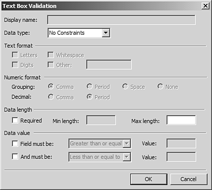
Now when you fail to enter your name, the error will be more descriptive, such as the one seen previously in Figure 18.15. Configuring Validation OptionsThe validation options available to you differ depending on what type of form field is selected. Let's look more closely at the Text Box Validation dialog box as seen earlier in Figure 18.18. The Data type dropdown allows you to configure the type of data you will allow in the text box. The following options are available:
The Text format section contains several check boxes to allow you to specify what type of entry is allowed when Text is selected in the Data type dropdown:
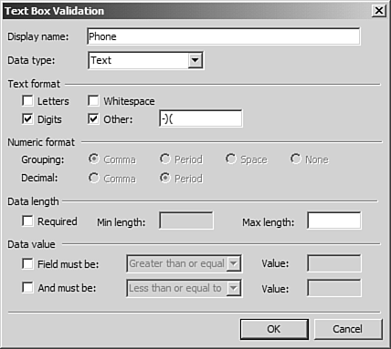
Suppose that you had a text box field for someone's telephone number and you wanted to make sure that it was in the correct format. The first thing you would want to do is provide some indication to the user for what format you expect. You would then configure validation by setting the Data type dropdown to Text and checking the Digits and Other check boxes. In the text box for Other, you would want to enter a dash character, which is the separator used in phone numbers. If you wanted to allow for area codes in parenthesis, you would enter those as well, as shown in Figure 18.21. Any other character besides a number, the dash, an opening parenthesis, or a closing parenthesis would fail validation. Figure 18.21. The Text Box Validation dialog box configured for validating phone number formats.
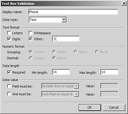
In order to avoid a phone number without an area code or one missing digits, you might also want to set a minimum and maximum field requirement. You know that a phone number formatted correctly will contain a total of 14 digits 2 for the parentheses, 2 for the dashes, and 10 for the phone number itself. The Data Length section of the Text Box Validation dialog box provides the perfect place to specify a size restriction on the data entered. In the Data Length section, check the Required check box and type 14 in both the Min Length and the Max Length text boxes as shown in Figure 18.22. The phone number text box has now been configured to perform validation against the information entered in to it. It is also now configured as a required field. If nothing is entered in to it, validation will fail. Figure 18.22. The Data Length section allows for restrictions on the length of the data and makes the text box a required field.
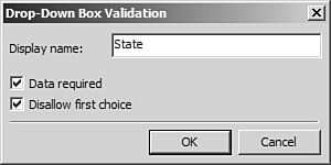
The final section in the Text Box Validation dialog box, the Data value section, allows you to specify a valid range for the data entered in to the text box. You might also want to collect data on what state your site visitors are from. A dropdown box is the perfect form field for this task. When using a dropdown box for the selection of a state, you would typically include an entry such as Select a State as the first entry. You would not, however, want the form submitted until the user selected a valid state from the dropdown. Figure 18.23 shows the Drop-Down Box Validation dialog box. Here, you can once again specify the name to display for the form field. You are also provided with a check box to specify that the field is required and another check box to disallow the first choice. The Disallow First Choice check box is convenient if your dropdown has an item such as Select a State as the first choice. Because you would obviously want someone to click the dropdown and select her state instead of leaving it set to Select a State, you would want to check the Disallow First Choice check box. Figure 18.23. The Drop-Down Box Validation dialog box is much simpler than the Text Box Validation dialog box.
|
EAN: 2147483647
Pages: 443