Preflighting Your Files
| For the layout designer, the document creator, or the production manager responsible for sending files to a printer, it's important to look for problems before sending the files to printin other words, to preflight the files. This quality check warns of problems that may prevent a document or book from imaging as desiredmost commonly, missing files or fonts. It provides helpful information such as the inks used, the first page on which a font appears, and print settings. (Note that in a very simple print workflowfor example, photographers printing directly from Photoshop to their own inkjet printersuch a checklist may not be necessary.) Preflighting must also be done by print service providers when they receive files from a customer. They must check that the files meet the requirements for their particular print work-flow, and correct the files if necessary. Catching mistakes as early in the production process as possible saves you time and money. Caught too late, they may not be correctable at all, and will end up in a printed piece. Previewing at High ResolutionTo work most effectively with graphics and pages in the Adobe Creative Suite applications, you must display them at high resolution. When graphics are placed near type created in InDesign or Illustrator, it's hard to see their relative positioning with low-resolution proxy previews. It's even more difficult to see color accurately in placed graphics without a high-resolution, color-managed display. CS2 applications use the Adobe Graphics Manager to display graphics based on their high-resolution information. This is a major step forward and provides you with a better onscreen representation of what your printed piece will look like. (This wasn't always so; see the sidebar "When What You Saw Wasn't What You Got.") All of the Creative Suite 2 applications share this technology, but only InDesign has controls for what kind of display is available for each document window or each individual graphic (Figure 16-1). There are three choices:
Figure 16-1. InDesign CS2 has three display options: Fast Display (left); Typical Display (middle), and High Quality Display (right). You can select these settings for each open document window by choosing the View > Display Performance submenu. Or you can individually select a graphic, and choose from the Display Performance submenu of the Object (or context) menu.
Overprinting Color and Previewing OverprintingOverprinting controls how overlapping objects with different colors interact with each other when printed. By default, overprinting is turned off: Printing one colored object on top of another knocks out, or removes, color on underlying objects to preserve the color on top. The basic knockout process is shown in Figure 16-3. Pure cyan type is placed on top of a pure yellow object in InDesign. The preview in the Separations Preview palette (see "Previewing Separations" for details) shows a holein the shape of the typeknocked out of the yellow plate. As a result, the colors don't mix. Figure 16-3. With overprinting turned off, the cyan plate knocks out the type on the yellow plate (top-left and top-right). The result is that the two colors don't mix, and print purely (bottom-left).(See color version on page C-6 of the Color Insert.) 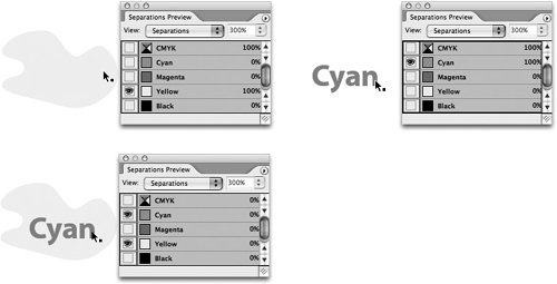 Overprinting can be used for several purposes:
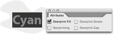
Setting OverprintingIn InDesign and Illustrator, apply overprinting by selecting an object, opening the Attributes palette (choose Window > Attributes), and selecting Overprint Fill, Overprint Stroke, or both (Figure 16-4). In addition, InDesign by default overprints anything colored solid black; you can turn this off in the Appearance Of Black preferences. Figure 16-4. InDesign Attributes palette set to overprint the cyan-colored type.(See color version on page C-6 of the Color Insert.) When the fill of the type is overprinted, the underlying object is not knocked out, and the colors mix (Figure 16-5). Figure 16-5. Setting the cyan type to overprint leaves the yellow plate untouched (top-left). The colors now mix (bottom-left).(See color version on page C-7 of the Color Insert.) 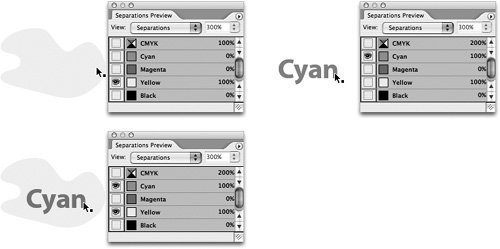 Previewing OverprintingOverprint Preview is a feature in InDesign, Illustrator, and Acrobat 7.0 Professional. It simulates how objects that use the overprint attribute will appear in color-separated output (or when transparency and spot colors interactsee the sidebar "Transparency and the White Box Effect"). You could use it to detect, for example, that the creator of a file incorrectly set an object to overprintwhich would cause the wrong printed result. To turn on Overprint Preview in InDesign and Illustrator, choose View > Overprint Preview. In Acrobat 7.0 Professional, choose Advanced > Overprint Preview. Tip: Preview Overprinting in Adobe Reader 7.0 Clients who use the free Adobe Reader 7.0 can now view overprinting in a proof so they can preview how it will print more accurately. To view the Overprint Preview, they must turn it on in Reader: Choose Page Display preferences, and check Overprint Preview. Previewing SeparationsAs Figures 16-3 and 16-5 show, you can preview and evaluate spot- and process-color separations onscreen in the InDesign Separations Preview palette. This preview helps you identify and prevent costly mistakes before they appear on a proof or on press. For example, you could use it to detect that an object would color-separate on the wrong printing plate. To open the palette, choose Window > Output > Separations Preview (or press Shift-F6). Then select Separations from the palette's View menu. (Acrobat 7.0 Professional has a similar feature that we describe later in "Preflighting, Correcting, and Printing PDF Files.") By default, all plates are showing. This is exactly the same display as when you choose Overprint Preview, as described in the previous section. Choosing the Overprint Preview keyboard shortcut (Shift-Option-Command-Y on the Mac, Shift-Alt-Ctrl-Y in Windows) toggles the Separations option when the palette is visible. For Steve, this seems almost too good to be true. When he worked as a production manager for a prepress company, he spent countless hours laser-printing proofs of separations to see what would print on each plate of a job. Now he can do it with just a few keystrokes. This is the most accurate way of previewing your InDesign pages because it uses the Adobe Graphics Manager display engine, and uses transparency when necessary to represent features such as overprinting, RGB-to-CMYK conversion, and spot-color interactions with transparency. The Adobe Graphics Manager even calculates its preview based on the ink characteristics of process and spot colors. Viewing by the NumbersYou can view the color values underneath your cursor as you move it around the InDesign document window, using the onscreen densitometer included in the Separations Preview palette. This process is kind of like using the Info palette to show color values when viewing a Photoshop image. You can turn the visibility of plates on and off by clicking the visibility (eye) icons. This is similar to changing the visibility of color channels in the Photoshop Channels palette. You can also toggle the visibility of plates with keyboard shortcuts (Table 16-1).
Controlling the PreviewYou can control the Separations Preview in these ways:
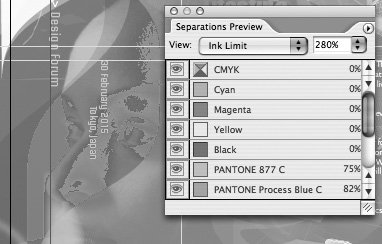
Previewing Ink LimitsPreviewing ink densities of objects on your InDesign page enables a print service provider to see (and subsequently correct) areas that can be problematic when printed with a particular ink and paper combination. (Too much ink on the paper can prevent press sheets from drying properly.) To preview ink densities, in the Separations Preview palette, and choose Ink Limit from the View menu (Figure 16-6). Select an ink percentage from the right-hand menu. Areas that exceed the designated ink limit appear in shades of red; areas within the ink limit are gray. You can also move your cursor over a specific location to read its ink limit. Figure 16-6. Select Ink Limit and an ink percentage in the Separations Preview palette to display, in shades of red, any areas exceeding the limit.(See color version on page C-7 of the Color Insert.) Controlling Transparency FlatteningTransparency is the visual interaction between overlapping, nonopaque colors in text and graphics. Examples of transparency include drop shadows, feathering effects, and opacity settings produced with a CS2 Transparency palette. Transparency can be created in InDesign, Illustrator, and Photoshop; and it can be displayed in Acrobat 7.0 Professional. (See Chapter 11, "Transparency," for how to create and use transparency.) Transparency effects must be flattened for printing. All the complex effects between text and graphics must be flattened to a single opaque layer when printing to most raster image processors (RIPs), when exporting EPS files, or when exporting to PDF files in Acrobat 4 or earlier formats. In Illustrator, flattening can also occur when saving backwards to Illustrator 8 and earlier formats. (Some newer Adobe PostScript 3 RIPs can directly process PDF files and handle transparency without a problem. But you won't find many of them at your print service provider yet.) To help prevent any nasty surprises when objects get flattened, InDesign, Illustrator, and Acrobat all provide ways of previewing transparency to give you more control over the process. (We discuss previewing transparency for InDesign and Illustrator in this section, and for Acrobat in "Previewing and Correcting PDF Files" later in this chapter.) Examples of problems that can occur when transparency is incorrectly applied and flattened include the following:
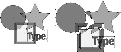
How the Transparency Flattener WorksThe Adobe Creative Suite 2 applications share a core technology called the Transparency Flattener (which we'll refer to as "the Flattener") that controls the flattening process. The Flattener is designed to maintain the appearance of objects as accurately as possible when you print or export files. When flattening occurs, transparent objects that interact with other objects or each with other may be broken into smaller opaque pieces, sometimes called atomic regions. Figure 16-7 shows four simple objects created in InDesign. Two of the shapes and the type have had their opacity reduced with the Transparency palette. To show the effect of flattening, which normally only appears when printed, we exported the file as an Acrobat 4.0 (PDF 1.3) file. (All PDF 1.3 files are automatically flattened.) Then we opened the PDF file in Illustrator to see the flattened objects. To make the effect more apparent, we offset some of the objects to show that they were broken into pieces. Note in this example that InDesign doesn't break up the type, but does convert some of it to a clipping path. Figure 16-7. Simple objects with transparency before flattening (left) and after (right). Some of the flattened objects were offset to make the results more obvious.(See color version on page C-8 of the Color Insert.) The Flattener employs a couple of other strategies to maintain the integrity of object appearances: If spot colors and transparency interact, the Flattener may use overprinting commands in the resulting file to create transparent effects with opaque objects. (We discuss the implications of this choice in the sidebar "Transparency and the White Box Effect.") If the Flattener encounters transparency that is too complex to be handled any other way, it must rasterize part of the artwork, turning vector objects into a bitmapped image. Flattener PresetsThe typical way to control how transparency will print is by selecting a transparency flattener preset in InDesign or Illustrator, or a transparency flattener setting in Acrobat 7.0 Professional. (We'll discuss transparency flattening in Acrobat in "Preflighting, Correcting, and Printing PDF Files.") You can select or create flattener presets in InDesign and Illustrator by choosing Edit > Transparency Flattener Presets. Flattening takes time, and usually adds to the time it takes to print a documenthow much time depends on the complexity of the page. There's no reason to use the highest quality flattening settings when printing a proof to a desktop printer, but you probably won't mind taking the time to get the best quality on an imagesetter or platesetter. To make the process easier, InDesign and Illustrator ship with three built-in transparency flattener presets: High Resolution, Medium Resolution, and Low Resolution (Figure 16-8, left). Most of the time, one of these settings will work for whatever you're doing. As we describe later in this section, you can also create custom presets. Figure 16-8. Transparency Flattener Presets dialog boxes in InDesign and Illustrator show three presets (left); selecting one and clicking New opens the Preset Options (right).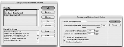 You select flattener presets in the Print dialog box, the Export Adobe PDF or Save Adobe PDF dialog box, or the Export EPS dialog box. Generally, match the preset to the resolution of your printer (low for proofing on low-resolution printers and high for imagesetters and platesetters). (InDesign also lets you override the flattener preset for an individual spread, using a command found in the Pages palette menu. It's rare that you'd need to do that.) If you're a print service provider and you need to fine-tune your transparency output, you can customize flattener presets by choosing a built-in preset to start, and then clicking the New button. A second dialog box appears (Figure 16-8, right), with a number of controls. The Raster/Vector balance slider alters how the flattening occurs: Drag toward Vectors to have the Flattener maintain as many objects as vector as the artwork's complexity will allow. This is usually what you want for high-resolution printing. If rasterization is necessary, you can also choose settings to control the resolution in this same dialog box. The Line Art And Text Resolution setting controls the resolution of hard-edged objects like type, and the Gradient Resolution setting controls the resolution of soft-edged objects like drop shadows, gradients, or Illustrator mesh objects. Controls for some special situations are discussed in the following section, "Best Practices for Preserving Transparency." For the nitty-gritty details of how to use the flattener preset controls, refer to the Adobe InDesign CS2 Printing Guide for Prepress Service Providers in the Technical Info folder of the CS2 Std Content CD of your installation CDs.
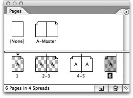
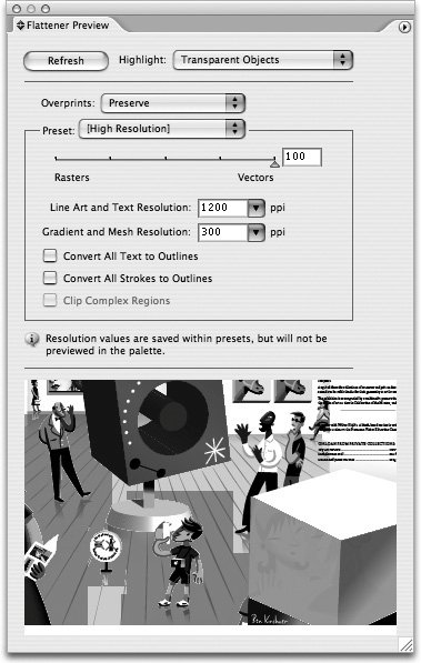
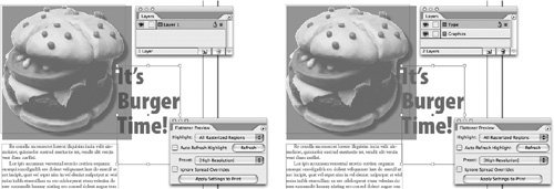
Previewing Transparency Flattening in InDesignInDesign provides the best controls for previewing how transparency will be flattened. InDesign displays a checkerboard pattern in the Pages palette (Figure 16-10) for any spread that has at least one transparent element: The checkerboard pattern is the same indicator for the transparency grid in a Photoshop layer. Figure 16-10. Checkerboard background on an InDesign page indicates transparency. Another way to preview transparency in InDesign is using the Flattener Preview palette (choose Window > Output > Flattener Preview) (Figure 16-11). To highlight the effects of any transparency flattener preset in the document window, specify the kind of results you want to see. Using the Flattener Preview, objects affected by the specified transparent settings appear in shades of red in the document window; all other objects appear as gray. You can continue to edit the document while previewing flattening. Figure 16-11. InDesign Flattener Preview palette highlights the effects of any transparency flattener preset in the document window.(See color version on page C-9 of the Color Insert.) To use the palette, use the Highlight menu to choose what to preview: Transparent Objects, All Affected Objects, or any of the other choices. Then select a transparency flattener preset from the Preset menu. After you change the settings, click the Refresh button to update the transparency display. Previewing Transparency in IllustratorIllustrator uses many of the same choices as InDesign, but it previews transparency within the Flattener Preview palette, providing a much smaller preview (Figure 16-12). To open the palette, choose Window > Flattener Preview. Be sure to choose Show Options from the palette menu to see all your choices. The choices for Presets and Highlight are similar to InDesign. Figure 16-12. Illustrator's Flattener Preview highlights the effects of transparency within the palette.(See color version on page C-9 of the Color Insert.) Tip: Navigate Through the Illustrator Flattener Preview To best use the Illustrator Flattener Preview palette, open the palette as large as possible by dragging the resize handle at the bottom right. To magnify (zoom) the preview, click in the preview area. To zoom out, Option/Alt-click the preview area. To pan the display, hold down the spacebar and drag. Best Practices for Handling TransparencyTo ensure that the transparency you create in a file appears as you expect when printed, it helps to follow certain best practices. Here are a few tips:
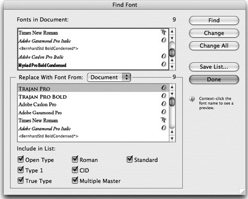
Preflighting and Packaging in InDesignSurveys of print service providers have shown that most output problems are caused by missing fonts and graphics. With its very capable automated Preflight feature, InDesign makes it easy to fix these and other problems, such as duplicate colors or missing plug-ins, before the file is packaged. Packaging a file creates a folder that contains the InDesign document (or documents in a book file), any necessary fonts, linked graphics, text files, and a customized report. You can preflight an InDesign file at any time by choosing File > Preflight, or pressing Shift-Option-Command-F (Mac) or Shift-Alt-Ctrl-F (Windows). After InDesign analyzes the document and prepares its report, the Preflight dialog box appears, set to the Summary panel (Figure 16-14). Problems are highlighted in the summary with a triangle warning icon. Figure 16-14. Summary panel of the InDesign Preflight dialog box.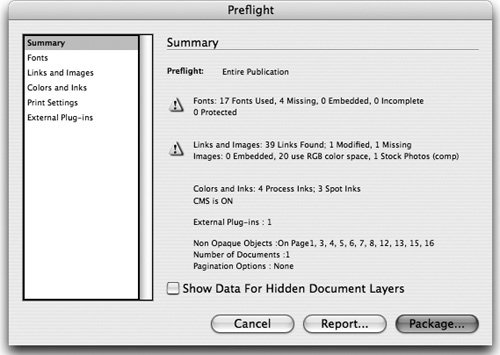 Displaying and Replacing FontsUse the Fonts panel to list the fonts in your document and in any linked EPS and PDF files (Figure 16-15). For any missing fonts, the panel will list the first page in the document where the font is used. Clicking the Find Font button opens the Find Font dialog box. Here you can find out more information about a font, or replace one. For more about this dialog box, see "When Good Fonts Go Bad" in Chapter 6, "Type Magic." Figure 16-15. Fonts panel of the InDesign Preflight dialog box.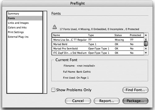 Displaying and Replacing Links and ImagesThe Links And Images panel lists the document's embedded and linked files (Figure 16-16). Linked images are listed by their name on disk, and embedded images are just listed as "(Embedded)". For each image, InDesign lists the file format and color space (unfortunately, the program can't detect RGB color information in vector RGB EPS or PDF files). It also lists the Actual ppi and Effective ppi (scaled resolution) for each image. Figure 16-16. Links And Images panel of the InDesign Preflight dialog box.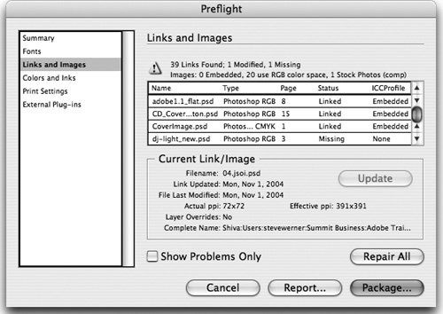 Use the Update/Relink button to select an individual linked graphic that is missing or modified, and to update or relocate it without leaving the dialog box (the feature toggles its name depending on the status of the image selected). The Repair All button lets you fix all missing and modified links. (For more information on linked and embedded images, see "Linking Files in Illustrator and InDesign" in Chapter 9, "Smart Objects and Intelligent Layouts.") Choosing Additional Preflight OptionsThere are three other panels in the InDesign Preflight dialog box:
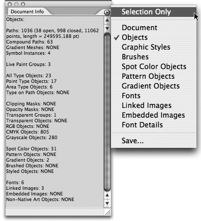
Packaging a File in InDesignPackaging creates a folder to collate a publication, its associated graphics and fonts, and a report about the document for the print service provider or to whomever you are handing off your document. (You don't need to perform a final preflight check before packaging. InDesign performs an up-to-date preflight check. If problem areas are detected, a dialog box appears.) To package a file in InDesign, click the Package button at the bottom of the Preflight dialog box (or press Shift-Option-Command-P (Mac) or Shift-Alt-Ctrl-P (Windows)). This launches the packaging feature. Before InDesign finishes packaging a file, it displays the Printing Instructions dialog box, in which you can enter contact information and printing instructions. Click Continue to choose how to package your document using the Create Package Folder dialog box (Mac, Figure 16-17) or the Package Publication dialog box (Windows). Figure 16-17. The InDesign Create Package Folder dialog box (called Package Publication in Windows).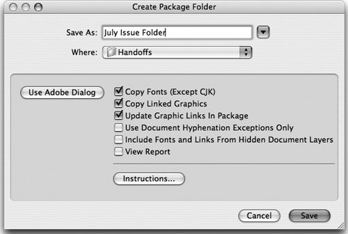 The document and the Printing Instructions report are always copied into the folder. However, you can choose which other items to include. Almost always, you'll want to use the default choices: copying the fonts, copying linked graphics, and updating the graphic links in the package. Choosing to update graphic links ensures that when your recipient opens the file, all the graphics will be linked and up-to-date. When you click Save (Mac) or Package (Windows), an alert from the Adobe Legal Department appears warning of the dangers of sending fonts to people who don't own them. (As much as we respect the message, we wish we could disable this.) Click OK to complete the packaging process. Manually Preflighting in IllustratorSadly, Illustrator lacks the automated preflighting feature of InDesign. It also has no packaging feature. So when you prepare a file for handoff, note that you'll have to manually include the fonts and graphics in the package for your print service provider. However, you can manually preflight your Illustrator file and check for many of the same items as does InDesign. We'll tell you where to look. Displaying Document and Object InformationTo list general file information and object characteristics, use the Illustrator Document Info palette. To open it, choose Window > Document Info. By default, the palette displays only information about the currently selected object. To show information about all objects in a file, deselect Selection Only in the palette menu (Figure 16-18). Figure 16-18. Illustrator's Document Info palette, with the Objects panel displayed. The default display, Document, is the least interesting. But choosing Objects from the palette menu displays a very comprehensive overview of all the kinds of objects in the Illustrator file. You can then select the other display options from the palette menu for more detailed information. Displaying Image and Font InformationTo get information about images and fonts in a document, use the respective Links palette and Find Font dialog box:
|


EAN: 2147483647
Pages: 192