Laying Out Controls in a Window
If you’re not careful, you can make a real mess with your controls. In the sections that follow, I describe the different things to watch out for so you don’t end up with your own dirty windows!
The Purpose of the Controls
I’m not about to try to insult your intelligence. You know what a check box is and what a radio button is. So instead, in this section I want to briefly go through some design issues particular to some of the controls.
Buttons
Don’t put bizarre images on your buttons. The purpose of an image or icon is to convey basic information so the user’s eyes can quickly spot the correct item. When you’re looking for the Recycle Bin or Trash on a desktop where the user completely rearranged the icons, you’ll probably look for the icon and won’t start in the upper-left and read the captions of each and every icon until you find the correct one. Even if you’re visually impaired and need to hold your eyes close to the monitor, you’ll probably still look at the icons rather than read the captions.
Now consider a button. Suppose you have an OK button and a Cancel button with images such as these:
![]()
Which is which? It isn’t clear.
| Note | I feel compelled to comment about Borland development products, in particular Delphi and C++Builder. I love these two products; I’ve written books about Delphi, and I teach courses about C++Builder. They’re great. But one thing that I will never understand is why they still have nonstandard graphics on their buttons. The two products have a class called TBitBtn, which stands for Bitmap Button (all the Borland class names start with a T). You can always spot a Delphi or C++Builder program because the OK button has a check mark on it, the Cancel button has an X on it, and the Close button has some strange figure that I still can’t figure out what it is. I’m not going to say not to use these buttons, because I use them on occasion. But I do struggle with this, and my urge is to set the Glyph property (which lets you choose the image) to None. |
Check Boxes
All I really want to say is this: Remember that check boxes are not mutually exclusive. The user can select one or more check boxes. If you are presenting the user with a choice where they must choose only one option, don’t use check boxes. Use radio buttons instead.
Radio Buttons
Unlike check boxes, radio buttons (sometimes called option buttons) are mutually exclusive. The user can select only one. But what if you want the user to make multiple selections? Group the radio buttons either by using a group box or by simply keeping them close together. The following image shows three radio buttons grouped together:

If you prefer, you can group your radio buttons together; however, please make sure the items are closer to one another than to items outside the group. Here’s a good example:

Finally, are two quick rules about radio buttons:
| RULE | Never have a radio button by itself. If you want a single selection, make it a check box. Besides, once you select a radio button, you cannot deselect it without clicking a different radio button. How would you do that with only one radio button? You can’t. |
And:
| RULE | When you have radio buttons in a dialog box, pick a radio button to be the default (or, if the dialog box reflects settings, then pick which one applies to the current setting), and make the dialog box open with the default chosen. Don’t start the dialog box with no radio buttons chosen, because after the user clicks one, he cannot revert back to the “none chosen” setting! |
Regarding the preceding rule, what if you want to give the user the option to select only one or none of the radio buttons? Some people have experimented with including a check box before the radio buttons. While the check box is checked, the radio buttons are active. While the check box is not checked, the radio buttons are inactive, meaning the user wants “none of the above.”
This works, but another solution is to include a final radio button labeled None Of The Above. That’s even better!
Labels
People usually use labels to give a title or name to each control. I recommend that you do this, but please position them carefully such that:
-
It’s obvious which control the label is referring to.
-
You are consistent.
Some GUI designers prefer to give you more explicit rules than this, such as, “Please right-align your text.” I do personally prefer right-aligning the text as in the following:
However, I question just how much of a negative impact left-aligning the labels would have on usability. In fact, while some people insist on a rule that says the labels should be right-aligned, the reality is that the usability studies have shown that left-aligned labels are easier for users. But this just shows how much subjectivity there really is in the usability world.
Be careful, however, when putting labels on your form, because the check box controls and radio button controls usually have the actual button to the left of the labels, while most people prefer to put the labels to the left of the control. (Indeed, if you use the built-in check boxes and radio buttons in Windows—which you should—then you don’t even create a separate label; the text automatically appears to the right of the button.) If you’re not careful in how you line things up, it can look pretty messy.
Arranging Your Dialog Box Controls
For English-speaking people, the natural pattern is that the eyes first look at the middle of the window and then move to the upper left and down to the lower right. If you’re designing a dialog box, you can therefore assume that your user will start at the top of the dialog box, read from left to right, and work his way down through the dialog box until he gets to the OK and Cancel buttons at the bottom.
Remember, the purpose of the dialog box is to allow your program to receive immediate input from the user. If the user is going to be changing current settings, then please follow this rule:
| RULE | Populate the controls with the current values. For example, if you are opening a Font dialog box, set the face (or name) and size with the current face and size. |
The reason is that the user might make only one change. With a Font dialog box, the user might want to change only the size of the selected text but not the face. If you don’t populate the Font dialog box with the name of the font and instead default to something such as MS San Serif, then when the user clicks OK, he will be quite unhappy to see the text he selected changed not only in size but in face as well.
How do you implement this in code? Normally, you would have a class for your dialog, and that class would include a constructor and a Show function. The Show function returns a Boolean value, true if the user clicks OK and false if the user clicks Cancel.
The calling function would create an instance of the dialog class and then populate the dialog instance with the current values. (You might consider having the dialog class populate itself by calling into code outside the class. Please don’t do this, because doing so tightly couples your dialog class to the main code, making it impossible to reuse the dialog class elsewhere.)
How does the calling function populate the dialog instance? You can take your pick:
-
Passes the current settings in as individual members to the constructor
-
Fills a structure and passes the single structure (probably as a pointer or reference) to the constructor
-
Fills a structure and passes the single structure (again, as a pointer or reference) to a separate function
I’m not too fond of the third item in this list. Other people may disagree (and we can agree to disagree), but I don’t like forcing the caller to go through a whole bunch of rigmarole to use the class. And each extra function you require the caller to call is one extra piece of rigmarole. (Yes, rigmarole is made up of pieces.) Why force the user to do this
MyDialog dialog; dialog.Initialize(&stuff); dialog.Show();
when this is shorter and easier to remember:
MyDialog dialog(&stuff); dialog.Show();
But other people have superstitions about passing data into a constructor, so the choice is yours.
At the bottom of your dialog box, put an OK button and a Cancel button. The Macintosh puts the OK button in the lower right, with the Cancel button to the left of the OK button, like so:
![]()
Windows puts the Cancel button in the lower right, with the OK button to the left of the Cancel button, like so:
Now remember, your code shouldn’t change anything until after the user clicks OK. You can if you want, however, allow a slight exception to this rule in the form of a preview. In your dialog box you would include a check box (not a radio button, please!) with the label Show Preview or Preview Changes. Then the user can see the changes as she tries them out. You find this kind of thing often in graphics programs, such as in a filter or a color settings dialog box. But remember, when the user clicks Cancel, the changes better not stick!
From a programming perspective, a dialog box with a Preview option is kind of a pain to program. The reason is that you normally want your dialog box to live inside a simple class, and that class includes a Show function. If Show returns a true, meaning the user clicked OK, the calling code can then inspect the member variables of Show to retrieve the data the user entered and then make the appropriate changes.
The problem with a Preview (again, from a programming perspective, not from a usability perspective) is that the class now needs to know how to make appropriate changes. But please, since Preview is a good feature, don’t be the mean, nasty programmer who says, “It’s not possible,” and forgoes the Preview feature. It is possible, and that’s one of the themes of this entire book. (And besides, I’m a programmer, too, so you can’t fool me.)
There are different ways you could make the Preview feature work, but please try to stick to good object-oriented practices. If you have code in your dialog box class that calls back into the main code, you are tightly coupling your code, meaning that the dialog box class isn’t useful anywhere else, wiping out the whole notion of reusability.
Instead, provide a callback function. One way to do this might be like so:
#include <iostream> #include <stdlib.h> using namespace std; class MyDialog { typedef void (*PreviewCallback)(MyDialog *); protected: PreviewCallback callback; int Height; public: MyDialog(PreviewCallback acallback = NULL); int getHeight() { return Height; } bool Show(); }; MyDialog::MyDialog(PreviewCallback acallback) { callback = acallback; Height = 10; } bool MyDialog::Show() { // Suppose the user made a change // by setting Height to 20. // Call the preview function: Height = 20; if (callback != NULL) { callback(this); } return true; } void MyPreviewCallback(MyDialog *dialog) { cout << dialog->getHeight() << endl; } int main(int argc, char *argv[]) { MyDialog dialog(MyPreviewCallback); dialog.Show(); return 0; } This is just a pattern along with some test code, and by itself it is not particularly useful. Notice how I’m passing a callback function to the MyDialog constructor, although I can optionally pass no callback. The Show function would open up the dialog box, set the default values for the controls, and include a Preview check box (all of which I’m skipping here). Then if the user clicks the Preview check box, or if the Preview check box is already selected and the user makes a change, the code would call the callback. (I’m just showing the call right inside the Show function, demonstrating where the user set something to 20.)
The callback would then make the appropriate changes for the preview and update the screen accordingly. Here, for demonstration purposes, I’m just printing out the value of the Height member.
This pattern is useful because now you can take the class elsewhere, and it doesn’t have a callback hard-coded into it. I removed the tight coupling between the dialog class and the main code.
The one thing that I intentionally left out, however, is code that demonstrates how to undo the preview in the event the user clicks Cancel. There are several ways you might want to implement this. You might decide to call your Undo code to undo the changes if the Show() function returns false. But I don’t like that. Why? Because then the Show() function has made changes even though the user clicked Cancel, and you, as the programmer creating the MyDialog class, are expecting the user to fix anything left around by the dialog box, even though the user clicked Cancel! That’s bad.
Or, you could provide another callback that would undo the changes, and the dialog box code would call this callback from the code for the Cancel button. But now you’re faced with a trade-off. I might be inclined to send in another callback for the Undo. While I don’t like to have a million callbacks (each one adds more coupling), I do think this is a better alternative than the dialog box that was canceled, leaving a mess for the caller to deal with. (In Chapter 8, “Under the Hood,” in the section “Implementing an Undo System,” I talk about the specific issues of how your Undo system can be preview-safe.)
Now, moving beyond the preview issues, what about the following two buttons?
-
Close
-
Apply
Please avoid using these two buttons. If you correctly design a dialog box, you will have no need for the Close button. The Close button makes more sense in a modeless context, but as you saw earlier I single-handedly brought a complete end to modeless dialog boxes (or at least tried!). The reason is that no changes should take place (except for a possible preview, which is temporary) until the user clicks OK. If the user doesn’t want the changes, he should click Cancel. Where does Close fit in here? It doesn’t. The only way you would need a Close button is if your dialog box makes changes while it is open, which is bad.
But what about a short utility program where I said a dialog box is okay for the main window? If you find you’re using a Close button, then please rethink the design and use a regular window, not a dialog box.
Now what about this Apply thing? Microsoft introduced the Apply button sometime during the ’90s, and, if I might be so blunt, they made a big mistake with it. Please don’t follow in their footsteps with it.
On the surface, it seems like a good idea: Make a few changes, click Apply and they stick. Make a few more changes, click Apply again, and they stick, too. Now click Cancel. What happens now? Do the changes get undone? In Microsoft products, the answer is “No, Jeff, they don’t get undone.” So much for the purpose of the Cancel button: When you click Apply, your changes are a done deal.
The problem with the Apply button is it’s just too darn confusing. Don’t use it. And don’t use the Close button either. Stick to OK and Cancel.
But wait, there’s more! Here are some others:
-
Abort
-
Retry
-
Ignore
-
Yes
-
No
As for Abort, Retry, and Ignore, all I’m going to say is this: Don’t you dare. Please, speak a human language. As for Yes and No buttons, they have (almost) no place in a dialog box. A dialog box is for entering information and choosing settings. There is no question involved and so no reason for the words Yes and No, which are answers to a question.
However, your program may have the need to occasionally ask the user a question. (But please, make sure this is only occasionally or never.) Since you’re not allowed to ask, “Are you sure you want to quit?” because that’s an insult to the user, you’ll find that questions are rare. Still, you will occasionally have a need, in which case your combination of buttons can be:
-
Yes, No
-
Yes, No, Cancel
And you might want a Help button as well.
Don’t Forget the Tab Order and Shortcuts!
One of my personal biggest frustrations is when I’m working with a dialog box, I’m in the very first control in the upper-left corner of a dialog box, I press Tab, and the wrong control gets the focus. Why did this happen? Because the programmer didn’t bother to set the tab order, and what you end up with is probably the order in which she created the controls. Setting the tab order is easy (although how you do it depends on the programming tools you’re using), and you should always do it. I don’t use the mouse very often when working with dialog boxes, and I rely a great deal on the Tab key.
In addition to the tab order, remember that the OK button should be a default button that responds to the Enter key, and the Cancel button should respond to the Esc key.
Also, some people prefer to use keyboard shortcuts to navigate about a dialog box. Take a look at Figure 3.8, which is the Page Setup dialog box from Microsoft Word. Each control in the dialog box has a label next to it, which includes an underlined letter. The underlined letter is the shortcut key. For example, while this dialog box is showing, if you press Alt+G the edit control labeled Gutter will receive the focus.
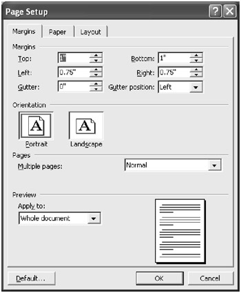
Figure 3.8: This dialog box from Microsoft Word lets you use keyboard shortcuts to navigate about the window.
But notice a slight disjoint issue here: The label control for the Gutter setting has the underlined G. But when you press Alt+G, the label isn’t what receives the focus; rather, the edit control beside the label receives the focus. This is a simple programming matter. For example, in Windows, to specify an underline in the label, you put an ampersand, &, before the letter you want underlined. But doing so doesn’t make the shortcut; it just underlines the letter. You separately specify a shortcut with the edit control using whatever method is present in the programming tool you’re using.
REAL WORLD SCENARIO: My Trip to the Grocery Store, or Adventures with a Self-Scan Machine
It looked intriguing. Day after day (okay, so I run to the grocery store every day…so sue me) I would see several machines at the grocery store that were purported to be self-scanning machines. The idea is that you scan your own groceries, running them over the laser that says “Beep,” and the computer tallies the total. You then slide your credit card or debit card through a reader, or even feed cash into the machine, and pay for your groceries.
But I was scared. Maybe it was a premonition of bad things to come. But why should I be afraid? I’m a computer programmer for goodness sake! So finally I got up the nerve to use the thing. I had only three items, and I figured this would be a good day to introduce myself to the next Wonder of the Modern World.
In preparation, I stood off to the side, spying on the people who were using the machines. Looked easy enough. So I got in line and waited. Finally it was my turn.
The computer screen told me to scan. So I did. One by one I scanned my items, and the total appeared on the screen. Then just like when I’m only a customer in the traditional lines, and not a cashier too, I swiped my debit card through the little card reader. And the card reader said, “Waiting for cashier.” So I stood and waited, not even realizing that I was the cashier in this case. I’m serious; it was waiting for an action from me. But I didn’t realize that. As it turns out, the store staffs one single cashier (a paid one, not a volunteer one like my proud self) to oversee the machines. I figured that was the cashier the card reader was waiting for. So I called the friendly gentleman over. And he says, “Did you follow the steps?” I said, “Yes.” He said, “What does the computer screen say?” (A slight argument ensued that involved me accusing him of talking to me like I’m stupid, but that’s not relevant to our story, so I’ll skip that part.)
And so I looked at the screen and everything seemed fine. There was a to-do list on the right, and I was going down through the items one by one. Each item in the to-do list was inside a rectangle. The first one said “Scan,” which I completed. But it was just waiting. I didn’t know what to do next.
The cashier finally lost his patience trying to help me discover the answers for myself, and he reached over and touched the screen, pushing the rectangle. Then the screen asked how I would like to pay. “Oh!” I yelped. I thanked him for his time and continued on my merry way as he walked off to help the next customer, presumably showing her exactly what he had just shown me.
What was the problem? The buttons bore no resemblance to any buttons I had ever seen. They gave no indication that they could be pushed. They just looked like rectangles to me, and that meant they were just colored, static text. Imagine how much stress the store could save on its own employees if the screens used more familiar idioms.
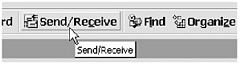
Hint Windows and Balloon Help
You’ve seen the ScreenTip on Microsoft Windows or the Balloon Help on the Macintosh. It’s a great thing, provided you use it correctly. Here’s an example of a ScreenTip in Microsoft Windows:
The idea behind the ScreenTip is to provide the users with a quick description of a toolbar button or control. The ScreenTip isn’t intended to provide extended help; rather, it’s just a short description. The ScreenTip appears when the mouse stops over a control or toolbar button and stays there for a couple of seconds. The ScreenTip opens, remains for a few seconds, and then disappears.
But please, if you’re going to use ScreenTips, use them wisely. Here’s a ScreenTip that’s a bit ridiculous:
The Macintosh has Balloon Help instead of ScreenTips. Balloon Help tends to be a bit more long-winded and wordy. Personally, I’m not fond of Balloon Help because the balloons are a bit too flashy and they take up too much space in my opinion.
Programming a ScreenTip is easy. Please don’t write your own pop-up windows and fill them with text to create a ScreenTip! The operating system has ScreenTip capabilities built in, and most programming tools include easy support for ScreenTips. For example, Microsoft Foundation Classes (MFC) includes a CToolTipCtrl class. Borland Delphi includes a Hint property for a control, which works provided you set the form’s ShowHints property to True.
Layers of Tabs in a Dialog, and Piles of Dialogs
If you need to step the users through several tasks in a row, and an order is required, please don’t use a dialog with tabs at the top. I’ve seen this done too many times. The problem is that the user can freely flip from tab to tab, and the user might not even realize she is supposed to go through all the tabs.
Instead, use a wizard, which is very similar in concept, but the tabs are not present. Instead, the users can move forward or backward through the wizard by clicking the Next and Back buttons, and the wizard will clearly show what steps they’ve completed and where they are in the process. However, please give the users the option to skip the wizard and go on to “expert mode.” (WinZip, the popular zip and unzip utility, includes an optional wizard, which I can’t describe because I’ve never used it. I prefer the expert mode, and that makes me perfectly happy.)
Or, better yet, rather than creating a wizard, keep your questions to a minimum, and fit them all in a single dialog box.
But if you’re not walking the users through a series of steps, and instead simply have several categories of options, then you are probably okay using tabs at the top of your dialog box. However, keep the tabs to a minimum. Don’t give the users more than one row of tabs. The reason is that strange things happen when you click a tab that’s on the back row: All the back row tabs move down and in front, and all the front row tabs move up and back. The whole thing flips, and I personally find myself getting lost in situations like this. My fight-or-flight instinct kicks in, and I often find that this is a good time to go visit the candy machine. Forget the software. (And what if that’s your software I’m using?)
A common place where people like to use tabs is in Options dialog boxes. This is fine, but too often people get a bit carried away. Figure 3.9 is an example from Microsoft Outlook 2000, where Microsoft kept the tabs nice and neat:
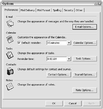
Figure 3.9: Only a few tabs are present.
Unfortunately, this dialog box suffers from its own set of problems. For one, it isn’t always clear to me where I should find an option. The Preferences tab shown in Figure 3.9 has some options that seem somehow a bit too interrelated to options on the Options tab, as shown in Figure 3.10.
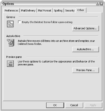
Figure 3.10: Some options are in strange places.
Further, the Options dialog suffers from the cascading dialog problem, where you can click a button and another dialog box opens, and then when you click another button, yet another dialog box opens! Figure 3.11 shows an example:
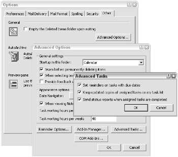
Figure 3.11: Where am I? What do I press? This is an example of cascading dialogs.
Do you know what the biggest problem with cascading dialog boxes is? The user’s eyes don’t always see a distinction between the dialog boxes. I personally have many times clicked the buttons of the dialog box that’s in back of the current dialog box, because they looked like the right buttons to click. Ugh. Don’t do this.
| RULE | If you have many, many options in your program, go ahead and use tabs, but keep them neat and orderly. Or, divide the dialog box into multiple dialog boxes, but don’t make them cascade. Give the user a separate command for reaching each dialog box. |
And finally:
| RULE | If you do include tabs on a dialog box, when the user changes something on a tab page and then clicks another tab page, makes some changes, and finally clicks OK, remember to record the changes for both tab pages the user worked on, not just the most recent. |
EAN: 2147483647
Pages: 114