New Methodology Topics
| This section is for discussing the evolution of project management, testing, user-interface design, project governance, and requirements gathering. Agile Project ManagementI earlier discussed the myth "We don't need no *%@! managers!" Even with a self-moderating team, there is still a role for someone to monitor and enhance focus, community, amicability, personal safety, and communications within the team; to give the project good visibility to the sponsors and to secure directional decisions and funding from them; and to keep distractions away from the team (see Figure 5.1-2). However, there is still a kernel of truth in the idea that the project manager's role is shifted, if not reduced, in agile development. Good agile teams develop their plans jointly, present their status visibly and publicly, and in general have a better understanding of themselves as a mutually dependent community. Since the writing of the manifesto, some excellent books have appeared on project management in the agile context:
All highlight the human aspects of managing.
A number of people felt that the discussion of how to lead agile projects was being missed in the fervor surrounding the agile manifesto. This included Jim Highsmith and me as agile manifesto authors, plus over a dozen other experts in product development, project management, and line management. Over a six-month period, we worked on a follow-on to the agile manifesto that would carry over to non-software projects and also to product (as opposed to project) management. The result was published in January of 2005 and called the "Declaration of Interdependence" or DOI.[23]
The DOI was written to fit self-managed teams as well as hierarchically managed teams. It is for development teams outside and inside software development, and for product development as well as project management. Anyone reading it will immediately detect that it provides good guidelines for line management as well as project management. It contains the things we expect from an agile mindset: paying attention to workers as human beings and using short feedback loops and situationally specific strategies. The DOI is described in detail in Appendix C. Extended support and discussion surrounding the DOI is provided by a non-profit group called the Agile Project Leadership Network (APLN).[24]
TestingThe newest topic in agile methodologies is the growth of automated testing and test-driven development as core practices. Here again, XP has been the leader. Five years ago I felt that automated testing was not a critical project success factor. However, it becomes more critical as project teams shorten their iterations, work incrementally, and refactor more often. Here is an example: A person in one of my classes asked me how to get started with agile development. I suggested that he pick any project he was working on and shift to a one-week iteration and delivery cycle just for one or two weeks. In each week, just for the trial run, he should take a new requirement, design and program it, test and integrate it, and deploy it to some user workstation. The person said he was immediately stuck. On his project, the testing would take two days alone, so he would have only three days to do requirements, design, and coding. He couldn't do a one-week iteration. It was at that point that I recognized that automated testing had become critical to agile practices. In project visits, I find people having trouble with developing in increments, with integrating with other people's code, and with refactoring, issues that would not be problems if they had automated test suites. To make the creation of tests more palatable and accessible to users, customers, and business analysts, Ward Cunningham created the Framework for Integrated Testing (FIT).[25] It allows people to specify input and output in a spreadsheet or HTML file and to hook those quite simply to the application under development. Using FIT or its relative, FITnesse, business analysts can write fewer specification documents, replacing those with user-readable specification tests. This shift supports the agile manifesto value of running software over documents (see "Hexagonal Architecture Explained" (Cockburn 2005 b) for a more detailed description of creating a system architecture that accommodates FIT).
Test-driven development (TDD) started as a way just to make sure that developers wrote unit tests at all. Its practitioners found that when they thought carefully about the tests they were writing one at a time, and how to make each test pass just after it was written, they came up with different designs than they expected. They were simpler, cleaner, and easier to change. TDD has become one of the top recommendations for developing new code. In a bit of irony, TDD coaches find they have to fight against the "test" implications of the termthey write tests to help them design, but resistant developers only see the reference to testing. A number of alternative acronyms are being suggested to reduce the association with testing. My favorite is XXD (eXecutable eXample), pronounced "Dos Equis-driven development."[26]
User-Experience DesignTop designers of the externally visible side of a software system no longer consider themselves designers of merely the "user interface" but of the "user experience." In keeping with their choice of words, I will refer here to user experience (UX) design rather than user interface (UI) design.[27]
UX designers have largely been resisting the fine-grained incremental development policies of the agile developers. Many say they need to collect most of their information before they can design a coherent user experience or interface. They say that if they are forced to develop the UX piecemeal, the result will be clumsy. There is much to be said for this position. However, many projects don't have a timeline that supports gathering so much information before starting development. A second group of UX designers argues that the low-precision UX model can be created in a matter of days, not months, so incremental development can be applied. Jeff Patton argues for this view and has published techniques to support rapid UX design with incremental development (Patton 2003, Patton 2005). Holtzblatt, Burns Wendell, and Wood have created a "rapid" form of their contextual design technique to support the same development style (Holtzblatt 2004). The UX question is complicated because the field has not sorted out how much needs to be done in advance and what can be done incrementally on the fly. It is clear that changing the user interface with each deployment causes users discomfort. That argues for at least some up-front design. It some cases, people have shown that a broad, low-precision design suffices and some screen details can be created incrementally over time. We can use the cooperative game model and lean manufacturing principles to help understand what is going on here and how to create a strategy. Here are the issues at play:
Neither of the two extremes is likely to be a good strategy. In some organizations the UX team drives the timeline and insists on getting their design "correct and complete" before interfacing with the programmers. This hurts them in two ways. First, the project is so delayed that quite likely the user requests will have changed before the system is developed (it was a correct UX design but no longer is a correct one). Second, the programmers are likely to raise valid issues that cause changes to the UX design. In some organizations, would-be agile programmers drive the timeline and insist that the UX design be done incrementally in two-week iterations, simultaneously with programming. The UX designers complain that there is insufficient time to research their users, create a design, and program it within the two-week window. Constantly encountering new user situations, they have trouble creating a consistent user model. Balance the need for lead time with the timing of the incremental development to get a consistent big picture. Strategize about what those lead times are, how much concurrency can be employed between UX designers and programmers, and how much needs to be laid down in one single, initial design to create a consistent user experience. Where possible, use the hexagonal architecture (Cockburn 2005b) to decouple the system functions from the presentation of those functions. Alert readers will notice that at this point we have left the realm of methodologies and are entering the realm of project management strategies. What I hope is that the team will discuss the tension between overall consistency and incremental development and will pay attention to the lead times required between the users, the UX designers, and the programmers. Then experiment, reflect, and adjust. Program Governance, Burn Charts, and Systems EngineeringAgile development is sometimes rejected out of cultural reasons. One such cultural mismatch is with systems engineering, which deals with the design and construction of large systems, usually with mechanical, hardware, and software components. Systems engineers typically accuse agile developers of being sloppy in their thinking. There are two real difficulties in applying agile principles to typical systems engineering projects:
It was therefore a real treat to discover one point of near-commonality that helps bridge the culture and communications gap between the two worlds. That is the "earned-value" chart in the systems engineering world and the "burn-up" chart in the agile world. Here is a simplified explanation of creating an earned-value chart to show how it fits with the agile burn-up charts (a simple web search will turn up many tutorials on the subject).
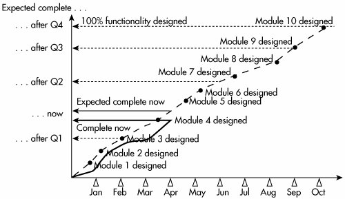
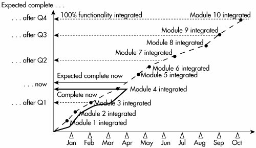
A similar pair of lines is created for the financial side, using expected and actual costs per task. They show the rate at which the project is burning through the budget. The literature on earned-value charts is full of four-letter acronyms standing for the work estimated, the work completed, the difference between the two, and so on. What is important here is that the earned-value graph provides one way of seeing the rate of progress at a glance. Figure 5.1-11 shows a series of design tasks for a system consisting of ten modules. The months are marked on the horizontal axis with small triangles. The fat dashed gray line shows the expected design schedule, and the shorter, solid black line shows the actual progress made to date. The vertical axis shows percent progress up to 100%. I have added one thing to the normal earned-value chart in order to set up the discussion on governance coming up shortly. The vertical axis in Figure 5.1-12 shows what should be completed at the end of each quarter, what should be completed by today's date, and what is actually completed at today's date. This projection gives an executive summary of the project status, without the details of the exact items being worked on. It shows the anticipated relative progress expected by quarter and where the team is now compared to where it should be. We shall make more use of this projection shortly. Figure 5.1-12. Equivalent burn-up chart. Here is the matching simplified description of how to create a burn-up chart.
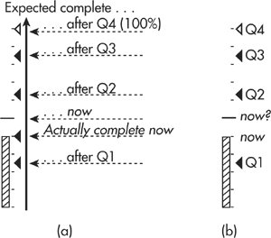
A similar pair of lines can be created for the financial side, using expected and actual cost per integrated feature set. It is no accident that I copied the text from the description of the earned-value chart, nor that the two graphs look almost identical. The point I wish to make is that the earned-value chart in systems engineering can be converted to a burn-up chart in the agile world as soon as one (very significant) change is made: No credit is given to completing requirements, design, or programming! Credit accrues only when the function or feature is integrated into the body of the system and passes testing. This is a much more reliable marker of progress than merely completing a paper design. It also requires the use of incremental development. Several other people have written about burn charts and earned-value charts. See, for example, John Rusk's "Agile Charts" (<http://www.agilekiwi.com/agile_charts.htm>), Glen Alleman's "Making Agile Development Work in a Government Contracting Environment" (Alleman 2003), and Mike Cohn's Agile Estimating and Planning (Cohn 2005). Few people notice that the value that gets granted is not the market value of the feature or function but only its estimated completion cost. In this sense, it is not "value" at all; it is "cost." Some (rare) teams are working with their users and sponsors to assign market values to each feature or feature cluster. Doing this makes very clear the difference between something that takes a long time to develop and something that is valuable to develop. Where they can do this, those teams are able to create true "earned-value" charts. A Governance View"Program governance" refers to a steering group of evaluators who meet periodically to watch over a set of projects, or "program" in systems engineering jargon. When the steering committee gets together monthly or quarterly, they have a lot of data to sort through. What they need is a quick way to see the status of each project and spot what needs attention. The vertical axis projection on the burn-up chart shows the information in an efficient way and has the remarkable property that it can be used for both incremental and waterfall projects. Figure 5.1-13 shows how to get from the burn-up chart to a very compressed rendering of the project's predicted schedule and current status. Figure 5.1-13(a) shows the vertical axis taken from Figure 5.1-12. Figure 5.1-13. The vertical axis of the burn-up chart converts to a compressed view of project status. (Two notes are in order before continuing with the description of Figure 5.1-13: First, I chose a 12-month period because it is common period and it makes the quarterly marks come out tidily. Second, I chose to show percent complete. I could have chosen to show number of use cases, number of function points, or number of user stories instead. Which to use depends on to whom you are showing them and what you would like to show.) Just to the left of the "expected complete" arrows of Figure 5.1-13(a) is a compressed rendering of the same information. The ten little tick marks placed vertically mark out 10% complete steps up to the 100% complete mark. The hollow triangle marks the amount of functionality expected to be complete by the end of the fourth and final quarter (it is, of course, at 100%). The three other black triangles mark the amount of functionality expected to be completely integrated at the end of quarters one, two, and three, respectively. Note that the existence of each triangle marks the time value (Q1, Q2, Q3, Q4), and the vertical placement of the triangle marks the amount of functionality completed. The amount of functionality expected to be complete "now" is shown by the placement of a longer horizontal line. This line moves upward continually as the time flies through the year. The amount of functionality actually completed "now" is show by the shaded thermometer bar. The bar grows upward only as new functionality gets integrated and completed. (Second note: For projects in which a significant amount of documentation is required as part of the deliverable, credit for "done" is only given when the code runs and all the documentation is complete for that functionality.) The triangles, line, and bar offer three nice features in Figure 5.1-13(b) besides just compactness:
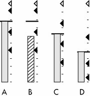
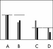
Let's look at those one at a time. Figure 5.1-14 shows the strategy and status of each of four projects, shown 7 1/2 months through a one-year plan. Figure 5.1-14. Four projects with different strategies and status. Projects A and B are using the same strategy: Develop and integrate about 40% of the total functionality in the first quarter, then up to about 63% in the second quarter, then up to about 90% in the third quarter, and finish it off in the fourth quarter. Presumably this strategy is intended to allow plenty of time for feedback, testing, and revision in the final quarter. The difference between projects A and B is that A is on schedule, and B is behind (it hasn't even finished the functions scheduled to have been completed at the end of the second quarter). Projects C and D, both on schedule, have very different strategies. Project C intends to develop very linearly, developing and integrating about 25% of the functionality each quarter. Project D is set up to run in a hybrid (semi-waterfall, semi-agile) fashion. The team expects to integrate less than 10% of the functionality in the first quarter (presumably they will be gathering requirements and setting up the architecture at that time). They will still have less than 25% of the functionality integrated by the end of the second quarter, then 60% at the end of the third quarter, and they plan to complete the last 40% of the work in the fourth quarter. John Rusk wrote in with an idea to show both financial and progress markers at the same time. Draw two renderings of the triangle, line, and bar, one for progress and one for cost (color or shade them differently, of course). Figure 5.1-15 illustrates this idea (it is a lot easier when in color on a screen, instead of black-and-white in this book). Figure 5.1-15. Four projects with varying progress and cost status (courtesy of John Rusk). The nice thing is that you can diagnose what is wrong from seeing the two bars at the same time. In Figure 5.1-15 we see that A is on track for progress and cost. B is behind schedule due to under-resourcing (the cost is just as low as progress). C is on track for progress, but the team is working overtime or extra team members have been added (cost is above prediction). D's costs are as planned but progress is slow. The next thing that can be done with the governance graphic is that it can be overlaid on a system architecture diagram to give a total program snapshot. Figure 5.1-16 shows such a picture (the figure is quite busy, and the interested reader is referred to the original article in which it is described in detail [Cockburn 2005c]). Figure 5.1-16. Full program status for a program involving three applications sitting on a common architecture (Cockburn 2005c).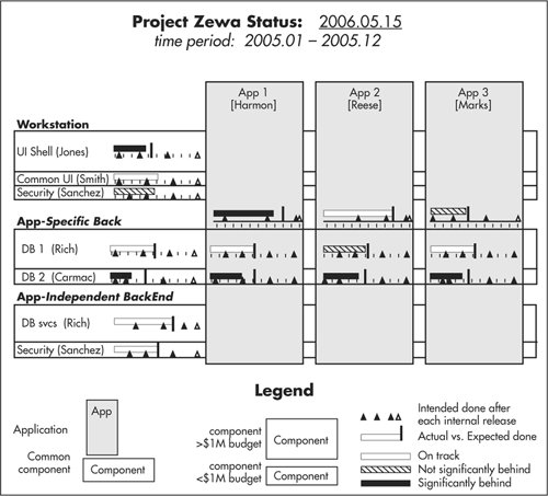 Briefly, there are three applications being developed on a common architecture consisting of a workstation portion and a back-end portion. Some of the back-end portion is application-specific, and some is application-independent. There are three things to notice about the graphic:
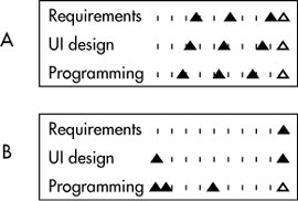
When the steering committee sees a project that is behind, they will naturally want to turn to a detail page for that project. The third piece of good news is that we can use the same marking mechanism to show the accomplishments of each sub-team. Figure 5.1-17 shows sub-project detail for two projects using very differing strategies. Figure 5.1-17. Detail sheets for two projects with different strategies and status (from Cockburn 2005c). Project A's team is using a concurrent development approach. Their graph shows that they intend to complete about a quarter of their requirements in the first quarter, almost two-thirds by the end of the second quarter, and about 90% by the end of the third quarter. Their UI team will run just behind, completing less than a quarter of the UI design work in the first quarter, then about half, and over three quarters in the next two quarters. The programming team will run just behind them, completing roughly 20%, 45%, and 78%, respectively, in those quarters. The team of project B is using a waterfall approach. That team plans to get the requirements completed in the first quarter, the UI design completed in the second quarter, and the programming done in the next two quarters. Both strategies can be shown on the same graph, simplifying the job of reporting status on multiple projects using differing mixes of waterfall, incremental, and concurrent development. More on the use of these projections and the use of color is given in (Cockburn 2005c). Use Cases and User StoriesXP brought with it the idea of marking work to be done in short phrases (user stories) on index cards (story cards). It is important to note that the short phrases on the cards are not "the requirements"; they are markers that promise a conversation about what is associated with the phrase on the card. In this sense they are efficient markers and tokens in the cooperative game as described in Chapter 1. However, unwary beginners, mistaking the early XP as defining agile practices, mistakenly thought that all agile development must be done with requirements captured as user stories on story cards. User Stories OverloadedThe problem is not that XP contains a practice of writing requests in short phrases on index cards. That is a useful practice in many instances. The problem is that because XP was so popular, many people just starting with agile development thought they were allowed only to write requirements as single sentences and only on index cards and that anything else would be un-agile (and therefore bad in the eyes of their peers). Just as story cards make a strong strategy in certain situations, they make a weak strategy in others. XP was created and tested in situations with a small user base. Developers could and did simply ask their users what they wanted. With short delivery cycles and only a few users seated close by, it was not necessary to spend much time writing down details and sorting through conflicts in the requests. The team simply wrote down the key phrases, asked the designated "customer" what to do at each choice point, programmed that up, and showed the result to the designated customer. There are, however, many situations where those conditions are not present: shrink-wrapped products, systems with a very large or diverse set of users, or systems being deployed into large, multicultural organizations. In these situations, the very notions of asking the customer or getting a quick answer to a question don't make sense. Here are two examples from organizations I have visited:
In these situations, it often takes weeks to get the answer to a question about how the user interface should work or the details of a seemingly simple business policy question. Sadly, I have heard numerous people on stage telling the following sort of story in an experience report:
After hearing this refrain a number of times, it dawned on me that the problem was not with their customer but with their process. They had built into it the misconception that there was one person anywhere who could give a definitive answer to business policy questions that were likely to cross multiple departments. The solution to the problem is not to look for an omniscient customer but to base the project's strategies around the concept that some questions will take a certain (long) time to answer. The trick is to ask those questions far enough in advance so that the delay in getting them answered doesn't delay the project. I call that "look-ahead." (This is a good time to re-inspect Figure 2-3. Imagine in that decision-flow diagram that asking the customer a question is putting an inventory item into their queue. Some of these inventory items take a short time to complete, while others take a long time.) There are three points of damage from using user stories and story cards in the wrong place:
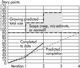
The first point of damage is the one just mentioned: it relies on developers being able to get quick answers to the detailed business policy questions that arise as they code. There are organizations where sound answers can't be provided quickly. The team needs a better form of lookahead to detect earlier on what questions are likely to be asked, which will be easy to answer, and which will take time. The second point of damage is lack of context. A well-written user story is a very short description, often just one sentence long, of something a user wants to have the system do: "Italicize text," "Add a line to an invoice," or "Compute the additional overtime pay for an hourly employee working H hours at 1.5 times R rate of pay." The shortest user story I have heard of is the one word "Kaboom" on naval artillery projects, meaning "Take a shot and tell me where it hit." A good thing about user stories is that they can be subdivided into tinier and tinier pieces to fit within shorter and shorter iterations and still be considered valid user stories. On one project, a user story was written: "Select text." As the team went to implement it in an early iteration, they decided to split it into two smaller user stories, "Select text with the mouse" and "Select text with the keyboard." Their intention, which was quite reasonable for that project, was to get something working early and grow it over time. Having one way to select text early meant they could develop other parts of the system separately from extending the text selection mechanisms. The only rules for a user story are that it has user value, the team can draft an estimate of how long it will take to develop, and that estimate fits within their iteration period. There is nothing in the idea of a user story about how much value to the user it contains. Being able to split user stories into very small slices generates trouble when there are hundreds or thousands of user stories. The developers and users find themselves looking at sentences that are very hard to relate to business situations. They are presented without an operations context and without being related to each otherwhich ones come first, which one surround others, and so on. At the time of this writing, there is a discussion on Yahoo's "agile-usability" discussion group about just this point. One person is asking for ideas on how to integrate hundreds of tiny user stories into a coherent whole so that he can come up with a decent user interface design for the system. UI design requires context to be done properly; user stories don't provide that context. For a feature in isolation, for a user story in isolation, or (for systems engineering types of contracts) for a shall statement in isolation, the context is information that can't be derived from other information. Only the most experienced business or usage experts can sew together hundreds of sentences into a coherent and sound whole. This is expensive and difficult work to do. The third point of damage is lack of completeness. As the developers ask questions, the answers generate more user stories, often more than were anticipated. On a plotted burn-up chart (as in Figure 5.1-18), the total number of stories keeps rising as they encounter unexpectedly complex business rules and split stories. Figure 5.1-18. Growth in estimated number of user stories needed to complete the project. On a project that is suited to the user-story methoda small project written for a few local usersthis is not a problem. The development team simply delivers a new system every few weeks, and the sponsors can tell whether they are happy with the rate of delivery. They view the ongoing work as a flow of cash for value and steer accordingly. On a fixed-price, fixed-scope project, however, the burn-up chart in Figure 5.1-18 presents a major problem. Is that sharp growth in the size of the system due to scope creep, poor initial estimates, or simply splitting stories in a normal way? I watched an agile team attempt to complete a fixed-price, fixed-scope project bid in which this problem arose. The client-side sponsors felt they were not going to get the system they had been promised; the contractor-side executives felt that they were having to overperform on the contract; the developers felt that there was too much scope creep; and the users felt that the project was never going to get delivered. Use Cases RevisitedUse cases solve those particular three problems. However, we must first repair the bad reputation that use cases have picked up from the people who write them poorly. Most organizations produce interaction use cases[28] that are long (think 2030 pages), contain as much screen design detail as the writer can include, and are hard to read. It is no wonder that they have a bad reputation.
That reputation applies only to interaction use cases. A good use case is short (think 13 pages[29]), readable, and contains no UI design. I used to call them intentional use cases, but I actually prefer Larry Constantine's term, essential use cases (Constantine 2001). Interaction and essential use cases are worlds apart in terms of ease-of-use and economics.
On the $15 million project mentioned earlier, we had over 200 use cases that served as the contract basis for the fixed-price, fixed-scope project. Even there, the use cases were essential use cases written in "casual" style,[30] about two paragraphs of simple prose. They were updated at the start of each three-month delivery cycle to pick up the latest business needs and development details.
Essential use cases, two paragraphs or two pages long, can be drafted, read, and updated easily. The team can write them all up front or incrementally, each to completion or one scenario at a time, at a low or high level of precision at any moment. Implementation can begin immediately or be deferred. Cost and value can be estimated on a line-at-a-time basis or on a use-case basis. In other words, you can arrange their construction and use according to your project's preferred strategies. Well-constructed essential use cases solve the three problems mentioned earlier:
The extension-conditions section of the use case is a place where the usage and business experts can brainstorm all the situations that the developers will have to deal with related to the use case. Brainstorming is done in a matter of minutes. The list of extension conditions then acts as a completeness criterion for the system's required behavior. The project team can (and should) strategize over that list to decide which extension conditions should be developed in which delivery cycle. They can (and should) attach development estimates and perceived business value, even at "low, medium, high" levels, to understand what they are constructing for the business. In the agile environment, a use case provides the context for what is wanted overall, but the team does not deliver all of it at once (Dave Churchill called the initial delivery "a sparse implementation of a use case, with a subset of extension conditions.") In examining the extension conditions, the team makes an assessment of how hard it will be to gather the information needed to complete the requirements associated with each condition ("low, medium, high" is often a good enough measure). Those requiring a lot of investigation or discussion should be started earlier, ahead of when the item is scheduled for development. Extensions estimated to have a quick response time can be left alone longer, possibly until the start of the iteration. In terms of Figure 2-3, the team adopts a work-scheduling strategy that arranges for information to reach the person needing it in a timely manner.
Because the story line of the system's use is captured at the same time as the system's behavioral features, use cases provide the context needed for each feature in the system. Kite or high-level use cases give context to individual user-goal use cases,[31] and the user-goal use cases give context to specific user actions.
Mapping Use Cases to User StoriesGerard Meszaros worked out how to fit use cases and user stories together (Meszaros 2004). The problem he solved is this:
This is the mismatch between user stories and use cases: some user stories are in the use cases, and some are not. That makes it difficult to "convert" use cases to user stories. Gerard's solution is simple and clever. He names four types of user stories:
Gerard solved the conceptual problem of relating use cases and user stories. We now have tooling problem. One organization constructed a special tool to help them track the mapping. People write use cases and non-behavioral requirements to define project scope. They break those down into user stories, or chunks of work (COWs) as the team refers to them (the team recognized the trouble with the term "user story" and changed their vocabulary). They attach effort estimates to the COWs and assign them to development teams for specific iterations. The tool allows the user to type anything in the COW description and associate that with a use case or a step in the use case and, independently, with a team and with an iteration. The tool has three panes, with drag-and-drop between panes.
With this tool, the team can write and evolve their use cases and develop them according to any strategy they like. They can always tell what portion of a use case is implemented to make sure that the functionality provided to a user is "fit for business use." They can see the context surrounding each COW. They can generate burn-up charts showing their rate of progress. (Before you write me asking for a copy of the tool, it was developed for internal use only, and the previous is all I am allowed to say about it, except that it took about a month to prototype and another month to get into use. With modern development environments, creating this sort of tool is not a large task.) For those who do not have such a tool, there is an even simpler method:
With this method, people will always know what they are working on and what has been completed. Best of all, they will be able to tell what portion of a meaningful user activity is available and what portion is being left out. |
EAN: 2147483647
Pages: 126