Tools
| We may not use all the tools available in Paint Shop Pro during the creation of our projects in this book. That doesn't mean you should never explore them on your own. In fact, that's one of the best ways to learn this type of software. You can't break anything, and it can be fun to roll up your sleeves, dip your fingers into the digital pots of paint, and spread them across your digital canvas as though you were a child again, delighting in the simple joy of finger painting. Go on, you know you want to try it.... The ToolbarA great number of tools are available in Paint Shop Pro, all of which are accessible through the toolbar (see Figure B.1). Figure B.1. Paint Shop Pro's default toolbar. If your toolbar doesn't look exactly like mine, you can whip it into shape by selecting File, Workspace, 1 Corel Paint Shop Pro X Default.PspWorkspace. Doing so resets the palettes and toolbars to the software's default settings. If you take a close look (how close depends on the size of your monitor, the resolution you have it set to, and how old your eyes are), you'll see that some of the icons in the toolbar have a small black arrow to their right. That means that there's some buried treasure under those tool's iconsthat is, more fun tools. You can click the icon itself to use the tool, or you can click the small arrow to have a flyout menu appear with more tools. The tools are grouped into similar behaviors. The Selection tools, for example, are all together, as shown in Figure B.2. Figure B.2. The Selection tool's flyout menu displaying all the selection tools. Spend a moment looking at the various tools available. Don't allow yourself to be overwhelmed. You can do tons of really cool stuff in Paint Shop Pro without memorizing the list of available tools. I promise that it'll be fun.
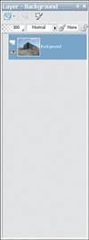
As I wrote earlier, a great number of tools are availableI count 51 in the toolbar. I wouldn't expect anyone to memorize where they all are or even what they all do. That would really suck all the fun out of playing with your digital darkroom tools. It would be more like studying biology than having fun playing with photos of your relatives. What I do expect is that using the software will become easier with time and that the tools you use and need to use on a regular basis will become more familiar to you. Don't get hung up on the large selection of tools; use what you need for the job. If the tools you normally use aren't working on a particular project, that might be a signal that you're becoming more experienced and that you might want to spend a little time exploring the tools you're unfamiliar with so you can grow as a Paint Shop Pro user. When I mention a particular tool in a project that you don't see, take a deep breath and then go though the toolbar clicking the small arrows until you find the tool you need. It'll be there somewhere, and eventually you'll get better at finding those hidden treasure tools. The Tool Options PaletteAs if having 50+ tools wasn't enough, they all have options. Some have a fairly large number of them, in fact. Although this seems like a recipe for disaster, the way it works is actually quite good and somewhat intuitive. It's also a fairly common type of interface with Windows programs these days. So just how does it work? There's a context-sensitive Tool Options palette that resides just below the Standard toolbar (with icons for New, Open, Browser Palette, and so on), which lives right below the Main menu (File, Edit, and so on). See Figure B.3. Figure B.3. The Tool Options palette showing selection tool options. Often, the default settings for any given tool will be good enough, but again, practice and experience will make selecting and using these settings easier. Be sure to give this palette a glance from time to time. One really nice aspect is that the options you select are kept so that the next time you activate the same tool, the settings are all waiting for you. Just like family. It's a kind of warm fuzzy feeling. The Layers PaletteThe Layers palette is one of the most important palettes. You won't be able to accomplish any of the projects in this book without having more than one layer in the document. In fact, many times you'll have more than four or five layers. The Layers palette is relatively simple in that there's not a lot going on there; it has a couple of icons, some pull-down menus, and your image's layers all stacked in their order (Figure B.4). Figure B.4. The Layers palette. At the top of the Layers palette you'll see the name of the palette (appropriately enough called Layers) along with the name of the currently active layer, in this case called Background.
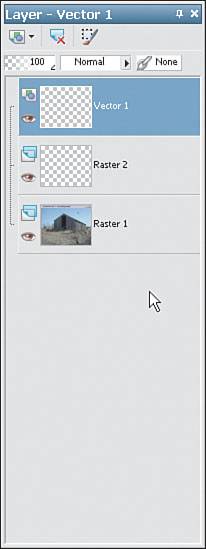
When you create a new image with a solid color, it has a layer called Background. This is true of images from your digital camera, from a scanner, and so on. When you create a new image with Transparent selected in the New Image dialog box, instead of using a color, the image has a layer called Raster 1. Raster simply means a bitmap layer or a layer that can have pixels painted or modified on it versus a vector layer, which holds vector-based shapes. A background layer is a little different from other raster layers. For example, if you use the eraser on a background layer, the layer is promoted to a raster layer. You can also promote the background layer to a regular raster layer. To do so, right-click the background layer in the Layers palette and select Promote Background Layer. You can create new layersand we'll do that quite a bit throughout the various projects in the book. You can create new layers using the Layers menu; by clicking the icon in the upper-left corner of the Layers palette; by right-clicking in the Layers palette; and (finallyphew!) by selecting Edit, Paste As New Layer. Next to the first icon in the Layers palette is an icon that summarily deletes the currently active layer. The third, and last, icon along the top of the Layers palette enables you to edit a selection. This is kind of like being able to paint a selection using common painting tools. You'll see how this is done later in this appendix. Next comes a series of pull-down menus. The first sets the opacity of the layer, the second sets the blending mode (we explore both of these in a couple of the projects), and the third enables you to link layers. Next to the pull-down menus is a small icon that toggles on and off whether transparent pixels will be locked (you are prevented from editing them in any way) or unlocked (any transparent pixel is free game...look, there goes one now!). Figure B.5 shows the Layers palette with another raster layer and a vector layer added to the document. Figure B.5. The Layers palette with three layers. Note that the Vector 1 layer is active. The active layer is the one you're currently working on. It's important to keep your layers straight, especially when you get past the first half dozen or so. Another thing to keep in mind is that vector layers and raster layers are quite different. Vector layers hold shapes that you can create in almost the same way as you would in Corel DRAW!, whereas raster layers hold the photo-quality information that will make up most of the layers in most of the projects. Vector layers can be converted to raster layers (called rasterizing), but it doesn't work the other way around.
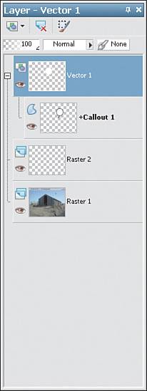
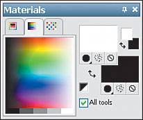
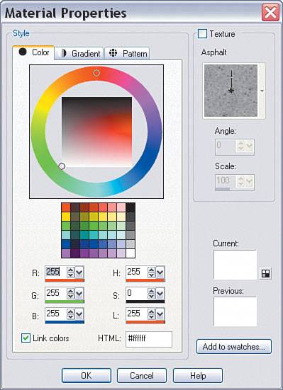
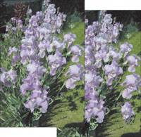
Note that text layers are vector-based. This is an advantage because they remain editable (so you can fix those nasty typos), but it's a disadvantage because really cool raster-based effects can't be applied to them. Solution: Keep two copies. One copy should be vector-based, and this will preserve the font face, size, and other important settings of your type. The second copy should be a raster copy of the text layer (duplicate the layer by right-clicking its layer in the Layers palette and then right-clicking the new layer and rasteriz ing it); it can then have the cool effects applied to it. Each layer in the Layers palette also has a few icons. Figure B.6 shows that the vector layer has a minus sign next to it and a shape layer below it. The minus sign, if clicked, turns into a plus sign and the shape sublayer is hidden away. Figure B.6. The Layers palette displaying a sublayer. Next to the plus/minus icon is the thumbnail icon (hover over that to get a better view of what's on any given layer) and a visibility icon (it resembles a small eye) toggle to turn the layer on and off. Toggling the visibility of a layer or several layers can be helpful for various tasks, such as positioning layers. Finally, layers can be dragged into other places in the layers stack so they can be reordered. Simply drag and drop the layer you want to reposition. This is necessary because the order of the layers in the Layers palette is indicative of the order of the actual layers in your image. Keeping in mind that fully opaque layers cover the layers below them, you can see how this can have an impact on your image. We'll be doing enough in the Layers palette that you should become familiar with it fairly quickly. The Materials PaletteThe Materials palette is another palette that gets a lot of use. You use this palette to set foreground and background colors and textures (see Figure B.7). It can seem a bit complex at first, but it's laid out quite well and you'll be an expert in its use in no time. Figure B.7. The Materials palette in its default state. Along the top of the Materials palette you'll find three tabs. The center one is, by default, active and showing the rainbow color picker. You can also select Frame (the first tab) or Swatches (the last tab). Click those now to see what I mean. It's a matter of choice as to which one will serve you best. I still prefer the default Rainbow setting. No matter which tab is selected, the color picker is a quick and easy way to set a foreground or background color. Simply move over the color picker and either left-click to set the foreground color or right-click to set the background color. Simple, right? The right side of the palette has several areas. First are the large rectangular icons. Clicking either of these opens the Material Properties dialog box (see Figure B.8). Clicking the topmost one opens the dialog box for the Foreground and Stroke properties. Clicking the bottommost icon opens the same dialog box but lets you set the properties for the Background and Fill properties. Figure B.8. The Material Properties dialog box. Below the larger foreground/stroke and background/fill icons are three smaller icons. The leftmost are activated in Figure B.7. These first two (one for each of the foreground/stroke and background/fill) set the tools to color. The middle icons set a texture, and the third icons set no color and no texturethat is, transparent. To the right of the bigger color/texture icons is a smaller replica. You can use these to set the color, but not the texture, for the foreground/stroke and background/fill. There's also a small rounded, double-headed arrow icon for the larger pair as well as the replica. Clicking either of those arrows swaps the foreground/stroke and background/fill properties. Just to the left of the larger icons is a small square icon that's half black and half white. Clicking this icon sets the foreground/stroke to black and the background/fill to white. This is the default setting. Finally, there's a check box that, if disabled, changes the settings only for the current tool. Having different setting for each tool can be very powerful, but power comes with responsibilityit can be confusing when, every time you select a different tool, the properties are different. You'll use the Material Properties dialog box along with the Materials palette enough that you'll soon find using both has become second nature. CloningNo, I'm not referring to secret government experiments or some weird conspiracy. I'm talking about using the Clone Brush (see Figure B.9). Figure B.9. The toolbar with the Clone Brush selected. The Clone Brush does just what it sounds like it does: It clones, or copies, one part of your image over another. Actually, it can even copy from one open document to another. Very powerful, indeed! The best way to use this tool is to make sure that, in the Tool Options palette, you set the Use All Layers option to on by placing a check mark in its check box. Doing so enables you to paint into a new layer. This way, if you get to a point where you think the whole thing has gone horribly wrong, you can simply delete the cloned layer and start again. The Clone Brush operates in much the same way as all the paint tools in that you can configure the Shape, Size, Hardness Step, Density, Thickness, Rotation, Opacity, and Blend Mode settings. The difference with the Clone Brush, though, is that you'll be painting with a portion of the image that you choose, rather than painting with a preset color, texture, or pattern. To get started with the Clone Brush, select the tool. Then, in an open image, right-clickor you can Shift-click somewhere in the image. This is the area of the image from which the Clone Brush will copy. Now that you've loaded the brush, you can start painting by clicking and dragging somewhere else in the image. In Figure B.10, the original image is the one on the left with the image to which I've started cloning below it. In the image to which I'm cloning, you can see that I've started to clone one of the purple flowers from above into the lower-right corner of the image. You can see the cloned- from brushit has an X in its middlewhile the cloning-to brush has a brush and a small rubber stamp symbol. It might be hard to locate, but it's above and a little to the left of the main cursor. Figure B.10. Using the Clone Brush to copy a flower from one part of the image to another. Move the brush slowly at first while you get used to copying from one area to another. When you're comfortable enough, open a second image and try cloning from one to the other. One of the tricks I use when teaching a class is to copy an eye from a straight-on portrait into the middle of the person's forehead. That usually gets a couple of snickers, along with a few gasps from my students.
After you've gotten comfortable using the Clone Brush, you will gain a lot from your playtime with Paint Shop Pro if you work on a couple of types of images (such as some with soft areas and some with sharp areas) while adjusting the Size, Hardness, and Opacity settings. You'll find that there is no perfect setting for every situation. Eventually, though, you'll find settings that are best to start with in any given image. This brush tool must be used carefully, and with wisdom because it has some pretty powerful magic. I have seen entire armies of dandelions created in the blink of an eye. Talk about a homeowner's nightmare....
Don't underestimate the power of copying and pasting a portion of an image to a new layer and then using the Clone Brush to help it blend in with the underlying layers rather than simply using the Clone brush on its own. Doing so can help with placement and can even save you time. Making SelectionsThis is easily the most important part of the book, so I do hope you've found your way here even though this appendix is tucked away in the very last pages of the book. Of course, if you're at all like me, it's entirely possible that you found these very pages as you flipped through the book from back to front (I'm still not sure why I do that) in the book store and based your purchase decision on the fact that there's some really, really useful information in these last few pages. In any event, I'm glad you're here because, whether this is new material for you or a bit of a refresher, the information here will enable you to complete all the projects in this book. In fact, I believe that being able to make good selections within your images is what separates the intermediate and advanced users from the beginners. Tip What the heck is a selection anyway, and why is it so important? A selection is a way to...well, select a portion (or portions) of an image so you can do something to the pixels that inhabit the selected area without affecting the pixels in the rest of the image. You could, for example, select the lips in a portrait and change their color without affecting the skin, eyes, or hair. You can also use selections as areas to paint into, and you can remove or copy a selected area or the inverted selection from an image. This is how montages and collages are created. It's fun stuff, believe me. It's hard work at times, yes, but it's well worth the effort. Rather than repeat these different selection processes with each project, because virtually every project will require some kind of selection, I made the decision to provide the information here. Of course, each project provides some basic and more detailed information on how the selections were made because each image is different. Thus, there is no magic formula. If you know how to make selections, you'll already be digging into the projects, I'm sure. Otherwise, read on for some tips and techniques that will enhance your ability and creativity. Basic SelectionsThere are a couple of ways to make basic selections. You can, for example, select the entire image by choosing Selections, Select All. This is useful for grabbing the entire image and copying and pasting it as a new layer in another image. This is one of the basic steps in creating a montage.
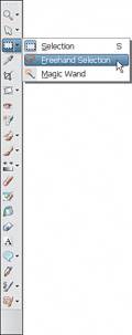
What exactly is a montage? A montage is two or more images layered together in such a way as to fool the viewer into believing that they are one image, even though the circumstances represented may appear unrealor extremely real, for that matter. Many of the projects in this book are examples of montages. Another way to make basic selections is with the Selection tool (see Figure B.11). Figure B.11. The toolbar with the Selection tool selected. Setting the Selection type after choosing the Selection tool enables you to select areas in a wide variety of shapes, from rectangles and ellipses to stars, arrows, and more. You can set the Mode to Replace (create a new selection with the tool), Add (add to an existing selection), or Remove (remove some of the already selected area). Using these settings, you can create some pretty complex shapes and then use other tools, such as the Freehand Selection tool, to do a little refining. Complex SelectionsMore complex selections are possible. In fact, many of the projects in this book require some level of complexity in the creation of the necessary selections. Many techniques can be used. The choices depend on your level of skill and proficiency with the tools (both of these come from spending time in front of the computer making these types of selectionsthere's no substitute for practice). Of course, working your way through the projects in this book and then applying the ideas presented in the projects to your own images will give you much of the practice you need. The best part of all is that the practice will be fun (at least, I think it's fun) and at the end of it all, you will have some great images to share with others. The Freehand tool, as described in the previous section, can be used to draw freehand selections (see Figure B.12). This is great if you're a wizard at navigating with your computer mouse or if you're lucky enough to own a graphics tablet. I mostly use this tool to add small bits to or nip small bits out of a preexisting selection. Figure B.12. The toolbar with the Freehand Selection tool selected.
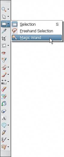
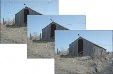
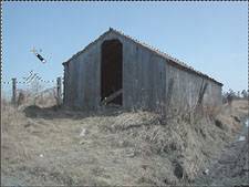
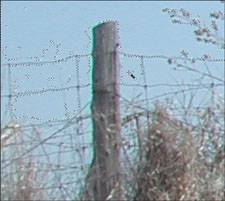
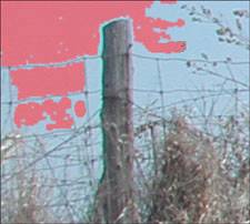
A graphics tablet is a device that plugs into your computer. The drawing surface on a tablet can vary in size from about 4" x 5" to 12" x 18" and even larger. Tablets are supplied with wireless pens that enable you to draw on the surface of the tablet and have that information translated to the computer screen. Tablets cost from about $100 to several hundred dollars or more and are used by many digital artists, from architects to 3D animation artists to digital photographers. I have several made by a company called Wacom. Many of these have been in service for years now, and they still run day in and day out. In fact, I have a 4" x 5" one that travels to school with me in my bag when I'm teaching graphics software classes. You can find more information at Wacom.com or by typing "graphic tablet" into your favorite search engine. It can take a little time for some people to get used to drawing on the tablet while the mouse cursor moves on the screen, but it's worth the cost both in dollars and in the time it takes to get up to speed. You'll probably start to think of your computer mouse as a boat anchor or a brick on a chain, and you'll never want to draw on your computer again without a pen and tablet. The Magic WandBy far, one of the most useful tools for the projects in this book is the Magic Wand (see Figure B.13). Figure B.13. The toolbar with the Magic Wand being selected. The Magic Wand can be used to select areas of the image with a common color. When you choose and manipulate the settings as you make your selection, you'll see that this Magic Wand is indeed magic. Figure B.14 shows a couple of selections made with various settings. The different selections in Figure B.14 were created by clicking in the same spot in the image with a different Tolerance value used each time. Figure B.14. Excuse me while I grab the sky.... Selecting the sky with the Magic Wand. The first time I set the Tolerance to 10, the second time to 20, and the third time to 30. Notice how the selected area is larger with each increase in the Tolerance setting. The problem is that, as more of the sky is selected, there's a chance that some other areas (in this case, the small tree and part of the wire fence) get selected when the Tolerance is set too high. We get some great power in this tool, but at a cost. The trouble is not the tool but light. Some of the color of the sky appears in the objects we see in the photograph. That's the nature of light. Unfortunately, this reality makes it difficult to select some areas of an image without selecting other parts. The trick is to play with the settings and work in smaller bites. For example, keep the Tolerance setting low (10 seems a good place to start because the settings range from 0 to 255); set the Mode to Add; and click several times in the image, selecting more and more as you go. Figure B.15 is the result of clicking about six times in the image. Although this took several clicks, it is the best result of the four. From here, I'd probably zoom in to the fence area, set the Tolerance even lower, and start grabbing the areas between the wires of the fence. Figure B.15. Selecting more by selecting lessusing consecutive clicks with a lower Tolerance setting. Figure B.16 shows how more of the image can be selected by setting the Tolerance as low as 4 and clicking in the smaller areas you want selected. Zooming in helps with cursor placement. Figure B.16. Zooming in and selecting even more pixels using consecutive clicks with an even lower Tolerance setting. Although this seems like it can be time-consuming (and it can, by the way), it really is necessary to get the parts of the image you want. In fact, all this hard work might not even yield the final result. You might have to go in really close and use the Eraser, or some other combination of tools, to fine-tune the selection. Wouldn't it be really cool if you could just use the paint tools to create a selection, or at least modify one? Actually you can. To see how this works, make a selection, such as the one I've been building here with the sky background, and then choose Selections, Edit. When you do, you'll see that some of your imagethe part(s) you've already selectedis partially covered with a semitransparent red (see Figure B.17). Figure B.17. Back in the day, when graphic artists used sharp knifes to cut out parts of an image (aren't you glad you have that computer now?), the red was actually semitransparent plastic sheets knows as rubylith. When you're in the Selection Edit mode, you can use the Paintbrush tool to virtually paint your selection. Simply select the Paintbrush tool and set the values you want to use: big or small brush, soft-edged or harder. Use White to add to the selection and black to subtract from it. You aren't painting on the image, so don't worry. When you're done, simply choose Selections, Edit again to return to editing the image. You'll see that the selection has changed where you painted the changes. This is a powerful tool! Practice with it as much as you can and you'll gain that time back in savings when you make complex selections. After you have the areas selected, you can do a number of things. In the example with the old farm building, you might want to invert the selectionthat is, select the building and ground instead of the sky. You'd do so by selecting the sky (you didn't think we'd click a million and a half times over the building and the ground, did you?) and then choosing Selections, Invert. See, that wasn't so hard. A couple of other settings might need your attention. You can set the Match mode, although the default RGB will serve you well in most cases. Keep an eye on the Use All Layers and Contiguous (contiguous is just a fancy way of saying stuck together) check boxes. These will also have an impact on your selection. Finally, the Feather and Anti-alias settings can also play important roles. I usually set the Anti-alias option to On and change the Feather setting depending on the image and the situation. It can be handy when blending an area of one image with a totally new background or for creating vignette effects. Note that vignettes are usuallythough not alwaysportraits and that the distinguishing feature is a softly blurred outer edge that blends into white or black. Modifying SelectionsIf creating the selections isn't enough, you can also modify them after you've created them. Under the Selections menu, you'll find ways to expand and contract the selection (see Figure B.18). You also can use the Select Similar option. This is the second most important and powerful tool. At least I think it is when it comes to helping with your Paint Shop Pro selections. Figure B.18. Modify your selection using one of the menu choices.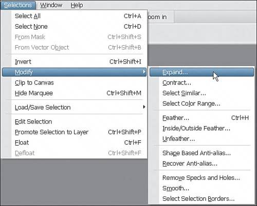 Choose Selections, Modify, Select Similar to bring up the Select Similar dialog box (see Figure B.19). Figure B.19. Refine your selection using Select Similar. From the Select Similar dialog box, you can refine the selection using the Tolerance, Contiguous/Discontiguous, and Anti-alias settings. You can expand the dialog box, as I've done in Figure B.18, by clicking and dragging its lower-left corner. Doing so can help you decide whether you've gone too far or if you still have a ways to go in making the perfect selection by presenting a larger preview. Even with all these tools, techniques, and more, you might finally have to resort to zooming in close and erasing pixels. This should be done later in the process when you can see how the layers interact. Whatever it takes to make the image believable is what you'll have to do. You do want people to believe that you really photographed those UFOs, right? Saving and loading SelectionsYou didn't actually think I'd leave you hanging, did you? I know how hard it was to make that selection. I've been there, gazing lovingly at the selection like a proud parent and then freaking out when I discover that over an hour has gone by. Ack! After spending that much time doing something on the stupid computer, there better be a way to preserve it, like writing it somewhere in bits and bytes a hundred times and then burning it to a CD and a couple of DVDsjust in case. Besides the time involved, you might find that you're spending more time wandering around with everything looking like it's pixelatedkind of like when your satellite dish freaks out during a storm and your television picture breaks up. I know it's uncomfortable, but it'll go away in a couple of hours and then you'll be able to enjoy all your hard work...I promise. The best part is that preserving and retrieving your hard work is easy, and certainly far easier than it was to create it. With your selection created, simply choose Selections, Load/Save Selection, Save Selection to Disk. Doing so brings up the Save Selection to Disk dialog box, enabling you to save your hard work in a file. Later, you can choose Selections, Save/Load Selections, Load Selection from Disk to retrieve your selection. Note that this method of saving and loading selections you've created means that you can reuse one selection you created with one file for many other files. I'll leave it to your imagination, at least for now, as to what that can mean in terms of your creativity. If you're done brushing up on your selection techniques, I suggest you pick a project and put it to the test. Good luck, and happy selecting and montaging. The Pen ToolFor quite a while now, Paint Shop Pro has offered vector-based tools. This means you can create razor-sharp graphics to go with your razor-sharp digital photographs. Vector-based graphics are a bit different from bitmapped or raster graphics. Raster-based images are like the photographs you take with your digital camera. They are made up of a collection of dots laid out in a grid. Vector-based images are based on math formulae (not to worry, you don't have to go back to math class to use the vector toolsPaint Shop Pro X takes care of that part for you). So, rather than a collection of dots making up a circle, the vector-based circle is a formula that might consist of things like the x, y point where the center is located, what the radius is, the color of the stroke (outline), the color or texture of the fill, and so on. Therefore, you manipulate vector graphics with tools that are different from the ones you use with the pixels that make up the raster-based layers in your image. You don't, for example, use the Eraser tool to remove bits of the circle you can create using the Ellipse tool. Instead you use the Pen tool in Knife mode (see Figure B.20). Figure B.20. Using the Knife mode of the Pen tool to dissect a vector circle. The black area is a raster shape that was created by making and filling a selection using the Selection tool and the Flood Fill tool. The red area is part of the vector-based ellipse. They resemble each other but are very different. Another difference is in how you change the color of the two areas. With the raster-based layer, you can simply select the Flood Fill tool, select a color, and click in the area you want changed. Figure B.21 shows the black area changed to a bright purple. Figure B.21. Changing the color of a raster-based area of an image. Note how some of the black is still left around the perimeter of the formerly black area. This is one of the problems that can pop up when you're painting with raster tools. With the vector-based shape, though, you can simply double-click the shape with the Pick tool to bring up the Vector Property dialog box. Take a look at Figure B.22 to see some of the available options. Figure B.22. Changing the color of a vector-based area of an image. Note how no red halo is left over with this color change. With vector-based objects, the change is made, in memory, to the attributes of the shape and the shape is redrawn. Let's get back to the reshaping I mentioned previously. Before I used the Knife mode with the Pen tool on the vector shape, I changed the vector shape by right-clicking it with the Pen tool and selecting Convert to Path. That took the ellipse shape I had drawn and turned it into a path. The difference here is that after the shape becomes a path, I can do more than change the colors and dimensionsI can move around the points that make up the path. In Figure B.23, I'm changing the shape of the path using the Pen tool to drag one of the handles of an end point of the path. Figure B.23. Changing the shape of a vector-based area of an image. You can also reshape a path by dragging the end points. As well, you can change the nature of the path as it relates to the points. That is, you can alter the points by selecting Asymmetric, Symmetric, Cusp, or Smooth. Asymmetric points have two control handles so the curve can be different on each side of the point. Symmetric points have two handles, but they are dependent on one another. Cusp points have sharp transitions or bends in them. Smooth points are, well, smooth. Right-click, point to a vector path, and choose any of these modes to see how the points and the lines/curves on each side of the points are affected. There are many other choices you can make from the menu that appears when you click a path. I won't go through them all, but you should take a moment to explore some of them. There are many that you might never use, but there are some that will get a constant workout. You can draw freehand lines, point-to-point lines, and Bézier curves with the Pen tool. When you draw a curve, don't fret if it isn't perfect the first time. And, whatever you do, don't start over. Because vectors are easily edited, simply drag the points around until you get the path you need. Don't forget to start with a predefined shape by drawing one with the various shape tools (Ellipse, Rectangle, and so on). After you have a basic shape, right-click the shape and convert it to a path. You'll then be free to use the Pen tools to bend and manipulate the shape/path. Other Tools and SettingsMany more tools and settings are available than can be represented in a book of this nature. I've covered all the tools that are used to create the projects in this book, and I invite you to use your new-found knowledge and confidence in your abilities to explore the other parts of Paint Shop Pro X. If you've backed up an image you're working on, you have nothing to lose but timeand believe me, any time you invest in playing around with this amazing graphics software will come back to you many times over. Have fun and enjoy yourself. |


EAN: 2147483647
Pages: 109