Chapter 13. AWT Components
 | CONTENTS |  |
|
Topics in This Chapter
-
The Component class
-
Creating lightweight components
-
The major types of windows, including Panel, Applet, Frame, and Dialog
-
Closing a Frame from a browser Applet
-
Putting menus in Frames
-
Creating scrollable windows
-
Using object serialization to save components to disk and reload them
-
Processing events in GUI controls
-
The major types of controls including labels, buttons, check boxes, list boxes, and textfields
The Abstract Window Toolkit (AWT), introduced in the first release of Java, provides basic window and control components for creating GUI programs. Since the release of the Java 2 Platform, the AWT components are now superseded by the newer Swing components (covered in Chapter 14, "Basic Swing," and Chapter 15, "Advanced Swing"). However, the only popular browser that currently supports Swing is Netscape 6; Swing is unsupported in earlier versions of Netscape and Internet Explorer without installation of the Java Plug-In (see Section 9.9), or including the required Swing classes in a JAR file for downloading along with the applet. So, if you are delivering Java content to customers over the Internet in Web pages, the best solution is to use the AWT components. In this chapter, we present the major types of windows and controls available in the AWT and discuss how to handle user events in the GUI controls. The Java 1.1 AWT API is supported by Netscape 4.06 and later, and Internet Explorer 4.0 and later.
The AWT has eight major types of windows for user interfaces: Canvas, Panel, Applet, ScrollPane, Frame, Dialog, FileDialog, and Window. Some windows (such as Panel and ScrollPane) are borderless and can only be placed in other windows; others (such as Frame and Dialog) have borders and title bars and can pop up anywhere on the screen. An Applet is the starting point for Web-embedded applets and remains the main driving force for still using the AWT components. A Frame is the base window for graphical applications. However, for most stand-alone graphical applications you would use the Swing components. Nonetheless, the AWT Frame still has an important role, since a Frame can be opened from an applet, creating a multiple-window user interface from a browser.
In the following sections, we describe each of the eight window types, summarizing their major purposes, their standard layout manager, the steps required to create and use them, and an example of their use. Separate sections are devoted to the Component and Container classes, the bases on which the windows are built.
After presenting the basic window types, we review the general approach for processing events in your program and then cover the major GUI controls (or "widgets") available in the AWT: buttons, check boxes, radio buttons, list boxes, textfields, labels, scollbars, and pop-up menus. All these GUI control components (as well as the major windowing components) can receive mouse and keyboard events; however, many of components use custom events for user input. For example, a List receives ItemSelectionEvents, and a Scrollbar receives AdjustmentEvents. For each major GUI control, we summarize the use of the component and the method of processing events.
GUI controls have their own graphical representation that you should not attempt to tamper directly with; the paint method is not used at all. Instead, the GUI controls adopt the look and feel of the operating system on which they are running (through a native "peer"), leaving interfaces that allow the user to change only certain aspects of their appearance. This feature is a two-edged sword. On the one hand, it lets you easily adapt to multiple platforms and saves you from the myriad details that implementing GUI controls yourself would require. On the other hand, you have only limited control over these graphical objects. For instance, you can always change the labels of buttons, but you can never change their shape, border thickness, or the means for clicking them.
Technically, you can create a custom AWT component that inherits directly from the Component class and that is lightweight and has no associated native window-system peer. For a custom component, you can override the paint method to create your own borders and colors. We present an example of a lightweight canvas to create a circle whose borders are transparent.
13.1 The Canvas Class
A Canvas is the simplest window and cannot contain any other GUI controls. Furthermore, you must place a canvas inside an existing window because a canvas cannot stand alone. As such, a Canvas does not have a layout manager. A canvas has two major roles:
-
Drawing area. Suppose that you have a complicated GUI and want to create a custom graph or image. Rather than directly drawing into the underlying window, you may find it more convenient to insert a separate Canvas on which to perform the drawing. Note, however, that the Canvas should draw itself by overriding the paint method.
-
Custom component. The Canvas is also the starting place for many custom components, for instance, an image label or image button.
Both approaches require you to subclass Canvas, so specialized extensions to the Canvas class are more common than direct instances of Canvas. Due to interaction of the default update and paint methods in a Canvas, looking up the Graphics object (i.e., getGraphics) of the Canvas for drawing into by an external class is not very reliable. Instead, the external routines should set some data that the Canvas knows about and then invoke the repaint method of the Canvas when drawing is required.
Core Approach
 | Windows that need to draw should override paint to draw themselves. Don't try to get the Graphics object of another window and draw into it. |
Creating and Using a Canvas
The basic steps for creating and using a Canvas are shown below:
Canvas canvas = new Canvas(); // Create the canvas. canvas.setSize(width, height); // Resize the canvas. add(canvas); // Add the canvas to a Container. // Or, for other layout managers, add(canvas, region); By default, the size of a Canvas is 0 pixels by 0 pixels, so if you forget to set the size of the canvas, then your Canvas won't show up. A few exceptions to this rule exist, such as when you put a Canvas into the Center region of a BorderLayout; see Chapter 12 (Layout Managers).
Core Alert
| | Don't forget to give a size to your Canvas. |
Example: A Circle Component
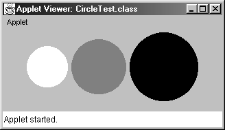
Listing 13.1 gives an example of a simple custom component one that draws a circle on the canvas. Use of a canvas does not require any modifications to the paint method of the window using it. Instead, you simply add the canvas to a window (Listing 13.2) and let Java take care the rest. The canvas is automatically redrawn whenever the window is covered and reexposed, or positioned by the layout managers if the enclosing window uses one. The result is shown in Figure 13-1. In this example, we let the Applet decide where to place the circles. In Chapter 12 (Layout Managers), we show you how to position the components by using different layout managers.
Figure 13-1. A Canvas can be used to create a new type of graphical component.
Listing 13.1 Circle.java
import java.awt.*; /** A Circle component built using a Canvas. */ public class Circle extends Canvas { private int width, height; public Circle(Color foreground, int radius) { setForeground(foreground); width = 2*radius; height = 2*radius; setSize(width, height); } public void paint(Graphics g) { g.fillOval(0, 0, width, height); } public void setCenter(int x, int y) { setLocation(x - width/2, y - height/2); } } Listing 13.2 CircleTest.java
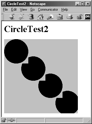
import java.awt.*; import java.applet.Applet; /** Insert three circles into an Applet using FlowLayout. */ public class CircleTest extends Applet { public void init() { setBackground(Color.lightGray); add(new Circle(Color.white, 30)); add(new Circle(Color.gray, 40)); add(new Circle(Color.black, 50)); } } In the AWT, all graphical components are rectangular and opaque. This means that the circles cannot overlap or even be arbitrarily close together without interfering with each other. To illustrate this behavior, Listing 13.3 creates multiple circles aligned diagonally in the window. As can be seen in Figure 13-2, the corners of the underlying Canvas block part of the neighboring circles. When using an event handler for a circle, you would need to filter out mouse clicks that fall outside the area of the circle and explicitly pass them to the enclosing window.
Figure 13-2. In the AWT, windows and GUI controls are rectangular and opaque.
Core Note
| | In the AWT, all windows and graphical components are rectangular and opaque. |
Listing 13.3 CircleTest2.java
import java.awt.*; import java.applet.Applet; /** Position circles down the diagonal so that their borders * just touch. Illustrates that AWT components are * rectangular and opaque. */ public class CircleTest2 extends Applet { public void init() { setBackground(Color.lightGray); setLayout(null); // Turn off layout manager. Circle circle; int radius = getSize().width/6; int deltaX = round(2.0 * (double)radius / Math.sqrt(2.0)); for (int x=radius; x<6*radius; x=x+deltaX) { circle = new Circle(Color.black, radius); add(circle); circle.setCenter(x, x); } } private int round(double num) { return((int)Math.round(num)); } } 13.2 The Component Class
All windows and GUI controls in the AWT inherit from the Component class. Below, we summarize the more common methods in the class.
public void add(PopupMenu menu)
public void remove(MenuComponent menu)
The add method associates a PopupMenu with the component. The menu won't pop up automatically; use show in the PopupMenu class to display the menu. The remove method removes the menu from the component.
public void addNotify()
public void removeNotify()
The addNotify method creates the "peer" (native window system object) associated with the component. If the component peer needs to exist before some action is performed, then call this method (or setVisible). For custom components, be sure to call super.addNotify to ensure that the peer is created. The removeNotify method destroys the native resource (peer). The method names are a bit unintuitive; the addNotify and removeNotify methods probably should have been called createPeer and destroyPeer.
public void addXxxListener(XxxListener listener)
public void removeXxxListener(XxxListener listener)
These two methods add and remove event listeners, where Xxx is one of the following listeners: Component, Focus, InputMethod (Java 2), Key, Mouse, MouseMotion, PropertyChange (Java 2). See Section 11.5 (The Standard Event Listeners) for more information.
public boolean contains(int x, int y)
public boolean contains(Point p)
These methods determine whether the specified location is inside the component.
protected final void disableEvents(long eventsToDisable)
protected final void enableEvents(long eventsToEnable)
These methods turn off and on the specified events for the component, respectively. See the AWTEvent class for input event types (masks).
public final void dispatchEvent(AWTEvent event)
This is a low-level event handling method for dispatching events to the component.
protected void firePropertyChange(String propertyName, Object oldValue, Object newValue) [Java 2]
The firePropertyChange method places a PropertyChangeEvent on the event dispatch queue. The event is dispatched to any registered PropertyChangeListeners.
public float getAlignmentX()
public float getAlignmentY()
These methods can be overridden to provide alignment information, where a value of 0.0f should be interpreted to align the side closest to the x or y axis (i.e., left and top, respectively), 0.5f should be interpreted to align the centers, and 1.0f to align the side farthest from the axis (i.e., right and bottom). The default value for both is 0.5f. The Component class defines five associated constants: TOP_ALIGNMENT (0.0f), CENTER_ALIGNMENT (0.5f), BOTTOM_ALIGNMENT (1.0f), LEFT_ALIGNMENT (0.0f), and RIGHT_ALIGNMENT (1.0f).
public Color getBackground()
public void setBackground(Color bgColor)
These two methods return and set the background color of the component, respectively.
public Rectangle getBounds()
public void setBounds(int x, int y, int width, int height)
public void setBounds(Rectangle boundingRectangle)
The getBounds method returns a Rectangle object describing the outside edges of the component. A Rectangle is a nongraphical data structure with x, y, width, and height fields. The remaining two methods change both the size and location of a component. You can replace the combination of setSize and setLocation with setBounds.
public Component getComponentAt(int x, int y)
public Component getComponentAt(Point p)
These methods return the topmost component at the specified location. The component itself is returned if there is no nested component at the location; null is returned for coordinates outside the component.
public Cursor getCursor()
public void setCursor(Cursor cursor)
The getCursor method returns the current cursor. Use setCursor in any Component to set the cursor display. To obtain a Cursor object, call Cursor.getPredefinedCursor(type), where type is one of the constants defined in the Cursor class: CROSSHAIR_CURSOR, DEFAULT_CURSOR, E_RESIZE_CURSOR, HAND_CURSOR, MOVE_CURSOR, N_RESIZE_CURSOR, NE_RESIZE_CURSOR, NW_RESIZE_CURSOR, S_RESIZE_CURSOR, SE_RESIZE_CURSOR, SW_RESIZE_CURSOR, TEXT_CURSOR, W_RESIZE_CURSOR, or WAIT_CURSOR.
public Font getFont()
public void setFont(Font f)
The getFont method returns the current font, either from a setFont call or inherited from the enclosing window. The Graphics object used in paint and update also inherits the component font.
public FontMetrics getFontMetrics(Font f)
Given a Font, getFontMetrics returns a FontMetrics object. Use this object to find the width and height of characters or strings in the specified font.
public Color getForeground()
public void setForeground(Color fgColor)
These two methods return and set the foreground color of the component. The foreground color is inherited by the Graphics object of the component.
public Graphics getGraphics()
This method returns a Graphics object that can be used to draw onto the component. The Graphics object is initialized with the component's font and foreground and background colors.
public Point getLocation()
public void setLocation(int x, int y)
public void setLocation(Point p)
The getLocation method returns a Point object (with x and y fields) describing, in the enclosing window's coordinate system, the top-left corner of the window. See getLocationOnScreen for retrieving the absolute coordinates. The setLocation methods move the top-left corner of the component to the specified position in the enclosing window's coordinate system. If the parent window is using one of the standard layout managers, then setting the location can be undone by the layout manager.
public Point getLocationOnScreen()
This method returns the absolute location of the component's top-left corner. For applets, however, you cannot obtain the absolute location of the component on the screen.
public Dimension getMinimumSize()
public Dimension getMaximumSize()
public Dimension getPreferredSize()
These methods return a Dimension object (with x, y, width, and height fields) describing the smallest, largest, or preferred size of the component. Layout managers use these values and should not resize components beyond these bounds if possible.
public Container getParent()
This method returns the enclosing window (null in the case of a Frame or a Component not yet associated with a window).
public Dimension getSize()
public void setSize(int width, int height)
public void setSize(Dimension d)
The getSize method returns the current size of the component as a Dimension object. A Dimension has width and height fields. The setSize methods change the width and height of the component by calling setBounds with the specified width and height and the current top-left corner location.
public Toolkit getToolkit()
This method returns the Toolkit, which is used to load images (getImage), find the available fonts (getFontList), look up the screen size (getScreenSize), resolution (getScreenResolution), and so forth.
public void invalidate()
public void validate()
The invalidate method sets an internal flag, indicating that the component and all nested components are no longer valid and should be laid out again before painting. The validate method works in coordination with the Container class to update the layout of the component and all nested components.
public boolean isEnabled()
The isEnabled method determines whether a component is enabled. See setEnabled.
public boolean isFocusTraversable()
The isFocusTraversable method determines whether the component will receive the input focus when the user uses Tab or Shift-Tab. If not, the component can still explicitly request the focus with requestFocus.
public boolean isShowing()
public boolean isVisible()
The isShowing method determines whether the component is visible and that the window holding it is showing. The isVisible method determines whether the component is currently visible. Even if the isVisible method returns true, the component won't appear if the containing window is not visible.
public boolean isValid()
The isValid method determines whether the component is valid. See validate and invalidate.
public void list()
public void list(PrintStream stream)
public void list(PrintStream stream, int indentation)
public void list(PrintWriter writer)
public void list(PrintWriter writer, int indentation)
These methods print information about the component and subcomponents, traversing the tree in depth-first order and printing nested components indented relative to their parents. These methods are useful during development, since calling list on the top-level window (i.e., the Applet or Frame) gives information on every component in the application.
Core Approach
| | The list method is a valuable debugging tool, especially when you are first learning about windows and GUI controls. |
public void paint(Graphics g)
The paint method is called whenever the user calls repaint or when the component is obscured and reexposed. Override this method to perform graphics operations in a component. If paint is called because part of the component has been covered, the clipping region of the Graphics object is set to that area.
public void paintAll(Graphics g)
This method paints the component and any nested components.
public boolean prepareImage(Image image, ImageObserver observer)
public boolean prepareImage(Image image, int width, int height, ImageObserver observer)
These methods start the loading of the image data for the associated Image. They are used to preload images with Graphics.drawImage before you draw with them. For more information on loading images, see Section 9.12 (Drawing Images). Note that scaled images are treated as new images, so if you are going to draw an image at a size other than the default, you have to call prepareImage with that size. A value of true is returned if all the image data is already available; otherwise, false.
public void print(Graphics g)
public void printAll(Graphics g)
These methods print the component if the Graphics object implements the PrintGraphics interface. The default implementations do nothing but call paint and paintAll.
public void processXxxEvent(XxxEvent event)
This method processes the associated enabled, low-level events (see enableEvents). The type of event, Xxx, is any of the following: Component, Focus, InputMethod (Java 2) Key, Mouse, or MouseMotion. For more information on events, see Chapter 11 (Handling Mouse and Keyboard Events).
public void repaint()
public void repaint(int x, int y, int width, int height)
public void repaint(long milliseconds)
public void repaint(long milliseconds, int x, int y, int width, int height)
These methods ask the AWT thread to asynchronously call update as soon as possible (or after the specified number of milliseconds). This action places a PaintEvent on the event queue. Upon reaching the front of the queue, PaintEvent is dispatched to update, which normally results in the screen being cleared, followed by a call to the paint method. If a rectangular region is specified, it is used for the clipping region of the Graphics object in update and paint.
public void requestFocus()
This method is called when the component is to receive the input focus. For instance, you could use requestFocus so that clicking on a certain Button results in a given TextField receiving the focus.
public void setEnabled(boolean enabledFlag)
The setEnabled method enables (true) or disables (false) an AWT component. On most operating systems, disabling a GUI control such as a button results in the component being grayed out.
public void setVisible(boolean visibleFlag)
The setVisible method makes an AWT component visible (true) or invisible (false).
public void transferFocus()
This method passes the input focus to the next component in the Tab order. The tabbing order of AWT components is determined by order in which the components were added to the window.
public void update(Graphics g)
This method is called by the AWT event dispatch thread after the user calls repaint. The default implementation clears the screen and then calls paint(g), but it is common to override update to simply call paint. This approach is particularly common when you are drawing into an off-screen pixmap. For more details on offscreen drawing, see the discussion on double buffering in Chapter 16 (Concurrent Programming with Java Threads).
13.3 Lightweight Components in Java 1.1
Java 1.1 introduced "lightweight" components that inherit directly from Component and have no associated native window-system "peer." Any region not directly drawn in the paint method will let the underlying component show through. For instance, Listing 13.4 shows a BetterCircle class that uses this approach. The code is similar to the version that used Canvas (Listing 13.1), with the exception that here we have to override getPreferredSize and getMinimumSize to do what Canvas already does: simply report its current size. In general, these two methods should be used to calculate the optimum and minimum sizes for the component. Listing 13.5 shows BetterCircle used in the same way as Circle was used in Section 13.1. As Figure 13-3 shows, the overlapping corners no longer cut into the underlying circle.
Figure 13-3. In Java 1.1, lightweight components can be transparent.

If you use lightweight components in a Container that has a custom paint method, this paint method must call super.paint or the lightweight components will not be drawn.
Listing 13.4 BetterCircle.java
import java.awt.*; /** An improved variation of the Circle class that uses Java 1.1 * lightweight components instead of Canvas. */ public class BetterCircle extends Component { private Dimension preferredDimension; private int width, height; public BetterCircle(Color foreground, int radius) { setForeground(foreground); width = 2*radius; height = 2*radius; preferredDimension = new Dimension(width, height); setSize(preferredDimension); } public void paint(Graphics g) { g.setColor(getForeground()); g.fillOval(0, 0, width, height); } public void setCenter(int x, int y) { setLocation(x - width/2, y - height/2); } /** Report the original size as the preferred size. * That way, the BetterCircle doesn't get * shrunk by layout managers. */ public Dimension getPreferredSize() { return(preferredDimension); } /** Report same thing for minimum size as * preferred size. */ public Dimension getMinimumSize() { return(preferredDimension); } } Listing 13.5 BetterCircleTest.java
import java.awt.*; import java.applet.Applet; /** Position circles down the diagonal so that their borders * just touch. Illustrates that Java 1.1 lightweight * components can be partially transparent. */ public class BetterCircleTest extends Applet { public void init() { setBackground(Color.lightGray); setLayout(null); BetterCircle circle; int radius = getSize().width/6; int deltaX = round(2.0 * (double)radius / Math.sqrt(2.0)); for (int x=radius; x<6*radius; x=x+deltaX) { circle = new BetterCircle(Color.black, radius); add(circle); circle.setCenter(x, x); } } private int round(double num) { return((int)Math.round(num)); } } The ability to create components that are lightweight permits development of controls that truly appear the same across all platforms. This capability is so beneficial that nearly all Swing components are lightweight and do not rely on peer components for drawing. See Section 14.1 (Getting Started with Swing) for a discussion of lightweight Swing components.
13.4 The Panel Class
A Panel is a borderless window that can contain GUI controls and nested windows. Like Canvas, a Panel is not a stand-alone window, and you need to place the Panel in an existing window. A Panel has two major purposes:
-
Grouping or organizing other components. For complex GUI layouts, you may want to break the display into rectangular regions, embedding each in a Panel. Each Panel is then in charge of laying out the components it contains, and the top-level layout simply has to put the panels in the proper positions.
-
Creating a custom component that requires embedded components.
Default LayoutManager: FlowLayout
Windows that can hold other components (i.e., Containers) use a LayoutManager to help them arrange their components. Components can have different sizes depending on the operating system; therefore, layout managers automatically help to position the components when the window size changes or when components are added and removed from the window
The FlowLayout layout manager respects the preferred size of the components and places them in rows, left to right, centered horizontally and vertically. Furthermore, a Panel's own preferred size is calculated to be just barely large enough to enclose the components that it contains. This means that if you put a Panel into some other window that is using FlowLayout, the Panel may shrink or stretch. In fact, if you put an empty Panel into a Container that is using FlowLayout, your Panel is shrunk to a width and height of zero and will not show up at all.
Core Warning
| | If you put an empty Panel into a Container that is using FlowLayout, your Panel will disappear. |
Creating and Using a Panel
In the following sections, we illustrate the basic steps for creating and using a Panel. Since the preferred size of a Panel is determined by the size of the contained components, a Panel is usually not given an explicit size before being added to a Container. The general approach for creating a panel is shown below.
// Create the Panel. Panel panel = new Panel(); // Add components to the Panel. panel.add(someComponent); panel.add(someOtherComponent); // Add the panel to a container. If FlowLayout, container.add(panel); // Or if a BorderLayout, container.add(panel, region); Example: Using a Panel for Grouping
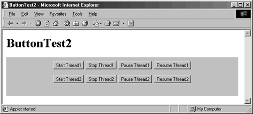
Here's an example of using a Panel to group buttons. In the first example (Listing 13.6), eight buttons are added to an Applet that is wide enough to hold five buttons side by side. So, the first six buttons are placed in the first row, with the final two buttons placed in the second row (Figure 13-4). However, this is not the best layout, since the first four buttons are related to one topic and the second four buttons are related to another topic. The second example (Listing 13.7) shows a way to group the buttons by placing each set of buttons in a different panel. Figure 13-5 shows the result.
Figure 13-4. Without nested panels, as many components as can fit are packed into each row.
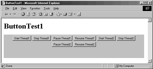
Figure 13-5. Use nested panels to group components together.
Listing 13.6 ButtonTest1.java
import java.applet.Applet; import java.awt.*; /** Eight ungrouped buttons in an Applet using FlowLayout. */ public class ButtonTest1 extends Applet { public void init() { String[] labelPrefixes = { "Start", "Stop", "Pause", "Resume" }; for (int i=0; i<4; i++) { add(new Button(labelPrefixes[i] + " Thread1")); } for (int i=0; i<4; i++) { add(new Button(labelPrefixes[i] + " Thread2")); } } } Listing 13.7 ButtonTest2.java
import java.applet.Applet; import java.awt.*; /** Eight buttons: four each in two panels. */ public class ButtonTest2 extends Applet { public void init() { String[] labelPrefixes = { "Start", "Stop", "Pause", "Resume" }; Panel p1 = new Panel(); for (int i=0; i<4; i++) { p1.add(new Button(labelPrefixes[i] + " Thread1")); } Panel p2 = new Panel(); for (int i=0; i<4; i++) { p2.add(new Button(labelPrefixes[i] + " Thread2")); } add(p1); add(p2); } } 13.5 The Container Class
In Section 13.4 we looked at Panel Java's basic window used to hold other components. Windows that can hold other components are part of the Container class. Being Components themselves, Containers inherit all the methods presented in Section 13.2 (The Component Class). The Container class has the following additional methods.
public Component add(Component c)
public Component add(Component c, Object constraints)
The first method simply inserts the component in the last position in the component array and is used with all standard layout managers. The one exception is BorderLayout, where you must specify a region BorderLayout.NORTH, BorderLayout.SOUTH, BorderLayout.EAST, BorderLayout.WEST, or BorderLayout.CENTER. In addition to these two add methods, the class also provides methods in which you can specify the index in the Container's component array to place the new component. See the java.awt.Container API for details.
public void addContainerListener(ContainerListener listener)
public void removeContainerListener(ContainerListener listener)
These two methods add and remove a container listener from the Container, respectively. Whenever a component is added to or removed from the Container, a ContainerEvent is created and later processed by the container listener.
public int getComponentCount()
This method returns the number of components contained in the container. Components are counted even if they are not visible (see the isVisible method of Component).
public Component getComponent(int position)
The getComponent method returns the Nth element contained in the container (window), where 0 corresponds to the first component added. An ArrayIndexOutOfBoundsException is thrown if you supply an N greater than or equal to the value of getComponentCount.
public Component[ ] getComponents()
This method returns an array of the components contained in the container (window). The array might have zero length but will not be null.
public LayoutManager getLayout()
This method returns the layout manager instance used by the container, or null if there is no layout manager.
public Insets getInsets()
This method returns an Insets object (top, bottom, left, and right fields) describing the margins of the window. The standard layout managers do not draw into these margins. No corresponding setInsets method is available; you have to override getInsets to return a different value than the default (determined by the peer windows) or retrieve the Insets object and modify its public fields.
public boolean isAncestorOf(Component possibleSubComponent)
This method determines whether the specified component is contained anywhere in the containment hierarchy of the window.
public void paint(Graphics g)
public void print(Graphics g)
These methods are inherited from Component. However, there is an important difference in how they are used in containers. If your window contains any lightweight components and you override paint or print, you must call super.paint or super.print to make sure the components are drawn properly. Since you never know whether a lightweight component will be added later, it's a good idea to always call the corresponding supermethods at the end of paint or print.
public void processContainerEvent(ContainerEvent event)
If container events are enabled, this method can monitor them. See Section 11.5 (The Standard Event Listeners) for more information.
public void remove(int Component)
public void remove(int position)
The remove method takes a specified component out of the window. You can also remove the Nth component in the window's component array; a 0 corresponds to the first component added; getComponentCount()-1 corresponds to the last component.
public void setLayout(LayoutManager manager)
This method changes the layout manager. For instance, you could change BorderLayout to FlowLayout for a Frame or tell an Applet to use FlowLayout with a horizontal and vertical gap of 10 pixels instead of 5.
13.6 The Applet Class
An Applet is most commonly used for Java programs embedded in Web pages. Technically, you could use an Applet in a Java application, but a better approach is to simply use a Panel instead, since an Applet inherits from Panel. The layout manager for an Applet is unchanged from the parent Panel class FlowLayout. For more details on using an Applet, see Chapter 9 (Applets and Basic Graphics).
13.7 The ScrollPane Class
A ScrollPane is a borderless window used to contain something too large to show all at once. In essence, a scroll pane is a window without borders and without a LayoutManager. A ScrollPane can contain only a single component. However, this one component could be a Panel containing many other components.
Creating and Using a ScrollPane
Although several options are available for controlling a scroll pane programmatically, the most common use is to simply place a large Component or Container in the ScrollPane and let the user perform the scrolling through scrollbars. When creating a ScrollPane, you can specify three possible behaviors for the scrollbars: SCROLLBARS_ALWAYS, SCROLLBARS_AS_NEEDED, SCROLLBARS_NEVER. A ScrollPane created through the default constructor uses scrollbars only when they are needed. Below is the basic approach for creating and using a ScrollBar.
// Create the scroll pane, indicating the presence // of scrollbars. ScrollPane pane = new ScrollPane(ScrollPane.SCROLLBARS_ALWAYS); // Size the scroll pane and add to the container. pane.setSize(width, height); add(pane);
Example: ScrollPane with 100-Button Panel
Listing 13.8 shows a simple ScrollPane containing a 100-button Panel. Figure 13-6 shows the result after the horizontal scrollbar is moved to the right. The example makes use of the CloseableFrame class shown in Listing 13.11, which provides support for letting the user close the frame. See Section 13.8 (The Frame Class) for details.
Figure 13-6. A ScrollPane can be scrolled to reveal any part of the enclosed Component that is beyond the bounds of the window.
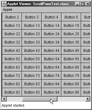
Listing 13.8 ScrollPaneTest.java
import java.applet.Applet; import java.awt.*; /** Places a Panel holding 100 buttons in a ScrollPane that is * too small to hold it. */ public class ScrollPaneTest extends Applet { public void init() { setLayout(new BorderLayout()); ScrollPane pane = new ScrollPane(); Panel bigPanel = new Panel(); bigPanel.setLayout(new GridLayout(10, 10)); for(int i=0; i<100; i++) { bigPanel.add(new Button("Button " + i)); } pane.add(bigPanel); add(pane, BorderLayout.CENTER); } } 13.8 The Frame Class
A Frame is the starting point for graphical applications and for pop-up windows in applets. Most often, a Frame is used to create a stand-alone window. A Frame has a title, menu bar, border, cursor, and icon image. Furthermore, a Frame is a container and can contain other GUI components.
Default LayoutManager: BorderLayout
The BorderLayout manager divides the screen into five regions: NORTH, SOUTH, EAST, WEST, and CENTER. Each region can contain at most one component, and you specify the region when adding the component to the window (e.g., add(component, BorderLayout.NORTH)). A component placed in the NORTH or SOUTH region is placed at the top or bottom of the frame, shrunk to its preferred height (see the preferredSize method of Component), and stretched to the full width of the frame, minus any margins (see the getInsets method of Container). Components placed in the EAST or WEST region are placed at the right or left sides, shrunk to their preferred widths, and stretched to the full frame height, minus any margins and space for NORTH and SOUTH. The CENTER region gets whatever is left. If you are already familiar with applets but not frames, the thing you will probably find most confusing is the layout manager. To switch the layout manager to the more familiar FlowLayout, use setLayout. For more details, see the discussion of BorderLayout in Chapter 12 (Layout Managers).
Creating and Using a Frame
When creating a Frame, you have two general design choices: explicitly defining the size of the Frame through setSize or letting the size of the Frame be determined by the size of the Components that the Frame is holding. Below, we illustrate both approaches.
To create a Frame with a fixed size:
// Create the Frame. Frame frame = new Frame(titleString); // Add any components to the Frame. frame.add(somePanel, BorderLayout.CENTER); frame.add(otherPanel, BorderLayout.NORTH); ... // Set the Frame size. The location will be // in the upper-left corner of the screen. frame.setSize(width, height); // Or ... specify both the size and position. frame.setBounds(left, top, width, height); // Pop up the Frame. frame.setVisible(true);
One of the most common errors people make when first starting out with Frames is forgetting to specify a region in which to add the component. If you simply call frame.add(someComponent), the component is placed in the CENTER region. Subsequent calls to frame.add(someOtherComponent) simply replace the existing component in the CENTER region with the new component.
To create a Frame whose size is determined by the size of the components it is holding:
// Create the Frame. Frame frame = new Frame(titleString); // Position the Frame (optional). frame.setLocation(left, top); // Add any components to the Frame. frame.add(somePanel, BorderLayout.CENTER); ... // Stretch the Frame. frame.pack(); // Pop up the Frame. frame.setVisible(true); By calling the pack method, you create the peer Frame component (see addNotify in the Component class) and the layout manager lays out all the components in the container. The size for the internal window of the Frame is no larger than necessary to hold the components.
If you prefer that the user not be able to resize the Frame, then call setResizeable(false). Furthermore, if you would like to determine the size of the screen before you position the Frame, then you can call getScreenSize from the frame's toolkit, getToolKit. For example, the following would center the frame on the screen.
Toolkit toolkit = frame.getToolkit(); Dimension scrnSize = toolkit.getScreenSize(); Dimension frameSize = frame.getSize(); frame.setLocation((scrnSize.width-frameSize.width)/2, (scrnSize.height-frameSize.height)/2);
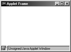
Note that you can pop up frames from applets, but the frames are generally annotated with some marking like "Unsigned Java Applet Window" (Netscape; see Figure 13-7) or "Warning: Applet Window" (Internet Explorer). The warning prevents applets from popping up in official-looking windows that say "Reestablishing lost network connection. Please enter username and password below," then reporting the password found to the applet's author.
Figure 13-7. Frames started by applets typically have warning labels at the bottom.
Frame Examples
Following, we present two examples for creating a Frame. In the first example, Listing 13.9, all the steps for creating the frame are performed in the main method of the class. Specifically, a Frame object (or an object that inherits from Frame) is first instantiated and then assigned to a reference variable. At that point, any changes (setting the frame size, adding components) are performed in the main method through the reference variable. This approach is best suited to simple applications or to situations in which the main GUI interaction is provided through another component, most often a Panel, added to the frame.
Listing 13.9 FrameExample1.java
import java.awt.*; public class FrameExample1 { public static void main(String[] args) { Frame f = new Frame("Frame Example 1"); f.setSize(400, 300); f.setVisible(true); } } In the second example, Listing 13.10, the steps for building the frame are performed in the class constructor. For this approach, the class inherits from a Frame object and provides an entry point, main, for instantiating an instance of itself. The frame properties are then established in the constructor when the object is created. This approach is more common, because it more easily lends itself to good object-oriented design principles and easily supports inheritance for further customization. Often, programmers use this approach to create child frames in a multiframe application, because the constructor provides an entry point for adding a new frame to the parent window and the main method provides an entry point for unit testing.
Listing 13.10 FrameExample2.java
import java.awt.*; public class FrameExample2 extends Frame { public static void main(String[] args) { new FrameExample2(); } public FrameExample2() { super("Frame Example 2"); setSize(400, 300); setVisible(true); } }
A Closeable Frame
By default, a Frame ignores all events, including window-destroy events. So, for the window to properly close, you either need to enable the low-level window events or attach a WindowListener to the Frame. Listing 13.11 shows a CloseableFrame that calls System.exit when the user tries to quit the frame. This class is used as the starting point for graphical applications throughout much of the rest of this chapter. Frames that are popped up from existing windows (e.g., from applets or other frames) should call dispose, not System.exit, when the user tries to close them. Also, since the title bar is part of the Frame, any drawing performed in the top several pixels of the frame will be covered up. So, to draw reliably in frames, you should either read the getInsets values to determine where to start the drawing or add a Container (e.g., Panel) to the CENTER of the frame and perform the drawing in the panel.
Listing 13.11 CloseableFrame.java
import java.awt.*; import java.awt.event.*; /** A Frame that you can actually quit. Used as the starting * point for most Java 1.1 graphical applications. */ public class CloseableFrame extends Frame { public CloseableFrame(String title) { super(title); enableEvents(AWTEvent.WINDOW_EVENT_MASK); } /** Since we are doing something permanent, we need * to call super.processWindowEvent <B>first</B>. */ public void processWindowEvent(WindowEvent event) { super.processWindowEvent(event); // Handle listeners. if (event.getID() == WindowEvent.WINDOW_CLOSING) { // If the frame is used in an applet, use dispose(). System.exit(0); } } } Menus
Frames let you add menu bars that contain one or more menus. To use menus, first create a MenuBar, then create one or more Menu objects. You can add a String (a label), another Menu (a cascading choice), or a CheckboxMenuItem (a choice with a check box) to a Menu. Once you have your menus, place them in the MenuBar by using the MenuBar's add method (to put them left to right) or setHelpMenu method (to put a menu at the far-right corner). Finally, put the MenuBar in the Frame through the Frame's setMenuBar method. To handle events, attach an ActionListener to each Menu and call event.getActionCommand to determine which menu item was selected by the user. Listing 13.12 gives an example that creates a menu of color choices and sets the background color of the Frame whenever a choice is selected. Figure 13-8 shows the result.
Figure 13-8. Frames can contain menu bars.
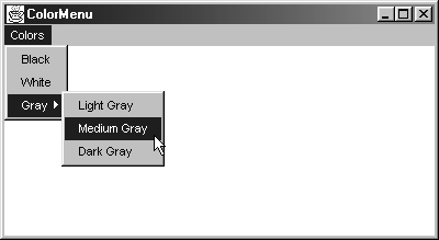
Listing 13.12 ColorMenu.java
import java.awt.*; import java.awt.event.*; /** Illustrates the insertion of menu entries in Frame * menu bars. */ public class ColorMenu extends CloseableFrame implements ActionListener { private String[] colorNames = { "Black", "White", "Light Gray", "Medium Gray", "Dark Gray" }; private Color[] colorValues = { Color.black, Color.white, Color.lightGray, Color.gray, Color.darkGray }; public ColorMenu() { super("ColorMenu"); MenuBar bar = new MenuBar(); Menu colorMenu = new Menu("Colors"); for(int i=0; i<2; i++) { colorMenu.add(colorNames[i]); } Menu grayMenu = new Menu("Gray"); for(int i=2; i<colorNames.length; i++) { grayMenu.add(colorNames[i]); } colorMenu.add(grayMenu); bar.add(colorMenu); setMenuBar(bar); colorMenu.addActionListener(this); grayMenu.addActionListener(this); setBackground(Color.lightGray); setSize(400, 200); setVisible(true); } /** Catch menu events in the containing Frame. */ public void actionPerformed(ActionEvent event) { setBackground(colorNamed(event.getActionCommand())); repaint(); } private Color colorNamed(String colorName) { for(int i=0; i<colorNames.length; i++) { if(colorNames[i].equals(colorName)) { return(colorValues[i]); } } return(Color.white); } public static void main(String[] args) { new ColorMenu(); } } Other Useful Frame Methods
Following is a quick overview of the methods available in the Frame class. All of the Component and Container methods are available as well, of course.
public void dispose()
This method destroys the Frame's peer (actual native window) and all nested components. Since you cannot call System.exit from applets, a frame launched from an applet should call dispose on a WINDOW_DESTROY event.
Core Approach
| | To close a Frame launched from an Applet, use dispose instead of System.exit. |
public Image getIconImage()
public void setIconImage(Image icon)
These methods let you retrieve or change the image that will be used when the Frame is iconified. The return value of getIconImage is null if you haven't explicitly called setIconImage.
public MenuBar getMenuBar()
public void setMenuBar(MenuBar menuBar)
public void remove(MenuComponent menuBar)
These methods let you retrieve or change the menu bar, as illustrated earlier in this section.
public String getTitle()
public void setTitle(String title)
These methods let you retrieve or change the label in the Frame's title bar.
public boolean isResizable()
public void setResizable(boolean resizeFlag)
By default, users can interactively stretch or shrink frames you create. Call setResizable(false) to suppress this ability; isResizable reports the current setting.
public void pack()
The pack method resizes the Frame according to the preferred sizes of the components it contains.
public void toBack()
public void toFront()
These methods move the Frame to the back or front of the display (i.e., behind or on top of any overlapping windows).
13.9 Serializing Windows
Java 1.1 introduced an extremely useful capability: serialization. This capability lets you save the state of Java objects to disk or to send them over the network. In particular, with a single command (writeObject), you can save the state of a frame or other window, including all subwindows, sizes, locations, colors, and GUI controls. The only restriction is that any objects the window references must be serializable if you want them to be saved with the window. All AWT components are already serializable, and making other objects serializable is a trivial matter of having the class implement the Serializable interface. This interface does not declare any methods, so you can implement it by simply tacking "implements Serializable" onto the class definition. If you have a field you don't want to bother saving, you can declare it transient. The frame can be reconstituted later with a single command (readObject).
Writing a Window to Disk
A standard approach to saving a window is as follows, assuming your code imports java.io.*:
try { FileOutputStream fileOut = new FileOutputStream("SaveFilename"); ObjectOutputStream out = new ObjectOutputStream(fileOut); out.writeObject(someWindow); out.flush(); out.close(); } catch(IOException ioe) { System.out.println("Error saving window: " + ioe); } If you are concerned about disk space, you can interpose a GZIPOutputStream (in java.util.zip) between the FileOutputStream and the ObjectOutputStream, but serialized windows are relatively compact even without compression.
Reading a Window from Disk
Reading the window back in is equally easy:
try { File saveFile = new File("SaveFilename"); FileInputStream fileIn = new FileInputStream(saveFile); ObjectInputStream in = new ObjectInputStream(fileIn); someWindow = (WindowType)in.readObject(); doSomethingWith(someWindow); // E.g. setVisible. } catch(IOException ioe) { System.out.println("Error reading file: " + ioe); } catch(ClassNotFoundException cnfe) { System.out.println("No such class: " + cnfe); } If the window was compressed when saved, you should put a GZIPInputStream between the FileInputStream and the ObjectInputStream.
Example: A Saveable Frame
Listing 13.13 creates a Frame that lets you draw circles by clicking the mouse. After drawing circles, moving the Frame around, and stretching it interactively, you can press Save to store the result on disk. Next time you run the same program, the saved version is automatically loaded: circles, buttons, location, size, and all. Figure 13-9 shows the result after a user adds some circles, quits, and restarts in a later session. The SavedFrame class makes use of two helper classes. CirclePanel is shown in Listing 13.14; it is simply a Panel with a MouseListener that adds circles wherever the mouse is clicked. The circles themselves are instances of the BetterCircle class, shown earlier in Listing 13.4.
Figure 13-9. Serialization lets you save the complete frame configuration to disk. The saved version is automatically used in later sessions.
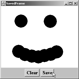
Listing 13.13 SavedFrame.java
import java.awt.*; import java.awt.event.*; import java.io.*; /** A Frame that lets you draw circles with mouse clicks * and then save the Frame and all circles to disk. */ public class SavedFrame extends CloseableFrame implements ActionListener { /** If a saved version exists, use it. Otherwise create a * new one. */ public static void main(String[] args) { SavedFrame frame; File serializeFile = new File(serializeFilename); if (serializeFile.exists()) { try { FileInputStream fileIn = new FileInputStream(serializeFile); ObjectInputStream in = new ObjectInputStream(fileIn); frame = (SavedFrame)in.readObject(); frame.setVisible(true); } catch(IOException ioe) { System.out.println("Error reading file: " + ioe); } catch(ClassNotFoundException cnfe) { System.out.println("No such class: " + cnfe); } } else { frame = new SavedFrame(); } } private static String serializeFilename ="SavedFrame.ser"; private CirclePanel circlePanel; private Button clearButton, saveButton; /** Build a frame with CirclePanel and buttons. */ public SavedFrame() { super("SavedFrame"); setBackground(Color.white); setFont(new Font("Serif", Font.BOLD, 18)); circlePanel = new CirclePanel(); add("Center", circlePanel); Panel buttonPanel = new Panel(); buttonPanel.setBackground(Color.lightGray); clearButton = new Button("Clear"); saveButton = new Button("Save"); buttonPanel.add(clearButton); buttonPanel.add(saveButton); add(buttonPanel, BorderLayout.SOUTH); clearButton.addActionListener(this); saveButton.addActionListener(this); setSize(300, 300); setVisible(true); } /** If "Clear" clicked, delete all existing circles. If "Save" * clicked, save existing frame configuration (size, * location, circles, etc.) to disk. */ public void actionPerformed(ActionEvent event) { if (event.getSource() == clearButton) { circlePanel.removeAll(); circlePanel.repaint(); } else if (event.getSource() == saveButton) { try { FileOutputStream fileOut = new FileOutputStream("SavedFrame.ser"); ObjectOutputStream out = new ObjectOutputStream(fileOut); out.writeObject(this); out.flush(); out.close(); } catch(IOException ioe) { System.out.println("Error saving frame: " + ioe); } } } } Listing 13.14 CirclePanel.java
import java.awt.*; import java.awt.event.*; import java.io.*; /** A Panel that draws circles centered wherever the user clicks * the mouse. <B>Uses a null layout manager.</B>. */ public class CirclePanel extends Panel { class ClickAdapter extends MouseAdapter implements Serializable { public void mouseClicked(MouseEvent event) { BetterCircle circle = new BetterCircle(Color.black, 25); add(circle); circle.setCenter(event.getX(), event.getY()); invalidate(); validate(); } } public CirclePanel() { setLayout(null); addMouseListener(new ClickAdapter()); } } 13.10 The Dialog Class
A Dialog is a stripped-down Frame, useful for applications that don't need all of the capabilities of a Frame. A Dialog has two major roles:
-
A modal dialog that freezes interaction with other AWT components until it is closed. A modal dialog is used in situations that require the user to respond before other processing can continue.
-
A simplified frame (no cursor, menu, icon image). A nonmodal dialog is used in a similar manner to its use in a Frame but requires fewer resources and is faster to pop up.
A Dialog also has a BorderLayout manager that divides the screen into five regions: NORTH, SOUTH, EAST, WEST, and CENTER. See the discussion of BorderLayout in Chapter 12 (Layout Managers).
Creating and Using a Dialog
Using a Dialog is similar to using a Frame except that the constructor takes two additional arguments: the parent Frame and a boolean specifying whether or not the dialog is modal, as shown below.
Dialog dialog = new Dialog(parentFrame, titleString, false); Dialog modalDialog = new Dialog(parentFrame, titleString, true);
To use dialog boxes from applets, you need to find the parent frame by using getFrame method described in Section 13.8 (The Frame Class). Modal dialogs will freeze all mouse/keyboard interaction with other Java components and suspend the calling thread.
Example: A Quit Confirmation Dialog
Listing 13.15 presents a dialog box with two buttons, asking you if you really want to quit. Clicking the Yes button quits the entire application; clicking the No button closes the dialog box itself but leaves the rest of the application alone. Listing 13.16 associates this dialog with the WINDOW_DESTROY event so that the dialog box pops up when the user tries to quit the window. Figure 13-10 shows the result.
Figure 13-10. Modal dialogs freeze interaction with all other Java components.
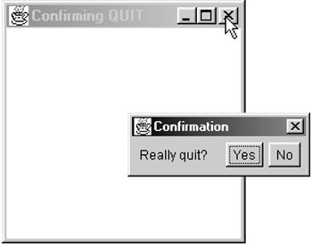
Listing 13.15 Confirm.java
import java.awt.*; import java.awt.event.*; /** A modal dialog box with two buttons: Yes and No. * Clicking Yes exits Java. Clicking No exits the * dialog. Used for confirmed quits from frames. */ class Confirm extends Dialog implements ActionListener { private Button yes, no; public Confirm(Frame parent) { super(parent, "Confirmation", true); setLayout(new FlowLayout()); add(new Label("Really quit?")); yes = new Button("Yes"); yes.addActionListener(this); no = new Button("No"); no.addActionListener(this); add(yes); add(no); pack(); setVisible(true); } public void actionPerformed(ActionEvent event) { if (event.getSource() == yes) { System.exit(0); } else { dispose(); } } } Listing 13.16 ConfirmTest.java
import java.awt.*; import java.awt.event.*; /** A Frame that uses the Confirm dialog to verify that * users really want to quit. */ public class ConfirmTest extends Frame { public static void main(String[] args) { new ConfirmTest(); } public ConfirmTest() { super("Confirming QUIT"); setSize(200, 200); addWindowListener(new ConfirmListener()); setVisible(true); } public ConfirmTest(String title) { super(title); } private class ConfirmListener extends WindowAdapter { public void windowClosing(WindowEvent event) { new Confirm(ConfirmTest.this); } } } 13.11 The FileDialog Class
A FileDialog is a type of modal dialog that is used to load or save files. Use FileDialog with applications; normal applets cannot access the local disk. Although a FileDialog is technically a Container, it cannot hold any other components and has no layout manager. Here are the basic steps for creating and using a FileDialog.
// Make the FileDialog. FileDialog fileLoader = new FileDialog(frame, title, FileDialog.LOAD); FileDialog fileSaver = new FileDialog(frame, title, FileDialog.SAVE); //Set a default file or file type. fileLoader.setFile("*.txt"); // Pop up the FileDialog. fileLoader.show(); // Look up the filename chosen. String filename = fileLoader.getFile(); Example: Displaying Files in a TextArea
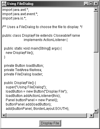
Listing 13.17 shows a Frame that is mostly filled with a large TextArea but that also contains one button at the bottom (see Figure 13-11). When the button is pressed, a FileDialog is displayed (also shown in Figure 13-11) to let the user choose a filename. Once that filename is chosen, a FileInputStream is opened and the file contents are placed in the TextArea (Figure 13-12).
Figure 13-11. The initial Frame shows a Button and an empty TextArea. The FileDialog pops up when the button is pressed.
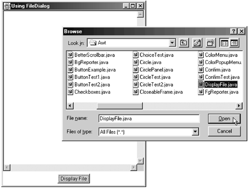
Figure 13-12. After the user chooses a file, it is displayed in the TextArea.
Listing 13.17 DisplayFile.java
import java.awt.*; import java.awt.event.*; import java.io.*; /** Uses a FileDialog to choose the file to display. */ public class DisplayFile extends CloseableFrame implements ActionListener { public static void main(String[] args) { new DisplayFile(); } private Button loadButton; private TextArea fileArea; private FileDialog loader; public DisplayFile() { super("Using FileDialog"); loadButton = new Button("Display File"); loadButton.addActionListener(this); Panel buttonPanel = new Panel(); buttonPanel.add(loadButton); add(buttonPanel, BorderLayout.SOUTH); fileArea = new TextArea(); add("Center", fileArea); loader = new FileDialog(this, "Browse", FileDialog.LOAD); // Default file extension: .java. loader.setFile("*.java"); setSize(350, 450); setVisible(true); } /** When the button is clicked, a file dialog is opened. When * the file dialog is closed, load the file it referenced. */ public void actionPerformed(ActionEvent event) { loader.show(); displayFile(loader.getFile()); } public void displayFile(String filename) { try { File file = new File(filename); FileInputStream in = new FileInputStream(file); int fileLength = (int)file.length(); byte[] fileContents = new byte[fileLength]; in.read(fileContents); String fileContentsString = new String(fileContents); fileArea.setText(fileContentsString); } catch(IOException ioe) { fileArea.setText("IOError: " + ioe); } } } 13.12 The Window Class
Window is the underlying class that Frame is built upon. A Window is used less frequently than the other window types and mainly serves to create pop-up windows with no border or title bar.
Default LayoutManager: BorderLayout
This layout manager divides the screen into five regions: NORTH, SOUTH, EAST, WEST, and CENTER. See the discussion of BorderLayout in Chapter 12 (Layout Managers).
Creating and Using a Window
When creating a Window, you can explicitly state the size of the Window through setSize or let the size of the Window be determined by the Components that the Window is holding. We show both approaches below.
To create a Window with a fixed size:
// Create the Window. Window window = new Window(parentFrame); // Add any components to the Window. window.add(somePanel, BorderLayout.CENTER); ... // Define the size of the Window. window.setSize(width, height); // Or specify both the size and position. size.setBounds(left, top, width, height); // Pop up the Window. window.setVisible(true);
To create a Window whose size is determined by the size of the components it is holding:
// Create the Window. Window window = new Window(parentFrame); // Position the Window (optional). window.setLocation(left, top); // Add any components to the Window. winddow.add(somePanel, BorderLayout.CENTER); ... // Stretch the Window. window.pack(); // Pop up the Frame. window.setVisible(true); Remember that a Window has a BorderLayout manager; when adding a component to a Window, you should specify the region to place the component. Simply calling window.add(someComponent) places the component in the CENTER region of the BorderLayout. Any subsequent calls to add(someOtherComponent) simply replace the existing component located in the CENTER region with the new component.
13.13 Handling Events in GUI Controls
In this section we present the general approach for handling events in GUI controls. Depending on the graphical control, different events are generated. For example, a Button generates ActionEvents and a Checkbox generates ItemEvents. As presented in Chapter 11 (Handling Mouse and Keyboard Events), you can use either high-level or low-level event processing to handle events. The two levels of event processing are briefly reviewed below.
-
High-level event processing. Process the event by attaching a listener to the component, using addXxxListener, where Xxx corresponds to the type of event the component can generate. Then, handle the event in the appropriate method defined by the listener. See Section 11.1 (Handling Events with a Separate Listener) for details.
-
Low-level event processing. Process the event by first enabling the low-level event, using enableEvents with the appropriate AWTEvent mask. Then, handle the event in the component by using processXxxEvent, where Xxx corresponds to the type of event the component can generate. See Section 11.6 (Behind the Scenes: Low-Level Event Processing) for details.
Depending on the component, each defines a specialized event type that is a subclass of the more general AWTEvent class. Specifically, ActionEvents are generated by Button, List, MenuItem, and TextField and are handled through addActionListener or in processActionEvent. Item selection events (ItemEvent) are generated by Checkbox, CheckboxMenuItem, Choice, and List and are handled through addItemListener or in processItemEvent. Textfields and text areas generate both keyboard events (KeyEvent) and text events (TextEvent); they are handled with addKeyListener or addTextListener or in processKeyEvent and processTextEvent, respectively. Scrollbars generate adjustment events (AdjustmentEvent); they are handled with addAdjustmentListener or in processAdjustmentEvent. Furthermore, the mouse and keyboard events (MouseEvent, KeyEvent) discussed in Chapter 11 are also delivered to all components except MenuItem and CheckboxMenuItem.
Two basic designs are available to handle high-level events through listeners: let each component process its own events, or handle the events in a centralized location such as an external component. Here, we describe these two approaches for handling ActionEvents. Processing of other events is handled in a similar manner.
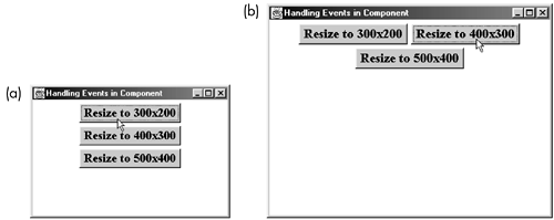
Figure 13-13 presents a frame with three buttons that result in resizing of the frame when pressed by the user. Except for the frame title, the following two examples, decentralized event processing and centralized event processing, result in an identical interface and in identical behavior.
Figure 13-13. Frame after (a) the first button and (b) the second button are pressed.
Decentralized Event Processing
In decentralized event processing, each component is given its own event handling methods; the component itself assumes complete responsibility for processing its own events. Users of the component are unaware of how the events are processed internally. This approach favors the object-oriented approach of encapsulation and modularity. However, information about the container class holding the component is not directly available, and the component will need to be relatively independent of application that it is in. As an example of decentralized event processing, consider that you need a GUI control to handle ActionEvents. You would first create an object that implements the ActionListener interface and then define a method called actionPerformed that takes an ActionEvent as an argument. Next, you associate the event handling method with the object itself through the addActionListener method. In this manner, the object will handle only its ActionEvents.
Listings 13.18 and 13.19 show a decentralized event handler. Here, a customized Button implements the ActionListener interface and provides an actionPerformed method for handling its own ActionEvents. The button itself is identified in the constructor to process the ActionEvents in the statement addActionListener(this). When the user presses the button, the size of the parent container is set to a new width and height. Then, through the invalidate and validate methods, the parent container is requested to lay out its components again and subsequently redisplay itself. Remember to import java.awt.event.*; that's where all the event types are defined.
Listing 13.18 ActionExample1.java
import java.awt.*; public class ActionExample1 extends CloseableFrame { public static void main(String[] args) { new ActionExample1(); } public ActionExample1() { super("Handling Events in Component"); setLayout(new FlowLayout()); setFont(new Font("Serif", Font.BOLD, 18)); add(new SetSizeButton(300, 200)); add(new SetSizeButton(400, 300)); add(new SetSizeButton(500, 400)); setSize(400, 300); setVisible(true); } } Listing 13.19 SetSizeButton.java
import java.awt.*; import java.awt.event.*; public class SetSizeButton extends Button implements ActionListener { private int width, height; private Container parent; public SetSizeButton(int width, int height) { super("Resize to " + width + "x" + height); this.width = width; this.height = height; parent = getParent(); addActionListener(this); } public void actionPerformed(ActionEvent event) { parent.setSize(width, height); parent.invalidate(); parent.validate(); } }
Centralized Event Processing
The second way to process GUI events is centralized event processing, where the events for multiple components are sent to a single ActionListener object. The disadvantage of this approach is that the single listener must first determine the source component from which the event originated before determining what processing to perform. However, from inside the actionPerformed method you can immediately access fields and methods in the ActionListener object, which, in most designs, is the container holding the components. Modularity and encapsulation are sacrificed for ease in accessing information in a common object.
Listing 13.20 gives an example of centralized event processing. In this particular case, the listener object for the three buttons is the window itself. Regardless of which button originates the ActionEvent, the event handling is processed by the single actionPerformed method in the external container. This approach suffers from the need to look up the source button from the ActionEvent object, but it simplifies common access to the private updateLayout method to resize the window.
Although it is sometimes convenient to handle events in the window itself, a variation to this approach is to assign a separate inner class (implementing the ActionListener interface) to each button for event processing. The advantage is that the window's inner classes have direct access to all data fields and methods in the window itself, but because a separate ActionListener is assigned to each button, determination of the event source is no longer needed. See Section 11.3 (Handling Events with Named Inner Classes) for more details on using inner classes for event handling.
Listing 13.20 ActionExample2.java
import java.awt.*; import java.awt.event.*; public class ActionExample2 extends CloseableFrame implements ActionListener { public static void main(String[] args) { new ActionExample2(); } private Button button1, button2, button3; public ActionExample2() { super("Handling Events in Other Object"); setLayout(new FlowLayout()); setFont(new Font("Serif", Font.BOLD, 18)); button1 = new Button("Resize to 300x200"); button2 = new Button("Resize to 400x300"); button3 = new Button("Resize to 500x400"); button1.addActionListener(this); button2.addActionListener(this); button3.addActionListener(this); add(button1); add(button2); add(button3); setSize(400, 300); setVisible(true); } public void actionPerformed(ActionEvent event) { if (event.getSource() == button1) { updateLayout(300, 200); } else if (event.getSource() == button2) { updateLayout(400, 300); } else if (event.getSource() == button3) { updateLayout(500, 400); } } private void updateLayout(int width, int height) { setSize(width, height); invalidate(); validate(); } }
13.14 The Button Class
The Button class creates push buttons with text labels. The Java programming language doesn't have a built-in class that supports buttons with images. The most common usage for a button is to simply create one with a specified label, drop it in a window, then watch for action events when the button is pressed. For instance, to create and add a button to the current window, you would perform the following two steps.
Button button = new Button("..."); add(button); Constructors
The Button class has two constructors.
public Button()
public Button(String buttonLabel)
The first constructor creates a button with no label. You can use setLabel to add a label to the button later. The width reported by preferredSize is greater than zero even when no label is present because the border requires some space. The second constructor creates a button with the specified label. The preferredSize (used by layout managers like FlowLayout and BorderLayout) of the button is based on the height and width of the label based on the current font, plus some additional border space that varies depending on the window operating system.
Example: Applet with Three Buttons
Listing 13.21 shows an applet that contains three buttons. In this particular case, because we don't ever do anything with the buttons, there is no need to assign the Button objects to separate instance variables; simply do add(new Button(...)). However, you will want access to the buttons when you attach a behavior to them, so you might as well plan ahead and store the button references somewhere that will be accessible in other methods. Figure 13-14 shows the result of Listing 13.21 in Netscape 4.7 on Windows 98.
Figure 13-14. Java buttons on Windows 98.
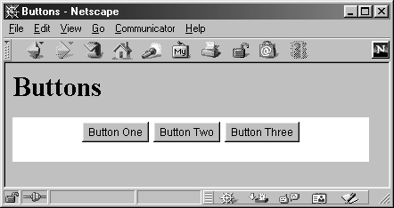
Listing 13.21 Buttons.java
import java.applet.Applet; import java.awt.*; public class Buttons extends Applet { private Button button1, button2, button3; public void init() { button1 = new Button("Button One"); button2 = new Button("Button Two"); button3 = new Button("Button Three"); add(button1); add(button2); add(button3); } } Other Button Methods
Following are the five most common methods in the Button class.
public String getLabel()
The getLabel method retrieves the current label.
public void setLabel(String newLabel)
The setLabel method changes the button's label. If the button is already displayed, changing the label does not automatically resize the button. So, the containing window should be invalidated and validated to force a fresh layout and resize the button with the new label, as below:
someButton.setLabel("A New Label"); someButton.getParent().invalidate(); someButton.getParent().validate();public void addActionListener(ActionListener listener)
public void removeActionListener(ActionListener listener)
These methods add and remove listeners (objects) that process ActionEvents. See the following subsection for a discussion on their use.
public void processActionEvent(ActionEvent event)
This is a low-level, event-processing routine you use when you want a button to handle its own events. If you use this method, don't forget to enable events first with enableEvents and to call super.processActionEvent from within the body of the method. See the following section for examples.
Also, as with every Component (Section 13.2), buttons have getForeground, setForeground, getBackground, setBackground, getFont, setFont, and a variety of other inherited methods.
Handling Button Events
Precisely how Java determines that a button has been activated depends on the operating system. However, activation occurs typically either when the user clicks and releases the mouse on a button or when the user enters a carriage return while the button has the input focus.
Like other action events, button events can be handled in one of two ways. To handle events in the Button object itself, first enable ActionEvents through
enableEvents(AWTEvent.ACTION_EVENT_MASK);
Next, override processActionEvent to perform the specific behavior you want. You should call super.processActionEvent in the body so that if any other listeners are attached to your button, they will still be invoked. Following is an abstract example; for specifics, see SetSizeButton (Listing 13.19).
public void processActionEvent(ActionEvent event) { takeSomeAction(...); super.processActionEvent(event); // Handle listeners. } That's the first possible approach: processing events directly in the Button. The next option is to attach one or more ActionListeners to the button. For this approach, create an object that implements the ActionListener interface, then associate the listener with the button through addActionListener. You would place the code for the action to take when the button is selected in the actionPerformed method of the listener.
In Listing 13.20, the window itself was the ActionListener, but you can provide a listener in a variety of ways. For instance, Listing 13.22 creates three buttons, each with one to three different ActionListeners attached. It associates an FgReporter (Listing 13.23) with the first button, an FgReporter and a BgReporter (Listing 13.24) with the second, and an FgReporter, a BgReporter, and a SizeReporter (Listing 13.25) with the third. Each of these reporters is an ActionListener that simply prints some information about the component that was the source of the action. Figure 13-15 shows the result; the output after the user clicks on the three buttons once each is shown in Listing 13.26.
Figure 13-15. You can attach more than one ActionListener to a component.
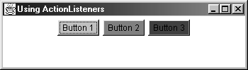
Listing 13.22 ButtonExample.java
import java.awt.*; import java.awt.event.*; public class ButtonExample extends CloseableFrame { public static void main(String[] args) { new ButtonExample(); } public ButtonExample() { super("Using ActionListeners"); setLayout(new FlowLayout()); Button b1 = new Button("Button 1"); Button b2 = new Button("Button 2"); Button b3 = new Button("Button 3"); b1.setBackground(Color.lightGray); b2.setBackground(Color.gray); b3.setBackground(Color.darkGray); FgReporter fgReporter = new FgReporter(); BgReporter bgReporter = new BgReporter(); SizeReporter sizeReporter = new SizeReporter(); b1.addActionListener(fgReporter); b2.addActionListener(fgReporter); b2.addActionListener(bgReporter); b3.addActionListener(fgReporter); b3.addActionListener(bgReporter); b3.addActionListener(sizeReporter); add(b1); add(b2); add(b3); setSize(350, 100); setVisible(true); } } Listing 13.23 FgReporter.java
import java.awt.event.*; import java.awt.*; public class FgReporter implements ActionListener { public void actionPerformed(ActionEvent event) { Component c = (Component)event.getSource(); System.out.println("Foreground: " + c.getForeground()); } } Listing 13.24 BgReporter.java
import java.awt.event.*; import java.awt.*; public class BgReporter implements ActionListener { public void actionPerformed(ActionEvent event) { Component c = (Component)event.getSource(); System.out.println("Background: " + c.getBackground()); } } Listing 13.25 SizeReporter.java
import java.awt.event.*; import java.awt.*; public class SizeReporter implements ActionListener { public void actionPerformed(ActionEvent event) { Component c = (Component)event.getSource(); Dimension d = c.getSize(); System.out.println("Size: " + d.width + "x" + d.height); } } Listing 13.26 ButtonExample output after user presses Button 1, Button 2, and Button 3, once each in that order.
Foreground: java.awt.Color[r=0,g=0,b=0] Foreground: java.awt.Color[r=0,g=0,b=0] Background: java.awt.Color[r=128,g=128,b=128] Foreground: java.awt.Color[r=0,g=0,b=0] Background: java.awt.Color[r=64,g=64,b=64] Size: 59x23
Because AWT buttons do not have built-in support for displaying images, we provide an ImageButton class, based on a Canvas, to support button images. See the on-line archive at http://www.corewebprogramming.com/ for the ImageButton class.
13.15 The Checkbox Class
This section describes check boxes (toggle buttons) that operate independently of other check boxes. In the next section, we'll show you how to put check boxes into a group so that they operate like radio buttons (where pressing one raises the previous selection). Most commonly, you would use the Checkbox class to create a check box with a specified label and then drop it into a window. You can watch for ItemSelectionEvents or simply wait until you need the value and then look it up with getState. The necessary steps to create a check box and place it in a nested window are:
Checkbox cb = new Checkbox("..."); somePanel.add(cb); Constructors
These three constructors apply to check boxes that operate independently of each other. The following section introduces two other constructors that are used with radio buttons.
public Checkbox()
public Checkbox(String checkboxLabel)
public Checkbox(String checkboxLabel, boolean state)
The first constructor creates an initially unchecked check box with no label. The second constructor creates a check box with the specified label. The check box is initially unchecked; see setState for changing the value. The last constructor creates a check box with the specified label, with a checked (true) or unchecked (false) state depending on the boolean value provided.
Example: Checked Checkboxes
Listing 13.27 creates twelve check boxes, placing them in a two-column layout with the even-numbered ones initially checked. Figure 13-16 shows the result on Windows 98.
Figure 13-16. Check boxes in Java on Windows 98.
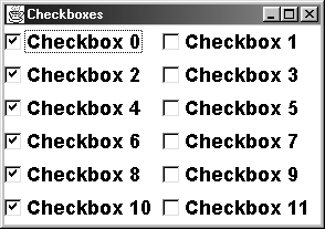
Listing 13.27 Checkboxes.java
import java.awt.*; public class Checkboxes extends CloseableFrame { public static void main(String[] args) { new Checkboxes(); } public Checkboxes() { super("Checkboxes"); setFont(new Font("SansSerif", Font.BOLD, 18)); setLayout(new GridLayout(0, 2)); Checkbox box; for(int i=0; i<12; i++) { box = new Checkbox("Checkbox " + i); if (i%2 == 0) { box.setState(true); } add(box); } pack(); setVisible(true); } } Other Checkbox Methods
Below are eight commonly used Checkbox methods.
public boolean getState()
public void setState(boolean checkedState)
The getState method determines if the check box is checked (true) or unchecked (false). The setState method sets the check box to be checked or unchecked.
public String getLabel()
public void setLabel(String newLabel)
The getLabel method retrieves the current label. The setLabel method changes the label. As with buttons, if the check box is already displayed, changing the label does not automatically resize the check box in its Container. So, the containing window should be invalidated and validated to force a new layout, as illustrated here:
someCheckbox.setLabel("A New Label"); someCheckbox.getParent().invalidate(); someCheckbox.getParent().validate();public void addItemListener(ItemListener listener)
public void removeItemListener(ItemListener listener)
These methods associate or unassociate ItemListeners with the check box. They are discussed further in the following subsection.
public void processItemEvent(ItemEvent event)
This is a lower-level, event-processing method. If you use this method, enable events first and call super.processItemEvent from within the method. See the following subsection for details.
public Object[ ] getSelectedObjects()
This method returns an array containing a single item: either the check box label (if the check box is checked) or null (if unchecked).
Like the other GUI controls, Checkbox inherits all of the Component methods listed in Section 13.2.
Handling Checkbox Events
Check boxes do not generate ActionEvents. They generate ItemSelectionEvents instead. To handle events in the check box itself, you first enable events:
enableEvents(AWTEvent.ITEM_EVENT_MASK);
Next, you override processItemEvent, which takes an ItemEvent as an argument. You should call super.processItemEvent in the body of processItemEvent in case any ItemListeners are attached. The ItemEvent class has two useful methods above and beyond those in the AWTEvent class: getItemSelectable and getStateChange. The first of these returns the check box as an ItemSelectable (an interface Checkbox implements); the second returns either ItemEvent.SELECTED or ItemEvent.DESELECTED.
To process events in another object, attach an ItemListener to the check box through addItemListener. An ItemListener must implement the itemStateChanged method, which takes an ItemEvent as an argument.
13.16 Check Box Groups (Radio Buttons)
If you combine check boxes into a CheckboxGroup, you get versions with a different graphical look where only one can be selected at any one time. Selecting a new entry results in the previously selected entry becoming unselected. Just as with radio button input forms in HTML (see Chapter 18, "HTML Forms"), there is no requirement that all the check boxes in a given group be placed near each other. However, you typically want the check boxes grouped together, so place them in a Panel or choose an appropriate layout manager for the container. The most common usage is to first create the CheckboxGroup object, then to create the check boxes that belong to the group. In the check box constructor, you can also specify whether the check box is initially checked. This approach is summarized as follows:
CheckboxGroup cbGroup = new CheckboxGroup(); Checkbox cb1 = new Checkbox("...", cbGroup, true); add(cb1); Checkbox cb2 = new Checkbox("...", cbGroup, false); add(cb2); ... Constructors
In this section we list the constructors for CheckboxGroup and Checkbox.
CheckboxGroup
public CheckboxGroup()
This constructor creates a nongraphical object used as a "tag" to group check boxes together into a set of radio buttons. Check boxes that are associated with a tag will look and act like radio buttons rather than like normal check boxes. Only one check box associated with a particular tag can be selected at any given time.
Checkbox
public Checkbox(String label, CheckboxGroup group, boolean state)
public Checkbox(String label, boolean state, CheckboxGroup group)
The first constructor creates a radio button associated with the specified group, with the given label and initial state. If you specify an initial state of true for more than one Checkbox in a group, the last one is shown as selected. The second constructor has the same effect but takes the final two arguments in the opposite order.
Example: Check Boxes vs. Radio Buttons
Listing 13.28 presents an applet that illustrates the difference between normal check boxes and those made into radio buttons through a CheckboxGroup. The left column shows radio buttons; the right shows regular check boxes. Figure 13-17 shows the result on Windows 98.
Figure 13-17. Radio buttons (left) vs. regular check boxes (right) on Windows 98.
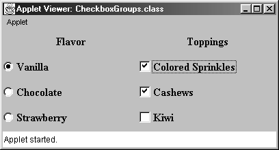
Listing 13.28 CheckboxGroups.java
import java.applet.Applet; import java.awt.*; public class CheckboxGroups extends Applet { public void init() { setLayout(new GridLayout(4, 2)); setBackground(Color.lightGray); setFont(new Font("Serif", Font.BOLD, 16)); add(new Label("Flavor", Label.CENTER)); add(new Label("Toppings", Label.CENTER)); CheckboxGroup flavorGroup = new CheckboxGroup(); add(new Checkbox("Vanilla", flavorGroup, true)); add(new Checkbox("Colored Sprinkles")); add(new Checkbox("Chocolate", flavorGroup, false)); add(new Checkbox("Cashews")); add(new Checkbox("Strawberry", flavorGroup, false)); add(new Checkbox("Kiwi")); } } Other CheckboxGroup and Checkbox Methods
Next, we list the most useful methods in the CheckboxGroup and Checkbox class.
CheckboxGroup
public Checkbox getSelectedCheckbox()
This method returns the radio button (Checkbox) that is currently selected. A null value is returned if none is checked.
public void setSelectedCheckbox(Checkbox boxToSelect)
This method sets the radio button that is currently selected. If you specify a radio button that is not part of the current group, the method call is ignored. Supplying null as an argument results in all radio buttons in the group becoming unselected.
Checkbox
In addition to the general methods described in Section 13.15 (The Checkbox Class), Checkbox has the following two methods specific to CheckboxGroups.
public CheckboxGroup getCheckboxGroup()
This method determines the group in which the radio button is associated.
public void setCheckboxGroup(CheckboxGroup newGroup)
This method registers the check box with a new group.
Handling CheckboxGroup Events
Putting check boxes into a CheckboxGroup does not change the basic way in which events are handled, so you should refer to Section 13.15 (The Checkbox Class) for details. However, one small variation does exist. As with ungrouped check boxes, it is common to ignore the events when they occur and simply look up the state when it is needed. Rather than cycling through the various check boxes in a group and checking getState on each, it is easier to call the getSelectedCheckbox method of the associated CheckboxGroup, which returns a reference to the currently selected Checkbox.
13.17 Choice Menus
Choice entries produce pull-down menus with a single selection showing but with other options displayed when the user clicks with the mouse. These GUI controls are sometimes known as "combo boxes," "drop-down list boxes," or "option menus," depending on the operating/windowing system you are using. Unlike buttons and check boxes, the entire Choice is not created with the constructor. Instead, a two-step process is required. The first step builds an empty menu, and the second adds elements to the menu with add. Creating a Choice menu and adding the menu to a panel is illustrated as follows:
Choice choice = new Choice(); choice.addItem("..."); choice.addItem("..."); ... somePanel.add(choice); Constructor
The Choice class has only a single, default constructor.
public Choice()
This constructor creates an empty combo box. Menu entries are not added in the constructor, but in a separate step through add.
Example: Simple Choices
Listing 13.29 creates a simple Choice with three entries. Figure 13-18 shows the results in appletviewer on Windows 98.
Figure 13-18. A Choice menu on Windows 98: (a) unselected, and (b) selected.
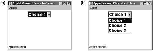
Listing 13.29 ChoiceTest.java
import java.applet.Applet; import java.awt.*; public class ChoiceTest extends Applet { private Choice choice; public void init() { setFont(new Font("SansSerif", Font.BOLD, 36)); choice = new Choice(); choice.addItem("Choice 1"); choice.addItem("Choice 2"); choice.addItem("Choice 3"); add(choice); } } Other Choice Methods
Available Choice methods are listed below.
public void addItem(String menuItem)
public void add(String menuItem)
A Choice menu is built in two steps. First, an empty menu is created by the empty constructor. Second, entries are added to the menu through addItem or by add. By default, the first item added is the one initially displayed, but you can override this behavior by using select. To remove entries once they are added, use remove or removeAll.
public void addItemListener(ItemListener listener)
public void removeItemListener(ItemListener listener)
These methods let you attach/detach an ItemListener to process selection events.
public int getItemCount()
This method returns the number of entries in the Choice.
public String getItem(int itemIndex)
This method returns the label of the item at the specified index.
public int getSelectedIndex()
This method returns the index of the item that is currently selected. A 1 value is returned if the Choice has no entries.
public String getSelectedItem()
This method returns the label of the currently selected item.
public Object[ ] getSelectedObjects()
This method returns an array containing either the selected entry or null if no entry is selected.
public void insert(String menuItem, int itemIndex)
The insert method adds an entry to the specified location in the list. This method is in contrast to add or addItem, which adds to the end of the list only.
public void processItemEvent(ItemEvent event)
You can override this lower-level, event-processing method if you want to have the Choice handle its own events.
public void remove(String menuItem)
public void remove(int itemIndex)
public void removeAll()
These methods remove entries from the combo box.
public void select(int itemIndex)
public void select(String itemLabel)
The first method selects the item at the specified index. Recall that the Java programming language uses zero-based indexing. The second method selects the first item with the specified label. No action is taken if no such label exists.
As usual, recall that the color, font, size, visibility, etc., methods of Component (Section 13.2) are inherited.
Handling Choice Events
Events are handled in a manner very similar to event handling of check boxes you override processItemEvent or use addItemListener to attach an external listener. The main difference is that with check boxes you have only two possible values (selected or deselected). With choice menus, you can have an arbitrary number of options. So, after determining that the check box was acted upon, you have to next decide which entry was chosen. Listing 13.30 gives an expanded version of the ChoiceTest class shown earlier. Here, the event-processing model prints out which entry was selected. Also, as with check boxes, it is quite common to ignore the selection event when it occurs and simply determine which item is selected through getSelectedItem or getSelectedIndex when it is needed.
Listing 13.30 ChoiceTest2.java
import java.applet.Applet; import java.awt.*; import java.awt.event.*; public class ChoiceTest2 extends Applet implements ItemListener { private Choice choice; public void init() { setFont(new Font("SansSerif", Font.BOLD, 36)); choice = new Choice(); choice.addItem("Choice 1"); choice.addItem("Choice 2"); choice.addItem("Choice 3"); choice.addItemListener(this); add(choice); } public void itemStateChanged(ItemEvent event) { Choice choice = (Choice)event.getSource(); String selection = choice.getSelectedItem(); if (selection.equals("Choice 1")) { doChoice1Action(); } else if (selection.equals("Choice 2")) { doChoice2Action(); } else if (selection.equals("Choice 3")) { doChoice3Action(); } } private void doChoice1Action() { System.out.println("Choice 1 Action"); } private void doChoice2Action() { System.out.println("Choice 2 Action"); } private void doChoice3Action() { System.out.println("Choice 3 Action"); } } 13.18 List Boxes
List boxes present scrolling lists from which the user can select an item (single-selectable lists) or several items (multiple-selectable lists). As with Choice menus, you first create an empty list, then add items to it through add, as below:
List list = new List(); list.addItem("..."); list.addItem("..."); ... add(list); Constructors
The List class has three constructors.
public List()
public List(int rows)
public List(int rows, boolean multiSelectable)
The first constructor creates a single-selectable list box with a platform-dependent number of rows and a platform-dependent width. The second constructor creates a single-selectable list box with the specified number of rows and a platform-dependent width.
The last constructor creates a list box with the specified number of visible rows. The number of rows specified affects the height of the List box, not the maximum number of possible entries. If more are added, a scrollbar is automatically created. The second argument determines if the List is multiple-selectable. As with Choice menus, an empty List is created, then items are added to it with addItem or add. The preferred width is set to a platform-dependent value and is typically not directly related to the width of the widest entry. Of course, you can always resize the width explicitly if your layout manager permits doing so.
Example: Single and Multiple List Selections
Listing 13.31 creates two lists. The first allows a single selection only, and the second permits multiple selections. Figure 13-19 shows the results on Windows 98.
Figure 13-19. List boxes can allow single or multiple selections. This example shows both kinds on Windows 98.
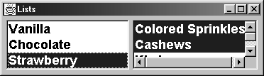
Listing 13.31 Lists.java
import java.awt.*; public class Lists extends CloseableFrame { public static void main(String[] args) { new Lists(); } public Lists() { super("Lists"); setLayout(new FlowLayout()); setBackground(Color.lightGray); setFont(new Font("SansSerif", Font.BOLD, 18)); List list1 = new List(3, false); list1.add("Vanilla"); list1.add("Chocolate"); list1.add("Strawberry"); add(list1); List list2 = new List(3, true); list2.add("Colored Sprinkles"); list2.add("Cashews"); list2.add("Kiwi"); add(list2); pack(); setVisible(true); } } Other List Methods
Below, we summarize 28 methods available in the List class.
public void add(String itemLabel)
public void add(String itemLabel, int itemIndex)
The first method adds an item with the specified label to the end of the list box. The second method adds an item with the specified label at the specified position in the list box and all items at that index or later get moved down.
public void addActionListener(ActionListener listener)
public void addItemListener(ItemListener listener)
public void removeActionListener(ActionListener listener)
public void removeItemListener(ItemListener listener)
These methods let you attach or detach an ActionListener or an ItemListener. Item events are generated whenever you select or deselect an entry. Action events occur only when you double-click an entry or press Return while an entry is selected. These methods apply only to single-selectable list boxes.
public boolean isMultipleMode()
This method determines whether the list is multiple selectable (true) or single selectable (false).
public void removeAll()
This method removes all items from the list.
public int getItemCount()
This method returns the number of items in the list.
public void remove(String menuItem)
public void remove(int itemIndex)
These methods remove entries from the list.
public void deselect(int itemIndex)
If the item at the specified index is selected, this method deselects it. Otherwise, it does nothing.
public String getItem(int itemIndex)
public String[] getItems()
The first method returns the label at the specified location. The second method returns an array of the labels, in order.
public int getRows()
This method returns the number of rows (visible height) of the list box, which does not change during the life of the list box. This method is in contrast to getItemCount, which returns the number of items in the list; that number can change over time and be less than or greater than the number of rows. A vertical scrollbar is automatically added if the number of items is greater than the number of rows.
public int getSelectedIndex()
public int[] getSelectedIndexes()
For a single-selectable list, the first method returns the index of the selected item. A value of 1 is returned if nothing is selected or if the list permits multiple selections. The second method returns an array of the indices of all selected items. It works for single- or multiple-selectable lists. If no items are selected, a zero-length (but non-null) array is returned.
public String getSelectedItem()
public String[ ] getSelectedItems()
For a single-selectable list, the first method returns the label of the selected item. It returns null if nothing is selected or if the list permits multiple selections. The second method returns an array of all selected items. It works for single- or multiple-selectable lists. If no items are selected, a zero-length (but non-null) array is returned.
public Object[ ] getSelectedObjects()
This method returns an array of the selected labels. A null is returned if nothing is selected.
public int getVisibleIndex()
This method returns the index of the most recent item made visible through makeVisible. Zero is returned if makeVisible has never been called.
public boolean isIndexSelected(int itemIndex)
This method determines if the item at the specified index is currently selected.
public void makeVisible(int itemIndex)
If necessary, this method scrolls the list to make the item at the given index visible.
public void processItemEvent(ItemEvent event)
public void processActionEvent(ActionEvent event)
You can override these lower-level, event-processing methods if you want to have the List handle its own events. Item events are generated every time an entry is selected or deselected. ActionEvents are generated when you double-click on an entry in a single-selectable list box or press Enter while an entry is selected.
public void replaceItem(String newItemLabel, int itemIndex)
This method overwrites the item at the specified index.
public void select(int itemIndex)
This method selects the item at the current index. If the list does not permit multiple selections, then the previously selected item, if any, is also deselected. Note that unlike a Choice, a List does not have a select method that lets you supply the label to be selected; you must supply the index.
public void setMultipleMode(boolean multipleSelectable)
This method permits (true) or prohibits (false) the list from allowing multiple selections.
As a subclass of Component (Section 13.2), List has access to all Component methods.
Handling List Events
Lists are interesting in that they generate two main kinds of events. ItemSelectionEvents are generated whenever an item is selected or deselected by the user. Calling select from the program does not generate selection events. ActionEvents apply only to single-selectable list boxes and are generated when the user double-clicks on an entry or presses Return while an entry is selected. A List also receives all mouse, keyboard, or focus events that occur over it.
If you want the List to handle its own events, you can enable AWTEvent.ITEM_EVENT_MASK and AWTEvent. ACTION_EVENT_MASK, then overrides processItemEvent and processActionEvent to handle item selection and action events. In general, however, it is more flexible to pass the events to an external object to process. You do this by registering an ItemListener through addItemListener, and an ActionListener through addActionListener. Listing 13.32 shows an example of the second approach, using the helper classes of Listing 13.33 (an ItemListener) and Listing 13.34 (an ActionListener). Figure 13-20 shows the result.
Figure 13-20. Result after user double-clicks "Pascal," then single-clicks "Java."
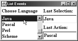
Listing 13.32 ListEvents.java
import java.awt.*; import java.awt.event.*; /** A class to demonstrate list selection/deselection * and action events. */ public class ListEvents extends CloseableFrame { public static void main(String[] args) { new ListEvents(); } protected List languageList; private TextField selectionField, actionField; private String selection = "[NONE]", action; /** Build a Frame with list of language choices * and two textfields to show the last selected * and last activated items from this list. */ public ListEvents() { super("List Events"); setFont(new Font("Serif", Font.BOLD, 16)); add(makeLanguagePanel(), BorderLayout.WEST); add(makeReportPanel(), BorderLayout.CENTER); pack(); setVisible(true); } // Create Panel containing List with language choices. // Constructor puts this at left side of Frame. private Panel makeLanguagePanel() { Panel languagePanel = new Panel(); languagePanel.setLayout(new BorderLayout()); languagePanel.add(new Label("Choose Language"), BorderLayout.NORTH); languageList = new List(3); String[] languages = { "Ada", "C", "C++", "Common Lisp", "Eiffel", "Forth", "Fortran", "Java", "Pascal", "Perl", "Scheme", "Smalltalk" }; for(int i=0; i<languages.length; i++) { languageList.add(languages[i]); } showJava(); languagePanel.add("Center", languageList); return(languagePanel); } // Creates Panel with two labels and two textfields. // The first will show the last selection in List; the // second, the last item activated. The constructor puts // this Panel at the right of Frame. private Panel makeReportPanel() { Panel reportPanel = new Panel(); reportPanel.setLayout(new GridLayout(4, 1)); reportPanel.add(new Label("Last Selection:")); selectionField = new TextField(); SelectionReporter selectionReporter = new SelectionReporter(selectionField); languageList.addItemListener(selectionReporter); reportPanel.add(selectionField); reportPanel.add(new Label("Last Action:")); actionField = new TextField(); ActionReporter actionReporter = new ActionReporter(actionField); languageList.addActionListener(actionReporter); reportPanel.add(actionField); return(reportPanel); } /** Select and show "Java". */ protected void showJava() { languageList.select(7); languageList.makeVisible(7); } } Listing 13.33 SelectionReporter.java
import java.awt.*; import java.awt.event.*; /** Whenever an item is selected, it is displayed * in the textfield that was supplied to the * SelectionReporter constructor. */ public class SelectionReporter implements ItemListener { private TextField selectionField; public SelectionReporter(TextField selectionField) { this.selectionField = selectionField; } public void itemStateChanged(ItemEvent event) { if (event.getStateChange() == event.SELECTED) { List source = (List)event.getSource(); selectionField.setText(source.getSelectedItem()); } else selectionField.setText(""); } }
Listing 13.34 ActionReporter.java
import java.awt.*; import java.awt.event.*; /** Whenever an item is activated, it is displayed * in the textfield that was supplied to the * ActionReporter constructor. */ public class ActionReporter implements ActionListener { private TextField actionField; public ActionReporter(TextField actionField) { this.actionField = actionField; } public void actionPerformed(ActionEvent event) { List source = (List)event.getSource(); actionField.setText(source.getSelectedItem()); } }
Lists can generate mouse, keyboard, and focus events. To demonstrate this, Listing 13.35 shows a variation of the previous example where typing any of the letters in "Java" (upper or lower case) results in the "Java" entry being selected and made visible. Note the use of an inner class to achieve this result. Instead of a separate KeyAdapter class being created, a nested version is made. Besides being more convenient in such a short class, this approach lets the showJava method of ListEvents remain protected.
Listing 13.35 ListEvents2.java
import java.awt.event.*; public class ListEvents2 extends ListEvents { public static void main(String[] args) { new ListEvents2(); } /** Extends ListEvents with the twist that * typing any of the letters of "JAVA" or "java" * over the language list will result in "Java" * being selected */ public ListEvents2() { super(); // Create a KeyAdapter and attach it to languageList. // Since this is an inner class, it has access // to nonpublic data (such as the ListEvent's // protected showJava method). KeyAdapter javaChooser = new KeyAdapter() { public void keyPressed(KeyEvent event) { int key = event.getKeyChar(); if ("JAVAjava".indexOf(key) != -1) { showJava(); } } }; languageList.addKeyListener(javaChooser); } } 13.19 The TextField Class
Textfields create boxed areas to display or read a single line of text. See TextArea (Section 13.20) for a component that can display multiple lines. Java textfields do not permit mixed fonts or colors within a single textfield. If a textfield is being used for input, you typically allocate it (perhaps with a default entry or size) by specifying everything in the constructor, as follows:
TextField lastNameField = new TextField(15); add(lastNameField); TextField langField = new TextField("Java"); add(langField); Textfields used only for display are similar but require a call to setEditable to turn off input capability. Also, the value is often filled in through a separate step, since it might not be available when the textfield is first created. Here's the idea:
TextField temperatureField = new TextField(4); temperatureField.setEditable(false); statusPanel.add(temperatureField); ... temperatureString = simulationTemperature("F"); temperatureField.setText(temperatureString); Constructors
The TextField class has four constructors.
public TextField()
public TextField(int numChars)
public TextField(String initialString)
public TextField(String initialString, int numChars)
The first constructor creates an empty textfield with a platform-dependent width (often one character). The second constructor creates an empty textfield that is the specified number of characters wide. Note that if a proportional-spaced font is being used, the definition of "the space required for N characters" is ambiguous. So the average character width is used. The third constructor creates a textfield filled with an initial string. It will be just wide enough to hold the string. The last constructor creates a textfield of the specified width, filled with an initial string. As before, the width is based on the average width of characters in the font the textfield is using.
Example: Creating TextFields
Listing 13.36 creates a TextField with each of the four constructors. The result is shown in Figure 13-21.
Figure 13-21. A TextField from each of the four constructors.
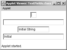
Listing 13.36 TextFields.java
import java.applet.Applet; import java.awt.*; /** A TextField from each of the four constructors */ public class TextFields extends Applet { public void init() { add(new TextField()); add(new TextField(30)); add(new TextField("Initial String")); add(new TextField("Initial", 30)); } } Other TextField Methods
A TextField is a subclass of TextComponent. The following two subsections list the methods of TextComponent and TextField. Some of the most commonly used methods are getText and setText (for retrieving and specifying TextField contents), setEditable (for allowing or disallowing user input), getColumns and setColumns (for looking up and setting the TextField width), and setEchoChar (for specifying that "*" or some other character be displayed when text is entered, as for password fields).
TextComponent Methods
public void addTextListener(TextListener listener)
public void removeTextListener(TextListener listener)
These methods let you add or remove a TextListener for processing text events. Recall that Component (Section 13.2) already supplies addKeyListener and removeKeyListener methods, but text events occur whenever the text value changes, even if the change is programmatic (i.e., through setText). A TextListener needs to implement a single method: textValueChanged. This method takes a TextEvent as an argument. To get the component's string from this event, use getSource to find the source object, cast the result to a TextComponent, and do getText on that.
public int getCaretPosition()
public void setCaretPosition(int index)
The first method lets you look up the position of the text insertion caret. The second method sets the position of the text insertion caret.
public String getSelectedText()
This method returns the selected text. If no text is currently selected, a zero-length (but non-null) string is returned.
public int getSelectionEnd()
public void setSelectionEnd(int startIndex)
The first method returns the index of the first character after the end of the selected text. Zero is returned if no text is selected. The second method sets the index of the first character after the end of the selected text.
public int getSelectionStart()
public void setSelectionStart(int endIndex)
The first method returns the index of the first character of any selected text. Zero is returned if no text is selected. The second method sets the index of the first character of selected text.
public String getText()
public void setText(String newText)
The getText method returns the text, if any, in the textfield. If there is no text, a zero-length (but non-null) string is returned. The setText method replaces any text with the supplied string. An input value of null is the same as "".
public boolean isEditable()
public void setEditable(boolean editableStatus)
The isEditable method determines whether the textfield allows user input (true) or whether it is just for display (false). The setEditable method permits (true) or prohibits (false) the user from typing into the textfield.
public void processTextEvent(TextEvent event)
This lower-level, event-processing method can be overridden to handle text events. See addTextListener for more details. You can also handle individual keyboard events, since processKeyEvent is inherited from the Component class (Section 13.2). Don't forget to enable text events, call super.processTextEvent from within the method, and import java.awt.event.*.
public void select(int startIndex, int endIndex)
This method selects the text starting at startIndex, up through but not including endIndex. Selected text is highlighted on most operating systems. If the ending index is longer than the length of the text, the entire text is selected.
public void selectAll()
This method selects all the text.
TextField Methods
In addition to the TextComponent methods, the following methods are available:
public void addActionListener(ActionListener listener)
public void removeActionListener(ActionListener listener)
ActionEvents are generated when the user presses Return while the textfield has the focus. These methods let you attach or remove an ActionListener to process these events. In many cases, addTextListener and removeTextListener (inherited from TextComponent) or addKeyListener and removeKeyListener (inherited from Component) are of more interest.
public boolean echoCharIsSet()
This method determines whether an echo character has been specified. See setEchoCharacter.
public int getColumns()
This method tells you the number of columns in the textfield. If you are using a proportional font, this method does not guarantee that this number of characters will really fit in the textfield, however, because the value is based on the average width of characters in the current font.
public char getEchoChar()
public void setEchoChar(char echoChar)
The getEchoChar method returns the current echo character. This value is only meaningful if echoCharIsSet is true. The setEchoChar specifies a character to display for each character the user types in. The actual text entered is still available from getText. The "*" character is often used for implementing fields that gather passwords or other sensitive data.
public void processActionEvent(ActionEvent event)
Action events are generated when the user presses Return while the textfield has the focus. If you want the textfield to process its own events, you first enable AWTEvent.ACTION_EVENT_MASK, then override this method. Be sure to call super.processActionEvent in case any listeners are attached. Also, see addActionListener.
public void setColumns(int cols)
The setColumns method lets you specify the width of the Textfield directly. Note that the width is in terms of the average width of characters in the textfield's font.
Because TextField is a subclass of Component, it has access to all Component methods. See Section 13.2 (The Component Class).
Handling TextField Events
Four event types are of interest: focus events, keyboard events, text events, and action events. Focus events happen when the textfield acquires or loses the input focus, keyboard and text events when the user presses a key while the textfield has the focus, and action events when the user presses Return while the textfield has the focus. The difference between keyboard events and text events is that text events are generated even when someone calls setText programmatically; keyboard events are not. As usual, you have the choice of handling events in the component itself by using the lower-level processXxxEvent methods or of attaching an external listener to process them. See Section 11.6 (Behind the Scenes: Low-Level Event Processing) for an example of low-level event handling and TextFields.
13.20 The TextArea Class
A TextArea is similar to a TextField, except that it can have multiple lines and does not generate action events. Here are some typical examples:
TextArea inputArea = new TextArea(4, 15); add(inputArea); TextArea resultsArea = new TextArea("No Results Yet", 2, 10); resultsArea.setEditable(false); add(resultsArea); Constructors
The following five TextArea constructors are available:
public TextArea()
This constructor creates an empty text area with a platform-dependent number of rows and columns and both vertical and horizontal scrollbars. The default size may be very large, so use this constructor with caution if you're not using a layout manager that will size the text area for you.
public TextArea(int rows, int cols)
This constructor creates an empty text area with the specified number of rows and columns. The column value is based on the average width of characters in whatever font the TextArea is using. Vertical and horizontal scrollbars are included.
public TextArea(String initialString)
This constructor creates an initialized text area with a platform-dependent size and both types of scrollbars. The initial string can contain explicit line breaks (\n) to force it to span multiple lines.
public TextArea(String initialString, int rows, int cols)
This constructor creates an initialized text area with the specified size and both types of scrollbars.
public TextArea(String initialString, int rows, int cols, int scrollbarType)
This constructor creates an initialized text area with the specified size. If the scrollbar type is TextArea.SCROLLBARS_BOTH, the result is the same as with the previous constructor. If TextArea.SCROLLBARS_VERTICAL_ONLY is specified, then the text area will have vertical but not horizontal scrollbars, and words will wrap to the next line if the user enters text that would otherwise extend past the right side of the text area. If TextArea.SCROLLBARS_ HORIZONTAL_ONLY is supplied, then the text area will have horizontal but not vertical scrollbars. Finally, if you specify TextArea.SCROLLBARS_NEITHER, no scrollbars will be included. Again, text will wrap as it is entered.
Example: Empty and Filled Text Areas
Listing 13.37 creates two text areas: an empty one and another filled with three initial lines. Figure 13-22 shows the result on Windows 98.
Figure 13-22. Text areas on Windows 98.
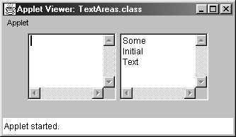
Listing 13.37 TextAreas.java
import java.applet.Applet; import java.awt.*; public class TextAreas extends Applet { public void init() { setBackground(Color.lightGray); add(new TextArea(3, 10)); add(new TextArea("Some\nInitial\nText", 3, 10)); } } Other TextArea Methods
TextArea inherits getText, setText, setEditable, select and all of the other methods of TextComponent described in Section 13.19 (The TextField Class). In addition, TextArea supports the following methods:
public void append(String additionalText)
This method adds the specified text to the end of the text area.
public int getColumns()
This method returns the number of columns in the text area.
public int getRows()
This method returns the number of rows used to create the text area.
public void insert(String additionalText, int index)
These methods insert the specified text at the given index. Any text at that location or later is moved down.
public void replaceRange(String replacement, int startIndex, int endIndex)
This method replaces the text starting at startIndex, up through but not including endIndex, with the specified string. The replacement string need not be the same length as the text being replaced.
As a subclass of Component (Section 13.2), TextArea has access to all Component methods.
Handling TextArea Events
Keyboard, text, and focus events are handled in exactly the same manner as with textfields. Text areas do not generate ActionEvents.
13.21 The Label Class
Labels are simple textual displays. It is often more convenient to use a Label than to draw text with the drawString method of Graphics because labels are redisplayed automatically and can be moved around by layout managers. You can just create one with designated text and drop it in a window, as follows:
Label label = new Label("..."); add(label); Frequently, however, you may use the label to describe some other object and want to be sure the label is aligned with it. So, you may want to use the label with a layout manager other than FlowLayout. Changing the label font or alignment is common as well. For instance, the following might be used to make a title on a panel:
Panel resultsPanel = new Panel(); resultsPanel.setLayout(new BorderLayout()); Label title = new Label("Results", Label.CENTER); title.setFont(new Font("SansSerif", Font.BOLD, 18)); resultsPanel.add(title, BorderLayout.NORTH); TextArea resultsArea = new TextArea(); resultsPanel.add(resultsArea, BorderLayout.CENTER);
Constructors
The Label class has only three constructors.
public Label()
public Label(String labelString)
public Label(String labelString, int alignment)
The first constructor simply creates a blank label. You can specify the text later with setText. The second constructor creates a label displaying the specified string. The last constructor creates a label with the specified alignment. The alignment is one of Label.LEFT (default), Label.RIGHT, and Label.CENTER. The alignment is not particularly important if the label is used in a window that is using FlowLayout or in the East or West regions of a BorderLayout. The preferred width of a Label is only a little bit bigger than the text it contains, and there's not much aligning left to be done. However, alignment is quite important if you resize a Label by hand or use one in a GridLayout, GridBagLayout, or the NORTH or SOUTH regions of a BorderLayout. In such a case, the width of the Label might be much larger than the text it contains, and you need to specify where to place the text in that area.
Example: Four Different Labels
Listing 13.38 creates four labels with various fonts and alignment options. Figure 13-23 shows the result.
Figure 13-23. Labels can have different fonts and can be left-aligned, right-aligned, or centered.
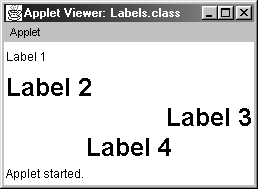
Listing 13.38 Labels.java
import java.applet.Applet; import java.awt.*; public class Labels extends Applet { public void init() { setLayout(new GridLayout(4,1)); Label label1, label2, label3, label4; label1 = new Label("Label 1"); label2 = new Label("Label 2", Label.LEFT); label3 = new Label("Label 3", Label.RIGHT); label4 = new Label("Label 4", Label.CENTER); Font bigFont = new Font("SanSerif", Font.BOLD, 25); label2.setFont(bigFont); label3.setFont(bigFont); label4.setFont(bigFont); add(label1); add(label2); add(label3); add(label4); } } Other Label Methods
The Label class has seven methods. We summarize the most important four below.
public int getAlignment()
public void setAlignment(int alignment)
The first method returns the current alignment, which will be one of Label.LEFT, Label.RIGHT, or Label.CENTER. The second method sets the text alignment.
public String getText()
public void setText(String newLabel)
The getText method returns the text of the label. If none has been set, a zero-length (but non-null) string is returned. The setText method changes the label's text. If the label is already displayed, changing the text does not automatically resize it in its Container. So, the containing window should be invalidated and validated to force a new layout, as follows.
someLabel.setText("A Different Label"); someLabel.getParent().invalidate(); someLabel.getParent().validate();
As a Component subclass, Label inherits all the color, font, and resizing methods of Component (Section 13.2).
Handling Label Events
For labels, the normal mouse and keyboard events are generated, but there are no selection or action events. Listing 13.39 shows a frame that inserts two "reversible" labels (Listing 13.40): labels with attached mouse listeners that switch the foreground and background colors when the mouse enters the label and switch back when the mouse leaves. Figure 13-24 and Figure 13-25 show the original result and the result after the mouse is moved over the second ReversibleLabel, respectively.
Figure 13-24. ReverseLabels: original appearance.
Figure 13-25. ReverseLabels: after the mouse is moved over right label.
Listing 13.39 ReverseLabels.java
import java.awt.*; public class ReverseLabels extends CloseableFrame { public static void main(String[] args) { new ReverseLabels(); } public ReverseLabels() { super("Reversible Labels"); setLayout(new FlowLayout()); setBackground(Color.lightGray); setFont(new Font("Serif", Font.BOLD, 18)); ReversibleLabel label1 = new ReversibleLabel("Black on White", Color.white, Color.black); add(label1); ReversibleLabel label2 = new ReversibleLabel("White on Black", Color.black, Color.white); add(label2); pack(); setVisible(true); } } Listing 13.40 ReversibleLabel.java
import java.awt.*; import java.awt.event.*; /** A Label that reverses its background and * foreground colors when the mouse is over it. */ public class ReversibleLabel extends Label { public ReversibleLabel(String text, Color bgColor, Color fgColor) { super(text); MouseAdapter reverser = new MouseAdapter() { public void mouseEntered(MouseEvent event) { reverseColors(); } public void mouseExited(MouseEvent event) { reverseColors(); // or mouseEntered(event); } }; addMouseListener(reverser); setText(text); setBackground(bgColor); setForeground(fgColor); } protected void reverseColors() { Color fg = getForeground(); Color bg = getBackground(); setForeground(bg); setBackground(fg); } } 13.22 Scrollbars and Sliders
The AWT uses the same basic component for scrollbars (used to scroll windows) and sliders (used to interactively select values): the Scrollbar class. The "preferred" size and shape of a Scrollbar is not generally usable, so scrollbars are not usually placed in a window that uses FlowLayout. Instead, they are typically placed in the east or south sections of a BorderLayout, used in a GridLayout, or resized by hand.
Unfortunately, scrollbars are not implemented in the same manner on all Java systems and are painful to use directly. The preferred alternative is to use TextAreas and ScrollPanes, unless you want sliders. If you are developing a Swing applet or application, the JSlider class (Section 14.7) is a significant improvement over the AWT Scrollbar for implementing sliders.
Constructors
Following are the Scrollbar constructors:
public Scrollbar()
This constructor creates a vertical scrollbar. The bubble (or thumb part that actually moves) size defaults to 10% of the trough length. The internal minimum and maximum values (see below) are set to zero.
public Scrollbar(int orientation)
This constructor creates a horizontal or vertical scrollbar. The orientation can be either Scrollbar.HORIZONTAL or Scrollbar.VERTICAL. The bubble (thumb) size defaults to 10% of the trough length. The internal minimum and maximum values (see below) are set to zero.
public Scrollbar(int orientation, int initialValue, int bubbleSize, int min, int max)
This constructor is the one you use when you want to make a slider for interactively selecting values. It creates a horizontal or vertical slider or scrollbar with a customized bubble (or thumb the part that actually moves) thickness and a specific internal range of values. The bubble thickness is in terms of the scrollbar's range of values, not in pixels, so that if max minus min was 5, a bubble size of 1 would specify 20% of the trough length. Note, however, that some operating systems (some versions of MacOS, in particular) do not support varying sizes for scrollbar thumbs.
Also, the value corresponds to the location of the left (horizontal sliders) or top (vertical sliders) edge of the bubble, not its center. For a horizontal scrollbar, rather the maximum corresponding to the highest value the left side of the slider can reach, it corresponds to the highest value the right side of the slider can reach, and similarly for vertical scrollbars. This means that the actual values that can be set to range from the minimum value to the bubble size less than the maximum value. For example, the following statement makes a scrollbar that can range only from 0 to 45, with the initial value at 25 and a bubble size of 5:
new Scrollbar(Scrollbar.HORIZONTAL, 25, 5, 0, 50);
Core Warning
| | To get a scrollbar with a thumb size of t that can range in value from min to max, you have to create it with a maximum value of max+t. |
Example: Variety of Sliders
Listing 13.41 creates a variety of horizontal and vertical sliders (scrollbars for selecting values). The values range from 0 to 100 with an initial value of 50 and various bubble thicknesses. Figure 13-26 shows the result on Windows 98.
Figure 13-26. Scrollbars with varying bubble sizes but constant ranges and initial values, shown on Windows 98.
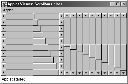
Listing 13.41 Scrollbars.java
import java.applet.Applet; import java.awt.*; public class Scrollbars extends Applet { public void init() { int i; setLayout(new GridLayout(1, 2)); Panel left = new Panel(), right = new Panel(); left.setLayout(new GridLayout(10, 1)); for(i=5; i<55; i=i+5) { left.add(new Scrollbar(Scrollbar.HORIZONTAL, 50, i, 0, 100)); } right.setLayout(new GridLayout(1, 10)); for(i=5; i<55; i=i+5) { right.add(new Scrollbar(Scrollbar.VERTICAL, 50, i, 0, 100)); } add(left); add(right); } } Other Scrollbar Methods
The following Scrollbar methods are available.
public void addAdjustmentListener(AdjustmentListener listener)
public void removeAdjustmentListener(AdjustmentListener listener)
These methods add and remove an AdjustmentListener to the scrollbar, used to monitor user adjustments to the scrollbar. An AdjustmentListener needs to implement adjustmentValueChanged, which takes an AdjustmentEvent as an argument. The AdjustmentEvent class contains a getAdjustmentType method that returns one of AdjustmentEvent.UNIT_INCREMENT (the right or down arrow was clicked), AdjustmentEvent.UNIT_DECREMENT (the left or up arrow was clicked), AdjustmentEvent.BLOCK_INCREMENT (the trough to the right of or below the bubble was clicked), AdjustmentEvent.BLOCK_DECREMENT (the trough to the left of or above the bubble was clicked), or AdjustmentEvent.TRACK (the bubble was dragged).
public int getUnitIncrement()
public void setUnitIncrement(int increment)
The getUnitIncrement method is intended to return the amount that the value will be adjusted when the arrows at either end of the scrollbar are pressed. It is usually 1 if the user has not specified anything different with setUnitIncrement. Unfortunately, however, some implementations ignore this method. For instance, the line increment value has no effect on Solaris in JDK 1.1. For many applications you can remedy this situation. See Listing 13.42 for an example. The setUnitIncrement method changes the amount the scrollbar will move when the user clicks on the arrows but is not supported on all platforms.
public int getMaximum()
public void setMaximum(int maxValue)
The getMaximum method returns the scrollbar's maximum possible value. This value is the getVisibleAmount more than the largest possible selectable value. The setMaximum method changes the maximum possible value.
public int getMinimum()
public void setMinimum(int minValue)
These two methods return and set the scrollbar's minimum possible value, respectively.
public int getOrientation()
public void setOrientation(int orientation)
These methods return and set the orientation of the scrollbar. Legal values are Scrollbar.HORIZONTAL or Scrollbar.VERTICAL.
public int getBlockIncrement()
public void setBlockIncrement(int increment)
These methods return and set how much the value will change when the user clicks inside the trough above or below the scrollbar bubble. The default is platform dependent; common defaults are 10 (Windows 98) or the bubble size (Solaris).
public int getValue()
public void setValue(int value)
public void setValues(int value, int bubbleSize, int min, int max)
These methods return and set the current value of the scrollbar. Specifying a value below the minimum value does not cause an error; the minimum value is simply stored. Specifying a value above the maximum minus the thumb size does not cause an error either. Instead, the scrollbar takes on the maximum minus the thumb size. The last method changes several parameters in one fell swoop.
public int getVisibleAmount()
This method returns the size of the bubble (thumb), represented in terms of the units used for the scrollbar range, not in terms of pixels.
public void processAdjustmentEvent(AdjustmentEvent event)
If you want to have a scrollbar handle its own events, you first enable adjustment events as follows:
enableEvents(AWTEvent.ADJUSTMENT_EVENT_MASK);Next, you override processAdjustmentEvent, which takes an AdjustmentEvent as an argument. Remember to call super.processAdjustmentEvent in case there are listeners on the scrollbar. See the following subsection for an example.
As a subclass of Component, the setForeground and setBackground methods are available, but setForeground is not generally supported. On Windows 95/NT, setBackground sets the color of the scrollbar trough. On Solaris, it sets the color of the bubble and the arrows. Many MacOS implementations do not support scrollbar colors.
Handling Scrollbar Events
To process scrolling events, you can either use processAdjustmentEvent or attach an AdjustmentListener. If you override processAdjustmentEvent, you can let a scrollbar handle its own events. If you attach an AdjustmentListener, an external object can handle the events. In either case, note that the AdjustmentEvent class has two methods of particular import: getValue and getAdjustmentType. The first returns an int giving the scrollbar's current value, and the second returns one of AdjustmentEvent.UNIT_INCREMENT, AdjustmentEvent.UNIT_DECREMENT, AdjustmentEvent.BLOCK_INCREMENT, AdjustmentEvent.BLOCK_DECREMENT, or AdjustmentEvent.TRACK. For instance, Listing 13.42 shows how you could use processAdjustmentEvent to make a scrollbar that honors the unit increment and block increment values, regardless of whether the underlying implementation already honors those values. Note, however, that this approach only works if all scrollbar adjustment is done by the user. Calling setValue will not properly update the lastValue variable, but there is no way around this since you cannot tell the difference between a system-generated setValue call (when the scrollbar is adjusted) and a user-generated one.
Note that the Swing API defines a JSlider class (Section 14.7) that provides significant improvements over the AWT Scrollbar and functions the same on all platforms. However, Swing components are not supported by all browsers and may require that the client install the Java Plug-In (Section 9.9).
Listing 13.42 BetterScrollbar.java
import java.awt.*; import java.awt.event.*; /** The beginnings of a better scrollbar. This one * adjusts for the fact that many implementations * ignore the line or page increment. Created to * demonstrate low--level scrollbar events. */ public class BetterScrollbar extends Scrollbar { private int lastValue; public BetterScrollbar(int orientation, int initialValue, int bubbleSize, int min, int max) { super(orientation, initialValue, bubbleSize, min, max); enableEvents(AWTEvent.ADJUSTMENT_EVENT_MASK); lastValue = initialValue; } /** Watch the events, adjusting by unit increment * or block increment if appropriate. */ public void processAdjustmentEvent(AdjustmentEvent e) { int type = e.getAdjustmentType(); switch(type) { case AdjustmentEvent.UNIT_INCREMENT: setValue(lastValue + getUnitIncrement()); break; case AdjustmentEvent.UNIT_DECREMENT: setValue(lastValue -- getUnitIncrement()); break; case AdjustmentEvent.BLOCK_INCREMENT: setValue(lastValue + getBlockIncrement()); break; case AdjustmentEvent.BLOCK_DECREMENT: setValue(lastValue -- getBlockIncrement()); break; } lastValue = getValue(); super.processAdjustmentEvent(e); } } See the archive at http://www.corewebprogramming.com/ for a custom Slider class that combines both horizontal Scrollbar and TextField as a single GUI component.
13.23 Pop-up Menus
Pop-up menus are remarkably simple to use: allocate a PopupMenu, add some MenuItems to it, then watch for the pop-up trigger in a Component by checking mouse events with isPopupTrigger. When the trigger is received, call show to display the menu. When the menu is shown, an ActionEvent is triggered for a selected menu item.
Constructors
The two PopupMenu constructors are:
public PopupMenu()
public PopupMenu(String title)
The first constructor creates an untitled pop-up menu. The second constructor creates a pop-up menu with the specified title. However, most current Windows 95/98/NT implementations do not display the title.
Example: Applet Pop-up Menu
Listing 13.43 creates a pop-up menu in an applet. It then watches the mouse events until one occurs that is a pop-up trigger (whatever mouse action normally displays menus in the current operating system), in which case the menu is displayed. By implementing the ActionListener interface and adding itself as a listener on each item in the menu, the applet calls its own actionPerformed method when items are selected. Figure 13-27 shows the result on Windows 95.
Figure 13-27. Pop-up menus on Windows 98 are displayed without titles.
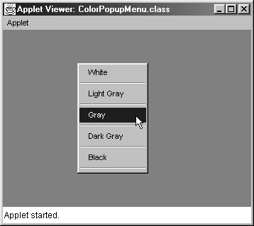
Listing 13.43 ColorPopupMenu.java
import java.applet.Applet; import java.awt.*; import java.awt.event.*; /** Simple demo of pop--up menus. */ public class ColorPopupMenu extends Applet implements ActionListener { private String[] colorNames = { "White", "Light Gray", "Gray", "Dark Gray", "Black" }; private Color[] colors = { Color.white, Color.lightGray, Color.gray, Color.darkGray, Color.black }; private PopupMenu menu; /** Create PopupMenu and add MenuItems. */ public void init() { setBackground(Color.gray); menu = new PopupMenu("Background Color"); enableEvents(AWTEvent.MOUSE_EVENT_MASK); MenuItem colorName; for(int i=0; i<colorNames.length; i++) { colorName = new MenuItem(colorNames[i]); menu.add(colorName); colorName.addActionListener(this); menu.addSeparator(); } add(menu); } /** Don't use a MouseListener, since in Win95/98/NT * you have to check isPopupTrigger in * mouseReleased, but do it in mousePressed in * Solaris (boo!). */ public void processMouseEvent(MouseEvent event) { if (event.isPopupTrigger()) { menu.show(event.getComponent(), event.getX(), event.getY()); } super.processMouseEvent(event); } public void actionPerformed(ActionEvent event) { setBackground(colorNamed(event.getActionCommand())); repaint(); } private Color colorNamed(String colorName) { for(int i=0; i<colorNames.length; i++) { if(colorNames[i].equals(colorName)) { return(colors[i]); } } return(Color.white); } }
Other PopupMenu Methods
The only method directly in the PopupMenu class is show, which displays the menu. Selected methods from the ancestor classes Menu and MenuItem are listed here as well.
public void add(MenuItem item)
public void add(String label)
These methods add an entry to the menu. Rather than adding a string directly, you usually do better to turn it into a MenuItem first through new MenuItem(label). This approach lets you add an ActionListener on the label.
public void addActionListener(ActionListener listener)
This method is normally applied to MenuItems within the pop-up menu and lets you add a listener to take action when the item is selected. Note that the label is available in the ActionEvent class through getActionCommand().
public void addSeparator()
This method adds a nonselectable horizontal line to the menu. In Figure 13-27, there is a separator after every entry.
public void setShortcut(MenuShortcut shortcut)
public MenuShortcut getShortcut()
public void deleteShortcut()
In JDK 1.1 and later, you can create portable shortcuts (keyboard shortcuts associated with menu items). Simply create a MenuShortcut through
MenuShortcut shortcut = new MenuShortcut(int key);Next, add the shortcut to a MenuItem through setShortcut. The getShortcut and deleteShortcut methods retrieve and delete the shortcut associated with a menu item.
public void show(Component c, int x, int y)
This method displays the pop-up menu at the specified location relative to the top-left corner of the component.
Strictly speaking, PopupMenu is a Component. However, you should not rely on custom colors or fonts being supported.
Handling PopupMenu Events
With pop-up menus you have two types of events you need to worry about. The first is the mouse click that brings up the menu in the first place. The second is the event that occurs when an entry is actually selected.
Rather than requiring programmers to remember what types of mouse clicks are supposed to initiate pop-up menus on different platforms, the Java programming language provides a convenient method in the MouseEvent class: isPopupTrigger. However, since some operating systems invoke the menu when the mouse is first pressed (e.g., Solaris) but others when it is released (e.g., Windows 98 and Windows NT), you probably want to watch mouse events in processMouseEvent rather than in a MouseListener. If you do use a MouseListener, be sure to check both mousePressed and mouseReleased. So, the process of popping up the menu would go something like this:
PopupMenu menu = new PopupMenu("[Title]"); ... enableEvents(AWTEvent.MOUSE_EVENT_MASK); ... public void processMouseEvent(MouseEvent event) { if (event.isPopupTrigger()) menu.show(event.getComponent(), event.getX(), event.getY()); super.processMouseEvent(event); } To process the selections, add an ActionListener to each as it is created, as follows:
MenuItem item = new MenuItem("[Label]"); menu.add(item); item.addActionListener(someListener); Recall that an ActionListener needs to implement the actionPerformed method, which takes an ActionEvent as an argument. The getActionCommand method of ActionEvent returns the label of the MenuItem.
13.24 Summary
The AWT offers eight major types of windows that the developer can use for user interfaces: Canvas, Panel, Applet, ScrollPane, Frame, Dialog, FileDialog, and Window. This chapter explains the differences among these and described the basics of their use. The major GUI controls available in Java are Button, Checkbox (which can create regular check boxes or radio buttons), Choice, List, TextField, TextArea, Label, Scrollbar (used for scrolling and for selecting values), and PopupMenu. To use built-in or custom GUI components, you need to know two things: how to create them with the look you want and how to process the events that occur when the user interacts with them. In most cases, the main look is specified in the interface element's constructor, but some elements (Choice, List, PopupMenu) are created empty, then filled later. Action events are perhaps the most important type of event that applies to GUI elements, but item selection events, keyboard events, text events, and scrolling events are important as well.
You should now be familiar with all the components available in the AWT for developing GUI programs. Most likely you will only use the AWT components for development of applets, since the newer Swing components, available in the Java 2 Platform, are more suitable for developing stand-alone GUI applications. The advantage of creating AWT Applets for browsers is that your program will run in most versions of Netscape and Internet Explorer; the Java 1.1 AWT API is supported in Netscape 4.06 and later and Internet Explorer 4.0 and later.
| CONTENTS | |
EAN: 2147483647
Pages: 31