19.5 Check Boxes and Radio Buttons
19.5 Check Boxes and Radio ButtonsCheck boxes and radio buttons are useful controls for allowing the user to select among a set of predefined choices. Although check boxes can be selected or deselected individually, radio buttons can be grouped so that only a single member of the group can be selected at a time. Check BoxesHTML Element: <INPUT TYPE="CHECKBOX" NAME ="..." ...> (No End Tag) Attributes: NAME (required), VALUE , CHECKED , ONCLICK , ONFOCUS , ONBLUR This input element creates a check box whose name/value pair is transmitted only if the check box is checked when the form is submitted. For instance, the following code results in the check box shown in Figure 19-14. <P> <INPUT TYPE="CHECKBOX" NAME="noEmail" CHECKED> Check here if you do <I>not</I> want to get our email newsletter Figure 19-14. An HTML check box. Note that the descriptive text associated with the check box is normal HTML, and care should be taken to guarantee that it appears next to the check box. Thus, the <P> in the preceding example ensures that the check box isn't part of the previous paragraph. Core Approach
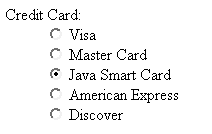
Radio ButtonsHTML Element: <INPUT TYPE="RADIO" NAME="..." VALUE="..." ...> (No End Tag) Attributes: NAME (required), VALUE (required), CHECKED , ONCLICK , ONFOCUS , ONBLUR Radio buttons differ from check boxes in that only a single radio button in a given group can be selected at any one time. You indicate a group of radio buttons by providing all of them with the same NAME . Only one button in a group can be depressed at a time; selecting a new button when one is already selected results in the previous choice becoming deselected. The value of the one selected is sent when the form is submitted. Although radio buttons technically need not appear near to each other, this proximity is almost always recommended. An example of a radio button is shown in Listing 19.7. Because input elements are wrapped as part of normal paragraphs, a DL list is used to make sure that the buttons appear under each other in the resultant page and are indented from the heading above them. Figure 19-15 shows the result. In this case, creditCard=java would get sent as part of the form data when the form is submitted. Listing 19.7 Example of a radio button group<DL> <DT>Credit Card: <DD><INPUT TYPE="RADIO" NAME="creditCard" VALUE="visa"> Visa <DD><INPUT TYPE="RADIO" NAME="creditCard" VALUE="mastercard"> Master Card <DD><INPUT TYPE="RADIO" NAME="creditCard" VALUE="java" CHECKED> Java Smart Card <DD><INPUT TYPE="RADIO" NAME="creditCard" VALUE="amex"> American Express <DD><INPUT TYPE="RADIO" NAME="creditCard" VALUE="discover"> Discover </DL>
Figure 19-15. Radio buttons in HTML. |
")
EAN: 2147483647
Pages: 194
- Chapter III Two Models of Online Patronage: Why Do Consumers Shop on the Internet?
- Chapter VII Objective and Perceived Complexity and Their Impacts on Internet Communication
- Chapter IX Extrinsic Plus Intrinsic Human Factors Influencing the Web Usage
- Chapter XV Customer Trust in Online Commerce
- Chapter XVIII Web Systems Design, Litigation, and Online Consumer Behavior