Chapter 8. Design Issues
 | CONTENTS |  |
| |
|

- Usability
- Navigation and Site Structure Design
- Methods of Page Layout
- Interview: Corey Eiges
- Page Composition Issues
- Use of Color
- Summary
A web developer might need to have dozens of skills and areas of knowledge, but nothing is as central to web development work as the actual design and layout of pages. As the web and HTML have evolved, new technologies and techniques have emerged, therefore there are many ways to build a page. Topics covered in this part of the book (Part II, "Design with Dreamweaver") include using tables for page layout and the Dreamweaver page layout aids; designing and working with forms; designing frame-based pages; and using layers for page layout.
This chapter discusses some general issues of page design, including usability, navigation, methods of page layout, page composition issues, and use of color.
Usability
Web sites are for users. Whether strictly informational or interactive, whether commercial or non-profit, a site's entire purpose and reason for existing is to enable the end user to get his information, do what he needs to do, and leave. If his experience has been good, he may well return; if it has been frustrating or fruitless, the site will probably never see him again.
There is a strong tendency for web developers to lose this perspective. Many who work in this field are artistic; many love technology for its own sake. And although artwork can be delightful, and technical wizardry fascinating, most users are not using the web in hopes of being impressed by prowess in these areas.
Criteria for a Positive User Experience
Jakob Nielsen, a widely respected authority on web usability, suggests in his book Designing Web Usability (Published by New Riders) that there are four main areas of focus with regard to providing a positive user experience; these criteria can be described using the acronym HOME:
-
High-quality content
-
Often updated
-
Minimal download time
-
Ease of use
There is no simple method for designing a web site with all of these criteria given high priority. Instead, the web developer should think in these terms as he makes each decision, large or small, in the design of both the site structure as a whole and the individual pages.
Informal User Testing
Testing web sites, even very informally, can be extremely informative and valuable to the designer. Take every opportunity possible to just watch someone use your web site. Resist the urge to give any instructions or information about the site, but allow your tester to explore it on her own, or possibly look for a piece of information to accomplish something, while you look on. Because we as designers know how to find something, watching someone else attempt to find something can be an eye-opening experience with the potential to encourage a rethink about the way web sites are built.
Download Time and Ease of Use
Nielsen's first two criteria, with regard to content, are beyond the scope of this chapter. "Minimal download time" is an unquestioned essential and is by far the most violated of all basic web design principles. Keeping download time at its lowest is a challenge that arises in almost every aspect of site and page design and is discussed throughout this book.
His last criterion, "ease of use," covers a broad range of theory and practice. Essentially, the user should never need an explanation as to how your web site works; navigation and all other interactive functions should be entirely intuitive. The designer's job is to think the way a multitude of users are most likely to think, and to create a site that makes accomplishing tasks as smooth and easy as possible. Ease of use is a concept that has numerous concrete applications and should never be far from the designer's mind when creating any aspect of a web site's user interface. The remainder of this chapter touches on this subject in various ways.
Navigation and Site Structure Design
By its very nature, the web demands its own very distinctive theory, protocols, and techniques with regard to navigation.
Although print media has always had navigational systems and its own traditions tables of contents, indexes, and even the Dewey Decimal System, for instance most of these systems have been fully developed for centuries. Because books have been used for hundred of years, and the methods for assisting the user to find information in books have developed slowly over vast periods of time, consideration of navigation was just not the urgent priority it has become on the web.
The sheer size of the web with its billions of documents, the very newness of it as a medium, and the emphasis on efficiency and speed of the typical web user all produce a demand for easily navigated web sites.
Without a good navigational system, a web site is an almost useless, unordered collection of documents; with a good navigational system, a web site's value vastly increases.
Site Structure
A web site's navigational system is connected directly to the site's actual structure what information is placed on what pages, and how the pages are linked. In its best and purest form, navigation is a visual representation of the user's current location and options for movement in relation to the site's information structure.
Even the best visual representation is not much use, if it represents an information structure that is difficult to understand and use. Therefore, good site navigation must always begin with careful planning.
Information Architecture Planning
For even the smallest web site, planning the information structure should precede any graphic design or page layout work. Careful consideration at this point in the process can pay off many times over later in the site production process; no amount of attractive visuals or cutting-edge techniques can compensate for a chaotic site structure.
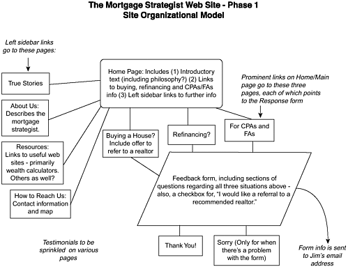
A web developer in the role of site structure designer needs to find out the full scope of information and services the site needs to provide, and aim for the ideal organization of categories and subcategories. This type of planning can often benefit from flowchart-type diagramming, whether using special software for this purpose, handfuls of sticky notes, or even pencil and paper (see Figure 8.1).
Figure 8.1. Careful site structure planning is essential.
User-Centered Versus Company-Centered Information Structure
As previously said, every aspect of web site development needs to be considered primarily from the point of view of the user. The goal is always to provide a positive user experience. It is crucial for the web developer to remember that his own perspective, and that of his colleagues, can differ significantly from that of a typical web user.
During the process of information structure design, however, the client himself often can benefit from some consciousness-raising as well. In particular, an all-too-common pitfall can be the tendency for the representatives of a company to want to structure a site according to the company's own departmental organization, or at least according to its own ways of thinking about itself. As any marketing expert can attest, however, the end user/customer usually has a very different way of thinking about a company's products and services; it is critical to a site's success that its information be ordered in a way that makes sense first and foremost to the user.
Principles of Good Navigation Systems
Anyone who has used the web can confirm that countless types of navigation systems exist; the designer has an almost limitless range of choices. However, the web designer whose goal is to produce a site that users love to use will follow certain basic principles:
-
Navigation should be based on a carefully planned site information structure.
-
The user should always know what site he is on a logo or other identifier should appear on every page, ideally in the same location.
-
Navigation controls the text or graphic links should be obvious on the page and clear as to their function.
-
The user should always know where he is in relation to other areas of the local site, a clear communication that "you are here." This should include his specific location in the site hierarchy; for instance, if he is two levels away from the site's start page, this should be clear (see Figure 8.2).
Figure 8.2. A navigation system should always show the user "you are here."
-
Each page's navigation links should make clear where the user can go from where he currently is.
-
Ideally, even on a very large site, the visitor should be able to reach the destination of his choice within two or three clicks.
-
When graphic elements are used for links, secondary text navigation should be provided somewhere on the page for the non-graphical-browser user.
Note
| | The function and appearance of individual links is discussed in more detail in Chapter 6, "Links and Navigation." |
Web developers sometimes tend to fall prey to the notion that users are weary of the "same old thing" with regard to navigation systems. However, one only needs to talk to a small cross-section of actual web users to confirm that just the opposite is true. Typical users (web designers excepted) simply do not go to the web hoping to find pages whose navigation systems are flashy, mysterious, or cutting-edge; just the opposite is true. In the vast majority of situations, users go to the Internet to get information and accomplish tasks. An ideal navigation system, from the user's point of view, is almost transparent, a humble servant: there exactly when he needs it, but never drawing attention to itself.
Methods of Page Layout
When graphical browsers first appeared, they didn't offer any page layout control. Text could be placed into paragraphs, headings, lists, and a few other formatting features, and images could be set to appear inline. But regardless, all elements started at the upper-left corner of the browser and proceeded left-to-right in lines down the page; there was no other way to arrange page elements (see Figure 8.3). Web site designers, accustomed to the measure of freedom and control over layout possible in print media, created a demand for page layout features that was soon met, initially by tables.
Figure 8.3. Before the advent of tables, HTML offered very little in the way of page layout aids.
Since that time, both the HTML specification and the support of major browsers for complex features has grown and developed significantly. Nowadays, the web designer can choose from a number of different ways to place images, text, and other elements on a web page, and design possibilities are almost limitless.
As of yet, however, no one content layout method gives the perfect combination of browser compatibility and flexibility. The various methods each have strengths and weaknesses. Some designers choose one method of page layout and use it almost exclusively, but the strongest approach is to become familiar with each tool and use it in the situations for which it is best suited.
Some web developers even use several of these layout tools on a single page to very good effect, but the ability to do this well is based on a thorough knowledge and lots of experience.
Tables
Basic table formatting was among the early additions to the original web browsers, and all major browsers have supported at least the simplest table tags since version 1.1 of Netscape. Although originally intended for laying out rows and columns of data, tables were soon being used for a very different purpose: to place elements more precisely within a page (see Figure 8.4).
Figure 8.4. Tables were originally intended specifically for displaying tabular data.
As of this writing, tables still represent a viable and useful page layout option, compatible with even very old browsers. But they are definitely not a quick-and-easy solution: To use tables well, you must be willing to spend time learning to understand their many quirks and limitations.
Dreamweaver provides a complete set of table-building features that make building this type of page extremely quick and convenient. Designing with tables is covered in detail in Chapter 9, "Building Tables."
Frames
Frames are sometimes treated as a newcomer to the scene, when in fact both major browsers have supported them for several years, since Netscape 2 and Internet Explorer 3. They are included in the HTML 4.0 specification.
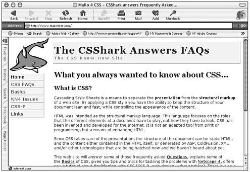
The use of frames enables you to specify rectangular areas of a browser window into which new, smaller pages of content can be loaded and reloaded, independently of each other. The most common use of this involves placing elements such as navigation bars and headers into frames, with page content appearing in a separate frame; the content frame can then be reloaded without disrupting the other frames. In this way, static elements need to be loaded only one time and stay in view as you navigate through various content pages (see Figure 8.5).
Figure 8.5. A fast-loading, "liquid," handicapped-accessible CSS-P page.
Frames allow a kind of flexibility that is hard to duplicate with any other method of page layout. However, some drawbacks are worth mentioning:
-
Users often find frame sites confusing to navigate.
-
Individual frames cannot be bookmarked.
-
If not handled carefully, frame sites can be difficult for search engines to index.
Still, the designer who understands frames and uses them carefully can produce some striking and useful designs. Designing with frames is covered in detail in Chapter 11, "Working with Forms."
Tip
| | Framesets are the HTML documents that describe how individual frames (also HTML documents) are to display in the browser. |
Layers
First, it's important to clarify some concepts and terminology with regard to the word layers.
-
Netscape introduced the <layer> element starting with Netscape 4. This is a Netscape-specific tag that has never become part of the HTML specification; its use is discouraged and later versions of Netscape have discontinued support of the tag. None of the discussions here or in Chapter 14, "Using Layers for PageLayout>," refer to the use of this proprietary element.
-
The term layer does not appear in any HTML or CSS specification.
-
Dreamweaver offers a tool/concept referred to as layers that is completely unrelated to the Netscape tag described in this list. Dreamweaver layers are actually <div> elements positioned with inline CSS.
-
Dreamweaver layers are distant relatives of the CSS technique referred to as CSS-P or CSS Positioning. Both use <div> tags to define rectangular elements, and both use CSS declarations to specify the properties of these <div> elements. However, CSS-P takes the concept further (as discussed later in this chapter).
Dreamweaver Layers
Dreamweaver layers are supported only by version 4 and above browsers; older browsers will either present an error message or display the page with missing or misarranged elements. However, Dreamweaver layers are integral to DHTML (see Chapter 17, "Controlling Layers with JavaScript," and Chapter 18, "Animating Layers").
Dreamweaver layers can be an extremely useful tool when used properly. However, inexperienced users, wishing that page elements could simply be "dragged and dropped" onto a web page the way they can in print layout applications, sometimes turn to them as a convenient shortcut; this is not a good use for layers. Their drawbacks and quirks make them a poor substitute for either tables-based layouts or CSS-P.
Tip
| | Layers should not be used as an easy shortcut to page layout. A rule of thumb when choosing between tables and Dreamweaver layers is this: If the design can be accomplished using tables, they are a much better choice, in that they are much more widely supported by the browsers. Layers should be used only if and when your design involves DHTML or timeline animation, or for other reasons that can be accomplished only with layers. |
Tip
| | For a detailed treatment of Dreamweaver layers, see Chapter 14. |
CSS Positioning
CSS Positioning, or CSS-P, is part of the CSS 2 Specification, which is a full recommendation of the W3C. As of this writing, the major browser vendors have failed to implement significant portions of the CSS 2 specification, but positioning is fairly well supported.
Important points to remember about CSS-P include the following:
-
Provides a way to achieve the functionality of the proprietary <layer> element with the <div> tag and style sheets.
-
Allows the separation of structure and presentation, which is central to the theory upon which HTML is built (see Figure 8.5).
-
Can be used to build page layouts that are easily manipulated and updated from a single linked style sheet
-
Can be used to build flexible, "liquid" page layouts
-
Lends itself very well to creating handicapped-accessible pages
-
Avoids the page-loading delays associated with table-based layouts
-
Although supported partially by Internet Explorer 4.x and later, and Netscape 4.x and later, should be tested thoroughly on numerous browsers and platforms.
See Chapter 14 for further discussion of CSS-P.
Interview: Corey Eiges
Business Name: 10 Digit Tender, Inc.
URL: http://YouNeedaWebstore.com
How did you get started in web design? What has your learning process been like? What kind of work are you currently doing?
I began web design when I took over an unfinished site for the company for which I was working at the time. I wound up scrapping it and starting all over, using Dreamweaver and learning as I went.
My learning process has been mostly by designing and reverse engineering, as opposed to by books or classes. I learned what works and what doesn't by personal experience, playing with code, and examining the works of others I have found through the Macromedia Dreamweaver and UltraDev newsgroups.
Currently I am creating e-commerce and database sites, as well as standard "brochureware" sites.
What hardware and software do you use in your work?
I work on a Windows 2000 Pro laptop networked to a Windows 98 desktop with cable modem Internet access for both, and use an Olympus digital camera, a Visioneer scanner, and an Epson color printer. My software includes Dreamweaver 4 and UltraDev 4 for web design (I keep both on the system), Fireworks 4 with a BladePro plugin for graphics, eyedropper for color matching, SnagIt32 for screen captures and some image editing, CuteFTP for file transfers, and of course my own handcoded software (registry utilities) for disaster prevention and recovery.
What are some characteristics of web pages that you consider to be well-designed?
For me, navigation is what it's all about. When I first started out as a newbie, I used "mystery meat" navigation, which looks cool but is user-unfriendly. I no longer do that. A site rarely has what I want on its home page, so where do I go from there? If I have to look for more than a few seconds to figure out how to get to what I need, then that site begins to irritate me. We have become a world that requires instant gratification, and a designer should take that into consideration.
A well-designed site has something that has a degree of familiarity to it. Even on sites with outlandish color schemes or graphics, if there is a sense of order or balance to it, I might consider it well-designed. Or if the site is, visually-speaking, as dull as dishwater, yet has that sense of familiarity that invites me back, that too might qualify as well-designed. That sense of familiarity includes the navigation structure, but really it is much more. Whether the layout or the lines or amount of white space, or even the size and placement of the logo, something on the page has to say, "Stay awhile. You have friends here."
Do you primarily use tables, frames, layers, CSS Positioning, or some combination? Which direction do you plan to move in?
I use a combination of these, with frames and CSS Positioning being used less than layers and tables. Although some people have a predisposition to avoid frames, I don't. Sometimes they are the best solution for a project. Nevertheless, I primarily use layers and tables, and almost always tables within layers.
I plan to use CSS Positioning a bit more, but I might wait to see what sort of improved integration with CSS Dreamweaver will provide in future releases.
What trends on the web and in the web designer's work do you see as important?
Netscape dying an ignominious death, falling off the edge of the Earth, is the most important Web trend for which I look. My productivity would zoom if I didn't have to deal with Netscape-related issues.
Beyond that, the rush to standardization, although important, really won't affect me personally in the near term. I enjoy using CSS and as far as this web designer is concerned, that is the trend that's most important.
What advice would you give to someone just starting out in web design?
Don't be afraid to get your hands dirty with code. You can create decent-looking sites using a tool such as Dreamweaver, but unless you look under the hood of the car, (look at the code), you will have learned little. The sense of accomplishment you will have after receiving your "aha!" epiphany will be far greater than the satisfaction of making a handsome and functional web site.
Page Composition Issues
The basic unit of a web site is the HTML document the page; a user is generally looking at a single page at a time. Although the structure of a site and its navigation system are very important to the user experience, the layout of the individual pages also is crucial. You have already read about the techniques by which pages are composed using tables, frames, layers, or CSS positioning; this section discusses a few of the pertinent issues and considerations in page composition design.
The Use of Screen Real Estate
The web designer's canvas is the browser window's viewport, the rectangular area available for displaying web content. This canvas, sometimes described as screen real estate, is valuable space. You have this finite number of pixels to present your message, and it is wise to carefully consider and plan how to use each part of it.
Always remember these few basics concerning the use of screen real estate:
-
Because of the way HTML documents load in the browser window, the top and the left portions of the document are the first to come in view; this renders the top and left areas more important than farther to the right or farther down on the page.
-
The portion of a document that fits into the user's browser window upon loading is far more valuable than any portion he has to scroll to see. Users generally will scroll vertically, although sometimes grudgingly; after all, web pages are scroll-like documents and are expected to reach beyond the bottom of the browser window. However, user testing has shown that users strongly dislike scrolling horizontally. Don't ask your users to scroll horizontally.
Tip

A cardinal rule of page layout: Don't ask the user to scroll horizontally. An exception is sometimes made for the very lowest resolution settings, such as 640x480, which are becoming quite uncommon, and whose users are accustomed to horizontal scrolling.
-
Users come to your web site for content, and the majority of a page's available space should be filled with relevant, useful content.
-
Repeating content such as headers, navigation bars, and footers is important to the cohesiveness of a site, but it shouldn't take up a large percentage of each page. Also these elements should load in exactly the same location on each page, so that the user doesn't have a visually jarring sensation when moving from page to page.
Page Width, Resolution, and Window Size
The web was designed as a platform-independent medium; ideally, web pages should be viewable in some acceptable form using any type of device, from giant monitors to handheld devices. At the very least, designers must be sure that pages display properly at all the most common resolution settings for desktop and laptop computer monitors.
New web designers often ask how to design their pages "so that they will look good on any size monitor"; this represents some errors in thinking. The size of the monitor is not the issue; what matters are the resolution setting and the browser window size.
A user with a 21-inch monitor set at an 800x600 pixel resolution will see your web page looking the same as a user with a 15-inch monitor set at 800x600, assuming that both have the browser window maximized. The lucky user with the 21-inch monitor will just see it a lot larger; he won't see any more content.
So it isn't of any use to talk about the size of the monitor. However, an issue beyond the resolution setting also needs to be considered: the size of the browser window itself. A browser window can be resized by the user to any dimensions he desires, of course, by dragging the edges of the window with his cursor. Although some users keep the browser window maximized, many do not (see Figure 8.6). Especially with larger monitors with higher resolution settings, it just isn't necessary to run programs maximized; the desktop space that isn't being used for the browser can be used for other purposes. Suppose, for example, that a user has his monitor resolution set to 1024x768 pixels, but his browser window resized to about 800 pixels wide and 600 pixels in height; he will see your web page the same way as the two previously mentioned users.
Figure 8.6. A non-maximized browser window.
As of this writing, the majority of Internet users are using an 800x600 pixel resolution setting. A much smaller but fast-growing group uses 1024x768 pixels. A very small and fast-shrinking group has the monitor set to 640x480 pixels. The users with the higher resolution settings do not always maximize the browser window, and so need to be considered along with the group with the lower resolution settings.
Another important factor in this discussion is that pages can be designed so that they are liquid or flexible and accommodate themselves to the size of the user's browser window viewport, as opposed to fixed-width pages (see Figure 8.7). This is the ideal solution, and a way to achieve it is discussed in Chapter 9. Even when designing flexible pages, however, in most cases a design will look better at one size than another, and the designer needs to decide for whom to optimize the design. Therefore, assuming that the designer wants to please the largest number of users, while not ignoring any, the issue of how many are browsing at what window size is still very relevant.
Figure 8.7. A flexible-width page accommodates itself to almost any browser window size.
One last consideration is the fact that browser windows contain chrome the toolbars, status bars, gray edges, and scrollbars, which take up screen pixels. So even those with the browser window set to 800 pixels wide do not have the full 800 pixels for viewing your web page (see Figure 8.8).
Figure 8.8. Browser window chrome.
At the time of this writing, the best suggestion is to design pages to be flexible, and that pages fit without scrolling into a browser width of less than 800 pixels. To allow for the browser chrome, use about 760 pixels. Pages should look good at about 1024 pixels wide as well, this being the second-most-common window size, and one that is growing rapidly. And pages should look good, or at least respectable, at 640 pixels wide. The most relevant content should be placed at the top and left of the page, and if some scrolling is required, it's probably acceptable to 640x480 resolution users.
Use of Fonts
New web designers often ask, "How can I control the way the fonts on my page will display for the user, so that he can't resize them and break my design?" The only way to do this is by turning the text into graphics. Even when text size is specified by CSS in pixels, the user can override the setting in some browsers. This is a difficult reality that designers need to be aware of; page designs must be built so that they still display well when the text size is altered. However, there's a good reason for the browsers giving the user this capability: those with visual impairments need to be able to choose a text size that works for them.
Use of Images
As powerful as images can be as a page layout tool, some restraint is advised in their use for several reasons:
-
Every image used adds to page download time; large images can add significantly.
-
Pages based on images are more difficult to make accessible to the less-common user agents (devices used to view the web) such as speech browsers and handheld devices.
-
Heavy use of images makes building flexible pages much more difficult.
Heavy use of images makes accommodating user changes in text size (see the last item in the preceding list) much more difficult.
White Space
White space is a term used in the print media industry for empty space on a page; note that white space can be of any color. Far from being wasted space, white space serves important purposes. One use for white space is just separating page elements. However, a more important use is related to the way people see and read; white space provides a much-needed "rest" from the visual busy-ness of most pages. Good use of white space can make a page much more pleasant to look at and easier to read (see Figure 8.9).
Figure 8.9. Good use of white space.
Use of Color
The use of color can make or break a web site. A consistent and well thought out color scheme sets the mood, establishes visual cohesiveness, and draws the user's eye as needed. Bad color choices too many colors, inconsistent use of colors, colors with too much or not enough contrast make the site look amateurish and hurts its usability. From a practical standpoint, web designers also have to decide whether to limit their choices to web-safe colors.
Working with the Color Wheel
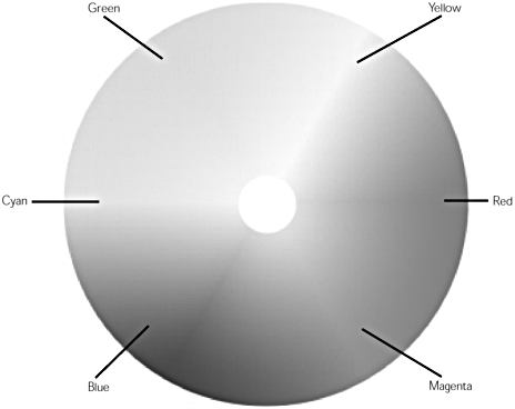
The color wheel, like that shown in Figure 8.10 and in the chapter_08 folder on the accompanying CD, is an important design tool when choosing a color scheme. Relationships between colors become apparent when viewed in this structure. And choosing a good color scheme is all about determining relationships.
Figure 8.10. The color wheel with major colors marked.
Hue, Saturation, Brightness
These are the principal characteristics of any color. Hue is the perceived color red, purple, green, and gold. Saturation refers to the intensity of the color a bright fire-engine red as opposed to a dusky rose color, for instance. Adding gray desaturates colors. Brightness refers to the amount of black added fire-engine red compared to a deep, heavy maroon. When mixing colors for a color scheme, you usually want to choose colors that contrast in more than just hue.
Warm Versus Cool Colors
The basic mood of a site can be determined by whether it primarily uses warm or cool colors. Warm colors are the colors of fire oranges, golds, reds, and yellows. Warm colors can be inviting and cozy, or assertive and in-your-face, demanding attention. Cool colors are the colors of water and air blues, greens, and turquoises. Cool colors can be restful and recessive, or even aloof, crisp, distant.
Complementary Colors
When two colors have hues that lie opposite one another on the color wheel, they are said to be complementary, and have a very strong visual impact together. Two complementary colors of equal brightness and saturation, placed up against each other, will be very jarring. They might even appear to "dance" where they meet. Two colors with complementary hues, but differing brightness and saturation values, will look as if they were made for one another. A bright, sharp turquoise and deep, dark maroon; a deep, rich blue and pale, muted gold; these are the start of a wonderful color scheme.
One popular method of using complementary colors to create a color scheme is to choose several variations of color from a particular area of the color wheel differing shades of gold and brown, for instance; and offset them with one choice from the opposite side of the wheel, like a bright sky blue.
Note
| | Dreamweaver offers two tools to help set up and implement a cohesive color scheme. Choose Commands > Set Color Scheme to apply one of dozens of pre-defined color schemes to your page. If you don't trust your ability to choose color wisely, this can be an inspiring place to start learning. After you've chosen your site's color scheme, the Assets panel can help you keep track of your colors, through its color category. See Chapter 22, "Local Site Management," for a full discussion of the Assets panel. |
Colors on the Web
In the print world, designers are limited by the colors their available inks can reproduce. Web designers aren't limited by ink, but have to consider other limiting factors when choosing colors.
Web-Safe Colors
A web-safe color is one that appears without dithering in Netscape Navigator and Microsoft Internet Explorer on both Windows and Macintosh systems running in 256-color mode; 216 colors are commonly considered to be web-safe. Dithering is a pattern like a tiny checkerboard made up of a combination of two colors in an attempt to approximate a third color, which the system is incapable of displaying.
On newer monitors using 24-bit True Color, colors other than the web-safe colors don't present a problem; these systems can display more than 16 million colors accurately. As more and more of these monitors come into use, and the old machines running 256 colors are retired, ignoring the web-safe palette is becoming a viable option. Many designers opt to use custom non-web-safe colors, deciding that possible display problems for a small percentage of users is an acceptable risk for the benefit of being able to choose from a rainbow of colors. However, the jury is definitely still out; many designers think that it is important to restrict themselves to the 216 web-safe colors.
Note
| | As you're using the Dreamweaver color picker, be aware that the color cubes and Continuous Tone color palettes offer web-safe colors. The Windows OS, Mac OS, and Grayscale palettes are not web-safe. If you are using one of these, and then choose Snap to Web-Safe, the selected color will be replaced with the closest web-safe color. (See Chapter 2, "Setting Up the Dreamweaver Workspace," for more on the color picker.) |
Gamma and Calibration Differences
Because most computer monitors are not calibrated to display color accurately, there is no guarantee that your colors will look exactly the same on any two computers. PCs tend to display colors darker and more saturated than Macs, for instance; this is especially noticeable in the very dark shades. In addition to this, color shifts occur in monitors as they warm up in the morning, as they age, and even as they reflect light from a window or overhead light.
How worried should you be about variation? Your colors are not going to be hijacked red will still be red; green will still be green. They might just be different shades of red or green. The colors at most risk of really hurting your design as they change are those on the cusp between warm and cool. A nice, warm gold can shift into a sickly greenish gold very easily.
Summary
It takes study and practice to learn how to plan and build attractive, useful web pages. In this chapter, you learned the basics of web page design: how to think in terms of the user experience, how to structure a site that is easily navigable, the pros and cons of the different page layout methods, and how to arrange a page that will look good on numerous different user agents. This chapter finished with a look at the skillful use of color on the web. The remainder of this part of the book examines the major page layout tools in depth.
| CONTENTS | |
EAN: 2147483647
Pages: 49