Working with Print Layout Tools
| In addition to working with existing documents such as disclosures and contracts, you also spend time creating marketing documents, from listing presentations to open house flyers to market comparison reports. Chances are you're using Microsoft Word, because it has rudimentary layout capabilities to support multiple columns and can display images. And Word has a pretty easy Table tool that's quite handy for creating lists of comps. But you can give your marketing documents more oomph and professional character if you use a page layout program like Microsoft Publisher or Adobe InDesign. The basic difference between using Word and using a page layout program is the level of refinement you can achieve. Layout tools offer finer control over item placement and typographic display, which simply looks better. It's often easy to spot a "home-made" flyer done in Word, which is why a professional-looking flyer produced in a professional-level layout program helps your materials stand outif you're willing to invest the time and money.
No matter what software you use to create your flyers, open house signs, and so on, if you plan to have them professionally printed, talk to the printer about the kinds of files it can accept and any restrictions it might have on those files. Some printers can work with Word or Publisher files, but many cannot. In some cases, you can create PDF files from Word or Publisher and submit the PDF files instead. But ask first. (Of course, if you're going to print these documents yourself, you don't have to worry about this issue.)
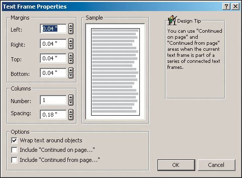
Tips for Using Microsoft WordMicrosoft Word is fine for basic layouts, but as you try to create more sophisticated pages, you'll quickly come across Word's limitations. That's because it was never designed as a layout tool; instead, layout capabilities were added for simpler needs as a bonus. Placing ItemsMicrosoft Word does not give you fine control over item placement, but you can still do the basics. Word handles images as objects that are typically anchored to a spot in text so they move with that text as you work on the document. You can control some of the layout attributessuch as whether text overprints the image and where the image alignsafter you find the right controls in Word. The exact location may vary based on your version of Word, but typically you can access the controls by double-clicking an image after you import it. (To import a picture, you typically choose Insert > Picture > From File.) The basic picture controls in Microsoft Word are on the left, and the positioning controls if you click Advanced are on the right. 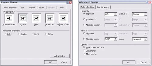 Note that the more images you have on a page, the harder it is to control their relative placement. Word really isn't designed to let you place several images in specific locations and leave them there, which is something you typically do in a flyer. What you can do easily is place a few images side by side (or separated with a few spaces), such as showing a row of images for a home. Using Multiple ColumnsThe other key area to pay attention to in Word is the use of multiple columns. You first need to create a new section in your documenteven if you want the columns to start in the middle of a pageby first choosing Insert > Break and then selecting the Continuous section break option before clicking OK. You'll need another continuous section break where you want the multiple columns to end. After you've created the breaks, your next step is to format the columns within the new section. Make sure you click the text pointer inside the section, and then choose Format >Columns. In the resulting dialog box, you can set the number of columns, their widths, and the spacing between the columns. To have multiple columns in Word, first create a new continuous section (left), then apply the desired column settings to that new section (right). 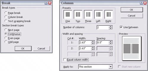 Applying StylesDon't forget to use styles to maintain consistent formatting of your text. A style saves all the formattingfont, size, alignment, and so onso you can apply that style repeatedly to ensure consistent formatting. To define styles, choose Format > Style, then click New. Now adjust the settings in the dialog, using the Format button to select different formatting options. Click OK when done with the style, and then click Close. To apply styles to text, make sure your text is selected, choose the style from the Formatting bar or by choosing Format Style, and select the desired style from the list on the left. Then click Apply. Tips for Using Microsoft PublisherMicrosoft Publisher is a popular layout tool in Windows for people who aren't professional designers. It uses lots of templates and wizardsstep-by-step guidance for various actionsto help make good-looking materials easily. Working with FramesOne thing that really distinguishes professional layout tools from word processors is the concept of framesindependent objects that can hold text or graphics, letting you place and format those objects independently. Publisher uses frames to hold text and graphics. For graphics, these frames are created automatically when you import an image (choose Insert > Picture > From File). But for text frames, you must first draw the frame before you can import the text (Import > Text File) or type in new text. To draw a frame, select the text frame icon (the letter A in the vertical button bar), then click and drag the rectangle shape, which will become the frame, where you want it on your page. (You can move and resize it later.) Applying StylesDon't forget to use styles to maintain consistent formatting of your text. A style lets you save all the formattingfont, size, alignment, and so onand lets you easily apply that style over and over. To define styles, choose Format > Text Styles, then select Create a New Style from the dialog box. Now specify the various settings in the dialog box, and click OK when done. To apply styles to text, be sure your text is selected, and then click the desired style from the list in the Formatting bar (as you would in Microsoft Word). Microsoft Publisher relies heavily on templates and step-by-step wizards to help you create your materials.  Applying ColorsOne area where Publisher is a bit weak is in its ability to create and apply colors. It works like Word in that you can select any color for fills, text, and lines (there are icons for each in the Formatting bar) by clicking Custom rather than choosing one of the colors initially shown. But you can't create what's called a palettea set of colors you select to apply over and over again, much like how text styles work for text formatting. Therefore,it's harder to ensure consistent color use in Publisher. Like professional layout tools, Publisher uses the concept of text frames to hold independent text blocks. These frames can have multiple columns and their own margins. Tips for Using Adobe InDesignTo create truly professional-quality layouts, you need a professional tool such as Adobe's InDesign. Although this tool lets you do a lot more with your layout than Word or Publisher, it's correspondingly more complex to use. So, if you're a novice InDesign user, start small by creating basic layouts and then experiment with the program's capabilities gradually so you don't get over-whelmed and give up. Working with Columns and Page DimensionsWhen you first create an InDesign layout, you set the basic specifications such as page size and number of columns. These aren't hard-and-fast settings, though: You can change the settings later by choosing Layout > Margins and Columns (for margins and columns) and File > Document Setup (for page dimensions).What can often confuse new users is that the columns you set for InDesign aren't forced on youthey're just guidelines that appear on every page. As you add text (by creating a text frame or by importing text), you can adjust InDesign's settings, including number of columns, independently of what is set in the general document settings. In other words, think of each text frame as its own mini-page that you can format as you want, and then arrange with the other text frames and pictures as you want. Using the Control PaletteInDesign has a very complex interface with way too many options scattered about. To keep things under control, use the Control palette (the rectangular palette at the top of the window) instead. Its options change based on whatever you currently have selected, helping you narrow down the relevant options. While not everything you want is displayed in the Control palette, most common actions are, so it's very handy. (Note that when you select text, the Control palette has two modes: If you click the A icon, you see character settings, but if you click the ¶ icon,you see paragraph settings.) InDesign's Control palette gives you quick access to most common functions for whatever is selected. Note that some of the functions reside in the palette menu, the triangle icon in the upper-right corner. Working with FramesInDesign uses frames to hold text and graphics. For both text and graphics, frames are created automatically when you import a text file or an image (choose File > Place). You can also draw frames before importing text or graphics (or before typing in your own text) by selecting either of the rectangle-shaped tools from the vertical button bar and then clicking and dragging the rectangle shape that will become the frame. You can place the frame anywhere on the page. (You can move and resize it later.) One often-used tool not displayed in the Control palette is the Text Wrap pane, which lets you set how text margins adjust when text frames overlap other objects. (Making text surround other objects is called text wrap.) Because InDesign uses independent text frames, sometimes it can be frustrating trying to get text to flow from one frame to another, whether on the same page or across pages. Importing Text and GraphicsThe method InDesign uses to import text and graphics is confusing. In InDesign, that action is called placing, so you use the Place dialog box to select text or graphics to bring into the layout (one at a time, of course). Choose File > Place to access that dialog box.
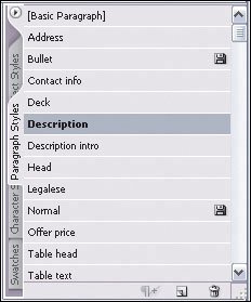
Applying StylesDon't forget to use styles to maintain consistent formatting of your text. You can apply a style repeatedly for consistent professional documents. To define styles, choose Type > Paragraph Styles, then select New Paragraph Style from the palette menu (the little arrow that appears in a palette's upper-right or upper-left corner, depending on the specific palette), then specify the desired settings in the dialog box, clicking OK when done. To apply styles to text, select your text, and then click the desired style from the list in the Paragraph Styles pane. You'll also see something called character styles, which lets you create styles for sections of text within a paragraph, affecting only highlighted text. A paragraph style affects the entire paragraph. InDesign's Paragraph Styles panelets you apply consistent formatting to text easily, as well as define and modify the styles.
|
EAN: 2147483647
Pages: 100