The Tyranny of Control Charts
Seven Common Tools
SPC takes numbers and presents the numbers pictorially to tell a story. The story that is told demonstrates what is happening within the process. That story is often called "the voice of the process." The pictures produced must be explained and must be accurate. To that end, there are seven commonly recognized tools for statistical process control:
-
Check sheet
-
Run chart
-
Histogram
-
Pareto chart
-
Scatter diagram/chart
-
Cause and effect or fishbone diagram
-
Control chart
Some basic examples are shown in Exhibits 1 through 7. These examples are for illustration only ” we do not go into how to derive the values for each chart and then how to translate the values into meaningful representations.
Check Sheet
The check sheet (Exhibit 1) is used for counting and accumulating data.
| |
| Student Name | In Class This Week? |
|---|---|
| Jane | ¼ ¼ ¼ ¼ ¼ |
| Robert | ¼ ¼ ¼ ¼ ¼ |
| Jennifer | ¼ ¼ ¼ |
| Puff Daddy |
| |
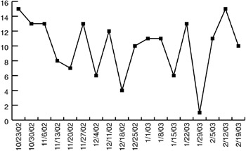
Run Chart
The run chart (Exhibit 2) tracks trends over a period of time. Points are tracked in the order in which they occur. Each point represents an observation. You can often see interesting trends in the data by simply plotting data on a run chart. A danger in using run charts is that you might overreact to normal variations, but it is often useful to put your data on a run chart to get a feel for process behavior.
| |
| |
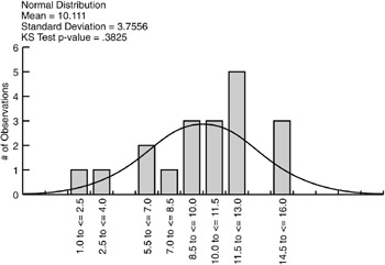
Histogram
The histogram (Exhibit 3) is a bar chart that presents data that have been collected over a period of time, and graphically presents these data by frequency. Each bar represents the number of observations that fit within the indicated range. Histograms are useful because they can be used to see the amount of variation in a process. The data in this histogram are the same data as in the run chart in Exhibit 2. Using the histogram, you get a different perspective on the data. You see how often similar values occur and get a quick idea of how the data are distributed.
| |
| |
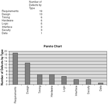
Pareto Chart
The Pareto chart (Exhibit 4) is a bar chart that presents data prioritized in some fashion, usually either by descending or ascending order of importance. Pareto diagrams are used to show attribute data. Attributes are qualitative data that can be counted for recording and analysis; for example, counting the number of each type of defect. Pareto charts are often used to analyze the most often occurring type of something.
| |
| |
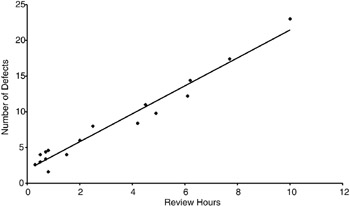
Scatter Diagram/Chart
The scatter diagram (Exhibit 5) is a diagram that plots data points, allowing trends to be observed between one variable and another. The scatter diagram is used to test for possible cause-and-effect relationships. A danger is that a scatter diagram does not prove the cause-and-effect relationship and can be misused. A common error in statistical analysis is seeing a relationship and concluding cause-and-effect without additional analysis.
| |
| |
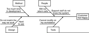
Cause-and-Effect/Fishbone Diagram
The cause-and-effect/fishbone diagram (Exhibit 6) is a graphical display of problems and causes. This is a good way to capture team input from a brainstorming meeting, from a set of defect data, or from a check sheet.
| |
| |
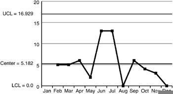
Control Chart
The control chart (Exhibit 7) is basically a run chart with upper and lower limits that allows an organization to track process performance variation. Control charts are also called process behavior charts.
| |
| |
Some of you may have reviewed the charts above and said, "Wait a minute! That's not a Pareto diagram; that's a bar chart!" or "That's not a control chart; that's a run chart!" Your organization may call these charts and graphs something totally different. Just make sure you use the right calculations for the charts, know where the data come from, know what the data represent, and how to interpret the charts.
While some people include the fishbone diagram as a "statistical" tool, others do not because the fishbone does not necessarily focus on quantitative data. We have included it because we often use it during data gathering workshops.
Why are pie charts not listed? Pie charts are the most commonly found charts in organizations, and are used frequently in newspapers and articles across this country. Why are they not included as statistical tools? I believe it is because pie charts simply take counts of data that could be (or actually are) listed in tables, either just by raw count or by percentages, and display these data as parts of the pie. I like pie charts ” they are easy to understand. However, I do not believe that they allow the viewer to understand the "voice of the process" better than other types of charts.
These seven graphical displays can be used together or separately to help gather data, accumulate data, and present the data for different functions associated with SPC. For example, I like to use the fishbone diagram when conducting brainstorming sessions with my clients . We select a problem that has occurred in the organization and brainstorm the causes and effects of the problem. We then draw a scatter diagram to spot trends in the gathered data. In any event, most people prefer to review data represented pictorially than by data listed in endless tables. While tables can list the values or results found, they cannot show the relationships between the values and between each table, or illustrate areas that are not performing in a statistically predictable way.
EAN: 2147483647
Pages: 205