Formatting Text on a Chart
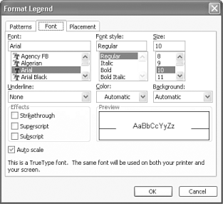
| Though charts are primarily graphic objects, every chart contains plenty of text in the form of a chart title, axis labels, and a legend. Even though the chart obtains its raw data (including text) from the worksheet, the chart itself controls the appearance of this text, and you can change the text appearance without affecting the appearance of your worksheet data. Before formatting text on a chart, be aware that all entries that appear within an object on the chart use the same text formatting. For example, if you change the font for the legend, all entries in the legend appear in the same font. You can't change one legend entry without changing all of them. To change the appearance of text on a chart, follow these steps:
|
EAN: 2147483647
Pages: 189
- Chapter IV How Consumers Think About Interactive Aspects of Web Advertising
- Chapter V Consumer Complaint Behavior in the Online Environment
- Chapter VIII Personalization Systems and Their Deployment as Web Site Interface Design Decisions
- Chapter X Converting Browsers to Buyers: Key Considerations in Designing Business-to-Consumer Web Sites
- Chapter XVI Turning Web Surfers into Loyal Customers: Cognitive Lock-In Through Interface Design and Web Site Usability