Section 4.4. Analysis
4.4. AnalysisWe still do not know if the metrics can predict the payout. We hope the data can make the prediction, but we need more information about the relationships in the data. The Pivot Table tool makes it easy to explore these relationships. We select all rows for columns B thru J. Then we select PivotTable and PivotChart Report from the Data menu. The PivotTable dialog opens up, and we select Pivot Chart Report as in Figure 4-11. Figure 4-9. Adding the SpeedRank column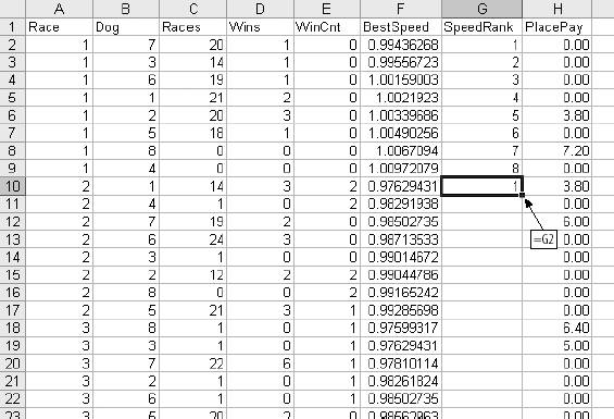 Figure 4-10. Adding the WinRank column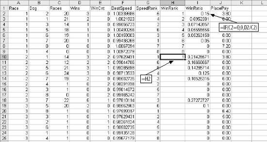 After Finish is clicked, the Pivot Chart is displayed. We are interested in the relationships between the payout and the other metrics. So, we drag PlacePay to the Data area in the center of the chart, labeled as Item 1 in Figure 4-12. By default the count of the data item, PlacePay, is displayed. We change to average by double-clicking on the Count of PlacePay button and selecting Average (Item 3). Next we drag Dog to the Category area at the bottom (Item 2). Figure 4-11. Setting up a Pivot Chart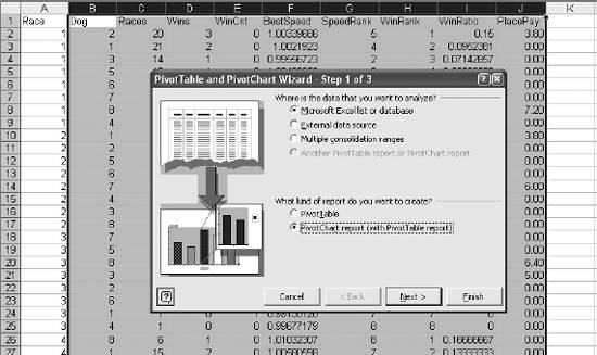 Figure 4-12. Configuring the Pivot Chart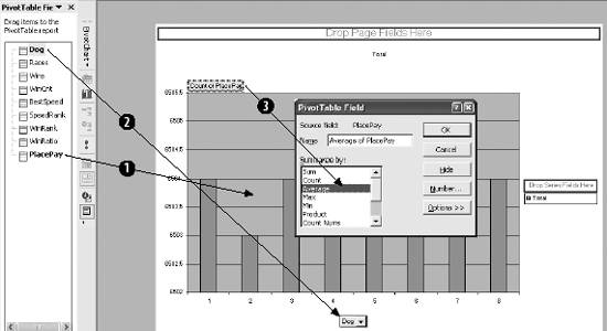 This results in the chart in Figure 4-13, showing how post position relates to payout. On average, the dog in position 1 pays more. So, if you bet dogs running in position 1, you will lose less money. The minimum bet is $2.00, thus there is a profit if the average of PlacePay is more than $2.00. Figure 4-13. Post position and Payout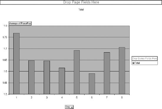 We use this chart to check the relationship between our metrics and the payout to find ones with the greatest predictive power. The metric Dog is dragged back to the list of metrics and the other metrics are dragged to the category box one by one. Races, Wins, and BestSpeed look odd because they have a large number of possible values. The metric that gives the best result is WinCnt, the number of wins out of the last six races. In Figure 4-14, which displays WinCnt, there are two important pieces of information. First, there is a definite increase for values five and six. And second, this metric comes closest to making a profit. The bar for WinCnt five is above $1.90. Of all the metrics WinCnt is the most predictive and powerful. But it still cannot make a profitable betting decision. WinCnt is our best metric. But how well does it predict the payout when combined with other metrics? To check, we change the chart. We drag Dog to the series area on the right side of the chart as shown in Item 1 of Figure 4-15. Then we right-click on the data region (Item 2), and select Chart Type from the dialog. We select Surface chart as shown. Figure 4-14. WinCnt and Payout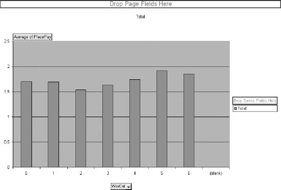 Figure 4-15. Setting up the surface chart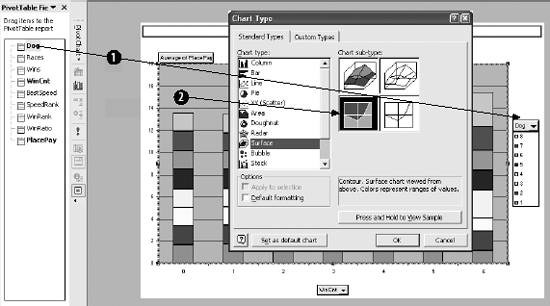 The result is Figure 4-16, and we see two regions of profitability; i.e., two areas where the average payout is over $2.00. The fact that there are two areas suggests that either we do not have enough data to get a good representation or the relationship between WinCnt, Dog, and PlacePay is complex. Either way, we now know a profitable model can be built if we can figure out how to do it. Figure 4-16. WinCnt and Dog have two profitable regions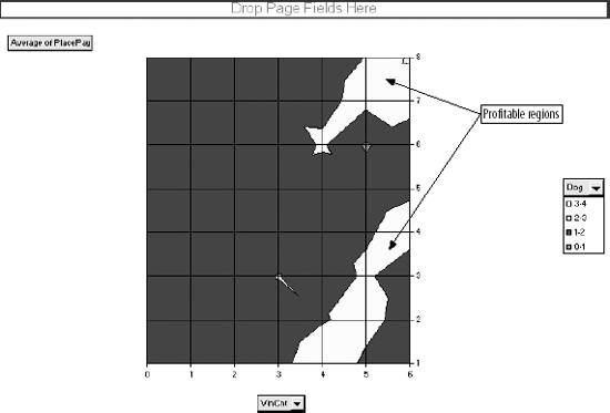 Checking the other metrics with WinCnt we find two more, SpeedRank and Winrank, with profitable regions, as shown in Figure 4-17. Figure 4-17. More profitable territory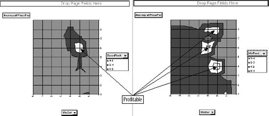 Before we start building a model, we need to make the problem as simple as possible. Regression is a good tool but it needs all the help it can get. In all the charts in Figures 4-16 and 4-17, the profitable areas have a WinCnt of four or higher. In Figure 4-15 we see that WinCnt is the best predictor. We can simplify the problem by only looking at dogs that have a WinCnt of four or higher. This group is the closest to profitable to start with, and we already know that by combining it with other metrics it is possible to make a profit. We eliminate the rows that have a WinCnt less than four by using a filter. First, we build the criteria for the filtering operation. In Figure 4-18 the criteria is in cell range K1:K2. It is simply the column heading of the column to be filtered and the condition that we want (i.e., greater than 3). Next we select Data Figure 4-18. Filtering the Data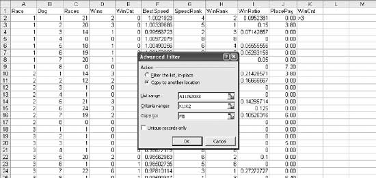 This leaves us with 710 rows. We are looking at results for the place bet, so in the general population 25% of the dogs would win. There are eight dogs in a race and two will win the place bet, since the place bet covers both first and second. The filtered population, dogs that have won at least four of their last six races, wins the place bet 47% of the time. This means that about half of the rows in the filtered data have a payout. This is important because regression works best when there is a good mix of values in the data. The average payout for the general population is $1.67, but for the filtered group it is $1.78. |
 Filter
  Advanced Filter and the dialog box in Figure 4-18 is displayed. Since we are eliminating tens of thousands of rows, we use the "Copy to another location option. The List range is the range of cells that contain the data we are looking at. The Criteria range points to the criteria in K1:K2. "Copy to" is the location that the filtered data will be in. After OK is clicked, a copy of columns A-J will be in columns M-V. The data in M-V will only have rows with a WinCnt of four or more. We then delete columns A-L and are left with the data we want. Earlier we saw an inconsistency between Races and WinCnt, and now Races is out of the model.
EAN: 2147483647
Pages: 101