| So far, the concept of dragging a symbol from the Library to create as many instances as you want has been pretty straightforward. It's powerful but easy to use. For a simple example, imagine that you made one symbol of a cloud. You could create many instances of the cloud symbol to make a cloudy sky. But you could do much more than that. Each instance on the Stage could be different from the next. One could be large and another one could be stretched out and darkened. In the upcoming task, for example, you'll see how multiple instances of one symbol can vary in size, scale, and rotation. And later this hour you'll make a symbol that contains instances of another symbol. Such nesting means not only that you can have many instances on the Stage but that you can recycle symbols to be used in the creation of other symbols. You'll learn about this one step at a time. Placing Instances of Symbols on the Stage This discussion might seem like repeated material, but the concept and process are very specific. One master symbol in the Library can be dragged on the Stage as many times as you like. Each one on the Stage is called an instance. You'll see how each instance can vary in a minute, but first let's review a couple points. If you copy and paste an instance that is already on the Stage, you are simply creating another instance. Not only is this okay, but it's sometimes preferable to the alternative simply dragging an instance from the Library because all the properties of the instance being copied will be in the new instance. Remember that the "copy" is just another instance. There's one other way to get an instance on the Stage (in addition to dragging it from the Library or copying one already on the Stage). Maybe you'll think I'm cheating, but as a review, consider that you can draw a plain old shape, select it, and use Convert to Symbol. This procedure puts the symbol in the Library but also leaves on the Stage an instance of the symbol. If this doesn't make sense, try repeating the task "Create a Symbol by Converting Selected Objects" from earlier in this hour. Modifying Instances of Symbols Believe it or not, by simply dragging two instances of the same symbol onto the Stage, you create two instances with different properties because they vary in position. In other words, each instance is in a different location on the Stage. Each instance can be made different in other ways, too. For example, you can transform the scale of any instance on the Stage without adding to the file size in any significant way. You can rotate each instance separately, as well. The following task explores how to vary the properties of separate instances in regard to their position, scale, and rotation. Try It Yourself: Transform the Location, Scale, and Rotation of Instances In this task you'll transform the properties of several instances. Here are the steps: 1. | In a new file, draw a rectangle and then use the Text tool to type your name. Use the Properties pane to ensure the text is Static Text. Try to position the text and resize the rectangle so that they're about the same size. Change the text color so it's legible on top of the rectangle.
| 2. | Select everything you just drew and then choose Modify, Convert to Symbol. Name this symbol My Name. Leave the default Behavior option, Movie Clip, selected and then click OK. Onscreen you now have an instance of the My Name symbol you just created.
| 3. | Create more instances of this symbol any way you want either by copying and pasting the one onscreen or by dragging instances from the Library.
| 4. | Make a change in the position of each instance on the Stage by simply moving the instance to a different location. With some of the instances, select the Free Transform tool and change their scale. (Remember from Hour 2, "Drawing and Painting Original Art in Flash," that you can scale width or height or both at the same time.) Change the rotation of other instances (remember that rotation includes skew when the Free Transform tool's Rotate and Skew option is selected and you drag the noncorner handles). You can go wild here, as in Figure 4.8, yet your file will only be as big as the master symbol. Notice, however, that only the Free Transform tool's Scale option and its Rotate and Skew option are available (you can't distort and envelop symbol instances only Shapes and Drawing Objects).
Figure 4.8. Many instances of the same symbol can be scaled, skewed, rotated, and positioned differently. 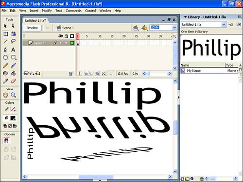
|
You might think that varying each instance's position, scale, and rotation provides for a lot of combinations and it does. However, there's more. Each instance on the Stage can have a color style, a blend, plus a variety of filters applied to it. Next, we'll explore each one briefly and then, next hour, you'll see them applied in practical applications. Using Color Styles Color Styles include tinting the color of an instance, changing its brightness, and changing its alpha property (that is, its opacity). Similarly to how each instance can have a different location, each instance can have different color effects. To move an instance, though, you just pick it up and move it. To apply a style, you use the Properties panel. To change an instance's color style, you simply make sure the Properties panel is visible and select the instance on the Stage. While the instance is selected, you can specify any style you want by selecting from the Color drop-down list. Take a look at Figure 4.9 and the following list to familiarize yourself with these effects (then you can proceed to the task, which steps you through many of the subtleties of several effects): Brightness This effect allows you to add black or white to the instance. It is similar to turning the lights out or turning them way up. Tint This effect is similar to brightness, but instead of causing the instance to be more white (or more black), it tints the instance any color you want. Alpha This effect, which is the same as opacity, lets you specify how "see through" the instance will be. Advanced This effect lets you combine tint and alpha (although later this hour you'll learn a trick to figure out the eight sliders). If you don't need to both tint and change the alpha of an instance, the Advanced effect is best applied to symbols that contain raster graphics, such as a photograph.
Figure 4.9. The Properties panel provides several ways to change an instance. 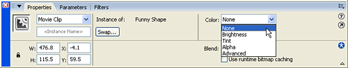
Try It Yourself: Change Color Styles on Several Instances In this task you'll explore color styles. Here are the steps: 1. | Open the file with the many instances of the My Name symbol that you created in the last task. (Redo the exercise if necessary.) Make sure you have at least four instances on the Stage.
| 2. | Select one instance by single-clicking it. (If you double-click, you'll be taken inside the master symbol and will need to return to the main scene.) Access the Properties panel.
| 3. | From the Color drop-down list in the Properties panel, select Brightness. The Brightness amount appears on the right of the panel, as shown in Figure 4.10. Click and hold the arrow to the right of the percentage, and you are given a slider. Adjust the slider until the percentage reaches 80%. Alternatively, you can just type the percentage 80 into the field.
Figure 4.10. The brightness color effect can be applied to an instance. 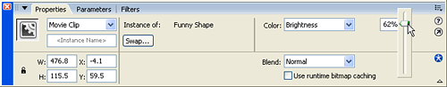
| 4. | Keep the Properties panel open and select another instance. This time, select Tint from the Color drop-down list. The tint effect is pretty straightforward: You just select the hue with which you want to tint the instance by selecting the swatch (as in Figure 4.11). But notice the default 50% in the Tint Amount field. If the original symbol contains several colors, the entire instance changes to the color in which you tint it. However, tinting less than 100% causes the colors to mix. For example, if the original symbol is yellow and white, tinting it 100% cyan causes everything to turn cyan. However, tinting it 50% cyan causes the white parts to become a faded cyan and the yellow parts to turn green.
Figure 4.11. The tint color style changes the color of an instance. 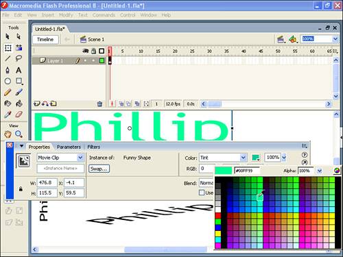
| 5. | Set the Color drop-down list of another instance on the Stage to Alpha and set the Alpha slider to 40%. Unless the selected instance is on top of something else, you're not likely to see much of a semitransparent effect. Therefore, go ahead and position the instance on the Stage to be on top of another instance. Remember that you can use Bring to Front and similar stacking controls by selecting Modify, Arrange.
| 6. | Finally, the Advanced setting in the Color drop-down list lets you combine alpha and tint. After you select Advanced, the Settings button gives you full control. However, figuring out the eight sliders that appear is next to impossible, so you need to use a trick to avoid using them. To learn how to use this trick, try tinting something yellow and making it semi-transparent as well. First, select an instance and choose Tint from the Color drop-down list. Then select a yellow swatch. Now, change the Color drop-down list to Advanced and click the Settings button. Notice that the pairs of numbers next to Red, Green, and Blue have already been filled in (with something other than 0), as Figure 4.12 shows. These are based on the tint you specified earlier. Now you can select the Alpha slider at the bottom of the Settings dialog box. The trick is that by first selecting Tint, you have a nice way to choose a color. If you first select Advanced, you would have to select a color in a less intuitive manner by using the sliders shown in Figure 4.12.
Figure 4.12. When you select the Advanced settings after first tinting, the sliders are initialized with the same color. 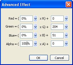
| 7. | Go wild and bring out a bunch of instances on the Stage. Adjust the Alpha, Tint, and Brightness settings. Do anything you want. Again, note that the file is basically the same size it would be with just one instance. Also, realize that you can apply a color effect on multiple instances if you simply select more than one and then access the Properties panel. (Keep this file open for the next task, "Changing Blends on Instances.")
|
By the Way: Getting More Colors You might have noticed that when you select a tint color, the Properties panel lets you choose from only discrete swatches. It's possible to select any color. You just open the Color Mixer panel first. When you set a tint, you click (and hold) on a swatch but don't let go until you've pointed to the color you want on the Color Mixer panel. This is like the way you sample colors outside Flash but it works within Flash, too. Also notice you can't set a clip's tint directly by using the Color Mixer panel. |
One way to describe color is by specifying the three factors: hue, saturation, and brightness. If you want to explore these factors, you can change the Color Mixer panel's option arrow from RGB (red, green, blue) to HSB (hue, saturation, brightness). Hue is the base color. Moving from left to right in the Flash Color Mixer panel, you see the hue change from red to yellow to green to blue and to red again (with every shade of color in between). Brightness is how much white is included in a color. Imagine a paint store with a bunch of hues of paint. The store could mix in white paint to create other colors. In the Flash Color Mixer panel, the brightness is shown vertically at the top, the colors are all white and at the bottom, they're all black. Finally, saturation is the amount of color. For example, if you were staining a wood fence, the more stain you used, the more saturated the color would become. In Flash you vary the saturation by changing the Tint Amount slider. Using Blends and Filters Flash Professional 8 adds the Blend option (under Color Styles in the Properties panel) as well as the concept of Filters (a separate panel). Both features fall into the "expressive" category because they give you greater image control. But they also fit well in this Library chapter because they both apply to instances. (Here you'll learn the technical details and then in Hours 5 and 13 you'll practice more practical uses.) Blends define how overlapping instances composite (or blend with) each other. You can think of the alpha color effect as a simple type of blend because it affects how much of the objects underneath will show through. Blends, however, are much fancier, performing such effects as Invert (which looks like photographic negatives) and Darken (which shows only the darker of two colors). Filters are like special effects filters found in imaging programs such as Adobe Photoshop but here you apply the effects to any symbol instance. The Drop Shadow Filter, for example, is a powerful (and easy) way to make an instance appear to float off the screen. It's also interesting that filters are nondestructive, meaning they don't permanently change the symbol. This means you can apply different filters (and at varying degrees) on several instances of the same symbol and always go back to adjust or remove the filter effect. (You can even animate filter effects, as you'll see in Part II.) In this chapter you'll see how Blends and Filters work and in the next chapter, you'll see practical ways they can be applied to your projects. Blends Applying a Blend is nearly identical to applying a color effect. Just select an instance and select one of the Blend options from the Properties panel, as shown in Figure 4.13. Normal The default or no blend. Layer Analyzes everything inside the overlay and ensures it will appear as expected. This Blend is really subtle but jumps out when you change the alpha color style on a symbol containing multiple overlapping objects. For example, if you draw an ice cream cone Movie Clip using a triangle under a circle and then set the clip's alpha to 50% you'll see through the ice cream scoop to the cone underneath unless you also use the Layer blend. Simply put, the Layer blend makes alpha transitions accurate. Layer is also required when a nested clip is set to Alpha or Erase. Darken Shows the darkest color. That is, you'll see the overlay except where the base is darker. Multiply Mixes the two colors. The effect is least when base and overlay are similar colors and greatest when the base and overlay are different colors. Lighten Shows the lightest color. That is, you'll see the overlay except where the base is lighter. Screen Similar to Multiply, but it uses the inverse of the overlay to make a result that appears washed out. Overlay Applies the Screen blend on pixels where the base is dark and applies Multiply where the base has light pixels. Hardlight The exact opposite of Overlay. Hardlight applies the Screen blend on pixels where the base is light and applies Multiply where the base has dark pixels. Add Adds the base and overlay, with the maximum being white. Subtract Subtracts base and overlay, with the minimum being black. Difference Subtracts the darker color from the lighter color regardless of whether that color came from the base or the overlay. Invert Inverts the base only (makes it appear like a negative). Alpha Like Erase, below, Alpha requires more than a base color and the overlaying clip on which you apply the blend. You apply the Alpha blend to a clip that's nested inside another clip, and that parent clip must have its blend set to Layer. The clip on which you set the Alpha blend should contain graphics that contain some level of transparency. The amount of transparency determines how much of the parent clip is revealed or cleared away to show through to what's underneath. That is, where the nested clip is 100% alpha (that's opaque) you'll see just the parent clip. Where the nested clip is 0% alpha you won't see the parent clip but rather see through to whatever is underneath. If you're familiar with masking, the Alpha blend lets you create a gradient alpha mask. Erase Requires that the clip on which Erase blend is applied is nested inside another clip which is set to Layer. Primarily, the nested clip set to Erase will clear away its parent clip and show through to whatever is underneath. It's opposite of Alpha because where ever the nested clip is 100% alpha (opaque) you'll see through the parent to what's underneath and where the nested clip is 0% alpha you'll only see the parent clip.
Figure 4.13. The Blend you select from the Properties panel affects how a symbol composites with what's underneath. 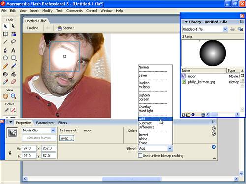
Notice the base is just as important as the overlay sometimes more important. Also notice that this list doesn't give you practical uses for each option. One perfectly legitimate way to use blends is by just exploring. However, you will see several practical uses in the next chapter. Using Filters You can apply filters to any symbol instance onstage (plus text objects). First, open the Filters panel, select an object, and then select the filter you want to apply. Take a look at Figure 4.14. Figure 4.14. You can apply advanced special effects to symbol instances using the Filters panel. 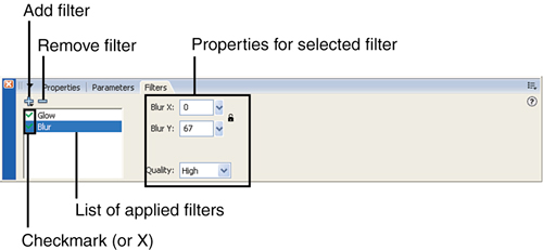
To start, select an instance and then click the Add Filter button (the plus) to select a filter. The menu that appears also lets you remove, enable, or disable all filters already applied to the instance. You can individually remove filters by clicking the minus button (don't press Delete on your keyboard because you'll remove the symbol instance). You can also click the green check mark (for enabled) to temporarily disable individual filters. After you've added a filter, the properties for that filter appear on the right side of the panel. You can adjust the strength or blur of a filter, for example. The Filters panel supports adding multiple filters to get a layer effect . For example, you can use the Adjust Color filter (say, to desaturate a color image into black and white) and then also add the Drop Shadow filter. Because multiple filters are cumulative, the order in which they're applied makes a difference. For example, if you apply a Drop Shadow and then a colored Glow, the Glow is applied to the instance as well as its Drop Shadow (and you'll see color all around the shadow). If you put a colored Glow and then a Drop Shadow, the object and its Glow are given a Drop Shadow (and the color only surrounds the instance). Because the order matters, you can click and drag to reorganize the filter order listed in the Filters panel. (The filters listed on top are applied first.) After you've spent time setting all the properties the way you want for one or more filters, you can save the settings as a preset. Just click the Add Filter button (plus) and select Presets, Save As. Watch Out!: Applying Presets Removes Existing Filters When you select on of the preset filters you've saved, it wipes away any filters already applied to an object. If you want to supplement a preset, start by applying the preset and then make adjustments or add more filters. |
The properties available for each filter vary, although there are some consistencies. For example, all except the Adjust Color Filter include an option for Quality. This affects how smooth or choppy the gradations appear. Interesting, Quality affects performance but has almost no impact on file size. You'll notice the visual impact of the Quality setting most when the blur is greatest. The good news about all the filters is that you'll see their visual effects immediately, so it's worth just exploring the various options. (The Blends tend to require a little more foresight because many blends don't have any impact under certain conditions.) Like blends, I'll just list the filters here and let you explore on your own. In the next hour, you'll get plenty of exercise applying them to real tasks: Drop Shadow Creates a single-color duplicate of your instance's shape, slips it underneath your instance, and offsets the location. There are options to control the strength (really alpha), blur, angle, and offset distance. Used conservatively, the Drop Shadow can add depth to an image. Interestingly, if you simply make the shadow very blurry and the same color as your symbol instance it looks a lot like a motion blur. Blur Blurs the entire content of your instance. Besides the out-of-focus look, you can blur the X or the Y more than the other to get a motion blur effect. That is, lots of Y blur makes something look like it's moving up or down. Glow Makes a duplicate of your instance's shape and blurs that. It's like having a blur with a copy of your original layered on top. There are many specific reasons to use Glow, but a common one is to make text stand out when, without a glow in a contrasting color, the text is too similar to the background color. Bevel Gives the instance an embossed look, almost like raised printing. The reason your instance looks raised is that the upper left is lightened (highlight) as if there's a light up to the left and the bottom right is darkened (shadow) as if that part is in the shadow of the object. Of course, you can change the highlight and shadow colors as well as the angle where the imaginary light is positioned. Gradient Glow Is just like Glow except the color of the glow is a gradation. Also, you can add bands to the gradation the same way you will when you study gradients next hour. Gradient Bevel Is just like Bevel except the colors for the highlight and shadow are gradated. Adjust Color Works best on instances that contain a raster graphic. It's an intuitive filter for adjusting the contained color. Simply drag the Saturation slider all the way to the left ( 100) to make a color photograph appear black and white.
As a summary of color styles, blends, and filters, consider the normal process you'll follow to create a graphic. Start by making symbols based on a foundation of building blocks basically, the graphics you can import or draw in Flash. Place them on stage and then apply color styles or filters. Blends let you define how layered objects appear. When you want the same effect applied to multiple objects, you can nest symbols inside symbols, as discussed later in "Nesting Instances of Symbols Inside Symbols." Although in Hours 2 and 3 you learned lots of ways to either create or import graphics, the color styles, blends, and filters shown previously give you ways to create even more advanced effects. Plus, compared to importing raster graphics with the same visual effect, applying effects to instances in this manner is much more bandwidth friendly. You're already being efficient by storing graphics in the Library, but because all these effects are applied at runtime, they are almost always smaller than raster alternatives. Of course, they're also better because you can make edits right inside Flash. I should note that even though such runtime effects don't add much to file size, they do tend to reduce your movie's performance by making it play slower. Don't worry, though, because the impact is not an issue unless you overdo it plus, you'll learn ways to optimize performance in Hour 21, "Optimizing a Flash Site." How Each Instance Behaves Differently You've already seen how each instance on the Stage can be uniquely positioned, scaled, rotated, and colored. There's one more way in which instances can be different from one another: They can behave differently. Remember the Behavior option for creating a symbol? You have to decide among Graphic, Button, and Movie Clip. So far, I've suggested just using Movie Clip, which is the default. Later, we'll look much more closely at the Button and Movie Clip options (see Hour 14, "Making Buttons for the User to Click," and Hour 12, "Animating Using Movie Clip and Graphic Symbols"). For now, we'll discuss how the Behavior option relates to instances on the Stage. When you create a symbol, you must select a behavior. Later on you'll learn about the differences between the behaviors, but for now they're not terribly important because you can change the behavior. From the Library window, you can change any symbol's behavior via Properties, which you access by clicking the little blue i button, by selecting the Library's options menu, or by right-clicking the item and selecting Properties. The Symbol Properties dialog box reappears; it's almost identical to the dialog box you use when you create a symbol in the first place as shown in Figure 4.15. Think of this setting as the default behavior. Any instance dragged out of the Library while the symbol is, say, set to Graphic starts out as a graphic. Changing the master symbol to another default behavior has no effect on instances already spawned, only new ones you drag onto the stage. Figure 4.15. The Symbol Properties dialog box lets you change the default behavior for a symbol. 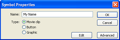
Not only does a master symbol have a default behavior, but each instance onscreen also has its own behavior. You can use the Properties panel to see and change the behavior of any instance or instances already on the Stage. For example, you can use the Properties panel to see that the instances used in the last two tasks have the Movie Clip behavior. That's because the master symbol was a Movie Clip at the time the instance was placed on stage. You can change the behavior of any onscreen instance by simply selecting it and changing the Behavior drop-down list in the Properties panel. Later you'll be deliberate in your choice of behavior just realize you can always change the symbol's default behavior or the behavior of any instance. Nesting Instances of Symbols Inside Symbols You can drag a symbol from the Library and create an instance anytime. You can even use instances of one symbol to create other symbols! This means you could draw a bunch of houses (as shown in Figure 4.16) with just one line. Sure, there's a House symbol, but that was drawn with several instances of another symbol, Box, and a few instances of a symbol called Line. Actually, the Box symbol was created with four instances of the Line symbol. This case shows an excessive use of hierarchy, but it proves a point: Instances of symbols can be used to create other symbols. In the next task you'll see how to perform such nesting. Try It Yourself: Make a Symbol by Using Instances of Another Symbol In this task you'll nest symbols inside each other. Here are the steps: 1. | In a new file set the background color to something other than white. Select Modify, Document and select pale red from the Background Color swatch. Then use the Oval tool to draw a circle and fill it with gray.
| 2. | Select the entire circle and then choose Modify, Convert to Symbol. Name the symbol Circle and click OK.
| 3. | Next, make an eyeball from two instances of Circle. One way you could do this is to create a new symbol and then, while inside the master Eyeball symbol, drag out instances of Circle. Instead, you should do it another way, which might be more confusing at first, but I think it'll be easier. There are two ways to get stuff in the Library: either create a new symbol or convert something you select to a symbol. In this case, you should use the Convert to Symbol method. To make the Eyeball symbol, notice that you already have one instance (Circle) on the Stage. Copy and paste this on the Stage (or drag another instance from the Library). Change the Brightness color style of one instance to 100%; by using the Properties panel, select Brightness from the Color drop-down list and set it to 100%. Make sure the other instance is set to 100%. It might help at this point to change your movie background color to any color except black or the default white; to do this, deselect everything and use the Properties panel to change the background color to gray. This will help you see the all-white instance of Circle.
| 4. | Arrange the two instances so that the black one is on top, scaled smaller, and set near the edge of the white instance, as shown in Figure 4.17. (If necessary, you can use Modify, Arrange to change the stacking order.)
Figure 4.17. The two instances of the same Circle symbol have different scales and brightness effects. 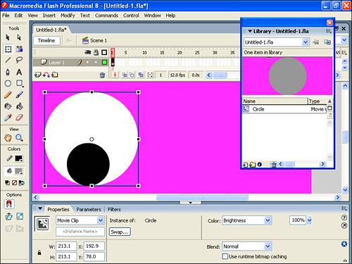
| 5. | Select both instances and then choose Modify, Convert to Symbol or press F8. This takes what's selected a couple of instances and puts them in the Library. Name this symbol Eyeball and click OK.
| 6. | Left behind, on the Stage, is an instance of the Eyeball symbol that you just created. If it's really big, scale it down a bit and then copy and paste it to make two instances that are exactly the same size. Rotate one instance of Eyeball if you want.
| 7. | Drag an instance of Circle onto the Stage. Because it'll start out on top, send it to the back by selecting Modify, Arrange, Send to Back. Scale it large enough to be the face for the two Eyeball instances. Change the Tint color effect of this instance of Circle to bright yellow.
| 8. | Now you'll make the entire face a symbol. First, though, select the Brush tool, confirm you're in Object Drawing mode, pick a fill color different than the fact, then draw a smile on the face.
| 9. | When your symbol looks like the one shown in Figure 4.18, select everything, choose Modify, Convert to Symbol, name the symbol Face, and click OK. You now have a Face symbol that can be used over and over again throughout a movie. It's nothing more than recycled circles plus a smile. By the way, there's no need to put the smile in the Library by itself (unless you needed to use it independently with other faces) because it's really in your movie only once inside the master version of the Face symbol. I should note that you're welcome to go inside and make edits to any element you want. For example, you can double-click the Face instance on stage, select one of the Eye instances, and change its rotation or add a Drop Shadow. Keep your bearings by paying attention to the edit bar.
Figure 4.18. The Face symbol was created with multiple instances of the same clip. 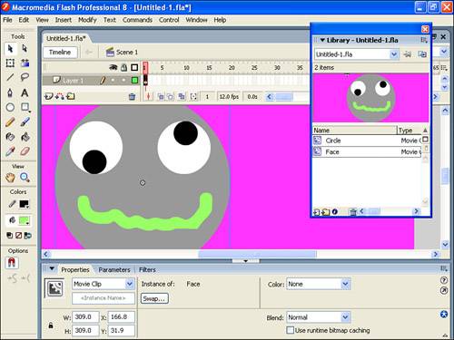
Watch Out!: Overnesting There comes a point where too much hierarchy affects file size negatively. In the case of the house in Figure 4.15, all I had was one line recycled many times. Earlier I said that Flash stores the original data in the Library, plus information concerning how each instance varies. Usually the original data is the big portion and instance information is insignificant. However, if you take the instance information to an extreme, it can actually work against you. To prove this point, suppose you make a one-pixel dot, put it in the Library, and then use it millions of times to create all kinds of graphics and then you tint each pixel instance individually. The extra data for those millions of instances would indeed outweigh the dot in the Library. It's a balance. You should combine convenience with efficiency. In the case of the house, I found that by creating the box from scratch (not with four instances of the Line symbol), I cut my exported movie size in half! |
|
Figure 4.16. The house, duplicated and modified, was created with several instances of a Line symbol. 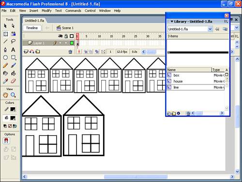
|