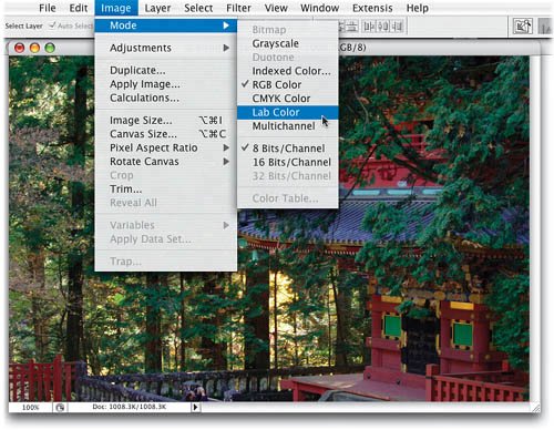
| HOW TO ADD DETAIL AND MAKE YOUR COLORS REALLY POP USING THE "A" AND "B" LAB CHANNELS Here are two techniques for adding detail and vibrant color to your images. The first one works wonders on landscape images that have a lot of greenery and/or flowers (although you can really use it on almost anything). But the second technique is absolutely one of the easiest, yet most effective, ways of really making the color "pop" in your image. It uses Curves on the "a" and "b" Lab Color channels, but the technique is so easy, and so straightforward that even if you've never used Curves before, not only will you be able to apply this move, it will make you want to learn more about Curves. The first time I saw this technique (Dan Margulis showed it to me before his landmark book on Lab Color was even published), I was just floored and I've been using it for enhancing my own photography ever since. In fact, I use it so often that I've created an action so I can apply it by pressing just one F-key on my keyboard, and I have to tell you, that key is starting to get pretty worn out. Step 1. | OPEN YOUR PHOTO AND CONVERT TO LAB COLOR MODE
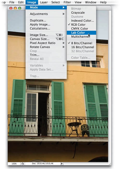
Open a photo that needs to have enhanced detail and more vibrant color (this technique works particularly well on landscape photography). Now, convert the image to Lab Color mode by going under the Image menu, under Mode, and choosing Lab Color (as shown here).
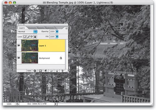
 ©SCOTT KELBY | | | Step 2. | DUPLICATE THE BACKGROUND LAYER
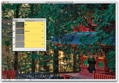
Your image is now comprised of three channels: (1) a Lightness channel, which holds most of the detail; (2) an "a" channel, which holds the Green and Magenta information; and (3) a "b" channel, which holds the Blue and Yellow information. Press Command-J (PC: Control-J) to duplicate the Background layer.
 | Step 3. | TARGET JUST THE LIGHTNESS CHANNEL
The first thing you're going to do is create some extra definition and contrast by pressing Command-1 (PC: Control-1), which displays the Lightness channel (as shown here). As you can see, there's plenty of detail here.
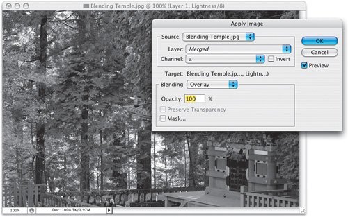
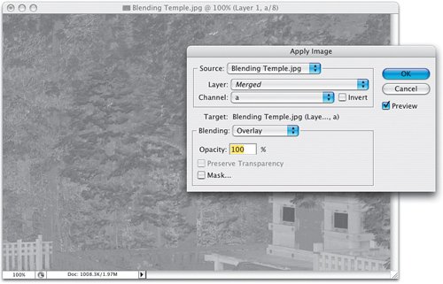
 | | | Step 4. | CHOOSE APPLY IMAGE. APPLY THE "A" CHANNEL TO THE LIGHTNESS CHANNEL IN OVERLAY MODE AT 100%
Now that your Lightness channel is targeted, go under the Image menu and choose Apply Image. For Channel choose "a," then change your Blending mode to Overlay. This intensifies the Lightness channel and adds more detail and contrast. Now you can click OK to apply this move.
 | Step 5. | TARGET THE "A" CHANNEL, THEN CHOOSE APPLY IMAGE. APPLY THE "A" CHANNEL TO ITSELF IN OVERLAY
Now, press Command-2 (PC: Control-2) to view the "a" channel. As you can see, it's pretty lame as far as detail goes, but that's not its jobits job is holding color detail, and that's what we're going to enhance now. Go under the Image menu and choose Apply Image. Now, you're on the "a" channel, right? Right. So, what you're going to do is use Apply Image to overlay another "a" over itself (if that makes any sense). You're kind of "doubling-up" to create a more vibrant "a" color channel. So, back in Apply Image, for Channel choose "a" and for Blending, leave it set at Overlay, and then click OK.
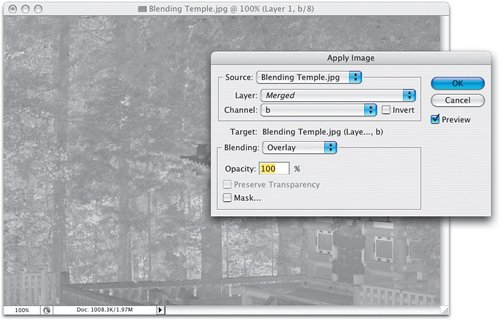
 | | | Step 6. | TARGET THE "B" CHANNEL, THEN CHOOSE APPLY IMAGE. APPLY THE "B" CHANNEL TO ITSELF IN OVERLAY
Now, press Command-3 (PC: Control-3) to view the "b" color channel. Again, not much detail here, but we're going to "pump up the color" here, too. Bring up Apply Image again (the "b" channel will be chosen for you automatically because you're on the "b" channel). You can leave the rest of the settings as is. Just click OK, and you've doubled-up the "b" channel's color.
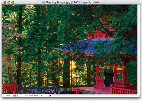
 | Step 7. | NOW THE IMAGE HAS MORE DETAIL AND IS MUCH MORE VIBRANT. MAYBE TOO VIBRANT
Press Command-~ (PC: Control-~) to see the full-color image, and you'll see that the colors are really vibrant, and the contrast and detail are greatly enhanced. The colors may actually be too vivid (it's up to you how vivid you want them), but since we applied these corrections to a separate layer, you can reduce the amount of your entire correction by simply lowering the Opacity setting for this layer in the Layers palette.
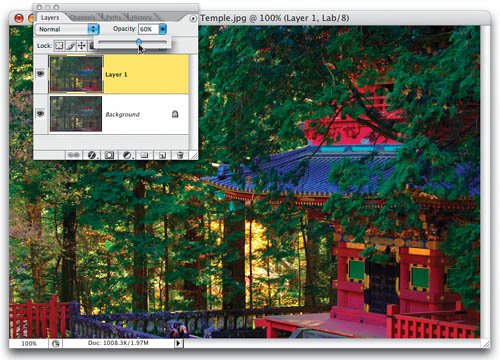
 | | | Step 8. | YOU COULD LOWER THE LAYER OPACITY, BUT WE JUST WANT TO "PULL BACK" THE BLUE IN THE ROOF
If you lower the Opacity for this layer, the entire photo will look less "punchy" and that may be okay. In the photo shown here, I personally really like the leaves and the temple really punchy, but to me the roof looks a little too blue. Again, it's just my opinion, and if you like the roof this blue (and there's nothing wrong with that), then you can just skip what I'm about to do next (which is bring back some of the original blue, using a simple Blend If trick in Lab Color mode).
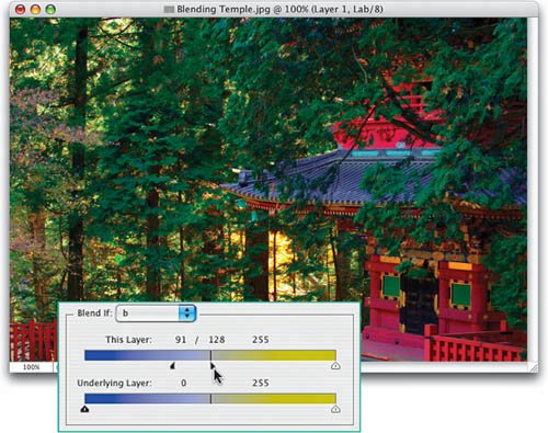
 | Step 9. | CHOOSE BLENDING OPTIONS. DRAG THE TOP LEFT SLIDER TO THE CENTER. SPLIT IT BEFORE YOU GET THERE
To lower the blue in the roof, and bring back the original roof color, bring up the Blending Options layer style dialog again. We're still in Lab Color mode, so when we go to the Blend If pop-up menu, we don't have choices of Red, Green, and Blue. Instead, we have Lightness, "a," and "b." Since the "b" channel holds the Blue and Yellow, choose "b" (as shown), then drag the top left slider to the right, and you'll see the original blue roof color start to return. As you get close to the middle of the bar, split the slider by holding the Option key (PC: Alt key), then drag right until you reach the center (as shown here) to fully, and smoothly, bring back the original blue roof.
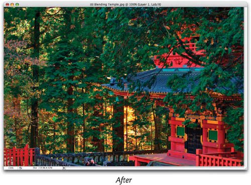
 | | | Step 10. | HERE'S A BEFORE AND AFTER WITH THE BLUE ROOF STILL INTACT, BUT EVERYTHING ELSE ENHANCED
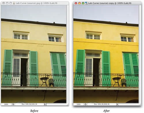
Here's the original image (on the top) with its flat leaves and lackluster reds, and on the bottom is our tweaked version, with more vibrant colors and detail. Now, there's another move you can make in Lab Color mode that works wonders on bland images. Dan showed me this trick earlier this year and we've all been using it ever since. I'm doing a simplified version of what he covers in his Lab Color book, so if this whets your appetite, make sure you check out his book. We'll use a different image, one even flatter than the one we used here.
  | | | Step 11. | ANOTHER METHOD FOR ADDING VIBRANCY USING LAB COLOR
Open a photo whose colors seem kind of flat and lifeless to you. Convert the photo to Lab Color mode by going under the Image menu, under Mode, and choosing Lab Color (as shown here).
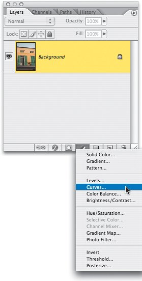
 ©SCOTT KELBY | Step 12. | ADD A CURVES ADJUSTMENT LAYER
Next, choose Curves from the Create New Adjustment Layer pop-up menu at the bottom of the Layers palette.
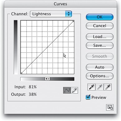
 | | | Step 13. | OPTION-CLICK (PC: ALT-CLICK) ON THE CURVES GRID FOR A FINER GRID
Now, even if you've never used Curves before, you'll be able to do this move without any problem, so if you were thinking about freaking outdon't. See how the grid you see here, behind our curve, looks smaller than the grid you see in your Curves dialog? That's because I have a special secret version of Curves with a smaller grid that nobody else has. (Okay, that's not true, but wouldn't it be cool if it was?) You'll need to get the finer grid to do this trick, and luckily it's easy to get. Just press-and-hold the Option (PC: Alt) key and click once anywhere on your larger grid and the smaller grid appears.
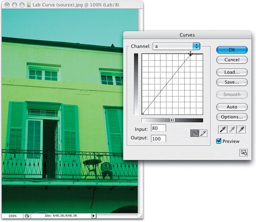
 | Step 14. | SWITCH TO THE "A" CHANNEL, MOVE THE TOP-RIGHT POINT TWO GRID SQUARES TO THE LEFT
In the Channel pop-up menu at the top of the Curves dialog, choose the "a" channel (as shown). Click on the double arrow in the gradient slider at the bottom of the grid to change your black point to the top-right corner of the grid and your white point to the bottom left. Now, click directly on the top-right corner point and drag it two grid squares to the left. This makes your photo look very cyan, but don't sweat itit's just the first move. Don't click OK yet.
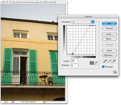
 | | | Step 15. | MOVE THE BOTTOM-LEFT POINT TWO GRID SQUARES TO THE RIGHT
Now, click directly on the bottom-left corner point and drag it two grid squares to the right. Ahhhh, that's starting to look better. The colors are already looking more vibrant, but we're not done yet, so don't click OK yet.
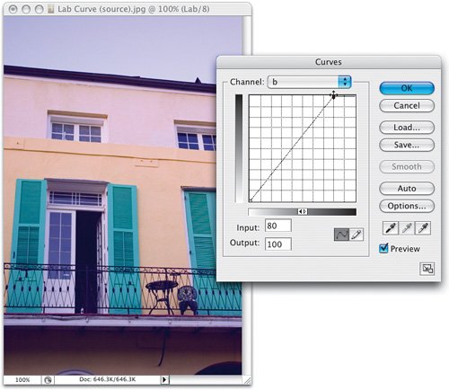
 | Step 16. | SWITCH TO THE "B" CHANNEL, MOVE THE TOP-RIGHT POINT TWO GRID SQUARES TO THE LEFT
Switch to the "b" channel up top, and do the exact same move with the two corner points. Start with the top-right corner point, and drag it straight over two grid squares to the left. Now your image looks kind of purple.
 | | | Step 17. | MOVE THE BOTTOM-LEFT POINT TWO GRID SQUARES TO THE RIGHT TO COMPLETE THE MOVE
Now the magic happens. When you click-and-drag the bottom-left corner point straight over to the right by two grid squares, the colors all fall into place, and you get a vibrancy that's hard to get with any other method. Notice how the colors just "pop" and the sky looks much bluer, and the whole image is so much punchier. Now, what if you want something even more vibrant? That's easy. Next time, instead of moving just two grid squares, move three. Thanks to Dan for sharing this part of his amazing L-Curve technique (see his book for the full-blown, Mac Daddy version of the move).
 |
|