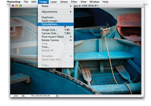
| YOU'RE ABOUT TO LEARN THAT THE MOST COMPLICATED-LOOKING DIALOG IN PHOTOSHOP IS ONE OF THE EASIEST If there's one dialog that sends chills down the spine of many a user, it's the Calculations dialog. It may look complicated, but using it is actually quite simple because what it does is pretty simpleit just blends two channels together to create a new channel, and you get to choose (in the dialog) how the two channels will be combined. See, I told you this was going to be simple. Now, later in the book, we'll do some more complex things using Calculations, but for now we're just going to look at our color channels, pick which two look best, and combine the best of the two channels to create one stunning black-and-white conversion. My prediction: Not only will you find using Calculations easy, you're also going to find out that, despite its previously scary looks, it's actually fun. Step 1. | OPEN A COLOR PHOTO, THEN CHOOSE CALCULATIONS FROM THE IMAGE MENU
Of course, start by opening the color photo you want to convert to black and white. Then go under the Image menu and choose Calculations (as shown here).
 ©SCOTT KELBY | | | Step 2. | YOU'RE ONLY GOING TO USE THE CHANNEL POP-UP MENUS, THE BLENDING POP-UP MENU, AND OPACITY
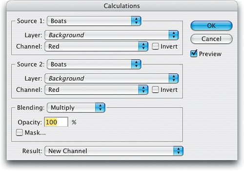
This brings up the Calculations dialog (shown here). Now, it looks complicated, but it's really not, especially because you're only going to use a few of the menus and controls in this dialog. First look at the Source 1 and Source 2 pop-up menus. You can ignore them for this black-and-white conversion because you'd only use them if you were combining channels from two different images. We're not, we're picking the two best channels from our one image. In fact, you can also ignore the two Layer pop-up menus, because we're only working on the Background layer. In fact, there's lots of junk here you can ignore (as you'll see).
 | Step 3. | FOR THIS CONVERSION YOU CAN IGNORE EVERYTHING BUT THESE FEW CONTROLS
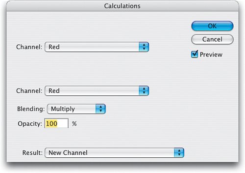
I doctored the screen capture of the Calculations dialog so only the parts you'll actually be using at this point are visible. See, when you bring it down to just this, it's pretty easy. From the top Channel pop-up menu, you're going to choose one channel of your RGB image. In the second Channel pop-up menu, you're going to choose another. Then you're going to blend these two using Photoshop's standard blend modes (just like you'd blend two layers togetherMultiply makes them blend darker, Screen makes them lighter, etc.). Then you're going to choose the amount of blending, and lastly, what happens to the channel you're creating. But I'm going to make it even easier.
 | | | Step 4. | OR YOU CAN THINK OF IT THIS WAY, JUST A FEW CONTROLS WITH VERY DESCRIPTIVE DIRECTIONS
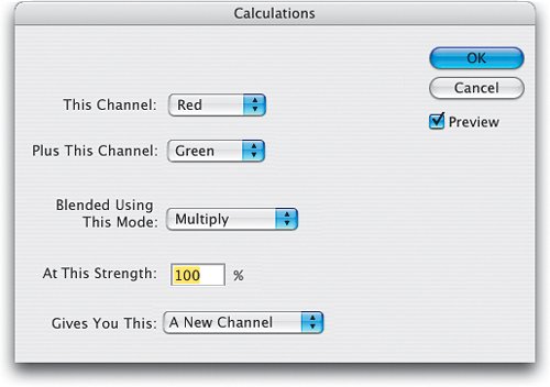
I doctored up another screen capture to really explain the Calculations process in even simpler terms. You're going to choose one channel, and combine it with another channel of your choice, but you get to choose how they're going to blend together (and you get a live preview onscreen of the results as you choose different blending modesso just stop at the mode that looks best). If you find a mode that looks good, but it's too intense (maybe too bright or too dark), then lower the Strength (it's actually called "Opacity" in the real Calculations dialog). When you click OK, by default it's going to create a new channel (an Alpha channel) in your document.
 | Step 5. | LOOK AT THE INDIVIDUAL CHANNELS FIRST, AS A STARTING POINT
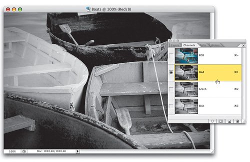
Okay, now that you get the idea, let's create our black-and-white image by combining our two best color channels. Start by clicking Cancel in the Calculations dialog because we have something to do first. It'll actually save you some time in Calculations if you take a quick look through the three color channels in your image (you know the shortcuts by now) and find the two you think look best, before you open the Calculations dialog. That way, you know where to start. In the example shown here, the Red channel seems to have some nice shadow detail, so it's a good candidate for one of the two channels.
 | | | Step 6. | CHECK THE GREEN AND BLUE CHANNELS
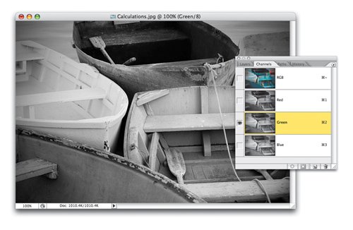
Check both the Green and the Blue channels. The Green channel holds a decent amount of highlights, but it seems to lose some of the detail. Let's try the Blue channel instead.
 | Step 7. | THE RED AND BLUE CHANNELS LOOK BEST
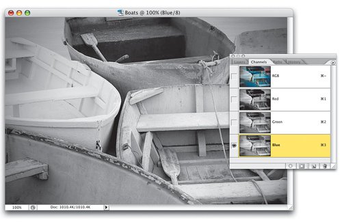
The Blue channel also holds a decent amount of highlights, but because of the light pastel blues in the boats, it seems to look better to me. So, I've got my starting point. I'm going to try to combine the good shadows in the Red channel and the nice highlights in the Blue channel to create a new version of the photo that has the best of both channels. Now, although I always get this head start, it's not necessary to do it this wayyou could just skip this "viewing the individual channels" and go straight to Calculations and just mix and match channels while looking at the preview. Try both methods, then choose the one you like best.
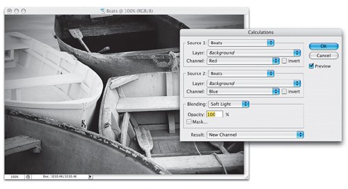
 | | | Step 8. | GO BACK TO CALCULATIONS, AND FOR THE SOURCE 1 CHANNEL CHOOSE RED, FOR SOURCE 2 CHOOSE BLUE
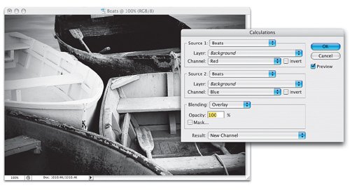
Now click back on your RGB Composite channel (so you can see the full-color image again), then let's "get to blendin'!" Go under the Image menu and choose Calculations. You'll start by choosing the Red channel from the Source 1 Channel pop-up menu, and then from the Channel pop-up menu under Source 2, choose the Blue channel. You've now chosen which channels you want to blend, so it's time to figure out which blend mode looks right for these two images. The default Blending mode is Multiply, which makes the blend of the two channels darker. Because of this, I rarely wind up using Multiply as my blend mode, so let's try some others.
 | Step 9. | TRY OUT DIFFERENT BLENDING MODES TO SEE WHICH LOOKS BEST (OVERLAY LOOKS GOOD HERE)
Since every image is different, I can't tell you which mode to choose, you're going to have to try them out and see what works for your particular image. However, I do have some favorites I seem to wind up using more than the rest. For example, I do a lot of my black-and-white conversions using Overlay mode. I just happen to like the way it looks. I also find that if Overlay looks too contrasty (I'm not sure if that's even a word), I then try the next blend mode downSoft Lightand that'll usually do the trick. Since you get a live preview as you change blend modes, try them all and you'll quickly see which ones work (and which ones don't).
 | | | Step 10. | IF OVERLAY MODE CREATES TOO MUCH CONTRAST, TRY SOFT LIGHT INSTEAD
Here are the same two channels, but this time I chose Soft Light as the Blending choice. You can see that the light is more even and less contrasty than when I used Overlay in the previous step. However, I gotta tell ya, I like the Overlay blending better (for this photo anyway), but that's because I like really contrasty black-and-white photos. Hey, that's just me. You have to decide what looks good to you, because there is no International Governing Body for black-and-white photo conversions.
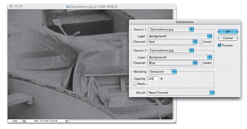
| Step 11. | AVOID THESE BLENDING CHOICES
By the way, here's a few Blending choices you'll probably avoidHard Mix, Difference, and Exclusionjust because they usually look pretty bad (as you can see here).
 | | | Step 12. | IF THE BLENDING IS TOO INTENSE, TRY LOWERING THE OPACITY AMOUNT
There are two final choices to make in this dialog: (1) Do you want to keep the Opacity (Strength) set at the default 100% or do you want to reduce the Opacity, which reduces the amount of the blending effect? Again, this is totally up to you, but you only need to use it if the blending effect seems too intense. Just so you'll know how it works, type in 50% as your Opacity, and you'll get a feel for how this works. And (2) When you click OK, what do you want the Result to be: a new channel in your existing document, or do you want it to create an entirely new document? Make your choice from the Result pop-up menu.
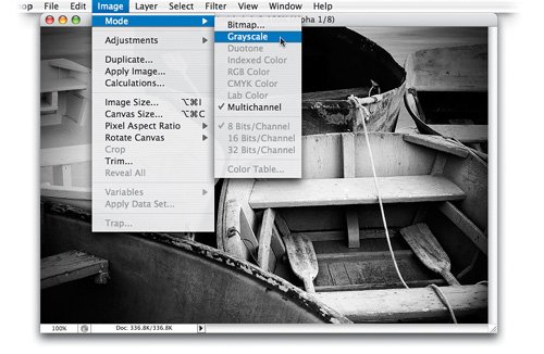
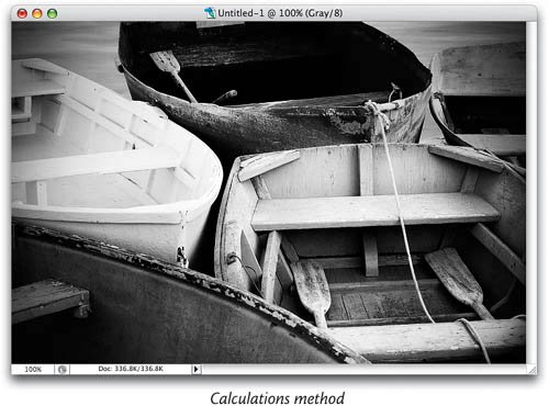
 | Step 13. | CHANGE YOUR NEW DOCUMENT TO GRAYSCALE MODE
As for the Result, I like to have it create a totally new document, but that new document is created in Multichannel mode. So, once it appears, you'll need to go under the Image menu, under Mode, and choose Grayscale, so you have access to regular Photoshop features like layers, filters, etc.
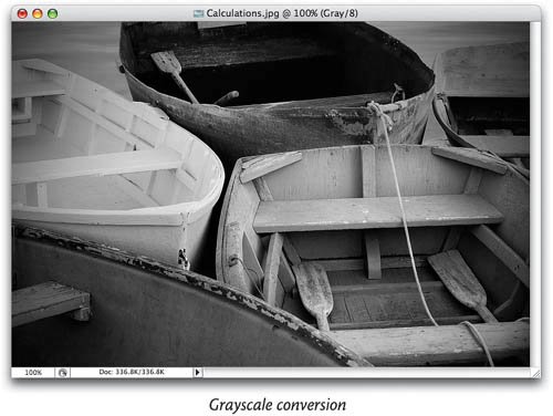
 | | | Step 14. | BEFORE & AFTER: A STANDARD GRAYSCALE CONVERSION AND CALCULATIONS METHOD
Here's a before & after version of the conversion. The image on the top was created by opening the color image and simply converting to Grayscale. The image on the bottom uses the exact Calculations method I showed you, blending the Red and Blue channels, in Overlay mode, at 100% Opacity. See, I told you this Calculations stuff was pretty simple.
  |
|