Chapter 9: Format Type
In Chapter 8 you learned to define text type (font) and size from the Type menu, but the Character, Paragraph, and Tabs palettes provide even more control over character and paragraph formatting.
In addition, many graphical tools such as stroke and fill attributes are applicable to text. You ll learn high- powered text formatting techniques in this chapter.
Format Characters
As demonstrated in Chapter 8, you can assign font and size to type from the Type menu, either before or after creating the text. To define the font before you type, select Type Font and select a font from the menu. Where supported, additional attributes such as italic or boldface can also be selected here. To define type size, select Type Size and select a font size in points. You can assign size and font to existing type by first selecting the text and then using the menu to define font and size.
The Character palette provides additional options for formatting text. Select Window Type Character to display the palette, and choose Show Options from the palette menu to display all the formatting options. The expanded palette is shown in Figure 9-1.
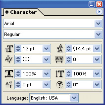
Figure 9-1: Assigning type size in the Character palette
The following options in the Character palette provide detailed control over how characters are spaced horizontally and vertically:
-
Font Family This is the font set, like Arial, Times Roman, Myriad, and so on.
-
Font Style Many font families include boldface, italic, or bold and italic formatting, selected here.
-
Size This measures font size in points. You can enter size with another unit of measurement (for example, by typing 0.25 inches ) and it will be converted, by default, to points.
-
Leading Leading is so named for the olden days when printers used extra shims of lead to separate lines of text. Combining 18-point leading with 12-point text, for example, produces 1 1/2 line spacing, while combining 12-point text with 24-point leading produces the equivalent of double-spacing, as shown in Figure 9-2.
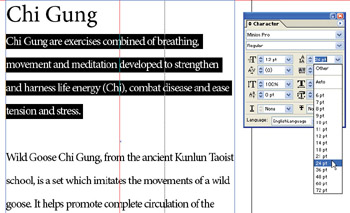
Figure 9-2: Double-spacing is created by setting leading at twice the font size. -
Kerning This option controls spacing between two selected characters. The default value is 0. The unit of measurement is the em ”about the size of the letter m ”and values are defined in units of 1/1000th of an em. Positive kerning values add spacing. More frequently, negative kerning is used to move characters closer together, as shown in Figure 9-3.
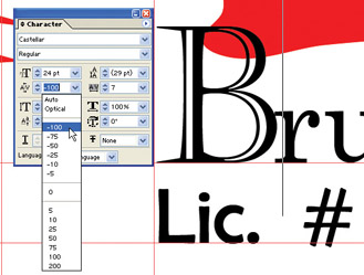
Figure 9-3: 100 percent kerning pushes the r back next to the BTip Kerning is only applied to two characters and can only be assigned when the Type insertion cursor is between two characters.
-
Tracking This selection controls horizontal spacing between characters and words. Measured in ems, like kerning, positive tracking values increase space while negative values crunch type together. Tracking is illustrated in Figure 9-4.
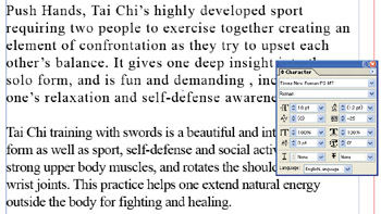
Figure 9-4: Positive and negative tracking regulate horizontal spacing. Negative tracking is much more frequently used and tends to make type more readable. -
The Scale options Vertical Scale creates taller, thinner text when a value over 100 percent is used; it creates shorter, thicker text when a value less than 100 percent is used. Horizontal Scale creates shorter, thicker text when a higher value is used. Proportionally, in terms of how text is distorted , vertical scaling set to less than 100 percent creates the same shape of text as horizontal scaling set to over 100 percent. Both are demonstrated in Figure 9-5.
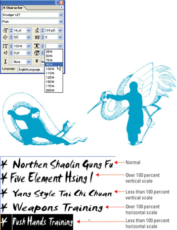
Figure 9-5: Horizontal and vertical scaling compresses or stretches type -
Baseline Shift When the baseline shift is positive, it raises any selected character(s) above the baseline of the text; negative values move selected characters below the text baseline. This treatment is usually reserved for individual superscript or subscript characters.
-
Rotation Character rotation rotates a character or symbol, as illustrated in Figure 9-6.
Figure 9-6: Rotated text is combined here with extreme negative tracking and kerning to push together letters that have been separated by rotation.Note You set default values for hyphenation language in the Preferences dialog box. To adjust them, select Illustrator (Edit) Preferences Hyphenation.
-
Language Language settings determine what spell check and hyphenation dictionaries are applied to selected text.
EAN: 2147483647
Pages: 175