5.3 Designing for Developers
| Regardless of whether we choose the composite approachconstructing a new UI element by assembling together several other controlsor we decide to write a complete control from scratch, there are some design issues that we must consider when designing a new type of control. The problem that faces all controls is that they must be a servant to two masters: the software developer who will reuse the control and the end user who will interact with the control. Non-visual classes don't suffer from this problem. They have a single interfacetheir public programming interface. Their internal workings are their own business. Likewise, visual components not designed for reuse, such as most forms, only present one public facetheir user interface. The majority of forms have no public programming interface at all, and those that do usually have a very simple one (such as properties for setting or retrieving fields on a form designed to present or collect data). But a reusable visual component must consider both types of userit has both a user interface and a programming interface. It is important not to confuse the two when designing your control; we have already seen how tempting it can be to misuse inheritance when we want to implement one control using the user interface of another. As a rule of thumb, the way the user interface does its job is an implementation detail, and should therefore not be visible to client code. Because your class derives (either directly or indirectly) from the Control class, a large amount of its programming interface is already taken care of. It will already have all the standard properties such as Location and Dock , and ambient properties such as Font and BackColor will propagate automatically. Most controls add very little to this standard feature setthe unique programmable aspects of a control are usually small in number. Most of your efforts will go into making the user interface work well. The best design heuristic for the programming interface is this: keep it simple. Before making anything a public feature of your control's API, stop and think whether it wouldn't be better off being private. Programmers who use your control will almost certainly do so by dropping it onto a form in the Forms Designer. A well-designed control should take certain steps to ensure that it works well in this environment. Fortunately, it is relatively easy to help Visual Studio .NET present your component more effectively. 5.3.1 Designer IntegrationVisual Studio .NET can provide visual editing facilities for your controls, but to do this, it expects them to be designed in a particular way. The most important requirement is that your classes must expose all editable features as properties (not fields or methods ). Doing this will make your properties visible in the designer, but you will normally want to apply certain attributes to those properties to make sure that they are represented correctly at design time. Examples Example 5-11 and Example 5-12 show an excerpt in C# and VB, respectively, from a control that provides a public property called BorderColor . Visual Studio .NET will detect this property (it uses the reflection facility provided by the CLR to determine what properties are available) and expose it in the property page for the control. Example 5-11. Exposing an editable property in C# private Color bcol; public Color BorderColor { get { return bcol; } set { if (!bcol.Equals(value)) { bcol = value; Invalidate(); } } } Example 5-12. Exposing an editable property in VBPrivate bcol As Color Public Property BorderColor() As Color Get Return bcol End Get Set(ByVal Value As Color) If Not bcol.Equals(Value) Then bcol = Value Invalidate() End If End Set End Property Figure 5-5 shows how Visual Studio .NET's property window will display this property. Notice that it has recognized the property's type Color and provided its standard color editing user interface for the property. Visual Studio .NET has built-in editors for all the types used by the built-in controls, such as Color , Font , ContentAlignment , and Image , and supports any properties that use the intrinsic types. It will also display a drop-down box of valid values if you use an enumeration type. (It is also possible to allow editing of properties that use custom types, but this requires a lot more work, and is described in Chapter 8 and Chapter 9.) Figure 5-5. A property shown in Visual Studio .NET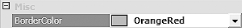 There is just one problem with thisthe property appears in the Misc category, when it really belongs in the Appearance section. Fortunately, it is possible to tell the Forms Designer which category our control belongs to. We do this by annotating the property with an attribute. In fact, this is just one example of the many attributes defined by Windows Forms to manage the design-time behavior of a component. The development environment will present all your component's public properties in the property window when using the component in the Forms Designer. It is reasonably intelligent about working out when to use special-purpose editors for certain property types such as colors and fonts. But there are limits to what it can deduce, and it will not always guess correctly, so it relies on the use of attributes to control its behavior. We might want to provide a property that is only meant to be used at runtimeit makes no sense to allow design-time editing of certain properties. For example, the ListView control has a ListViewItemSorter property, which allows the order in which items appear to be controlled, but because code needs to be written to set this property usefully, it is inappropriate to provide visual editing. So you won't see this item in a list view's property page in the Designer. We can do the same thing with our own controls' propertieswe can make them invisible to the designer by using the Browsable attribute. The property shown in Example 5-13 will not appear at design time. (But it will still be accessible to code.) Example 5-13. Making a property invisible at design time // C# code [Browsable(false)] public bool Connected { get { . . . ' VB code <Browsable(False)> Public Property Connected() As Boolean Get . . . We can also control in which categories those properties that are visible will appear. By default, they will appear as Misc, but the Category attribute lets us select something more appropriate. If we modify the property shown in Example 5-11 by adding a Category attribute, as shown in Example 5-14, the property will now appear in the appropriate category in the Designer. Example 5-14. Setting the category for a property // C# code [Category("Appearance")] public Color BorderColor { . . . as before ' VB code <Category("Appearance")> Public Property BorderColor() As Color . . . as before Although you can use any category name you like, it is best to use one of the standard categories recognized by the designer such as Appearance or Behavior (see the reference section for a complete list). This is partly because it means your control's properties will appear in categories with which the user is already familiar. But it also makes internationalizing your class easier. If you use a standard category, the string will automatically be localized (i.e., the category name will be translated into the local language.) But if you use a category of your own devising, the only way to arrange for it to be translated for different locales is to use your own attribute derived from CategoryAttribute . You can also annotate your property with a Description attribute. This controls the text that will be displayed in the area at the bottom of the Properties windowmost properties provide a short (one sentence ) description of the property's purpose. Because the Description attribute is always used to define a new property (i.e., you don't need to supply a description for properties defined by the Control class), there are no standard description strings. This means that localization of the description cannot be automated. The only way to supply localizable descriptions is to derive your own attribute class from DescriptionAttribute . (Chapter 8 describes how to create a localizable Description attribute.) ToolboxBitmap is another interesting attribute. It lets you determine how your control will appear in the Toolbox. Visual Studio .NET supplies its own default bitmap for your controls, but if you provide your own, it will use that instead. Use it by applying the ToolboxBitmap attribute to your control class. To use this attribute, you must build a bitmap into your component as an embedded resource. You can add a bitmap to the project as a New Item (see Visual Studio .NET's Project menu), and you should set its Build Action in the properties window to Embedded Resource. You should give the file the same root filename as your control but with a .bmp extension. Having done this, you can then simply add an attribute to your control class as follows : // C# code [ToolboxBitmap(typeof(MyControl))] public class MyControl : Control { . . . ' VB code <ToolboxBitmap(GetType(CustomControl4))> __ Public Class CustomControl4 Inherits System.Windows.Forms.Control . . . When you add your component to Visual Studio .NET's Toolbox, it will detect this attribute and use the name of the specified class to determine the name of the bitmap resource. In this case, it will look for Namespace.MyControl.bmp , where Namespace is the namespace in which MyControl is defined. Visual Studio .NET adds the project's default namespace to the filename automatically at build time, so the bitmap in your project would be called just MyControl.bmp . Many controls will not need to use anything more than the Category , Description , and ToolboxBitmap attributes to integrate satisfactorily into the Forms Designer. However, if you want to provide properties with nonstandard types, making sure that Visual Studio .NET is able to set your properties correctly is nontrivial. We will look at the techniques involved for supporting custom types and providing your own user interfaces for editing properties in Chapter 8 and Chapter 9.  |
EAN: 2147483647
Pages: 794