Blooper 27: Lame Label Placement
| < Day Day Up > |
Blooper 27: Lame Label Placement
Forms on the Web often suffer from poor label placement (Johnson, 2000). The result is websites that look sloppy and amateurish and in severe cases may be difficult to use.
Labels Too Far from Field or Control
A severe case can be seen at IOBA.org, the website of the Independent Online Booksellers Association (Figure 4.38). The membership form is laid out using an invisible table that keeps the labels at the left edge of the browser window and the type-in fields near the right edge of the browser window. The gap between labels and type-in fields grows as users widen their browser window. If you make your browser full-screen size , it's hard to see which label goes with which field.
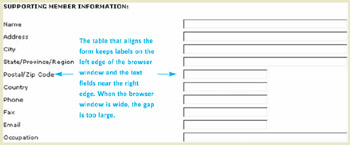
Figure 4.38: www.IOBA.org (Feb. 2002)-The labels appear at left edge of browser window, whereas the text fields appear at the right edge. If the browser window is large, the gap is so large it's hard to see which label goes with which field.
A slightly different version of the same problem can be seen at ITN.net, a travel-booking website operated by American Express (Figure 4.39). This site's designers obviously expect users to immediately associate the labels with the buttons .
Figure 4.39: www.ITN.net (Feb. 2002)-The Search questions appear at left, while the Search buttons appear at the right. Users won't immediately associate the questions with their buttons.
However, that isn't how human vision works. We associate objects based on proximity if no other cues are present. Thus, most people initially see this as two questions on the left and two Search buttons-unrelated to the questions-on the right.
Furthermore, we group "nearby" items based on which are nearest . A label in a Web-based form might be close to its control but still closer to another control. For example, the labels on checkboxes at Long Island University's website are closer to the next checkbox than to their own (Figure 4.40). Some people might think "Fall" goes with the checkbox on its right, rather than the one on its left. This would be even more likely if the list of checkboxes were longer.
Figure 4.40: www.LongIslandUniversityedu (Mar. 2002)-Labels are closer to the next button than to the one they label.

Reproduced with permission. Copyright 2002 The Christian Science Monitor (www.csmonitor.com). All rights reserved.
Inconsistent Horizontal Alignment
A common problem in positioning data labels in forms is inconsistency in whether the labels are left aligned or right aligned. At some sites, labels are aligned differently on different pages of the site, as at Pitsco-LEGOdacta's online store (Figure 4.41).
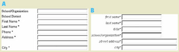
Figure 4.41: www.PLDStore.com (Feb. 2002)-Inconsistent label alignment. A- Customer registration page. B- Order Catalog page.
At other sites, labels are aligned differently in different parts of the same page, as at TechReview.com (Figure 4.42).
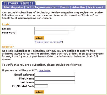
Figure 4.42: www.TechReview.com (Jan. 2002)-Left- and right-aligned form labels on same page.
Whether the inconsistency is within a single page or across different pages, the cause is usually that different developers coded the different forms and didn't coordinate with each other.
Sloppy Vertical Alignment
The most common way for form labels to be misplaced is vertically, relative to their data fields. For example, a credit card application form at LLBean.com has labels that are not properly aligned with the data fields (Figure 4.43). This conveys an impression of amateurish design. In extreme cases, it can cause confusion about which label goes with which field.
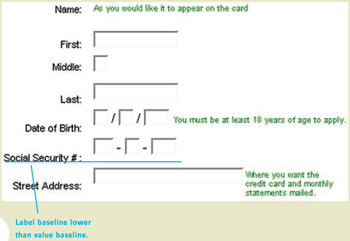
Figure 4.43: www.LLBean.com (Oct. 2002)-Label baselines are not aligned with baselines of text in the fields.
Labels in Web-based forms often are misaligned because developers don't take the time to align them. They may intend to improve the alignment when they have more time, but often that is never.
Alternatively, Web developers may want to align the components , but not know what alignment is best. Until a recent site upgrade, a form at Erlbaum.com, a book publisher's website, had the bottoms of labels aligned with the bottoms of the text fields (Figure 4.44). One could also align the vertical middles of the labels with the vertical middles of the text fields or the tops of the labels with the tops of the text fields. However, none of these is the correct alignment.
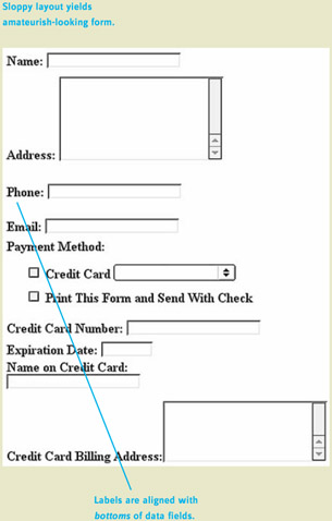
Figure 4.44: www.Erlbaum.com (Feb. 2002)-Labels are bottom aligned with data fields and data fields aren't aligned with each other, resulting in an amateurish-looking form.
Avoiding the Blooper
Here are the guidelines for aligning form labels with their data fields.
Labels should be close to their data fields and controls.
Even though one of our examples of labels being too far from their data fields came from IOBA.org , the same site also has an example of doing it right (Figure 4.45). The form for searching for a member bookseller has labels close to their respective data fields. The reason for the difference between the two forms is unclear; probably they were added by two different people.
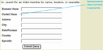
Figure 4.45: www.IOBA.org (Feb. 2002)-Labels on the member-search form, unlike the new-member registration form, are close to their type-in fields.
How could ITN.net's designers correct their blooper-labels too far from the Search buttons (see Figure 4.39)? One way is to connect the labels with the buttons visually (Figure 4.46).

Figure 4.46: Correction of blooper at www.ITN.net (Figure 4.39)-Added visual connection between labels and buttons.
Simply adding a visual connection helps, but it still seems odd and unnecessary for the labels to be so far from the buttons. If they were just closer, no visual connector would be needed (Figure 4.47). Therefore, I first moved the labels over to the buttons and eliminated the unnecessary question marks (Figure 4.47[A]). Next, I deleted "Search for" from both labels, since it is redundant with the buttons (Figure 4.47[B]).

Figure 4.47: Correction of blooper at www.ITN.net (Figure 4.39)- A- Better- Moved labels next to buttons and deleted question marks. B- Best- Deleted redundant words.
Align Labels Consistently, Either Left or Right
Within a website, alignment of form labels should be consistent: either always left aligned or always right aligned. Many designers prefer right alignment because it puts the labels closer to the fields (e.g., Brinck, Gergle, and Wood, 2001), but some designers argue that right-aligned labels create a ragged left margin that makes the labels difficult to scan.
Whether you choose left or right alignment isn't actually very important. What is important is that you pick a convention and follow it consistently throughout your site.
Align Baselines of Labels with Baselines of Text in Controls
For correct vertical alignment, all text in a "line" of controls should be positioned so the baselines (bottoms of letters , ignoring descenders as in p and y ) are aligned. This includes the text inside the controls (e.g., text fields and menus ). Well-positioned left -aligned labels can be seen in the Advanced Search page of Google.com (Figure 4.48[A]). Well-positioned right -aligned labels can be seen in the login page of Amazon.com (Figure 4.48[B]).
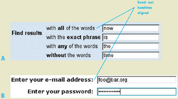
Figure 4.48: Good label position- A- www.google.com (Feb. 2002) Left aligned. B- www.amazon.com (Feb. 2002) Right aligned.
| < Day Day Up > |
EAN: 2147483647
Pages: 128