Blooper 2: Confusing Classifications
| < Day Day Up > |
Blooper 2: Confusing Classifications
One of the most important aspects of Web content is how it is organized. The schemes used to categorize and classify products, services, and information on a website can make or break the site, because they affect how difficult it is for site visitors to find what they are looking for. Thus content organization strongly affects navigation.
Mermaids, Suckling Pigs, Stray Dogs, and Others
The novelist and essayist Jorge Luis Borges wrote of an ancient Chinese encyclopedia containing a system for classifying animals (Borges 1966). The encyclopedia, probably fictional, was supposedly entitled Celestial Emporium of Benevolent Knowledge. According to Borges, it divided all animals into the following categories:
-
Belong to the Emperor
-
Embalmed
-
Trained
-
Suckling pigs
-
Mermaids
-
Fabulous
-
Stray dogs
-
Included in this classification
-
Tremble as if they were mad
-
Innumerable
-
Drawn with a very fine camel's hair brush
-
Others
-
Have just broken a flower vase
-
From a great distance, resemble flies
It is not a classification scheme that today would be considered very logical. The categories are arbitrary, overlapping, nonexhaustive, and subjective ”skewed by the perceptions of the scheme's supposed author. It is these characteristics that make the scheme seem humorous to us.
Many Web designers seem to be trying to amuse us by mimicking , in their own way, Borges' "ancient Chinese" classification scheme. The problem is, Web users aren't laughing. Well, maybe you will laugh when you see some of the examples I've found of weird categorization schemes from websites , but Web users who are trying to find something aren't laughing. They're wasting time. They're getting frustrated. They're cursing at their computers. And they're hitting the Back button.
For example, check out the categories on the Binoculars page of ZBuyer.com , an e-commerce site (Figure 1.7[A]). The categories include Camera and Photo, Products, See more Education & How-To software, Really Cool Stuff, and Michael Lewis, among others. I'll discuss the inconsistent wording and capitalization later (see Chapter 6, Blooper 46: Inconsistent Style). For now, I am concerned about a deeper, more important problem: The arbitrariness and subjectiveness of the categories. It is almost as if zBuyer's Web designers had Borges' "ancient Chinese" classification scheme in mind.
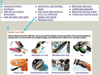
Figure 1.7: www.zBuyer.com (Feb. 2002)-(a, b) Arbitrary, subjective categories. C ” "Michael Lewis" isn't even a product category.
What's in Really Cool Stuff? Products to help you lead a lifestyle somewhere between Zen and extravagant (Figure 1.7[B]). That's a pretty broad category: almost anything could be in it. The subcategories of Really Cool Stuff are almost as arbitrary. The category Michael Lewis isn't a product category at all; it's about the people ”two people, not just Michael Lewis ”who edit this section of the site. People who really want to use this site have to browse through a lot of categories to find where things are.
The U.S. Postal Service's website employs a category scheme that is only a little more sensible than that of ZBuyer.com . The categories overlap considerably and it seems, at least to a postal service outsider, that what is in them is arbitrary (Figure 1.8). Here is a brief analysis of the major categories listed on the left side of the page:
-
Online Services. Everything on the site is in some sense an online service and so could be in this category. However, only some of the site's functions are in this category. Are the other services ”such as Business Rate Calculator ”supposed to be offline?
-
Mailing. Again, nearly everything you do at a postal service website could be considered to be about mailing. As long as the categories overlap so much, why aren't buying stamps and looking up postage rates considered to be about mailing?
-
Shipping. To the postal layperson, mailing and shipping are the same, but to the postal service, shipping seems to refer only to mailing by businesses. However, notice that in the gray horizontal navigation bar near the top of the page, Mail/Ship is treated as one functional category.

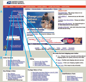
Figure 1.8: www.usps.gov (June 2002)- A ” On the USPS home page, the top-level categories seem arbitrary. B ” The pages for each category show that the categories overlap.There is a separate category for small businesses, so maybe the Shipping category is only for large businesses.
-
Buy Stamps and More. This might at first seem to be the category for buying things, but it isn't the only one containing functions involving purchasing from the postal service. In fact, it seems to be a miscellaneous category, not unlike Jorge Luis Borges' Other category.
-
Postage Rates and Fees. This is one of the more sensible categories in the set. However, the categories overlap. Rates also appears in the Shipping category.
-
Small Business Tools. This is more of a collection of functions ”from all around the site ”that are useful to small businesses than it is a true category. That may be why it is set apart from the foregoing items in the list.
Because computer-based systems make it easy and fairly natural for items to be in several categories simultaneously , it is common for categories in computer information systems ”including websites ”to overlap. Unfortunately, this gives site designers an excuse for haphazard design. Ideally, Web designers should carefully analyze, design, test, and revise a category scheme until it makes sense to prospective users. In practice, many Web designers concoct their site's categories quickly, then try to cover inadequacies by putting items in all the categories where they think people might look for them. Taken to an extreme, this approach leads to "categories" that each contain everything, which is not very useful. This is the primary problem with the postal service's categories.
A secondary problem is that the content of each category seems to depend on the page-designer's subjective whim.
Why Is This Here?
At some websites, the categories initially seem reasonable, until you look at what is in them. At Northwest Airlines' website, NWA.com, a More Specials category supposedly offers special airfares (Figure 1.9). However, someone at NWA.com thought More Specials would be a convenient place to put two announcements about new airplanes the airline is using. Hey, it had to go somewhere!

Figure 1.9: www.NWA.com (Feb. 2002)-Two items on this list are not travel specials; they are announcements about new planes.
Walmart.com, the website of a retail chain, makes the opposite mistake: items that should be in a category are not. On its home page is a Digital Cameras category linking to a Digital Camera Collection page. Visitors to this site probably assume that the 11 cameras listed on the Digital Camera Collection page (Figure 1.10[A]) are all the digital cameras Wal-Mart sells. Bad assumption! Clicking "See similar items" under most of the cameras displays a page showing a few similar cameras , but clicking that link under the S300 Digital Elph camera [1] displays an All Digital Cameras page that lists 17 cameras (Figure 1.10[B]). It is unclear why the Digital Camera Collection page doesn't list all the cameras. Customers could easily not happen across those extra six cameras.
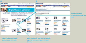
Figure 1.10: www.Walmart.com (Jan. 2002)-Main page for category doesn't list all products in category. A ” Digital Cameras category page lists 11 cameras. B ” All Digital Cameras page lists 17 cameras.
Avoiding the Blooper
The eighteenth century Swedish botanist Karl von Linne ”better known by his Latin name Carolus Linnaeus ”devised a logical and objective biological taxonomic system. The categories in it are organized hierarchically and are independent, mutually exclusive, and exhaustive. Most competing biological classification systems of that day were almost as subjective and arbitrary as Borges' "ancient Chinese" animal taxonomy and thus had little scientific utility. The linnaean system ”as it came to be called ”soon replaced all the others and today remains the basis for all biological classification (anthro.palomar.edu/animal/animal_1.htm).
Classifying Goods and Services
Wouldn't it be wonderful if we had a linnaean system for classifying goods and services? Assuming it became widely accepted and used in e-commerce websites, imagine how much it would improve Web surfers' ability to find what they are looking for.
Until then, Web designers need to design their site's categories carefully. In so doing, they should try to avoid the arbitrariness and subjectivity that make Borges' "ancient Chinese" animal categories humorous and useless. Detailed guidelines and best practices for information architecture are beyond the scope of this book, but entire books have been devoted to the subject (Rosenfeld and Morville 2002). I'll simply suggest a few methods that can help designers organize a site's content usefully for its users:
-
Literature search. Do your homework. Someone has probably thought and written about your site's topic before. Don't be afraid of research literature; it could save you reinventing the wheel.
-
Competitive analysis. Examine sites of competitor businesses or similar organizations. What categories do they use? What's in them? How is their site structured? What did they do well? If they are a weak competitor, look for obvious flaws in how they've organized their content, and avoid those.
-
Testing. After devising a category scheme for a site, Web designers should test it on typical users. This can be done long before the website is implemented, using paper and pencil or rough static on-screen prototypes . This allows designers to improve and reevaluate the category scheme several times before the site architecture and the development team become too resistant to changes.
Though innovative, unique categorization schemes may pay off for particular websites, experience shows that it is hard to go wrong if your content categories are
-
Organized hierarchically
-
Independent
-
Mutually exclusive
-
Exhaustive
-
Nonarbitrary.
A Site With Well-Organized Content
An example of a website with an excellent set of categories is Yale.edu, the site of Yale University. The top-level categories and the subcategories under them are clear, nonarbitrary, exhaustive, and sensible (Figure 1.11). This is not surprising, for two reasons. First, Yale is not an Internet startup. It had no need to rush its site to market on "Internet time." Its designers could carefully design the site. And so they did. Second, Yale's Web designers have demonstrated their commitment to good Web design by writing the authoritative and widely-used Yale style guide (Lynch and Horton 2002), and then actually following their own guidelines.

Figure 1.11: www.Yale.edu (June 2002)-Categories at Yale University's site are clear, nonarbitrary, and sensible.
Maybe more Internet startups should follow Yale's example. By rushing to put sites on the Web, often with little or no usability testing before release, perhaps they are inadvertently dooming themselves to arbitrary, subjective, "ancient Chinese" schemes for categorizing whatever it is they offer.
[1] This item is missing a brand name; to see what the company makes, the Digital Elph, customers have to click on the link.
| < Day Day Up > |
EAN: 2147483647
Pages: 128