Master Slides
To create a template, you must work on the slide master (View ’ Master ’ Slide Master):
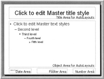
Figure 16-1: Default Master Slide Template
Create A Background For Your Slides
Decide what you want on the presentation background. There are several choices, all of which are found by right-clicking on the master slide and selecting Background. This will open the Background options dialog. At the bottom of this dialog is a white-filled box with a drop-down arrow to its right. The options you see “ More Colors and Fill Effects ” should look familiar, as these are the same options you see whenever you use any of the Fill commands.
-
Create a plain colored background “ Select More Colors from the drop-down in the Background dialog. You will see a default set of eight colors to choose from, as well as other options. If you do not like any of the default colors, select More Colors and pick a color from these expanded options.
-
Create a gradient background “ Select Fill Effects from the drop-down list in the Background dialog. The first tab on the resulting window lets you pick either a pre-created gradient or create your own. Play around with the options and see which one you like.
-
Use an existing texture square for the background “ Select Fill Effects from the drop-down list. The second tab shows a list of available textures. Since textures are graphics, the picture will be tiled on the slide to create a full background. If you have a graphic to use as a tile, click Other Texture and select the graphic.
-
Create a patterned background “ Select Fill Effects from the drop-down list. The third tab shows a set of 48 possible patterns. The two boxes at the bottom of the tab allow the background and foreground colors for the pattern to be chosen .
-
Use an existing graphic for the background “ Select Fill Effects from the drop-down list. The fourth tab is used navigate to and select the graphic. It previews the selected graphic once. Whereas texture makes the graphic into a tile for the background, picture stretches it to cover the entire slide. Select Lock picture aspect ratio to prevent the image from being distorted .
Once a background is selected click OK to return to the Background dialog. Here, either preview the background or apply it to just the current slide or all slides. In this case, the slide master is the only slide, so after previewing, click Apply.
One More Step
Before you go much further, set up the color schemes based on the colors chosen for the background. For information on choosing and setting up the color scheme, see Chapter 5.
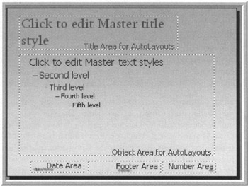
Figure 16-2: Setting a Background on the Master Slide
Determine Which Elements Will Show On Each Slide
The next step is to decide what additional elements need to be on each slide. Examples are company logos, signature shapes and graphics, and design- related items. In addition, you may want a picture or a graphic on each slide.
Add graphical items by creating them with autoshapes or WordArt, importing pictures and graphics from other programs, or by adding clipart. Insertion of these items is done using the Insert menu.
Be careful with what you add. The items added here will show up on every slide. You want to be sure you are not adding so many items you leave no room for the elements of the individual slides.
If you decide to add items to the master purely for design purposes, such as shapes and swooshes, keep them clean and consistent with the colors used in the background. Even better, use colors from the color scheme (the first eight color blocks on the color choices). This way, if the color schemes are changed, the elements will change accordingly .
No matter what you add to the slide master, what colors you use, or what fonts and typefaces you use, subtle is almost always the better choice. It is always easier to add impact by changing something that started simply than it is to add impact by changing something that started out glaring and outlandish.
Next, you need to determine what “ if anything “ will show in the header and footer of each slide. Do you want the slide number on each slide? Do you want the date on each slide? You can add static text for each of these elements to the header or footer. If you want the fields to be automatically updated as the presentations are created, use the Header and Footer dialog found on the View menu. Be sure to notice the bottom check box on this window. It allows the footer elements on the content slides to be turned on, but leaves them off of the title slides.
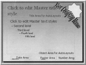
Figure 16-3: Master Slide with WordArt and Graphics
Format The Text On Your Slides
Now that the graphic background of the slides done, it is time to be creative with the text. Format the text on the master slides just as you would on a regular slide (select the text, Format ’ Font, make changes). You can change the font, the color, the size , etc. Make sure the font color is complementary to the background, but will still show from the necessary distance.
Having said that, keep in mind other people will be using this template. If you pick fonts not on the common fonts list from Chapter 4, be sure you have permission to share the fonts when you distribute the template.
In PowerPoint 2000 or earlier, fonts cannot be embedded in the template. If using non-standard fonts, be sure those using the template have them as well.
Next, change the indent on the sub-bullets by clicking on the text and using the margin markers to adjust the indent. The margin marker is on the ruler. It looks like two triangles pointing at each other, with a rectangle below the bottom one.
You can also change the look of the bullets (Format ’ Bullets and Numbering). If you really want to get fancy, select a picture for the bullet (if using a picture bullet, only people using PowerPoint 2000 and later will be able to see them).
It is a good idea to give the users an extra visual clue about the outline level by making sure the bullets for each level are distinctly different. You can change the shape and the color on regular bullets. On picture bullets, make the changes outside of PowerPoint. No matter what you use for bullets, the size of the bullet will be determined by the font size for the text.
| |
Right-click the placeholder and select Format Placeholder. This will bring up a dialog which changes the look of the text placeholder and apply a font to all the text in the placeholder. If you change the color of the placeholder's background, I recommend turning on the Resize AutoShape to Fit Text option in Tools ’ Options. This allows the colored area to grow and shrink automatically with the text on the slide.
| |
Define The Default Animations For Your Slides
The next item to define for the template is the elements will become visible when the presentation is running. While I prefer not to use animation on my master slides, I do know it is sometimes needed. If you need it, set up animations on the masters in the template. Just be sure the animations and transitions are only used where they add to the message of the content and the presentation.
If master animation, the first thing to define is how the text on content slides will look when it comes in and when the focus moves on to the next piece of text. To set the animations for the placeholders, select the placeholder and apply whatever animation and effects you have chosen. See Chapter 6 for information on applying animations and effects.
You may also want to animate the logo in some manner so it stands out. If the logo is animated, be sure the animation isn't going to become repetitive for those viewing the presentation. Animation of a logo on the content master is a sure way to overwhelm the audience. If you must have an animated logo, consider placing it on the title master only.
To adjust the animation for items in the header or footer of the slides or for other graphics on the master, apply the animation to those placeholders on the master as well. You can't access these elements from anywhere other than the master.
If you plan to set up a preferred transition for all of the slides in presentations using this master, set the transition on the slide master and the title master using Slide Show ’ Slide transition. While I don't recommend putting animations and effects on the masters, I do recommend putting transitions on the masters. They can be changed later, but by putting transitions on the masters, you give other presentations based on this template a head start on consistency.
Finally, if this template might be used to create kiosk presentations, put the basic five navigation buttons on the master. If the files created from the template aren't kiosks , the presentation designer can always remove these elements from the masters. However, by placing them here, you make the navigation interface to the presentation more consistent.
Create The Title Master
Now the slide master the way you want it, it is time to leverage that work and create the title master. You could have created the title master at any point previous to this. However, by creating it after creating the slide master, you will have less work to do.
To insert a title master, select New Title Master from the Insert menu. Note you must be in Master View (View ’ Master) to access this command. You will see a slide that looks much the same as the slide master, but with different placeholders. Chances are good you will find there is little more you need to customize at this point. However, you should check the following items
-
Check that the graphics still look proportional to the slide. Because there is considerably less text on a title slide, you may enlarge or change the graphics to catch the readers' notice.
-
Check that the fonts on the slide look the way you want them. They should be large, easy to read and yet still stand out from the rest of the presentation.
-
Decide whether the background needs a tweak to stand out from the main slides. You may want to change the color or the graphic.
-
Decide whether you really want those footer text areas to show on the title slides. Decide if they are distracting from the impact of the title slide.
-
Add animation to any logos or other graphic elements you use. Since the title slide will be used less frequently, animated items here are more acceptable.
Multiple Masters
In PowerPoint 2002 and later, you can have more than one master in a given file. This also means templates built into PowerPoint 2002 and later can have multiple pairs of master slides. This is a great thing for template designers.
For example, the template I designed for this chapter has two pairs of masters. When you look at the Slides tab of the taskpane on the left side of the screen in the Master Slide view, you see:
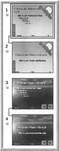
Figure 16-4: Multiple Master Templates
One great use for the multiple master pairs is the navigation buttons. Create two masters, one with buttons and one without. The masters can even be otherwise identical! Then, no matter which type of presentation “ speaker-led or kiosk “ is being built, the correct navigation options will be available.
When templates with multiple masters are applied to a presentation, PowerPoint will bring up this message:
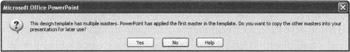
Figure 16-5: Multiple Master Templates Warning Message
The users of the template can decide if they want all of the masters or just the first one. So, be sure if you include multiple master pairs, the first one is the one most likely to be used. If you didn't create it first, select that pair of masters and drag them to the top of the list.