Project: Newsletter
| We'll be creating a newsletter in 20 easy steps: STEPS
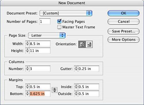
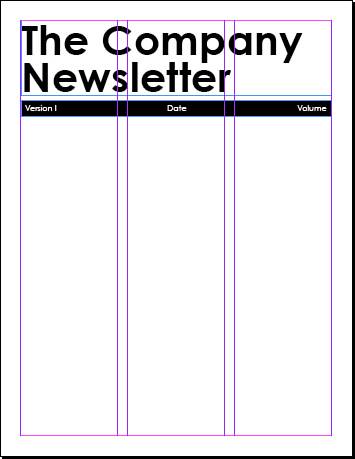
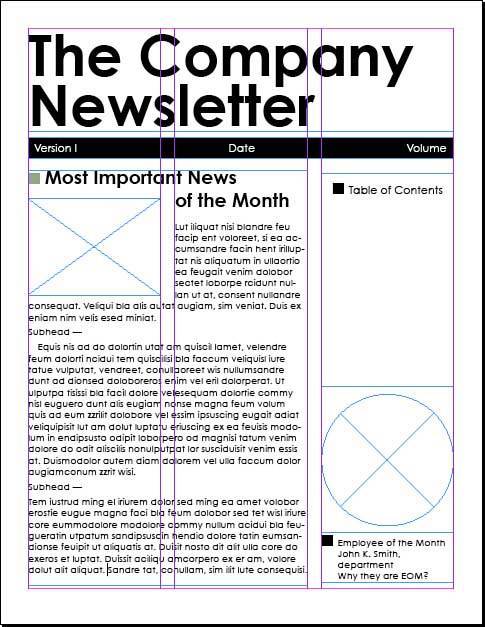
Step 1: Arranging WindowsThese last few projects are going to get more complicated. You might want to navigate to the finished projects folder and open my version of the finished newsletter as a reference alongside your project file, as well as use the screen captures throughout this chapter. When you eventually have two windows open (my file and yours), go to the Window pull-down menu and select Arrange (see Figure 9.1). Experiment with your options based on your available workspace/monitor size. Figure 9.1. Open the layout using the Window, Arrange, Tile command.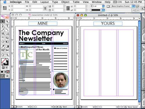 Step 2: Setting Up Your Document FormatLaunch InDesign and go to the File pull-down menu. Select New, Document and fill out the New Document window as indicated in Figure 9.2. You will be creating an eight-page portrait layout with a three-column grid. Figure 9.2. Fill out the window as indicated. We're going to start by laying in the structure of your document, specifically the repeating elements. When I say repeating elements, I'm not just referring to elements placed on the master pages, but also elements that will repeat in every issue. Those elements include the masthead, the table of contents, the letter from the editor, financials, a calendar of events, mailing information, and so on. Step 3: Creating the MastheadLet's start with the masthead. Create a text box with the following coordinates and dimensions: x: .5", y: .5", w: 7.5", h: 1.8125". Type in your company newsletter masthead. I've used The Company Newsletter formatted in Century Gothic bold, 72 points, and 64-point leading. Note: I created a soft return (Shift-Return) so that my masthead takes up two lines. Below the masthead, you will create a slug for publication information, including volume, date, and version. See Figure 9.3 for an example. Create a text box with the following coordinates and dimensions: x: .5", y: 2.425", w: 7.5", h: .375". Figure 9.3. The masthead and slug.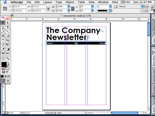 Step 4: Creating TabsLet's create tab stops in this text box. Doubleclick inside the box to switch to the Type tool and then go to the Type pull-down menu and select Tabs. Drag the left indent to the .25" mark. Then click a center tab stop and click it at the 3.75" mark (or type 3.75" for the x coordinate and press Return) to set the first tab. Now, select a right tab stop and click it at the 7.25" mark. Now close the Tab window and type Version 1; then tab to the center and type Date. Finally, tab to the right and type Volume Volume 1. Highlight the text and format it. I have chosen Century Gothic, 14 points, vertically centered. Color the text Paper and the background of the text box Black (or create spot company color and use it for the accent color throughout this project). Your first page should look like Figure 9.4. Figure 9.4. Your progress on page 1. Step 5: Using the Glyphs PaletteNow let's create the text box for the main story on the front page. Create a text box starting at x: .5", y: 3" and spanning the first two columns on the page; draw it to fit the bottom margin. I've used the headline Most Important News of the Month, but feel free to improvise. Likewise, I experimented with an element that would anchor every feature with a dingbat. You can find your character by using the Glyph palette and selecting a dingbat font. I've used a square Zapf Dingbat, followed by a space, followed by the headline formatted in Century Gothic Bold, 24 points (see Figure 9.5). Figure 9.5. Using the Glyphs palette to insert a dingbat.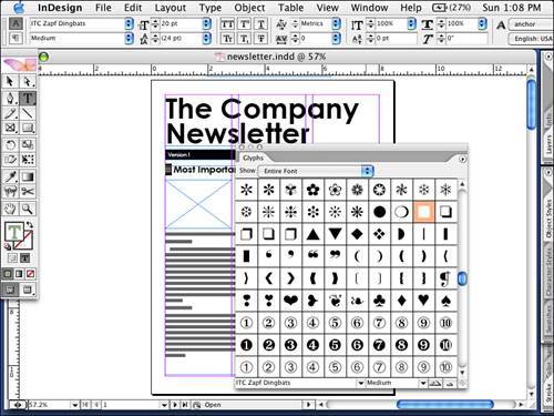 Note
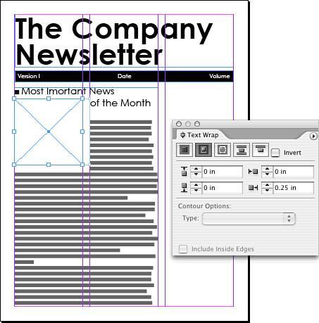
Step 6: Creating Text WrapDraw a graphic frame to fit the upper-left corner of your text box, just below the headline, to fit the first column with the following coordinates x: .5", y: 3.5". Set the width to fit the column and set the height to 2.5". Place a text wrap around this picture box with a right offset of .25", but no offset on the top, bottom, and left offsets (use Figure 9.6 as a reference). Figure 9.6. Your continued progress on page 1. Create a text frame in the last column at the same y: 3" and with a height of 3.75". Type a square Zapf Dingbat and then type Table of Contents. Just below the Table of Contents text, draw a circle graphic frame to fit the column. Below it create a text box for a caption and type Employee of the Month. I've formatted my text in Century Gothic, 12 points. Page 1 is shown in Figure 9.7. Figure 9.7. Page 1 so far. Step 7: Formatting Master Pages with Auto Page NumberingGo to the Pages palette and double-click Master Page A. Draw a text frame across the bottom of the left master with the following coordinates and dimensions: x: .5", y: 10.375", w: 7.5", h: .25". Use Century Gothic, 12 points and type The Company Newsletter. Add a comma and a space after The Company Newsletter. With the text insertion point next to the word Page, go to the Type pull-down menu and select Insert Special Character, Auto Page Number. You should see an A appear. Now we will create a rule above by going to the Paragraph palette menu. You can also select the Paragraph Control palette, pull down the menu to the far right of the Control palette, and select Paragraph Rules. Select Rule Above, 1 pt, and an offset of .15". Do the same thing for the right master, but change the paragraph alignment to right aligned. Your finished master page should look like Figure 9.8. Figure 9.8. Master page A formatted.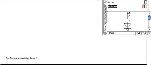 Go back to the Pages palette and double-click Page 1. Notice the new footer. Tip
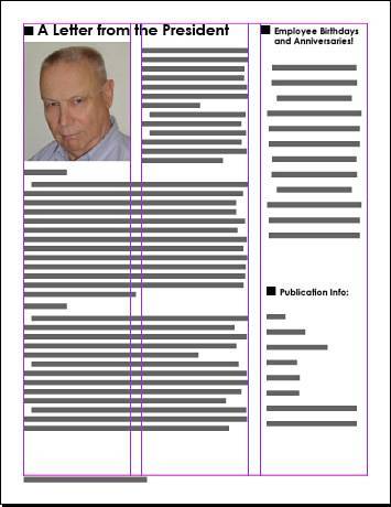
Let's rough in the rest of the pages. Page 2 should contain a letter from the CEO, president, or editor. Create a text frame that fits the first two columns and from the top and bottom margins. Type A letter from the President (or CEO or Editor) using Century Gothic bold, 24 points. Press Return. Note
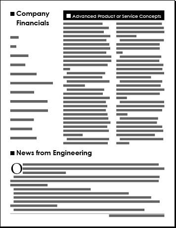
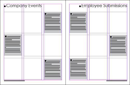
Create a picture frame to fit the first column, roughly 2½" in height. Place the picture, Pete.tif, in the frame. With the Direct Selection tool, select the image and scale it to 50%. Using the Direct Selection tool, drag the image into positionthe Direct Selection tool turns into a hand when you hover over the image. The last column should contain two text boxes: Employee Birthdays and Anniversaries and Publication Info. Use Century Gothic bold, 12 points for this text. Use Figure 9.9 as a reference. Figure 9.9. A roughed in page 2. On page 3, the first column will contain the text Company Financials. Use my example and add text such as sales, profit, stock stats, new initiatives, and so on. Create a text box across the top of the last two columns .5" high. I've used this area for new product/service information and have titled it Advanced Product or Service Concepts, formatted Century Gothic, 16 points, centered text (horizontally and vertically), with paper text, and a black fill. Underneath this box, create another text box across the last two columns, 6" deep. Make this text frame two columns, with a gutter of .25" by going to the Object pull-down menu and selecting Text Frame Options. Finally, create a text frame across the bottom of the page, starting at y: 7.265" and fitting all the margins. I've titled this section News from Engineering, formatted it in Century Gothic bold, 24 points. Press Return, and change the type to Adobe Garamond Pro, 12 points. Fill the box with placeholder text, select the first paragraph, and create a drop cap using the Control palette. Use Figure 9.10 as a reference. Figure 9.10. A roughed-in page 3. Pages 4 and 5 are the center spread of the newsletter, and I've devoted them to pictures, with page 4 for company events and page 5 for employee submissions. Because most shots are horizontal in orientation, I've drawn three graphic frames on each page with corresponding caption boxes. Step 8: Creating Object StylesLet's explore a new feature with InDesign CS2. We are going to create an object style for the caption boxes. Drop in your graphic frames as I have done in Figure 9.11. Essentially, each graphic frame is two columns wide and approximately 2 3/4" deep. There are three frames on each pagedon't worry about being exact. Create a caption box to the right of the first picture box and format it as you would like. Figure 9.11. The inside spread of your newsletter roughed in. I've filled it with 20% black and created a text inset using Text Frame options in the Object pull-down menu. I developed the text using Adobe Garamond Pro italic, 12 points and have saved that text as a paragraph style called Caption.
Next, with the frame selected with the Selection tool, go to the Object Styles palette. Select the Palette menu, and then select New Object Style. Make sure all your options are turned on and label this new style spread caption boxes (see Figure 9.12 for guidance). Figure 9.12. The New Object Style window.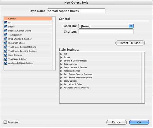 Note
To test your new object style, create another text frame and, with it selected, choose your new style from the Object Style palette and watch the frame reformat. Draw four more frames aligned with the graphic frame on the spread for pages 4 and 5. Finally, draw two text frames, one across the top of each page. On page 4, the coordinates and dimensions should be x: .5", y: .5", w: 7.5", h: .85". On page 5, the coordinates and dimensions should be x: 9", y: .5", w: 7.5", h: .85". Type Company Events on page 4 and Employee Submissions on page 5, both formatted Century Gothic Regular, 40 points. Text should be left aligned on page 4 and right aligned on page 5. Refer to Figure 9.11 for reference. Page 6 will be devoted to sales and marketing. Across the top of the page create a text box that fits the top, left, and right margins and is .5" deep. Choose a title for the page (I used The Sales and Marketing Corner!!!) and format it Century Gothic, 30 points. Step 9: Using Display PerformanceBelow the title, create two graphic frames side by side. Each graphic frame should measure 3.5" x 2.35" with a y coordinate at 1.15". Import chart1.eps from the Chapter 9 projects folder into the first box and chart2.eps into the second box. For each box, use the Fit Content Proportionally command on the Object pull-down menu. Stroke the graphic frame with 1-point, black. Create a caption text box that spans from the left margin to the right margin. Fill it with placeholder text and apply the caption paragraph style you made previously. Note
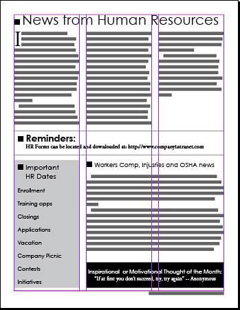
Next, create a text frame that spans the width of your page from margin to margin with the following coordinates and dimensions: x: .5", y: 4.5", w: 7.5", h: .5". I've used the title Update on Marketing Initiatives. Highlight the text and format it Century Gothic bold, 24 points, horizontally and vertically centered aligned, fill with paper swatch. Fill the text frame with black. Below this headline, create a two-column text frame with a .25" gutter. Fill it with placeholder text. Select the first paragraph and create a drop cap three lines deep. Your finished page should look like Figure 9.13. Figure 9.13. The roughed-in page 6. Page 7 will be devoted to human resources. Create a text frame across the top of the page that fits the top, left, and right margins. Its coordinates and dimensions should be x: 9", y: .5", w: 7.5", h: .5". I've used the title News from Human Resources, Century Gothic Regular, 36 points. Create a text box with three columns, .25" gutters, and the following dimensions: x: 9", y: 1", w: 7.5", h: 3.5". With your text insertion point, select Adobe Garamond Pro, 12 points. Fill the box with placeholder text and create a drop cap for the first paragraph three lines deep. Create a text box that spans the middle of your page with these dimensions: x: 9", y: 4.5", w: 7.5", h: 1". Use the Object pulldown menu and Text Frame Options and create a text inset .125" on all sides. Note: This might be another good object style to create. For the headline, type Reminders: formatted with Century Gothic Bold, 24 points. Press Return and change it to Adobe Garamond Pro bold, 12 points. In this area, I've added the location of the HR forms on the website. Stroke the box in 1-point, black. Draw the next box in the first column with the following dimensions: x: 9", y: 5.75". Tag this box with your Spread Caption Boxes object style and then type the title Important HR Dates. Highlight the title and format it with Century Gothic Regular, 18 points. Press Return, change the point size to 14 points, and type some HR topics with 32-point leading. Add a text box to the right two columns with the following dimensions: y: 5.75", h: 3.4". I've used the headline Workers Comp, Injuries, and OSHA news formatted Century Gothic Regular, 16 points. Press Return. Note
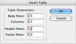
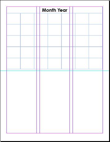
Finally, add a frame just below the Workers Comp article to fit the two columns and fit the bottom margin. I've used the text Inspirational or Motivational Thought of the Month: formatted in Century Gothic Regular 14 points, paper, centered. On the next line of copy, the thought itself is formatted in Adobe Garamond Pro, 14 points, paper. Fill the box with black. Use Figure 9.14 as a reference and compare your own layout accordingly. Figure 9.14. The roughed-in page 7. Step 10: Creating a TableOn the last page, or back self-cover, we'll create a calendar using the table feature. First, drag and drop a horizontal ruler guide to the 5.5" mark. This represents your fold mark should you self-mail. Click and drag a text frame that fits the left, top, and right margins and the fold rule. Go to the Table menu and select Insert Table. Fill out the window as shown in Figure 9.15. Figure 9.15. The initial Insert Table window as described in the screen capture. Select the first row of your new table and set the row height to .5". To do this, go to the Window pull-down menu and select Type & Tables, Table. With the row still selected, type .5" in the height field. Highlight the next five rows and set the row height to .875" in the Table palette. Highlight the first row (header row), open the Table Palette menu, and select Merge Cells. Click in the header row with the Text tool, center the text insertion point horizontally and vertically, and then type Month Year. Format the text Century Gothic bold, 26 points. Use Figure 9.16 as your reference. Figure 9.16. The last page roughed in. Note
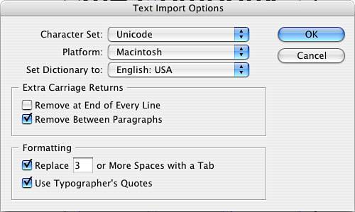
Congratulations, you've just roughed in your eight-page newsletter. Now we're going to fine-tune all the pages by adding graphical elements, developing style sheets, and discussing supplied text files and horizontal spacing strategies. Move back to page 1. Let's create a couple of style sheets. The first paragraph of a published article or story typically does not contain an indent. Assuming you've filled the frame with placeholder text, select the first paragraph in your main text and create a new paragraph style using the Palette menu; name it first paragraph. Select the second paragraph and create a first-line indent of 12 points. With the paragraph still highlighted, create another new style sheet called body copy. Highlight the remaining copy and tag it with body copy. Go through the remaining pages, highlight each page's first paragraph, and tag it with the first paragraph style sheet. Highlight the remaining paragraphs throughout the rest of the pages and tag them with the body copy style sheet. Step 11: Importing and Cleaning Up Copy from Text FilesIf you are importing copy from an outside source, you are virtually at the mercy of your supplier. What am I referring to? Specifically how well they created their text file. Ideally, you would like your supplier to type in their copy with no formatting, except for a carriage return between paragraphs and a spell check. That's it. However, this is not realistic. So what follows are some tips to assist you in cleaning up the text. Import your copy into a text box using the File, Place command. Turn on Show Import Options and review your choices. I recommend the following setup, shown in Figure 9.17. Figure 9.17. Use these import options for text, assuming you don't know how well the text might be formatted. Choose whichever platform is appropriate for you. Turn on Show Hidden Characters on the Type pull-down men, and then examine the imported copy. Common errors include double carriage returns between paragraphs, spaces or tabs for indentation, and double spaces at the end of each sentence (which is correct for word processing but incorrect for typesetting). These hidden characters can be found and replaced using the Find/Change command on the Edit pull-down menu. You find and change not only normal text, but hidden characters as well. For example, instead of filtering them out through import options, you can use the Find/Change command and find every double return and change it to a single return (see Figure 9.18). Figure 9.18. Use the Find/Change command on the Edit pull-down. Pull down the triangle to the right of the Find field and view all the hidden characters you can search for and change. Step 12: Back to the LayoutCreate a text frame below the rectangular graphic frame on page 1it will hold the caption for the image. Create a text wrap around the caption box just like the text wrap of the logo itself. Set no offset in the top, bottom, and left fields, but set a .25" offset on the right side. Tag this new text frame with your caption style sheet; then type in anything relevant. Move to the last page, 8. Let's create a couple of styles for the calendarone for the dates and one for the descriptions. Feel free to play around with one in an individual cell. My date style is Century Gothic bold, 12 points. Save the style and name it calendar date. Now create another style with Century Gothic Regular, 10 points; save it as a new paragraph style; and name it calendar description. Step 13: Creating Type OutlinesFinally, you'll create some finishing touches to the layout using type outlines as modified graphics. You'll choose a text character, sizing it very large. Then you'll convert that character to vector art, which you'll add as graphical elements throughout the layout. Throughout the newsletter, you are going to place oversized characters in 20% black placed behind significant stories. Let's take page 1. Out on the pasteboard, draw a rather large, vertically oriented text box. Type in an exclamation point and format that character as Adobe Garamond Pro, bold, 240 points. Select the frame itself, go to the Type pulldown menu, and select Create Outlines. Note
Now you can stretch the exclamation point to any size because it's no longer type but a graphical element. Fill the shape with 20% black and drag it over the main story. Go to the Object pull-down menu and select Arrange, Send to Back. Create two more elements for page 1they will look like drop shadows. Create a rectangle slightly offset to the top and left of the table of contents (TOC) box. Fill with 20% black and send it to the back, behind the TOC. Create a circle slightly offset from the initial circle down and to the right. Fill it with 20% black and send it to the back. Check your work against Figure 9.19. Figure 9.19. The exclamation point and circle.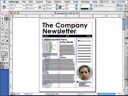 Go to page 2 and place a star behind the birthdays and anniversaries. Again, fill it with 20% black and send it to the back. Create another rectangle similar to the publication information one, only offset this one to the left and above the publication information box. Fill it with 20% black and send it to the back. Go to page 3 and, like page 1, create a long, vertically oriented text box on the pasteboard. Type in a question mark and format it Adobe Garamond Pro, bold, 240 points. Create outlines, fill it with 20% black, and stretch it into a shape. Place the question mark between the last two columns and send it to the back. Go to page 6 and draw a text frame on the pasteboard that is rather large and vertically oriented. Type in a dollar sign and format it as Adobe Garamond, bold, 240 points. Create outlines, stretch it into shape, position it in the middle of the page, and send it to the back. Go to page 7 and draw a horizontal rule through the middle of the three-column story. Apply an 80-point stroke, a dot style, and 20% black. Drag it into position and send it to the back. Step 14: Creating Tab LeadersWhen all the elements are in place, just where you want them, you can go back to page 1 and fill out the table of contents. For the purposes of this short document, we'll create one manually. For the longer publications in the upcoming chapters, we'll use InDesign's TOC feature. So, for now, insert a carriage return or two after the Table of Contents title. Set the paragraph alignment to left-aligned, reduce the type size to 12 points, and reduce the leading to 30 points. Go to the Type pull-down menu and select Tabs. You are going to create a tab stop with a dot leader. Select a right tab and click it at the 2" mark. In the Leader field, type a period and press Return to activate the field. Close the Tab window and begin typing the TOC items. First, type Letter from, and then press the Tab key and type the page number. You should see the dot leaders appear and fill up to the page number. Press Return, type the next topic, press Tab, and then type in the page number. Do this for the remaining TOC items. I've added the following thumbnails so you can see the finished pages collectively. Use Figure 9.20 to view the finished project pages. Figure 9.20. The finished pages in sequential order.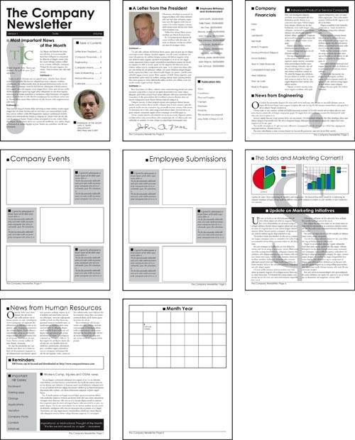 Prior to printing, always save your document. In this case you might want to save it twiceonce as a document and once as a template. Note
Step 15: Creating a Color Composite ProofLet's print a content proof. Go to the File pulldown menu and select Print. Choose the appropriate settings for the printer that is available to you. Then go to the File pulldown menu and select Print. Again choose the appropriate settings for the printer available to you. On the General tab, choose one copy. On the Setup tab select 8.5" x 11" and Vertical Orientation; leave the Scale setting alone. On the Marks and Bleed tab, turn off all the options. On the Output tab, if possible, print a color composite output for your work; if not, select Grayscale. On the Graphics tab, the default settings should work. The remaining tabs can be ignored for now. Print and review your proof, make any necessary adjustments, and save your changes. Print it again. Step 16: Managing Horizontal Space with KerningOne of the last things you can tweak is the type, particularly after you create a proof and see your publication in print at the actual size. Kerning is typically executed on large type when pairs of characters look awkward. In the Kerning field either in the Control palette or Character palette, positive numbers add space between characters (see Figure 9.21) while negative numbers take space out (see Figure 9.22). The numbers are expressed in 1/1000 of an em space. An em space is the width of the letter m in the typeface and point size with which you are currently working. In the case of our masthead, the em space is a 72-point character. By doing nothing, you allow InDesign to automatically kern (called font metrics) using the kerning tables supplied by the font vendor. To override the metric setting, you can select Optical Kerning to allow InDesign to visually kern the pair of letters in question, or you can type your own number to override InDesign completely and kern to your own amount. Figure 9.21. The letters M and P have positive manual kerning. Figure 9.22. The letters M and P have negative manual kerning. Step 17: Managing Horizontal Space with TrackingEssentially, tracking should be used only for special effect and not for horizontal space management. Typically, you will see it used to spread letters far apart or bring them close together. But it should never be used for copy fit, which is when you need to get that last line of text to fit in the box, which is currently overflowing, and you track it all to squeeze it in. See the effect of tracking on letters in Figure 9.23. Do you want the recipient to read the content? If so, don't make it more difficult! Tracking is a monospaced command, so it does not distinguish letter spacing from word spacing. It's therefore better to use letter and word spacing: Select Justification from the Paragraph palette's pull-down menu. Figure 9.23. Company without tracking, and Company with tracking of 400, for special effect.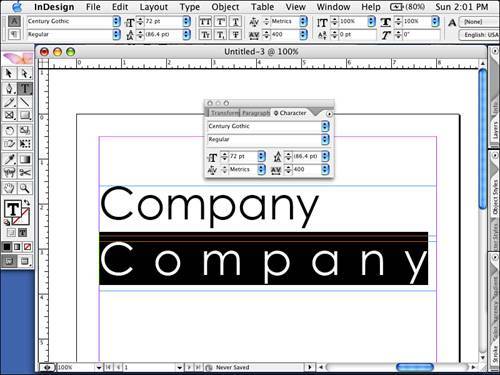 You can see the differences between unadjusted spacing, word spacing, and letter spacing in Figures 9.249.26 Figure 9.24. Paragraph spacing unadjusted.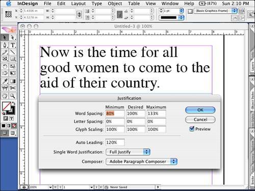 Figure 9.25. Paragraph spacing with additional word spacing only adjusted.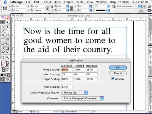 Figure 9.26. Paragraph spacing with less letter spacing only adjusted.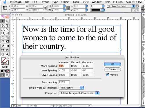 Step 18: Managing Horizontal Space with JustificationFirst, don't assume your text needs to be justified for this command to apply. The term justification simply addresses horizontal spacing and alignment issues. You can adjust letter spacing separate from word spacing in this dialog box, and this is ideal. For all alignment options other than Justified Alignment, you use the Desired column to adjust your copy. Any number larger than 100% (which represents the spacing as is) adds space and any number less than 100% takes space out. Any number greater than 0% (which represents the spacing as is) adds space and any negative number 0% takes space out. If you are working with copy whose alignment is justified, you will work with the Minimum, Desired, and Maximum fields. This is because you must give InDesign a range to work with when you are dealing with justified alignment because every line contains a different number of letters and words and still is forced to fit a fixed width. Therefore, you need to give InDesign a range of acceptability because every line will be treated differently. Step 19: In-house Digital ProductionWhile I cannot account for the type of digital output devices, RIPs, and software you might have access to using software, it will be necessary to redistribute your pages from reader's pairs to simple printer's pairs. Printer's pairs are the pairs of pages in imposition (folding and binding) sequence. In the case of this newsletter, they are pages 8 and 1, pages 2 and 7, pages 6 and 3, and pages 4 and 5. I don't advise you to use InDesign to create printer's pairs; however, you can override master items (detach them) and turn off Allow Pages to Shuffle. Both of these options are found on the Pages Palette menu. After turning these off, you can drag the pages into position. Again, I don't recommend this. This step is best executed by your commercial print service provider. If you still want to attempt a booklet for comping purposes, the bundled InBooklet plug-in will more than likely do the job, particularly for in-house digital production. With the layout complete, access InBooklet by going to the File pull-down menu and selecting InBooklet. Of the three tabs down the left side of the dialog box, the first tab (Layout) is where you choose your impostion style. For printer's pairs, select 2-up Saddle-stitch. This places the pages into pairs that will, when folded and stapled, read correctly. I recommend turning on the Save to Separate File option, as shown in Figure 9.27. Figure 9.27. The InBooklet Layout tab.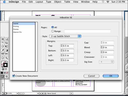 If no marks are necessary, select the Preview tab and navigate through your printer's pairs to ensure everything looks correct. Notice how the interior or middle spread, pages 4 and 5, remains the same. See Figure 9.28 for a reference. When you click OK, InBooklet creates a separate file for you to print from. Figure 9.28. The InBooklet Preview of imposed pages. Another option is to export each page as an individual PDF and import the pages in printer's pairs in Acrobat. Or check out A Lowly Apprentice Production's (www.alap.com) new plug-in for Acrobat, Imposer Pro 1.0. The same developer of InBooklet for InDesign has created a similar plug-in for Acrobat. That way, no matter which application you develop your pages in, after they become PDFs, they can be imposed in Acrobat. You will still need to be able to manage duplexing to produce this in-house, and many output devices that can fold and staple come with software that allow you to compile your pages as necessary. Note
Step 20: Creating a PDF for Alternative DistributionWith your document open and already proofed, go to the File pull-down menu and select Export. Navigate your way to your Chapter 9 finished projects folder and name your PDF. At the bottom of the window, make sure the format is set to Adobe PDF; then click Save. Select Preset, High Quality Print and click Export. |


EAN: 2147483647
Pages: 148
- Integration Strategies and Tactics for Information Technology Governance
- Linking the IT Balanced Scorecard to the Business Objectives at a Major Canadian Financial Group
- A View on Knowledge Management: Utilizing a Balanced Scorecard Methodology for Analyzing Knowledge Metrics
- Measuring ROI in E-Commerce Applications: Analysis to Action
- Governance Structures for IT in the Health Care Industry