Project: Postcard
| We'll be creating a postcard in 13 easy steps: STEPS
Step 1: Setting Up Your Document FormatLaunch InDesign, go to the File pull-down menu, and select New Document. Fill out the New Document window as indicated in Figure 4.27. Figure 4.27. Fill out the window as indicated. Orient yourself to your layout. Check to ensure that you can see your guides. If not, go to the View pull-down menu and select Grids and Guides, Show Guides. Step 2: Placing an Image for Full BleedDraw a rectangle graphic frame to fit the bleed guides on the front of your postcard. This is called a full bleed because the image bleeds equally on all four sides. Go to the File pull-down menu and select the Place command. Navigate to your Chapter04 project files folder and open the DM_BGRD_DUO.eps file. After the file is initially placed in the picture frame, scale the image only (by selecting the image with the Direct Selection tool) anamorphically (disproportionately) to 350% wide by 150% tall. To do this, make sure you turn off the Constrain Proportions for Scaling option, which is the little link next to the Vertical/Horizontal fields in the Control palette. This type of scaling is unusual and beyond the normal acceptable scaling limits for standard production, but we are attempting to create a special effect. When you hover over this frame with the Direct Selection tool, the icon changes to the Hand tool. Using the Hand tool, drag the resized image in the frame so that the distorted ampersand symbol fits in the lower-left corner of the frame. See Figure 4.28 for a visual reference. Figure 4.28. The image placed, scaled, and positioned within the picture frame. Step 3: Adding TextNow let's add the text to the front of the postcard. You are going to draw a text frame to fit the margins of the postcard by starting to drag a text frame with the Text tool, somewhere out on your pasteboard. The dimensions and coordinates of the frame should be as follows: w: 8", h: 5", x: .5", y: .5". Begin typing with the Type tool. Feel free to use your company name and message; mine reads DesktopMedia Graphic Arts Training: Hands-On. Instructor-Led. On-Site. Certified. Turn on Show Hidden Characters, found on the Type pull-down menu, to monitor the line breaks you are about to create. Step 4: Creating BreaksTo break a line without creating a new paragraph, create a soft return. To do this, hold down the Shift key and press Enter at the same time. Instead of creating a standard carriage return (signaling to any word processing or page layout application that you want to create a new paragraph), the soft return simply creates a line break where you want it. I've inserted a soft return after the word DesktopMedia. I've placed normal, or hard, returns after TRaining: and Site. Note
Step 5: Centering Text Horizontally and VerticallyAfter you have broken the lines the way you would like them to flow, select all the type and center the alignment horizontally (either by clicking the Paragraph button in the Control palette or by using the Paragraph palette itself). Next, center the type vertically by clicking the Vertical Alignment button to the right of the Control palette or by going to the Object pull-down menu and selecting Text Frame Options. See Figure 4.29 to make sure you have breaks in the correct places and that your type is aligned properly. Figure 4.29. Our text, with hidden characters turned on and the breaks in the correct positions. Highlight the text and format it as follows: For the text DesktopMedia Graphic Arts Training, I've chosen Optima, Roman, 50-point type over 52-point leading. For the text Hands-on. Instructor-Led. On-Site., I've chosen Optima, Roman, 38-point type over 52-point leading. For the last line, Certified., I've chosen Optima, Roman, 50-point type over 70-point leading. See Figure 4.30 to monitor your progress. Figure 4.30. The front of the postcard so far. Step 6: Creating a Reverse or KnockoutFinally, select all the type and open the Swatches palette if it's not already open. Then, with the Type swatch selected or clicked forward in the upper-left corner of the palette, select the swatch called Paper. InDesign borrowed this concept from PageMaker and uses the color Paper (which really isn't a color at all) to convey the concept of knockout or reverse in the layout. Anything tagged or colored with the swatch paper creates a knockout (a reverse or hole) in the color plates it sits on top ofin this case Black and PMS 8322 (the spot color found in the background image). Take a moment to review your work so far by turning off the guides (found on the View pull-down menu) and turning off the Special Characters (found on the Type pull-down menu). See Figure 4.31 for the finished front. Figure 4.31. The finished front of the postcard with the type formatted and reversed out of the anamorphically scaled background image. Step 7: Navigating in an InDesign DocumentLet's navigate to the back of our postcard, page 2. To do this, you can use the navigation buttons at the bottom of the window by clicking the Next Page button, which looks like a right triangle. You can also use the Pages palette (double-click the page icon numbered 2) or the Next Page command, found on the Layout pull-down menu. Turn the guides back on. It will be important to establish a visual aid to divide the back of the postcard in half. The left side will contain content, while the right side will be reserved for postal information, including the address and postage. To create a visual divide, you can place a ruler guide. I will offer two options. Step 8: Creating Ruler GuidesWith the Selection tool, hover over the vertical ruler on the left side of the InDesign window; then click and drag out a ruler guide. Watch the ruler across the top of the window and drag the guide to the 4.5" mark. Let go of the ruler and you will see a new guide down the middle of the page. Another method for placing guides can be found by using the Layout pull-down menu and the Create Guides command. Using this dialog box, insert two columns with a 0" gutter and click the preview box. A ruler guide will appear exactly down the middle of the page. See Figure 4.32 for the exact positioning of the ruler guide. Figure 4.32. The back of the postcard with the guides correctly positioned. Now that you have a visual guide dividing the back of your postcard, let's add some content. Draw a text frame that is 4" wide by 1.125" deep and position it to fit the upperleft corner margins. Or, if you prefer, you can place it at the following x,y coordinate: x: .5", y: .5". Type in the headline Now is the time to train and upgrade your staff's skill set with minimal interruption and maximum production. Format this text as follows: Optima, Roman, 20-point type and 21-point leading, centered alignment. Tag the text with PMS 8322 from the Swatches palette. Remember that the spot color arrived in the Swatches palette when you imported the image on the front of the postcard. See Figure 4.33 to check your work. Figure 4.33. The back of the postcard with the head line in place. Step 9: Placing TextDraw the next text frame as follows: x: .5", y: 1.75", w: 3.5", h: 3.25". Go to the File pull-down menu and import the text file named training.doc. This text file will flow into the text frame. Note
Highlight the text in the frame with the Text tool by clicking in the text box and using the Select All command, found on the Edit pull-down menu. Format this text as follows: Trebuchet, Regular, 10.5-point type over 16-point leading. Place two hard returns after the word delivers. The following short paragraph will require two soft returns: one after contact us at... and another after e-mail us at.... Use Figure 4.34 as a visual reference and to compare your work. Figure 4.34. The back of the postcard with the imported text formatted. Finally, we need to place the logo. Deselect everything on the back of the postcard either by clicking anywhere in the window that's not on an existing element or by using the Deselect All command found on the Edit pull-down menu. Step 10: Positioning with the ProxyGo to the File pull-down menu and select the Place command. Select the DMLogo.eps file and click Open. Click the Paintbrush tool anywhere on the postcard, and you should see the logo appear. With the logo still selected, scale it to 50%. Click the center proxy point of your proxy in the Control palette and set the x coordinate to 4.5". This snaps the center of the logo to the center of the postcard. With the Selection tool, drag the logo straight down. Step 11: Constraining Object MovesHolding down the Shift key while you are in motion constrains the movement of an option so that you do not accidentally move it off its axis. Drag the logo while holding down the Shift key until you feel the bottom of the logo snap to the bottom margin. Figure 4.35 shows the finished postcard back. Deselect all, hide the guides, and turn off hidden characters to review your work. Figure 4.35. The finished back with all the type and the logo in place. Save the postcard in your finished projects folder for Chapter04. Because this is the first project we've done together with some text, let's use the spell-checker in InDesign to make sure our typing doesn't contain errors. Step 12: Spell-checking in InDesignYou have several options for spell-checking in InDesign CS2. If you are a previous user, you will note the addition of Dynamic Spelling and Autocorrect. First, though, let's cover straightforward spell-checking. Go to the Edit pull-down menu and select Spelling, Check Spelling. You will see a dialog box appear, ready to check your spelling. Click the Start button and spell-check begins examining the words in this documentif you have several documents open, you can have it spell-check all the open documents. The default option is This Document. As InDesign reaches an incorrect word, it suggests corrections. You can choose a correction from the list it offers, or you can type your own correction (see Figure 4.36). Figure 4.36. The InDesign Check Spelling dialog box. Options during spell-check include ignoring a word, including all instances of that word; changing a word, including all instances of that word; and adding a word to the dictionary of your choice. You can even include guidance on how you prefer to hyphenate a word. Dynamic spelling allows you to spell-check using contextual menus. Contextual menus are pop-up menus you can access by either right-clicking with your mouse (if you are a PC user) or Control-clicking with your mouse (if you are a Mac user). When Dynamic spelling is enabled, InDesign underlines misspelled words directly in the layout. You then simply right-click or Control-click the underlined word in the layout and select the desired action from the context menu. Finally, Autocorrect enables InDesign to automatically correct errors as you type. However, you have to train InDesign to do this. You set this option in Preferences (found on the Edit pull-down menu for Windows users and on the InDesign pull-down menu for Mac users). InDesign automatically corrects for capitalization errors if this preference is turned on. For all other misspellings, though, you need to first teach InDesign which words you typically misspell by telling it the common spelling mistake and then telling it the correction. Spell-check your postcard with any of these methods before you generate your proof. Step 13: Printing a Composite ProofLet's print a content proof. Go to the File pull-down menu and select Print. Select the appropriate settings for the printer available to you. On the General tab, select one copy. On the Setup tab, select Letter and Horizontal Orientation. Leave the Scale setting alone, but center the page positioning. On the Marks and Bleed tab, turn on crop marks. On the Output tab, if possible, print a color composite output for your work; if this isn't possible, select Grayscale. On the Graphics tab, the default settings should work. The remaining tabs can be ignored for now. Print and review your proof, make any necessary adjustments, and then save your changes. Print it again, using Figure 4.37 as your guide. Figure 4.37. Fill out the window as indicated.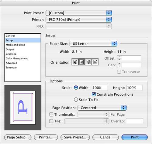 |


EAN: 2147483647
Pages: 148