Section 5.5. Calendar
The ASP Calendar control is a rich web control that provides several capabilities:
-
Displays a calendar showing a single month
-
Allows the user to select a day, week, or month
-
Allows the user to select a range of days
-
Allows the user to move to the next or previous month
-
Programmatically controls the display of specific days
The Calendar control is customizable, with various properties and events. Before digging into all the detail, look at a bare bones .aspx file showing a simple Calendar control, along with the resulting web page. Create a new web site called Calendar-Simple , and drag a Calendar control onto the page.
Example 5-16 contains the code with the Calendar declaration highlighted, and Figure 5-14 shows the results. There is no code-behind file with this example other than the default boilerplate created by VS2005.
Example 5-16. Default.aspx for Calendar-Simple
<%@ Page Language="C#" AutoEventWireup="true" CodeFile="Default.aspx.cs" Inherits="_Default" %> <!DOCTYPE html PUBLIC "-//W3C//DTD XHTML 1.1//EN" "http://www.w3.org/TR/xhtml11/DTD/xhtml11.dtd"> <html xmlns="http://www.w3.org/1999/xhtml" > <head runat="server"> <title>Calendar - Simple</title> </head> <body> <form id="form1" runat="server"> <div> <h1>Calendar Control</h1> <h2>Default Calendar</h2> <asp:Calendar ID="Calendar1" runat="server"></asp:Calendar> </div> </form> </body> </html> Figure 5-14. A default Calendar control
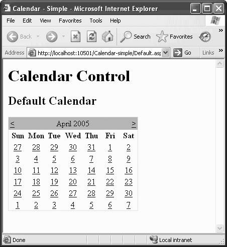
Pretty spiffy. Zero manual coding yields a web page with a working calendar that displays the current month. The user can select a single day (though at this point nothing happens when a day is selected, other than it being highlighted) and move through the months by clicking on the and navigation symbols on either side of the month name .
|

Table 5-14. Properties of the Calendar control
| Name | Type | Get | Set | Values | Description |
|---|---|---|---|---|---|
| Caption | String | | | Text to display on the page above the calendar. | |
| CaptionAlign | TableCaption-Align | | | Bottom , Left , NotSet , Right , Top | Specifies horizontal and vertical alignment of the Caption. |
| CellPadding | Integer | | | , 1 , 2 , and so on | Distance in pixels between the border and contents of a cell. Applies to all the cells in the calendar and to all four sides of each cell . Default is 2 . |
| CellSpacing | Integer | | | , 1 , 2 , and so on | Distance in pixels between cells . Applies to all the cells in the calendar. Default is . |
| DayNameFormat | DayName-Format | | | Full , Short , FirstLetter , FirstTwoLet-ters | Format of days of the week. Values are self-explanatory, except Short , which is the first three letters . Default is Short . |
| FirstDayOfWeek | FirstDayOfWeek | | | Default , Sunday , Monday , ... Saturday | Day of week to display in the first column. Default (the default) specifies system setting. |
| NextMonthText | String | | | Text for next month navigation control . The default is > , which renders as the greater than sign (>). Only applies if ShowNextPrevMonth property is true. | |
| NextPrevFormat | NextPrevFormat | | | CustomText , FullMonth , ShortMonth | To use CustomText , set this property and specify the actual text to use in NextMonthText and PrevMonthText . |
| PrevMonthText | String | | | Text for previous month navigation control. Default is < , which renders as less than sign (<). Only applies if ShowNextPrevMonth property is true . | |
| SelectedDate | DateTime | | | A single selected date . Only the date is stored; the time is set to null. | |
| SelectedDates | DateTime | | | Collection of DateTime objects when multiple dates are selected . Only the date is stored; the time is set to null. | |
| SelectionMode | Calendar-Selection-Mode | | | Described later in this section. | |
| SelectMonth-Text | String | | | Text for month selection element in the selector column. Default is >> , which renders as two greater than signs (>>). Only applies if SelectionMode property is set to DayWeekMonth . | |
| ShowDayHeader | Boolean | | | true , false | If true , the default, the days of week headings are shown. |
| ShowGridLines | Boolean | | | TRue , false | If TRue , grid lines between cells are displayed. Default is false . |
| ShowNextPrev-Month | Boolean | | | true , false | Indicates if next and previous month navigation elements are shown. Default is true . |
| ShowTitle | Boolean | | | TRue , false | Indicates if the title is shown . If false , then next and previous month navigation elements will be hidden. Default is TRue . |
| TitleFormat | Title-Format | | | Month , MonthYear | Indicates if title is month only or month and year. Default is MonthYear . |
| TodaysDate | DateTime | | | Today's date. | |
| UseAccessible-Header | Boolean | | | TRue , false | Specifies if a header accessible to assistive technologies is to be used. |
| VisibleDate | DateTime | | | Any date in the month to display. |

In addition to the properties inherited by all the ASP.NET server controls that derive from WebControl , the Calendar has many properties of its own. The most important ones are listed in Table 5-14.
5.5.1. Selecting Dates in the Calendar
If you want to give the user the ability to select either a single day, an entire week, or an entire month, then you must set the SelectionMode property. Table 5-15 lists the legal values for the SelectionMode property.
Table 5-15. Members of the CalendarSelectionMode enumeration
| Description | |
|---|---|
| Day | Allows the user to select a single day. This is the default value. |
| DayWeek | Allows user to select a single day or an entire week. |
| DayWeekMonth | Allows user to select a single day, an entire week, or an entire month. |
| None | Nothing on the Calendar can be selected. |
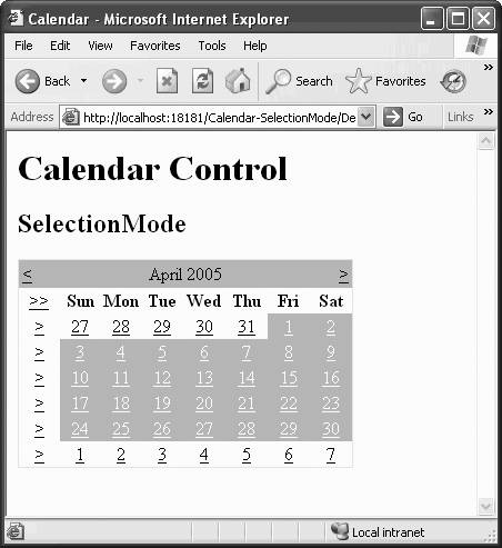
To see the effects of setting the SelectionMode property, copy Calendar-Simple to a new web site, called Calendar-SelectionMode. The content file will be nearly identical to Example 5-16, with the addition of a single attribute to the Calendar declaration:
SelectionMode="DayWeekMonth"
The resulting calendar, with the entire month selected, looks like Figure 5-15.
Figure 5-15. Calendar-SelectionMode with a month selected
Copying a Web Site As described in Chapter 2, you can easily copy a web site to a new location and/or a new name using the Copy Web Site... menu item under the Websites menu or using the Copy Web Site icon ( |
 ) found at the top of the Solution Explorer. This is a technique we will use throughout this book to successively build on previous examples to demonstrate additional functionality.
 When the SelectionMode property is set to DayWeek , an extra column containing the  symbol is added to the left side of the calendar. Clicking on one of those symbols selects that entire week.
Similarly, when the SelectionMode property is set to DayWeekMonth , in addition to the week selection column, a symbol (two greater than or equal symbols) is added to the left of the day names row. Clicking on that symbol selects the entire month, as is shown in Figure 5-15.
5.5.2. Controlling the Calendar's Appearance
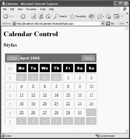
A number of read/write properties, all of type TableItemStyle , control the style for each part of the calendar. These TableItemStyle type properties are listed in Table 5-16 and demonstrated in the next example, Calendar-Styles , shown in finished form in Figure 5-16.
Table 5-16. Calendar control properties of type TableItemStyle
| Name | Sets style for... |
|---|---|
| DayHeaderStyle | Days of the week |
| DayStyle | Dates |
| NextPrevStyle | Month navigation controls |
| OtherMonthDayStyle | Dates not in the currently displayed month |
| SelectedDayStyle | Selected dates |
| SelectorStyle | Week and month selection column |
| TitleStyle | Title section |
| TodayDayStyle | Today's date |
| WeekendDayStyle | Weekend dates |
Figure 5-16. Calendar-Styles
These TableItemStyle type properties work exactly the same way in VS2005 for the Calendar control as was described previously for the Wizard control. When working in Design view, the properties appear as in Figure 5-8, and when working in Source view, the properties appear as in Figure 5-9. The format of the declaration also follows the same pattern described for the Wizard control.
In addition to the TableItemStyle type properties, there are four read/write Boolean properties that control various aspects of the calendar, shown in Table 5-17.
Table 5-17. Boolean properties controlling various aspects of the Calendar control's appearance
| Property | Default | Controls visibility of... |
|---|---|---|
| ShowDayHeader | TRue | Names of the days of the week |
| ShowGridLines | false | Grid lines between the days of the month |
| ShowNextPrevMonth | true | Month navigation controls |
| ShowTitle | TRue | Title section |
You could click on the Calendar control smart tag in Design view and select one of the Auto Format formats, but in this example, you will choose your own styles. You can do this in the Properties window after selecting the Calendar control in either Design or Source view.
To see how these style properties are used, copy the previous example, Calendar-SelectionMode , to a new web site, Calendar-Styles , and open the new web site. The complete content file for this latest example is listed in Example 5-17, with the Calendar declaration highlighted, and the finished page is shown in Figure 5-16. You can see what styles to set for this example by looking at the declarations in Example 5-17.
Example 5-17. Default.aspx for Calendar-Styles
<%@ Page Language="C#" AutoEventWireup="true" CodeFile="Default.aspx.cs" Inherits="_Default" %> <!DOCTYPE html PUBLIC "-//W3C//DTD XHTML 1.1//EN" "http://www.w3.org/TR/xhtml11/DTD/xhtml11.dtd"> <html xmlns="http://www.w3.org/1999/xhtml" > <head runat="server"> <title>Calendar</title> </head> <body> <form id="form1" runat="server"> <div> <h1>Calendar Control</h1> <h2>Styles</h2> <asp:Calendar ID="Calendar1" runat="server" SelectionMode="DayWeekMonth" CellPadding="7" CellSpacing="5" DayNameFormat="FirstTwoLetters" FirstDayOfWeek="Monday" NextMonthText="Next >" PrevMonthText="< Prev" ShowGridLines="True" DayStyle-BackColor="White" DayStyle-ForeColor="Black" DayStyle-Font-Names="Arial"> <DayHeaderStyle BackColor="Black" Font-Names="Arial Black" ForeColor="White" /> <SelectedDayStyle BackColor="Cornsilk" Font-Bold="True" Font-Italic="True" Font-Names="Arial" ForeColor="Blue" /> <SelectorStyle BackColor="Cornsilk" Font-Names="Arial" ForeColor="Red" /> <WeekendDayStyle BackColor="LavenderBlush" Font-Names="Arial" ForeColor="Purple" /> <OtherMonthDayStyle BackColor="LightGray" Font-Names="Arial" ForeColor="White" /> <TodayDayStyle BackColor="Cornsilk" Font-Bold="True" Font-Names="Arial" ForeColor="Green" /> <NextPrevStyle BackColor="DarkGray" Font-Names="Arial" ForeColor="Yellow" /> <TitleStyle BackColor="Gray" Font-Names="Arial Black" ForeColor="White" HorizontalAlign="Left" /> </asp:Calendar> </div> </form> </body> </html> 5.5.3. Programming the Calendar Control
The Calendar control provides three events that are not inherited from other control classes and are of particular interest. By providing event handlers for the events, you can exercise considerable control over how the calendar behaves. These events are:
-
SelectionChanged
-
DayRender
-
VisibleMonthChanged
The following sections describe each of these in detail.
5.5.3.1. SelectionChanged Event
The SelectionChanged event fires when the user makes a selectioneither a day, a week, or an entire monthin the Calendar control. The event is not fired if the selection is changed programmatically. The event handler is passed an argument of type EventArgs .
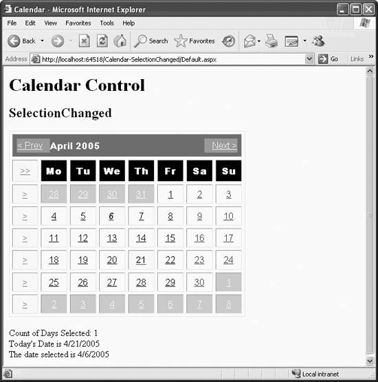
The next example, Calendar-SelectionChanged , demonstrates handling the SelectionChanged event. Whenever you select a new date, it displays text strings with today's date, the selected date, and number of days selected.
To create this example, copy the previous example, Calendar-Styles , to a new web site called Calendar-SelectionChanged . Add the default named event handler for the SelectionChanged event by selecting the Calendar control in Design view, clicking on the Events icon (the lightning bolt) in the Properties window, and double-clicking on the space next to the SelectionChanged event.
This will add the OnSelectionChanged attribute to the Calendar declaration in the content file and open the code-behind file with the event handler skeleton in place, ready to accept your typing. In the Calendar1_SelectionChanged method, type in the highlighted code from Example 5-18, as well as the highlighted helper method lblCountUpdate .
Example 5-18. Default.aspx.cs from Calendar-SelectionChanged
using System; using System.Data; using System.Configuration; using System.Web; using System.Web.Security; using System.Web.UI; using System.Web.UI.WebControls; using System.Web.UI.WebControls.WebParts; using System.Web.UI.HtmlControls; public partial class _Default : System.Web.UI.Page { protected void Page_Load(object sender, EventArgs e) { } protected void Calendar1_SelectionChanged(object sender, EventArgs e) { lblTodaysDate.Text = "Today's Date is " + Calendar1.TodaysDate.ToShortDateString(); if (Calendar1.SelectedDate != DateTime.MinValue) lblSelected.Text = "The date selected is " + Calendar1.SelectedDate.ToShortDateString(); lblCountUpdate(); } private void lblCountUpdate() { lblCount.Text = "Count of Days Selected: " + Calendar1.SelectedDates.Count.ToString(); } } You must also add three Label controls to the bottom of the page to display the information from the calendar. The content file is listed in Example 5-19, with the style attributes of the Calendar control omitted since they are the same as the previous example. The code changed since the previous example is highlighted.
Example 5-19. Truncated default.aspx.cs from Calendar-SelectionChanged (Calendar style attributes not shown)
<%@ Page Language="C#" AutoEventWireup="true" CodeFile="Default.aspx.cs" Inherits="_Default" %> <!DOCTYPE html PUBLIC "-//W3C//DTD XHTML 1.1//EN" "http://www.w3.org/TR/xhtml11/DTD/xhtml11.dtd"> <html xmlns="http://www.w3.org/1999/xhtml" > <head runat="server"> <title>Calendar</title> </head> <body> <form id="form1" runat="server"> <div> <h1>Calendar Control</h1> <h2>SelectionChanged</h2> <asp:Calendar ID="Calendar1" runat="server" OnSelectionChanged="Calendar1_SelectionChanged"> </asp:Calendar> <br/> <asp:Label id="lblCount" runat="server" /> <br/> <asp:Label id="lblTodaysDate" runat="server" /> <br/> <asp:Label id="lblSelected" runat="server" /> </div> </form> </body> </html>
Running the page and selecting a date will result in the screen shown in Figure 5-17.
Looking at Example 5-19, you can see that this example adds the OnSelection-Changed event handler to the Calendar control. This event handler points to the Calendar1_SelectionChanged method in the code-behind file, shown in Example 5-18. Three Label controls have been added after the Calendar control. The first of these, lblCount , is used to display the number of days selected. The other two labels, named lblTodaysDate and lblSelected , are used to display today's date and the currently selected date, respectively.
All three of these labels have their Text property set in the SelectionChanged event handler method. Looking at that method in Example 5-18, you can see that lblTodaysDate is filled by getting the Calendar control's TodaysDate property, with the following line of code:
lblTodaysDate.Text = "Today's Date is " + Calendar1.TodaysDate.ToShortDateString();
Figure 5-17. Calendar-SelectionChanged with date selected
The ID of the Calendar control is Calendar1 . TodaysDate is a property of the Calendar control that returns an object of type System.DateTime . To assign this to a Text property (which is an object of type String ), you must convert the DateTime to a String . This is done with the ToShortDateString method.
The DateTime structure has various methods for converting a DateTime object to other formats, including those shown in Table 5-18.
Table 5-18. Methods for converting a DateTime object to a string
| Method name | Description |
|---|---|
| ToFileTime | Converts to the format of the local filesystem |
| ToLongDateString | Converts to a long date string |
| ToLongTimeString | Converts to a long time string |
| ToShortTimeString | Converts to a short time string |
| ToString | Converts to a string |
Though not specific to ASP.NET, the DateTime structure is useful for obtaining all sorts of date and time information. Some of the read-only properties available from this structure include those listed in Table 5-19.
Table 5-19. DateTime read-only properties
| Property name | Type | Description |
|---|---|---|
| Date | DateTime | Returns the date component |
| Day | Integer | Returns the day of the month |
| DayOfWeek | DayOfWeek | Returns the day of the week, e.g., Friday , Saturday , and so on |
| DayOfYear | Integer | Returns the day of the year |
| Hour | Integer | Returns the hour component |
| Millisecond | Integer | Returns the millisecond component |
| Minute | Integer | Returns the minute component |
| Month | Integer | Returns the month component |
| Second | Integer | Returns the second component |
| Ticks | Long | Returns the number of 100 nanosecond ticks representing the date and time |
| TimeOfDay | TimeSpan | Returns the time of day |
| Year | Integer | Returns the year component |
lblSelected is filled by the following line of code:
if (Calendar1.SelectedDate != DateTime.MinValue) lblSelected.Text = "The date selected is " + Calendar1.SelectedDate.ToShortDateString();
To detect if any date has been selected, you test to see if the currently selected date, Calendar1.SelectedDate , is equal to DateTime.MinValue . DateTime.MinValue is a constant representing the smallest possible value of DateTime and is the default value for the SelectedDate property if nothing has been selected yet. MinValue has the literal value of 12:00:00 AM, 1/1/0001 CE. There is also a MaxValue that has the literal value of 11:59:59 PM, 12/31/9999 CE.
|
If a date has been selected by the user, the Text property of lblSelected will be set to the string value of the SelectedDate property.
The Label control lblCount displays the number of days selected. The SelectionChanged event handler calls the lblCountUpdate method, which sets the Text property of lblCount . To set that control, you must determine how many dates were selected. The Calendar control has a SelectedDates property that returns a SelectedDates collection. SelectedDates is a collection of DateTime objects representing all the dates selected in the Calendar control. Count is a property of the SelectedDatesCollection object that returns an integer containing the number of dates in the collection. Since the Count property is an integer, you must use the ToString method to convert it to a string so that it can be assigned to the Text property.
Calendar1.SelectedDates.Count.ToString()
Though SelectedDates (the collection of selected dates) and SelectedDate (the single selected date) both contain DateTime objects, only the Date value is stored. The time value for these objects is set to a null reference in C#.
The range of dates in the SelectedDates collection is sorted in ascending order by date. When the SelectedDates collection is updated, the SelectedDate property is automatically updated to contain the first object in the SelectedDates collection.
The user can navigate from month to month by clicking on the month navigation controls to either side of the month title. The user can also select a single day by clicking on that day, an entire week by clicking on the week selector control, or the entire month by clicking on the month selector control.
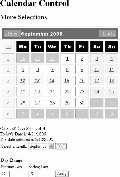
However, you can give the user much more flexibility than this. To demonstrate, you must add several controls and methods. Copy the current example, Calendar-SelectionChanged, to a new web site called Calendar-MoreSelections .
To enable the user to navigate directly to any month in the current year, add a DropDownList containing all the months of the year and a button, labeled TGIF , which selects all the Fridays in the currently viewed month.
The Calendar control also allows the user to select a range of dates. You might expect to be able to use the standard Windows techniques of holding down the Ctrl or Shift keys while clicking on dates, but this does not work. However, you can put controls on the page to select a starting day and ending day. In Calendar-MoreSelections , you will add a pair of TextBox controls to accept a starting day and an ending day for a range of dates. A Button control can force the selection of the range of dates.
The content file to accomplish this is listed in Example 5-20. Again, all the style- related attributes for the Calendar control have been omitted for the sake of brevity; they are identical to those shown back in Example 5-17. The code which has changed from the previous example, representing the added controls, is highlighted.
Example 5-20. Default.aspx for Calendar-MoreSelections, omitting Calendar style attributes
<%@ Page Language="C#" AutoEventWireup="true" CodeFile="Default.aspx.cs" Inherits="_Default" %> <!DOCTYPE html PUBLIC "-//W3C//DTD XHTML 1.1//EN" "http://www.w3.org/TR/xhtml11/DTD/xhtml11.dtd"> <html xmlns="http://www.w3.org/1999/xhtml" > <head runat="server"> <title>Calendar</title> </head> <body> <form id="form1" runat="server"> <div> <h1>Calendar Control</h1> <h2>More Selections</h2> <asp:Calendar ID="Calendar1" runat="server" OnSelectionChanged="Calendar1_SelectionChanged"> </asp:Calendar> <br/> <asp:Label id="lblCount" runat="server" /> <br/> <asp:Label id="lblTodaysDate" runat="server" /> <br/> <asp:Label id="lblSelected" runat="server" /> <br/> <table> <tr> <td> Select a month: </td> <td> <asp:DropDownList id= "ddl" runat="server" AutoPostBack="true" onSelectedIndexChanged = "ddl_SelectedIndexChanged"> <asp:ListItem text="January" value="1" /> <asp:ListItem text="February" value="2" /> <asp:ListItem text="March" value="3" /> <asp:ListItem text="April" value="4" /> <asp:ListItem text="May" value="5" /> <asp:ListItem text="June" value="6" /> <asp:ListItem text="July" value="7" /> <asp:ListItem text="August" value="8" /> <asp:ListItem text="September" value="9" /> <asp:ListItem text="October" value="10" /> <asp:ListItem text="November" value="11" /> <asp:ListItem text="December" value="12" /> </asp:DropDownList> </td> <td> <asp:Button id="btnTgif" runat="server" text="TGIF" onClick="btnTgif_Click"/> </td> </tr> <tr> <td colspan="2"> </td> </tr> <tr> <td colspan="2"><b>Day Range</b></td> </tr> <tr> <td>Starting Day</td> <td>Ending Day</td> </tr> <tr> <td> <asp:TextBox id= "txtStart" runat="server" Width="25" MaxLength="2" /> </td> <td> <asp:TextBox id= "txtEnd" runat="server" Width="25" MaxLength="2" /> </td> <td> <asp:Button id="btnRange" runat="server" text="Apply" onClick="btnRange_Click" /> </td> </tr> </table> </div> </form> </body> </html> The complete code-behind file for this example is listed in Example 5-21. Code changed from the previous example is highlighted.
Example 5-21. Default.aspx.cs for Calendar-MoreSelections
using System; using System.Data; using System.Configuration; using System.Web; using System.Web.Security; using System.Web.UI; using System.Web.UI.WebControls; using System.Web.UI.WebControls.WebParts; using System.Web.UI.HtmlControls; public partial class _Default : System.Web.UI.Page { /// <summary> /// This Page_Load makes the selected days visible first time /// the TGIF button is clicked by initializing the VisibleDate /// property. /// </summary> /// <param name="sender"></param> /// <param name="e"></param> protected void Page_Load(object sender, EventArgs e) { if (!IsPostBack) { Calendar1.VisibleDate = Calendar1.TodaysDate; ddl.SelectedIndex = Calendar1.VisibleDate.Month - 1; } lblTodaysDate.Text = "Today's Date is " + Calendar1.TodaysDate.ToShortDateString(); } protected void Calendar1_SelectionChanged(object sender, EventArgs e) { lblSelectedUpdate(); lblCountUpdate(); txtClear(); } private void lblSelectedUpdate() { if (Calendar1.SelectedDate != DateTime.MinValue) lblSelected.Text = "The date selected is " + Calendar1.SelectedDate.ToShortDateString(); } private void lblCountUpdate() { lblCount.Text = "Count of Days Selected: " + Calendar1.SelectedDates.Count.ToString(); } protected void ddl_SelectedIndexChanged(Object sender, EventArgs e) { Calendar1.SelectedDates.Clear(); lblSelectedUpdate(); lblCountUpdate(); Calendar1.VisibleDate = new DateTime(Calendar1.VisibleDate.Year, Int32.Parse(ddl.SelectedItem.Value), 1); txtClear(); } protected void btnTgif_Click(Object sender, EventArgs e) { int currentMonth = Calendar1.VisibleDate.Month; int currentYear = Calendar1.VisibleDate.Year; Calendar1.SelectedDates.Clear(); for (int i = 1; i <= System.DateTime.DaysInMonth(currentYear, currentMonth); i++) { DateTime date = new DateTime(currentYear, currentMonth, i); if (date.DayOfWeek == DayOfWeek.Friday) Calendar1.SelectedDates.Add(date); } lblSelectedUpdate(); lblCountUpdate(); txtClear(); } protected void btnRange_Click(Object sender, EventArgs e) { int currentMonth = Calendar1.VisibleDate.Month; int currentYear = Calendar1.VisibleDate.Year; DateTime StartDate = new DateTime(currentYear, currentMonth, Int32.Parse(txtStart.Text)); DateTime EndDate = new DateTime(currentYear, currentMonth, Int32.Parse(txtEnd.Text)); Calendar1.SelectedDates.Clear(); Calendar1.SelectedDates.SelectRange(StartDate, EndDate); lblSelectedUpdate(); lblCountUpdate(); } private void txtClear() { txtStart.Text = ""; txtEnd.Text = ""; } } The result of running Calendar-MoreSelections is shown in Figure 5-18 after selecting a range of days.
The selection controls are all in a static HTML table so you can control the layout of the page.
The ListItem objects in the DropDownList contain the names of the months for the Text properties and the number of the months for the Value properties.
The Calendar1_SelectionChanged method has been modified by having the bulk of its code refactored into a separate method named lblSelectedUpdate , which updates the Text property of the lblSelected label. This method is then called from Calendar1_SelectionChanged , as well as several other places throughout the code. In addition, another helper method, txtClear , is called to clear the Start and End Day text boxes.
Figure 5-18. Calendar-MoreSelections with a range of days selected
The ddl_SelectedIndexChanged event handler method begins by clearing the SelectedDates collection:
Calendar1.SelectedDates.Clear();
A call is made to the lblSelectedUpdate method to clear the Label control containing the first selected date and to the lblCountUpdate method to clear the Label control containing the count of selected dates. Then the VisibleDate property of the Calendar control is set to the first day of the newly selected month:
Calendar1.VisibleDate = new DateTime(Calendar1.VisibleDate.Year, Int32.Parse(ddl.SelectedItem.Value), 1);
The VisibleDate property is of type DateTime ; a new DateTime is instantiated . The DateTime structure, like many objects in the .NET Framework, uses an overloaded constructor . An object may have more than one constructor; each must be differentiated by having different types of arguments or a different number of arguments.
In this case, you want to instantiate a DateTime object that contains only the date. To do so requires three integer parameters: year, month, and day. The first parameter, cal.VisibleDate.Year , and the last parameter, 1 , are inherently integers. However, the month parameter comes from the Value property of the selected item in the DropDownList control. The Value property is a string, not an integer, though the characters it contains look like an integer. Therefore, it must be converted to an integer using the statement:
Int32.Parse(ddl.SelectedItem.Value)
The TGIF button is named btnTgif and has an event handler for the Click event, btnTgif_Click . This method iterates over all the days of the currently visible month and tests to see if it is Friday. If so, it will add that date to the collection of SelectedDates .
First, the btnTgif_Click method gets the month and year of the currently visible month, using the VisibleDate property of the Calendar control, which is a DateTime object, and gets the Month and Year properties of the DateTime object:
int currentMonth = Calendar1.VisibleDate.Month; int currentYear = Calendar1.VisibleDate.Year;
Then, it clears all the currently selected dates:
Calendar1.SelectedDates.Clear();
Now, it does the iteration. The limit part of the for loop is the number of days in the month as determined by the DaysInMonth property of the DateTime object. The month in question is specified by the currentYear and currentMonth arguments:
System.DateTime.DaysInMonth(currentYear, currentMonth)
Once inside the for loop, a DateTime variable called date is assigned to each day. Again, the DateTime object is instantiated with parameters for year, month, and day. The crucial question becomes, "Is the day of the week for this day a Friday?" If so, then TGIF and add it to the collection of SelectedDates :
DateTime date = new DateTime(currentYear, currentMonth, i); if (date.DayOfWeek == DayOfWeek.Friday) cal.SelectedDates.Add(date);
Finally, after iterating over all the days of the month, call the lblSelectedUpdate method to update the label showing the first selected date, call the lblCountUpdate method to update the label showing the number of days selected, and call txtClear to clear the Start and End day text boxes.
You will notice a Page_Load method in the code-behind file. As the comment in the code explains, this makes the page behave correctly the first time the TGIF button is clicked even before the month is changed. Without this Page_Load event procedure, the page behaves correctly for the TGIF button only after the month has been changed at least once. The btnTgif_Click method uses the VisibleDate property to set the current month and year variables . If that property is not initialized during the initial page load, then the values assigned to those variables will not correspond to the visible month.
In addition, the code to update the label displaying today's data, lblTodaysDate , has been moved from the SelectionChanged method to the Page_Load method because it makes more sense to have it there.
The controls for selecting the range are in the same static HTML table as the controls for selecting the month and all the Fridays. There are two text boxes, one named txtStart for the start day and one named txtEnd for the end day. In this example, the TextBox controls' Width and MaxLength attributes provide limited control over the user input. In a production application you will want to add validation controls, as described in Chapter 8, to avoid getting all sorts of nasty error messages if the user enters invalid characters or numbers out of range.
The UI provided in Calendar-MoreSelections for selecting a range of dates is admittedly limiting because you cannot span multiple months. You could almost as easily provide three independent Calendar controls: one for the start date, one for the end date, and one for the range. Also, the day range does not apply after the month changes without reapplying the selection because the VisibleMonthChanged event is not trapped. (See the section "VisibleMonthChanged event" later in this chapter.)
A helper method, txtClear , is provided to clear the day range selection boxes. This method is called at appropriate points in the other methods.
The Apply button is named btnRange , with the Click event handled by the method btnRange_Click . In btnRange_Click , you set integer variables to hold the current month and year:
int currentMonth = Calendar1.VisibleDate.Month; int currentYear = Calendar1.VisibleDate.Year;
Set two DateTime variables to hold the start date and the end date:
DateTime StartDate = new DateTime(currentYear, currentMonth, Int32.Parse(txtStart.Text)); DateTime EndDate = new DateTime(currentYear, currentMonth, Int32.Parse(txtEnd.Text));
Similarly to the month DropDownList described previously, the DateTime object requires the year, month, and day. You have the year and month as integers; all you need is the day. You get the day by converting the text entered in the appropriate text box to an integer.
|
Once the method has the start and end dates as DateTime objects, it clears any currently selected dates and uses the SelectRange method of the SelectedDatesCollection class to add the range of dates to the SelectedDates collection:
Calendar1.SelectedDates.Clear(); Calendar1.SelectedDates.SelectRange(StartDate, EndDate);
The SelectRange method requires two parameters: the start date and the end date.
5.5.3.2. DayRender Event
Data binding is not supported directly for the Calendar control. However, you can modify the content and formatting of individual date cells. This allows you to retrieve values from a database, process those values in some manner, and place them in specific cells.
Before the Calendar control is rendered to the client browser, all of the components that comprise the control are created. As each date cell is created, it raises the DayRender event. This event can be handled.
The DayRender event handler receives an argument of type DayRenderEventArgs . This object has two properties that may be programmatically read:
-
Cell
-
TableCell object that represents the cell being rendered
-
Day
-
CalendarDay object that represents the day being rendered in that cell
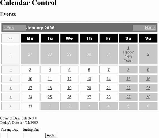
This next example, Calendar-Events , will demonstrate the DayRender event. (The following section on the VisibleMonthChanged event will build on this same example.) All the weekend days will have their background color changed and a New Year's greeting will be displayed for January 1.
Copy the previous example, Calendar-MoreSelections , to a new web site called Calendar-Events . In this section, you will make the changes to handle the DayRender event. There are only two changes.
First, go into Design view, select Calendar1, click on the Events icon in the Properties window (the lightning bolt), and double-click on the text box next to DayRender . This will add the following attribute to the Calendar1 declaration in the content file:
OnDayRender="Calendar1_DayRender"
This will also create a default event handler code skeleton in the code-behind file, with the cursor placed ready to type. Enter the code highlighted in Example 5-22 to this code skeleton.
Example 5-22. DayRender event handler in Calendar-Events
protected void Calendar1_DayRender(object sender, DayRenderEventArgs e) { // Notice that this overrides the WeekendDayStyle. if (!e.Day.IsOtherMonth && e.Day.IsWeekend) e.Cell.BackColor = System.Drawing.Color.LightGreen; // Happy New Year! if (e.Day.Date.Month == 1 && e.Day.Date.Day == 1) e.Cell.Controls.Add(new LiteralControl("<br/>Happy New Year!")); } The first thing the Calendar1_DayRender method does is color the weekends LightGreen . Recall that there is a WeekendDayStyle property set for this control that colors the weekends LavenderBlush . The DayRender method overrides the WeekendDayStyle . (The distinction may not be apparent in the printed book, but you will see the colors when you run the web page in a browser.)
The event handler method is passed two parameters:
void DayRender(Object sender, DayRenderEventArgs e)
DayRenderEventArgs contains properties for the Day and the Cell . The Day is tested to see if it is both the current month and also a weekend day:
(!e.Day.IsOtherMonth && e.Day.IsWeekend)
The Day property is a member of the CalendarDay class, which has the properties shown in Table 5-20 (all of which are read-only except IsSelectable ).
Table 5-20. Properties of the CalendarDay class
| Property | Type | Description |
|---|---|---|
| Date | DateTime | Date represented by this Day . Read-only. |
| DayNumberText | String | String representation of the day number of this Day . Read-only. |
| IsOtherMonth | Boolean | Indicates this Day is in a different month than the month currently displayed by the Calendar . Read-only. |
| IsSelectable | Boolean | Indicates if Day can be selected. Not read-only. |
| IsSelected | Boolean | Indicates if Day is selected. |
| IsToday | Boolean | Indicates if Day is today's date. |
| IsWeekend | Boolean | Indicates if Day is a weekend date. |
If the date is both in the current month and is also a weekend day, then the Cell.BackColor property is assigned a color:
e.Cell.BackColor=System.Drawing.Color.LightGreen;
Calendar1_DayRender then tests to see if the selected date is New Year's Day. Again, the Day property of the DayRenderEventArgs object is tested to see if the Month of the Date is 1 and the Day of the Date is 1:
if (e.Day.Date.Month == 1 && e.Day.Date.Day == 1)
If so, a LiteralControl is added to the cell that adds an HTML break tag and a greeting:
e.Cell.Controls.Add(new LiteralControl("<br/>Happy New Year!")); The thing to remember here is that, like all ASP.NET server controls , what is actually sent to the browser is HTML. Thus, a calendar is rendered on the browser as an HTML table. Each of the selectable components of the calendar has an anchor tag associated with it, along with some JavaScript that accomplishes the postback. (This is evident when you hover the cursor over any clickable element of the calendar: the status line of the browser will display the name of the JavaScript function that will be executed if the link is clicked.) Using a LiteralControl inserts the text in its argument as a control into the HTML cell as is. A look at a snippet from the source code visible on the browser confirms this:
<td align="Center" style="color:Black;background-color:White; font-family:Arial;width:12%;"> <a href="javascript:_ _doPostBack('cal','selectDay7')" style="color:Black"> 1 </a> <br/>Happy New Year! </td> When the Calendar-Events example is run and the month navigated to January, you will see something like that shown in Figure 5-19.
Figure 5-19. Calendar-Events showing results of DayRender event
5.5.3.3. VisibleMonthChanged event
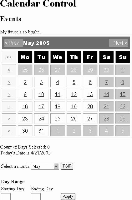
The Calendar control also provides an event to indicate that the user has changed months. You will extend the current example, Calendar-Events , to handle this event.
In the same manner as you added an event handler to Calendar1 for the DayRender event, add a hander for the VisibleMonthChanged event. This will add the following attribute to the Calendar1 declaration in the content file:
OnVisibleMonthChanged="Calendar1_VisibleMonthChanged">
and create a default event handler code skeleton in the code-behind file, with the cursor placed ready to type. Enter the code highlighted in Example 5-23 to this code skeleton.
Example 5-23. VisibleMonthChanged event handler in Calendar-Events
protected void Calendar1_VisibleMonthChanged(object sender, MonthChangedEventArgs e) { if ((e.NewDate.Year > e.PreviousDate.Year) ((e.NewDate.Year == e.PreviousDate.Year) && (e.NewDate.Month > e.PreviousDate.Month))) lblMonthChanged.Text = "My future's so bright..."; else lblMonthChanged.Text = "Back to the future!"; Calendar1.SelectedDates.Clear(); lblSelectedUpdate(); lblCountUpdate(); txtClear(); } You will also need to add a Label control, named lblMonthChanged , to the content file just before the Calendar control:
<asp:Label id="lblMonthChanged" runat="server" />
The Calendar1_VisibleMonthChanged event handler method receives an argument of type MonthChangedEventArgs . This argument contains two properties that may be read programmatically:
-
NewDate
-
Represents the month currently displayed by the Calendar
-
PreviousDate
-
Represents the month previously displayed by the Calendar
These values are tested in the Calendar1_VisibleMonthChanged method to see which came first. Depending on the results, one of two text strings is assigned to the Text property of lblMonthChanged .
Finally, the selected dates are cleared from the calendar, the text strings below the calendar are updated, and the day range edit boxes are cleared with the following lines of code:
Calendar1.SelectedDates.Clear() lblSelectedUpdate() lblCountUpdate() txtClear()
The results of running Calendar-Events and navigating a month can be seen in Figure 5-20.
Figure 5-20. Calendar-Events with effects of VisibleMonthChanged event
EAN: 2147483647
Pages: 173