Adding Styles and Templates
You've seen how easy data binding is to use, and how much code and effort it saves. Next , we'll look at how to change the appearance of the data-bound controls. This can be done in three ways:
-
Adding CSS styles to the control “ either directly using a <style> element in the page, or by setting the specific style properties of the controls.
-
Creating templates that specify the appearance of individual sections of the control's output.
-
Using a combination of the two techniques.
All of the example pages include a standard HTML <style> element in the <head> element, which specifies the font name and font size for the page. The controls are generating ordinary HTML, so their output is automatically formatted inline with these styles by the browser. The style section is as follows :
<style type="text/css"> body, td {font-family:Tahoma,Arial,sans-serif; font-size:10pt} input {font-family:Tahoma,Arial,sans-serif; font-size:9pt} </style>
So, all of the <input> elements (including those that are created by the ASP:ListBox control and ASP:DropDownList control) are formatted with the style specified within your <style> element. Also, specific CSS style definitions for the <td> elements are included in the <style> section, so that the HTML tables created by some of the list controls will be formatted as well.
Using the Style Properties
The list controls designed for use with data binding have a set of style properties that override the CSS styles defined in the page. These can be used to change the appearance of the control. The one exception is the Repeater control, which provides no visible interface elements (it simply repeats the content of the templates defined within it). Some of the properties that can be set are shown as follows (a full list for each control is included in the .NET SDK Documentation):
| Properties | Description |
|---|---|
| BackColor , BackImageUrl | Sets the appearance of the control's background |
| BorderStyle , BorderColor , BorderWidth | Sets the appearance of the control's border |
| GridLines , CellPadding , CellSpacing | Specifies the appearance of each cell |
| Font-Name , Font-Size , Font-Bold | Specifies the text style within the control |
| HeaderStyle , ItemStyle , FooterStyle AlternatingItemStyle | Specifies the style for various parts of the control's output, such as the header or the content items |
Adding Style to a DataGrid Control
If you run the Using CSS to Add Style to a DataGrid ( css-style-datagrid.aspx ) example page, you will see how these style properties can be used, and the effect they have on the appearance of a DataGrid control. The styles selected are shown in Figure 7-8, and thankfully, the alternating green and red text is not visible in these monochrome screenshots. You can edit the code yourself to experiment with the different styles.
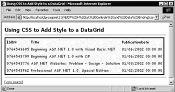
Figure 7-8:
All of the work of formatting the output of this example is done using the style properties of the DataGrid object. The definition of the DataGrid within the HTML section of the page is as follows:
<ASP:DataGrid id="MyDataGrid" runat="server" ShowHeader="True" ShowFooter="False" BackColor="darkgray" BackImageUrl="background.gif" ToolTip="A List of Wrox Books" GridLines="None" BorderStyle="Solid" BorderColor="black" BorderWidth="3" CellPadding="2" CellSpacing="2" Font-Name="Comic Sans MS" Font-Size="10pt" Font-Bold="True" > <HeaderStyle ForeColor="blue" /> <ItemStyle ForeColor="red" /> <AlternatingItemStyle ForeColor="green" /> </ASP:DataGrid>
This specifies that the grid should display a header but not a footer row (although, in fact, these are the defaults). Also specified are the background color and an image to be used to fill the grid, a tool-tip that is displayed when the mouse hovers over the grid, as well as turning off the grid lines display.
Next come the properties that define a 3-pixel wide black border for the control, and the padding within and spacing between the cells . You also specify the font name and size, and make it bold. Finally come the style definitions for the header, each item (row) in the grid, and each alternating item.
All that's being done here is specifying a color for the ForeColor property (via the ForeColor attribute), though in fact you can include values for the other properties such as BackColor , BorderWidth , Font , and so on.
In the Page_Load event, all you have to do now is create a DataReader object, set it as the DataSource property of the grid, and then call the DataBind method. In this case, as there's only the one control to deal with, the DataBind method is called for your DataGrid control rather than at Page -level:
... 'create a suitable DataReader object here ... 'set the DataSource property of the DataGrid MyDataGrid.DataSource = objDataReader 'and bind the control to the data MyDataGrid.DataBind()
Using Templates with Data-Bound Controls
The second way to manage the appearance of the ASP list controls designed for use with data binding is through the addition of templates to the control definition. In fact (as seen in earlier examples), templates can do a lot more than just change the appearance of a control “ you can use them to specify which columns are displayed in a control, and how the values appear.
Three of the ASP list controls “ the Repeater , DataList, and DataGrid “ accept a series of templates that define the appearance and content of specific parts of the output. All the templates are optional (depending on the control and the data source, as you'll see shortly). Figure 7-9 demonstrates the complete list:
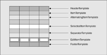
Figure 7-9:
The names of each template are self-explanatory; you can optionally specify a different appearance for the header row (usually where the names of each field or column appear), the item rows, the alternating item rows, the separator used between each item row, and the footer row (often used to display navigation controls if there is more than one 'page' of rows available).
The remaining two templates require a little more explanation:
-
The DataList and DataGrid controls allow you to specify one item or row that is "selected" (by setting the SelectedIndex property). The SelectedItemTemplate is then used to specify the appearance of this item or row.
-
The DataList and DataGrid controls also allow you to switch them into edit mode (by setting the EditItemIndex property). The EditItemTemplate is used to specify the appearance of this item or row; for example, by changing the controls used to display the values in the row from labels to input controls.
Specifying Style and Content in a Repeater Control
You'll recall that a Repeater control is the simplest of all list controls, and is designed simply to repeat the content of the item or row without adding any formatting or layout information. To specify the content of each item when using a Repeater control (as in earlier examples), you have to add at least an <ItemTemplate> element to the control declaration. For example, to bind to an ArrayList, the code used is as follows:
<ASP:Repeater id="MyRepeater" runat="server"> <ItemTemplate> <%# Container.DataItem %> </ItemTemplate> </ASP:Repeater>
This specifies that the value in each row of the one-dimensional ArrayList should be displayed within the control. The <ItemTemplate> is used to define the content of the output.
The Using a Simple Template with a Repeater Control ( simple-repeater-template.aspx ) example page demonstrates how to use templates to specify both the content and the appearance of a Repeater control.
In this case you're displaying an image, a subheading , and some text for each item, and are also displaying a header, a footer with a hyperlink to the Wrox web site, and separating each row with a dark red horizontal rule image, as shown in Figure 7-10:
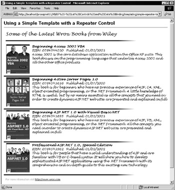
Figure 7-10:
This example applies style to a Repeater control through the use of four templates “ one each for the header, item, separator, and footer of the control “ and through a set of CSS styles defined within a <style> element in the <head> section of the page. Each template specifies the formatting, layout, and content of that section of the control's output “ it has to do so as the Repeater control produces no layout information of its own.
The following code shows how the control definition starts with the opening <ASP:Repeater> tag, and then contains the first template definition. This is the <HeaderTemplate> (although template definitions don't have to be placed in any particular order within the control definition). It uses a <div> element to place the heading text and a ruler-style image on the page. This <div> element uses the rHead CSS style class to format the appearance of the text in the header:
<ASP:Repeater id="MyRepeater" runat="server"> <HeaderTemplate> <div class="rHead"> Some of the Latest Wrox Books from Wiley<br /> <img src="images/redrule.gif"> </div> </HeaderTemplate>
This is followed by the <ItemTemplate> definition, which again is a <div> element. However, this time it takes its style from the rItem CSS style class. Inside the <div> element is an <img> element that contains the cover image “ it uses the value of the column ImageURL as the src attribute of the image. This is followed by definitions of the text and bound values “ similar to those used in earlier examples “ that display the book title, the ISBN, the publication date, and a short description obtained from a column named Precis . Then comes a <br /> element that prevents the next item from wrapping to the cover image in this row.
<ItemTemplate> <div class="rItem"> <img src="images/<%# Container.DataItem("ImageURL") %>" align="left" hspace="10" /> <b><%# Container.DataItem("Title") %></b><br /> ISBN: <%# Container.DataItem("ISBN") %> Published: <%# DataBinder.Eval(Container.DataItem, _ "PublicationDate", "{0:d}") %><br /> <%# Container.DataItem("Precis") %> </div><br clear="all" /> </ItemTemplate>
| Note | A line-continuation character has been included in the Eval statement for the Published value. As this code is executed within the control at runtime to obtain the values, you can't have line breaks within it when using Visual Basic unless you include the line-continuation character. |
Next comes the <SeparatorTemplate> definition. This is simply the red horizontal rule image:
<SeparatorTemplate> <img src="images/redrule.gif"> </SeparatorTemplate>
Finally, you have the <FooterTemplate> definition. This also contains the red horizontal rule image. The SeparatorItem template is only rendered between items in the control, and not before the first one or after the last one. After the image comes the more information link, and then the closing </ASP:Repeater> tag:
<FooterTemplate> <img src="images/redrule.gif"> <div class="rFoot"> For more information visit <a href="http://www.wrox.com">http://www.wrox.com</a> </div> </FooterTemplate> </ASP:Repeater>
The Page_Load Event Handler
In this example, we provide the Repeater control with a DataView object created in code within the Page_Load event handler, rather than using a separate user control as seen in some of the earlier examples. The first part of the Page_Load event handler is responsible for creating a DataTable object from which you can obtain a DataView . The code follows in abridged form “ we'll discuss the concepts of relational data access in depth in Chapters 8 to 10:
Sub Page_Load() 'create a new empty DataTable object Dim objTable As New DataTable("NewTable") 'define four columns (fields) within the table objTable.Columns.Add("ISBN", System.Type.GetType("System.String")) objTable.Columns.Add("Title", System.Type.GetType("System.String")) objTable.Columns.Add("PublicationDate", _ System.Type.GetType("System.DateTime")) objTable.Columns.Add("ImageURL", System.Type.GetType("System.String")) objTable.Columns.Add("Precis", System.Type.GetType("System.String")) 'declare a variable to hold a DataRow object Dim objDataRow As DataRow 'create a new DataRow object instance in this table objDataRow = objTable.NewRow() 'and fill in the values objDataRow("ISBN") = "1861004478" objDataRow("Title") = "Professional Application Center 2000" objDataRow("PublicationDate") = "2001-03-01" objDataRow("ImageURL") = "appcenter.gif" objDataRow("Precis") = "This book takes you through ... etc." objTable.Rows.Add(objDataRow) ... 'repeat process for other rows ... 'assign the DataTable's DefaultView object to the Repeater control MyRepeater.DataSource = objTable.DefaultView MyRepeater.DataBind() 'and bind (display) the data End Sub
The penultimate line of code simply assigns the DataView object that is returned from the DefaultView property of the table to the DataSource property of the Repeater control. The DataBind method of the control is then executed to display the contents of the DataView .
Loading Templates Dynamically at Runtime
The templates used in the previous example were hardcoded into the source of the page. But what happens if you want to change the template you use at runtime? The Loading Templates Dynamically with a DataList Control ( datalist-load-template.aspx ) example page shown in Figure 7-11 demonstrates how to do this by dynamically loading templates using code. The page includes a drop-down list from which you can select a color scheme for the output, and it loads the appropriate set of header, footer, item, and alternating item templates from disk each time:
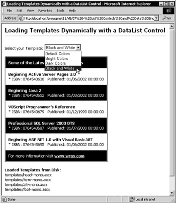
Figure 7-11:
The HTML section of the page defines a <form> element containing the drop-down list that is used to select the color scheme. By setting the AutoPostback property to True (as described in Chapter 6), the need for a separate button is avoided, as the form will be posted to the server automatically whenever the selection in the list is changed. The remainder of the HTML defines the DataList control with minimal formatting, and a Label control where the names of the template files currently in use are displayed:
<form runat="server"> Select your Template: <ASP:DropDownList runat="server" id="TemplateList" AutoPostback="True"> <ASP:ListItem Value="default" Text="Default Colors" /> <ASP:ListItem Value="bright" Text="Bright Colors" /> <ASP:ListItem Value="dark" Text="Dark Colors" /> <ASP:ListItem Value="mono" Text="Black and White" /> </ASP:DropDownList> </form> <ASP:DataList id="MyDataList" runat="server" BorderStyle="None" Font-Name="Tahoma" Font-Size="10pt" /> <p><ASP:Label id="lblFileNames" runat="server" /></p>
The Dynamic Template Files
Dynamically loaded templates must be disk files stored within the same application's root folder or a subfolder of the page that uses them.
| Note | We've provided four templates for each color scheme (one each for the header, item, alternating item, and footer), placed in a folder named templates below the folder that contains our example page. |
These template files contain just the contents of each of the templates, and omit the enclosing < xxxx Template> element. For example, the complete ItemTemplate section for items when the bright color scheme is selected is as follows:
<div style="color:white; background-color:blue; padding=10px"> <b><%# DataBinder.Eval(CType(Container,DataListItem).DataItem, "Title") %></b> <br />* ISBN: <%# DataBinder.Eval(CType(Container,DataListItem).DataItem, "ISBN") %> Published: <%# DataBinder.Eval(CType(Container,DataListItem).DataItem, "PublicationDate") %> </div>
The Page_Load Event Handler
When the page loads, a DataReader object is created, which will return some data rows from the sample database. We then create the filenames of the four templates for the selected color scheme. If this is the first time the page has been loaded (meaning it's not a postback, so no color scheme has been selected yet), the default templates are used:
Sub Page_Load() 'create a suitable DataReader object here Dim strFileName As String If Page.IsPostBack Then strFileName = TemplateList.SelectedItem.Value & ".ascx" Else strFileName = "default.ascx" End If Dim strHeadFile As String = "templates/head-" & strFileName Dim strItemFile As String = "templates/item-" & strFileName Dim strAltIFile As String = "templates/alt-" & strFileName Dim strFootFile As String = "templates/foot-" & strFileName
Now that you have the filenames, you can load the templates by calling the LoadTemplate method of the Page object. The reference returned by this method is assigned to the appropriate property of the DataList control:
MyDataList.HeaderTemplate = Page.LoadTemplate(strHeadFile) MyDataList.ItemTemplate = Page.LoadTemplate(strItemFile) MyDataList.AlternatingItemTemplate = Page.LoadTemplate(strAltIFile) MyDataList.FooterTemplate = Page.LoadTemplate(strFootFile)
The final tasks are to display the names of the templates in the Label control, and then to bind the DataReader object containing your data rows to the DataList control:
lblFileNames.Text = "<b>Loaded Templates from Disk:</b><br />" _ & strHeadFile & "<br />" & strItemFile & "<br />" _ & strAltIFile & "<br />" & strFootFile & "<br />" MyDataList.DataSource = objDataReader MyDataList.DataBind() End Sub
Multiple Column Layouts with a DataList Control
The DataList control used in the previous example creates output that is, by default, an HTML table that contains the items you bind it to. One very useful aspect of this control is the ability to change the layout of the table content by specifying the number of columns to use, and the order in which the columns are filled from the data source (that is, from top to bottom or from left to right).
The Using Multiple Display Columns with a DataList Control ( columns-datalist-template.aspx ) example page shows this technique in use. It displays six book cover images in two columns of three when the page is opened. However, you can use the controls in the page to change the number of columns and the layout direction, as shown in Figure 7-12:
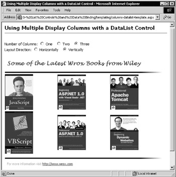
Figure 7-12:
The HTML section of this page contains a <form> element with the five radio buttons that control how the DataList should lay out the content. Use the AutoPostback feature so that any change to the current settings automatically posts the values to the server, which regenerates the page with the new layout:
<form runat="server"> Number of Columns: <ASP:RadioButton id="Cols1" GroupName="Cols" AutoPostback="True" runat="server" /> One <ASP:RadioButton id="Cols2" GroupName="Cols" AutoPostback="True" runat="server" /> Two <ASP:RadioButton id="Cols3" GroupName="Cols" AutoPostback="True" runat="server" /> Three<br /> Layout Direction: <ASP:RadioButton id="Horiz" GroupName="Dir" AutoPostback="True" runat="server" /> Horizontally <ASP:RadioButton id="Vert" GroupName="Dir" AutoPostback="True" runat="server" /> Vertically<p /> </form>
| Note | The DataList control lays out its content using an HTML <table> . If you include a definition of a < table > and the corresponding < tr > and < td > elements within a DataList control's template, the contents of this table are ignored by default. To display the content for each data item in a nested table, you must set the ExtractTemplateRows attribute to True for the DataList control, and use the < ASP:Table >, < ASP:TableRow >, and < ASP:TableCell > server controls within the templates to create the nested table. |
The following code snippet shows the declaration of the DataList control. Here, three templates are specified to control the appearance of the header, footer, and each item “ in this case, using an <img> element in the <ItemTemplate> to display the cover images:
<ASP:DataList id="MyDataList" runat="server" RepeatLayout="Table"> <HeaderTemplate> <div class="rHead"> Some of the Latest Wrox Books from Wiley </div> <img src="images/redrule.gif"> </HeaderTemplate> <ItemTemplate> <span> <img src="images/<%# Container.DataItem %>" /> </span> </ItemTemplate> <FooterTemplate> <img src="images/redrule.gif"> <div class="rFoot"> For more information visit <a href="http://www.wrox.com">http://www.wrox.com</a> </div> </FooterTemplate> </ASP:DataList>
The Page_Load Event Handler
The layout styles for the DataList are set in the Page_Load event handler code. Let's start by checking if this is a postback, or if it's the first time the page has been loaded. If it's a postback, you will already have the data source (an ArrayList in this case) available, so you only need to check what values were selected in the radio buttons and set the appropriate values for the RepeatColumns and RepeatDirection properties of the DataGrid . This automatically lays out the contents in the required way, without the need to rebind the data source:
Sub Page_Load() If Page.IsPostBack Then 'set the number of columns to display If Cols1.Checked = True Then MyDataList.RepeatColumns = 1 If Cols2.Checked = True Then MyDataList.RepeatColumns = 2 If Cols3.Checked = True Then MyDataList.RepeatColumns = 3 'set the repeat direction of the items in the columns If Horiz.Checked = True Then MyDataList.RepeatDirection = RepeatDirection.Horizontal End If If Vert.Checked = True Then MyDataList.RepeatDirection = RepeatDirection.Vertical End If
However, if this is the first time that the page has been loaded (that is, it's not a postback), you must create and populate the ArrayList and bind it to the DataList control. You also have to set the default values for the radio buttons, and set appropriate initial values for the properties of your DataList control:
Else 'create an ArrayList of values to bind to Dim arrValues As New ArrayList(5) arrValues.Add("4055.gif") arrValues.Add("3679.gif") arrValues.Add("3695.gif") arrValues.Add("3962.gif") arrValues.Add("3725.gif") arrValues.Add("3741.gif") 'bind the ArrayList to the DataList control MyDataList.DataSource = arrValues MyDataList.DataBind() 'set default columns and direction when page first loads Cols2.Checked = True MyDataList.RepeatColumns = 2 Horiz.Checked = True MyDataList.RepeatDirection = RepeatDirection.Horizontal End If End Sub
You only have to create the data source once “ when the page is first loaded “ and not every time the user changes the layout. The values from the ArrayList are persisted through the viewstate of the page. However, you should be aware of issues that can arise from this. We'll look at the whole concept of managing the viewstate in the section on sorting and filtering the rows displayed in a list control.
Custom and Hidden Columns in a DataGrid
Templates are immensely powerful when used with the Repeater , DataList , and DataGrid controls. In fact, when you use a DataGrid control, they become almost indispensable .
The DataGrid control is very clever. It automatically figures out how many columns are needed to display the contents of a data source such as a DataView or DataReader object, and adds the column names to the header row. Unlike the Repeater and DataList controls, you don't have to include templates that define the content. In other words, just use a simple definition of the control and bind it to the data source:
<ASP:DataGrid id="MyDataGrid" runat="server" /> ... MyDataGrid.DataSource = objDataView MyDataGrid.DataBind()
But what if you don't want to display all of the columns in the data source or if want to add custom columns to the output? It would be a shame to have to abandon the DataGrid , with all the extra features it provides, and go back to using a DataList or Repeater control.
Specifying a Custom Column Layout
You can use templates to specify the column layout of the DataGrid control, rather than relying on it to automatically generate the columns. You can set the AutoGenerateColumns property to False and then use a <Columns> element to specify the columns to be displayed. Within the <Columns> element, you can place a series of ASP:BoundColumn controls that define the column properties:
<ASP:DataGrid id="MyDataGrid" runat="server" AutoGenerateColumns="False"> <Columns> <ASP:BoundColumn HeaderText="Book Code" DataField="ISBN" /> <ASP:BoundColumn HeaderText="Book Title" DataField="Title" /> </Columns> </ASP:DataGrid>
The preceding code specifies that the control should display only the ISBN and Title columns from your data source, and that the columns should have the names Book Code and Book Title in the header row of the final output rather than the column name.
Adding Unbound Columns
You can also add extra columns that are not part of the original dataset by using an ASP:TemplateColumn control and an ItemTemplate element. For example, the declaration of a DataGrid control as shown in the following code includes a column with the heading Information . In each row of this column is an (unbound) ASP:Button control with the caption More Info :
<ASP:DataGrid id="MyDataGrid" runat="server" AutoGenerateColumns="False"> <Columns> ... <ASP:TemplateColumn HeaderText="Information"> <ItemTemplate> <ASP:Button id="cmdInfo" Text="More Info" runat="server" /> </ItemTemplate> </ASP:TemplateColumn> </Columns> </ASP:DataGrid>
Formatting the Column Contents
You can change the appearance of each of the custom columns, and format the values they contain. The following code declares a DataGrid like that described earlier, but now it has a column with the heading Released that displays the value of the PublicationDate column in the source dataset. The value is formatted as a date using the format string " {0:D}" , and right-aligned in the column on a yellow background:
<ASP:DataGrid id="MyDataGrid" runat="server" AutoGenerateColumns="False"> <Columns> <ASP:BoundColumn HeaderText="Book Code" DataField="ISBN" /> <ASP:BoundColumn HeaderText="Book Title" DataField="Title" /> <ASP:BoundColumn HeaderText="Released" DataField="PublicationDate" DataFormatString="{0:D}" ItemStyle-BackColor="yellow" ItemStyle-HorizontalAlign="right" /> <ASP:TemplateColumn HeaderText="<b>Buy Now</b>" ItemStyle-BackColor="silver" ItemStyle-HorizontalAlign="center"> <ItemTemplate> <ASP:CheckBox id="chkBuy" runat="server" /> </ItemTemplate> </ASP:TemplateColumn> </Columns> </ASP:DataGrid>
There is also a column with the heading Buy Now in bold text. It has a silver background with the content aligned centrally in the column, and each row contains an unbound checkbox control. You can see all of the effects we've just been describing by running the Specifying the Columns in a DataGrid Control ( columns-datagrid.aspx ) example page. The result is shown in Figure 7-13:
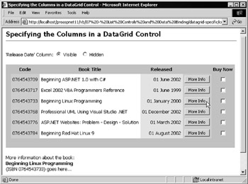
Figure 7-13:
Clicking any of the More Info buttons produces some text at the foot of the page (it's displayed in a Label control). This text would probably be extracted from the same database table (or another table). However, it's not implemented in the example, as we're more interested in the way that the DataGrid control is used.
The first part of the HTML is the definition of the two radio buttons that control the display of the Released column. As in previous examples, you can use automatic postback to make it more intuitive to use:
<form runat="server"> 'Release Date' Column: <ASP:RadioButton id="chkVisible" GroupName="Col2Visible" runat="server" AutoPostback="True" /> Visible <ASP:RadioButton id="chkNotVisible" GroupName="Col2Visible" runat="server" AutoPostback="True" /> Hidden<p />
Next comes the DataGrid control definition. It's on the <form> because it contains controls that you want to use for posting the page back to your server (that is, the More Info buttons). It uses the techniques we've just been discussing to create a custom column layout (including columns that contain only a non-breaking space and are simply there to give the required appearance for the control).
The penultimate ASP:TemplateColumn control contains an <ItemTemplate> element that specifies that each row will contain an ASP:Button control with the caption More Info. It also specifies that the CommandName property of the button is Info . You'll see how to use this when you look at the code in the page shortly.
<ASP:DataGrid id="MyDataGrid" runat="server" AutoGenerateColumns="False" CellPadding="5" GridLines="None" HeaderStyle-BackColor="silver" HeaderStyle-HorizontalAlign="center" FooterStyle-BackColor="silver" ShowFooter="True" OnItemCommand="ShowInfo"> <Columns> <ASP:TemplateColumn HeaderText="" ItemStyle-BackColor="silver"> <ItemTemplate> </ItemTemplate> </ASP:TemplateColumn> <ASP:BoundColumn HeaderText="<b>Code</b>" DataField="ISBN" ItemStyle-BackColor="lightblue" /> <ASP:BoundColumn HeaderText="<b>Book Title</b>" DataField="Title"/> <ASP:BoundColumn HeaderText="<b>Released</b>" DataField="PublicationDate" DataFormatString="{0:D}" ItemStyle-BackColor="yellow" ItemStyle-HorizontalAlign="right" /> <ASP:TemplateColumn HeaderText="" ItemStyle-BackColor="lightblue"> <ItemTemplate> <ASP:Button id="cmdInfo" Text="More Info" CommandName="Info" runat="server" /> </ItemTemplate> </ASP:TemplateColumn> <ASP:TemplateColumn HeaderText="Buy Now" ItemStyle-BackColor="silver" ItemStyle-HorizontalAlign="center"> <ItemTemplate> <ASP:CheckBox id="chkBuy" runat="server" /> </ItemTemplate> </ASP:TemplateColumn> </Columns> </ASP:DataGrid>
The only other control is the Label named lblInfo used for displaying information about each book in the table:
<ASP:Label id="lblInfo" runat="server" /> </form>
Binding the DataGrid
The code in this page is divided into three subroutines:
-
Page_Load is executed each time the page is loaded. It sets the visibility of the Released column and then calls the BindDataGrid routine.
-
BindDataGrid fetches the data from the database and returns it as a DataReader object. Then it binds this to the DataGrid control to display the values.
-
ShowInfo runs when any of the command buttons in the grid is clicked. It retrieves the ISBN and title of the book from the row, and displays it in the Label control at the foot of the page.
Showing and Hiding Columns
When you click the relevant radio button at the top of the page, the Released column is hidden or shown in the grid as shown in Figure 7-14. Compare this with Figure 7-13 to see the difference.
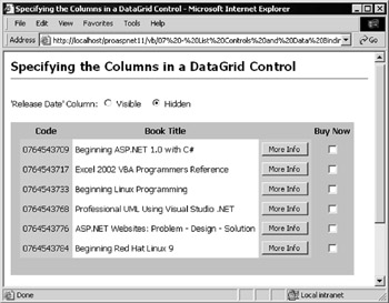
Figure 7-14:
The radio buttons have their AutoPostback property set to True so that the page is reloaded each time the selection is changed. In the Page_Load event, check to see if this is the first time the page has been loaded. If not (that is, if it's a postback), you have to set the Visible property of the appropriate column using its index within the Columns collection of the DataGrid control. If it's not a postback, you have to set the default value for the radio buttons and bind the grid to the data source. In this case, the Released column will be displayed, because the default is to show all columns:
Sub Page_Load() If Page.IsPostBack Then 'display or hide the "Released" column 'have to use the index of the column not the column name MyDataGrid.Columns(3).Visible = (chkVisible.Checked = True) Else chkVisible.Checked = True 'set default value BindDataGrid() 'create dataset and bind grid End If End Sub
Reacting to the ItemCommand Event
The other interesting feature of the example page is how it displays information about each book in response to a click on the More Info button. In the definition of the DataGrid control, we specified the name of an event handler for the ItemCommand event by setting the OnItemCommand property of the DataGrid :
OnItemCommand="ShowInfo" When any control within the grid is activated “ in this case, the ASP:Button control with the caption More Info “ this event handler is executed. The parameters sent to the event handler contain a reference to the control that initiated the event, and a DataGridCommandEventArgs object that contains details of the event as well as references to the current row in the control (the row containing the control that was activated).
Within the event handler, you can access the CommandName of the CommandSource object (the More Info button) to see which control activated the event (there could be more than one in each row). The button has a CommandName property value of Info , so you can choose the action to take based on this:
Sub ShowInfo(objSender As Object, objArgs As DataGridCommandEventArgs) 'runs when any command button in the grid is clicked 'see if the CommandName of the clicked button was "Info" If objArgs.CommandSource.CommandName = "Info" Then ...
Now that you've identified that it was the More Info button that was clicked, you can access the values in that particular row of your control. The DataGridCommandEventArgs object (named objArgs ) exposes the items in the current row of a DataGrid control as a Cells collection. As shown in the following code, you can access the cell by specifying its index within the row (starting at zero), and get the value from the Text property. These values can then be used to create the output and place it in the Label control located below the grid on the page.
... 'get values of ISBN and Title from Text property of the table cells 'for the current row returned in the objArgs parameter values Dim strISBN As String = objArgs.Item.Cells(1).Text Dim strTitle As String = objArgs.Item.Cells(2).Text 'display the information in the page possibly extract from database? lblInfo.Text = "More information about the book:<br /><b>" & strTitle _ & "</b><br />(ISBN " &strISBN & ") goes here..." End If End Sub
Using this technique, you could extract the ISBN and use it to look up information about the book in another table. You could even use it to access another web site or a web service to get information to display to the user.
Handling Data Binding Events
The content of each cell or item in a list control is created with a control's execution, as part of the overall page creation process. This means the content of each cell is controlled only by the value in the data source and the formatting applied by the template or style properties in the control definition. However, it's often useful to be able to access and modify the content at runtime, based on the actual value that occurs in the source dataset. You can do this by reacting to events that the control raises. The most useful event in this scenario is DataBinding , which occurs after the values for the column have been determined but before they are output to the client. This event is supported in all the list controls designed for data binding, including the ASP:DataGrid , ASP:DataList , ASP:Repeater , and HtmlSelect controls.
In essence, you just have to create a handler for the event, and tell the control where to find this event handler. It is then called for each row in the data source as the binding takes place. Within the event handler, you can access the entire row of data, and modify the content of any of the controls within that row.
The Handling Data Binding Events in a DataList Object ( datalist-bind-events.aspx ) example page, shown in Figure 7-15, demonstrates this technique by adding the slogan Great for ASP Programmers! to any book title that contains the text ASP or ADO:
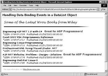
Figure 7-15:
The definition of the DataList control used in this example is much the same as in previous examples. You have <HeaderTemplate> , <ItemTemplate> , and <FooterTemplate> elements along with some CSS styles to specify how to format the output from the control. It's also important to set the OnItemDataBound property of the DataList object to the name of an event handler that you want executed as each row in the list is bound to the data source:
<ASP:DataList id="MyDataList" runat="server" RepeatLayout="Table" OnItemDataBound="CheckTitle"> ... </ASP:DataList>
We use the same Page_Load event handler as in previous examples to get a DataView object that contains the source data from the separate custom user control, and bind it to the grid for display. What makes this example different is the event handler specified for the ItemDataBound event.
Reacting to the ItemDataBound Event
When the CheckTitle event handler is called by the control, as each row is bound to the source data, it is passed two parameters. The first is the usual reference to the object that caused the event, and the second is a DataListItemEventArgs object that contains information about the event, and the row that was being bound.
First, in your event handler, check what type of row was being bound “ whether it's a header row, footer row, item row, alternating item row, and so forth (this is determined by the type of template used to create the row). You can obtain the row type from the ItemType property of the current row in the DataListItemEventArgs as follows:
Sub CheckTitle(objSender As Object, objArgs As DataListItemEventArgs) 'see what type of row (header, footer, item, etc.) caused the event Dim objItemType As ListItemType = CType(objArgs.Item.ItemType, ListItemType) 'only format the results if it's an Item or AlternatingItem event If objItemType = ListItemType.Item _ Or objItemType = ListItemType.AlternatingItem Then ...
Once you know that this is a row you want to process, you can get the values from the DataItem property of this row. This returns a DataRowView object “ basically a collection of the columns within this row. You can access the value of the column you want (in this case, the Title column) by specifying the column name as follows:
... 'objArgs.Item.DataItem returns the data for this row of items Dim objRowVals As DataRowView = CType(objArgs.Item.DataItem, DataRowView) 'get the value of the Title column Dim strTitle As String = objRowVals("Title")
You need to test the value to see if it's one that you want to modify. Look for book titles that contain the text strings "ASP" or "ADO". If you find one that matches, use the FindControl method of the row to get a reference to the control with an ID value of TitleLabel . This is the control that was bound to the Title column within the definition of the DataList control earlier in the page. Once you get a reference to this control, you can append the extra text (Great for ASP Programmers!), putting it in a <span> element that specifies the large red font style:
If strTitle.IndexOf("ASP") >= 0 _ Or strTitle.IndexOf("ADO") >= 0 Then 'get a reference to the "Title" ASP:Label control in this row Dim objLabel As Label = _ CType(objArgs.Item.FindControl("TitleLabel"), Label) 'add a message to this Label control objLabel.Text += " <span class='bigRed'>" _ & "Great for ASP Programmers!</span>" End If End If End Sub
If you look back at Figure 7-15, you'll see that the slogan text appears only for the two books that contain your search text within their title. This gives a useful technique for dynamically modifying the contents of a list control based on the current values of the data “ something you can't always do by hardcoding logic into the page.
This technique isn't limited to just adding text to a Label control. You could place other controls that are not visible (such as <img> elements), in the output of a DataList , and then change their properties in the ItemDataBound event handler based on the values in the bound data. Or you could just change the formatting of existing bound content based on the current value. The possibilities are almost endless.
Sorting and Filtering Rows in a DataGrid
When you need to display more than a few rows of data, it's helpful for users to be able to sort the rows based on values in a specific column, and filter the rows based on the values in any column. Both techniques make it much easier for users to find what they are looking for. It means extra trips to the server using the current generation of controls, but it's a useful feature to add to applications nonetheless.
You can provide both these facilities easily when using a DataGrid control. The DataGrid can do most of the work required to provide a "sort by column" facility. And if the data source for the control is a DataView object, you can take advantage of the sorting and filtering features that it includes:
-
To sort the rows within a DataView , just set the Sort property to a string containing the name of the column, and optionally the keyword DESC to sort in descending order. You can sort by more than one column by separating the column names with a comma.
-
To filter the rows that appear in the DataView , set the RowFilter property to an expression that specifies the rows to be displayed. A simple example is Title LIKE 'ASP' . More details on the Sort and RowFilter properties are provided in the upcoming data access chapters.
The big advantage in using a DataGrid control is that it has a property named AllowSorting , and it exposes an event named SortCommand . When the AllowSorting property is set to True (usually done within the definition of the control), each column heading automatically becomes a hyperlink. When these are clicked, a postback occurs and the event handler specified for the SortCommand property is executed. You can see the way that we implement both sorting and filtering in the Sorting Rows and Finding Data in a DataGrid Control ( sort-find-datagrid.aspx ) example page, as shown in Figure 7-16:
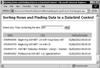
Figure 7-16:
The <form> section of the HTML for this page contains the textbox and button used to filter the rows based on the title of the book. These controls are followed by the definition of the DataGrid used to display the matching titles:
<form runat="server"> Select only Titles containing the text: <ASP:TextBox id="txtFindText" runat="server" /> <ASP:Button id="cmdFind" Text="Find" runat="server" /><p /> <ASP:DataGrid id="MyDataGrid" runat="server" Enableviewstate="False" CellPadding="5" GridLines="None" HeaderStyle-BackColor="silver" HeaderStyle-HorizontalAlign="center" FooterStyle-BackColor="silver" ShowFooter="True" AllowSorting="True" OnSortCommand="SortRows" /> </form>
Other than some minimal styling information, the two properties set for the DataGrid that are of interest here are the AllowSorting and OnSortCommand properties. These properties specify the appearance of the LinkButton controls that make up the column names in the header row, as well as the name of the event handler that is executed when one of the column names is clicked.
The code section of the page contains three subroutines. Apart from the Page_Load event handler, you have a BindDataGrid routine that is responsible for fetching the data sorted and filtered as required. The third routine, named SortRows , is executed when the column headings are clicked. You can see that it is attached to the DataGrid in the preceding code as the OnSortCommand property. The page also defines two global ( Page -level) variables that will hold the current sort order and filter expression:
Dim gstrSortOrder As String 'to hold the sort order Dim gstrFindText As String 'to hold the filter expression
Binding the DataGrid
The first subroutine, BindDataGrid , uses the same custom user control as some of the earlier examples to fetch a DataView object containing some book details from the data store. It then binds this DataView to the DataGrid control. However, it has a couple of other tasks to perform as well. It uses the two global variables to set the sort order of the rows in the DataView (by setting the Sort property), and applies a filter to the rows to control which ones will be displayed (by setting the RowFilter property):
Sub BindDataGrid() ... 'get dataset from get-dataset-control.ascx user control ... 'sort the rows in the DataView into the specified order objDataView.Sort = gstrSortOrder 'select the rows in the DataView that match the filter objDataView.RowFilter = gstrFindText 'set the DataSource property of the DataList and bind it MyDataGrid.DataSource = objDataView MyDataGrid.DataBind() End Sub
The Page_Load Event Handler
The second subroutine is the Page_Load event handler. This is executed when the page first loads and when the user clicks a column heading to change the sort order, or clicks the Find button to filter the rows that are displayed. In the event handler, if this is a postback, the global filter expression variable is changed to reflect the value in the textbox. If it's the first time that the page has been loaded, set default values for the textbox and the global string that specifies the sort order of the rows.
The result is that you start out with the value ASP in the textbox when you first load the page, and from then on the global string variable will always hold the expression used to filter the rows. You also call the BindDataGrid subroutine (the one we just examined) each time the page is loaded, so that the DataView object and the grid are recreated with the current sort order and row filter:
Sub Page_Load() If Page.IsPostBack Then 'set the value to be used for the RowFilter on the DataView gstrFindText = "Title LIKE '*" & txtFindText.Text & "*'" Else 'set the default values for the sort string and filter textbox gstrSortOrder = "ISBN" txtFindText.Text = "ASP" End If 'create the data set and bind to the DataGrid control BindDataGrid() End Sub
When the page is first loaded, the Page_Load event handler sets the Page -level variable holding the sort order to the value "ISBN" , so the rows will be sorted in the order of the ISBN column values. But how do you change the sort order?
Sorting the Rows in the DataGrid
The DataGrid control raises the SortCommand event whenever the user clicks on a column heading LinkButton . The SortRows subroutine that is specified as the handler for this event is shown next:
Sub SortRows(objSender As Object, objArgs As DataGridSortCommandEventArgs) 'runs when the column headings in the DataGrid are clicked 'get the sort expression (name of the column heading that was clicked) gstrSortOrder = objArgs.SortExpression.ToString() 'recreate the data set and bind to the DataGrid control BindDataGrid() End Sub
As you can see, the code required is minimal. The DataGridSortCommandEventArgs object that's automatically passed to your event handler when a column heading is clicked exposes a SortExpression property, which contains the name of the column. All you do is ensure that it's converted to a string and assign it to the Page -level sort order variable, and then call the routine that recreates the DataView and binds it to your grid.
Controlling the Size of the Viewstate
One issue that you really must be aware of when using the ASP.NET list controls is the effect that they have on the amount of data being transmitted across the wire “ with each postback and with each newly generated page. As discussed in the previous chapter, an ASP.NET page containing a server-side <form> control automatically generates viewstate . This is an encoded representation of all the values in all the controls on the page, and it is persisted across page loads using a HIDDEN -type <input> control. If you view the source of the page in your browser, you'll see something like this:
... <form name="ctrl0" method="post" action="mypage.aspx" id="ctrl0"> <input type="hidden" name="__VIEWSTATE" value="dDwxOTAwNDM2ODc1Ozs+" /> ...
If you place a list control on a page and fill it with data, all that data is encoded into the viewstate and passed across the wire with each page load and postback. In fact, it's even worse than that; when the user loads the page, you actually send all the values twice “ once as the visible output of the list control, and once as the content of the viewstate.
Of course, you might want this to occur as a feature of the way that the page works. If you create the output for the list control and bind it only during the first page load (and not during each postback), you depend on the viewstate to maintain the values in the list control. If getting the values from the data source is an expensive process in terms of resources or time, then persisting them in the viewstate is a good idea.
However, if you are limited in bandwidth or are serving devices such as mobile phones that can't cope with large volumes of form content, you might instead decide to recreate the values on each postback, and not include them in the viewstate. Bear in mind that this option requires a deliberate decision “ if you take no action, the values will be included in the viewstate.
Persisting List Control Values Automatically Across Postbacks
If you are persisting values across postbacks, use the IsPostback property of the Page object so that the values are only created when the page is executed for the first time. For example, the values that are automatically included in the viewstate will be used to populate the DataGrid control when the page is reloaded:
Sub Page_Load() If Not Page.IsPostback Then objDataView = GetDataView(.....) 'get or build a DataView object MyDataGrid.DataSource = objDataView 'specify the data source MyDataGrid.DataBind() 'bind data to grid control End If End Sub
Preventing List Control Values from Being Persisted Across Postbacks
There may be occasions when you wouldn't want to persist the values in a list control across postbacks. As well as the concern over bandwidth, you might have other reasons for recreating the data set or rebinding the list control each time you load the page. The simplest scenario is when the page does not actually include a <form> element. Many of our previous examples were like this. With non-interactive pages, there is no requirement to post values back to the server “ just load the page and view it. In this case, there is no viewstate, but no user interaction either.
However, if the page does contain a <form> section, the values from the list control are automatically included in the viewstate. If the list control contains any interactive elements (such as buttons or edit controls where the value must be posted back to the server) the control has to be on an HTML <form> . This is the case with the sorting and filtering example you've just seen, where the column headings are automatically rendered as LinkButton controls.
However, to sort and filter the rows, you have to rebind the data grid to the DataView object each time. The whole DataSet and DataView is recreated with each postback, so there is no need to maintain the values in the viewstate. For this reason, you need to set the Enableviewstate property of the DataGrid object to False in the control definition so that the contents of this control are not included in the viewstate:
<ASP:DataGrid id="MyDataGrid" runat="server" Enableviewstate="False" You can always check how much data is included in the viewstate of a page by using page tracing . In the Page directive, add Trace="True" :
<%@Page Language="VB" Trace="True"%> Then run the page locally (that is, in a browser running on the web server itself). In the Control Tree section of the output, shown in Figure 7-17, you can see that the viewstate of the DataGrid control named MyDataGrid is 528 bytes. However, this does not include child controls. In fact, the DataGrid including all its child controls has a viewstate size of over 5 kB in this example!
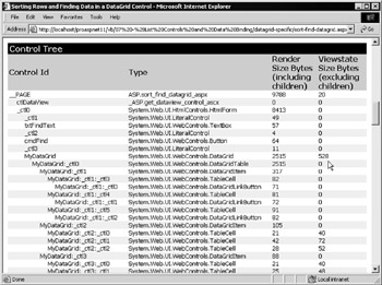
Figure 7-17:
To save you adding all the values together, there is another simple way to get an indication of the total viewstate in a page “ just view the source in the browser so that you can see the HIDDEN -type <input> control. From that you can get a good idea of the amount of data being sent to the client and back to the server each time.
Automatic Paging in a DataGrid
Our final example of using the DataGrid control just to display data demonstrates the use of paging . When there are a large number of rows to display, sending them all to the client in one go doesn't make sense. Users will get impatient waiting for them to arrive , and may find that they actually wanted to see something else instead. To prevent this aggravation and waste of bandwidth, you can divide the output into pages containing, for example, 10 or 20 rows (depending on the content), and then provide navigation controls so that users can view other pages of rows as required.
The DataGrid control makes it easy to provide a paging feature. It contains logic that can automatically create pages containing the number of rows you require, and it can render the navigation controls in a range of ways. You can also take over paging entirely and implement all the features yourselves in order to provide a custom interface.
To turn on the automatic paging feature, you simply need to set the AllowPaging property of the DataGrid control to True , and specify the name of an event handler that will run when the PageIndexChanged event occurs. These properties are set when you define the control in the HTML of the page. You can also specify the position of the Pager navigation controls. By default they are located in the footer row of the grid, aligned on the left.
The Using Automatic Paging with a DataGrid Control ( paging-datagrid.aspx ) example shown in Figure 7-18 uses the automatic paging feature This example also contains controls that can be used to specify other properties of the paging feature. For example, specify the number of rows in each page, and the style of the navigation controls. After changing any of the property values, just click on one of the navigation links to reload the page with the new options set.
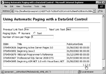
Figure 7-18:
As usual, the HTML section of the page starts with the controls where you can specify how the DataGrid behaves:
<form runat="server"> 'Previous' Link Text: <ASP:TextBox id="PrevText" runat="server" /> 'Next' Link Text: <ASP:TextBox id="NextText" runat="server" /><br /> Paging Style: <ASP:RadioButton id="PageNumeric" GroupName="Style" runat="server" /> Numeric <ASP:RadioButton id="PageText" GroupName="Style" runat="server" /> Text<br /> Number of rows per Page: <ASP:TextBox id="PageRows" runat="server" /><p />
This is followed by the definition of the DataGrid control. Set the three properties that control the paging behavior: set AllowPaging to True , specify that the paging controls should be right-aligned within the footer row, and specify that the ChangeGridPage event handler (which we'll look at shortly) will be executed when the user selects a page using the paging controls:
<ASP:DataGrid id="MyDataGrid" runat="server" Width="90%" AllowPaging="True" PagerStyle-HorizontalAlign="Right" OnPageIndexChanged="ChangeGridPage" /> </form>
The Page_Load Event Handler
Whenever the page loads, either when the user opens the page for the first time or in response to a click by the user on the paging controls, the Page_Load event handler is executed. However, we only want to execute code when the page is first opened so check the value of the IsPostback property first. If it's False , you can set the default values for the controls in the page and call the BindDataGrid subroutine to bind and display the source data values in the DataGrid control:
Sub Page_Load() If Not Page.IsPostback Then 'set the default values in the controls on the page PrevText.Text = "Prev" NextText.Text = "Next" PageNumeric.Checked = True PageRows.Text = "10" 'set the initial page in the DataGrid to zero '(not actually required as this is the default) MyDataGrid.CurrentPageIndex = 0 'create the dataset and bind it to the DataGrid control BindDataGrid() End If End Sub
The BindDataGrid Routine
Before you bind the source data to the DataGrid , you first have to set the values of the properties that control the paging feature. You can get the number of rows that are to be shown in each page from the PageRows textbox on the page, and assign this value to the PageSize property of the DataGrid control.
See which type of paging controls the user specified (either page numbers , or Previous and Next text captions), and set the PagerStyle.Mode property of the DataGrid .
You can also retrieve and set the values that the user wants for the text captions (in reality, we actually only need to set this if the pager mode is text captions but it makes no difference to the operation of the page). The code is as follows:
Sub BindDataGrid() 'set the value of the number of rows per page MyDataGrid.PageSize = CInt(PageRows.Text) 'set the type of pager to include in the DataGrid If PageNumeric.Checked = True Then MyDataGrid.PagerStyle.Mode = PagerMode.NumericPages Else MyDataGrid.PagerStyle.Mode = PagerMode.NextPrev End If 'set the text for the pager to use when in NextPrev mode MyDataGrid.PagerStyle.NextPageText = NextText.Text MyDataGrid.PagerStyle.PrevPageText = PrevText.Text
Now get the DataView object and bind it to the grid. We're using the same custom user control as in previous examples here:
... 'get dataset from get-dataset-control.ascx user control ... MyDataGrid.DataSource = objDataView MyDataGrid.DataBind() End Sub
In Figure 7-19, the text-style paging option has been selected, and different text for the pager links has been chosen . The number of rows that should appear in each page has also been changed:
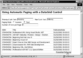
Figure 7-19:
Changing the Displayed Page
We've set all the properties of the DataGrid control that affect the appearance, and bound and displayed the data content starting from the first page of rows. All that remains is to handle the PageIndexChanged event that occurs when the user clicks one of the page navigation links. We specified an event handler named ChangeGridPage in the original definition of the DataGrid control, the code for which is shown as follows:
Sub ChangeGridPage(objSender As Object, _ objArgs As DataGridPageChangedEventArgs) 'runs when one of the pager controls is clicked 'update the current page number from the parameter values MyDataGrid.CurrentPageIndex = objArgs.NewPageIndex 'recreate the dataset and bind it to the DataGrid control BindDataGrid() End Sub
All you have to do is collect the index number of the page that the user selected from the NewPageIndex property of the DataGridPageChangedEventArgs object that is passed to the event handler when the event occurs. You can assign this value to the CurrentPageIndex property of the DataGrid , and then call the BindDataGrid routine to fetch, bind, and display the appropriate page of data rows.
Building paging into applications that display rows of data was always a notoriously error-prone task, but is easy with the DataGrid . You can also specify custom paging controls “ building your own with buttons, hyperlinks , images, and so on. This involves setting the AllowCustomPaging and AllowPaging properties to True . This means that the paging controls will not appear, but you can still react to the PageIndexChanged event to display the appropriate set of rows, and display your own paging controls.
Custom paging is also useful if you want to use a DataReader as the data source for your control. When using the built-in paging feature of the DataGrid , you cannot use a DataReader as the data source “ it must be one of the other disconnected data source types, such as a DataView , DataSet , ArrayList , or HashTable . However, you can use a DataReader if you implement custom paging. We aren't demonstrating custom paging here, but there are examples in both the SDK and the QuickStart samples included with ASP.NET.
EAN: 2147483647
Pages: 243