The HTML Server Controls
The HTML server controls are defined within the System.Web.UI.HtmlControls namespace. The controls inherit from a couple of generic base classes defined here. There are also specific classes for each of the interactive controls (those controls that are usually used on an HTML <form> ).
The HtmlControl Base Classes
The base class for all HTML controls is System.Web.UI.HtmlControls.HtmlControl . This exposes methods , properties, and events that are common to all HTML controls. The ones used most often are shown in the following table.
| Member | Description |
|---|---|
| Attributes property | Returns a collection of all the attribute name /value pairs within the .aspx file for this control. It can be used to read and set non-standard attributes (custom attributes that are not actually part of HTML) or to access attributes where the control does not provide a specific property for that purpose. |
| ClientID property | Returns the control identifier that is generated by ASP.NET. |
| Controls property | Returns a ControlCollection object containing references to all the child controls for this control within the page hierarchy. |
| Disabled property | Sets or returns a Boolean value indicating if the control is disabled. |
| EnableViewState property | Sets or returns a Boolean value indicating if the control should maintain its viewstate and the viewstate of any child controls when the current page request ends. The default is True . |
| ID property | Sets or returns the identifier defined for the control. |
| Page property | Returns a reference to the Page object containing the control. |
| Parent property | Returns a reference to the parent of this control within the page hierarchy. |
| Style property | References a collection of all the CSS style properties (selectors) that apply to the control. |
| TagName property | Returns the name of the element; for example, a or div . |
| Visible property | Sets or returns a Boolean value indicating if the control should be rendered in the page output. Default is True . |
| DataBind method | Causes data binding to occur for the control and all of its child controls. |
| FindControl method | Searches within the current container for a specified server control. |
| HasControls method | Returns a Boolean value indicating if the control contains any child controls. |
| DataBinding event | Occurs when the control is being bound to a data source. |
A full list of all the members for this object can be found in the .NET Framework SDK Documentation under Reference, Class Library, System.Web.UI.HtmlControls, HtmlControl Class, HtmlControl Members .
The second base class is System.Web.UI.HtmlControls.HtmlContainerControl , which is used as the base for all HTML elements that must have a closing tag (elements such as <i> , <b> , and <select> , which, unlike <img> or <input> , make no sense as single tags). This class inherits from HtmlControl , and exposes the same methods, properties, and events as shown earlier. Also, because it is only used for container elements that themselves can have content, it adds two more very useful properties that allow us to read and set this content:
| Property | Description |
|---|---|
| InnerHtml | Sets or returns the HTML and text content between the opening and closing tags of the control. |
| InnerText | Sets or returns just the text content between the opening and closing tags of the control. |
The HtmlGenericControl Class
As you will no doubt be aware, there are around 100 elements currently defined in HTML, although some are browser-specific. Rather than provide a distinct class for each of these, the .NET Framework contains specific classes for only a few of the HTML elements. These mainly include those elements that we use on an HTML <form> , or which we use to build interactive parts of a page (such as hyperlinks or images).
This doesn't mean that we can't use other HTML controls as server controls. If there is no specific class for an element, the framework substitutes the System.Web.UI.HtmlControls.HtmlGenericControl class instead. Note that this is not a base class “ it is a public class designed for use with elements for which there is no specific class.
For example, you may have noticed in an example earlier in the chapter that we used a <div> element to display the results of some code in an event handler like this:
<div id="divResult" runat="server" /> ... Sub Page_Load() ... divResult.InnerHtml = strResult End Sub
You can see that we have defined the <div> as being a server control (it includes the runat="server" attribute, and this allows us to use the XML-style shorthand syntax of specifying a forward slash instead of a closing tag). To display the result, we simply set the InnerHtml property on the server. So, if the value of strResult is This is the result , the page output will contain:
<div id="divResult">This is the result</div> As the HtmlGenericControl is based on the HtmlContainerControl base class (which itself inherits from HtmlControl ), it exposes the same list of members (properties, methods, and events) that we described earlier for these classes. In our previous code, we used the InnerHtml property to display a value within the control. We can equally well use the other members. For example, we can force the element to be displayed or hidden (included or not included in the final page output) by setting the Visible property.
The Specific HTML Control Classes
The System.Web.UI.HtmlControls namespace includes specific classes for the HTML interactive controls, such as those used on a <form> . Each one inherits from either HtmlControl or HtmlContainerControl (depending on whether it has a closing tag), so it has the same members as that base class.
However, for these controls to be useful, we need to be able to access the properties and events that are specific to each type of control. For example, with a hyperlink, we might want to read and set the href, name, and target attribute values in our server-side code. We might also want to be able to detect when a user clicks on a hyperlink.
To accomplish this, each of the controls has specific properties and events that correspond to the attributes we normally use with that element. A few also have other properties that allow access to control-specific values, such as the PostedFile property for an <input type="file"> element or the specific data binding properties of the <select> element. The button-type controls also have a CausesValidation property, which we will see in use when we look at the validation server controls later in this chapter. The following table lists the different HTML server controls that are available in the Framework:
| HTML Element | Specific Properties | Specific Events |
|---|---|---|
| <a> | Href , Target , Title , Name | OnServerClick |
| <img> | Align , Alt , Border , Height , Src , Width | - none - |
| <form> | Name , Enctype , Method , Target | - none - |
| <button> | CausesValidation | OnServerClick |
| <input type="button"> | Name , Type , Value , CausesValidation | OnServerClick |
| <input type="text"> | MaxLength , Name , Size , Type , Value | OnServerChange |
| <input type="checkbox"> | Checked , Name , Type , Value | OnServerChange |
| <input type="radio"> | Checked , Name , Type , Value | OnServerChange |
| <input type="image"> | Align , Alt , Border , Name , Src , Type , Value , CausesValidation | OnServerClick |
| <input type="file"> | Accept , MaxLength , Name , PostedFile , Size , Type , Value | - none - |
| <input type="hidden"> | Name , Type , Value | OnServerChange |
| <textarea> | Cols , Name , Rows , Value | OnServerChange |
| <select> | Multiple , SelectedIndex , Size , Value , DataSource , DataTextField , DataValueField Items ( collection ) | OnServerChange |
| <table> | Align , BgColor , Border , BorderColor , CellPadding , CellSpacing , Height , NoWrap , Width Rows ( collection ) | - none - |
| <tr> | Align , BgColor , Border , BorderColor , Height , VAlign Cells ( collection ) | - none - |
| <td> | Align , BgColor , Border , BorderColor , ColSpan , Height , NoWrap , RowSpan , VAlign , Width | - none - |
In the next sections of this chapter, we will examine these controls in more detail using the demonstration application we have provided.
Using the HTML Server Controls
In most cases, the use of HTML controls is self-evident if you are familiar with the quirks of HTML and its inconsistent use of attribute names. The properties of the controls, as we have just seen, match the attribute names almost identically. We will look at a couple of useful techniques that apply to all the HTML controls, and to most other server controls as well.
Setting the Control Appearance Using Style Properties
All the server controls (including the ASP Web Form controls we look at in the next two chapters) provide a Style property that we can use to change the appearance of the control. It defines the CSS properties that will be added to the element tag when the control is created. We simply set or add the appropriate CSS style selectors to the collection for that control, using the same values as we would in a normal CSS stylesheet. For example, we can display the content of a <div> element in large red letters using the code shown in following listing:
<div id="divResult" runat="server" /> ... <script language="VB" runat="server"> Sub Page_Load() divResult.InnerHtml = "Some Big Red Text" divResult.Style("font-family") = "Tahoma" divResult.Style("font-weight") = "bold" divResult.Style("font-size") = "30px" divResult.Style("color") = "Red" End Sub </script>
Figure 5-6 shows the result:
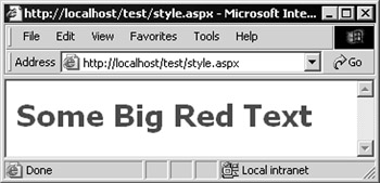
Figure 5-6:
If we examine the output that is generated by the control, we see the style attribute that determines the formatting we specified in our code:
<div id="divResult" style="fontfamily:Tahoma;font-weight:bold; font-size:30px;color:Red;">Some Big Red Text</div>
This technique is most useful with the HTML controls, as the ASP.NET Web Form controls and most of the other server controls have specific properties that can be used to change their appearance, as you will see in the next chapter.
Managing Viewstate across Postbacks
One important point you should be aware of is the effect that viewstate has on the performance of the server and the page itself. You looked at what viewstate is in the previous chapter, and will see more detail about its effects on performance in Chapter 7, when we look at the more complex list controls.
To recap, an ASP.NET page containing a server-side <form> control automatically generates viewstate. This is an encoded representation of all the values in all the controls on the page, and it is persisted across page loads using a HIDDEN -type <input> control. If you view the source of the page in the browser, you'll see the following:
<form name="ctrl0" method="post" action="mypage.aspx" id="ctrl0"> <input type="hidden" name="__VIEWSTATE" value="dDwxOTAwNDM2ODc1Ozs+" /> ...
You can prevent a control from persisting its values within the viewstate by changing the EnableViewState property from its default value of True to False :
<ASP:TextBox id="MyTextBox" EnableViewState="False" runat="server" /> This is also useful if you use a control such as a <div> to display some kind of status or information value by setting the InnerText or InnerHtml property in your server-side code. When the page is posted back to the server, the value is persisted automatically. By changing the EnableViewState property to False , you start with a fresh new empty <div> (or whichever element you use it with) each time.
Examples of the HTML Server Controls
So that you can appreciate how each of the HTML server controls works, and how the properties defined affect the output that the control generates, the next few sections show each of the controls in detail, together with some pointers to be aware of when you use them.
The HtmlGeneric Control
There's not much to say about the HtmlGeneric control, other than this is the only control where the TagName property is read/write “ it is read-only in all other controls. We can use the HtmlGeneric control to create any container-type HTML element that we need.
The HTML for creating the server control in the source code for the page seen in Figure 5-7 is:
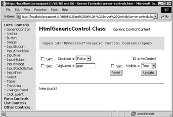
Figure 5-7:
<span id="MyControl" runat="server"> Generic Control Content </span>
The HtmlAnchor Control
We saw the HtmlAnchor control in the demonstration application earlier in this chapter. The five attributes that we generally use with an HTML hyperlink or an HTML anchor are available as properties, as shown in Figure 5-8:
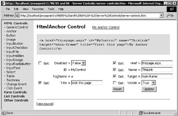
Figure 5-8:
The HTML used for creating the server control in the source code for the page is:
<a href="html_anchor.aspx" id="MyControl" runat="server"> My Anchor Control </a>
The HtmlImage Control
To display an image, and be able to interact with this <img> element on the server, we can use the HtmlImage control. Figure 5-9 shows most of the properties set to custom values. You can see that we have changed the image, specified a five pixel wide border for it, set the height and width, and added a pop-up tool-tip.
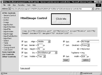
Figure 5-9:
The HTML used for creating the server control in the source code for the page is:
<img id="MyControl" src="BookmarkButton.gif" runat="server" /> The HtmlForm Control
The HtmlForm control can't be demonstrated in our sample application. However, it can easily be used to create a form “ in fact, it is how we usually do it when building ASP.NET interactive pages:
<form runat="server"> ... form content defined here ... </form>
ASP.NET automatically sets the remaining attributes so that the contents of the form are posted back to the same page. What is actually generated as output is shown next. Notice that the hidden viewstate element is automatically added:
<form name="ctrl0" method="post" action="test.aspx" id="ctrl0"> <input type="hidden" name="__VIEWSTATE" value="dDwxN...Oz4=" /> ... form content appears here ... </form>
We can also use the HtmlForm control to create a form with some of our own specific attributes. For example, in order to make our demonstration application work properly (due to the need to fetch the page separately with the XMLHTTP component to show the content), we need to use the get method for the form content, rather than post :
<form method="get" runat="server"> Also, remember that if you use the HtmlInputFile control or a normal <input type="file"> element (which we look at later in the chapter), you must set the enctype attribute yourself to allow files to be uploaded to the server:
<form enctype="multipart/form-data" runat="server"> Other points to look out for are that you cannot set the action attribute of a server-side <form> element (one with a runat="server" attribute) to post the contents of the form to a different page. It always posts back to the same page. Also, all HTML form controls and their ASP Web Form equivalent input controls must be placed on a <form> . Failure to do so results in a compile-time error.
The HtmlButton Control
The HtmlButton control creates an HTML element of type <button>...</button> . This isn't a commonly used element (it isn't supported in some of the older browsers), but is actually quite useful if you are targeting Internet Explorer 4 and above. Unlike the <input type="button"> element, HtmlButton is a container control, so you can place HTML inside the element instead of just text.
This means that you can display an image and text together, for example, and can even use an animated GIF image if you like. All the content is rendered on top of a standard button control background, and it depresses just like a normal button. Figure 5-10 shows an example:
Figure 5-10:
The following code is used to create this effect:
<button id="cmdRemove" accesskey="R" style="font-size:9pt" runat="server"> <img id="imgbtnRemove" src="remove.gif"><br /> <u>R</u>emove </button>
Note that, to change the content of an HtmlButton control, you have to set the InnerHtml property or define the content at design-time within the element. There is no specific property for the 'caption', 'text', or 'value'.
In Figure 5-11, you can see one of the few properties available for the HtmlButton control in use. In this case, the Disabled property is set to True , and you can see how the caption is dimmed to indicate that the button is disabled:
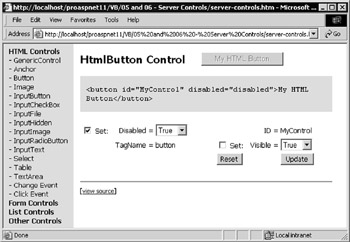
Figure 5-11:
The HTML used for creating the server control in the source code for the page is:
<button id="MyControl" runat="server">My HTML Button</button> Remember that the Disabled property, which adds the disabled="disabled" attribute to the element, only has an effect in Internet Explorer and the latest version 6 browsers from Netscape, Opera, and Mozilla. Most older browsers do not recognize this attribute.
The HtmlInputButton Control
The types of button we normally use in our interactive forms are the <input type="submit"> , <input type="button"> , and <input type="reset"> elements. The HtmlInputButton control is used to create these three elements. The only button-specific property we can set is the Value (the caption). The Disabled and Visible properties are, of course, inherited from the HtmlControl base class.
In Figure 5-12, we have set a variety of values for the three variations of the HtmlInputButton control:
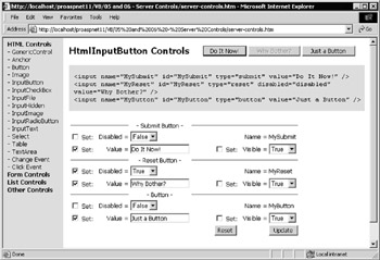
Figure 5-12:
The HTML we use to create the server controls in the source code for the page is:
<input id="MySubmit" type="submit" runat="server" /> <input id="MyReset" type="reset" runat="server" /> <input id="MyButton" type="button" runat="server" Value="My Caption" />
The HtmlInputText Control
Probably the most common HTML form control is the textbox, and this is implemented as a server control by the HtmlInputText control. As usual with the HTML controls, the properties map one-to-one with the attributes of the <input type="text"> element that defines a textbox in the browser.
In Figure 5-13, you can see that we have set the MaxLength and Size properties. The HTML used for creating the server control in the source code for the page shown in Figure 5-13 is:
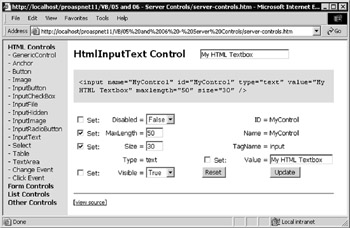
Figure 5-13:
<input type="text" id="MyControl" value="My HTML Textbox" runat="server" />
The HtmlInputCheckBox and HtmlInputRadioButton Controls
To create a checkbox or a radio button (or 'option button' as it is sometimes called) we use the HtmlInputCheckBox and HtmlInputRadioButton HTML server controls. The set of properties, and the way they work, are pretty much the same for both controls. In Figure 5-14, we show the HtmlInputRadioButton control:
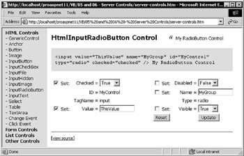
Figure 5-14:
The HTML used for creating the controls in the sourcecode for these two pages is:
<input type="radio" id="MyControl" name="MyGroup" runat="server" /> My RadioButton Control
And:
<input type="checkbox" id="MyControl" runat="server" /> My Checkbox Control
Note that the HtmlInputRadioButton control allows you to specify the Name property (or attribute) as a value other than that of the ID property (or attribute). This is required to be able to create a mutually exclusive 'option' group of radio buttons on a form. The other HtmlInputxxxx controls do not allow the Name property to be set to a value different from that of the ID property.
The HtmlInputImage Control
An easy way to display an image that is clickable is with an <input type="image"> element. It acts like a Submit button in that when the button is clicked, the form containing the element is submitted to the server along with the coordinates of the mouse pointer within the image. Our demonstration page, as shown in Figure 5-15, allows you to set all the commonly used properties for this type of control, including the alignment, border width, alternative text, and image source (from a selection we have provided), as well as the value:
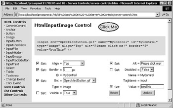
Figure 5-15:
The HTML used for creating the server control in the source code for the page is:
<input type="image" id="MyControl" src="BookmarkButton.gif" runat="server" />
The HtmlInputFile Control
If you need to allow users to upload files to your server, you can use the <input type="file"> element. This is implemented as a server control by HtmlInputFile . It has a special property just for this purpose, named Accept (the MIME type of the file to upload). The other properties are the same as for a textbox element. In Figure 5-16, you can see the settings we have made. And while the Browse button that the control creates allows you to select a file, you can't actually upload files with our demonstration application.
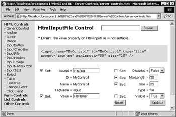
Figure 5-16:
One important point to note is demonstrated by the error message you see just below the control in the page. For security reasons, you cannot set the Value property of the control (the file to download) on the server. The HTML used for creating the server control in the source code for the page is:
<input type="file" id="MyControl" runat="server" /> The Code to Upload a File
To create a working file upload page, all we need is a form with the correct value for the enctype attribute, an HtmlInputFile element, and a button to start the process, as shown in the following listing:
<form enctype="multipart/form-data" runat="server"> Select File: <input type="file" id="MyFileInput" accept="image/*" runat="server" /> <input type="button" id="SubmitButton" value="Upload" runat="server" onserverclick="UploadFile" /> </form> <div id="outError" runat="server" /> ... <script language="VB" runat="server"> Sub UploadFile(objSource As Object, objArgs As EventArgs) If Not (MyFileInput.PostedFile Is Nothing) Then Try MyFileInput.PostedFile.SaveAs("c:\temp\uploaded.jpg") Catch objError As Exception outError.InnerHtml = "Error saving file " _ & objError.Message End Try End If End Sub </script> The <script> section following the form contains the code routine that runs when the user clicks the Upload button. It checks to see that there is a file by referencing the PostedFile property of the control, and if so saves it to the server's disk. Any error message is displayed in a <div> control on the page.
Note that you will probably need to change the value of maxRequestLength in the <httpRuntime> element within the <system.web> section of web.config or machine.config to allow files to be posted to the server. The default value is 4096 (bytes), and you should change it to accommodate the largest file you wish to accept. See Chapter 13 for details of the web.config and machine.config configuration files.
The HtmlInputHidden Control
In the days before ASP.NET, hidden-type input controls were used to persist values between pages. In fact, this is what ASP.NET does behind the scenes to maintain the viewstate of the page, as seen previously in this chapter. However, there are still uses for hidden-type controls in our applications.
For example, we can use hidden-type controls to post values back to a different page on our server, or to store and manipulate values using client-side script within the page and have these values posted back to the server.
Note in Figure 5-17, that the value for the Visible property is True . Don't be confused by this “ the Visible property simply defines whether the HTML output generated by the control will actually be included in the output for the page (the HTML that the server returns to the client). It doesn't make the control visible or hidden .
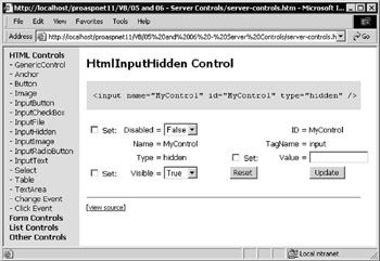
Figure 5-17:
If you set the Visible property to False , the control itself will not appear in the output generated for the page (though it still remains within the control tree of the page). You can try this yourself, and you will see that the gray area showing the output from the control is then empty. This feature allows us to dynamically hide and display controls as required.
The HTML used for creating the server control in the source code for the page is:
<input type="hidden" id="MyControl" runat="server" /> The HtmlSelect Control
HTML defines only one way to create list box controls, the HTML <select> element. This is implemented as the server control named HtmlSelect . Our demonstration page uses data binding to create the list of options for the control, using a pre- populated HashTable object as the DataSource that is created by the following code:
Dim tabValues As New HashTable(5) tabValues.Add("Microsoft", 49.56) tabValues.Add("Sun", 28.33) tabValues.Add("IBM", 55) tabValues.Add("Compaq", 20.74) tabValues.Add("Oracle", 41.1) MyControl.DataSource = tabValues MyControl.DataBind()
You will see more about data binding in Chapter 7. In the meantime, you can experiment with the results here. A HashTable is similar to the Dictionary object found in ASP 3.0, with each value (in our case, the numbers ) being identified by a key (in our case, the company names).
The demonstration page, as shown in Figure 5-18, allows you to set the DataTextField and DataValueField properties, which specify whether the property value should come from the Key or the Value in the HashTable. To see the effect that this has on the list, try swapping the values over in the page.
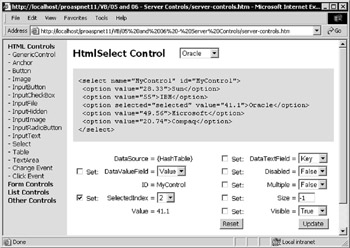
Figure 5-18:
The HTML used for creating the server control in the source code for the page is:
<select id="MyControl" runat="server" /> The HashTable is very useful in this scenario, as it allows the options in the list to use some readable text, while the actual values that are submitted to the server can be different. An example would be the use of part numbers for the values, with the text of each option showing the part name or description.
Creating List Content with ListItem Objects
Instead of populating the list using data binding, we can just use <option> elements in the traditional way “ as shown in the following listing:
<select id="MyControl" runat="server"> <option value="value1">Option 1 Text</option> <option value="value2">Option 2 Text</option> <option value="value3">Option 3 Text</option> </select>
Note that we haven't marked the <option> elements with runat="server" . There is no need, as they will automatically be converted into ListItem objects when the page is compiled.
A ListItem object is not actually a server control, though it is part of the same namespace as the ASP.NET Web Form controls classes (which we will look at in more detail in the next chapter).
It is enough to know that this object exposes three useful properties, as shown in the following table:
| Property | Description |
|---|---|
| Selected | Sets or returns a Boolean value indicating if this item is selected in the list. Useful for iterating through the list when the control allows multiple selections to be made by clicking while holding down the Shift and Ctrl keys. |
| Text | Sets or returns the text that is displayed in the list control for this item. |
| Value | Sets or returns the value that is returned when this item in the list is selected. |
To create a multiple-selection list, just change the Multiple and Size properties in the demonstration page and click Update. In our example (see Figure 5-19) even after doing so, you can still only select a single item using the input control for the SelectedIndex property, but the demonstration control at the top of the page then works as a multiple-selection list:
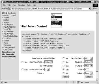
Figure 5-19:
We'll see how to use the ListItem object in a list control to extract the list of selected items shortly, when we work with the events that the HTML controls raise.
The HtmlTextArea Control
To display a multi-line textbox in a web page, use the <textarea> element. This is implemented by the server control named HtmlTextArea . It has the specific properties required to set the number of rows and columns in the control, as well as the value. Notice in Figure 5-20 that in this case the value is actually the content rather than an attribute “ the text that lies between the opening and closing <textarea> tags:
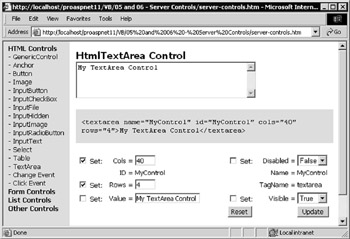
Figure 5-20:
The HTML used for creating the server control in the source code for the page is:
<textarea id="MyControl" runat="server">My TextArea Control</textarea> The HtmlTable, HtmlTableRow, HtmlTableCell Controls
The final HTML control we are looking at here is actually a combination of several controls. We can create tables dynamically on the server, and save ourselves a lot of hand coding, using an HtmlTable server control and the associated HtmlTableRow and HtmlTableCell controls. Figure 5-21 shows how we can build tables with the specified number of rows and columns, and then populate the cells on demand. The page also allows you to experiment with some of the other common properties of the HtmlTable control. For example, changing the alignment of the table within the page, the spacing and padding of the cells, the height, width, and border styles, and so on.
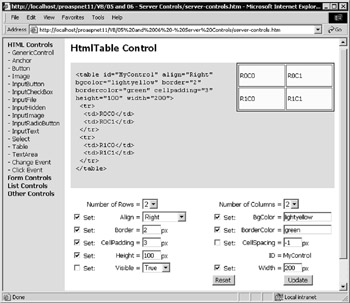
Figure 5-21:
While we have only shown the properties for the HtmlTable control in our demonstration page, we can also use very similar sets of properties for the HtmlTableRow and HtmlTableCell controls. For the HtmlTableRow control, the commonly used properties are Align , BgColor , Border , BorderColor , Height , and VAlign . For the HtmlTableCell control, they are Align , BgColor , Border , BorderColor , ColSpan , Height , NoWrap , RowSpan , VAlign , and Width .
The Code to Create a Table
To create a table dynamically using the HtmlTable , HtmlTableRow , and HtmlTableCell server controls, we first add an HtmlTable control to the page like this:
<table id="MyControl" runat="server" /> Then, we have to create each cell in turn and add it to a row, and then add the row to the table. In our demonstration page, we use the code shown here:
'get values for number of rows and columns from drop-down lists Dim intRows As Integer = selRows.Value Dim intCols As Integer = selCols.Value 'declare the local variables we'll need Dim intRowCount, intColCount As Integer 'declare variables to hold an HtmlTableRow and HtmlTableCell Dim objRow As HtmlTableRow Dim objCell As HtmlTableCell 'loop for the number of rows required For intRowCount = 0 To intRows 1 'create a new row control objRow = New HtmlTableRow() 'loop for the number of columns required For intColCount = 0 To intCols 1 'create a new table cell control and set the content objCell = New HtmlTableCell() objCell.InnerHtml = "R" & intRowCount & "C" & intColCount 'add each cell to the new row objRow.Cells.Add(objCell) Next 'add the new row to the table MyControl.Rows.Add(objRow) Next 'go to the next row
Reacting to the ServerClick and ServerChange Events
Our examples so far have shown how we can change the appearance and behavior of the HTML controls by setting properties. However, we also interact with them by responding to the events that they raise. There are two events we can use, ServerClick and ServerChange . We will look at each one in turn.
Handling the ServerClick Event
The ServerClick event occurs for the HtmlAnchor , HtmlButton , HtmlInputButton , and HtmlInputImage controls. Figure 5-22 shows the latter three of these controls. As you click a button, a message is displayed to indicate that the event occurred:
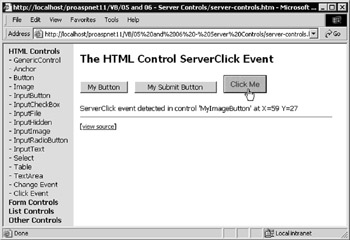
Figure 5-22:
As you can see, for the image button, we can also get extra information “ the x and y coordinates of the mouse pointer on the image. This could be used to create a server-side image map “ code could easily examine the coordinates and take different actions, depending on which area of the image was clicked.
The following listing shows the HTML section of the code used here. It defines a form and the three button controls. Notice that the onserverclick attribute is set to one of two event handlers “ MyCode or MyImageCode :
<form runat="server"> <input id="MyButton" type="button" value="My Button" onserverclick="MyCode" runat="server" /> <input id="MySubmitButton" type="submit" value="My Submit Button" onserverclick="MyCode" runat="server" /> <input id="MyImageButton" type="image" src="ClickmeButton.gif" onserverclick="MyImageCode" runat="server" /> </form>
The page also contains a <div> element where the messages about the events are displayed. Notice that we have disabled viewstate for this control so that the message will not be persisted across postbacks:
<div id="divResult" runat="server" enableviewstate="false" /> Each event handler receives two parameters when the event occurs. The first parameter is a reference to the object that raised the event (one of our button controls) from which we can get the ID of the source of the event.
The second parameter is an Args object that contains more information about the event. In the case of the HtmlInputButton , the second parameter is an EventArgs object, which contains no extra useful information. However, for the HtmlInputImage control, the object is an ImageClickEventArgs object, and this includes the two fields X and Y that contain the coordinates of the mouse pointer when the event was raised. The two event handlers are shown in the code that follows :
<script runat="server"> Sub MyCode(objSender As Object, objArgs As EventArgs) divResult.InnerHtml &= "ServerClick event detected in " _ & "control '" & objSender.ID & "'<br />" End Sub Sub MyImageCode(objSender As Object, _ objArgs As ImageClickEventArgs) divResult.InnerHtml &= "ServerClick event detected in " _ & "control '" & objSender.ID & "' at X=" & objArgs.X __ & " Y=" & objArgs.Y & "<br />" End Sub </script>
The ServerClick event is reasonably intuitive to use “ when a button is clicked, the form is posted back to the server, and the event can be handled in our server-side code. Let's consider the ServerChange event.
Handling the ServerChange Event
The ServerChange event occurs for controls that don't automatically submit the form they are on; for example, HtmlInputText , HtmlInputCheckBox , HtmlInputRadioButton , HtmlInputHidden , HtmlTextArea , and HtmlSelect . So, how (and when) can the server-based code react to the event?
This event is raised when the page is submitted by any other control, and occurs for every control where the value has changed since the page was loaded (sent to the client). Figure 5-23 shows this. It contains three different types of controls that expose the ServerChange event, and a Submit button that simply submits the form to the server:
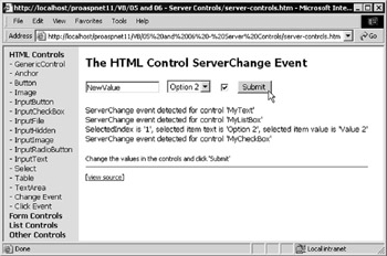
Figure 5-23:
You can see that we detected three ServerChange events, and they occur in the order that the controls appear in the source of the page. You can also see that we are displaying the values from the option that is selected in the HtmlSelect control (the values for the SelectedIndex start at zero).
The following listing shows the declarative page syntax (the HTML source) to create the form and the server controls. The onserverchange attributes point to two event handlers in our page, named MyCode and MyListCode . Notice also that, in this case, the Submit button is not a server control “ we haven't included the runat="server" attribute in the <input type="submit"> element. We don't need to access the control on our server - we just want it to submit the form.:
<form runat="server"> <input id="MyText" type="text" value="OriginalValue" onserverchange="MyCode" runat="server" /> <select id="MyListBox" onserverchange="MyListCode" runat="server"> <option value="Value 1">Option 1</option> <option value="Value 2">Option 2</option> <option value="Value 3">Option 3</option> </select> <input id="MyCheckBox" type="checkbox" onserverchange="MyCode" runat="server" /> <input type="submit" value="Submit" /> </form> <div id="divResult" runat="server" enableviewstate="false" />
The MyCode event handler is similar to that in the ServerClick event example discussed earlier, simply displaying the event name and the ID of the control that raised the event:
<script runat="server"> Sub MyCode(objSender As Object, objArgs As EventArgs) divResult.InnerHtml &= "ServerChange event detected for " _ & "control '" & objSender.ID & "'<br />" End Sub ...
However, the MyListCode event handler needs to extract the selected value from the drop-down list created by the HtmlSelect control. You will see how it does this, in the next section.
Getting the Selected Values from HtmlSelect List Controls
You have seen how the server control that creates listboxes or drop-down lists is made up of an HtmlSelect control that contains child ListItem elements. The ServerClick event handler demonstration page you just saw used code similar to the following code, for creating a list control:
<select id="MyListBox" runat="server" onserverchange="MyListCode"> <option value="Value 1">Option 1</option> <option value="Value 2">Option 2</option> <option value="Value 3">Option 3</option> <option value="Value 4">Option 4</option> <option value="Value 5">Option 5</option> </select>
The simplest way to get the value of the currently selected item is to query the Value property of the list control:
strValue = MyListBox.Value This may not return the expected value. As with the normal HTML <select> list, the Value of the control returns the content of the value attribute for the currently selected item, or the first item (the item with the lowest index) selected if there is more than one item selected. In case of no value attributes in the <option> elements, it returns the content of the first selected <option> element “ in other words, the text displayed in the list.
We have to be more specific to extract both the content of the value attribute and the text content itself. To extract the values from the ListItem objects for each <option> element, we use the Items collection of the parent control (the HtmlSelect control). The SelectedIndex property of the HtmlSelect control returns the index of the first item that is selected in the list. So, we can extract the text and value of that item using:
strText = MyListBox.Items(MyListBox.SelectedIndex).Text strValue = MyListBox.Items(MyListBox.SelectedIndex).Value
Thus, in the MyListCode event handler, we extract the ID of the HtmlSelect control that raised the event (so we can display it in the page), and then extract the text and value of the selected list item. The following listing shows the complete event handler for doing this:
... Sub MyListCode(objSender As Object, objArgs As EventArgs) divResult.InnerHtml &= "ServerChange event detected " _ & "for control '" _ & objSender.ID & "'<br />SelectedIndex is '" _ & objSender.SelectedIndex _ & "', selected item text is '" _ & objSender.Items(objSender.SelectedIndex).Text _ & "', selected item value is '" _ & objSender.Items(objSender.SelectedIndex).Value End Sub </script>
Getting Multiple Selected Values from List Controls
The technique just described is fine if the list control only allows one item to be selected. In terms of the HtmlSelect control, when the Multiple property is False . However, if it is True , users can select more than one item in the list by holding the Shift or Ctrl keys while clicking. In this case, the SelectedIndex and SelectedItem properties only return the first item that is selected (the one with the lowest index).
To detect which items are selected in a multi-selection list (none, one, or more), we query the Selected property of each ListItem object within the list. Probably the easiest way is to use a For Each...Next construct. In the following listing, you can see how the event handler creates a String variable to hold the result, and a variable of ListItem type to hold each item in the list as you iterate through it.
Sub MyListCode(objSender As Object, objArgs As EventArgs) Dim strResult As String strResult = "The following items were selected:<br />" Dim objItem As ListItem For Each objItem in objSender.Items If objItem.Selected Then strResult &= objItem.Text & " = " & objItem.Value _ & "<br />" End If Next divResult.InnerHtml = strResult End Sub
In the For Each...Next loop, we reference each member of the Items collection for the list control in turn. If it is selected, we add the Text and Value properties to the results string. After examining all the items in the list, we can display the results string in a <div> control. Figure 5-24 shows the result:
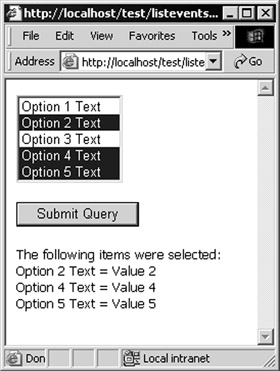
Figure 5-24:
The ASP.NET Validation Controls
One of the most tiresome tasks when building interactive web forms is the requirement for validating values that the user enters into input controls. This is particularly so when you need to perform client- side validation and have to validate the values on the server when the page is submitted. For maximum browser compatibility, you should write the client-side code in JavaScript, which is often error-prone unless you are well versed with this language. It is also often a long-winded and repetitive task.Help is at hand with the range of validation controls included in ASP.NET. They cover almost all the common validation scenarios. There is even a custom validation control that you can use to integrate specific nonstandard validation requirements into the overall process. The available controls are shown in the following table:
| Validation Control | Description |
|---|---|
| <asp:RequiredFieldValidator> | Checks that the validated control contains a value. It cannot be empty. Can be used in conjunction with other validators on a control to trap empty values. |
| <asp:RangeValidator> | Checks that the value in the validated control is within a specified text or numeric range. If the validated control is empty, no validation takes place. |
| <asp:CompareValidator> | Checks that the value in the validated control matches the value in another control or a specific value. The data type and comparison operation can be specified. If the validated control is empty, no validation takes place. |
| <asp:RegularExpressionValidator> | Checks that the value in the validated control matches a specified regular expression. If the validated control is empty, no validation takes place. |
| <asp:CustomValidator> | Performs user-defined validation on an input control using a specified function (client-side, server-side or both). If the validated control is empty, no validation takes place. |
| <asp:ValidationSummary> | Displays a summary of all current validation errors. |
What the Input Validation Controls Do
The principle is that we associate one or more validation controls with each of the input controls we want to validate. When a user submits the page, each validation control checks the value in its associated control to see if it passes the validation test. If any fail the test, the ValidationSummary control will display the error messages defined for these validation controls.
The validation controls also automatically detect the browser or client device type, and generate client- side validation code in the page for Internet Explorer 5 and above (in future versions, they may support other browsers as well).
This client-side code uses Dynamic HTML to display the content of the validation control (the text or characters between the opening and closing tags of the validation control) in the page dynamically, as the user tabs from one control to the next. It also prevents the page from being submitted if any of the validation tests fail. This gives a far more responsive interface, much like traditional handcrafted client- side validation code can do. You can see an example of this in the demonstration application we provide, under the subsection Other Controls in the left-hand pane.
The validation controls also help to protect against malicious use of our pages. Client-side validation is great, but users could create their pages (or edit the page delivered to them) so that client-side validation does not take place. In this case, they could possibly 'spoof' our server by submitting invalid values. However, even if the validation controls are performing client-side validation, they always perform the same checks server-side as well when the page is submitted, so we get the best of both worlds automatically.
We can turn off client-side validation if it's not needed, and can also check the result for each validation control individually when the page is submitted. This allows us to create custom error message Strings for each control and (for example) put them into Label controls on the page, rather than using the ValidationSummary control.
We can also specify that particular submit buttons or controls will not cause validation to occur (as we will see later in this chapter). This allows us to include a Cancel button in a page that allows the user to abandon the page without having to fill in valid values for the controls.
The BaseValidator Class
All of the validation controls inherit from the BaseValidator base class, which is part of the System.Web.UI.WebControls class library namespace. The BaseValidator class exposes a series of properties and methods that are common to all the validation controls.
The most commonly used ones are shown in following table:
| Member | Description |
|---|---|
| ControlToValidate property | Sets or returns the name of the input control containing the value to be validated |
| EnableClientScript property | Sets or returns a Boolean value indicating whether client-side validation is enabled where the client supports this |
| Enabled property | Sets or returns a Boolean value indicating if validation will be carried out |
| ErrorMessage property | Sets or returns the text of the error message that is displayed by the ValidationSummary control when validation fails |
| IsValid property | Returns a Boolean value indicating if the value in the associated input control passed the validation test |
| Validate method | Performs validation on the associated input control and updates the IsValid property |
The Specific Validation Control Members
Each validation control also has properties and methods (and in the case of CustomValidator , an event) that are specific to that control type.
As shown in the following table, most are self-explanatory. However, we will look at all the validation controls in the next section and see how these properties and the single event are used.
| Control | Properties | Events |
|---|---|---|
| RequiredFieldValidator | InitialValue | - none - |
| RangeValidator | MaximumValue , | - none - |
| CompareValidator | ControlToCompare, | - none - |
| RegularExpression | ValidationExpression | - none - |
| CustomValidator | ClientValidationFunction | OnServerValidate |
| ValidationSummary | DisplayMode , | - none - |
Using the Validation Controls
The demonstration application provided includes a page that you can use to experiment with the validation controls ( open the Other Controls section of the left-hand menu). The page contains several textboxes where you have to enter specific values in order for validation to be successful.
If you enter invalid values and then click the Submit button, a summary of all the errors is displayed, as shown in Figure 5-25. Notice also that there is an asterisk next to each control where validation failed.
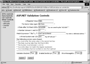
Figure 5-25:
Once you enter valid values for all the controls and click Submit, a message is displayed showing that validation at page-level succeeded, as shown in Figure 5-26:
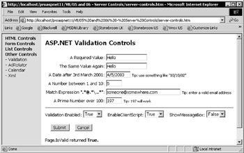
Figure 5-26:
We will now examine each of the validation controls used in this demonstration page, and then move on to look at other issues, such as checking if the complete page is valid during postback, and enabling and disabling client-side and server-side validation.
The RequiredFieldValidator Control
The first textbox requires a value to be entered before validation can succeed. The source code used for this is as follows:
A Required Value: <input type="text" id="txtRequired" size="20" runat="server" /> <asp:RequiredFieldValidator id="valRequired" runat="server" ControlToValidate="txtRequired" ErrorMessage="* You must enter a value in the first textbox" Display="dynamic"> * </asp:RequiredFieldValidator>
We have specified the <input> control named txtRequired as the control to be validated, and an error message that will be displayed by the ValidationSummary control if validation fails when the user attempts to submit the page. An asterisk is used as the content of the control in our example, though any content placed within the element will be displayed in the output (at the point where the validation control is actually located in the page) to indicate to the user that the associated control contains an invalid value. We can change the color of this text from the default of red using the ForeColor attribute if required.
The Display property determines if the text content of the validation control will take up space in the page even when not displayed (that is, whether it will be set to hidden but still inserted into the page, or just omitted from the page when not required). This means that we can control the layout of, for example, a table by setting the attribute Display="static" to prevent the width of the column containing the validation control from changing when the 'error' characters are displayed.
The CompareValidator Control
The second textbox requires the same value as the first one in order to pass the validation test. The code used for this control and its associated validation control is shown in the following listing:
The Same Value Again: <input type="text" id="txtCompare" size="20" runat="server" /> <asp:CompareValidator id="valCompare" runat="server" ControlToValidate="txtCompare" ControlToCompare="txtRequired" Operator="Equal" ErrorMessage="* You must enter same value in the second textbox" Display="dynamic"> * </asp:CompareValidator>
In this case, we set the ControlToCompare property to the name of the first textbox ( txtRequired ). The txtRequired textbox contains the value we want to compare with the value of the textbox we're validating now ( txtCompare ). We also get to specify the type of comparison ( Equal , GreaterThan , LessThanOrEqual , and so forth).
Remember that only the RequiredFieldValidator returns an invalid result when a text control on the page is left empty. This is intentional, and you have to associate a RequiredFieldValidator and any other specific validation controls you require if you don't want the user to be able to submit empty values.
The third textbox in the demonstration page also uses a CompareValidator control, but this time we compare the value in this textbox to a fixed value, and using a comparison based on a date instead of the default String type (as returned by a textbox control):
A Date after 3rd March 2001: <input type="text" id="txtCompareDate" size="10" runat="server" /> <asp:CompareValidator id="valCompareDate" runat="server" ControlToValidate="txtCompareDate" ValueToCompare="3/3/2001" Operator="GreaterThan" Type="Date" ErrorMessage="* The Date must be later than 3rd March 2001" Display="dynamic"> * </asp:CompareValidator>
We specify the fixed value in the ValueToCompare property, an Operator for the comparison, and the Type of comparison. This is simply the data type of the fixed value we are comparing to, and can be one of Currency , Double , Date , Integer , or String .
The RangeValidator Control
The fourth textbox requires a value that is between two specified values. We use the RangeValidator here, and indicate the MaximumValue and MinumumValue in the respective properties. We also specify the Type of comparison to use when validating the content of the associated control:
A Number between 1 and 10: <input type="text" id="txtRange" size="5" runat="server" /> <asp:RangeValidator id="valRange" runat="server" ControlToValidate="txtRange" MaximumValue="10" MinimumValue="1" Type="Integer" ErrorMessage="* The Number must between 1 and 10" Display="dynamic"> * </asp:RangeValidator>
The RegularExpressionValidator Control
To validate complex text values, we can use a RegularExpressionValidator control. The fifth textbox on our demonstration page uses this control to force the entry of a valid e-mail address. An appropriate regular expression is provided for the ValidationExpression property:
Match Expression "<b>.*@.*\..*</b>": <input type="text" id="txtRegExpr" size="40" runat="server" /> <asp:RegularExpressionValidator id="valRegExpr" runat="server" ControlToValidate="txtRegExpr" ValidationExpression=".*@.*\..*" ErrorMessage="* Your entry does not match the regular expression" Display="dynamic"> * </asp:RegularExpressionValidator>
The CustomValidator Control
When the validation to be performed is too complex for any of the standard validation controls, we can use a CustomValidator control. The final textbox in the page, which in fact has two validation controls associated with it, demonstrates this. We use a CompareValidator to ensure that a value greater than 100 has been entered, and a CustomValidator to validate the value itself:
A Prime Number over 100: <input type="text" id="txtCustom" size="5" runat="server" /> <asp:CompareValidator id="valComparePrime" runat="server" ControlToValidate="txtCustom" ValueToCompare="100" Operator="GreaterThan" Type="Integer" ErrorMessage="* The Prime Number must be greater than 100" Display="dynamic"> * </asp:CompareValidator> <asp:CustomValidator id="valCustom" runat="server" ControlToValidate="txtCustom" ClientValidationFunction="ClientValidate" OnServerValidate="ServerValidate" ErrorMessage="* Your knowledge of prime numbers is not optimal" Display="dynamic"> * </asp:CustomValidator>
The CustomValidator control provides two properties named ClientValidationFunction and OnServerValidate , where we specify the names of custom functions created (and included within the page) to validate the value.
Client-Side Validation
The ClientValidationFunction is usually written in JavaScript for maximum compatibility, as it must be included in the page we send to the browser so that the validation can be carried out on the client-side. In the example page, we used the code shown in the following listing:
<script language="JavaScript"> <! // client-side validation function for CustomValidator function ClientValidate(objSource, objArgs) { var blnValid = true; var intNumber = objArgs.Value; if (intNumber % 2 == 1) { var intDivisor = Math.floor(intNumber / 3); if (intDivisor > 2) { for (var i = 3; i <= intDivisor; i = i + 2) { if (intNumber % intDivisor == 0) { blnValid = false; break; } } } else blnValid = false; } else blnValid = false; objArgs.IsValid = blnValid; return; } //--> </script>
Notice how the validation control supplies a reference to itself ( objSource ) and an object containing the arguments for the function call ( objArgs ). We get the value of the associated control from the Value field of objArgs , and set the IsValid field of objArgs to indicate whether the custom validation succeeded or not.
Server-Side Validation
For server-side validation, we use the same logic. However, as our page is written in VB.NET, we have to use VB.NET to create the server-side validation function as well (in the current version of ASP.NET there can only be one language server-side per page). In this case, our function receives as parameters a reference to the validation control and a ServerValidateEventArgs object that contains the value of the associated control as its Value property. The function is shown in the following listing:
Sub ServerValidate(objSource As Object, objArgs As ServerValidateEventArgs) Dim blnValid As Boolean = True Try Dim intNumber As Integer = objArgs.Value 'check that it's an odd number If intNumber Mod 2 = 1 Then 'get the largest possible divisor Dim intDivisor As Integer = intNumber \ 3 If intDivisor > 2 Then Dim intLoop As Integer 'check using each divisor in turn For intLoop = 3 To intDivisor Step 2 If intNumber Mod intDivisor = 0 Then blnValid = False Exit For End If Next Else blnValid = False End If Else blnValid = False End If Catch objError As Exception blnValid =False Finally objArgs.IsValid = blnValid End Try End Sub
The ValidationSummary Control
The list of errors that is shown when the page is submitted with any invalid value is created automatically by a ValidationSummary control within our demonstration page. In our example, the heading we want is specified in the HeaderText property and the ShowSummary property is set to True so that the value of the ErrorMessage property of each of the other validation controls that fail to validate their associated textbox is displayed:
<asp:ValidationSummary id="valSummary" runat="server" HeaderText="<b>The following errors were found:</b>" ShowSummary="True" DisplayMode="List" />
The DisplayMode allows us to choose the type of output for the error messages. The options are List , BulletList , and SingleParagraph , and we can also use the ForeColor property to set the color for the messages. Another useful property is ShowMessageBox . Setting it to True causes the validation error messages to be displayed in an Alert dialog on the client instead of the page, as shown in Figure 5-27. You can try this in the demonstration page by setting the ShowMessageBox drop-down list to True .
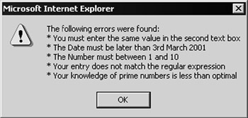
Figure 5-27:
Checking If a Page Is Valid
The demonstration page contains two buttons marked Submit and Cancel. Both are HTML <input type="submit"> buttons that submit the page to the server for processing. The Submit button calls the ConfirmEntry server-side routine, which would be used in an application to carry out the process for which you collected the values from the user:
<input type="submit" id="cmdConfirm" value="Submit" onserverclick="ConfirmEntry" runat="server" />
Each validation control, and the Page object itself, exposes an IsValid property. Our demonstration page displays the value of the Page.IsValid property when you click the Submit button. Bear in mind that, unless you first disable client-side validation by making use of the EnableClientScript drop- down list, you won't be able to submit an invalid page using this button:
Sub ConfirmEntry(objSender As Object, objArgs As EventArgs) outMessage.InnerHtml = "Page.IsValid returned <b>" _ & Page.IsValid & ".</b>" End Sub
If you want to only determine the state of an individual validation control (perhaps to check which ones contain invalid values), you can query the control's IsValid property. For example, to get the value for the validation control with the id of valRegExpr , you could use:
blnValidated = valRegExpr.IsValid Canceling Validation of a Page
The Cancel button (for abandoning data entry and closing the page) calls the CancelEntry server-side routine. This button also has to submit the page to the server, but if client-side validation is in use (the default on most script-enabled browsers), the user can't submit the page while it contains invalid values. In other words, a traditional <input type="submit"> button that you might use as a Cancel button to abandon the page will still cause validation to occur, and will prevent the page from being submitted.
The solution is to set the CausesValidation property for this button to False . All button-type controls ( HtmlButton , HtmlInputButton , HtmlInputImage , and the equivalents in the ASP Web Form controls that we'll look at in the next chapter) have this property. The default value is True , which means that they will cause validation unless we turn it off .
So, our Cancel button looks like this:
<input type="submit" id="cmdCancel" value="Cancel" runat="server" CausesValidation="False" onserverclick="CancelEntry" />
The CancelEntry event handler that is executed when the button is clicked simply displays a message indicating that validation was not carried out.
The Enabled and EnableClientScript Properties
You can also disable client-side, server-side, or both types of validation in your server-side code by changing the value of the Enabled and EnableClientScript properties of the appropriate validation control(s). This allows you, for example, to force the browser to use only server-side validation even if it supports dynamic client-side validation. The following code -listing, taken from the demonstration page, shows how you can iterate through the collection of validation controls and set these properties:
Sub Page_Load() Dim objValidator As BaseValidator For Each objValidator In Page.Validators objValidator.Enabled = lstEnabled.SelectedItem.Text objValidator.EnableClientScript = lstClientScript.SelectedItem.Text Next End Sub
In our example, this code is executed each time the page loads, and the property settings are controlled by two drop-down lists near the bottom of the page, labeled Validation Enabled and Enable Client Script.
EAN: 2147483647
Pages: 243