Editor Zones
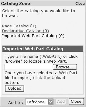
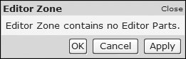
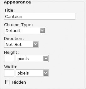
| The Editor zone allows properties and behavior of WebParts to be modified by the user, and is displayed when the DisplayMode of the WebPartManager is set to WebPartManager.EditDisplayMode. The Editor zone displays one or more Editor parts, each of which has a specific function; without any parts (see Figure 13.9), the Editor zone has no function (see Figure 13.10). Figure 13.9. The Imported WebPart Catalog Figure 13.10. The Editor Zone (without editor parts) There are four Editor parts that can be used in any order that may or may not appear depending upon the capabilities of the WebPart being edited. Changes applied to settings in the Editor zone will be saved with the personalization and thus will persist across sessions. The act of personalization can change the styling of the WebPart being personalized. For example, the SelectedPartChromeStyle is applied when a part is being edited: <SelectedPartChromeStyle BorderColor="#A7B756" BorderStyle="Dotted" BorderWidth="5px" /> This would place a dotted border around the WebPart being edited, making it clear which WebPart is selected. AppearanceEditorPartThe Appearance Editor Part (see Figure 13.11) allows modification of the appearance of the WebPart, including the following:
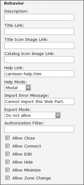
Figure 13.11. The Appearance Editor Part BehaviorEditorPartThe Behavior Editor Part (see Figure 13.12) allows modification of how the WebPart behaves, including the following:
Figure 13.12. The Behavior Editor Part Authorization FilterThe Authorization Filter property can be used to store any authorization information about the WebPart. For example, if you want to authorize WebParts based on roles, you can store a comma-separated list of role names. However, WebParts don't automatically take notice of the authorization, so you have to implement your own logic to determine whether a WebPart is authorized. The simplest way to do this is to use the AuthorizeWebPart event of the WebPartManager. For example, consider Listing 13.12, which the WebPartManager will call for each WebPart to ensure it is authorized for use on the page. Listing 13.12. Authorizing WebParts
This code checks the type of the WebPart, and sets the IsAuthorized property to indicate whether the WebPart is authorized for use. You could combine this with user and/or role authentication, as shown in Listing 13.13, where the MSNWeatherWebPart is only shown if the user is in the Admin role. Listing 13.13. Combining WebPart Authorization with Roles
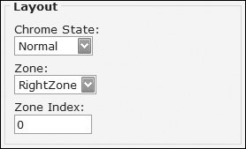
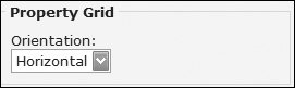
Since this logic is applicable to the WebPartManager, you have two options if you want it across multiple pages. The first is to use Master Pages and place the WebPartManager and associated code in the Master Page. The second is to derive a class from WebPartManager and place the common authorization code in the derived class. For the page catalog, the DeclarativeCatalogPart explicitly checks to see if each WebPart is authorized, and if not, the WebPart is not shown in the catalog. Because the PageCatalog only shows WebParts that have been included on the page, no unauthorized WebParts will be shown. LayoutEditorPartThe Layout Editor Part (see Figure 13.13) defines which zone a WebPart appears in and whether the state of the part is normal or minimized. The Zone Index identifies the order of the WebPart within the zone, with 0 being the first WebPart. PropertyGridEditorPartThe Property Grid Editor Part shows custom properties of WebParts and is used for exposing custom properties to users. For example, consider a weather WebPart that shows a forecast for a few days and displays this as a series of images in a table. You can offer the user a choice of whether the images are horizontally or vertically aligned. Within the WebPart, this would be defined as a public property, perhaps as an enumeration. Consider Listing 13.14, where the property is called Orientation, using the WeatherOrientation for the allowable options. To ensure this is exposed to the property grid, the Personalizable and WebBrowseable attributes are used. Figure 13.13. The Layout Editor Part Listing 13.14. Exposing Custom Properties in WebParts
When this WebPart is edited, the property grid (see Figure 13.14) shows custom properties, as a text box for scalar types, or as a list for enumerations. Changing the orientation changes how the WebPart displays its weather images, giving the user a chance to interact with the WebPart itself. Figure 13.14. Property Grid for the YahooWeatherWebPart |
EAN: 2147483647
Pages: 147