| In the previous chapter you saw how easy it was to configure a grid to use a data source control to not only display the data, but to also provide editing. These topics are worthy of discussion in more detail, and the following common scenarios will be covered: How to bind controls to sources of data Which controls to use to display data How to allow custom editing of the data How to customize the display controls
The methods of handling these questions are similar for many of the controls, so you'll find it easy to switch between them. Data Binding to Data Source Controls Along with the declarative style of setting the SqlDataSource control, the new grid and edit controls provide a DataSourceID property, which can be set to the ID of the data source. This automatically links the two controls, so that when the page is loaded, the data is fetched and displayed automatically. For example: <asp:SqlDataSource runat="server" ... </asp:SqlDataSource> <asp:GridView runat="server" DataKeyNames="ProductID" DataSource></asp:GridView>
The DataKeyNames property identifies the unique key of the underlying data; it isn't required for displaying data, but it is required when you use the grid for updating data. The GridView will automatically display all columns supplied to it, but by default provides a read-only view. To enable modification, you can use the properties on the GridView Tasks pane, as shown in Figure 3.8. Figure 3.8. GridView Tasks pane 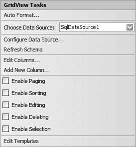
Enabling editing and deleting adds a custom column to the grid. <asp:GridView runat="server" DataKeyNames="ProductID" DataSource> <Columns> <asp:CommandField ShowDeleteButton="True" ShowEditButton="True" /> </Columns> </asp:GridView>
The common task doesn't have an option to enable new rows, and although there is a ShowInsertButton property, the grid itself doesn't support the notion of a new row; you don't get a blank row into which you can add your new data. There are ways to overcome this with the grid if required, but a far better solution is to use a DetailsView or FormView control, which is where the ShowInsertButton is primarily used. The DetailsView and FormView controls are covered later in the chapter. Setting the ShowDeleteButton and ShowEditButton to true automatically gives edit and delete functionality, as shown in Figure 3.9. When the Edit button is selected, the row automatically switches to edit mode, with text boxes for editing the columns. Clicking Update automatically sends the changes back to the data source, which in turn sends them back to the SQL table. Figure 3.9. A GridView in edit mode 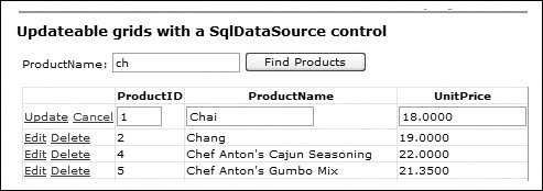
No code is required to enable editing and deleting within a grid. When the Update link is clicked, the column values are passed into the parameters of the SqlDataSource and the UpdateCommand is executed. If the Cancel link is clicked, the current values are ignored and the Update-Command is not run. Customizing the GridView Control The look shown in Figure 3.9 is the default look and behavior for a GridView control, but you can achieve complete flexibility by customizing the control. Adding a Custom Pager Screen real estate is always a problem, especially when displaying tables of data. This is solved by paging the data, so that a limited number of rows are shown at once. Paging is easily achieved by setting the AllowPaging property to true, and optionally the PageSize property to the number of rows to show (this defaults to 10). Adding paging will, by default, place an additional row at the bottom of the grid with the page numbers, as shown in Figure 3.10. Figure 3.10. The default pager 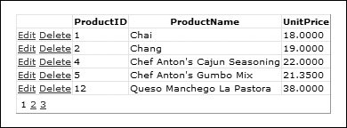
The pager can be customized in two ways. The first is to use the PagerSettings element, the general declaration of which is shown in Listing 3.5. Listing 3.5. The PagerSettings Element <PagerSettings FirstPageImageUrl="String" FirstPageText="String" LastPageImageUrl="String" LastPageText="String" Mode="NextPrevious|NextPreviousFirstLast|Numeric|NumericFirstLast" NextPageImageUrl="String" NextPageText="String" PageButtonCount="Integer" Position="Bottom|Top|TopAndBottom" PreviousPageImageUrl="String" PreviousPageText="String" />
|
The PageButtonCount property defines how many page numbers are shown, and if set to a value lower than the actual number of pages, ellipses are shown to indicate there are more pages. The pager can be set to show text instead of page numbers by using the Mode property, and when done that way, the PageText properties define the text to show. These default to <<, <, >, and >>, but you can set them to any text you like, as shown in Listing 3.6. Listing 3.6. Setting the Pager Text Links <PageSettings Mode="NextPreviousFirstLast" FirstPageText="First" LastPageText="Last" NextPageText="Next" PreviousPageText="Previous" />
|
As an alternative, you can set the ImageUrl properties, which will display image links instead of text links. You can perform further customization by templating the pager, by using the PagerTemplate subelement. Within the PagerTemplate, you can add any content, including server controls. For example, instead of page numbers of Next/Previous buttons, you could place a DropDownList containing the pages. Defining Columns If you don't want to accept the automatic generation of columns, you can set the AutoGenerateColumns property to False and use the Columns subelement to define your own. The advantage of this is that you can define how the columns appear in both display and edit modes, as opposed to the default types used by the grid. In default mode, labels are used for displaying data, and a TextBox is used in edit mode for strings, and a CheckBox for bit columns. Instead of using this default, you can use the following controls: BoundField, which acts like a default column, displaying text in display mode, and a TextBox in edit mode ButtonField, which displays a button in each row. The button can be a standard Button, a LinkButton, or an ImageButton CheckBoxField, which displays bit data as a CheckBox CommandField, which can display a text link, buttons, or image buttons to use for issuing commands on the grid. The commands can be standard ones to switch between display and edit mode, in which case the standard set of commands are displayed (Select, Edit, Delete, Insert, and Cancel), or custom commands to perform custom actions in the button event handler HyperLinkField, which displays a HyperLink control ImageField, which displays an Image control TemplateField, which provides a custom area for content
There are different types of templates for different states, and these are covered in more detail in the Template Columns section. The BoundField Control The BoundField control displays as text in display mode, and as a TextBox in edit mode. The field to display is set with the DataField property, while the DataFormatString property can be used to format the value. For example, displaying a currency value can be done by setting DataFormatString to {0:C}. Listing 3.7 shows the outline syntax for the BoundField control. Listing 3.7. Syntax of the BoundField Control <asp:BoundField DataField="String" DataFormatString="String" ApplyFormatInEditMode="[True|False]" ConvertEmptyStringToNull="[True|False]" NullDisplayText="String" HtmlEncode="[True|False]" ReadOnly="[True|False]" Visible="[True|False]" InsertVisible="[True|False]" SortExpression="String" ShowHeader="[True|False]" HeaderText="String" AccessibleHeaderText="String" ControlStyle-[PropertyName]="[value]" HeaderStyle-[PropertyName]="[value]" HeaderImageUrl="String" ItemStyle-[PropertyName]="[value]" FooterText="String" FooterStyle-[PropertyName]="[value]" />
|
A description of these properties can be seen in Table 3.4. Table 3.4. Properties of the BoundField ControlProperty/Attribute | Description |
|---|
DataField | Sets or returns a String that is the name of the column in the source rows that will provide the data to display in this column of the grid. | DataFormatString | Sets or returns a String that contains the formatting details for the value displayed in this column. | ApplyFormatInEditMode | Sets or returns a Boolean value that indicates whether the formatting applied by the DataFormatString property when in "normal" mode will also be applied in "edit" mode; for example, displaying a currency symbol and trailing zeros in the text box in edit mode rather than just the numeric value. | ConvertEmpty StringToNull | Sets or returns a Boolean value that indicates whether an empty string in this column should be treated as null. This is useful when editing the data if the data source expects null values to be used when no value is present. | NullDisplayText | Sets or returns a String that is the text to display in the grid for rows that have a null value in this column. | HtmlEncode | Sets or returns a Boolean value that indicates whether are the values in this column will be HTML-encoded before they inserted into the output generated by the GridView control. | ReadOnly | Sets or returns a Boolean value that indicates whether the values in this column can be edited. If True, the column will not display a text box in edit mode. | Visible | Sets or returns a Boolean value that indicates whether this column is visible within the output generated by the grid control. | Insert Visible | Sets or returns a Boolean value that indicates whether this column is visible when the grid is in insert mode. | SortExpression | Sets or returns a String that defines the sort expression for this column, as a comma-delimited list of column names. | ShowHeader | Sets or returns a Boolean value that indicates whether the header for this column will be displayed. | HeaderText | Sets or returns a String that is the text to display in the header row for this column. | Accessible HeaderText | Sets or returns a String that sets the value of the HTML abbr attribute of the <th> elements that display the column headings when this column is rendered. Non-visual page reader applications and specialist user agents use the abbr attribute to assist in determining the layout of a table. | ControlStyle | Returns a reference to a Style instance that describes the style and formatting of any server controls displayed in the row. | HeaderStyle | Returns a reference to a TableItemStyle instance that describes the style and formatting of the header for this column. | HeaderImageUrl | Sets or returns a String that is the relative or absolute URL of an image to display in the header row for this column. | ItemStyle | Returns a reference to a TableItemStyle instance that describes the style and formatting of the values in the data-bound rows in this column. | FooterText | Sets or returns a String that is the text to display in the footer row for this column. | FooterStyle | Returns a reference to a TableItemStyle instance that describes the style and formatting of the footer for this column. |
The ButtonField Control The ButtonField control is for when you need a button or link in the column to cause a page postback, perhaps to indicate that more details for the row are to be shown, or to perform an action on the row, such as editing. A ButtonField control can be a standard button, a link button, or an image button. Listing 3.8 shows the outline syntax of the ButtonField control. Listing 3.8. Syntax of the ButtonField Control <asp:ButtonField ButtonType="[Button|Image|Link]" CommandName="String" DataTextField="String" DataTextFormatString="String" CausesValidation="[True|False]" ValidationGroup="String" Text="String" ImageUrl="String" ApplyFormatInEditMode="[True|False]" HtmlEncode="[True|False]" Visible="[True|False]" InsertVisible="[True|False]" SortExpression="String" ShowHeader="[True|False]" HeaderText="String" AccessibleHeaderText="String" ControlStyle-[PropertyName]="[value]" HeaderStyle-[PropertyName]="[value]" HeaderImageUrl="String" ItemStyle-[PropertyName]="[value]" FooterText="String" FooterStyle-[PropertyName]="[value]" />
|
The properties in bold are specific to the ButtonField control and are described in Table 3.5, while the others are the same as for the BoundField control. Table 3.5. Properties of the ButtonField ControlProperty/Attribute | Description |
|---|
ButtonType | Sets or returns a value from the ButtonType enumeration (Button, Image, or Link) that specifies the type of control to create in each row for this column. The default is Link. | CommandName | Sets or returns a String value that is the CommandName property of the button in each row of the output. | DataTextField | Sets or returns a String that indicates the name of the column within the source data that will supply the value for the Text property of the control (the caption of a button or the text of a link). | DataTextFormatString | Sets or returns a String that contains the formatting information for the value in the row. Uses the same syntax as the DataFormatString property described for the BoundField control, using {0} as a placeholder. | CausesValidation | Sets or returns a Boolean value that indicates whether the button will cause any validation controls in the page to validate their values and report any errors. The default is true. | ValidationGroup | Sets or returns a String that is the name of the group of validation controls that this button will be a member of. See Chapter 9 for more details about validation groups. | Text | Sets or returns a String that will be used in place of DataTextField, in other words, the static value for the caption or text of the link that is the same for every row. | ImageUrl | Sets or returns a String that is the relative or absolute URL of the image to display when the ButtonType property is set to Image. |
The CheckBoxField Control The CheckBoxField control is used to display a checkbox, which reflects the Boolean value from the underlying data, such as a bit column from SQL Server. Listing 3.9 shows the outline syntax for the CheckBoxField control. Listing 3.9. Syntax of the CheckBoxField Control <asp:CheckBoxField DataField="String" DataFormatString="String" NullDisplayText="String" ReadOnly="[True|False]" Text="String" ApplyFormatInEditMode="[True|False]" HtmlEncode="[True|False]" InsertVisible="[True|False]" Visible="[True|False]" SortExpression="String" ShowHeader="[True|False]" AccessibleHeaderText="String" HeaderText="String" ControlStyle-[PropertyName]="[value]" HeaderStyle-[PropertyName]="[value]" HeaderImageUrl="String" ItemStyle-[PropertyName]="[value]" FooterText="String" FooterStyle-[PropertyName]="[value]" />
|
The property in bold is specific to the CheckBoxField control and is described in Table 3.6, while the others are the same as those for the BoundField control. Table 3.6. Properties of the CheckBoxField ControlProperty/Attribute | Description |
|---|
Text | Sets or returns a String that will be used as the Text property of the CheckBox control. |
The HyperLinkField Control The HyperLinkField control is used to display a clickable link in each row using a standard HTML <a> element. The text and link reference can be set as static text or bound to columns from the underlying data. Listing 3.10 shows the outline syntax for the HyperLinkField control. Listing 3.10. Syntax of the HyperLinkField Control <asp:HyperLinkField DataTextField="String" DataTextFormatString="String" Text="String" DataNavigateUrlFields="String[,String]" DataNavigateUrlFormatString="String" NavigateUrl="String" Target="String" ApplyFormatInEditMode="[True|False]" HtmlEncode="[True|False]" Visible="[True|False]" SortExpression="String" ShowHeader="[True|False]" HeaderText="String" AccessibleHeaderText="String" ControlStyle-[PropertyName]="[value]" HeaderStyle-[PropertyName]="[value]" HeaderImageUrl="String" ItemStyle-[PropertyName]="[value]" FooterText="String" FooterStyle-[PropertyName]="[value]" />
|
The properties in bold are specific to the HyperLinkField control and are described in Table 3.7 while the others are the same as for the BoundField control. Table 3.7. Properties of the HyperLinkField controlProperty/Attribute | Description |
|---|
DataTextField | Sets or returns a String that indicates the name of the column within the source data that will supply the value for the Text property of the control (the visible text of the link). | DataTextFormatString | Sets or returns a String that contains the formatting information for the bound value that is applied to the Text property of the link. | Text | Sets or returns a String that will be used in place of DataTextField, in other words, the static value for the text of the link that is the same for every row. | DataNavigateUrlFields | Sets or returns a String Array that specifies the names of the columns within the source data that will supply values for the NavigateUrl property of the control (the href attribute of the resulting <a> element). Use a comma-delimited list of column names when declaring the control. This means that you can use values from different columns for hyperlinks. See the next section, Using the DataNavigateUrlFields Property. | DataNavigateUrlFormatString | Sets or returns a String that contains the formatting information for the bound values that will be applied to the NavigateUrl property. | NavigateUrl | Sets or returns a String that will be used in place of DataNavigateUrlFields, in other words, the static value for the href of the links that is the same for every row. | Target | Sets or returns a String that is the name of the target window for the link and will be used as the target attribute of the resulting <a> element. |
Using the DataNavigateUrlFields Property You can specify more than one column for the DataNavigateUrlFields property or attribute of a grid-type control. When the GridView binds a HyperlinkField to its source data, all the columns declared for the DataNavigateUrlFields property can be used within the DataTextFormatString property to provide more than one HRef value for the hyperlinks. For example, you can declare a HyperlinkField like this: <asp:HyperLinkField DataTextField="ProductName" DataNavigateUrlFields="ProductID,ProductName" DataNavigateUrlFormatString= "http://www.mysite.com/products?product={0}" />
In this case, for a row containing the product named Chang with ProductID value 2, the href value will appear as: http://www.mysite.com/products?product=2
However, you can also declare the DataNavigateUrlFormatString as: DataNavigateUrlFormatString= "http://www.mysite.com/products?product={1}" />
In this case, the href value for the same row will appear as: http://www.mysite.com/products?product=Chang
The same effect can be obtained, of course, by changing the value of the DataNavigateUrlFormatString property at runtime in the Item-DataBound event, just as you would with one of the v1.x grid or list controls. However, the most useful feature of all, and one that was much requested by users, is that the DataNavigateUrlFormatString can now contain more than one placeholder, for example: DataNavigateUrlFormatString= "http://www.mysite.com/products?product={0}&&name={1}" />
The href value for the same row will now appear as: http://www.mysite.com/products?product=2&name=Chang
This gives you the opportunity to easily create HRef values that contain multiple query string parameters. Just remember to use the HTML-encoded ampersand (&) to concatenate them together, as shown. The ImageField Control The ImageField control is used to display images, using the underlying data to provide the URL for the image. Listing 3.11 shows the outline syntax for the ImageField control. The properties in bold are specific to the ImageField control and are described in Table 3.8, while the others are the same as those for the BoundField control. Table 3.8. Properties of the ImageField ControlProperty/Attribute | Description |
|---|
DataImageUrlField | Sets or returns a String that indicates the name of the column within the source data that will supply the value for the ImageUrl property of the image control. | DataImageUrl FormatString | Sets or returns a String that contains the formatting information for the bound value that is applied to the Url property of the image. | DataAlternate TextField | Sets or returns a String that indicates the name of the column within the source data that will supply the value for the AlternateText property of the image control. | DataAlternateTextFormatString | Sets or returns a String that contains the formatting information for the bound value that is applied to the AlternateText property of the image. | AlternateText | Sets or returns a String that contains the alternate text displayed for the image. | NullImageUrl | Sets or returns a String that contains the URL of the image to display if the data in the DataImageUrlField contains a null value. |
Listing 3.11. Syntax of the ImageField Control <asp:ImageField DataImageUrlField="[String]" DataImageUrlFormatString="[String]" DataImageTextField="[String]" DataImageTextFormatString="[String]" AlternateText="[String]" NullImageUrl="[String]" ApplyFormatInEditMode="[True|False]" HtmlEncode="[True|False]" Visible="[True|False]" SortExpression="String" ShowHeader="[True|False]" HeaderText="String" AccessibleHeaderText="String" HeaderStyle-[PropertyName]="[value]" HeaderImageUrl="String" ItemStyle-[PropertyName]="[value]" FooterText="String" FooterStyle-[PropertyName]="[value]" />
|
Command Columns Earlier in the chapter, you saw that a column can be added that can issue commands to the grid. These commands can take the form of selecting rows, deleting rows, switching between display and edit mode, or a custom command. To add these commands to a grid, you use a CommandField control, the outline syntax of which is shown in Listing 3.12. Listing 3.12. Syntax of the CommandField Control <asp:CommandField ButtonType="[Button|Image|Link]" UpdateText="String" UpdateImageUrl="String" ShowCancelButton="[True|False]" CancelText="String" CancelImageUrl="String" ShowSelectButton="[True|False]" SelectText="String" SelectImageUrl="String" ShowEditButton="[True|False]" EditText="String" EditImageUrl="String" ShowInsertButton="[True|False]" InsertText="String" InsertImageUrl="String" NewText="String" NewImageUrl="String" ShowDeleteButton="[True|False]" DeleteText="String" DeleteImageUrl="String" CausesValidation="[True|False]" ValidationGroup="String" Visible="[True|False]" SortExpression="String" ShowHeader="[True|False]" HeaderText="String" AccessibleHeaderText="String" ControlStyle-[PropertyName]="[value]" HeaderStyle-[PropertyName]="[value]" HeaderImageUrl="String" ItemStyle-[PropertyName]="[value]" FooterText="String" FooterStyle-[PropertyName]="[value]" />
|
The properties in bold are specific to the CommandField control and are described in Table 3.9, while the others are the same as those for the BoundField control. Table 3.9. Properties of the CommandField ControlProperty/Attribute | Description |
|---|
ButtonType | Sets or returns a value from the ButtonType enumeration (Button, Image, or Link) that specifies the type of controls to create in each row of this column. The default is Link. | UpdateText | Sets or returns a String value that is the caption for the button that causes an update process to occur. The default is Update. | UpdateImageUrl | Sets or returns a String that is the relative or absolute URL of the image to display in place of a text Update link. | ShowCancelButton | Sets or returns a Boolean value that indicates whether a Cancel button will be displayed in this column when the row is in edit mode. | CancelText | Sets or returns a String value that is the caption for the button that cancels an update process. The default is Cancel. | CancelImageUrl | Sets or returns a String that is the relative or absolute URL of the image to display in place of a text Cancel link. | ShowSelectButton | Sets or returns a Boolean value that indicates whether a Select button will be displayed in this column. | SelectText | Sets or returns a String value that is the caption for the button that causes the row to be shown in selected mode. The default is Select. | SelectImageUrl | Sets or returns a String that is the relative or absolute URL of the image to display in place of a text Select link. | ShowEditButton | Sets or returns a value that indicates whether an Edit button will be displayed in this column. | EditText | Sets or returns a String value that is the caption for the button that causes the row to be shown in edit mode. The default is Edit. | EditImageUrl | Sets or returns a String that is the relative or absolute URL of the image to display in place of a text Edit link. | ShowInsertButton | Sets or returns a Boolean value that indicates whether an Insert button will be displayed in this column. Inserting only has an effect in the DetailsView and FormView controls, and is not supported in the GridView control. | InsertText | Sets or returns a String value that is the caption for the button that causes the row to be shown in insert mode. The default is Insert. | InsertImageUrl | Sets or returns a String that is the relative or absolute URL of the image to display in place of a text Insert link. | NewText | Sets or returns a String value that is the caption for the button that causes the row to be shown in New mode. The default is New. | NewImageUrl | Sets or returns a String that is the relative or absolute URL of the image to display in place of a text New link. | ShowDeleteButton | Sets or returns a Boolean value that indicates whether a Delete button will be displayed in this column. | DeleteText | Sets or returns a String value that is the caption for the button that deletes a row. The default is Delete. | DeleteImageUrl | Sets or returns a String that is the relative or absolute URL of the image to display in place of a text Delete link. | CausesValidation | Sets or returns a Boolean value that indicates whether the button will cause any validation controls in the page to validate their values and report any errors. The default is TRue. | ValidationGroup | Sets or returns a String that is the name of the group of validation controls that this button will be a member of. See Chapter 9 for more details about validation groups. |
You can use a CommandField control to provide automatic management of data editing. For example, setting the ShowEditButton property to true will display an Edit link in the column. Clicking this link will switch the row into edit mode, which automatically shows Update and Cancel links. The former will update the underlying data with your changes, while the latter will cancel your changes. Both return the row to display mode. The ShowDeleteButton property will show a Delete link, which deletes the underlying row with no user confirmation. Confirmation and events will be covered in the Using Events section later in the chapter. Template Columns If the column types presented here do not give enough control over the layout of your data, you can use templated columns, which work in much the same way as templates work on controls such as the DataList or DataGrid. You specify the output in one or more templates, and the control selects the appropriate template depending upon the status of the grid. Listing 3.13 shows the outline syntax for a TemplateField control. Listing 3.13. Syntax of the TemplateField Control <asp:TemplateField ApplyFormatInEditMode="[True|False]" HtmlEncode="[True|False]" Visible="[True|False]" SortExpression="String" ShowHeader="[True|False]" HeaderText="String" AccessibleHeaderText="String" HeaderStyle-[PropertyName]="[value]" HeaderImageUrl="String" ItemStyle-[PropertyName]="[value]" FooterText="String" FooterStyle-[PropertyName]="[value]" > <HeaderTemplate>...</HeaderTemplate> <ItemTemplate>...</ItemTemplate> <AlternatingItemTemplate>...</ AlternatingItemTemplate> <EditItemTemplate>...</EditItemTemplate> <FooterTemplate>...</FooterTemplate> <asp:TemplateField>
|
All the attributes of the control are the same as those listed for the BoundField control in Table 3.4. The five kinds of templates that you can specify, highlighted in Listing 3.13, are documented in Table 3.10. Table 3.10. Templates of the TemplateField ControlTemplate | Description |
|---|
HeaderTemplate | The markup, text, controls, and other content required to generate the entire content for the header of this column of the grid. | ItemTemplate | The markup, text, controls, and other content required to generate the entire content for this column in data-bound rows within the grid. | AlternatingItemTemplate | The markup, text, controls, and other content required to generate the entire content for this column in alternating data-bound rows within the grid. | EditItemTemplate | The markup, text, controls, and other content required to generate the entire content for this column in the row within the grid that is in edit mode. | FooterTemplate | The markup, text, controls, and other content required to generate the entire content for the footer of this column of the grid. |
When using template columns, you have to provide the binding directly, and for this you would use the Eval or Bind methods. The difference between these methods is that Eval provides read-only binding, while Bind provides read-write binding, and you'd generally use these in different templates. For example, consider Listing 3.14, where an ItemTemplate is used to display the price of a product, and the EditItemTemplate shows a TextBox, but also has a RequiredFieldValidator to ensure that a value is entered for the price. Listing 3.14. Two-Way Binding in a Template <asp:TemplateField HeaderText="Price" SortExpression="UnitPrice" ItemStyle-Font-Bold="True"> <ItemTemplate> <asp:Label runat="server" Text='<%# Eval("UnitPrice", "${0:F2}") %>' /> </ItemTemplate> <EditItemTemplate> <asp:TextBox runat="server" Text='<%#Bind("UnitPrice")%>' /> <asp:RequiredFieldValidator runat="server" ControlToValidate="UnitPrice" Text="You must enter the price" /> </EditItemTemplate> </asp:TemplateField>
|
This technique is very useful when you want to use the data update features of the data source and grid controls, but also need custom content such as validation or drop-down lists when the user is editing data. The use of Eval is a shortcut to the old syntax of DataBinder.Eval. Bind is new in version 2.0.
Styling Columns You can style columns in a number of ways, either using properties on the columns themselves, or by setting general column properties in the grid, which can be done in two ways. The first way is to set the properties on the GridView declaration, like this: <asp:GridView runat="server" DataSource RowStyle-BackColor="Aqua" HeaderStyle-Font-Bold="True"
Alternatively, you can set the styling as separate elements, like this: <asp:GridView runat="server" DataSource> <HeaderStyle Font-Bold="true" Font-Names="Verdana" /> <RowStyle Font-Names="Verdana" /> </asp:GridView>
There is no practical difference between the two methods, although the latter style is easier to read and keeps the styling separate from the rest of the grid declaration. Styles can also be set on columns, like this: <asp:HyperLinkField DataTextField="ProductName" ItemStyle-Font-Bold="True" ItemStyle-BackColor="Yellow" />
As well as using the individual style elements, you can use CSS to style elements by using the CssClass property. <asp:HyperLinkField DataTextField="ProductName" Css />
The following eight style elements are available: AlternatingRowStyle, for alternating rows (RowStyle handles the others) EditRowStyle, for rows in edit mode EmptyDataRowStyle, for the row shown when there is no data to display FooterStyle, for the footer row HeaderStyle, for the header row PagerStyle, for the page row RowStyle, for all rows, unless AlternatingRowStyle is also set SelectedRowStyle, for rows selected by a select command
Styles used on individual columns override any styles set at the grid level. Custom GridView Commands You are not limited to using a CommandField to issue commands, because any button control (anything that causes a postback) can be set to emulate the standard commands. Each submit-style button has two properties, CommandName and CommandArgument, which can be set to a specific command. When an appropriately set button is clicked within the context of a grid row, the command is executed. For example, consider the following: <asp:LinkButton runat="server" CommandName="Edit" Text="Edit" />
If this is placed in a column, then clicking the link will execute the Edit command, switching the row into edit mode, exactly as it would be done through a standard edit Command button. You can set the CommandName property to any of the following: Insert, Cancel, Delete, New, or Select. Putting it All TogetherA Customized GridView Control There is no limit to the way you can combine columns, and you can even leave the auto-generation of columns on and define columns within the <Columns> section. In this case, any columns you explicitly define are placed at the start of the grid, while automatic columns are placed afterwards. It's generally better to explicitly name the columns, because you then have control over how they appear. Figure 3.11 shows a grid with a variety of column types and formats. Figure 3.11. A GridView with a mixture of column types 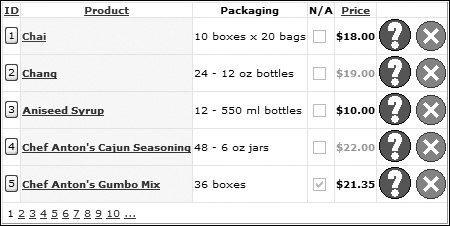
Definition of this grid is as shown in Listing 3.15. Auto-generation of columns is disabled, and sorting and paging are enabled, with a style set for the header and each row. Although not the best looking grid, you can see that the column types and styling give you a great deal of flexibility in the look and feel of grids. You can see that although editing is possible, when you come to edit more than one or two columns, the GridView could have limitations. For example, adding validation is possible, but validation errors might not fit within the grid cells. Or what if you have a column that accepts a large amount of texta product description perhapswhere a cell within a grid would provide a restrictive way of both viewing and editing the data? A better editing solution, or for display of single rows of data, is to use either a DetailsView or FormView control. Listing 3.15. The GridView Definition <asp:GridView runat="server" DataSource DataKeyNames="ProductID" AutoGenerateColumns="False" AllowSorting="True" AllowPaging="True" PageSize="5"> <HeaderStyle Font-Bold="True" Font-Names="Verdana" /> <RowStyle Font-Names="Verdana" /> <Columns> <asp:ButtonField ButtonType="Button" DataTextField="ProductID" SortExpression="ProductID" HeaderText="ID" /> <asp:HyperLinkField DataTextField="ProductName" DataNavigateUrlFields="ProductID,ProductName" DataNavigateUrlFormatString="http://www.site-that-shows-more- info.com/products?product={0}&name={1}" SortExpression="ProductName" HeaderText="Product" ItemStyle-Font-Bold="True" ItemStyle-BackColor="Yellow" /> <asp:BoundField DataField="QuantityPerUnit" HeaderText="Packaging" /> <asp:CheckBoxField DataField="Discontinued" HeaderText="N/A" > <asp:TemplateField HeaderText="Price" SortExpression="UnitPrice" ItemStyle-Font-Bold="True"> <ItemTemplate> <asp:Label runat="server" Text='<%# Eval("UnitPrice", "${0:F2}") %>62;' /> </ItemTemplate> <AlternatingItemTemplate> <asp:Label runat="server" ForeColor="DarkGray" Text='<%# Eval("UnitPrice", "${0:F2}") %>' />; </AlternatingItemTemplate> <EditItemTemplate> <asp:TextBox runat="server" Text='<%#Bind("UnitPrice")%>' /> <asp:RequiredFieldValidator runat="server" ControlToValidate="UnitPrice" Text="You must enter the price" /> </EditItemTemplate> </asp:TemplateField> <asp:CommandField ButtonType="Image" ShowCancelButton="True" ShowEditButton="True" ShowDeleteButton="True" CancelImageUrl="s.gif" EditImageUrl="q.gif" UpdateImageUrl="i.gif" DeleteImageUrl="x.gif" CancelText="Cancel this update" EditText="Edit this row" UpdateText="Apply these changes" DeleteText="Delete this row"/> </Columns> </asp:GridView>
|
The DetailsView Control The DetailsView control provides a view of a single row of the data, in a form style rather than a grid style. The DetailsView can be used stand-alone, or in combination with a GridView, for showing and editing individual rows. This works well when combining the selection from a grid and a SelectParameters on a SqlDataSource control, as shown in Listing 3.16. Listing 3.16. Using a DetailsView Control <asp:SqlDataSource runat="server" ConnectionString="<%$ ConnectionStrings:NorthwindConnectString %>" DeleteCommand="..." InsertCommand="..." UpdateCommand="..." SelectCommand="SELECT * FROM Products WHERE ProductID = @ProductID)"> ... <SelectParameters> <asp:ControlParameter Control Name="ProductID" PropertyName="SelectedValue" Type="Int32" /> </SelectParameters> </asp:SqlDataSource> <asp:DetailsView runat="server" DataKeyNames="ProductID" DataSource> </asp:DetailsView>
|
Figure 3.12 shows the DetailsView displaying a row of data, with the row having been selected in a GridView. Figure 3.12. Showing a single row with a DetailsView control 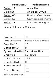
By default the DetailsView does not show any edit commands, but these can be added in one of two ways. The first is by properties on the control itself, like this: <asp:DetailsView runat="server" DataKeyNames="ProductID" DataSource AutoGenerateInsertButton="True" AutoGenerateDeleteButton="True" AutoGenerateEditButton="True">
This would add the commands at the bottom of the control, as shown in Figure 3.12. Alternatively, a CommandField can be explicitly defined, like this: <asp:DetailsView runat="server" DataKeyNames="ProductID" DataSource> <Fields> <asp:CommandField ShowDeleteButton="True" ShowEditButton="True" ShowInsertButton="True" /> </Fields> </asp:DetailsView>
Like the GridView, the default behavior is suitable for both display and editing of data, but it does have the same limitations, such as how to display different controls to edit the data. Defining Fields The DetailsView automatically generates the fields based upon the underlying data. Like the GridView though, automatic generation of fields can be turned off and the fields specified directly. This is done with the AutoGenerateRows property and the Fields subelement, as shown in Listing 3.17. Listing 3.17. Defining the Fields on a DetailsView <Fields> <asp:BoundField DataField="ProductID" HeaderText="ProductID" InsertVisible="False" ReadOnly="True" SortExpression="ProductID" /> <asp:BoundField DataField="ProductName" HeaderText="ProductName" SortExpression="ProductName" /> <asp:BoundField DataField="SupplierID" HeaderText="SupplierID" SortExpression="SupplierID" /> <asp:BoundField DataField="CategoryID" HeaderText="CategoryID" SortExpression="CategoryID" /> <asp:BoundField DataField="QuantityPerUnit" HeaderText="QuantityPerUnit" SortExpression="QuantityPerUnit" /> <asp:BoundField DataField="UnitPrice" HeaderText="UnitPrice" SortExpression="UnitPrice" /> <asp:BoundField DataField="UnitsInStock" HeaderText="UnitsInStock" SortExpression="UnitsInStock" /> <asp:BoundField DataField="UnitsOnOrder" HeaderText="UnitsOnOrder" SortExpression="UnitsOnOrder" /> <asp:BoundField DataField="ReorderLevel" HeaderText="ReorderLevel" SortExpression="ReorderLevel" /> <asp:CheckBoxField DataField="Discontinued" HeaderText="Discontinued" SortExpression="Discontinued" /> <asp:CommandField ShowDeleteButton="True" ShowEditButton="True" ShowInsertButton="True" /> </Fields>
|
You can see that these are the same fields as used in the GridView, so you can use TemplateField controls to provide customization, such as displaying drop-down lists for supplier and category when editing data, as shown Listing 3.18 with the supplier. Listing 3.18. Using TemplateField Controls <asp:TemplateField HeaderText="Supplier"> <ItemTemplate> <%#Eval("CompanyName") %> </ItemTemplate> <EditItemTemplate> <asp:SqlDataSource runat="server" ConnectionString="<%$ConnectionStrings:NorthwindConnectString%>" SelectCommand="SELECT SupplierID, CompanyName FROM Suppliers ORDER BY CompanyName" /> <asp:DropDownList runat="server" DataSource DataValueField="SupplierID" DataTextField="CompanyName" SelectedValue='<%#Bind("SupplierID")%>' /> </EditItemTemplate> </asp:TemplateField>
|
You can see that the ItemTemplate simply displays the CompanyName, while the EditItemTemplate contains a SqlDataSource and a Drop-DownList. The data source fetches the ID and name of all suppliers, and the list binds to this data, as seen in Figure 3.13. The DataValueField holds the ID, while the DataTextField holds the display data. The key item here is the SelectedValue, which is set to a data-binding expression, using Bind to provide two-way binding to the SupplierID column. Because SelectedValue is used, whatever SupplierID the underlying row has is displayed as the currently selected item in the list, and because Bind is used, when the Update link is clicked, that new SupplierID is pushed back to the database through the data source control. Figure 3.13. TemplateColumns with DropDownLists 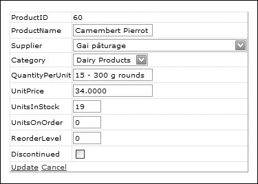
The DetailsView can be further customized with styling, in a similar way to the GridView. The DetailsView supports the following style elements: AlternatingRowStyle, for alternating rows (RowStyle handles the others) CommandRowStyle, for the row holding the commands (Edit, New, etc.) EditRowStyle, for rows in edit mode EmptyDataRowStyle, for the row shown when there is no data to display FieldHeaderStyle, for the row headers FooterStyle, for the footer row HeaderStyle, for the header row InsertRowStyle, for the row shown when in insert mode PagerStyle, for the page row RowStyle, for all rows, unless AlternatingRowStyle is also set
There are also other properties, such as GridLines, which sets the display borders, so you can remove the grid-like look this control has. Using a Stand-Alone DetailsView The DetailsView doesn't have to be used in conjunction with another control, displaying details for a selection, but can be used stand-alone. While it still only displays one row at a time, it can step through rows in a set of data, as shown in Figure 3.14, where three records have been stepped through. The navigation buttons are intelligent, so they only show when required; for the first record, only the Next and Last buttons are visible, while for the last record on, the First and Previous buttons are visible. Figure 3.14. The DetailsView in standalone mode 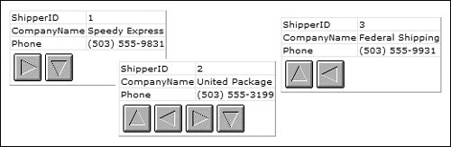
Custom DetailsView Commands Like the GridView, any button can emulate the standard button commands by use of the CommandName and CommandArgument properties. For the standard commands, the CommandName would be set to one of: Insert, Cancel, Delete, New, or Select. To emulate the paging buttons, you set the CommandName to Page and the CommandArgument to one of First, Last, Prev, or Next. For example: <asp:LinkButton runat="server" CommandName="Page" CommandArgument="First" Text="First" />
The FormView Control If more flexibility is required than the DetailsView provides, then a FormView can be used. This is very similar in action to a DetailsView, displaying a single row at a time, but it provides no default user interface; you have to provide the entire interface via templates. Most of the properties and usage of the FormView are the same as for the DetailsView, but conceptually it differs in one major way. When using custom columns on the DetailsView, you define the fields, and then within the fields, you define the templates. With the FormView, because there is no default interface, you define the templates, and then within the templates, you put all of the content to be displayed when that template is visible. For example, consider Figure 3.15, which shows three states of a FormView. Figure 3.15. The FormView control in normal, insert, and edit modes 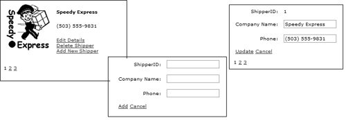
The FormView declaration is shown in Listing 3.19. Listing 3.19. The FormView Declaration <asp:FormView DataSource runat="server" DataKeyNames="ShipperID" AllowPaging="True" PagerSettings-Mode="Numeric">
|
Listing 3.20 shows the ItemTemplate, and you can see that the entire interface is detailed, including a table for layout, standard server controls using read-only binding, and LinkButton controls for the commands, which allow rows to be edited, deleted, and added. Listing 3.20. The FormView ItemTemplate <ItemTemplate> <table border="0" cellpadding="5"> <tr> <td> <asp:Image runat="server" Width="100" Height="123" ImageUrl='<%# Eval("ShipperID", "{0}.gif") %>' AlternateText='<%# Eval("CompanyName", "{0} Logo") %>' /> </td> <td> <b><%# Eval("CompanyName") %></b><p /> <%# Eval("Phone") %><p /> <asp:LinkButton runat="server" CommandName="Edit" Text="Edit Details" /><br /> <asp:LinkButton runat="server" CommandName="Delete" Text="Delete Shipper" /><br /> <asp:LinkButton runat="server" CommandName="New" Text="Add New Shipper" /> </td> </tr> </table> </ItemTemplate>
|
Listing 3.21 shows the EditItemTemplate, with both read-only and read-write binding. The read-only binding is used for the ShipperID, the primary key column of the table, which cannot be edited. The CompanyName and Phone columns use Bind to allow the user-entered value to be pushed back to the database. Because this template is shown when editing data, the buttons have their commands set to Update and Cancelthe two actions that can be performed on a row in edit mode. Listing 3.21. The FormView EditItemTemplate <EditItemTemplate> <table border="0" cellpadding="5"> <tr> <td align="right">ShipperID:</td> <td><%# Eval("ShipperID") %></td> </tr> <tr> <td align="right">Company Name:</td> <td> <asp:TextBox runat="server" Text='<%# Bind("CompanyName") %>' /> </td> </tr> <tr> <td align="right">Phone:</td> <td> <asp:TextBox runat="server" Text='<%# Bind("Phone") %>' /> </td> </tr> <tr> <td colspan="2"> <asp:LinkButton CommandName="Update" Text="Update" runat="server" /> <asp:LinkButton CommandName="Cancel" Text="Cancel" runat="server" /> </td> </tr> </table> </EditItemTemplate>
|
Listing 3.22 shows the InsertItemTemplate, which uses Bind for read-write binding of the ShipperID and Phone; even though this is a new row, Bind is still used. Because this is a new row, the commands are set to Add and Cancel; Add will add the new row, calling the InsertMethod, while Cancel will cancel the insertion and return the row to display mode. Listing 3.22. The FormView InsertItemTemplate <InsertItemTemplate> <table border="0" cellpadding="5"> <tr> <td align="right">ShipperID:</td> <td> <asp:TextBox runat="server" Text='<%# Bind("ShipperID") %>' /> </td> </tr> <tr> <td align="right">Company Name:</td> <td> <asp:TextBox runat="server" Text='<%# Bind("CompanyName") %>' /> </td> </tr> <tr> <td align="right">Phone:</td> <td> <asp:TextBox runat="server" Text='<%# Bind("Phone") %>' /> </td> </tr> <tr> <td colspan="2"> <asp:LinkButton CommandName="Insert" Text="Add" runat="server" /> <asp:LinkButton CommandName="Cancel" Text="Cancel" runat="server" /> </td> </tr> </table> </InsertItemTemplate>
|
You can see that even though there is more source, there is still no requirement for code to provide data updates. The techniques for the DetailsView and FormView are very similar, and the whole use of commands is common to all of these data controls. The declarative nature of these controls makes them easy to use, but there are still occasions when code is required. The first is if you want to avoid the two-tier system of the SqlDataSource, such as using a separate data layer, which is covered in Chapter 4, and the second is when you require some advanced features of the data source and grid controls, which is covered in Chapter 5. |