A Simple Web Parts Example Page
A Simple Web Parts Example PageThe screenshots shown earlier are taken from a simple example page that demonstrates most of the features of the portal framework and Web Parts technologies. In this section, you'll see how this page is constructed and the way that the various attributes and control elements govern the behavior of the page. The Page in OutlineListing 8.4 shows the outline of the page with most of the attributes and all the explicit declarations of the individual Web Parts removed. The two User Controls that display the customer and product details are registered at the start of the page, and a WebPartManager control is added to the <body> section. This is followed by a server-side <form> that contains the five zones used in the page:
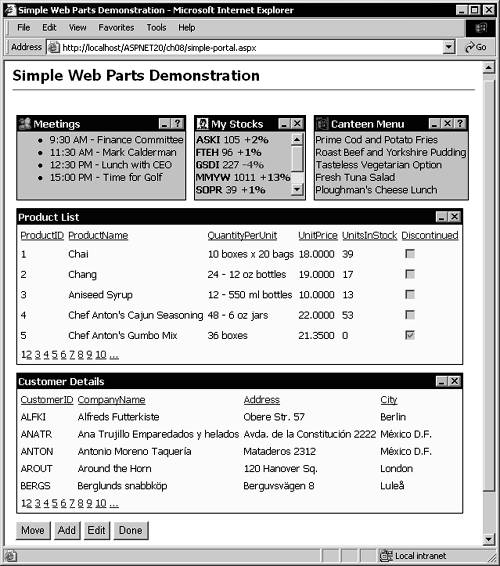
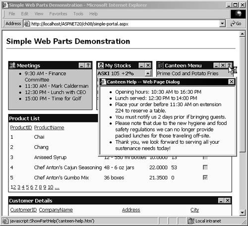
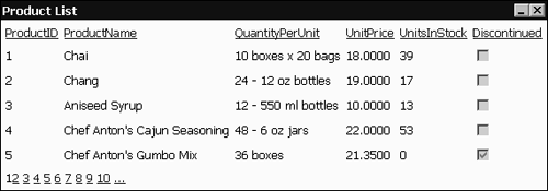
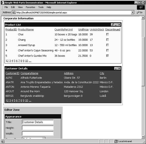
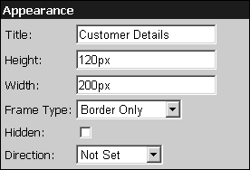
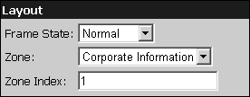
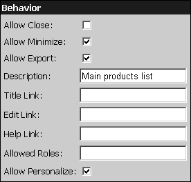
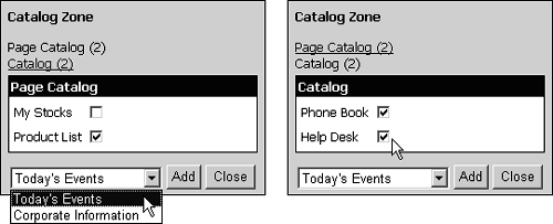
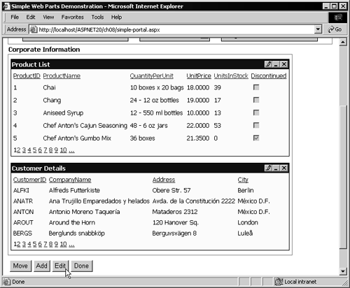
Listing 8.4 The Overall Outline of the Page<%@ Register TagPrefix="ahh" TagName="Products" Src="products.ascx" %> <%@ Register TagPrefix="ahh" TagName="Customers" Src="customers.ascx" %> <html> <head><title>Simple Web Parts Demonstration</title></head> <body> <asp:WebPartManager id="PartManager" runat="server" /> <form runat="server"> <asp:WebPartZone id="EventsZone" runat="server"> <ZoneTemplate> <asp:ContentWebPart id="pMeetings" runat="server"> ... explicit declaration of Web Part content here ... </asp:ContentWebPart> <asp:ContentWebPart id="pStocks" runat="server"> ... explicit declaration of Web Part content here ... </asp:ContentWebPart> <asp:ContentWebPart id="pCanteen" runat="server"> ... explicit declaration of Web Part content here ... </asp:ContentWebPart> </ZoneTemplate> </asp:WebPartZone> <asp:WebPartZone id="CorpInfoZone" runat="server"> <ZoneTemplate> <ahh:Products id="pProducts" runat="server" Title="Product List" /> <ahh:Customers id="pCustomers" runat="server" Title="Customer Details" /> </ZoneTemplate> </asp:WebPartZone> <asp:EditorZone id="EditorZone" runat="server"> <ZoneTemplate> <asp:AppearanceEditorPart id="AppearanceEditorPart1" runat="server" /> <asp:LayoutEditorPart id="LayoutEditorPart1" runat="server" /> <asp:BehaviorEditorPart id="BehaviorEditorPart1" runat="server" /> </ZoneTemplate> </asp:EditorZone> <asp:CatalogZone id="CatalogZone" runat="server"> <ZoneTemplate> <asp:PageCatalogPart id="PagePart" runat="server" /> <asp:TemplateCatalogPart id="CatalogPart" runat="server" Title="Catalog"> <WebPartsTemplate> <asp:ContentWebPart id="pPhoneBook" runat="server"> ... explicit declaration of Web Part content here ... </asp:ContentWebPart> <asp:ContentWebPart id="pHelpDesk" runat="server"> ... explicit declaration of Web Part content here ... </asp:ContentWebPart> </WebPartsTemplate> </asp:TemplateCatalogPart> </ZoneTemplate> </asp:CatalogZone> <asp:WebPartZone id="ControlsZone" runat="server"> <ZoneTemplate> <asp:ContentWebPart id="ControlsPart" runat="server"> ... explicit declaration of Web Part content here ... </asp:ContentWebPart> </ZoneTemplate> </asp:WebPartZone> </form> </body> </html> The default appearance of the page when first loaded is shown again in Figure 8.6 so that you can see the relationship between the control declarations and the output they generate. Figure 8.6. The example page, showing the view when first loaded The Events Zone DeclarationZones contain one or more Web Parts and also control the layout and appearance of these Web Parts. The Events zone at the top of the page contains three Web Part controls, arranged horizontally by setting the Orientation attribute. The zone attributes also define the text to display for the zone when in edit mode, the separation between individual Web Parts, whether an icon appears in the title bars, the type of links to use, and the relevant images for the Minimize, Help, Restore, Edit, and Close buttons (by default they appear as hyperlinks ). Zone attributes also define the appearance of the Web Part when it is being edited. You'll see the effects of this later. Within the main WebPartZone element are "style" elements that define individual features of the appearance of the contained Web Parts. In this example (see Listing 8.5) the declaration specifies a Windows-style appearance for the title bar of all contained Web Parts and a light green background. Listing 8.5 Declaring the Events WebPartZone<asp:WebPartZone id="EventsZone" runat="server" Title="Today's Events" TitleStyle-Font-Bold="True" Orientation="Horizontal" WebPartPadding="5" ShowIconInPartTitle="True" VerbButtonType="Image" WebPartHelpVerb-ImageUrl="images/help.gif" WebPartMinimizeVerb-ImageUrl="images/minimize.gif" WebPartRestoreVerb-ImageUrl="images/restore.gif" WebPartCloseVerb-ImageUrl="images/close.gif" WebPartEditVerb-ImageUrl="images/edit.gif" EditWebPartStyle-BackColor="Red" EditWebPartStyle-ForeColor="White"> <PartTitleStyle BackColor="Blue" ForeColor="White" Font-Bold="True" /> <PartStyle BackColor="LightGreen" /> ... The Individual Web Part DeclarationsThe rest of the content of the WebPartZone element shown in Listing 8.5 is a ZoneTemplate that contains the declarations of the Web Parts it will display by default (see Listing 8.6). Each Web Part is declared within a ContentWebPart control in this example, though you can mix any of the types of Web Parts listed earlier. Notice that there are some specific attribute settings that vary the appearance and behavior of the Web Parts in this zone from each other. The first Web Part, Meetings, cannot be closed because it contains the Allow Close="False" attribute. It also specifies the image that will appear at the left of the title bar and the URL of the page that will be displayed when the user clicks the Help (question mark) button in the title bar for this Web Part. Simply setting this attribute causes the Help button or link to be displayed in the title bar. (You can see in Figure 8.6 that the My Stocks Web Part does not display this button.) Listing 8.6 Declaring the Events ZoneTemplate and Content... <ZoneTemplate> <asp:ContentWebPart id="pMeetings" runat="server" AllowClose="False" Title="Meetings" SmallIconImageUrl="images/titleicon3.gif" HelpUrl="meetings-help.htm"> <ContentTemplate> <ul> <li>9:30 AM - Finance Committee</li> <li>11:30 AM - Mark Calderman</li> <li>12:30 PM - Lunch with CEO</li> <li>15:00 PM - Time for Golf</li> </ul> </ContentTemplate> </asp:ContentWebPart> <asp:ContentWebPart id="pStocks" runat="server" Title="My Stocks" Height="80" SmallIconImageUrl="images/titleicon2.gif" ScrollBars="Vertical"> <ContentTemplate> <b>ASKI</b> 105 <font color="blue"><b>+2%</b></font><br /> .... etc. ... </ContentTemplate> </asp:ContentWebPart> <asp:ContentWebPart id="pCanteen" runat="server" Title="Canteen Menu" SmallIconImageUrl="images/titleicon1.gif" HelpUrl="canteen-help.htm"> <ContentTemplate> Prime Cod and Potato Fries<br /> .... etc. ... </ContentTemplate> </asp:ContentWebPart> </ZoneTemplate> </asp:WebPartZone> The second ContentWebPart declaration specifies the My Stocks section and has the height fixed and a vertical scroll bar added. The same technique can be used to apply horizontal scrolling instead (or as well). This is useful to maintain a neat layout of the controls irrespective of the content of each one. Notice that while the first Web Part does not have a Close button, the second and third ones do because they do not contain the Allow Close="False" attribute. Also notice that these three Web Parts have fixed declarative content, using ordinary HTML. However, they can contain any static or dynamic content that you might use when creating output in a Web page. For example, you could use a Repeater control and build the text lists dynamically at runtime through data bindingor perhaps even display tempting pictures of the canteen menu items! The Help buttons shown for the Meetings and Canteen Menu Web Parts open a small browser window (modal in Internet Explorer 4 and higher) that displays custom help for that Web Part. The HelpUrl attribute in the declaration of the Web Part defines the URL that will open. In the example here, it is simply an HTML page that contains some details about the company canteen (see Figure 8.7). Figure 8.7. The Help window for the Canteen Menu Web Part The Corporate Information Zone DeclarationThe second zone on the page contains the lists of products and customers. Notice that these are fully interactiveyou can sort the rows by clicking the column headings and page through the rows using the links at the bottom of each list. In this zone there are no icons at the left of the title bars, and the orientation is set to Vertical this time, but otherwise the attributes in the WebPartZone element are similar to the previous zone (see Listing 8.7). Listing 8.7 Declaring the Corporate Information WebPartZone<asp:WebPartZone id="CorpInfoZone" runat="server" Title="Corporate Information" TitleStyle-Font-Bold="True" Orientation="Vertical" WebPartPadding="5" VerbButtonType="Image" WebPartHelpVerb-ImageUrl="images/help.gif" WebPartMinimizeVerb-ImageUrl="images/minimize.gif" WebPartRestoreVerb-ImageUrl="images/restore.gif" WebPartCloseVerb-ImageUrl="images/close.gif" WebPartEditVerb-ImageUrl="images/edit.gif" EditWebPartStyle-BackColor="Red" EditWebPartStyle-ForeColor="White"> <PartTitleStyle BackColor="Blue" ForeColor="White" Font-Bold="True"/> <PartStyle BackColor="LightYellow" /> <ZoneTemplate> <ahh:Products id="pProducts" runat="server" Title="Product List" /> <ahh:Customers id="pCustomers" runat="server" Title="Customer Details" /> </ZoneTemplate> </asp:WebPartZone> However, this time the ZoneTemplate contains instances of the two User Controls that are declared in Register directives at the top of the page. And, even though they don't expose public properties for the Title , this can be set as an attribute of the control instance element (the same applies for all of the Web Partspecific attributes). The Products and Customers User ControlsThe two User Controls for the lists of products and customers are extremely simple, despite the rich content they generate. They use a data source control and a GridView control (as demonstrated in Chapters 3 and 4). Notice that there is no <form> element in the controlone is already included in the main page. Listing 8.8 shows the entire code for the Product List User Control. Listing 8.8 Declaring the Product List User Control<%@ Control Language="VB" debug="True" %> <asp:SqlDataSource id="ds1" runat="server" ConnectionString="server=localhost;database=Northwind;uid=x;pwd=x;" SelectCommand="SELECT ProductID, ProductName, QuantityPerUnit, UnitPrice, UnitsInStock, Discontinued FROM Products" /> <asp:GridView id="grid1" runat="server" DataSourceID="ds1" Border="0" CellPadding="3" SummaryViewColumn="ProductName" AllowSorting="True" AllowPaging="True" PageSize="5" /> The output of this simple declarative-only User Control (shown in Figure 8.8) provides the content that is exposed as a Web Part, and the list of customers is generated in exactly the same way but (of course) with a different SQL statement. Figure 8.8. The output of the Product List User Control The EditorZone DeclarationAdding editing features to a page is extremely easythe controls do all of the work for you pretty much automatically. However, bear in mind that there are effectively two ways that users can configure a page containing Web Parts. Simply switching the WebPartManager control into design mode causes the zone frames to be displayed, and users can drag controls from one place within a zone to another or drag them from one zone to another. However, switching to edit mode causes the Edit button or link in the title bar of all the Web Parts to become visible as well, and when this is clicked that Web Part is displayed using the settings specified for the Edit WebPartStyle properties. However, this alone does not display the controls for editing the layout, behavior, or appearance of the selected Web Part. To display these controls, you must add an EditorZone to the page. Listing 8.9 shows the declaration for the EditorZone , containing all three of the common editing controls. The attributes of the main Editor Zone element specify the appearance of the editing controls. Listing 8.9 Declaring the EditorZone Control<asp:EditorZone id="EditorZone" runat="server" TitleStyle-Font-Bold="True" BackColor="LightBlue" Style="padding:5px;margin-top:7px"> <PartTitleStyle BackColor="Blue" ForeColor="White" Font-Bold="True" /> <ZoneTemplate> <asp:AppearanceEditorPart id="AppearanceEditorPart1" runat="server" /> <asp:LayoutEditorPart id="LayoutEditorPart1" runat="server" /> <asp:BehaviorEditorPart id="BehaviorEditorPart1" runat="server" /> </ZoneTemplate> </asp:EditorZone> In the screenshot in Figure 8.9 you can see the Edit button (we chose a pencil image) for the Product List Web Part, which is not itself in edit mode, while the Customer Details Web Part is being edited. Figure 8.9. Edit mode, with highlighting that indicates the Web Part currently being edited The Editor ControlsThe three editing controls included in the declaration of the EditorZone can be seen in the next three screenshots. In the Appearance section (Figure 8.10), you can specify the text of the title bar of the Web Part and its size on the page. The Frame Type can be Default, Title and Border, Title Only, Border Only, or None. The Web Part can also be hidden within the page, and you can specify the layout direction (Left to Right, Right to Left, or Not Set). Figure 8.10. The Appearance section of the EditorZone control For the Layout settings (Figure 8.11), you can specify the Frame State (Normal or Minimized), the zone that the Web Part will appear in, and the index (position) within that zone. Figure 8.11. The Layout section of the EditorZone control Finally, for the Behavior settings (Figure 8.12), you can specify whether the Web Part can be closed, minimized, or exported; the text for the alternate description of the Web Part; and URLs to open when a custom link in the title bar or the Edit or Help button is clicked. You can also specify a list of roles (as defined by the current personalization settings of the page and application) that can display the Web Part, as well as turn on or off personalization support for this Web Part. Figure 8.12. The Behavior section of the EditorZone control A Web Part developer can add custom properties to the Web Part and declare metadata defining other entries that will appear in the Behavior section. The CatalogZone DeclarationThe Catalog section of available Web Parts for the page is created using a CatalogZone control. By default this control is not displayed, but when the WebPartManager is switched into catalog mode the control displays its content. Listing 8.10 shows the CatalogPart control, with the attributes and the nested PartTitleStyle and PartStyle elements that specify its appearance within the page. The ZoneTemplate contains the declarations of the two sections of the Catalog that will be shown. The PageCatalogPart displays any controls that are currently closed (but not hidden), while the TemplateCatalog Part defines two more controls that a user can add to the page. Listing 8.10 Declaring the CatalogZone Control<asp:CatalogZone id="CatalogZone" runat="server" BackColor="LightGray" BorderWidth="1" BorderColor="Black" TitleStyle-Font-Bold="True" Style="padding:5px;margin-top:7px"> <PartTitleStyle BackColor="Blue" ForeColor="White" Font-Bold="True" /> <PartStyle BackColor="White" /> <ZoneTemplate> <asp:PageCatalogPart id="PagePart" runat="server" /> <asp:TemplateCatalogPart id="CatalogPart" runat="server" Title="Catalog"> <WebPartsTemplate> <asp:ContentWebPart id="pPhoneBook" runat="server" Title="Phone Book"> <ContentTemplate> Cassandra Royce - 249<br /> Joan Bone - 261<br /> ... etc. ... </ContentTemplate> </asp:ContentWebPart> <asp:ContentWebPart id="pHelpDesk" runat="server" Title="Help Desk"> <ContentTemplate> <asp:RadioButtonList id="bl1" runat="server"> <asp:ListItem Text="Computer Fault" /> <asp:ListItem Text="Software Fault" /> ... etc. ... </asp:RadioButtonList> <asp:Button id="b1" runat="server" Text="Call" /><br /> </ContentTemplate> </asp:ContentWebPart> </WebPartsTemplate> </asp:TemplateCatalogPart> </ZoneTemplate> </asp:CatalogZone> The screenshot in Figure 8.13 (repeated from earlier in the chapter for convenience) shows the two views of the Catalog section when the user has previously closed the My Stocks and Product List Web Parts but now wants to display the Product List again. The control automatically detects the closed controls, and the zones they can be placed in, by analyzing the page content. Figure 8.13. The two views of the CatalogZone control The Controls Zone DeclarationThe example page contains one more zone. This is a WebPartZone that contains the four buttons that switch the page and the WebPartManager from one mode to another. It seemed sensible to prevent users from moving, editing, or closing this zone, so it has attributes added that hide the edit link; prevent a frame from being displayed in normal, design, and edit modes; and prevent the layout from being changed (see Listing 8.11). Listing 8.11 Declaring the Controls Zone<asp:WebPartZone id="ControlsZone" runat="server" Title=" " WebPartEditVerb-Visible="False" PartFrameType="None" AllowLayoutChange="False" BorderWidth="0" BorderStyle="None"> ... Displaying the Move, Add, Edit, and Done ButtonsThe ZoneTemplate defines the content of this zone. In this case, it contains a single ContentWebPart that has attributes added to reinforce and complete the process of preventing the user from moving this Web Part to another zone or closing, minimizing, or hiding it. Then, inside the ContentTemplate are declarations of four standard ASP.NET Button controls that initiate the switch from one mode to another. Each has its CommandName set to indicate the mode it should switch to. All have the OnClick attribute set to the same event handler named SwitchMode (see Listing 8.12). Listing 8.12 The ZoneTemplate for the Controls Zone... <ZoneTemplate> <asp:ContentWebPart id="ControlsPart" runat="server" AllowZoneChange="False" AllowClose="False" AllowHide="False" AllowMinimize="False"> <ContentTemplate> <asp:Button id="btnLayout" Text="Move" CommandName="Move" OnClick="SwitchMode" runat="server" /> <asp:Button id="btnAdd" Text="Add" CommandName="Catalog" OnClick="SwitchMode" runat="server" /> <asp:Button id="btnEdit" Text="Edit" CommandName="Edit" OnClick="SwitchMode" runat="server" /> <asp:Button id="btnCancel" Text="Done" CommandName="Done" OnClick="SwitchMode" runat="server" /> </ContentTemplate> </asp:ContentWebPart> </ZoneTemplate> </asp:WebPartZone> You can see in the screenshot in Figure 8.14 (on the next page) that, even when the page is in edit mode, the section containing the buttons is not available for editing and does not display the "drag" pointer that indicates it can be moved to another zone. Figure 8.14. The four buttons in the noneditable and nonmovable Controls zone
Changing the WebPartDisplayModeThe final section of the source for the example page is an event handler that runs when any of the four buttons in the Controls zone is clicked. Inside a server-side script section is the SwitchMode routine, which simply checks the value of the CommandName property of the control that raised the event and then calls the SetDisplayMode method of the WebPartManager with the appropriate value from the WebPartDisplayMode enumeration (see Listing 8.13). Listing 8.13 Switching the Display Mode of the WebPartManager<script runat="server"> Sub SwitchMode(oSender As Object, oArgs As EventArgs) Select Case oSender.CommandName Case "Move" PartManager.SetDisplayMode(WebPartDisplayMode.Design) Case "Catalog" PartManager.SetDisplayMode(WebPartDisplayMode.Catalog) Case "Edit" PartManager.SetDisplayMode(WebPartDisplayMode.Edit) Case "Done" PartManager.SetDisplayMode(WebPartDisplayMode.Normal) End Select End Sub </script> Of course, the controls used to create this page expose their interfaces to code running in the page. So, while this example used hardly any code (only the routine to switch modes), you can write code that interacts with the zone and Web Part controls and reacts to events in the page. We look briefly at this topic in the next section.  |