The ASP.NET 2.0 Portal Framework
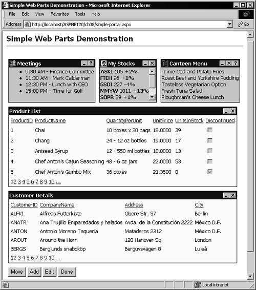
| In reality, the home page of any Web site or Web application is a "portal" to that site or application. In general, the home page carries things like news, information, and of course links to the other pages that make up the content of the site or application. However, the term "portal" has increasingly become associated with pages that offer a modularized view of information. This is one of the main aims of Microsoft SharePoint and other similar content management systems. The ASP.NET 2.0 Web Parts technology is designed to make this kind of page and application easy to build, often without requiring the developer to write any code. The screenshot in Figure 8.1 shows a simple example of a portal page containing five Web Parts. They display different sets of information that would be useful for, say, a worker on the corporate intranet. Figure 8.1. A simple demonstration of Web Parts and the portal framework The Goals of the Portal FrameworkWeb Parts is not a brand-new technology, and in some ways it collects together existing development efforts in an attempt to provide a general solution. The goals for the technology are to:
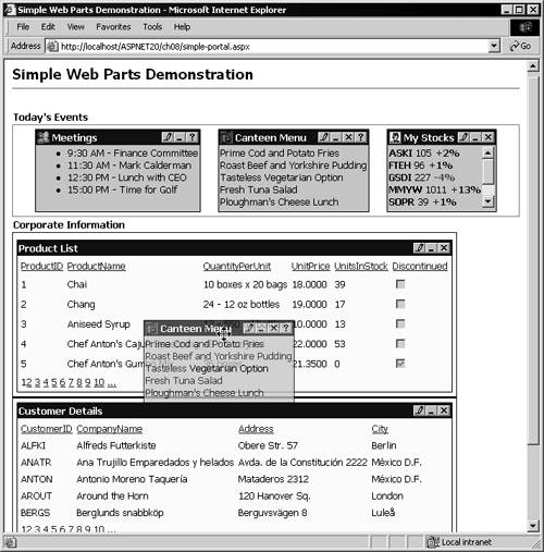
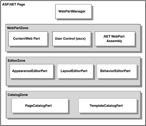
Integration with SharePoint and Office Web PartsOne important aim of the new ASP.NET Web Parts technology is to allow it to be extended within SharePoint and other Microsoft applications, as well as to provide support for existing Web Parts. Web Parts have been around for a couple of years , in products like the Digital Dashboard and Content Management Server. It's hoped that all of these Web Parts would be usable directly within the ASP.NET portal framework. The ongoing Web Parts development process aims to expose an interface that can be used by other Microsoft applications and other third-party tools and environments. Customization and PersonalizationThe Web Parts technology used to create the page shown in Figure 8.1 also provides built-in capabilities for customizing the display. This can be just for the current session, or integrated with the ASP.NET personalization features so that the settings are persisted on a per-user basis and automatically retrieved when that user logs in again next time. As an example of the customization features, the screenshot in Figure 8.2 shows how a rich client (Internet Explorer 6) allows the user to enter design mode and change the layout of the modules on the page by simply dragging them from one place to another. Figure 8.2. Changing the layout in Internet Explorer 6 Web Parts technology implements all the customization processes automatically and many other features as well. You can minimize or "roll up" a Web Part so that only the title bar is visible. And, as you'll see in the example page shown in this chapter, you can easily expose features that allow the user to edit the appearance and behavior of individual Web Parts, open dedicated Help windows for each one, close or hide individual Web Parts, and add new Web Parts to the page. It all looks like a complex process, and it certainly does produce a page containing features that would take quite a considerable developer effort to achieve from scratch. Yet the example in Figure 8.2, which we'll discuss in more depth shortly, mainly contains only declarative content (ASP.NET server controls) and requires almost no server-side or client-side code to be written. About the Web Parts FrameworkThe Web Parts technology is exposed through a series of ASP.NET server controls. In combination, they work together to generate the kind of output and feature set you saw in the previous screenshots. Underneath, the source for the page builds up a structured hierarchy of objects from the server control declarations. Figure 8.3 shows that structure. Figure 8.3. The object structure for a Web Parts portal page Every page that uses Web Parts must contain a single instance of the WebPartManager control. This control is responsible for binding all the other controls together, reacting to events in the page, handling dynamic connections between Web Parts, and calling the methods on each Web Part to create the control tree for the page and generate the output. A WebPartManager requires only this simple declaration: <asp:WebPartManager id="PartManager" runat="server" /> The remaining Web Parts features are declared within "zones" on the page (although other content for the page can, of course, be located outside the zones). Web Parts that appear when the page is first opened are declared or referenced within a WebPartZone . Web Part ZonesIt's possible to place a Web Part directly on an ASP.NET page, but in general you will place them within zones that are defined using a WebPartZone control. This is a templated control that contains all the Web Parts for the current zone and synchronizes the layout, appearance, and colors of these Web Parts. An ASP.NET page can contain more than one WebPartZone the example in Figures 8.1 and 8.2 contains two zones. One shows today's events, and the other shows corporate information such as the product and customer lists. A WebPartZone declaration follows the same principles as most other familiar templated controls. It accepts attributes that define the behavior of the zone and all of the Web Parts within the zone, elements that define the style of specific sections of the output, and a ZoneTemplate that contains the declaration of the Web Parts that will appear in this zone by default (see Listing 8.1). Listing 8.1 Outline of a WebPartZone Control Declaration<asp:WebPartZone id="EventsZone" runat="server" Title="Today's Events" TitleStyle-Font-Bold="True" Orientation="Horizontal"> <PartTitleStyle BackColor="Green" Font-Bold="True" /> <PartStyle BackColor="Yellow" /> <ZoneTemplate> ... Web Parts for this zone are declared here ... </ZoneTemplate> </asp:WebPartZone> Bear in mind that the layout of the Web Parts in the page may be different when the page is actually displayed. If this is a postback, and editing of the page layout is enabled, the user may have moved Web Parts from one zone to another. Likewise, if personalization is enabled for the page, Web Parts may appear in a different zone from that where they were originally located. The following kinds of Web Parts can appear in a WebPartZone :
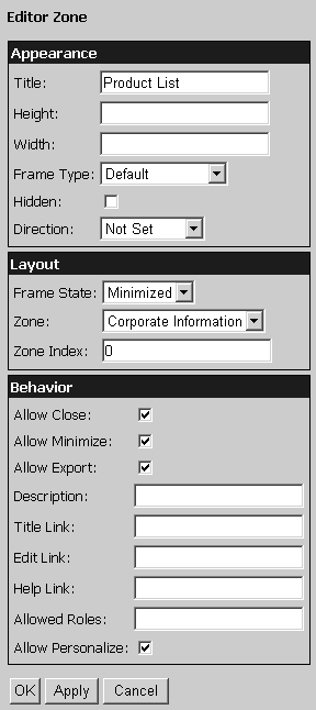
In the future, it's possible that support may also be extended to DLLs and components that do not run under the .NET Framework, to provide cross-application integration with Web Parts from other arenas. Editor ZonesTo allow the user to change the layout of the Web Parts, it's necessary only to shift the WebPartManager into design mode. This simply involves changing the WebPartDisplayMode property during a postback; the WebPartManager and the individual Web Part controls then update their output to reflect this mode. In forthcoming beta releases and in the final version of ASP.NET 2.0, there will be dedicated server controls to achieve this mode switching. However, for the time being you can use any control to submit the page and then change the mode using server-side code. We demonstrate this approach in the example later in this chapter. To enable the end user to edit the behavior and appearance of individual Web Parts, you must switch the WebPartManager into edit mode and provide an EditorZone containing instances of one or more of the different types of editor control (depending on which editing features you want to offer). The three editing controls most commonly used within an EditorZone are the AppearanceEditorPart , LayoutEditorPart , and BehaviorEditor Part controls, as seen in Listing 8.2. Listing 8.2 Declaring an EditorZone Control<asp:EditorZone id="EditorZone" runat="server" TitleStyle-Font-Bold="True" BackColor="LightBlue" Style="padding:5px;margin-top:7px"> <PartTitleStyle BackColor="Blue" ForeColor="White" /> <ZoneTemplate> <asp:AppearanceEditorPart id="AppearanceEditorPart1" runat="server" /> <asp:LayoutEditorPart id="LayoutEditorPart1" runat="server" /> <asp:BehaviorEditorPart id="BehaviorEditorPart1" runat="server" /> </ZoneTemplate> </asp:EditorZone> The screenshot in Figure 8.4 shows the output that these controls generate when the page is in edit mode and a single control is selected for editing. (At other times they do not appear in the output generated for the page.) You can, of course, provide just one or two of the different edit controls if you don't want users to be able to change all of the settings to which these controls provide access. Figure 8.4. The EditorZone control in action
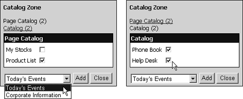
Catalog ZonesBy default, users can close a Web Part on the page by clicking the Close button or link in the title bar. They can later add this Web Part back to the page or add any other Web Parts you have associated with the page. Adding a new or a closed Web Part to the page is achieved through controls declared within a CatalogZone . Like the other zone controls, the CatalogZone is a templated control. The lists of available Web Parts are generated with a PageCatalogPart and/or a TemplateCatalogPart control (see Listing 8.3). Listing 8.3 Declaring a CatalogZone Control<asp:CatalogZone id="CatalogZone" runat="server" TitleStyle-Font-Bold="True" BackColor="LightGray" Style="padding:5px;margin-top:7px"> <ZoneTemplate> <asp:PageCatalogPart id="PagePart" runat="server" /> <asp:TemplateCatalogPart id="CatalogPart" runat="server" Title="Catalog"> <WebPartsTemplate> ... Web Parts for this zone are declared here ... </WebPartsTemplate> </asp:TemplateCatalogPart> </ZoneTemplate> </asp:CatalogZone> The PageCatalogPart control generates a list of the Web Parts for the page that are currently closed (i.e., Web Parts that the user has removed from the page by using the Close button on the title bar of that Web Part). It also generates UI elements where the end user can specify which of these Web Parts should be shown again and which zone they should appear in. You can see this in the left-hand screenshot in Figure 8.5 on the next page. Figure 8.5. The two modes of the CatalogZone control At the top of the Catalog Zone dialog are links to the two types of Catalog Part in the pagethe Page Catalog (the Web Parts that are currently closed) and the Catalog (other controls that were not included in the page originally but are available to be added to the page). The right-hand screenshot in Figure 8.5 shows the display when the Catalog section is selected. These are the Web Parts defined within the WebPartsTemplate section of the CatalogZone control shown in Listing 8.3. Like the EditorZone discussed previously, the CatalogZone is not visible in the page by default. It appears only when the WebPartDisplayMode property of the WebPartManager is changedin this case to catalog mode. So, by using the edit and catalog features, users can customize the page to suit their requirements, displaying just the Web Parts they want to see and laying them out in the page as they require.  |