| The DataList control is similar to the DataGrid, but allows for more control at a lower level. There is no paging ability either. If you want this capability, you will have to build it yourself. The control works in a similar manner to the DataGrid, and has a similar event model. Where it differs is in the way you design the rows. You have much more control than with the DataGrid. Each row of the control is a separate page document, and you can use any controls you want. There are no columns , each control stands by itself. You can mix text boxes, DropdownLists, labels, and so forth on any row. Not only that, but each row has different mode templates, so for Edit mode you show one template and regular View mode another. Think of the DataList as repeating rows of separate groups of controls. Let's create a project for working with the DataList control called ADOBook09-03. Create the project in the normal way, then copy the DataSets and the form into the new project folder from ADOBook09-02. Include them in the new project the way we did before. In case you forgot , click the Show All Files button in the Solution Explorer toolbar and then right-click the files and Include In Project. You may then delete the default form created with the project. When you have the previous project's form in the project, delete the grid control. Now go into the code and delete all the grid control's event procedures. Configuring the DataList Configuring the DataList control turns out to be an adventure in eye-hand coordination. To configure the control visually, you have to switch back and forth between the control's normal design-time view and an Edit Templates view. The Edit Templates view is accessible only through the right mouse button. The only other way to configure the control is via HTML view, and unless you happen to be an HTML guru, this is no simple task. Here is the HTML required to configure the DataList control as shown in Figure 9.36. Figure 9.36. The DataList control. 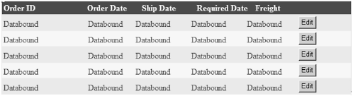 <asp:datalist id=DataList1 style="Z-INDEX: 111; LEFT: 40px; POSITION: absolute; TOP: 136px" runat="server" Width="734px" DataSource="<%# DsCust1 %>" DataMember="Orders" GridLines="Both" DataKeyField="OrderID" CellPadding="3" BackColor="White" BorderWidth="1px" BorderStyle="None" BorderColor="#E7E7FF" > <SelectedItemStyle Font-Bold="True" ForeColor="#F7F7F7" BackColor="#738A9C"></SelectedItemStyle> <HeaderTemplate> <asp:Label id="Label5" runat="server" Width="158px">Order ID</ asp:Label> <asp:Label id="Label6" runat="server" Width="102px">Order Date</ asp:Label> <asp:Label id="Label7" runat="server" Width="102px">Ship Date</ asp:Label> <asp:Label id="Label8" runat="server" Width="110px">Required Date</asp:Label <asp:Label id="Label3" runat="server" Width="110px">Freight</ asp:Label> </HeaderTemplate> <AlternatingItemStyle BackColor="#F7F7F7"></AlternatingItemStyle> <ItemStyle ForeColor="#4A3C8C" BackColor="#E7E7FF"></ItemStyle> <ItemTemplate> <asp:Label id=Label9 runat="server" Text='<%# DataBinder.Eval(Container, "DataItem.OrderID", "{0}") %>' Width="160px"> </asp:Label> <asp:Label id=Label11 runat="server" Text='<%# DataBinder.Eval(Container, "DataItem.OrderDate", "{0:d}") %>' Width="88px"> </asp:Label> <asp:Label id=Label12 runat="server" Text='<%# DataBinder.Eval(Container, "DataItem.RequiredDate", "{0:d}") %>' Width="104px"> </asp:Label> <asp:Label id=Label13 runat="server" Text='<%# DataBinder.Eval(Container, "DataItem.ShippedDate", "{0:d}") %>' Width="104px"> </asp:Label> <asp:Label id=Label14 runat="server" Text='<%# DataBinder.Eval(Container, "DataItem.Freight", "{0:C}") %>' Width="96px"> </asp:Label> <asp:Button id="Button1" runat="server" Text="Edit" CommandName="edit"></asp:Button> </ItemTemplate> <FooterStyle ForeColor="#4A3C8C" BackColor="#B5C7DE"></ FooterStyle> <HeaderStyle Font-Bold="True" ForeColor="#F7F7F7" BackColor="#4A3C8C"></HeaderStyle> <EditItemTemplate> <asp:TextBox id=Textbox2 runat="server" ReadOnly="True" Text='<%# DataBinder.Eval(Container, "DataItem.OrderID", "{0}") %>'> </asp:TextBox> <asp:TextBox id=Textbox9 runat="server" Text='<%# DataBinder.Eval(Container, "DataItem.OrderDate", "{0:d}") %>' Width="96px"> </asp:TextBox> <asp:TextBox id=Textbox10 runat="server" Text='<%# DataBinder.Eval(Container, "DataItem.RequiredDate", "{0:d}") %>' Width="104px"> </asp:TextBox> <asp:TextBox id=Textbox11 runat="server" Text='<%# DataBinder.Eval(Container, "DataItem.ShippedDate", "{0:d}") %>' Width="96px"> </asp:TextBox> <asp:TextBox id=Textbox12 runat="server" Text='<%# DataBinder.Eval(Container, "DataItem.Freight", "{0:C}") %>' Width="102px"> </asp:TextBox> <asp:Button id="Button2" runat="server" Text="Update" CommandName="update"></asp:Button> <asp:Button id="Button3" runat="server" Text="Cancel" CommandName="cancel"></asp:Button> </EditItemTemplate> </asp:datalist> Not for the faint of heart, even for HTML freaks. Figure 9.36 shows the DataList in design mode. At runtime, the control looks like Figure 9.37. Figure 9.37. The DataList at runtime with a row in Edit mode. 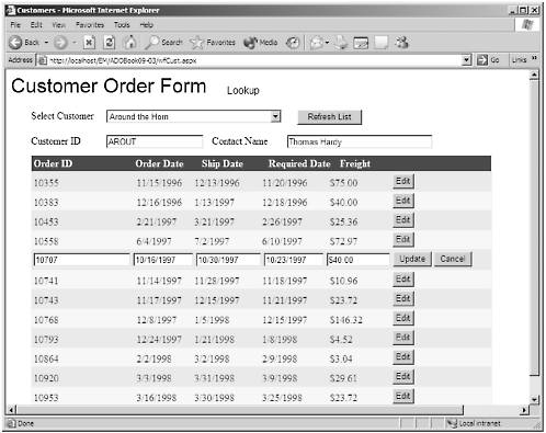 As we said before, the tricky thing about configuring the control is setting up the templates. To begin, drop a DataList control on your form. The raw control doesn't look like much (see Figure 9.38). Figure 9.38. The raw DataList control. 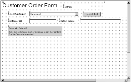 In order to get the DataList to look usable, we have to add at least one item template. We do this by right-clicking the control and then selecting Edit TemplatesItem Templates from the context menu. See Figure 9.39. I told you this would be an adventure with the mouse! This converts the control to Template Editing mode. What you see (Figure 9.40) is a set of four empty templates. You must add controls to these templates and then bind them to a DataSource. Figure 9.39. Finding the Edit Template command. 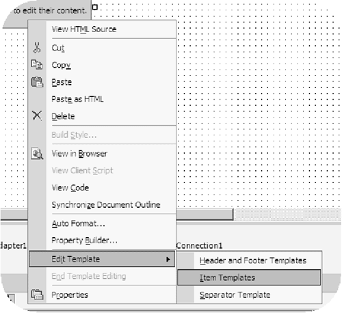 Figure 9.40. The DataList in Edit Template mode. 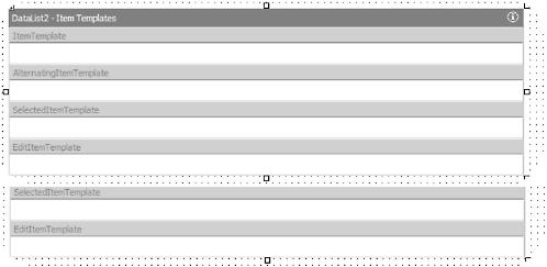 NOTE  | In the examples the control is DataList2. That is because I have already configured the control and mine is called DataList1. So the code will say DataList1, but the graphics might show DataList2. |
Figure 9.40 shows the control in the Edit Template mode. What you see are four available item templates. The only one you must create is ItemTemplate. If your control is read-only that would be enough. If you want your control to support in-place editing, you also must create the EditItemTemplate. Typically, you would use static controls like labels for the ItemTemplate, and text boxes (or other editable control) for the EditItemTemplate. We add controls to the templates the normal way, by dragging them from the toolbox. The tricky part is binding to the data source. You must first set the DataSource of the control, just as we did with the DataGrid. This must be done with the control in normal design mode (not in Template Editing mode). Exit Template Editing mode by selecting End Template Editing from the context menu. Now you can set up the DataSource as in Figure 9.41. Figure 9.41. Setting the DataSource. 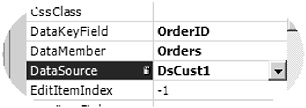 Once the DataSource is set up, go back into Template Editing mode. Now we will add control to the ItemTemplate. As we said, we want to use static controls here. You could use editable controls as well, then you would be able to edit all rows at all times. But let's stick with the normal static data until the user clicks an Edit button, like with the DataGrid. This would enable you to put some security behind the form, allowing only those with the proper privileges to update data. Figure 9.42 shows a label added to the ItemTemplate. Figure 9.42. A label in the Item Template. 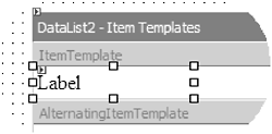 Now we have to bind the label to the DataSource. This is where it is a little different than we're used to. To bind the control, open the normal DataBinding dialog using the Property window. The dialog appears as in Figure 9.43. Figure 9.43. The DataBindings dialog. 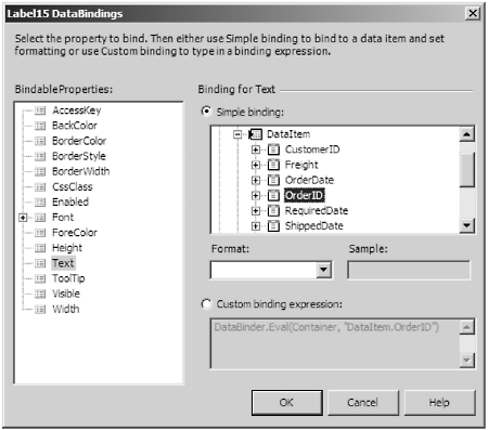 We do not bind the control directly to the DataSet. Instead we expand the container node and then the DataItem mode. This shows the columns bound to the control itself. We then choose from one of these columns, in this case the OrderID. The full list of options is shown in Figure 9.44. Figure 9.44. The full tree control. 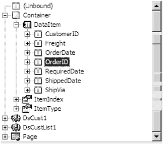 When you complete the ItemTemplate, it will look like Figure 9.45. Figure 9.45. The control with the templates complete. 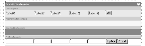 The next question you may ask is "How do we set up the buttons to fire the events?" We have to use the CommandName property of the button. The DataList is set up to respond to certain predefined commands and fire the events based on the property value. The commands are as they would seem: Edit, Update, and Cancel. There are also Select and Delete commands but we will not be using those in this example. Set the property for the Edit button as in Figure 9.46. Figure 9.46. The CommandName property. 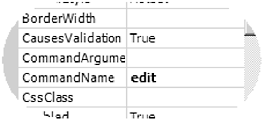 One of the problems I had with this control was setting up the headings. It is very difficult to get the headings to align properly with the controls because you cannot edit the headings and the controls at the same time. You have to jump back and forth using trial and error. The heading is created using another template editor, Headers and Footers (see Figure 9.47). Figure 9.47. The Header and Footer template editor. 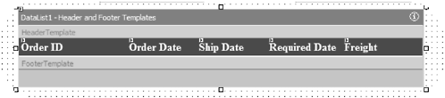 Once this is done, we can add the code to the events. I will show all of the events here, because the code is almost the same as for the DataGrid. Private Sub DataList1_UpdateCommand(ByVal source As Object, ByVal e As System.Web.UI.WebControls.DataListCommandEventArgs) Handles DataList1.UpdateCommand Dim i As Integer Try DsCust1.Orders.Rows(e.Item.ItemIndex)("OrderDate") = CType(e.Item.FindControl("TextBox9"), TextBox).Text DsCust1.Orders.Rows(e.Item.ItemIndex)("RequiredDate") = CType(e.Item.FindControl("TextBox10"), TextBox).Text DsCust1.Orders.Rows(e.Item.ItemIndex)("ShippedDate") = CType(e.Item.FindControl("TextBox11"), TextBox).Text DsCust1.Orders.Rows(e.Item.ItemIndex)("Freight") = CType(e.Item.FindControl("TextBox12"), TextBox).Text SqlDataAdapter3.Update(DsCust1) Catch errobj As Exception lblError.Text = errobj.Message & vbCrLf & errobj.StackTrace Exit Sub End Try DataList1.EditItemIndex = -1 DataList1.DataBind() End Sub Private Sub DataList1_EditCommand(ByVal source As Object, ByVal e As System.Web.UI.WebControls.DataListCommandEventArgs) Handles DataList1.EditCommand DataList1.EditItemIndex = e.Item.ItemIndex DataList1.DataBind() End Sub Private Sub DataList1_CancelCommand(ByVal source As Object, ByVal e As System.Web.UI.WebControls.DataListCommandEventArgs) Handles DataList1.CancelCommand DataList1.EditItemIndex = -1 DataList1.DataBind() End Sub The only difference is in the UpdateCommand event. Instead of looping through the cells (there are no cells ), we use the FindControl method of the UpdateCommandEventArgs' Item property. This allows us the get a reference to the text box using its name and then directly assigns the value to the DataTable's row item object. Then we do the standard Update method of the DataAdapter. | 