Using Basic Web Server Controls
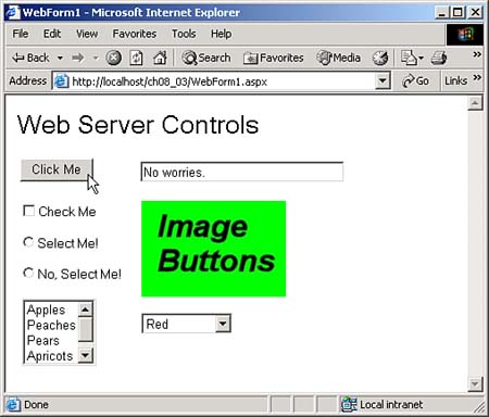
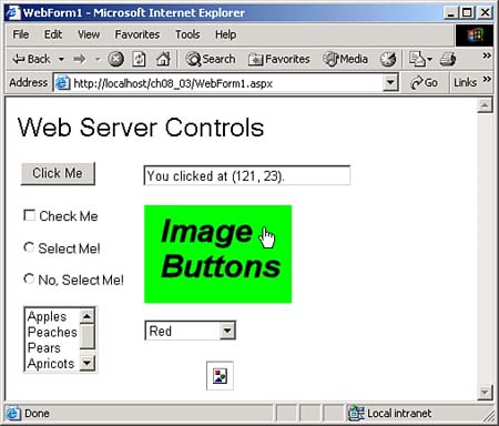
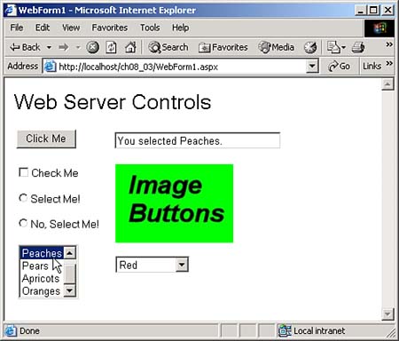
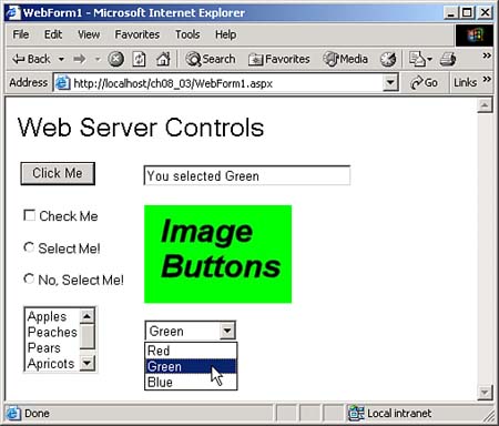
| There are plenty of Web server controls available, although there are fewer than the available Windows controls. Because Web server controls operate in Web browsers, they're also much simpler than Windows controls, and support fewer properties, methods , and events. They're still much like programming Windows controls, however, and you can see an assortment of the basic Web server controls in Figure 8.12, in the ch08_03 example. Compare this figure to Figure 7.10 in Chapter 7. As you can see, the basic Windows controls are practically unchanged (at least in appearance) when you move to Web server programming. Figure 8.12. Running the ch08_03 example. LabelsYou can see a label control in the ch08_03 example, Figure 8.12, displaying the text "Web Server Controls" . When you're working with Web Server controls, you're working with HTML controls (even if a single Web server control is made up of a combination of HTML controls). In this case, that means that Web server labels are converted to HTML <SPAN> elements; here's the HTML used to create the label you see in Figure 8.12: <span id="Label1" style="font-size:X-Large; Z-INDEX: 101; LEFT: 12px; POSITION: absolute; TOP: 14px">Web Server Controls</span> You can set the font in a control (in label controls or others like text boxes) to a standard HTML font with the Font property. The Font holds a FontInfo object, which has these properties (note that not all properties will be supported by all browsers):
You can set these properties at design time or at runtime. For example, at runtime, you can make the text in Label1 italic like this: Label1.Font.Italic = true; You set the Font.Size property to members of the FontUnit enumeration: FontUnit.Large , FontUnit.Larger , FontUnit.Medium , FontUnit.Small , FontUnit.Smaller , FontUnit.XLarge , FontUnit.XSmall , FontUnit.XXLarge , and FontUnit.XXSmall . Here's how you set the font to XXLarge : Label1.Font.Size = FontUnit.XXLarge; You can also use CSS styles to set the style of a label, because labels are really <SPAN> elements. For example, to underline text in a label, you can use code like this: Label1.Style["Text-Decoration"] = "underline"; ButtonsButtons are much like the buttons discussed in Chapter 7; when the user clicks the button labeled Click Me in Figure 8.12, the text "No worries." appears in the text box, as you see in the figure. Because the entire Web page has to be sent back to the server when the user clicks a button, they're really HTML Submit buttons. Here's the HTML for the button you see in Figure 8.12: <input type="submit" name="Button1" value="Click Me" id="Button1" style="Z-INDEX: 102; LEFT: 15px; POSITION: absolute; TOP: 66px" /> The Click event is the big (and default) event for buttons. Programming a Web server button's Click event works just as for a button in Windows, as in this code from WebForm1.aspx.cs: private void Button1_Click(object sender, System.EventArgs e) { TextBox1.Text = "No worries."; } As with Windows buttons, you can set the caption of a Web server button with its Text property. You can also turn Web server buttons into command buttons . You turn a button into a command button simply by assigning text to its CommandName property. Besides CommandName , you can also assign an object, usually text, to a button's CommandArgument property. When you click a command button, the button's Click event fires as well as its Command event. The CommandEventArgs object passed to the Command event handler has both a CommandName and CommandArgument property, and you can recover the text in those properties using this object. Text BoxesYou can see a text box in Figure 8.12, displaying the text "No worries." Text boxes are similar to text boxes in Windows programs; their default event is TextChanged (you need to set AutoPostBack to true if you want to handle this event as it occurs), and their text is accessed through the Text property. Here's the HTML for the text box in Figure 8.12: <input name="TextBox1" type="text" id="TextBox1" style="width:212px;Z-INDEX: 103; LEFT: 140px; POSITION: absolute; TOP: 69px" /> Web server text boxes do differ from Windows text boxes in a number of ways. For example, although you can create multiline and password controls using text boxes, you don't do so with MultiLine and PasswordChar properties. Instead, you use the TextMode property. By default, the TextMode property is set to SingleLine to create a single-line HTML text field, but it can also be set to MultiLine for a multiline text box, or set to Password to create a password control. Password controls are turned into HTML <input> controls with the type attribute set to "password" like this: <input name="TextBox1" type="password" id="TextBox1" style="Z-INDEX: 104; LEFT: 182px; POSITION: absolute; TOP: 209px" /> A multiline text box is actually an HTML text area control. Here's what one looks like in the HTML that ASP.NET sends to the browser: <textarea name="TextBox1" id="TextBox1" style="height:74px;width:157px;Z-INDEX: 103; LEFT: 100px; POSITION: absolute; TOP: 100px"></textarea> Check BoxesIn Figure 8.12, you'll see a check box set up to handle the CheckChanged event in code. When you check or uncheck a check box, this event occurs, and you can use the check box's Checked property to determine its new setting. Here's what the HTML looks like for this check box: <span style="Z-INDEX: 104; LEFT: 14px; POSITION: absolute; TOP: 110px"> <input id="CheckBox1" type="checkbox" name="CheckBox1" onclick="__doPostBack('CheckBox1','')" language="javascript" /><label for="CheckBox1">Check Me</label></span> When you check or uncheck the check box, the code indicates the check box's new setting, as you see in Figure 8.13. Figure 8.13. Checking or unchecking the check box. To make this code work, all you have to do is to look at the Checked property to determine whether a check box is checked, and display that information in the text box. (Don't forget to set the check box's AutoPostBack property to True if you want the CheckChanged event to be handled immediately; otherwise , it'll be handled the next time the page is sent back to the server, such as when the user clicks a button.) private void CheckBox1_CheckedChanged(object sender, System.EventArgs e) { if(CheckBox1.Checked == true) { TextBox1.Text = "The check box is checked."; } else { TextBox1.Text = "The check box is not checked."; } } If you wanted to check or uncheck a check box in code, you can set the check box's Checked property to true or false . You can also set a check box's Checked property to true at design time (the default is false ), and if you do, the check box will appear checked when the application first starts. Besides individual check boxes, C# also supports check box lists . A check box list is a single control that can display a number of check boxes at oncein other words, they create check box groups . This is useful in some circumstances, as when you want to loop over a set of check boxes that are part of a set, such as check boxes that let the user select items for a pizza. They're most useful when you want to vary the number of check boxes you display at runtime. For example, check box lists are often connected to the data in database records, because the number of check boxes can vary depending on the number of bool fields in a record, and true or false easily translate into checked and unchecked. Check box lists have an Items collection, inherited from the ListControl class, with members corresponding to check boxes in the list. The main event here is the SelectedIndexChanged (not CheckChanged ) event, which occurs when the user clicks a check box. Each item in the Items collection is an object of the ListItem class, and you can use the ListItem class's Value , Text , and Selected properties to work with the individual check boxes. To find out which check boxes are checked, you can loop through the list and test the Selected property of each item. Check box lists also support SelectedItem or SelectedIndex properties, but these are less useful than you might think. Because check box lists can support multiple selections, the SelectedItem and SelectedIndex properties hold only the selected item with the lowest index value, and the index value of the selected item with the lowest index value. This tells you nothing about the other selected items. You will typically use the SelectedItem or SelectedIndex properties with radio button lists, which only support a single selected item. Radio ButtonsRadio buttons usually operate in groups, in which only one radio button at a time can be checked. When you add radio buttons to a Windows form, they're automatically placed into a single group . That's not true in Web formsin this case, you must set the GroupName property of every radio button you want to be in a group to the same name as the others in the group. If you want a radio button's events to be handled when they occur rather than waiting for the next server round-trip, you must set the radio button's AutoPostback property to true . Radio buttons are supported in the Web browser with the HTML <input type="radio"> element like this for the two radio buttons you see at work in the ch08_03 example, Figure 8.14: <span style="Z-INDEX: 105; LEFT: 13px; POSITION: absolute; TOP: 143px"> <input id="RadioButton1" type="radio" name="group1" value="RadioButton1" onclick="__doPostBack('RadioButton1','')" language="javascript" /> <label for="RadioButton1">Select Me!</label></span> <span style="Z-INDEX: 106; LEFT: 13px; POSITION: absolute; TOP: 175px"> <input id="RadioButton2" type="radio" name="group1" value="RadioButton2" checked="checked" onclick="__doPostBack('RadioButton2','')" language="javascript" /> <label for="RadioButton2">No, Select Me!</label></span> Figure 8.14. Selecting a radio button. In C#, you can handle Web server radio buttons just as you can Windows radio buttons, using the default CheckChanged event. Here's the code that handles the two radio buttons in the ch08_03 example: private void RadioButton1_CheckedChanged(object sender, System.EventArgs e) { TextBox1.Text = "Radio button 1 is selected."; } private void RadioButton2_CheckedChanged(object sender, System.EventArgs e) { TextBox1.Text = "Radio button 2 is selected."; } Besides individual radio buttons, you can also use radio button lists, which work like check box lists. The radio buttons in a radio button list control are automatically part of the same group, and at runtime, a radio button list looks just like a set of standard radio buttons. Image ButtonsWeb server controls include image controls, which are like picture boxes in Windows, except that they don't support a click event. Image controls are translated into HTML <IMG> controls like this: <img id="Image1" border="0" src="file:///C:\inetpub\wwwroot\ch08_03\image.jpg" style="Z-INDEX: 110; LEFT: 204px; POSITION: absolute; TOP: 269px" /> Image buttons do support Click events, and you can see an image button in the ch08_03 example, Figure 8.12. Here's the HTML for this controlan HTML <input type="image"> control: <input type="image" name="ImageButton1" id="ImageButton1" src="file:///C:\inetpub\wwwroot\ch08_03\image.jpg" border="0" style="Z-INDEX: 110; LEFT: 141px; POSITION: absolute; TOP: 110px" /> You're passed an object of the System.Web.UI.ImageClickEventArgs class in the Click event handler, and this object's X and Y properties tell you where the user clicked. You can report that location in the application's text box like this: private void ImageButton1_Click(object sender, System.Web.UI.ImageClickEventArgs e) { TextBox1.Text = "You clicked at (" + e.X + ", " + e.Y + ")."; } You can see this at work in Figure 8.15, where the user has clicked the image button and the code for this application is telling the user where they clicked. Figure 8.15. Clicking an image button. Image maps often let the user navigate to a new URL when you click a "hotspot" in them, and you can handle that with the Response object's Redirect method. Here's an example which makes the browser navigate to http://www.microsoft.com when the user clicks a region of the imagethe rectangle stretching from (100, 50) to (300, 150)which we'll treat as a hotspot: private void ImageButton1_Click(object sender, System.Web.UI.ImageClickEventArgs e) if (e.X >= 100 && e.X <= 300) && (e.Y >= 50 && e.Y <= 150) { Response.Redirect("http://www.microsoft.com"); } } You can also use the Command event handler to make an image button control work like a command button. In this case, you assign a command name to the image button with the CommandName property, and the CommandArgument property can also be used to pass additional information about the command. As with image controls, you can also set the URL of the image to be used to the ImageUrl property. To set the ImageUrl property at design time, click this property in the properties window and browse to the image you want to use. You can also set the ImageUrl property at runtime; just assign it a string containing the URL of an image. And you can set the image's width and height with the Width and Height properties. Using List BoxesYou can see a Web server list box in the ch08_03 example, Figure 8.12, displaying the names of various fruits like the list box we saw in Chapter 7 in the basic Windows controls example. You can add items to a list box at design time using the ListItem Collection Editor, which opens when you select the list box's Items property and click the ellipsis button that appears, as shown in Figure 8.7. In HTML, the list box is a <SELECT> control, and it looks like this in the browser: <select name="ListBox1" size="4" onchange="__doPostBack('ListBox1','')" language="javascript" id="ListBox1" style="Z-INDEX: 107; LEFT: 17px; POSITION: absolute; TOP: 212px"> <option value="Apples">Apples</option> <option value="Peaches">Peaches</option> <option value="Pears">Pears</option> <option value="Apricots">Apricots</option> <option value="Oranges">Oranges</option> </select> As in Windows list boxes, the default event here is the SelectedIndexChanged event, and we handle that event in the ch08_03 example by displaying the new selected item: private void ListBox1_SelectedIndexChanged(object sender, System.EventArgs e) { TextBox1.Text = "You selected " + ListBox1.SelectedItem + "."; } You can see how this works in Figure 8.16. Note that if you want to handle a list box's events immediately, you must set its AutoPostBack property to true . Figure 8.16. Making a selection in a list box. Multiple-Selection List BoxesTo allow the user to select multiple items, you set the SelectionMode property to ListSelectionMode.Multiple . You can determine the selected item in a single-selection list box using the SelectedItem and SelectedIndex properties. The SelectedItem property returns the selected item as a ListItem object, which supports Text , Value , and Selected properties. The ListControl class's Items property holds a collection of ListItem objects that you can use to access any item in a list box. Standard Web server list boxes let the users select only one item at a time. However, if you set the list box's SelectionMode property to Multiple , the list box will support multiple selections. You can make multiple selections in list boxes the same way as in other Web controls. You can use the Shift key with the mouse to select a range of items, or the Ctrl key to select multiple items, clicking one after the other. The HTML for the multiple-selection list box is almost the same as for the single-selection list box we saw earlier, except for the addition of the multiple attribute. When the user makes a selection in a multiple-selection list box, a SelectedIndexChanged event occurs. You don't usually send the page back to the server each time the user selects a new item in a multiple selection list box, however; you normally use a Submit button and read the list box selections in the button's Click event handler. To determine which items are selected in a multiple selection list box, you can loop over the Items collection of ListItem objects, checking each item's Selected property to see whether that item is selected. Here's how that looks: private void Button1_Click(object sender, System.EventArgs e) { TextBox1.Text = "You selected: " + "\n"; for (int loopIndex = 0; loopIndex < ListBox1.Items.Count - 1; loopIndex++) { if (ListBox1.Items[loopIndex].Selected ){ TextBox1.Text += ListBox1.Items[loopIndex].Text + "\n"; } } } That's all you need to handle multiple selections in Web server list boxes. Adding Items to List Boxes at RuntimeWhen you use any Web server control based on the ListControl class, you can use the Items collection's Add method to add items to it, and that works for Web server list boxes as well. The Items collection is a collection of ListItem objects, and you can pass either a ListItem object to the Add method, or the text you want to give to the new item: private void Button1_Click(object sender, System.EventArgs e) { ListBox1.Items.Add("Item " + ListBox1.Items.Count); } Using Drop-Down ListsThe drop-down list you see under the image button in the ch08_03 example, Figure 8.12, allows the users to select from an assortment of colors, as you see in Figure 8.17. When the user selects a color , the selection appears in the text box, as you also see in Figure 8.17. Figure 8.17. Making a selection in a drop-down list. The items of a drop-down list aren't visible until the user clicks the control's down arrow button. Clicking that button makes the control display its drop-down list, and the user can select an item in that list. He can't select multiple items, because the list closes as soon as a selection is made. Like Web server list boxes, drop-down lists are supported with <SELECT> controls. In this case, the <SELECT> controls are created without a SIZE attribute, which means the browser will create a drop-down list instead of a list box (the SIZE attribute indicates how many items in the list to display at one time, and if you omit it, the browser displays a drop-down list). Here's what the drop-down list in the ch08_03 example looks like in HTML: <select name="DropDownList1" onchange="__doPostBack('DropDownList1','')" language="javascript" id="DropDownList1" style="width:95px;Z-INDEX: 109; LEFT: 141px; POSITION: absolute; TOP: 227px"> <option value="Red">Red</option> <option value="Green">Green</option> <option value="Blue">Blue</option> </select> As with standard list boxes, the default event in drop-down lists is the SelectedIndexChanged event, and you can get the selected item with the SelectedItem property this way: private void DropDownList1_SelectedIndexChanged(object sender, System.EventArgs e) { TextBox1.Text = "You selected " + DropDownList1.SelectedItem; } You can see the results of this code in Figure 8.17. As with list boxes, you need to set this control's AutoPostBack property to true if you want events handled on the server as soon as they happen. When the user has selected an item in a drop-down list, you use the control's SelectedIndex and SelectedItem properties in code to determine which selection was made. The SelectedIndex property gives you the index in the list of the selected item, and the SelectedItem property gives you the actual ListItem object that corresponds to the selected item. You can use the ListItem class's Value , Text , and Selected properties to get more information about the selection. There's another property worth looking at both here and in standard list boxesthe Value property. Controls that hold ListItem objects, such as check box lists, radio button lists, list boxes, and drop-down list boxes, let you add text to each item using the Value property. That's useful if you want to store more text in each item than is displayed in the control itself. For example, a drop-down list might display the names of various colors, red, green, blue, and so on as in our example. However, behind the scenes, each item in the list stores each color in HTML terms as "#ff0000" , "#00ff00" , "#0000ff" , and so on, in its Value property. That text can be retrieved and used in your code when the user makes a selection. You can set a ListItem object's Value property at runtime in code, or at design time using the ListItem Collection Editor. To work with the current selection in list-oriented controls, you can use the SelectedIndex , SelectedItem , and SelectedValue properties. The SelectedValue property holds the value in the Value property of the currently selected item.  |


EAN: 2147483647
Pages: 181