Using Basic Windows Controls
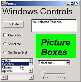
| With the basic Windows programming skills under our belts, we'll take a look at working with basic Windows controls next. There are many controls available, from buttons to tree views. To get a look at how the basic Windows controls work, take a look at the ch07_04 example, which appears in Figure 7.10. We'll take a look at handling the various controls in this example next . Figure 7.10. Running the ch07_04 example. LabelsYou use label controls to display text that the user isn't supposed to change at runtime, such as the result of some long calculation. The label in ch07_04 displays the text "Windows Controls" , and its font has been set to 24 points using its Font property. The main property here is the Text property, which holds the displayed text. The default event is the Click event, which responds to user clicks. ButtonsWe've already seen buttons at work. When you click the button in the ch07_04 example, the text "You clicked the button!" appears in the text box, as you see in Figure 7.10. Here's the code that made that happen: private void button1_Click(object sender, System.EventArgs e) { textBox1.Text = "You clicked the button!"; } The main property of buttons is the Text property, which holds the button's caption. The default event is the Click event. Buttons have a Click method that you can call to click them. Prefacing a letter in a button's caption with an ampersand ( & ) makes that letter the button's access key . For example, if a button's caption is set to E&xit , the x appears underlined at runtime, and the user can click the button by pressing Alt+X. Other controls, such as menus , can also use access keys.
Text BoxesThe text box in ch07_04, Figure 7.10, is a multiline text box because it allows users to enter multiple lines of text. By default, you can only enter a single line of text in a text box, but if you set its Multiline property to true , it'll accept multiple lines of text, and you can resize it vertically (which you can't do for single-line text boxes). Multiline text boxes wrap words by default, but you can turn that off by setting the WordWrap property to false . You can set the maximum number of characters a text box can accept with the MaxLength property, and if you set the PasswordChar property to a character such as "*" , the text box becomes a password control, displaying * for every character the reader types (you can still read the underlying text with the text box's Text property). The default event for text boxes is the TextChanged event, which occurs when the text in a text box changes and the text box loses the focus (the focus is the target of keystrokes in a Windows application). Text boxes also support the Cut , Copy , and Paste methods so you can let users select text with the mouse and cut, copy, or paste it using the Windows Clipboard. In addition to standard text boxes, C# also supports rich text boxes, which you can find in the toolbox. Rich text boxes support rich-text format (RTF) text, which includes all kinds of formatting like italics, underlining, different fonts, and so on. These controls act like word processors in a control. They can save and read .RTF files (use their SaveFile and LoadFile methods), which can then be read by other word processors such as Microsoft Word. Check BoxesThe check box in the ch07_04 example appears under the Click Me button, and has the caption Check Me. When the user clicks this control, its CheckChanged event occurs. We can determine whether the check box is checked with its Checked property, and report its status in the application's text box: private void checkBox1_CheckedChanged(object sender, System.EventArgs e) { if(checkBox1.Checked == true) { textBox1.Text = "The check box is checked."; } else { textBox1.Text = "The check box is not checked."; } } Note that the Checked property is read/write. Not only can you determine whether a check box is checked using this property, you can also check or uncheck it by setting this property to true or false respectively. The Text property sets the check box's caption, and the default event for check boxes is the CheckedChanged event. Radio ButtonsRadio buttons enable the users to make an exclusive selection from a set of options. Although you can select as many check boxes as you want from a set, you can select only one radio button from a set of radio buttonsthe others are automatically cleared. As with check boxes, you can set the caption for radio buttons using the Text property, and set or get the checked status with the Checked property. The default event is the CheckedChanged event.
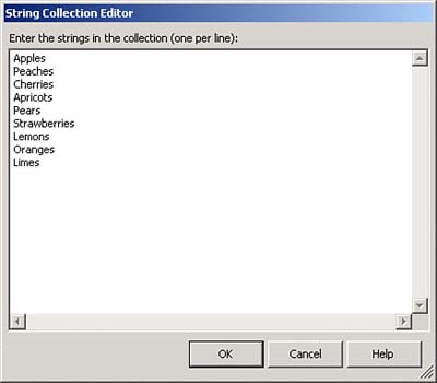
There are two radio buttons in the ch07_04 example, as you see in Figure 7.10. When you select one, the other is automatically unselected . That means we don't have to look at the Checked property in the CheckedChanged event handler. If a radio button was clicked, it's been selected. We can therefore display the status of the radio buttons in the application's text box like this: private void radioButton1_CheckedChanged(object sender, System.EventArgs e) { textBox1.Text = "Radio button 1 is selected."; } private void radioButton2_CheckedChanged(object sender, System.EventArgs e) { textBox1.Text = "Radio button 2 is selected."; } List BoxesUnder the radio buttons in Figure 7.10, you can see a list box displaying the names of various fruits. When the user selects a fruit, the selection appears in the application's text box, as shown in Figure 7.11. Figure 7.11. Making a selection in a list box. When you add a list box to a form from the toolbox, that list box is empty. To add items to the list box at design time, select the list box's Items property, and click the ellipsis (...) button that appears next to the Items property to open the String Collection Editor, as you see in Figure 7.12. You can enter the strings you want to display in the list box, also shown in Figure 7.12. Figure 7.12. Using the String Collection Editor. The Items property is actually a list collection, so you can use methods like Add , Remove , RemoveAt , and so on to manipulate the contents of a list box. In this case, we're adding bananas to the list: listBox1.Items.Add("Bananas"); The default event for list boxes is the SelectedIndexChanged event, which occurs when a new selection is made in a list box. You can get an object corresponding to the current selection using the list box's SelectedItem property, so we can display the currently selected item in the application's text box this way: private void listBox1_SelectedIndexChanged(object sender, System.EventArgs e) { textBox1.Text = "You selected " + listBox1.SelectedItem + "."; } When the MultiColumn property is set to true , the list box displays items in multiple columns and a horizontal scroll bar appears. When ScrollAlwaysVisible is set to true , the scroll bar appears regardless of the number of items. The SelectedIndex (not SelectedItem ) property returns a 0-based integer value that corresponds to the first selected item in the list box. You can programmatically change the selected item by changing the SelectedIndex property in code; the corresponding item in the list will appear highlighted on the Windows Form. If no item is selected, the SelectedIndex value is 1. If the first item in the list is selected, the SelectedIndex value is 0. The Items.Count property reflects the number of items in the list. List boxes can also support multiple selections; the SelectionMode property determines how many list items can be selected at a time. You can set this property to these values from the SelectionMode enumeration:
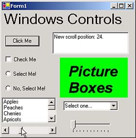
You can access the items in a list box with the Items collection like this: In single-selection list boxes, you use the SelectedIndex and SelectedItem properties to determine which item has been selected. On the other hand, when you support multiple selections, you use the SelectedIndices property to get the selected indices (as an array) and the SelectedItems property to access the selected items themselves (as a collection of objects). For example, here's how you might use a foreach loop to loop over and display the selected items in a multiple selection list box: foreach(int index in listBox1.SelectedIndices) { textBox1.Text += listBox1.Items[index] + " "; } You can also sort a list box's list if you set the Sorted property to true (the default is false ). Scroll BarsUnder the list box in the ch04_07 example, you can see a horizontal scroll bar; C# lets you use both horizontal and vertical scroll bars in forms. Scroll bars are usually tied to other controls, and they appear automatically in text boxes, list boxes, and other controls as needed. However, you can also use your own free-standing scroll bars in Windows applications. The important properties for scroll bars are the Value , Maximum , and Minimum properties, which hold the current value of the scroll bar, the maximum possible value (default = 100), and the minimum possible value (default = 0). The default event for scroll bars is the Scroll event. Here's how we use it to report the new position of the scroll bar in the application's text box after the user has scrolled that scroll bar: private void hScrollBar1_Scroll(object sender, System.Windows.Forms.ScrollEventArgs e) { textBox1.Text = "New scroll position: " + hScrollBar1.Value + "."; } You can see this code at work in Figure 7.13, where the user has scrolled the scroll bar. Scroll bars like these are good when you want the user to be able to select visually from a numeric range, as when setting red, green, and blue values in colors. In this case, you can pass the three color values, 0-255, to the static method System.Drawing.Color.FromArgb( red, green, blue ) , which returns a System.Drawing.Color object that you can assign to the forms' and controls' ForeColor and BackColor properties. Figure 7.13. Using a scroll bar. Picture BoxesAs the name implies, picture boxes display images. You can see one under the multiline text box in the ch07_04 example application in Figure 7.10. Picture boxes can display images from files in many formats (.BMP, .GIF, .JPG, .PNG, and .ICO). To load an image into a picture box at design time, select its Image property in the properties window. Click the ellipsis button that appears to browse to the image you want to load into the picture box. In this example, we're displaying the image in a file named image.jpg, which is included with the code you can download for this book. You can also load images into picture boxes at runtime using code like this: pictureBox1.Image = Image.FromFile("image.jpg"); Clipping and positioning images is handled by the SizeMode property, which is set to values from the PictureBoxSizeMode enumeration. You can change the size of the display area at runtime with the ClientSize property. By default, picture boxes don't display any borders; you can display a standard or three-dimensional border using the BorderStyle property. Picture boxes also support the Click event, which is their default event. Here's how we report when the picture box was clicked in the ch07_04 example: private void pictureBox1_Click(object sender, System.EventArgs e) { textBox1.Text = "You clicked the picture box."; } Combo BoxesCombo boxes are similar to list boxes with an added text box into which the users can enter their own text. You use the DropDownStyle property to make a list a combo box. Here are the options:
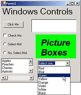
You can see the combo box in the ch07_04 example, at work in Figure 7.14. This control displays various colors for the user to select from. After users make their selection, the example displays that selection in the application's text box. Figure 7.14. Using a combo box. True to the name, combo boxes combine aspects of both text boxes and list boxes. For example, you can access the text in a combo box using the Text property like a text box. And like list boxes, you can use the SelectedIndex and SelectedItem properties to access the selected item in a combo box. (Unlike list boxes, however, you can select at most one item in a combo box. You click the combo box's drop-down list, and when you click the list once, the list immediately closes .) The Items.Count property contains the number of items in the drop-down list. To manage the drop-down list, you can use the Items.Add , Items.Insert , Items.Clear , Items.AddRange , and Items.Remove methods. You can also add items to and remove items from the list by using the Items property at design time. You can also sort a combo box's list if you set the Sorted property to true (the default is false ). Like list boxes, the default event for combo boxes is the SelectedIndexChanged event, and we can use that event to display the user's new selection like this: private void comboBox1_SelectedIndexChanged(object sender, System.EventArgs e) { textBox1.Text = "You selected: " + comboBox1.SelectedItem + "."; } Track BarsTrack bars are similar to scroll bars, except that they look more like the controls you find on stereos. You can see a track bar in the bottom-right corner of Figure 7.10, under the combo box. Like scroll bars, track bars support the Minimum (default = 0), Maximum (default = 10), and Value properties, and the default event is the Scroll event. We can display the new value the user scrolls the track bar to like this in the ch07_04 example application: private void trackBar1_Scroll(object sender, System.EventArgs e) { textBox1.Text = "New track position: " + trackBar1.Value + "."; } That finishes the discussion of basic Windows controls. We'll take a look at some advanced controls next.  |

EAN: 2147483647
Pages: 181
- Chapter II Information Search on the Internet: A Causal Model
- Chapter VI Web Site Quality and Usability in E-Commerce
- Chapter XIII Shopping Agent Web Sites: A Comparative Shopping Environment
- Chapter XIV Product Catalog and Shopping Cart Effective Design
- Chapter XVIII Web Systems Design, Litigation, and Online Consumer Behavior