Using Advanced Controls
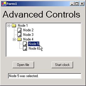
| If you take a look at the ch07_05 example in Figure 7.15, you'll see a few advanced controls at work in C#. This example supports timers, tooltips, image lists, and tree views. It uses one of the built-in dialog box controls that comes with C#. Figure 7.15. Running the ch07_05 example. Built-in Dialog BoxesC# comes with seven built-in controls corresponding to standard Windows dialog boxes:
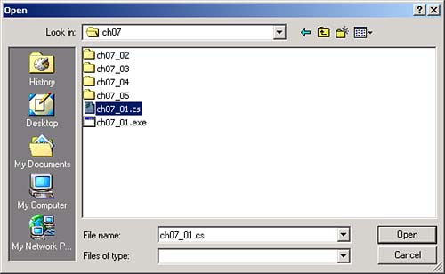
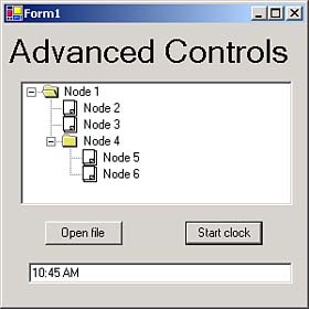
These dialog boxes look just like the standard Windows dialog boxes used for opening files, saving files, and so on. They allow your application to fit in other Windows applications. All of these dialog boxes correspond to controls that can be dragged from the toolbox onto a Windows form. The ch07_05 example displays an Open File dialog box when you click its Open File button. To do that, it uses an OpenFileDialog control, openFileDialog1 , which you can drag from the toolbox onto the main form in this example, form1 . This dialog box doesn't have any visual appearance on the form, so instead of appearing on the form at design time, it appears in the component tray just below form1 , as you see in Figure 7.16. The component tray displays controls that have no visual appearance in a form at runtime. Figure 7.16. The component tray. When the user clicks the Open File button, we can show this new dialog box. You show the dialog box with the dialog control's ShowDialog method, which returns a value from the DialogResult enumeration we've already seen. If the user clicks the Open button in our Open File dialog box, which will make ShowDialog return DialogResult.OK , we can display the name of the file they've selected in a text box like this: private void button1_Click(object sender, System.EventArgs e) { if(openFileDialog1.ShowDialog() == DialogResult.OK) { textBox1.Text = "You selected " + openFileDialog1.FileName; } } You can see the dialog box that appears when the user clicks the Open File button in Figure 7.17, where the user is selecting the file C:\c#\ch07\ch07_01.cs . Figure 7.17. An Open File dialog box. When the user clicks the Open button after selecting this file, they'll see this message in the application's text box: "You selected C:\c#\ch07\ch07_01.cs" . TimersTimers let you create periodic events, called timer ticks . The associated code is executed every time the event occurs. These controls are helpful when you need to perform some task repeatedly, such as when you're polling a connection or displaying the time. There's a Timer control in ch07_05, as you can see in the component tray in Figure 7.16. By default, the Enabled property for timers is set to false and their Interval property, which holds the interval between timer tick events, is set to 100 milliseconds (.1 seconds). To make the ch_07 example display the current time when the user clicks the Start Clock button, set the Interval property of timer1 to 1000 milliseconds, or one second. When the user clicks the Start Clock button, we can enable the timer like this: private void button2_Click(object sender, System.EventArgs e) { timer1.Enabled = true; } Enabling the time in this case means that timer1_Tick events will occur every second. You can add code to this event's handler just as you can to any event. In this case, we'll display the current time in the application's text box, using the System.DateTime.Now.ToShortTimeString method: private void timer1_Tick(object sender, System.EventArgs e) { textBox1.Text = System.DateTime.Now.ToShortTimeString(); } This event handler is called once a second, so the time displayed in the application's text box is updated that often. You can see this at work in Figure 7.18. (Note that this example has no way to turn off the clockif you want to do that, you need to add code to set the clock's Enabled property to false .) Figure 7.18. Using a timer.
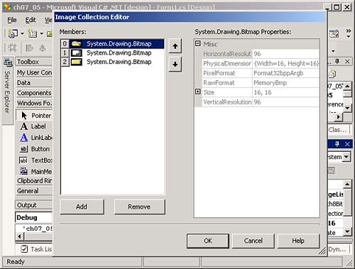
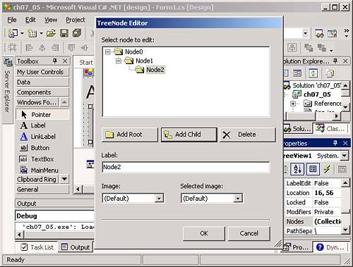
Image ListsImage list controls are simply repositories for images; they don't appear in forms at runtime. Other controls, like the tree view control coming up next , use image lists to store the images they display. You can see an image list, imageList1 , in the ch07_05 example in the component tray in Figure 7.16. When you click the ellipsis button that appears when you select the image list's Images property, the Image Collection Editor appears, as you see in Figure 7.19. Figure 7.19. Managing images in an image list. You can add images to the image list by clicking the Add button and browsing to the images you want. Each image in the list is given an index, starting with 0 for the first image. In this example, we're storing icons that display open and closed folders, as well as a generic document icon, for use with the tree view control, which we'll discuss next. You can see these icons in the tree view control in the middle of Figure 7.15. (Visual Studio comes with many icons, including the ones we're using here; you can find them in the Visual Studio Common7\Graphics directory.) Tree ViewsYou can see a tree view control, treeView1 , in Figure 7.15 in the ch05_07 example. As the name indicates, tree views display trees of nodes, much like the left pane of the Windows Explorer is used to display directory hierarchies. To add nodes to a tree view at design time, you can click the ellipsis button that appears when you select the tree view's Nodes property in the properties window. Doing so displays the TreeNode Editor, as you see in Figure 7.20. Figure 7.20. Managing images in an image list. On the other hand, node trees are rarely built at design time; you usually build them at runtime, in code (as when you want to display the directory structure the user has browsed to). Each node in the tree is a TreeNode object, and each node has a Nodes collection that you can add nodes to with the Add method, remove with the Remove method, and so on (we saw this in action in the list collections in Chapter 6). To create the node tree you see in Figure 7.15 when the form first appears, you can add code to the form's Form_Load event, which is the default event for forms, and which occurs when the form loads. We'll build our tree view in that event's handler method. Each node has two properties that let you specify the normal image it will display and the image it will display when the node is selected, ImageIndex and SelectedImageIndex . These properties refer to the index of the images you want to use in an image list, so first assign our image list, imageList1 , to the tree view's ImageList property in the properties window. In this example, we use a closed folder icon for nodes that have subnodes, and an open folder icon when those nodes are selected. We give the subnodes a simple document icon, as you can see in Figure 7.15. Here, then, is how we build our tree view display when the form loads: private void Form1_Load(object sender, System.EventArgs e) { TreeNode node; node = new TreeNode("Node 1"); node.ImageIndex = 2; node.SelectedImageIndex = 0; treeView1.Nodes.Add(node); for(int intLoopIndex = 2; intLoopIndex <= 3; intLoopIndex++) { node = new TreeNode("Node " + intLoopIndex); node.ImageIndex = 1; node.SelectedImageIndex = 1; treeView1.Nodes[0].Nodes.Add(node); } node = new TreeNode("Node 4"); node.ImageIndex = 2; node.SelectedImageIndex = 0; treeView1.Nodes[0].Nodes.Add(node); for(int intLoopIndex = 5; intLoopIndex <= 6; intLoopIndex++) { node = new TreeNode("Node " + intLoopIndex); node.ImageIndex = 1; node.SelectedImageIndex = 1; treeView1.Nodes[0].Nodes[2].Nodes.Add(node); } } You can also handle tree view selections with the AfterSelect event, which is the default event for tree views. This event's handler is passed a System.Windows.Forms.TreeViewEventArgs object whose Node property holds the selected node, and the Text property of that node will give you the node's text, which we can display in a text box: private void treeView1_AfterSelect(object sender, System.Windows.Forms.TreeViewEventArgs e) { textBox1.Text = e.Node.Text + " was selected."; } You can see the results in Figure 7.21. When the user selects a node in our tree view, that node is reported in the text box. Figure 7.21. Selecting a tree view node. TooltipsThe ch07_05 example also supports tooltips, as you see in Figure 7.15. The mouse is resting over the Open file button, which makes the button display a tooltip with the explanatory text "Opens a file." To add tooltips to a form, drag a ToolTip control from the toolbox to the form, creating toolTip1 . This adds a new property to every control in the form, as well as to the form itself"Tooltip on toolTip1 ". When you supply text for that property for a particular control, that text becomes that control's tooltip.  |
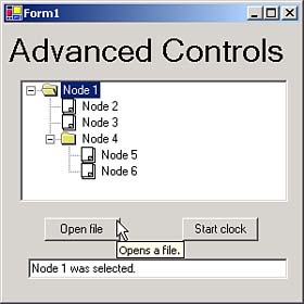
EAN: 2147483647
Pages: 181