Theme Design
|
| You should consider two main focuses when designing a successful theme: form and function. The two parts might seem at odds on occasion, but well-designed themes always provide a balance between the two elements. When most people think about site design, they concern themselves with the image and appearance of a website. Acknowledgment of brand identity and successful communication of a design's impression on visitors are both important goals, but a site that does not provide adequate navigation or contain all desired information is more likely to lose visitors than keep them. The following sections look at visual design guidelines to ensure your site is attractive to visitors and cover tips and techniques to ensure the site's interface works with users to connect them with online content. Crash Course in DesignThroughout this section, you learn basic rules that you can use to make a successful web design. These methods are standards you can certainly explore in greater detail by taking courses or reading books specifically on design, but as this is a book on PostNuke and not design, they are presented here as refined instructions you can apply to even the simplest designs to create a professional polish for your site. Design to Fit Your ContentYour site's design communicates to your visitors as much as your content, and it does it at a glance, much faster than it takes to read your introductory paragraph. When planning and creating your website design, be certain it is appropriate for the content it frames. A site serving wedding information shouldn't look like a World War II history site any more than a crayon-inspired kids' interface applies to a company site in the technology industry. Select your colors, fonts, and layout to suit the subject matter in the site. The tone for a site is set immediately at the first load. The balance between content and design is as important as color and imagery. Having cluttered content so packed it's nearly impossible to see where to begin is not a path to success; for most sites, effective use of whitespace makes your content more legible. Furthermore, content that is easy to read gets read. Select Appropriate and Effective ColorsThe choice of color can make or break a design. It's important to select and apply well-suited colors to your layout, and to help you stay on the right track, consider the following rules of thumb:
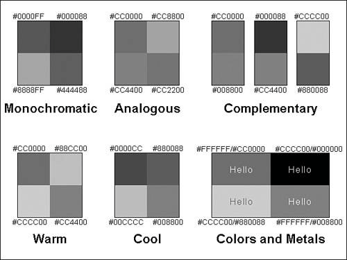
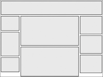
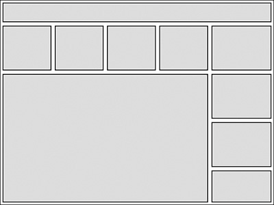
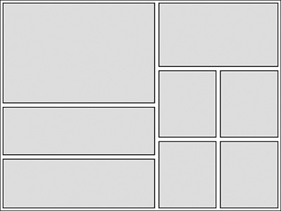
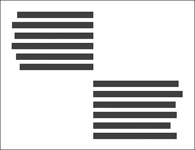
Tip You can manage your color selections with cascading style sheets to make experimentation easier. By defining colors in your styles, a few changes in your styles let you view your site with alternative choices. These color concepts are illustrated in Figure 15.1. The printed figure is grayscale for this text, but you can download the image with the online materials for this chapter. Each color swatch is also labeled with a hex code to make the specific colors clear. Figure 15.1. Common PostNuke site layout. Websites Are Not Meant to Be PrintedThis might seem obvious, but for many site developers, printing support is a common dilemma. Websites are a unique medium, just as the same content printed or spoken is conveyed separate and distinctive. Modern websites are saturated with dynamic content and animation in a way that will never be printableno matter what design they employ. If you need to provide print capabilities for your site, you should have your dynamic content applied to a print view that strips out all the colors and navigation layout. Many PostNuke modules include the ability to view page content in alternate printer-friendly layouts, so you should never be concerned about designing printing support into the main site layout itself. Design to Screen ResolutionsMore than half of the computer users in the world have monitors set to 1,024¥768 resolution. A shrinking 35% use 800¥600. Nearly all of the remaining screens are larger than 1,024¥768, with very small percentages lower than 800¥600. The trend is moving toward the higher resolutions, but you can expect 800¥600 to remain a standard minimum target well into 2006. All this means you need to consider your visitors' screen resolution when designing the layout of your site. To support 800¥600 users, a design must be able to function at a minimum width when the users' browsers are maximized to full screen. Subtracting out the average widths of browsers' window frames and scrollbars leaves about 770 pixels to work with. Even designs that can stretch to an unlimited width should be compressible to at least 770 pixels. A design larger than this can result in horizontal scrolling, and very few people like scrolling horizontally. Selecting the Right Typeface: Serif Versus Sans SerifSerifs are the little projections accenting the ends of the strokes that make up a letter. They are designed to help the eye stick to the line and make reading the site easier. In the print world, you will find standard Serif fonts such as Times New Roman used almost exclusively for regular text. Sans Serif typefaces like the popular Arial and Verdana fonts are more modern, coming to light in the last century. They became popular in print due to a desire for more type variety, especially in advertising, but they are especially important for website design. Printed text materials are created with a very high resolution, usually hundreds of dots per inch. Computer monitors, on the other hand, display at much lower settings, usually around 72dpi. Serifs become a problem at low dpiwhen they are harder to render with only a few pixels available. At small sizes, Serifs are distorted or not displayed on the screen at all, and when the typeface is designed to use Serifs, unclear display can hurt readability. Using Sans Serif fonts on your website can solve this problem. Sans Serifs are designed to display clearly without the leading serifs, and they retain readability on computer screens even at smaller sizes. It's for this reason the vast majority of websites today incorporate Sans Serif fonts. Tip Use fonts that are very common across different operating systems to be certain your site displays correctly. The common Sans Serif family group includes Verdana, Arial, and Trebuchet MS. For Serif fonts, use Georgia, Times New Roman, and Courier New. Verdana and Georgia are wider fonts and specifically designed to be more readable on computer screens. For more variety, Arial Black, Impact, and Comic Sans MS are also found across different operating systems. When in doubt, use Sans Serif fonts on your site. You really can't go wrong no matter what your size or layout. There are instances in which Serif fonts are good for larger titles or design effects, but most sites should use Serif fonts sparingly. CSS also supports the use of generic font families, such as serif, sans-serif, cursive, fantasy, and monospace. Use a family designation to help ensure your viewers get the right font. When to Break the RulesAll these rules might seem very constraining, but they are, at heart, guidelines. Just because a design technique is standard, you are not locked into applying the technique the same every time. Good design comes from the application of many combined features, and often a better design can result from the breaking of the right rule at the right time. If you break all the rules, your site will more than likely become a jumbled mess. The key is creating a professional, consistent design that works with your content, and doesn't interfere with your content. Design should be primarily used in a subtle way to enhance content, but having a standout visual element can make your site more memorable, and memorable sites get return traffic. Make Your Design WorkSites that rely on the attraction of public visitors must acknowledge the true secret to success is maintaining return traffic. Thousands of dollars can be spent on marketing to increase site hits, but if those visitors don't find anything to make them return later, the increase is only a temporary inflation. Creating a quality site that's functional and useful to your users is essential. The previous section was concerned with purely visual design, but the following techniques illustrate steps you can take to create a layout that does more than just look good. Navigation Must Be Clear, Consistent, and RedundantIf visitors can't find their way around your site, they will never see your content. It is important to provide a clear, simple navigation system visitors can use. After you have a navigation system designed, it should remain consistently placed in the same location throughout your site. Moving the links around only forces users to need to look for them. The majority of sites place their links to the left or top of the page. It's okay to creatively place navigation elements elsewhere, or to break them into separate tiered levels that display in different locations. Having a consistent position for your navigation system generates a rhythm for your site, and even if it is nontraditional, your visitors will quickly be able to predict where to find the links they need. Break Out of the BoxPostNuke, like nearly all Content Management Systems (CMSs), has a modular layout resulting in a "blocky" feel. Take a look at Figure 15.2. Figure 15.2. Common PostNuke site layout. If you've browsed through a variety of PostNuke sites, you recognize the common theme shown in Figure 15.1. The vast majority of sites use the same top header with a three-column layout. To the designers' credit, PostNuke does lend itself to that layout in its default configuration. But it is built that way simply to provide an example of how you can organize site content in a modular way. However, it is purely a guideline. You don't have to make every site the same; the incredible diversity of designs displayed by non-PostNuke sites on the Web set the right example. For starters, make your design asymmetrical. It's very easy to change the default themes slightly to achieve a custom effect. Even though the standard block areas are labeled "left" and "right," there is no reason why they must remain in those positions. Those are simply labels. You can rename the labels to be "area 1" and "area 2," or anything you like. Take a look at Figure 15.3. The blocks in this example have been made horizontal above the main content area. Figure 15.3. Placing block areas horizontal for a unique effect. Even the relative standard of having all the small blocks the same size in columns or even rows is unnecessary. If your site would benefit from having completely customized content areas and layout, there would be no reason to use the defaults included with PostNuke. It can create any site layout you need. PostNuke is a content management tool with many options. The more options you elect and adapt, the more your site is customized to your needs (see Figure 15.4). Figure 15.4. Customizing your site layout. Finally, even though PostNuke content is defined in modular pieces, which by design need to be square and boxy to make them easily placeable, the graphic design you place under your contentthat colorizes and decorates your content to join the pieces into a sitedoes not need to be boxy or blocky itself. Use fields of color to group the content areas and break across the imaginary lines drawn by the code. Most PostNuke themes incorporate a template for each block. The template frames the content into a box. In design, the use of boxes to frame content is generally a bad decision; it appears amateurish. PostNuke lets you template every content element, but you don't have to border them in an obvious way. Consider, for example, a column of vertical blocks. Simplify the template for those blocks to only format the text, and instead theme the area in the page template with a solid band of color. The blocks lose their boxy individuality and combine to make a column of content. Place Content to Lead the Reader's EyeYou should always place your content in ways that effectively lead a reader around the page. The top of any page is always seen first, but you can use your design to draw readers down to other areas on the page. This is done by the use of leading lines, invisible lines drawn between page elements. For example, suppose you have a series of content pieces each titled in bold text. Just having the titles stronger than the rest of the content prompts a reader to glance through the titles. A splash of color like red placed in key areas of the design naturally draws one's eye from the last marker to the next. Even the alignment of your text is a tool. Content aligned together is read together. This works even if one paragraph is aligned to a right edge, and the next is aligned left to the same point (see Figure 15.5). You can use this technique to great effect, especially in larger areas with blocks aligned to different sides. Figure 15.5. Using leading lines to help visitors read content. But as with all things design, moderation is important. If you have too many visual cues, your pages can become distracting. Visitors might spend more time being lead around a page than reading the content it presents. Emphasize certain areas of the page to be certain they are seen, and use a general flow of consistent alignment and formatting to do the rest. Design for SpeedNo one likes to stare at a blank screen. It's very important to provide a design that loads swiftly. Having a powerful, well-managed server caching its pages for speed only helps reduce bottlenecks at the server. If your design is very large and cumbersome, it still takes a while for a user to load. The solution is intelligent use of images. You want to reduce the quantity of images that need to be loaded and shrink the overall combined file size of those images. Every image is another request that has to be sent all the way to the server, and often having one larger image takes less time to load than multiple smaller images of a mathematically smaller file size. Look for areas in which you can reduce or eliminate images altogether. Color areas using style codes instead of background images. If you need an image in the background, tile it from a very small original size. Look for ways you can reuse images instead of having multiple graphics that are very similar. And, above all, compress those images hard. You really need to know how to compress your images and which format to use. The JPEG format (from the Joint Photographic Experts Group) is great for photos and graphics containing many different colors mixed together. JPEGs get "fuzzy" when compressed, which can be unnoticeable in some designs but very obvious in others. The Graphics Interchange Format (GIF) is designed for flat color, such as cartoons and charts; it is limited to 256 colors, but includes an alpha channel with one color for transparency and it retains sharpness even when highly compressed. Tip Decrease the color depth of GIFs and PNGs to produce incredibly small file sizes. A lower bitdepth performed carefully can sometimes beat the file size of a well-compressed JPG format for a photo image. Drop the colors as low as possible while still retaining image clarity. Portable Network Graphics (PNG) is a format designed to replace GIF. With the same palette and color depth, PNG is often smaller than GIF file sizes. PNG also possesses a true alpha channel for smooth transitions and can perform animations using the Multiple-image Network Graphics (MNG) format. The problem with PNG is that most users unfamiliar with the details of the formats have trouble getting the most out of the image type, and their PNG files end up being larger than GIFs. And although both Amaya (www.w3.org/Amaya/) and Mozilla (www.mozilla.org) have done a good job keeping up with image standards, other browsers including Internet Explorer have very poor support for many of the features that make PNG better than GIF, most notably full alpha channel and color support. All that can seem very complicated to someone without a graphic design background, so if you are having problems deciding what to use, the simplest method is to take a given image for your site and save it in all three formats. Try compressing them if you want; save different versions with different levels of compression, and then test in your browser to see which is the smallest of those that look good. Use that image and delete the rest. Try to keep your total image size under 50K. A 56K modem on a good day can pull 45K per second. Broadband connections on a bad day can drop that low, but are usually better. So if you can keep the total under 50K, your site loads in 10 seconds or less for the majority of your visitors. Having a swift page load also means less overall weight on your server, making improvements on the server-side more effective and able to handle additional concurrent users. Test in Multiple BrowsersThe majority of Web users in the world currently use Internet Explorer to browse sites. That has not always been the case, nor is it likely to be in the future if current trends continue. The market share of the Mozilla Firefox browser has been steadily growing, and that growth, as well as its focus on standards support, suggests the Firefox browser should not be ignored. It's always strongly recommended that you develop to World Wide Web Consortium (W3C; www.w3.org) standards and test display of your site in multiple browser brands. The W3C also provides a markup validation service for easy testing at validator.w3.org. If you are developing to a fixed audience, such as an intranet site for internal company employees, you know what browser brands and versions to expect. But for public sites, it can be harder to predict. It is easier and saves more time in the long run to simply create your sites to suit all visitors, no matter their browser. That means you need to refrain from the use of proprietary tags, but even a site optimized for one browser type can be made very functional for other browsers, even if the result is that the view in other browsers is slightly less attractive. Maintain cross-browser functionality and you will be fine. A good table of tags can be found at EchoEcho.com (www.echoecho.com/htmlreference.htm); any tag not marked in the W3C column is proprietary. |
|
EAN: 2147483647
Pages: 207