Paragraph Palette
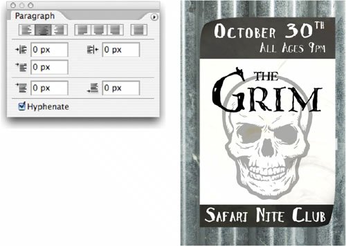
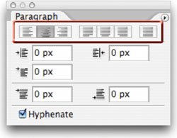
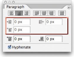
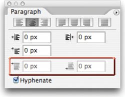
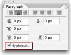
| To finish out your control over text, you'll need to visit the Paragraph palette. While there are not as many choices, you will still need these controls. If it wasn't clear from its name, the Paragraph palette works best with Paragraph Text. Use of the Paragraph palette allowed the text on this poster to be precisely aligned. Note: Paragraph Art For a more creative example of using the Paragraph palette, open the project file Concert Sign.psd to examine its construction. Alignment/Justification ButtonsThese buttons will attempt to align text left, right, or centered. They also add support for justification, which causes the text to be aligned to both margins through the adjustment of spaces between words. Indent FieldsThese three fields allow for the indentation of the left or right margins, as well as the first line of text. If you are going to have multiple lines of text, be sure to use the first line indentation to improve readability. Spacing FieldsTo further improve readability when multiple paragraphs are involved, use the Spacing option. You can specify how much space to add before or after a paragraph (either really works). This is a much better option than adding extra hard returns at the end of a paragraph. Enable Hyphenation At the bottom of the Paragraph palette is a Hyphenate checkbox. If enabled, this will allow lines to break mid-word. Photoshop will use the selected dictionary from the Language Selection Menu in the Paragraph palette. While this better fills out a text block, it is not always the best for large type. It is more acceptable for a multicolumn layout or body copy. Be sure to try out the Adobe Every-line and Single-line Composer options, which can be accessed from the Paragraph palette submenu.
Note: Number of Fonts There are no hard and fast rules about how many fonts to use on a page... but here are a few "basics."
|
EAN: 2147483647
Pages: 129