| The last major form design aid you need to know about is the Toolbox. The Toolbox is used to add new controls (labels, text boxes, check boxes, and so on) to forms. These controls can be attached to data (such as the text boxes and check box you just created on the Plantings form), or they can be independent of any data (such as the labels that contain the captions for those controls). To see the Toolbox, place a form in design view and either click the Toolbox button on the toolbar or select View , Toolbox . Figure 13.8 shows the Toolbox and the buttons it contains (your Toolbox might be shaped differently; you can drag the borders to control its size and shape). Figure 13.8. The Toolbox. 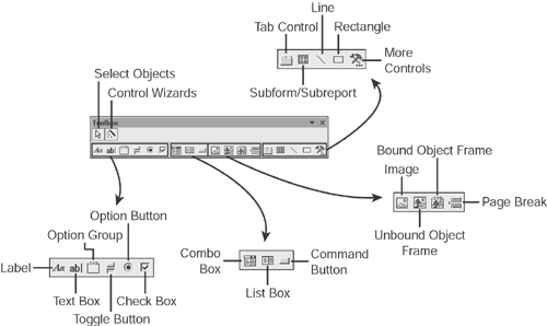 Note  | In Access, a control that is attached to data is called a bound control. A control that is independent of data is called an unbound control. |
Most of the buttons on the Toolbox are used to select the type of control with which you want to work. We'll show you how to use the following six common buttons later in this section of the chapter: -
Label Used to display unbound text -
Text box Used to display an area in which the user can type -
Check box Used to allow making a yes/no choice -
List box Used to display a list of information -
Combo box Used to display a drop-down list of information -
Command button Used to display a button Tip  | When you're learning your way around design mode, the Control Wizards can save you a lot of time. Later, when you're more of an expert, you might want to turn them off and set the control properties by hand. |
Three of the buttons in the Toolbox have special meanings: -
Select Objects arrow Used to choose an already existing control with which to work. -
Control Wizards button Turns the Control Wizards on or off. You should have them turned on for now. -
More Controls button Allows you to add more controls to the Access Toolbox. We won't be using this button in this book. Labels Perhaps the simplest of all controls is the Label control, which is designed for displaying information, not editing information. When you see field names or captions displayed on a form, those are all Label controls. Although Label controls are not as complex as other controls, they do offer an easy way to practice some essential form design operations: placing, moving, sizing, and changing the properties of controls. Start by following these steps to add some Label controls to the Plantings form: -
Open the Plantings form in design view. If the form is still on your screen in form view, you can select View , Design View to change it back. -
Click the Label control in the Toolbox, and move your cursor to the form. It will display a crosshair and a capital letter A , indicating that it is ready to create a label. Click and hold the mouse button where you want the upper-left corner of the new label to be on the form. Then, drag the cursor down and to the right. A box will appear as you drag, indicating the dimensions of the new control. -
Release the mouse button; the label will be displayed as a blank, white box with a blinking cursor. Type the text Number Planted and click Enter to finish creating the label. -
Create a second label beneath the first one, following the same steps. Enter the text Purchase Price for the second label. You might not have managed to place the controls precisely where you want them when you created them. That's okay because Access offers flexible ways to control the sizes and positions of controls. Try these steps to see how you can alter the placement of the new controls: -
Click in the Number Planted control, and Access displays eight dark boxes around the control. These boxes are called sizing handles ; there's one at each corner of the control and one in the middle of each side of the control. -
To resize the control, click one of the sizing handles, hold down the mouse cursor, and drag the handle in the direction in which you want to move that part of the control. -
To make the control exactly the right size to contain its contents, double-click any one of the sizing handles. -
To move the control, move the cursor until it is over one of the sides of the control, between sizing handles. The cursor turns into an open-palmed hand at this point. Click and hold the mouse button, and you can drag the control wherever you want to place it. -
Press F4 to display the Properties window if it's not already visible. -
Click the Format tab of the Properties window. -
Four properties dictate the size and position of the control. The Left property measures the distance between the left side of the control and the left side of the form, whereas the Top property measures the distance between the top of the control and the top of the form. The Width property measures the width of the control, and the Height property measures the height of the control. Type a new value in one of these properties, and you'll see the control immediately change in response. -
With the Number Planted control still selected, hold down the Shift key and click the Purchase Price control. This results in both controls being selected, as shown in Figure 13.9. Note that the Properties window now displays values for the properties that the two controls have in common. For example, they're both the same height, so the Height value is displayed; but they have different widths, so the Width value is missing. Figure 13.9. The Properties window with multiple controls selected. 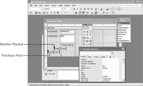 -
Type a value in the Properties window for the Left property. You'll see that the new value is applied to both selected controls. -
Select Format , Size , To Widest to make both controls the same width. The other choices on the Format, Size submenu offer other ways to make multiple controls the same width or the same height. -
Hold down Shift and click the Purchase Price control again. This deselects that control, leaving only the Number Planted control selected. -
Drag the Number Planted control to the left or right so that the two controls are not lined up vertically. -
Place the mouse cursor at a point below and to the right of both controls. Now hold down the mouse button and drag the mouse up and to the left; Access draws a box that follows the mouse pointer as you do this. When the box includes both controls, release the mouse button. Both controls are now selected. -
Select Format , Align , Left to set the Left property of both controls to the same value. The Format, Align submenu contains other choices for aligning controls. Besides the sizing and placement properties, many other properties are available, even for a control as simple as the Label. Inspecting the Properties window with a Label selected shows you the entire list. Table 13.2 lists some of the properties that you'll most likely find useful as you're starting out. Table 13.2. Properties of the Label Control | Property | Meaning | | Name | Each control on a form has a unique name. Until you start writing code, you won't need to worry about this. The caption of the Properties window shows both the control type and the control name when you have a control selected. | | Caption | Specifies the text displayed in the control. | | Left | Specifies the distance between the left edge of the control and the left edge of the form. | | Top | Specifies the distance between the top edge of the control and the top edge of the form. | | Width | Specifies the width of the control. | | Height | Specifies the height of the control. | | Back Style | Specifies whether the background of the control is transparent. | | Back Color | Specifies the background color of the control. | | Special Effect | Specifies the 3D appearance (if any) of the control. | | Border Style | Specifies the style of line used to draw the box around the control in form view. | | Border Color | Specifies the color of the line around the control in form view. | | Border Width | Specifies the width of the line around the control in form view. | | Fore Color | Specifies the color of the text in the control. | | Font Name | Specifies the font used to display text in the control. | | Font Size | Specifies the size of the text in the control. | | Font Weight | Specifies the boldness of the text in the control. | | Font Italic | Controls whether the text in the control appears in italic. | | Font Underline | Controls whether the text in the control appears underlined . | | ControlTip Text | Specifies the control tip to appear when the user hovers the cursor over the control. | Tip | | Most of the properties of Label control also apply to other types of controls. |
You can set any of the properties listed in Table 13.2 by making entries directly in the Properties window. However, user interface shortcuts exist for some of these properties as well. Follow these steps to explore some of the properties of the Label control: -
Select the Purchase Price control. -
Click the drop-down arrow next to the Fill/Back Colo r button on the toolbar. Select a background color for the control by clicking one of the color patches that appears. -
Click in the Fore Color property in the Properties window. A build button appears to the right of the propertyclick it. -
Select a color from the Color dialog box and click OK to assign that color to the text of the control. -
Click the drop-down arrow next to the Special Effect button on the toolbar; then select the Shadowed special effect. -
Click in the Font Name property in the Properties window. A drop-down arrow appears; click a font name to assign that font to the control. -
Double-click in the Font Italic property in the Properties window to switch the property value from No to Yes . -
Double-click one of the sizing handles for the control to ensure that it can still display all its text. You might have noticed that the Fore Color and Back Color properties display numbers in the Properties window. That's because Access assigns a numeric code, ranging from 0 to 16 million, to each of the colors it can display. If you pick a number at random for a color property, you'll get a random coloralthough generally it's more useful to use the toolbar buttons or the Color dialog box to select the color you want. Text Boxes Text boxes provide a control that can display data from a table and that a user can use to edit or enter data. Most of the controls you've been working with on forms so far in this book are text boxes. You'll find that all your skills from manipulating labels apply equally well to text boxes. In fact, all controls are sized , placed, and so on using the same techniques. Follow these steps to add some text boxes to the Plantings form: -
Select the Text Box tool in the Toolbox. The Properties window displays the default properties for a text box control. Set the Auto Label property to No . -
Now move your cursor to the form. It displays a crosshair and control with letters in it, indicating that it is ready to create a text box. Click and hold the mouse button where you want the upper-left corner of the new label to be on the form; start just to the right of the Number Planted label. Then, drag the cursor down and to the right. A box appears as you drag, indicating the dimensions of the new control. -
Release the mouse button, and the text box is displayed with the contents Unbound . -
Click in the Control Source property to display both a drop-down arrow and a build button. Click the drop-down arrow and select Number Planted from the list. -
Hold down Shift and click the Number Planted label so that both the text box and the label are selected. Use the Format menu to size and align the two controls. -
Click the Text Box control in the Toolbox again. -
Set the Auto Label property to Yes . -
Draw another text box on the form. This time, however, when you release the mouse button, Access creates both a Text Box control and a Label control. Both controls will be selected. -
Move the cursor until it is over the edge of one of the controls and displays the open hand. -
Click and drag the cursor; both controls move together. -
Move the cursor over the upper-left sizing handle of one of the controls. At this point, the cursor displays a hand with one finger sticking up. Click and drag the cursor to move just that control, without moving the other control. -
Set the Control Source property of the new text box to Bed . The Text Box control has many of the same properties as the Label control. However, it also has other properties because it can contain data. Figure 13.10 shows the Data tab of the Properties window with a Text Box control selected. Figure 13.10. Data properties for a Text Box control. 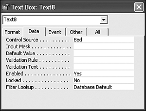 Many of the data properties of a Text Box control are familiar to you from table design (and indeed, these properties inherit their values from the values assigned to the corresponding table field). This includes the Input Mask, Default Value, Validation Rule, and Validation Text properties. Three of the other properties on this tab will be important to you as you design forms: -
Control Source Specifies the data field to which this control will be bound. The Control Source will be a field from the Record Source specified for the form. -
Enabled Controls whether the control is displayed as a live control. If you set the Enabled property to No, the control is grayed out and the user is not able to type in it. -
Locked Controls whether the user can enter data in the control. If you set the Locked property to yes, the user cannot edit the data contained in this control. Check Boxes Check boxes are an appropriate control to use when you want the user to make a yes/no choice. Indeed, the Form Wizard and the Field List use Check Box controls to represent any data field with the Yes/No data type. That's why the Future control on the Plantings form is a check box. If you select the Future control on the Plantings form, you'll see that we've already discussed many of the properties of the control. The following are two more properties we want to point out: -
Status Bar Text Holds the text to be displayed on the Access status bar when this control is selected. Access automatically initializes this property from the description property of the corresponding table field, but you can override that here if you want. -
Triple State Controls whether the control is just a yes-or-no choice or whether it has a third, indeterminate state. If you set the Triple State property to Yes, a Check Box control can be checked, unchecked, or grayed out. The grayed out state corresponds to a null value in the underlying table. List Boxes and Combo Boxes List boxes and combo boxes are the most complex controls you'll be working with as you design your first databases. These controls actually relate data from one table to data from another table. You can think of the List Box and Combo Box as little machines that allow the user to pick a value from one table and then pump that value into a field from another table. Fortunately, although these controls are complex, they aren't hard to build because Access includes a Control Wizard to help you build them. Here's how you can create a simple List Box control: -
Open the Plants table in design view. -
Make sure that the Control Wizards button in the Toolbox is selected. If it isn't, click it before you continue so Access will automatically launch the appropriate control wizard. This button is a toggle button and remains selected until you click it to deselect it. -
Select the List Box control in the Toolbox. -
Use the cursor to draw a control in the empty area of the form, just as you earlier drew Label and Text Box controls. When you release the mouse button, instead of creating the new control, Access launches the List Box Wizard, as shown in Figure 13.11. Figure 13.11. The first panel of the List Box Wizard. 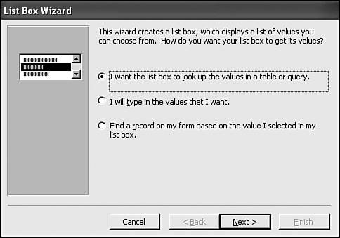 -
On the first panel of the List Box Wizard, select I Want the List Box to Look Up the Values in a Table or Query . Then, click Next . -
On the second panel of the List Box Wizard, select the Types table as the source of data for the List Box. Click Next . -
On the third panel of the List Box Wizard, click the >> button to move both the TypeID field and the Description field from the Available Fields list to the Selected Fields list. Click Next . -
The next panel of the List Box Wizard, shown in Figure 13.12, displays the way the List Box control will look. You'll see that Access has chosen to hide the TypeID column. Click Next . Figure 13.12. Setting column options in the List Box Wizard. 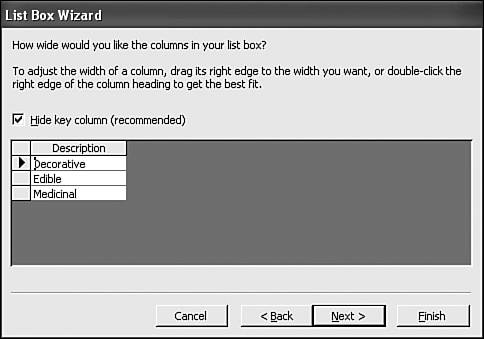 -
On the fifth panel of the List Box Wizard, select Store the Value in This Field. Select the TypeID field from the drop-down list and click Next . -
Assign the name Type to the List Box. Then click Finish to create the list box. -
Select View , Form View to see the effects of your changes. Figure 13.13 shows the form at this point. Figure 13.13. The form with a new List Box control. 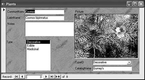 As you scroll through the records displayed by this form, you'll notice that the new List Box control and the existing Combo Box control always show the same selected value. The reason is that they're both bound to the same underlying field in the Plants table. There's nothing to prevent you from displaying the same data in two different controls, although users of your database might find this a bit confusing. The major difference between a list box and a combo box is that the list box shows the entire list at all times, whereas the combo box shows only the selected value until you click the drop-down arrow. A list box is also limited to the values that are already in the list. A combo box, on the other hand, can let the user enter a value that's not in the list, although this capability is usually turned off. To see the properties that control the behavior of a combo box or list box, switch the Plants form back to design view and click the TypeID combo box (the one that existed before you added the list box). Here's what you'll find: -
The Control Source property is set to TypeID This is the field in the Plants table in which the user's selections are stored. -
The Row Source Type property is set to Table/Query In most cases, this is the setting you'll want here. You can also choose Value List, which lets you embed the list directly on the form rather than taking it from another table. -
The Row Source property is set to SELECT Types.TypeID, Types.Description FROM Types You might recognize this as a select query. Fortunately, you don't have to build the row source by typing such code in; when you click in the Row Source property, the Properties window displays a build button that opens the query design grid. The row source specifies the source of the list of values in this control. In this case, it's using all the TypeID and Description values from the Types table to build the list. -
The Column Count property is set to 2 This tells the form that there are two columns in the row source. -
The Column Widths property is set to 0";1" This tells the form that the first column should be hidden (by setting its width to 0) and the second column should be 1" wide. -
The Bound Column property is set to 1 This tells the form that when the user selects a row in the list, the value from the first column of that row should be stored in the field specified by the control source property. -
The List Rows property is set to 8 This is the maximum number of rows Access will display in the drop-down list at once. If more than eight rows are in the list, Access displays a scrollbar. -
The Limit to List property is set to Yes This prevents the user from entering a value not in the list. Access also offers a useful tool to change the type of a control, which comes in handy when you change your mind about the best user interface for a form. For example, the Plants form currently contains a text box to enter the catalog, but you know that all the catalogs are listed in the Catalogs table. By converting this control to a combo box, you can let the user select from a list rather than forcing her to type in a value: -
Select the Type list box you created earlier in this section, and press the Delete key to remove it from the form. -
Select the CatalogName text box. -
Select Format , Change To , Combo Box . -
Click in the Row Source property for the new combo box, which displays a build button. Click the build button. -
Select the Catalogs table in the Show Table dialog box and click Add . -
Click Close to dismiss the Show Table dialog box. -
Drag the Name column from the field listing in the Query Builder down to the query grid. Set the Sort property for this field to Ascending . -
Click the Close button to close the Query Builder. -
Access displays an error message, as shown in Figure 13.14. Even though this is not the friendliest dialog box possible, its appearance is completely normal. Click Yes to finish building the Row Source property. Figure 13.14. The prompt you see when setting the Row Source property. 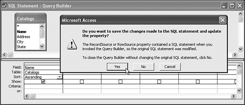 -
Set the Column Widths property by typing 1.5" . -
Set the Limit to List property by selecting Yes . -
Save the form. -
Switch to form view. Now you can select the catalog name from a list, instead of having to type it in for each record. Command Buttons The last important control that we'll look at in this chapter is the Command Button control. Command buttons, as you might guess from their name, are used to tell Access to do something. To get deeply into the subject of commands requires more programming than you'll learn in this book, although there's a short introduction in Chapter 15. But for now, you'll use the Control wizards to construct a command button to give you a feel for what they can do. Follow these steps: -
Open the Plants form in design view. -
Click the Command Button button in the Toolbox. -
Click in an empty area on the form to launch the Command Button Wizard, shown in Figure 13.15. Figure 13.15. The Command Button Wizard. 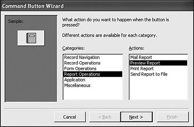 -
Select Report Operations in the Categories list. Then select Preview Report in the Actions list and click Next . -
On the second panel of the wizard, select the Plants report. Click Next . -
On the third panel of the wizard, accept the default picture and click Next . -
On the final panel of the wizard, accept the default name and click Finish . -
Save the form and switch back to form view. -
Click the newly created button. The Plants report opens in print preview view. |