Using ASP.NET Server Controls
|
|
As we've mentioned, you can use ASP.NET server controls to easily create and programmatically reference and control objects in ASP.NET script pages. To make programming this large library of controls easier, each control has a base object model that contains the same properties, methods, and events. In our previous example, you saw a few HTML server control counterparts to some standard HTML form controls we all know and love. However, HTML server controls are only the beginning. There are 45 default ASP.NET web server controls that you can use for everything from controlling the value of a text box to managing the display of an ad banner system to binding a form field to a column in a database.
At this point, you may be wondering about the differences between HTML server controls and web server controls. Very simply, HTML server controls are standard HTML tags with the RUNAT=SERVER parameter that marks them as a server controls. HTML server controls lack the expansive attributes and control provided by web server controls. In addition, the ASP.NET web server won't generate HTML targeted to browser versions as web server controls will. Table 14.2 shows a list of common HTML server controls. (As you recall, most HTML elements can be transformed into HTML server controls by adding the RUNAT=SERVER parameter.) Table 14.3 lists and describes web server controls. Don't stop there. Hundreds of web server controls are freely available on the web. In fact, you can even create your own web server controls.
| Control | What It Controls |
|---|---|
| HTMLAnchor | The HTML <a> tag |
| HtmlButton | The HTML <button> element |
| HtmlForm | The HTML <form> element |
| HtmlGenericControl | HTML elements that are not specifically supported by existing server controls, such as <span>, <div>, and <font> |
| HtmlImage | The HTML <img> element |
| HtmlInputButton | The HTML <input type=button>, <input type=submit>, and <input type=reset> elements |
| HtmlInputCheckBox | The HTML <input type=checkbox> element |
| HtmlInputFile | The HTML <input type=file> element |
| HtmlInputHidden | The HTML <input type=hidden> element |
| HtmlInputImage | The HTML <input type=image> element |
| HtmlInputRadioButton | The HTML <input type=radio> element |
| HtmlInputText | The HTML <input type=text> and <input type=password> elements |
| HtmlSelect | The HTML <select> element |
| HtmlTable | The HTML <table> elemen |
| tHtmlTableCell | The HTML <td> and <th> elements |
| HtmlTableRow | The HTML <tr> element |
| HtmlTextArea | The HTML <textarea> element |
| Control | Purpose |
|---|---|
| AdRotator | Displays an advertising banner |
| Button | Displays a push button |
| Calendar | Displays a one-month calendar with which the user can select dates and move to the previous and next months |
| CheckBox | Displays a check box control |
| CheckBoxList | Creates a group of check boxes that can be dynamically created by binding to a data source |
| CompareValidator | Compares one form control value to another or to a specified |
| valueCustomValidator | Validates based on user-defined parameters |
| DataGrid | Displays items from a data source in a table and allows the user to select, edit, and sort items |
| DataList | Displays items from a data source using templates that can be customized |
| DropDownList | Displays a drop-down list from which the user can select an item |
| HyperLink | Displays a link that directs the user to another page |
| Image | Displays an image defined by the ImageURL property |
| ImageButton | Displays an image and allows the server to handle click events |
| Label | Displays and manipulates static content on the page with the benefit of applying styles to the content |
| Litera | Displays and manipulates static content on the page without applying styles to the content |
| LinkButton | Displays hyperlink-style buttons |
| ListBox | Displays a single- or multiple-selection list box |
| Panel | Displays a panel as a container for other controls |
| PlaceHolder | Reserves a location in the page for programmatically added controls |
| RadioButton | Displays a radio button |
| RadioButtonList | Displays a radio button group that can be dynamically created by binding to a data source |
| RangeValidator | Validates that the value of a form control falls within a given range |
| RegularExpressionValidator | Validates that the value of a form control matches a specific pattern such as a date or a credit card number |
| Repeater | Displays the items from a data source in a layout dictated by repeating a single template for each item in the list |
| Table | Displays and manipulates a tableTableCell Creates and manipulates a cell for the Table control |
| TableRow | Creates and manipulates a row for the |
| Table controlTextbox | Displays a single or multiline text box |
| RequiredFieldValidator | Validates that the user does insert a value into a form control before submitting the form |
| ValidationSummary | Displays a summary of all failed validation controls |
| XML | Used to output data to an XML document or text stream |
In most cases, using a server control in Dreamweaver MX is simple. For example, to add a Form control to your page, follow these steps:
-
Create a new ASP.NET page in your defined ASP.NET site.
-
From the ASP.NET toolbar, click the Textbox button to open the TagEditor - Textbox dialog box, which is shown in Figure 14.3.
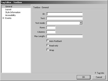
Figure 14.3: Dreamweaver MX inserts the Textbox server control -
Enter the ID and TextMode, and click OK. Dreamweaver MX places the Textbox server control in your page.
|
|
EAN: 2147483647
Pages: 214