Editing Color and Font Parameters
|
|
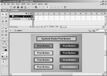
| On the CD | Open the PixelButton.fla file in the Chapter 4 folder on the CD (see Figure 4.1). Save the file to your local computer so that you can save your edits as you follow along. |
Test the movie and roll over the various buttons (see Figure 4.2). Notice that each of the buttons looks the same except that the default and rollover colors are different and the top center button is also wider than the other buttons. Each of these buttons is actually a different instance of the same component. Now go ahead and close the text movie window and return to the PixelButton.fla file.
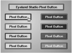
Figure 4.2: The movie shows nine buttons on the stage.
Open the library and notice that the PixelButton component has a custom icon instead of the default component icon (see Figure 4.3). If you are not familiar with the default icons for Flash resources-such as movie clips, graphic symbols, bitmap symbols, audio symbols, and components-then it might not be very easy to spot a custom icon. Custom icons, however, cannot be created for anything other than components. Therefore, if you spot an icon that you haven't seen before, chances are it's a custom component icon.
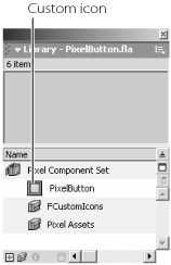
Figure 4.3: The PixelButton component features a custom icon in the library.
Custom component icons can help distinguish one component from another. They are particularly useful if you are using a series of components that have similar names and similar purposes. You will see an example of this later in this chapter when we look at using MXP files. Now let's look at the component parameters for the PixelButton component.
Select the top-left PixelButton component in the first column on the stage (the instance of the PixelButton that is green with a red outline) and press Option/Alt+F7 to open the Component Parameters panel. Read the Instructions if you like (see Figure 4.4) and then click the Next Page button to proceed to the editable parameters.
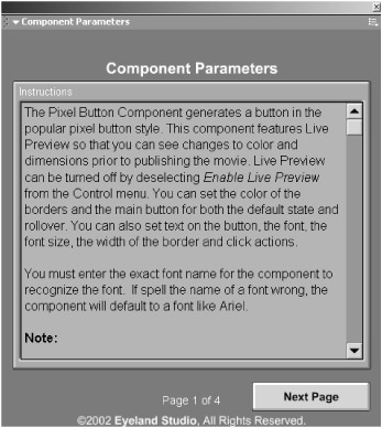
Figure 4.4: The first page of the Component Parameters panel for an instance of the PixelButton component
 |
Notice that you did not have to copy a UI.swf file to the local computer as discussed in Chapter 3. This is because the custom UI for the PixelButton component is embedded into the component. This means that an external .swf file is not needed for the custom UI. Embedding custom UIs will be covered in Chapter 11.
|
The PixelButton custom UI contains three pages of parameters. Here's description of each parameter:
Button Text Specifies text that will appear on the button. You can enter letters, numbers, and punctuation.
Text Size, Text Color, Text Font Specifies the size of the text in points (you can specify anything from 5 to 100 points), its color, and the font. You can only specify a font that is on your local system. It is important to enter the exact name of the font, or a default font will be displayed. Some fonts may not display perfectly centered on the button.
Inner Bevel Color, Outer Bevel Color Specifies the default colors of the button and its border. If the color of the first parameter is the same as the color specified for the Text Color parameter, the text may not be visible.
Rollover Inner Bevel Color, Rollover Outer Bevel Color Specifies the rollover colors of the button and its border. If the color of the Rollover Inner Bevel Color parameter is the same as the color specified for the Text Color parameter, the text may not be visible on rollover. If you specify the same for the Outer Bevel Color parameter as the Rollover Outer Bevel Color, then the border will not change color on rollover.
Button Width, Button Height Specifies the width and height of the button, in pixels.
Band Spacing Specifies the width of the border. The larger the value, the more the border will push into the button area. Very large values may make the main button area too small. This parameter accepts values from 2 to 50.
Action Type Specifies whether to load a URL, load a movie, or specify an action. Selecting any option will produce a related field. For instance, Get URL will produce a field to enter the URL in.
URL Allows you to specify a URL that will be opened if the user clicks on the button. For instance, enter http://www.eyeland.com. This parameter is only available if you specify URL in the Action Type parameter.
URL Window Specifies how you want the URL to load. The value _self will load the URL in the current browser window. Selecting _blank will load the URL in a new browser window. This parameter is only available if you specify URL in the Action Type parameter.
Load Movie SWF Specifies the movie to load. For example, enter move.swf to specify the movie to load. This parameter is only available if you specify Load Movie in the Action Type parameter.
Load Movie Level Specifies the level to load the movie in. If you enter 0 for the level, the movie you load will replace the current movie (which is not typically the desired effect). This parameter is only available if you specify Load Movie in the Action Type parameter.
Action Use this to specify an action that will be executed when the user clicks on the button. For example _root.instance_name.gotoAndStop(10);. This parameter is only available if you specify Action in the Action Type parameter.
Now change the text in the Button Text parameter to "Components". Move the Component Parameters panel so that you can see the instance of the PixelButton component that you are editing. Notice that the text has already been changed on the button (see Figure 4.5). You did not have to close the Component Parameters panel and you did not have to publish or test the movie in order to see the change that you made to the value of the Button Text parameter.
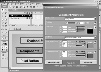
Figure 4.5: The change that you make to the Button Text parameter is reflected on the instance of the component.
This behavior is made possible by a new feature in Flash MX called Live Preview. Components that take advantage of Live Preview let you see edits that you make to the component without forcing you to publish the movie. Obviously, this can help save time and frustration because you don't have to test and retest the movie as you make changes to the component's parameters. However, as you will see, there are some drawbacks to Live Preview.
|
One of the key problems with Live Preview is that it can tend to slow things down while you are working in Flash. As you will learn in Chapter 11, Live Preview is implemented by creating a Flash movie that actually runs or displays within Flash. This should not be confused with Test Movie. When Live Preview is implemented for a component, a movie is actually running within the Flash working environment.
The trouble is, the movie that is running within Flash to facilitate the Live Preview functionality only runs at 1 frame per second. Any changes made in the Component Parameters panel for a component that utilizes Live Preview will only be reflected on the stage once every second. Obviously, this is not bad if Live Preview is displaying simple changes like text edits, color, height, width, position, and so on.
However, each instance of a component that uses Live Preview basically has a movie playing within Flash to show the updates. The Live Preview movie (or movies) is constantly running even if nothing is changing. If you have 20 instances of a component that utilizes Live Preview, then you have 20 movies playing at 1 frame per second within Flash.
This can pose a problem if a lot of code is being executed on a continual basis; the drain on your computer's resources could possibly cause your computer to crash. Live Preview can, in fact, be implemented to show live updates to components that perform animation or other dynamic effects. However, these sorts of things can be very distracting while you're working within Flash and can cause an excessive drain on your computer's resources.
Therefore, Live Preview is usually used in moderation to avoid these problems. In addition, if you need to use a large number of instances of a component that utilizes Live Preview, you might want to turn off Live Preview. You can turn off Live Preview by deselecting Enable Live Preview from the Control menu.
|
Now change the value of the Text Size parameter to 18. You can enter 18 in the value field by sliding the slider to the right until the value reads 18, or you can click the right arrow four times until the value reads 18. Notice that the changes you make to the Text Size parameter are also reflected on the instance of the PixelButton component on the stage (see Figure 4.6).
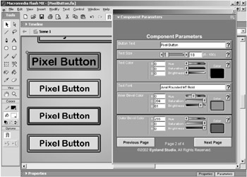
Figure 4.6: Changes to the Text Size parameter are reflected on the instance of the Pixel-Button component on the stage.
|
Most custom UIs allow you to press the Tab key on your keyboard to navigate between fields. For instance, you can click the Text Button field in this example and then hit the Tab key five times to navigate to the Text Size field.
|
Now let's look at the Text Color parameter. Enter a value of 135 in the field with the G next to it. The R, G, and B fields are fields for Red, Green, and Blue values. The fields accept values between 0 and 255. Notice that when you change the value of the Green field, the values or slider positions for the Hue, Saturation, and Brightness fields automatically change (see Figure 4.7). Similarly, you can adjust the sliders for Hue, Saturation, and Brightness, and the values in the R, G, and B fields will automatically adjust to reflect the changes.
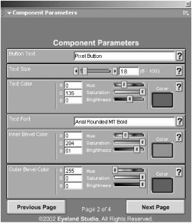
Figure 4.7: Edits to the R, G, and B fields are automatically reflected in the Hue, Saturation, and Brightness fields.
Once again, the changes that you made to the Text Color parameter are shown on the instance of the Pixel-Button component on the stage. As noted in the side-bar, Live Preview only updates once a second. It is a little easier to observe this if you try dragging one of the Hue, Saturation, or Brightness sliders while you watch the changes on the stage. You should be able to see that the changes will not be shown on the instance of the PixelButton component on the stage in real time. Go ahead and return each of the R, G, and B values for the Text Color parameter to 0 before we move on.
The next parameter is the Text Font parameter. As you might expect by now, edits to the Text Font parameter are, indeed, shown by Live Preview. This is particularly useful for letting you know if you've mistyped a font in the field. To see this, try to change the value for the Text Font parameter to a font that you have on your system. Stop before you've entered the entire name and notice that the font shown on the instance of the PixelButton component on the stage is a default font (see Figure 4.8).
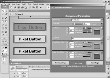
Figure 4.8: If the value for Text Font parameter is not a font name on your system, Flash will display a default font (or possibly no font).
If you enter the Font name correctly, Flash will display that font on the instance of the PixelButton component on the stage (see Figure 4.9). However, note that the font names are case-sensitive, and you must enter even the spacing correctly. Small errors in the font name may result in no font being displayed (see Figure 4.10).
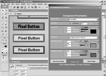
Figure 4.9: If you enter the name of the font correctly, you will see the font displayed on the instance of the component.
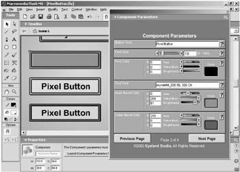
Figure 4.10: Even small errors will result in no font being displayed (the first letter is lowercase instead of uppercase in this example).
Now change the Inner Bevel Color parameter so that the R, G, and B values are 133, 255, and 177 respectively. Move on to the Outer Bevel Color parameter and change the R, G, and B values so that they are 0, 0, and 153 respectively (see Figure 4.11). These changes are reflected by Live Preview. The color controls for these two parameters work exactly the same as the controls for the Text Color parameter that we looked at earlier, so let's move on. Click the Next Page button to look at the third page of parameters for the PixelButton component.
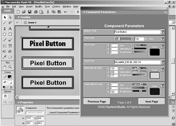
Figure 4.11: Changes to the Inner Bevel Color and Outer Bevel Color parameters are shown on the stage with Live Preview.
Change the R, G, and B values for the Rollover Inner Bevel Color parameter to 212, 255, and 228 respectively. Notice that the edits you make to the Rollover Inner Bevel Color parameter are not reflected on the stage as shown in Figure 4.12 (changes to the Rollover Outer Bevel Color parameter will also not be displayed). The Rollover Inner Bevel Color parameter specifies the color that the button will change to when you roll over the button. However, even if you roll over the instance of the component on the stage, you will not be able to see the changes you enter in the Rollover Inner Bevel Color parameter.
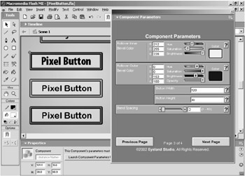
Figure 4.12: Adjustments made to the Rollover Inner Bevel Color and Rollover Outer Bevel Color parameters are not visible on the stage unless you publish or test the movie.
It won't even work if you turn on the Enable Simple Buttons and/or Enable Simple Frame Actions options in the Control menu. Live Preview doesn't display interactive functions. The only way to view the edits to these parameters is to close the Component Parameters panel and test the movie or publish and view the movie.
Notice that the value of the Rollover Outer Bevel Color parameter is already the same as the value that you entered for the Outer Bevel Color parameter. This means that when the movie is played, the border will not change when the user rolls over the button. If the values for the Outer Bevel Color and Rollover Outer Bevel Color parameters are different, then the border will change colors when you roll over the button.
Of course, you can also make the values for the Inner Bevel Color and Rollover Inner Bevel Color parameters the same and then make the values the Outer Bevel Color and Rollover Outer Bevel Color parameters different so that only the border colors change on rollover. These simple options may be obvious, but they nevertheless allow you to generate a range of rollover effects.
There is one more option on the Rollover Outer Bevel Color parameter: A, for Alpha. There is also a corresponding Opacity slider. This allows you to make, for example, the outer bevel invisible on rollover.
|
|
EAN: 2147483647
Pages: 111