Exploring the Component Definition Dialog Box and Value Types
|
|
Open the library and right-click or Control+click the Zoom component. Select Component Definition from the pop-up menu (see Figure 2.8). As we will discuss in Chapter 10, you use the Component Definition dialog box (shown in Figure 2.9) to create a component. Right now we just want to poke around a bit and look at the different value types that there can be for component parameters.
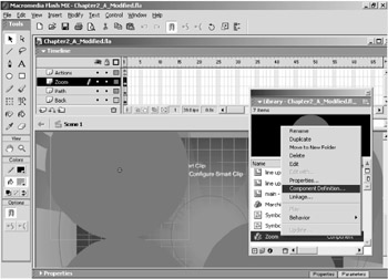
Figure 2.8: Open the Component Definition dialog box for the Zoom component.
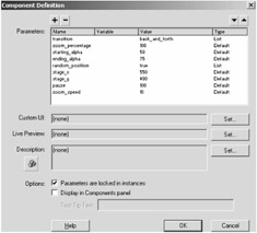
Figure 2.9: You use the Component Definition dialog box to create components.
Notice that the Component Definition dialog box looks somewhat similar to the Component Parameters panel. There is a column for names and a column for values. However, there is another column named Type. Click the top field in the Type column. You will see a gray button with a down-arrow on it. Click this button to open a list of value types (see Figure 2.10). As you can see, nine different types can be used for component parameter values: Default, Array, Object, List, String, Number, Boolean, Font Name, and Color.
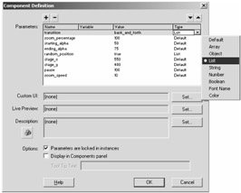
Figure 2.10: There are nine value types for component parameters.
In the Zoom component, select one of the circles on the Zoom layer. Open the Component Parameters panel again. Some value types for component parameters make things a little easier on you. For instance, click once on the value for Transition (the top parameter), which is a List value type. A small gray button will appear on the right side of the value field. Click the button, and you will be presented with two options, Back_And_Forth and Jump, as shown in Figure 2.11.
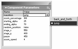
Figure 2.11: The Transition parameter has a List value type.
Selecting the Back_And_Forth value will cause the zooming to start from the smaller size, zoom to the larger size, and then reverse the motion. The Jump value, on the other hand, will cause the component to zoom the shape from the starting size up to the larger size, and then it will jump back to the smaller size and begin the process again.
Let's take a look at the various value types for parameters. It's helpful to be at least aware of the value types, so you can understand how to edit and use them better and also so you can better understand the capabilities and limitations of components.
The Zoom component contains only two value types—Default and List.
The Default Value Type
As you would expect, the most frequently used value type is the Default value type, which is essentially a literal. You can use it to specify strings or numbers or any type of value for a simple variable. When you are working with a component that is utilizing the default user interface for the component parameters, editing a value that is set to default value type is obviously very simple: simply click in the value field and enter whatever value you want to specify. Clicking a default value field automatically selects the entire value so you can more easily replace it with a new value. You can even copy and paste values into default value fields.
Unfortunately, there is a potential problem. Since default value fields can be letters or numbers, users may have difficulty determining what kind of value to enter for a Default value type. For instance, the value for the first Zoom_Percentage parameter in the Zoom component is set to 1 by default. For some users, it may not take very much deduction to figure out that this parameter specifies the zoom percentage of the object.
Values below 100 will make the component start at the original size of the object and then zoom down. Therefore, if you enter a value of 5, the component will begin at its original size and then zoom down to 5 percent of the original size. A value of 300 will tell the component to zoom the object to 300 percent of its original size. If you enter a value of 100, nothing will appear to happen, because you will be directing the object to zoom to 100 percent of its original size.
Thus, for the Zoom_Percentage parameter, you pretty much can't mess anything up as long as you enter a numeric value. However, you can enter a value such as "False" for the Zoom_Percentage parameter and cause the component to no longer work. You can easily make a mistake like this if you don't have a clear idea of what values are acceptable for a given parameter.
 |
The Default value type is commonly used, rather than the more specific Number or String value types, in order to make the component backwards-compatible with Flash 5. In the Zoom component, it would have been better to have set the values that take numerical values to a Number value type so that users couldn't inadvertently specify a string as a value for any parameter that requires a number. However, Flash 5 only supports Default, List, and Array value types. In general, if you are writing a component that is to be compatible only with Flash MX, don't use the Default value type. Flash MX provides more specific value types, such as the Color or Font value type.
|
The next two parameters in the Zoom component's Component Parameters panel, for example, are named Starting_Alpha and Ending_Alpha. These parameters are used to specify the alpha transparency for the shape when it begins zooming and when it ends zooming. The default values are 25 for Starting_Alpha and 75 for Ending_Alpha. This means that the shape will be set to 25% alpha or 25% opaque when it begins zooming, and it will gradually change to 75% alpha or 75% opaque when it zooms to the maximum size.
Unlike the Zoom_Percentage parameter, however, the Starting_Alpha and Ending_Alpha parameters will not work with just any number. The alpha setting for an object can only be set from 0 to 100. In this case, the code is written so that if you enter a value over 100, the code will automatically round it down to 100. Without this safety net code, users could inadvertently set a value that wouldn't work for the Starting_Alpha and Ending_Alpha parameters.
The Default value type for a component parameter is easy enough to edit, and if you know the purpose of the parameter, then you will likely have little difficulty using it. However, if you download a component from the Internet that utilizes the default component parameters interface, you might be in for a little frustration and experimentation figuring out what the parameters are for and what values they can take.
The Number and String Value Types
The Number and String value types operate similarly to the Default value type, except they accept only numeric or string values, respectively.
Click the Cancel button in the Component Definition dialog box for now.
The List Value Type
Refer back to Figure 2.10 and notice that the Transition parameter's value type is List. The List value type allows you to specify specific options that component users can select from. The advantage of the List value type is that users can select only those options. There is no possibility for entering a value that will not work for a List value type (assuming all the relevant coding works properly in the component).
|
The only minor problem with the List value type is that it is not readily apparent that the value is a list value. That is, when you initially look at a parameter with a List value type, you cannot immediately see that it is any different from the Default value type. A single click rectifies this problem, but it is not ideal having to click around to figure out what the value type is for each value.
|
The Array Value Type
The Array value type allows you to specify an array of values. Like the List value type, it requires a different interface. Figure 2.12 shows an example of a parameter that uses the Array value type.
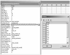
Figure 2.12: The Array value type requires a separate dialog box so that you can enter multiple values.
When you click a value that is set as an Array value type, you will see a small gray button at the right side of the value field with a magnifying glass icon. Clicking this button opens the Values dialog box. You can enter the values for the array in the Values dialog box.
Unlike the List value type, there are a few small indications that an Array value type is different from other types. Values in array are enclosed with brackets (see Figure 2.13). Also, Array value types frequently have multiple values separated by commas rather than a single value.
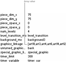
Figure 2.13: Brackets in a value field help to identify that the field is an Array value type.
The Font Name and Color Value Types
The Font Name and Color Value types also provide slightly different interface options. The Font Name value type allows you to select from the available fonts on the system, and the Color value type adds a color picker to the Components panel so you can select colors from within the Component Parameters default user interface.
The Font Name value type, shown in Figure 2.14, is similar to the List value type. When you click the value field, you are presented with a small gray button with a down-arrow (the middle image in the figure). Clicking the button produces a list of all the fonts on the user's local system.
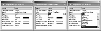
Figure 2.14: The Font Name value type provides a means for the user to specify any font that is on the user's local system.
The Color value type offers a little more. A value set to be a Color value type will include a small color bar on it. When you click the value field, it produces a color picker that allows you to either select from one of the color swatches or enter a Hex value (see Figure 2.15). You can further click a button in the upper-right corner of the color picker to open the standard Color dialog box, which allows you to specify colors according to RGB or HSB values (see Figure 2.16).
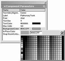
Figure 2.15: The Color value type provides a means for the user to specify a color for an object or text.

Figure 2.16: You can open the standard (for your given OS) color picker from the pop-up color picker for the Color value type.
|
If you open the Color dialog box from the color picker for a Color value type in the Component Parameters panel, you must enter a value. If you do not enter a value while you are in the Color dialog box and you press the Cancel button instead, the corresponding value in the Component Parameters panel will be emptied of any color value information. You can click it again and reenter the information.
|
|
|
EAN: 2147483647
Pages: 111
- Linking the IT Balanced Scorecard to the Business Objectives at a Major Canadian Financial Group
- Measuring and Managing E-Business Initiatives Through the Balanced Scorecard
- A View on Knowledge Management: Utilizing a Balanced Scorecard Methodology for Analyzing Knowledge Metrics
- Measuring ROI in E-Commerce Applications: Analysis to Action
- Governance Structures for IT in the Health Care Industry