| When CSS first started becoming popular (that is, when enough browsers supported it consistently), its primary use was for styling text, and Web designers were thrilled to say goodbye to the font tag. It's just as possible to use CSS to define how your page is laid out, and thankfully, browsers and their market share have now gotten to the point where it's feasible to make the switch. The box model When you're talking about positioning elements with CSS, you immediately run into the term the box model . Here's a quick overview of what you'll need to know to be able to use CSS for positioning. When working with CSS and layout, you're creating boxes (almost always done by adding a div ) and positioning them on your pages. Each box contains several elements ( Figure 6.1 ): its margin, border, padding, and content. Using CSS, you can set rules for each element. Additionally, you can (for example) set different rules for the top, right, bottom, and left sides of an element. 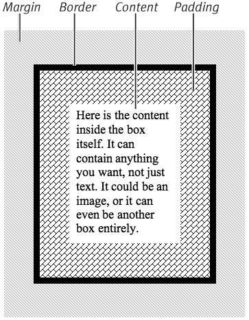
Let's say that you want to put a line above and below your text. You can set the border around your text (that is, to the tag that contains your text) to 1px black solid just for the top and bottom. If you don't set the other sides, they'll be set to 0 by default. Positioning your boxes Now that you've created boxes on your page, you want to place them. In order to do that, you need to understand two new concepts: position and float . The position of a box can be static , relative , inherit , absolute , or fixed ( Figure 6.2 ). 
-
Static: The simplest position is static; it just means that the box ends up wherever it would normally end up, all on its own. Any left or top offsets you give it are ignored. -
Relative: The next simplest is relative, which is just like static except that you can set its left and top positions . -
Inherit: Inherit is used when you want a box to automatically inherit the properties of its parent (that is, its container). Wherever that box happens to be, it just takes on the position rules based on its container. -
Absolute: Absolute and fixed are similar, in that both can specify exactly where on your page you want the box to appear. The difference between the two involves their frame of reference: an absolutely positioned box is positioned in reference to its container. If you have an absolutely positioned box placed 100 pixels from the top of a page, and another absolutely positioned box inside that box that is also set to be 100 pixels down, the interior box will be 200 pixels down, not 100because its frame of reference is to the box that it's inside. -
Fixed: Fixed positioning, on the other hand, is based on the page itself. If you set a box to be fixed at 100 pixels down, it will always be there, even if you scroll the page. When you scroll, that box will move down with you so that it's always 100 pixels down from the top of the visible page. Floating your boxes Alternatively, a box can be set to float, such that its contents stick to one side of its containing element or another ( Figure 6.3 ). The values for float are left , right , none , and inherit . 
-
Left: A box that is floated to the left causes everything else on the page (everything that isn't explicitly told to be somewhere else, that is) to wrap around it to the right. -
Right: Just like left, a box floated to the right causes everything else to wrap around it on the left. -
None: This is the default, but it's sometimes useful to be able to explicitly tell a box, no, don't float (usually when trying to work around browser bugs ). -
Inherit: If you do want a box to inherit the float value of its container, just say so explicitly by setting float to inherit.  Tips Tips -
What's described here is how browsers are supposed to handle positioning and floating boxes, and all of the browsers released in the last few years handle it well. Older browsers may have varying degrees of difficulty with these concepts. As always, we recommend testing your site in as many browsers (and versions and platforms) as possible. -
This is just a quick and dirty definition. Many pages (and possibly some entire books) have been written on the intricacies of the box model.
 |