Working with the DataGrid Control
Working with the DataGrid ControlThe DataGrid control displays data in a tabular form. The control can be bound to a data table or a collection. The .NET Compact Framework's DataGrid control provides a limited subset of the functionality that the full .NET Framework's DataGrid control provides. Despite this limitation, the DataGrid control is still quite useful. The control allows you to bind to different data sources; customize which columns will be displayed; customize the colors, row header text, and column header text; and handle events that are fired when the user selects rows and cells in the grid. The DataGrid control does not provide editing support. You can work around this by providing your own editing user interface when users click inside the control. To learn how to handle user click events, see the "Determining the Selected Row or Selected Cell in the DataGrid" section. The DataGrid also provides limited support for customizing how columns are drawn. The "Customizing the DataGrid Control" section describes how to customize the columns of the DataGrid . Populating the DataGrid ControlThe DataGrid can be bound to the following data tables and collections:
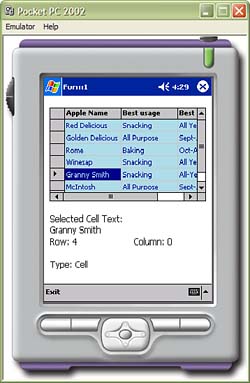
Binding the DataGrid to its data source is simple. All you have to do is set the DataSource property on the DataGrid to a reference of the data source. The DataGrid will display all of the columns and rows in the data source by default. See the "Customizing the DataGrid Control" section to learn how to customize which columns will be displayed in the grid. The following code demonstrates how to bind a DataTable in a DataSet to a DataGrid control. C# dataGrid1.DataSource = dataset.Tables["Apples"]; VB dataGrid1.DataSource = dataset.Tables("Apples"); Figure 3.30 demonstrates the DataGrid control running on the Pocket PC 2002 emulator. The complete listing for this application can be found in the code accompanying this book. Figure 3.30. An application that showcases the DataGrid control running on the Pocket PC 2002 emulator. Customizing the DataGrid ControlThe DataGrid control can be customized by changing the display colors and by customizing the style of each column. There are several properties that control the colors of the DataGrid control, as described in Table 3.11. Table 3.11. DataGrid Properties That Format the Colors of the Grid
The column headers and row-indicator headers are displayed by default. You can hide these headers by setting the ColumnHeadersVisible and RowHeaderVisible properties to false. The columns of the DataGrid control can be further customized by using the DataGridTableStyle class, which represents how the DataGrid control is drawn. The MappingName property represents the name of the data source that will be displayed in the DataGrid . For example, if the data source is a DataTable named Apples , then the MappingName should be set to "Apples". The DataGridTableStyle class also exposes the GridColumnStyles property, which is a collection of DataGridColumnStyle objects. You should create an instance of the DataGridTableStyle class for each column that you want to display; it will dictate how the column will be drawn. Once you have added all of the DataGridColumnStyle objects to the DataGridTableStyle.GridColumnStyles property, you must add the DataGridTableStyle to the DataGrid 's TableStyles property. The DataGridColumnStyle is an abstract class that you can inherit from to customize how the column will be drawn. The .NET Compact Framework provides an implementation of the abstract class: the DataGridTextBoxColumn class. Table 3.12 lists the properties of the DataGridTextBoxColumn and how they affect the DataGrid column. Table 3.12. Properties of the DataGridTextBoxColumn Class
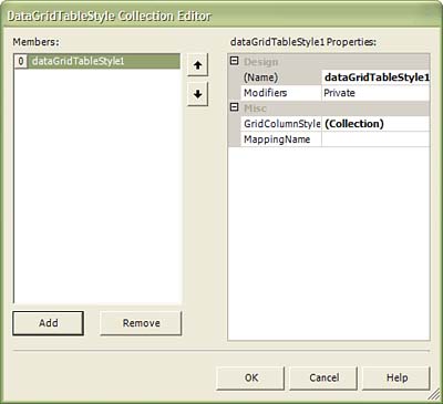
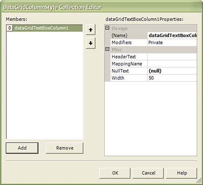
Listing 3.5 demonstrates how to format columns through code using the DataGridTableStyle class: Listing 3.5C# DataGridTableStyle dgts = new DataGridTableStyle(); dgts.MappingName = "Apples"; DataGridTextBoxColumn nameColumn = new DataGridTextBoxColumn(); nameColumn.MappingName = "Name"; nameColumn.HeaderText = "Apple Name"; nameColumn.Width = 80; dgts.GridColumnStyles.Add(nameColumn); DataGridTextBoxColumn useColumn = new DataGridTextBoxColumn(); useColumn.MappingName = "Usage"; useColumn.HeaderText = "Best usage"; useColumn.Width = 80; dgts.GridColumnStyles.Add(useColumn); DataGridTextBoxColumn avalColumn = new DataGridTextBoxColumn(); avalColumn.MappingName = "Availability"; avalColumn.HeaderText = "Best Time to Buy"; avalColumn.Width = 80; dgts.GridColumnStyles.Add(avalColumn); this.dataGrid1.TableStyles.Add(dgts); VB Dim dgts = new DataGridTableStyle() dgts.MappingName = "Apples" Dim nameColumn = new DataGridTextBoxColumn() nameColumn.MappingName = "Name" nameColumn.HeaderText = "Apple Name" nameColumn.Width = 80 dgts.GridColumnStyles.Add(nameColumn) Dim useColumn = new DataGridTextBoxColumn () useColumn.MappingName = "Usage" useColumn.HeaderText = "Best usage" useColumn.Width = 80 dgts.GridColumnStyles.Add(useColumn) Dim avalColumn = new DataGridTextBoxColumn() avalColumn.MappingName = "Availability" avalColumn.HeaderText = "Best Time to Buy" avalColumn.Width = 80 dgts.GridColumnStyles.Add(avalColumn) dataGrid1.TableStyles.Add(dgts) Editing the TableStyles property can also be done through the Properties window. First, select the DataGrid in the Form Designer. Click the ellipsis next to the TableStyles property name in the Properties window. This will display the DataGridTableStyle Collection Editor (see Figure 3.31). You can click the Add and Remove buttons to add DataGridTableStyle objects. This dialog allows you to edit the MappingName property. Figure 3.31. The DataGridTableStyle Collection Editor. You can also add DataGridColumnStyle objects to the GridColumnStyle property by clicking the ellipsis next to the property name. This will bring up the DataGridColumnStyle Collection Editor (see Figure 3.32). You can add and remove DataGridColumnStyle objects as well as edit their properties. Figure 3.32. The DataGridColumnStyle Collection Editor. Determining the Selected Row or Selected Cell in the DataGridThe DataGrid control can have either an entire row or a single cell selected. To determine which cell or row the user clicked, you should use the HitTest method in combination with the DataGrid 's MouseUp event. The MouseUp event will be fired when the user clicks anywhere inside the DataGrid control. You should retrieve the coordinates of the click event from the MouseEventArgs object (the X and Y properties). Then pass the coordinates to the HitTest method. The method will return information about the DataGrid at the click coordinates. The method returns a HitTestInfo object. The object contains the Column , Row , and Type properties. The Row and Column properties are the indexes of the row and column the user clicks. The Type property specifies the part of the DataGrid control the user clicked. The Type property returns a member of the DataGrid.HitTestType enumeration. Table 3.13 defines the member of the HitTestType enumeration and the meanings. Table 3.13. Members of the HitTestType Enumeration
The following code demonstrates how to handle the MouseUp event and use the HitTest method. C# private void dataGrid1_MouseUp(object sender, System.Windows.Forms.MouseEventArgs e) { HitTestInfo hitInfo = dataGrid1.HitTest(e.X, e.Y); if(hitInfo.Type == HitTestType.Cell) { string selCell = dataGrid1[hitInfo.Row, hitInfo.Column]; if(cellData != null) this.label1.Text = selCell.ToString(); } } VB Private Sub DataGrid1_MouseUp _ (ByVal sender As Object, ByVal e As System.Windows.Forms.MouseEventArgs)_ Handles DataGrid1.MouseUp Dim hitInfo As System.Windows.Forms.DataGrid.HitTestInfo hitInfo = DataGrid1.HitTest(e.X, e.Y) Me.label2.Text = String.Empty Me.label3.Text = String.Format("Row: {0}", hitInfo.Row) Me.label4.Text = String.Format("Column: {0}", hitInfo.Column) Me.label5.Text = String.Format("Type: {0}", hitInfo.Type.ToString()) If hitInfo.Type = System.Windows.Forms.DataGrid.HitTestType.Cell Then Dim selCell As Object selCell = DataGrid1.Item(hitInfo.Row, hitInfo.Column) If Not selCell Is Nothing Then Me.label2.Text = selCell.ToString() End If End If End Sub |
EAN: 2147483647
Pages: 206