The Human-Computer Interface
| Designing a good user interface is not about how beautiful and whizzy you can make your buttons . In fact, the core essence of the user experience ”enabling the player to interact with the game world ”doesn't need any fancy graphics or sound. The functionality that allows a player to interact with the game effectively could theoretically be implemented using simple placeholder elements. In fact, while the interface is being designed, this is the recommended approach ”it's faster, and more resource-efficient. As you may have already realized, we place more importance on the functional aspects of the user interface over the purely aesthetic aspects. Although we could argue that a perfectly functional user interface has a certain aesthetic appeal , we will not limit ourselves to this in our discussion. We would be foolish to completely disregard the aesthetic requirements ”eye candy sells and certainly provides a more enjoyable, immersive experience ”but they should be secondary to the functional aspects.
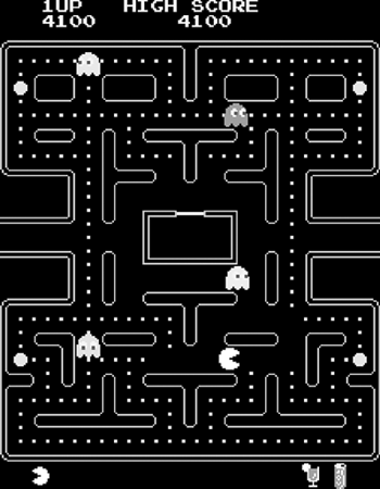
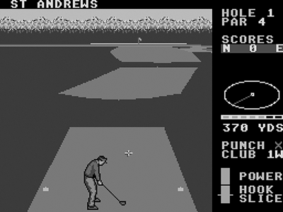
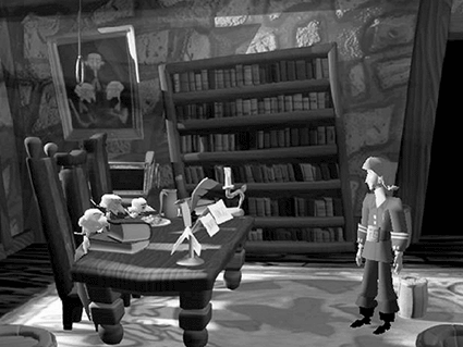
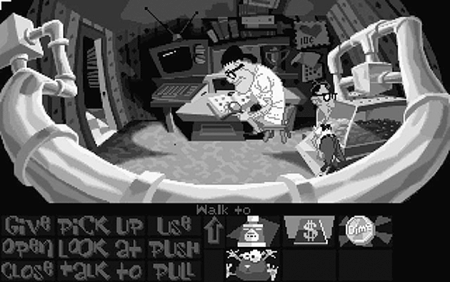
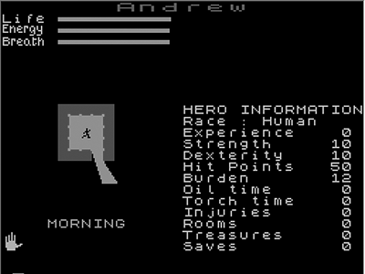
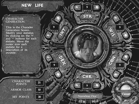
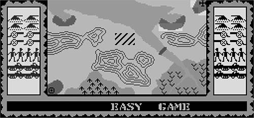
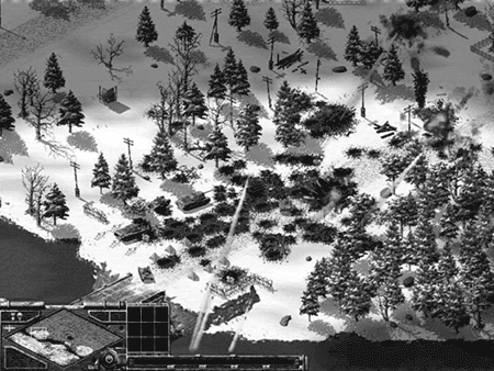
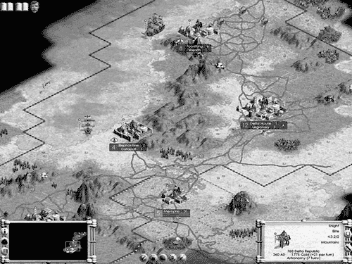
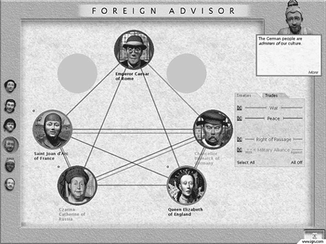
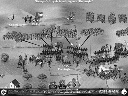
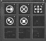
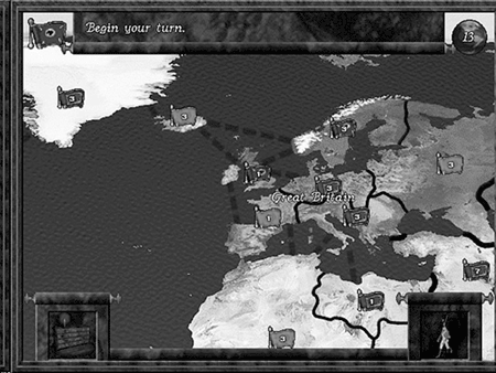
The functionality of the user interface is the most important consideration. After all, what player is going to take the time to play a beautiful game if she can't figure out which exquisitely detailed picture is the button to start the game? Conversely, even with the most efficient user interface, few people will bother with the game if it's as ugly as sin. Consequently, the discussions in this chapter take on a dual aspect: First, and most important in our view, we will concentrate on the functionality of the user interface. After we have discussed the functional aspects, we will concentrate on the aesthetics, paying particular attention to making sure that the aesthetics do not impact the functionality. Note that pure physical beauty is not the primary meaning of aesthetics for a user interface. Fitness for purpose is a far more important aesthetic consideration. This doesn't necessarily exclude having a beautiful interface, but we do insist that there should be more to the beauty than mere appearances . A butterfly may be prettier than a rubber life raft, but which would you rather have with you on a stormy sea? Evolution of the User ExperienceIn order to set a context for the discussion in this chapter, it will be worth our while to take a brief look at how the user experience has progressed over the last 20 or so years . Twenty years ago, each game had a different interface, although usually there was some influence from other sources ”console games, arcade games, and other games in the same genre . It wasn't until the advent of the windowed operating systems that any form of homogeny was achieved. Nowadays, we don't even think twice before using the mouse to navigate and clicking the mouse button to press an onscreen button. It's a de facto standard now (on the PC at any rate), but it used to be a novelty. Arcade GamesInitially, the game interface was simple. For arcade-style games, there would be a title screen with instructions (usually limited to a simple explanation of the controls) or a simple attract mode that cycled between two or three screens (title, instructions, and a high-score table). The game would remain in this state until the player pressed the Start button. This soon evolved to include a fourth screen: the demo mode . For a small length of time (usually 30 seconds or so), a sequence was shown from the game in play, implemented either as a slide show of screens from various levels or as one of a selection of short snippets of gameplay. Once the game was started, the in-game interface was usually very simple (see Figure 6.1). The playing area would take up most of the screen. There would be a score display, a high-score display, a level display (if appropriate), and a "lives remaining" display. These would be placed at the top or bottom of the screen. And for many years, that was about the extent of the arcade game interface. Of course, there were subtle variations on this theme ”for example, a power level meter in addition to or instead of a "lives remaining" display, and the odd bit of pertinent information specific to the game, such as "number of lines" in Tetris . Figure 6.1. The standard arcade game interface ( Pac-Man Plus ). Williams's Defender (shown in Figure 6.2) was arguably the first game to enhance this core interface by adding a minimap; it was one of the first games with a playing area larger than the visible screen. Figure 6.2. Williams's Defender . Without waxing too lyrically about the nostalgia value of this proto-interface, it has to be said that there was a certain purity of purpose present. All the information that the player needed to be able to play the game was there at a glance. Of course, it wasn't that difficult to achieve, either; the limitations of the format pretty much dictated that the games be fairly simple. Any homogeny of interface was the result of the fact that there were only a few sensible ways of displaying the same information. The real progress occurred when the player needed to be fed too much information to be displayed on the screen at once. Most arcade games are simple enough to be able to present all the necessary information on a single screen, and it's just as well that this is the case, because switching to an information screen in the middle of a fast-paced game is not a recipe for success. For those wanting to investigate some of these classic arcade games further, the MAME (Multiple Arcade Machine Emulator) web site, www.mame.net, is a good starting point. Consider an example of interface evolution: the humble golf game. Presumably, you are familiar with the basics of golf: Take a stick, go for a walk, and hit a small ball toward a marginally larger hole with as much force as you possibly can. As enjoyable as that sounds, a good number of developers have injected even more fun into the sport by allowing you to simulate it while not moving from the front of your computer. Of course, golf has an element of skill in the aiming and timing of the swing. Walking from hole to hole is also an important part of real golf ( socially speaking, anyway), but this would not translate well as a fun gameplay feature, and so it is usually skipped . Hence, it's a logical assumption that game designers made the actual swinging at and hitting of the ball the main focus of the game. In fact, taking a look at the rough lineage of golf games, it can be seen that this interface was perfected early on (around the time of the original Leaderboard golf game, shown in Figure 6.3) and has only had minor tweaks since then, ignoring the odd short-lived "revolution" that has occurred in the meantime. The first button click started the power meter rising , the second button click set the power (whereupon the meter indicator would begin to fall), and the third determined the accuracy of the shot; it had to be clicked when the indicator returned to the starting position. Getting it exactly right resulted in a perfect shot. Apart from the switch from keyboard to mouse or trackball , there has been very little modification to this system; it's the perfect interface for the golf game and has been relied upon since then. Even fairly recent games, such as the latest effort in the Links series of games, have stuck to this basic mechanic for gameplay. Even Golden Tee , the latest in a long series of golf games, uses a trackball-based evolution of this original interface. Figure 6.3. U.S. Gold's World Class Leaderboard . This demonstrates an important point: Aside from the occasional flash of brilliance, the general progression of game interfaces has been an evolutionary, not revolutionary, one. Adventure GamesTraditionally, adventure games were text-based. The player interacts with the system by reading a textual description of the location, and performing queries and actions based on that description. The first adventures took their input in a " verb-noun " format. That is, "Take Food" would work, whereas "Take the Food on the Table" would be rejected. Movement commands generally took the single-word form ”Up, Down, North, East, South, West ”and could be abbreviated to U, D, N, E, S, W, NW, NE, and so on. Adventure games used to be a popular and lucrative section of the games market. Over time, the sophistication of the parser allowed improvements in the nature of sentences usable with the games, and the quality of the writing correspondingly improved with the increasing capabilities of the target machines. Games such as The Hitchhiker's Guide to the Galaxy from Infocom (publishers of the original Zork series of games) and Fish! from Magnetic Scrolls are good examples. For the curious , a Java version of The Hitchhiker's Guide is available to play at Douglasadams.com (www.douglasadams.com/creations/infocomjava.html). Eventually, simple graphics appeared to help enliven the textual description. This improved the atmosphere to a degree, but also coincided with a general decrease in the quality of the writing. The designers relied more on the graphics (it's easier to draw a good picture than to craft good text) to tell the story, and the writing suffered correspondingly. The graphics tended to be presented in one of two forms: as either a full-screen image that was displayed briefly on entering a new location before clearing to allow the text to be displayed, or as a split-screen style, occupying a portion of the screen (usually the top half). Apart from general improvements to the parser, which is indirectly related to the quality of the game interface, this was the pinnacle of the adventure game interface. Today, text adventure games are not commercially viable , but they do live on in the form of MUDs (multiuser dungeons) and MUSHs (multiuser shared hallucinations). For those wanting to investigate MUDs and MUSHs further, a good place to begin is www.mudcenter.com. Graphic AdventuresGraphic adventures are the spiritual successor to text adventures. Taking the maxim "a picture is worth a thousand words" as their rallying cry, designers began to take advantage of the increasing power of computers to create a fully graphical interface to the standard adventure game. In many ways, this was unfortunate. We may lament the degradation of standards from the classic adventure game ”similar to the preference of a significant portion of today's youth for watching cartoons over reading a good book ”but we cannot argue with progress. Simply put, text adventures that required the player to type in their commands did not appeal to the consumer in the same way as a graphic adventure, which is, in effect, an interactive cartoon. That aside, the point-and-click interface of the graphic adventure has changed very little over the years since the first appearance of the genre. From the earliest Leisure Suit Larry games (shown in Figure 6.4) through the latest in the Monkey Island series (shown in Figure 6.5), the interface has remained pleasingly consistent. The interface to a graphic adventure is a fairly simple construct. Most graphic adventures are 2D or pseudo-3D (that is, they use 3D graphics in a 2D scene-oriented fashion, rather like a stage show), and consequently, only a relatively simple game interface is required. Figure 6.4. Leisure Suit Larry II. Figure 6.5. Escape from Monkey Island. There are two main paradigms for the interface that are currently in use. The first is the split-screen text- or icon-based interface, where the player selects actions in the selection area of the screen and watches the results in the results portion of the screen. An example of a game that uses this format is LucasArts's Maniac Mansion: Day of the Tentacle , shown in Figure 6.6. Figure 6.6. Maniac Mansion: Day of the Tentacle. The second paradigm, used by such games as Myst (shown in Figure 6.7), uses the whole screen as the interface. The player moves the cursor around the screen and clicks on objects or characters of interest. In this way, the story is visually progressed by player interaction. What this format loses in flexibility over the first system, it gains in atmosphere and immersion. Figure 6.7. Myst. We are not going to include games such as Ion Storm 's Deus Ex in the category of adventure games. The action quotient in that game is too high to warrant inclusion, and we would prefer to class games of this type as a union of first/ third-person shooters and role-playing games (even though it is a close call to make). Adventure games, on the other hand, are typically thought of as games that require pure thought and logic, and little in the way of reflexes. Thus, the game interface for the graphic adventure does not have speed as one of its main priorities, instead focusing on clarity of use. Role-Playing GamesRole-playing games (RPGs), for the most part, have had roughly the same user interface since day one. This isn't necessarily a good thing. In fact, there is a lot about the standard role-playing game interface that we do not like, but aside from incremental improvements, it seems to be a case of using what works well enough, although a notable exception is the starting interface for Morrowind. Your character is defined by your responses to questions posed by interactive characters in the opening part of the game. The generic role-playing game interface comes in three sections: the character generation screen, the in-game screen, and the inventory screen. These do not seem to have changed much since the inception of the genre, but their forms have been modified and refined somewhat. Take, for example, an early role-playing game. Out of the Shadows from Mizar Software was released for the Sinclair Spectrum in 1984. Figure 6.8 shows the main game and character generation screen of this game. Pay particular attention to the character attributes on the right of the screen. Figure 6.8. Out of the Shadows main game and character screen. Now contrast this with the character generation screen from a more recent game, such as Black Isle Studio's Planescape: Torment , as shown in Figure 6.9. Figure 6.9. Planescape: Torment character generation screen. Apart from the huge differences in the quality of the artwork and the capabilities of the target platforms, these screens are scarily similar in function. Sure, there are a few bells and whistles added to the latter example, but fundamentally, the functionality hasn't really changed in the 16 years between the two games. Note that we feel that Planescape: Torment is an excellent game, and we are not trying to imply otherwise by singling it out for our example. We merely want to illustrate how the basic character generation interface has not changed in functionality over the years. You may be of the school of thought that believes this lack of change is a good thing. After all, it's a system that's been in use since the advent of paper-and-pencil role-playing games in the '70s. However, our view is different. Why use numbers at all in the game interface? They were a necessity in the paper-and-pencil role-playing games, but what a computer is very good at is dealing with numbers. Why bother the player with them? Having "Saving Roll +1" flash up onscreen when we've just dealt a mighty blow to a zombie does nothing except remind us that we're playing a dry game of statistics with some pretty graphics slapped on top. We know that this argument has been used before, and that some players actually prefer to deal with numbers ”after all, it does allow the players to know exactly where they stand in the game. However, wondering how high your hit-points are while smiting a zombie jars your suspension of disbelief. Let those players who want to deal with numbers have them, but make them an option in the game. If you need to display numbers (maybe for the sake of accuracy), then at least display them as labels on some sort of bar chart or other graphical representation. To be fair, though, the user interface of Planescape: Torment does allow some limited hiding of the numbers, borrowing the technique of displaying graphical power bars from other genres, which is a neat way of sidestepping the problem. Strategy and War GamesLike their cousin, the role-playing game, strategy and war games have their roots in board games. Hence, early efforts were often heavy on the numbers and played almost exactly like a computer-controlled board game. One of the first breakthrough titles that heralded the roots of the more accessible arcade-strategy genre was a title released for the Sinclair Spectrum back in 1984, called Stonkers (see Figure 6.10). This game presented simulated war in a more accessible arcade-influenced format and is arguably the very first RTS (real-time strategy) war game, introducing many of the concepts that are familiar in today's RTS and strategy games. Figure 6.10. Stonkers. More recent RTS games (such as Sudden Strike , shown in Figure 6.11), classic strategy games (such as Civilization III , shown in Figures 6.12 and 6.13), and the more traditional war games (such as Sid Meier's Gettysburg , shown in Figure 6.14) have a similar user experience ”at least at a superficial level. All games of this type are concerned with the same basic set of actions: controlling large groups of units to solve a goal that could not be achieved by one unit alone. Of course, once you go beyond this superficial level, there is some variance in the user interface; for example, Civilization III has a diplomatic and city control interface that handles specific decisions at a wider level than those simply concerned with unit- and group -level decisions. Figure 6.11. Sudden Strike. Figure 6.12. Civilization III in-game interface. Figure 6.13. Civilization III foreign advisory interface. Figure 6.14. Sid Meier's Gettysburg. Because of its universal nature, the unit- and group-based interface has evolved to allow the player to control these groups easily. Games such as Blizzard's Warcraft and Westwood's Command and Conquer series have helped define the standard interface for RTS games that most games now follow. Left-clicking to select a unit, and then right-clicking on an object to select a context-sensitive action for the unit to perform on that object, have become familiar actions for most RTS gamers. More recently, the ability to click-drag select a group of units (a method borrowed directly from the Windows operating system) has been added to the repertoire . However, as these games have become more complex, ways of managing that complexity become needed. This has prompted a divergence in the interfaces, especially with respect to the camera control mechanisms in those games that give the player control of the camera (although why the player would want to control the camera is beyond us ”except in special situations, that should be a job for the computer). Strategy games and war games are characterized by the strategic-level decisions the player is required to make. Consequently, the interface has to allow the player to make these strategic decisions. Note that a lot of these games (for better or worse ) also include a fair amount of micromanagement of individual units, usually in the form of giving orders or training. This micromanagement is usually handled by a contextual iconic interface. In order to be an effective interface, it has to seamlessly handle three levels of abstraction: grand strategy (as in Figure 6.13), group and unit navigation (as in Figure 6.14), and unit micromanagement (as in Figure 6.15). Not all these levels are necessarily present, depending on the strategic slant of the game. As a general rule, RTS games tend to focus on the latter two levels, group and unit navigation and unit micromanagement. More serious war games tend to use all three levels, usually with a focus on the grand strategic and the group and unit navigation levels. Pure strategy games (akin to computer-controlled board games), such as Risk (shown in Figure 6.16), focus on the grand strategic level, with varying levels of usage of the latter two levels. Of course, the best of these games allow the player to choose to what level he wants to involve himself ”from the overseeing dictator figure all the way down to the bean-counting micromanager, and anywhere in between. Sid Meier's Civilization series of games are excellent in their use of the computer to handle such menial tasks at the player's request. Figure 6.15. Starcraft's unit micromanagement interface. Figure 6.16. Risk. The more serious war games, which have traditionally been rather dry in their presentation, have started to use a number of these more "gamer-friendly" techniques. Previously, these games have focused on the accuracy of the war simulation, rather than any presentational niceties, and generally, that suited the players of these games perfectly. However, in order to attract new players, designers have learned lessons from the more accessible RTS-style games, which in turn were derived from the need to make war games more accessible to the average gamer. Nowadays, the hard-core war games are, in many cases, virtually indistinguishable from the RTS games that they initially inspired. |
EAN: 2147483647
Pages: 148