Owner Draw Controls
 | ||
| ||
We mentioned in the CircularForm example that it wasn't sensible to give the list box a round shape without altering the way it displays its text, to make sure that the text for each item is placed firmly within any round region. This means writing the list box as an owner-draw control. That's the subject of this section. We'll enhance the CircularForm example into a new example that looks like this:
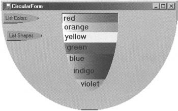
This screenshot ought to give you some idea of how distinctive you can make your Windows Forms applications when you start implementing owner-draw, non-rectangular, controls. Not only do the names of the colors in the list box line up with its curved boundary, but each one is displayed on a background of the correct color so there's a visible rainbow effect (which unfortunately you can't really see on a greyscale-printed page! You'll have to download the code if you want to see the full effect). You'll also notice that the heights of the items get slightly bigger as we move down the list box - compensating to some extent for the reduction in width, so the items appear to occupy something more like the same area. In the screenshot, the green item is selected, which is shown by the gradient-brush backdrop fading to the normal background color for selected items instead of to white on the left - hence this item appears to be darker.
The different colors and item heights only appear if the list box is displaying colors. If it's displaying shapes then the text of each item is still offset to follow the curve of the list box border, but the items all have a white background. If you download and run the example, swapping between the two views will quickly bring home just how boring controls can look if you haven't used the owner-draw facility to spice them up.
Although we can draw controls manually by overriding their OnPaint() method, not every control has built-in support for owner drawing. The ones that at present do have built-in support are ListBox, ComboBox, MenuItem, TabControl, StatusBar, and derived classes. What owner-draw means is that when an item in the control needs to be drawn, Windows doesn't draw the control itself. Instead, an event called DrawItem is raised. You can implement a handler for this event, which should do the drawing. That means you get complete control over what the control looks like. DrawItem is passed a DrawItemEventArgs parameter, which contains all the information you need to do the drawing, including which item is to be drawn, whether this item is selected, what the default foreground and background colors would be for drawing the item if the control weren't owner-draw, and - most importantly - a Rectangle struct that indicates the bounds within which the item needs to be drawn.
So that's the theory. How do you actually make an item owner-draw? For ListBox and ComboBox you need to set a property called DrawMode. This property is an enum type, also called DrawMode, and can have one of these values:
-
Normal - the default value.
-
OwnerDrawFixed - This means that the control will be owner-draw, with the DrawItem event being raised.
-
OwnerDrawVariable - This is similar to OwnerDrawFixed, except that immediately before the DrawItem event is raised, another event, MeasureItem, is raised. MeasureItem gives you the chance to modify the bounding rectangle of the item, so that items will be displayed in different sizes. The location of subsequent items is automatically adjusted to take account of any changes in size of previous items.
The OwnerDrawVariable value will be ignored for multi-column list boxes - variable item size is not supported for this case.
Owner-Draw Example
The next example, CircularFormOwnerDraw, is created by modifying the code for the previous example. First, we need to use the Properties window to set the DrawMode property of the list box to OwnerDrawVariable. Then, in code, we will use the Region property of the list box to actually change it to a half-ellipse shape. The logic for doing this follows the same principles as for the form and buttons in the last example:
private void SetListBoxLocation() { int lbHeight = (this.ClientSize.Height * 8) / 9; int lbWidth = (this.ClientSize.Width) / 3; this.lbResults.Location = new Point(this.Width / 3, 5); this.lbResults.Size = new Size(lbWidth, lbHeight); int titleBarHeight = this.ClientTopLeft.Y; int remainingHeight = this.Height - titleBarHeight; GraphicsPath outline = new GraphicsPath(); outline.AddLine(0, 0, lbWidth, 0); Rectangle twiceClientRect = new Rectangle(0, -lbHeight, lbWidth, (int)(1.9 * lbHeight)); outline.AddArc(twiceClientRect, 0, 180); Region rgn = new Region(outline); this.lbResults.Region = rgn; }
This method actually changes the list box location and size. I've kept the same width for the list box - one third the width of the form, but increased its size to 8/9 of the height of the client area of the form. Now that the list box has a rounded lower edge, it can be taller without running over the elliptical lower edge of the form.
In preparation for controlling what is displayed in the list box, we need a couple more member fields of the Form1 class: an enum that defines what the list box might currently be displaying, and an array of Color structs which indicates the background color for each item:
public class Form1 : System.Windows.Forms.Form { private enum ListBoxContents { Colors, Shapes, Nothing }; private ListBoxContents itemSetToDisplay = ListBoxContents.Nothing; private const int nButtons = 2; private Button[] buttons; private string[] colors = { "red", "orange", "yellow", "green", "blue", "indigo", "violet" }; private Color[] colorStructs = { Color.Red, Color.Orange, Color.Yellow, Color.Green, Color.Blue, Color.Indigo, Color.Violet }; private string[] shapes = { "circle", "triangle", "square", "pentagon", "hexagon" }; The button Click event handlers now set the itemSetToDisplay field:
private void btnShapes_Click(object sender, System.EventArgs e) { lbResults.Items.Clear(); itemSetToDisplay = ListBoxContents.Shapes; lbResults.Items.AddRange(this.shapes); } private void btnColors_Click(object sender, System.EventArgs e) { lbResults.Items.Clear(); itemSetToDisplay = ListBoxContents.Colors; lbResults.Items.AddRange(this.colors); } And the list box's MeasureItem event handler is implemented as follows:
private void lbResults_MeasureItem(object sender, System.Windows.Forms.MeasureItemEventArgs e) { if (itemSetToDisplay == ListBoxContents.Colors) e.ItemHeight += (2 * e.Index); }
MeasureItem works by changing the item height inside the MeasureItemEventArgs that is passed into the event handler - this size is specifically available as the ItemHeight property. There is also an ItemWidth property available, but we have no need to fiddle with that here. Notice that we only increase the ItemHeight property if we are displaying colors: as noted earlier, the list box does not change items sizes when displaying shapes.
Now for the DrawItem handler:
private void lbResults_DrawItem(object sender, System.Windows.Forms.DrawltemEventArgs e) { switch(this.itemSetToDisplay) { case ListBoxContents.Colors: PaintListBoxColors(e); break; case ListBoxContents.Shapes: PaintListBoxShapes(e); break; case ListBoxContents.Nothing: return; } }
This method simply contains a switch statement because the way that items are drawn differs according to whether the list box is displaying colors or shapes. If we are displaying shapes, the actual drawing is handled by the PaintListBoxShapes() method:
private void PaintListBoxShapes(DrawItemEventArgs e) { e.Graphics.FillRectangle(new SolidBrush(e.BackColor), e.Bounds); e.Graphics.Drawstring(this.shapes[e.Index], e.Font, new SolidBrush(e.ForeColor), e.Bounds.Left + GetListBoxLeft (e.Bounds.Bottom), e.Bounds.Top); }
This method is relatively simple: it simply fills the background with the appropriate color, and then draws the text over it. Notice how the colors, bounding rectangle, and item index are taken from the DrawItemEventArgs parameter.
This method also needs to make sure that the text of each item is indented sufficiently so that the curved border of the list box does not cut it off. The principle here is no different from that used in the last example for positioning the buttons; it relies on a helper method that can work out how many horizontal pixels right of the original list box bounding rectangle this border is, given how many pixels down from the top of the list box we are. This method is GetListBoxLeft(), and just as in the previous example it uses Pythagoras' theorem to work out the offset:
private int GetListBoxLeft(int y) { double yOverH = ((double)y) / ((double)lbResults.Height); double sqrt = Math.Sqrt(1.0 - yOverH * yOverH); return (int)((1.0 - sqrt) * ((double)lbResults.Width) / 2.0); }
Finally, here is the code for drawing each item if the list box is displaying colors:
private void paintListBoxColors(DrawItemEventArgs e) { Color leftColor = e.BackColor; string text = null; Brush brush = null; Color rightColor = this.colorStructs[e.Index]; text = this.colors[e.Index]; brush = new LinearGradientBrush(e.Bounds, leftColor, rightColor, LinearGradientMode.Horizontal); e.Graphics.FillRectangle(brush, e.Bounds); e.Graphics.DrawString(text, e.Font, new SolidBrush(e.ForeColor), e.Bounds.Left + GetListBoxLeft(e.Bounds.Bottom), e.Bounds.Top); }
One point to notice about this code is that we don't need to take any special action for the case where this item is selected. In that case, the e.BackColor value from the DrawItemEventArgs parameter will automatically yield the correct background color for this item state. If, however, you do need to know the item state, however, this is available as the e.State property. Also bear in mind that, although we've provided a drawing routine that displays text, in principle you can add code to draw whatever you want here - for example, you could replace the text with images that identify the item.
| ||
EAN: 2147483647
Pages: 124