Section 8.8. Designing the Search Interface
8.8. Designing the Search InterfaceAll the factors we've discussed so farwhat to search, what to retrieve, and how to present the resultscome together in the search interface. And with so much variation among users and search-technology functions, there can be no single ideal search interface. Although the literature of information retrieval includes many studies of search interface design, many variables preclude the emergence of a "right way" to design search interfaces. Here are a few of the variables on the table:
In the early days of the Web, many search engines emulated the functionality of the "traditional" search engines used for online library catalogs and CD ROM-based databases, or were ported directly from those environments. These traditional systems were often designed for researchers, librarians, and others who had some knowledge of and incentive for expressing their information needs in complex query languages. Therefore, many search systems at the time allowed the user to use Boolean operators, search fields, and so forth; in fact, users were often required to know and use these complex languages. As the Web's user base exploded, overall searching experience and expertise bottomed out, and the new breed of user wasn't especially patient. Users more typically just entered a term or two without any operators, pressed the "search" button, and hoped for the best. The reaction of search engine developers was to bury the old fancy tricks in "advanced search" interfaces, or to make them invisible to users by building advanced functionality directly into the search engine. For example, Google makes a set of assumptions about what kind of results users want (through a relevance algorithm) and how they'd like those results presented (using a popularity algorithm). Google makes some good assumptions for web-wide searching, and that's why it's successful. However, most search systems, web-wide or local, don't work as well. For that reason, the pendulum may eventually swing back to supporting users who, out of frustration, have become more search-literate and are willing to spend more time learning a complex search interface and constructing a query. But for now, it's fair to assume that, unless your site's users are librarians, researchers, or specialized professionals (e.g., an attorney performing a patent search), they won't invest much time or effort into crafting well-considered queries. That means the burden of searching falls chiefly on the search engine, its interfaces, and how content is tagged and indexed; therefore, it's best to keep your search interface as simple as possible: present users with a simple search box and a "search" button. 8.8.1. The BoxYour site is likely to have the ubiquitous search box, as shown in Figure 8-29. Figure 8-29. The ubiquitous search box (in this case, from ibm.com) Simple and clear. Type in some keywords ("directions Somers") or a natural language expression ("What are the directions to the Somers offices?"), hit the "search" button, and the whole site will be searched and results are displayed. Users make assumptions about how search interfaces work, and you may want to test for those as you design your own search system. Some common user assumptions include:
If your users have those assumptions and are not especially motivated to learn more about how your site's search works differently, then go with the flow. Give them the box. You certainly could provide a "help" page that explains how to create more advanced, precise queries, but users may rarely visit this page. Instead, look for opportunities to educate users when they're ready to learn. The best time to do this is after the initial search has been executed and the user reaches a point of indecision or frustration. The initial hope that the first try would retrieve exactly what they were looking for has now faded. And when users are ready to revise their searches, they'll want to know how they can make those revisions. For example, if you search IBM's site for "servers" (see Figure 8-30), you'll likely get a few more results than you'd like. Figure 8-30. IBM's search results provide ample opportunities to revise your search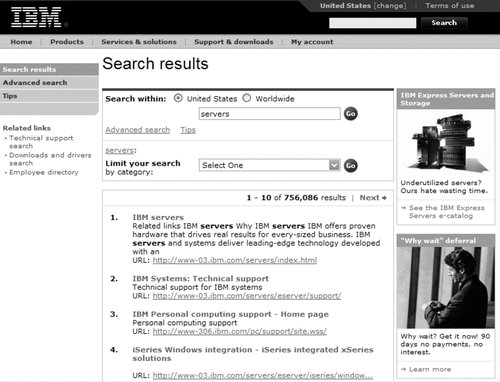 At this point, IBM's search system goes beyond the box: it tells the user something to the effect of "Here are those 729,288 results that you asked for. Perhaps this is too many? If that's the case, consider revising your search using our souped-up 'advanced search' interface, which allows you to narrow your search, as shown in Figure 8-31. Or learn how to search our site better from our 'tips' page." Or, select from a list of categories (really search zones) to narrow your results further. Figure 8-31. including the ability to narrow by category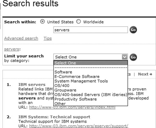 In general, too many or too few (typically zero) search results are both good indicators for users to revise their searches; we'll cover more on this topic in the section "Supporting Revision" later in this chapter. The box can cause confusion when it occurs alongside other boxes. Figure 8-32 shows a main page with many boxes, all of which come with the same "go" button, regardless of functionality. It's a good bet that users won't read the nice labels next to each box and will instead do all sorts of confounding things, like typing their search queries in the "password" box, not to mention URLs in the "search" box. (Search logs regularly turn up such "box bloopers.") Figure 8-32. Where will users type in their search queries? A better approach is to place the search box nearer to the site-wide navigation system at the top of the page and relabel its "go" button as "search." The other boxes could be made less prominent on the page or moved somewhere else altogether. Consistent placement of the search box alongside other site-wide navigation choices on every page in the site, along with the consistent use of a button labeled "search" that comes with that box, will go a long way toward ensuring that users at least know where to type their queries. In Figure 8-33, the three search boxes could be reduced to one that searches a combined index of articles, comments, and users. This would save space and demand less of the user. The distinctions between the three types of search zones could always show up (and be made selectable) in a pull-down menu or advanced search interface. Figure 8-33. These three boxes could be combined into one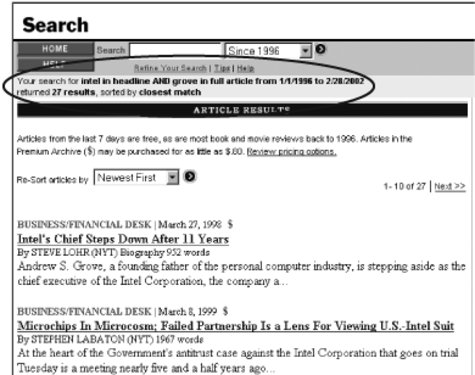 Clearly, there are many assumptions behind that innocuous little search box, some made on the part of the user, and some by the information architect who decides what functionality will be hidden behind that box. Determining what your users' assumptions are should drive the default settings that you set up when designing the simple search interface. 8.8.2. Advanced Search: Just Say NoAdvanced search interfaces are where much of the search system's functionality is "unveiled" to users. In stark contrast to The Box, advanced search interfaces allow much more manipulation of the search system and are typically used by two types of users: advanced searchers (librarians, lawyers, doctoral students, medical researchers), and frustrated searchers who need to revise their initial search (often users who found that The Box didn't meet their needs). Often, you find everything and the kitchen sink thoughtlessly stuffed into advanced search interfaces. Fielded searching, date ranges, search-zone selection, and specialized query languages all crop up here. In fact, these can often crowd the interface and make it difficult for users to know what to do. Gartner's advanced search interface, shown in Figure 8-34, for example, doesn't even fit on one page. Figure 8-34. Gartner's endless advanced search interface: who will use it?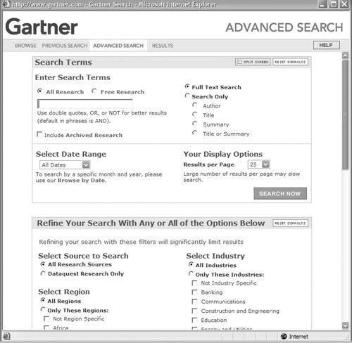 We won't cover these functions in this chapter because we've found that, contrary to our original assumptions, few users ever take advantage of them. Therefore, because few users will ever visit your advanced search page, we don't recommend investing much effort into its design. You're better off looking for ways to enable users to revise when they need toin other words, in the appropriate context. More on that below. As for advanced search, it can't be completely ignored, unfortunately. It is something of a convention, and many users will expect to see it. Perhaps a good rule of thumb is to unearth your search engine's various heavy-duty search functions on the advanced page for those few users who want to have a go at them, but design your search system with the goal of making it unnecessary for the vast majority of searchers to ever need to go to the advanced search page. 8.8.3. Supporting RevisionWe've touched on what can happen after the user finds what she's looking for and the search is done. But all too often that's not the case. Here are some guidelines to help the user hone her search (and hopefully learn a little bit about your site's search system in the process). 8.8.3.1. Repeat search in results pageWhat was it I was looking for? Sometimes users are forgetful, especially after sifting through dozens of results. Displaying the initial search within the search box (as in Figure 8-35) can be quite useful: it restates the search that was just executed, and allows the user to modify it without re-entering it. Figure 8-35. The original query is displayed on the results page and can be revised and re-executed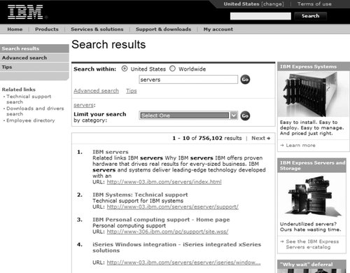 8.8.3.2. Explain where results come fromIt's useful to make clear what content was searched, especially if your search system supports multiple search zones (see Figure 8-36). This reminder can be handy if the user decides to broaden or narrow her search; more or fewer search zones can be used in a revised search. Figure 8-36. Dell's search system shows you where you searched (i.e., "Technical Support"), and makes it easy to reach results from other search zones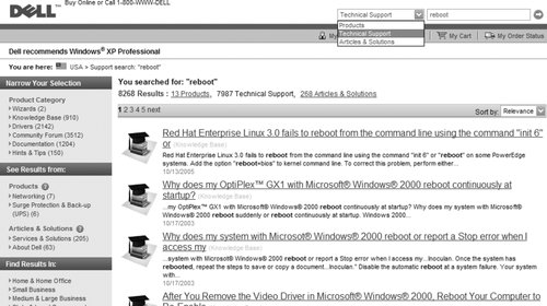 8.8.3.3. Explain what the user didIf the results of a search are not satisfactory, it can be useful to state what happened behind the scenes, providing the user with a better understanding of the situation and a jumping-off point should she wish to revise her search. "What happened" can include the two guidelines just mentioned, as well as:
In Figure 8-37, the New York Times site provides an excellent example of explaining to the user what just happened. Figure 8-37. All aspects of the search are restated as part of these search results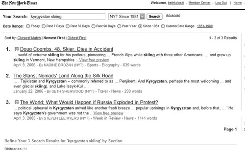 8.8.3.4. Integrate searching with browsingA key theme in this book is the need to integrate searching and browsing (think of them together as "finding"), but we won't belabor it here. Just remember to look for opportunities to connect your search and browse systems to allow users to easily jump back and forth. In Figures 8-38 and 8-39, Amazon.com provides this functionality in both directions. Figure 8-38. Searching leads to browsing: a search for "camera" retrieves categories as well as documents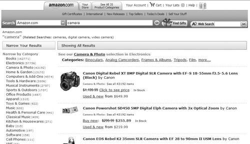 Figure 8-39. while browsing leads to searching: navigate to the "Digital Cameras" section, and you'll find the search box set to search that zone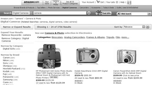 8.8.4. When Users Get StuckYou can strive to support iterative searching with fully integrated browsing and state-of-the-art retrieval and presentation algorithms, yet users still will fail time and time again. What should you do when presenting the user with zero results, or with way too many? The latter case is a bit easier to address, because in most cases your search engine provides relevance ranked results. In effect, winnowing oversized result sets is a form of search revision, and often the user will self-select when he is ready to stop reviewing results. But it is still useful to provide some instruction on how to narrow search results, as shown in Figure 8-40. Figure 8-40. Dell's tech-support help page provides advice on how to deal with too many results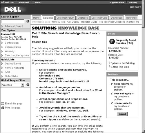 You can also help users narrow their results by allowing them to search within their current result set. In Figure 8-41, the initial search for "naked bungee jumping" retrieved over 9,000 documents; we can "search within these results" for "figure skating" to narrow our retrieval. Figure 8-41. Exalead allows users to search within their result set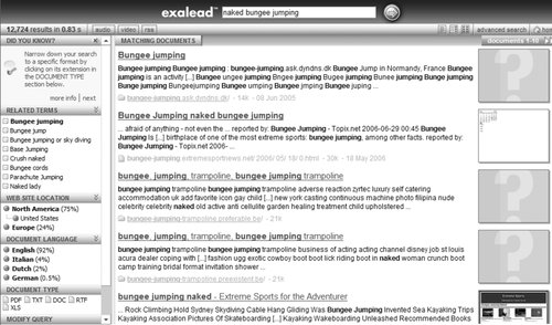 At the other end of the spectrum, zero hits is a bit more frustrating for users and challenging for information architects. We suggest you adopt a "no dead ends" policy to address this problem. "No dead ends" simply means that users always have another option, even if they've retrieved zero results. The options can consist of:
It's worth noting that we've seen few (if any) search systems that meet all these criteria. |
EAN: 2147483647
Pages: 194