Section 4.1. Visualizing Information Architecture
4.1. Visualizing Information ArchitectureWhy is it important to be able to visualize information architecture? There are several answers. One is that the field is new, and many people don't believe that things exist until they can see them. Another is that the field is abstract, and many who might conceptually understand the basic premise of information architecture won't really "get it" until they see it and experience it. Finally, a well-designed information architecture is invisible to users (which, paradoxically, is quite an unfair reward for IA success). IA's lack of tangible qualities forces all information architects to be salespeople to some degree. Because it's highly probable that you'll need to explain information architecture to several important people, including colleagues, managers, prospects, clients, and perhaps your significant other, it's in your interest to be able to help them visualize what an information architecture actually is. Let's start by looking at a site's main page. Figure 4-1 shows the main page for Gustavus Adolphus College in Saint Peter, Minnesota, USA. Figure 4-1. Gustavus Adolphus College's main page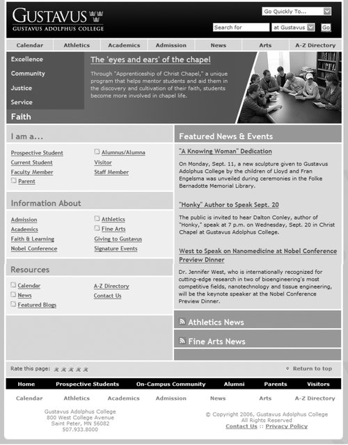 What's obvious here? Most immediately, you see that the site's visual design stands out. You can't help but notice the site's colors (you'll have to take our word for it), typeface choices, and images. You also notice aspects of the site's information design; for example, the number of columnsand their widthschanges throughout the page. What else? With a careful eye, you can detect aspects of the site's interaction design, such as the use of mouseovers (over main menu choices) and pull-down menus for "Go Quickly To" and search options. Although the college's logo and logotype are prominent, the site relies on textual content (e.g., "Excellence," "Community," and so forth) to convey its message and brand. And although this particular site functions well, you'd learn something about its supporting technology (and related expertise) just from the main pagefor example, if it didn't load properly in a common browser, you might guess that the designers weren't aware of or concerned with standards-compliant design. Thus far, we've noticed all sorts of things that aren't information architecture. So what is recognizable as information architecture? You might be surprised by how much information architecture you can see if you know how to look. For example, the information has been structured in some basic ways, which we'll explain in later chapters:
Figure 4-2 provides a visualization of these architectural components. Figure 4-2. This page is crammed with architectural components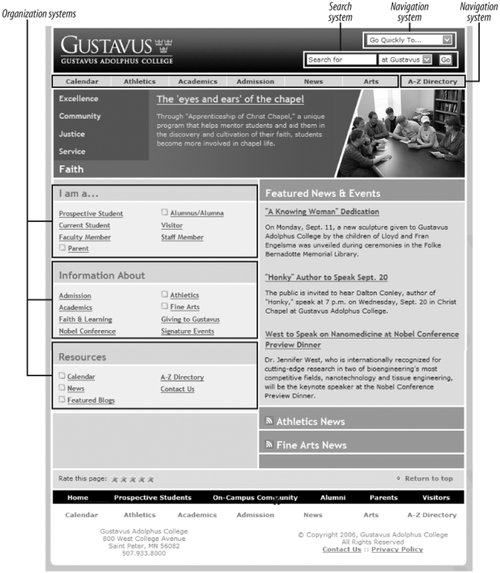 As we can see from this figure and from Figure 4-3, these areas are just the tip of the iceberg. Categories group pages and applications throughout the site; labels systematically represent the site's content; navigation systems and a search system can be used to move through the site. That's quite a lot of information architecture to cram into one screenshot! In effect, the Gustavus main page tries to anticipate users' major information needs, such as "How do I find out about admissions?" or "What's going on this week on campus?" The site's information architects have worked hard to determine the most common questions, and have designed the site to meet those needs. We refer to this as top-down information architecture, and the Gustavus main page addresses many common "top-down" questions that users have when they land on a site, including:
Figure 4-3. A site's main page is crammed with answers to users' questions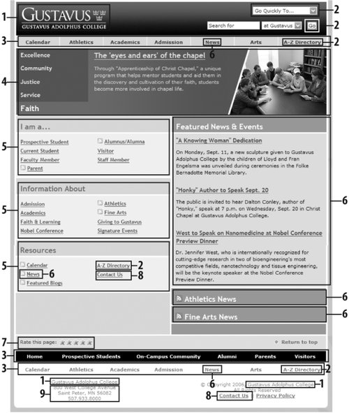 Figure 4-4 shows a slightly different examplepages tagged by one of the authors as relevant to enterprise user experience in del.icio.us, a social bookmarking service. Figure 4-4. Bookmarks tagged as about "enterprise_UX" in del.icio.us, a social bookmarking service.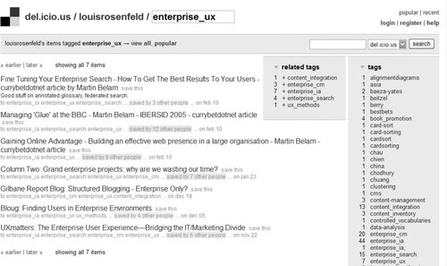 There is little to see here besides the information architecture and the content itself. In fact, as the content is just a collection of links to bookmarked pages from other web sites, the information architecture is the bulk of the page. It provides context for the content, and tells us what we can do while we're here.
In many respects, this page from del.icio.us is nothing but information architecture. Content itself can have information architecture embedded within it. The recipe in Figure 4-5 shows a nutritious drink from the Epicurious site. Figure 4-5. A recipe for the thirsty from Epicurious.com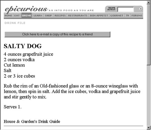 Beyond the navigational options at the top of the page, there's not much information architecture here. Or is there? The recipe itself has a clear, strong structure: a title at the top, a list of ingredients, then preparation directions and serving information. This information is "chunked" so you know what's what, even without subtitles for "ingredients" or "directions." The recipe's native chunking could also support searching and browsing; for example, users might be able to search on the chunks known as "recipe titles" for "salty dog" and retrieve this one. And these chunks are sequenced in a logical manner; after all, you'll want to know the ingredients ("Do I have four ounces of grapefruit juice?") before you start mixing the drink. The definition and sequential placement of chunks help you to recognize that this content is a recipe before you even read it. And once you know what it is, you have a better idea what this content is about and how to use it, move around it, and go somewhere else from it. So, if you look closely enough, you can see information architecture even when it's embedded in the guts of your content. In fact, by supporting searching and browsing, the structure inherent in content enables the answers to users' questions to "rise" to the surface. This is bottom-up information architecture; content structure, sequencing, and tagging help you answer such questions as:
Bottom-up information architecture is important because users are increasingly likely to bypass your site's top-down information architecture. Instead, they're using web-wide search tools like Google, clicking through ads, and clicking links while reading your content via their aggregators to find themselves deep in your site. Once there, they'll want to jump to other relevant content in your site without learning how to use its top-down structure. A good information architecture is designed to anticipate this type of use; Keith Instone's simple and practical Navigation Stress Test is a great way to evaluate a site's bottom-up information architecture (http://user-experience.org/uefiles/navstress/). You now know that information architecture is something that can be seen, if you know what to look for. But it's important to understand that information architecture is often invisible. For example, Figure 4-6 shows some search results from the BBC's web site. Figure 4-6. BBC's search results include three "Best Links"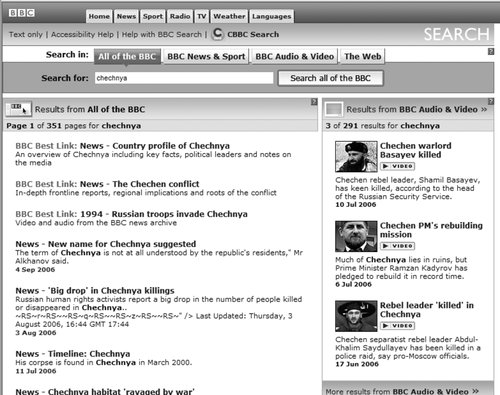 What's going on here? We've searched for "chechnya," and the site has presented us with a couple of different things, most interestingly three results labeled as a "BBC Best Link." As you'd imagine, all search results were retrieved by a piece of softwarea search enginethat the user never sees. The search engine has been configured to index and search certain parts of the site, to display certain kinds of information in each search result (i.e., page title, extract, and date), and to handle search queries in certain ways, such as removing "stop words" (e.g., "a," "the," and "of"). All of these decisions regarding search system configuration are unknown to users, and are integral aspects of information architecture design. What's different is that the "Best Link" results are manually created: some people at the BBC decided that "chechnya" is an important term and that some of the BBC's best content is not news stories, which normally come up at the top of most retrieval sets. So they applied some editorial expertise to identify three highly relevant pages and associated them with the term "chechnya," thereby ensuring that these three items are displayed when someone searches for "chechnya." Users might assume these search results are automatically generated, but humans are manually modifying the information architecture in the background; this is another example of invisible information architecture. Information architecture is much more than just blueprints that portray navigational routes and wireframes that inform visual design. Our field involves more than meets the eye, and both its visible and invisible aspects help define what we do and illustrate how challenging it really is. |
EAN: 2147483647
Pages: 194
- Challenging the Unpredictable: Changeable Order Management Systems
- Data Mining for Business Process Reengineering
- Intrinsic and Contextual Data Quality: The Effect of Media and Personal Involvement
- Healthcare Information: From Administrative to Practice Databases
- A Hybrid Clustering Technique to Improve Patient Data Quality